

From soft and romantic to earthy and raw, the newly launched Haymes Colour Library has a paint colour volume you’ll love!
The inaugural Colour Library has seven volumes — Curate, Collaborate, Timeless, Consider, Form, Conscious and Experience — which paves a new direction for Haymes Paint, no longer waiting to release an annual forecast of colour trends.
The Colour Library allows us to move away from putting a date on colour and helps us build an evolving palette that can be changed according to personal style and taste.
Related article: Colour and emotion: How to select colour for the mood you want to achieve in your home
Related article: How to select paint colours to make a room feel larger

“The landscape has dramatically changed in the past few years, particularly with how quickly people can access global trend information via social media and digital platforms,” explains Wendy Rennie, Colour and Concept Manager at Haymes.
“We are seeing a more fluid environment when it comes to colours and trends, which makes it difficult to embargo or hold off releasing new information.”
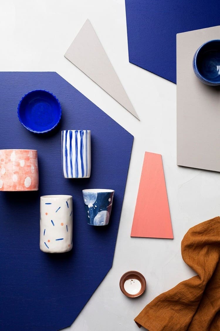
Aimed at starting a conversation about colour and design based on personal interest and style, here’s a snippet about each volume, starting with Curate which was launched in partnership with Etsy.
Curate
Curate represents a considerable shift in colour directions for the future, incorporating the pairing of unexpected colour combinations. Electric blues, bright corals, rich tans and soft greys, this palette is influenced by natural materials such as leather, rope, linen and ceramics, while the bright colours channel a playful and contemporary approach to colour and design.
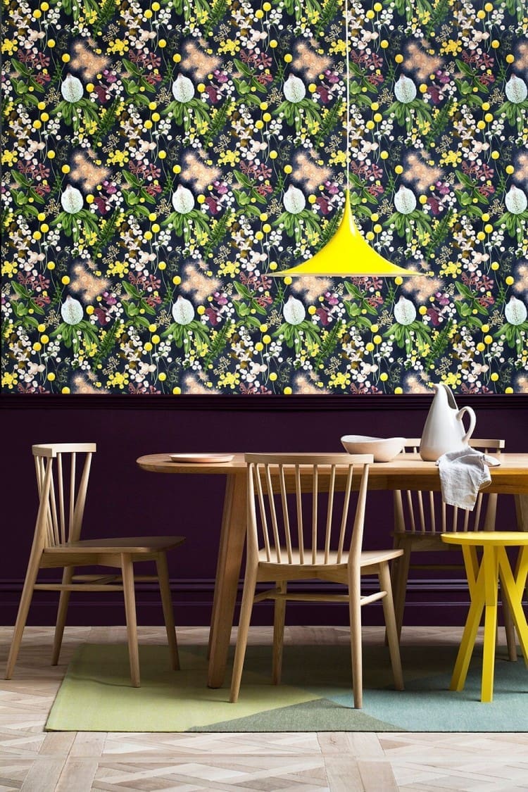
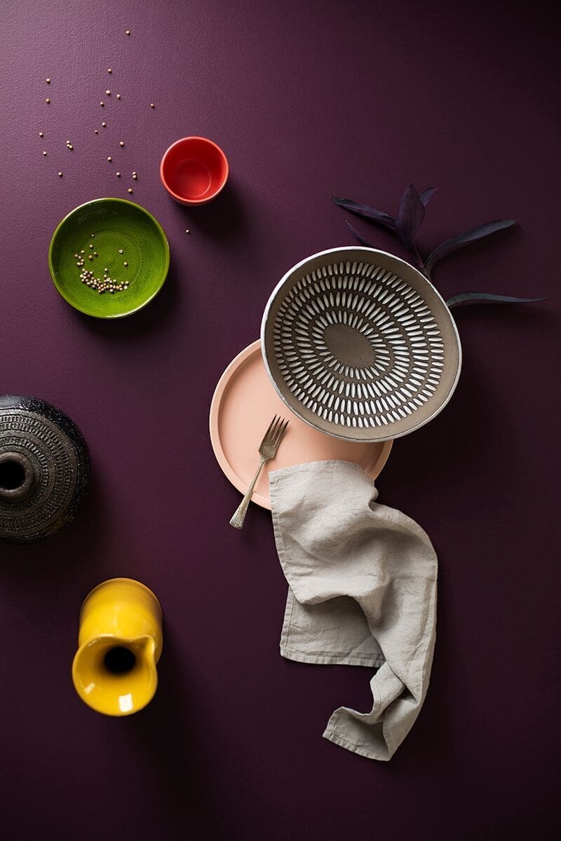
Collaborate
Interiors embrace in the rich, deep and bold Collaborate palette. With an unmistakable botanical look, the lush greens, deep red wines and golden yellows are beautiful yet mysterious.

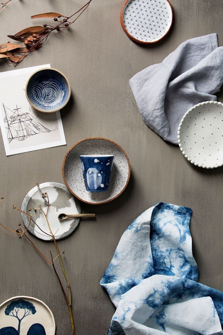
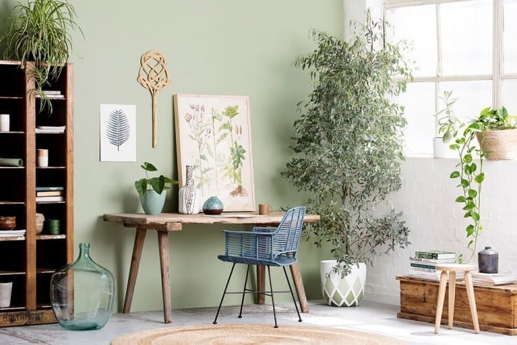
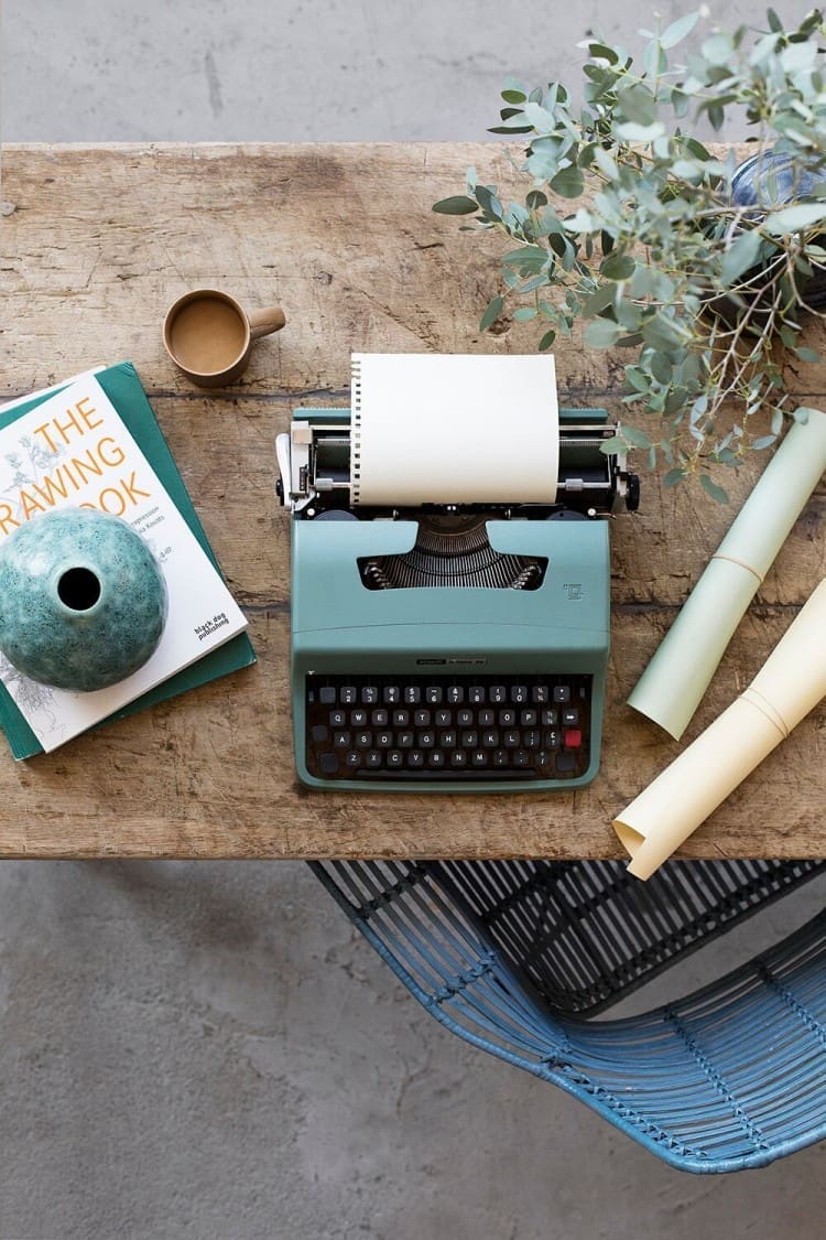
Consider
Consider is a thoughtful and refreshing palette featuring a blend of colours, including soft pastels of blue, green and yellow paired with earthy neutrals. Colour is emotive and Consider is about creating interiors with a fresh and organic feel, the perfect combination of soothing interiors, without being oppressive or boring.

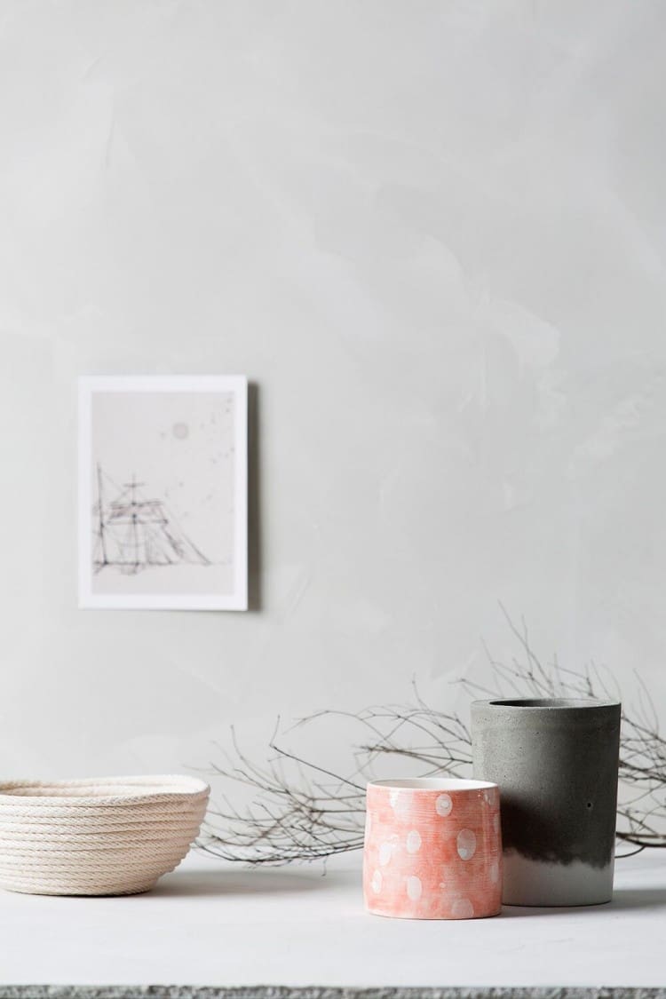
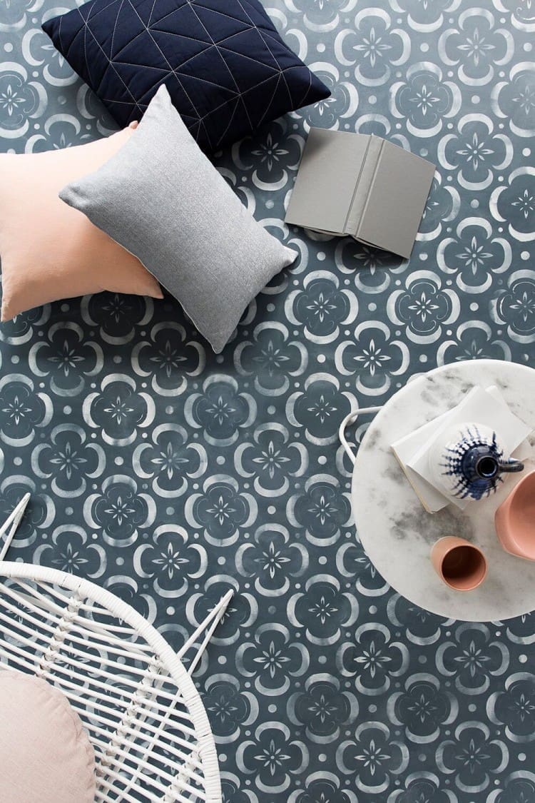
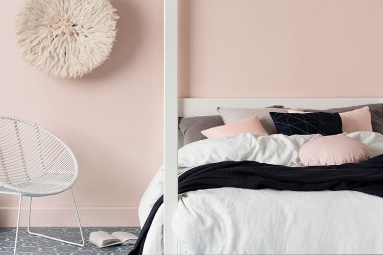
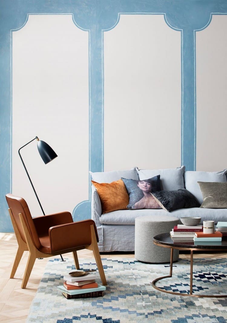
Conscious
Soft, light and airy, with a feminine feel, the Conscious palette is intimate and personal — and our favourite of the colour trends. We love the beautiful dusty pinks and blues teamed with warm grey tones.
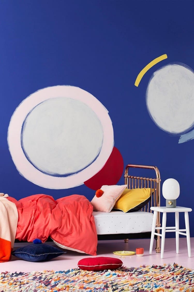
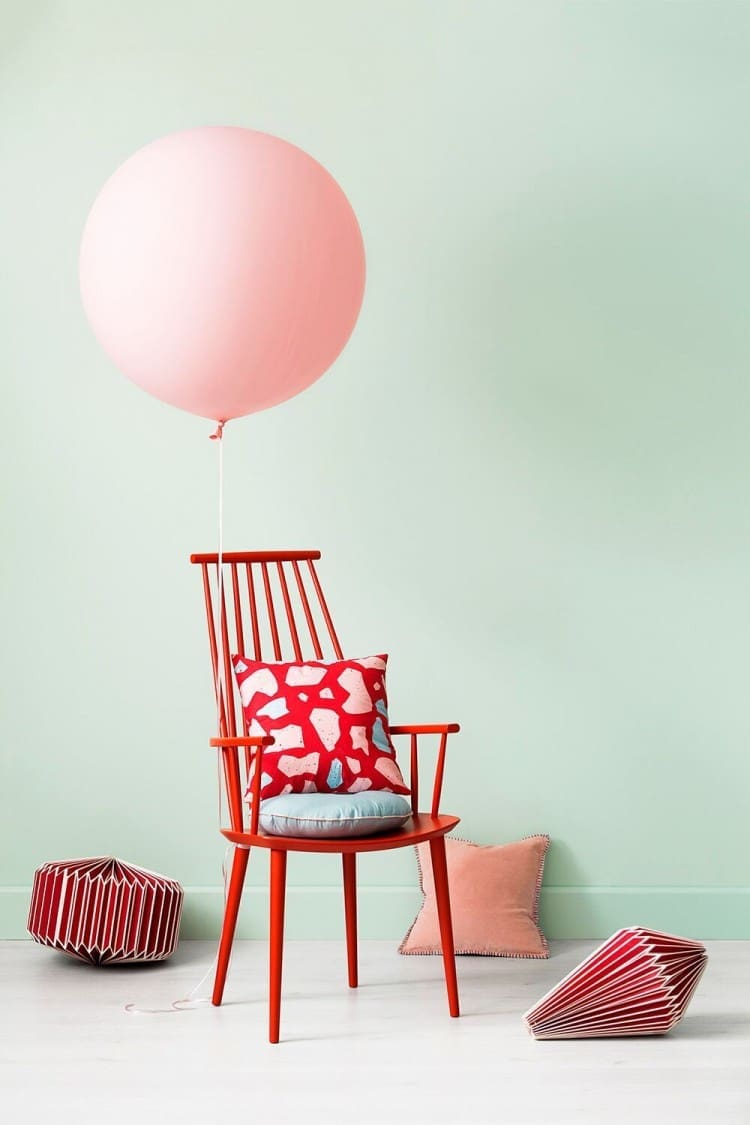
Experience
The Experience palette is bright and vibrant, reflecting the way we push our boundaries. It doesn’t sit quietly in the background; rather it has bright pops of cherry red, purple and yellow, softened by pastels and fresh neutrals.
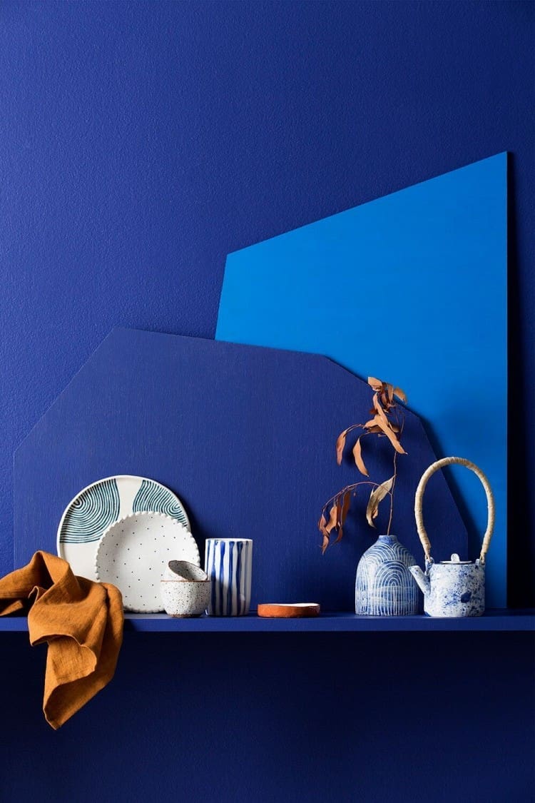
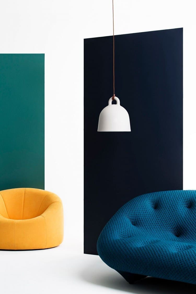
Form
All about scale and colour, the Form palette recognises the need to create interchangeable spaces that can be reconfigured to adapt to the needs of evolving lifestyles. Form is fun and functional, and the colours are definitive and strong in contrast; blue, teal and mustard sit with deep, muddy tones and light, earthy neutrals, which help to ground the heavy accents within the palette.
Timeless
Trends come and go; good design beats the test of time. We can make interior choices that will endure time when we know what has worked in the past. The Timeless palette offers a look back to look forward. Wedgewood blue, burnt reds and terracotta tones, sitting comfortably alongside clay neutrals to recreate a palette that moves from then to now.

For more information or interiors and paint inspiration, check out the Haymes website. Tell us, which of these colour trends do you love the most?


Interesting concept – the Conscious is really my style, I will look into this when I redo my bedroom.
The romantic colour palette of Conscious is our fave too! Just so dreamy and perfect for a bedroom <3