Woooow! The living and dining rooms on this years Block have really surprised us! From elegant chic, classic Hamptons to retro cool, there’s so much diversity in the contestants styles and we’re loving it!
Get ready for some seriously impressive reveals this week!
Related article: The Block 2020: Week 7 — Living and dining reveal
Related article: The Block 2021: Week 7 — Kitchen week
Ronnie and Georgia
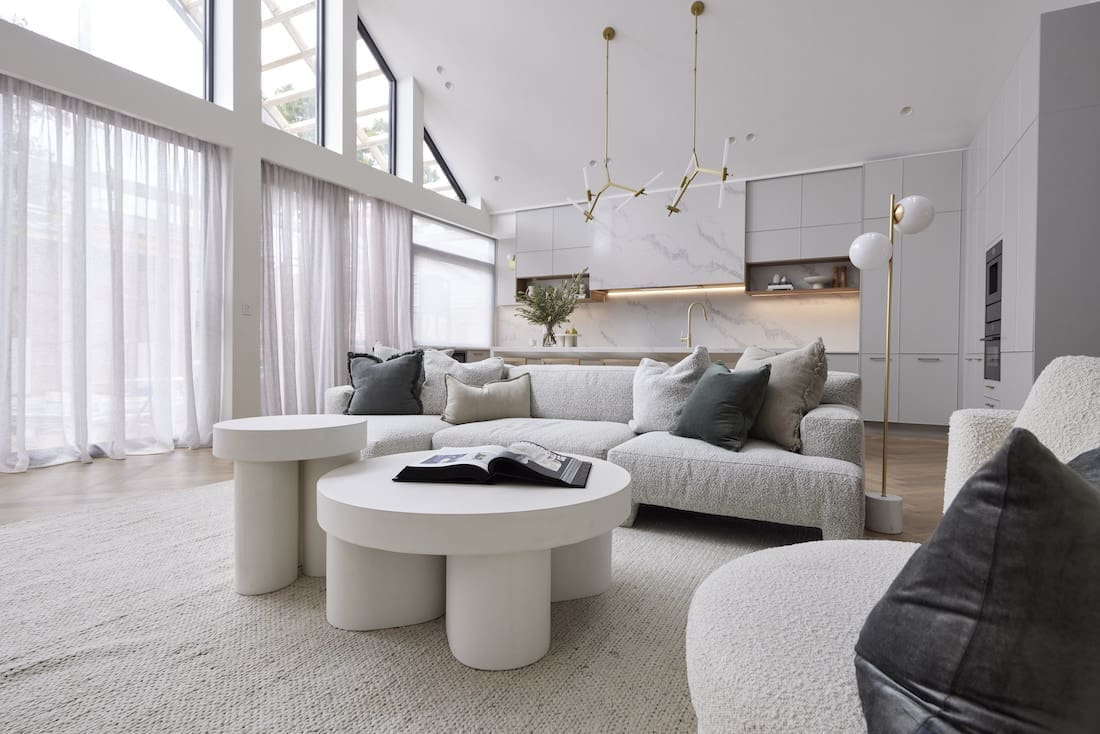
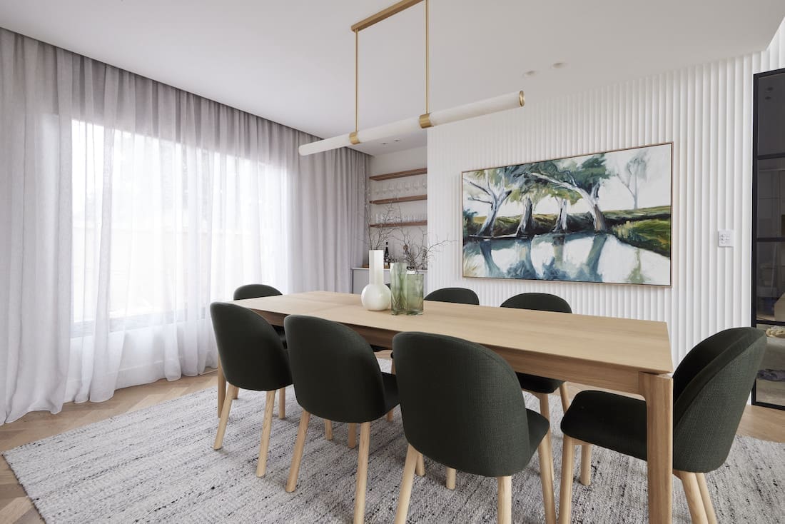
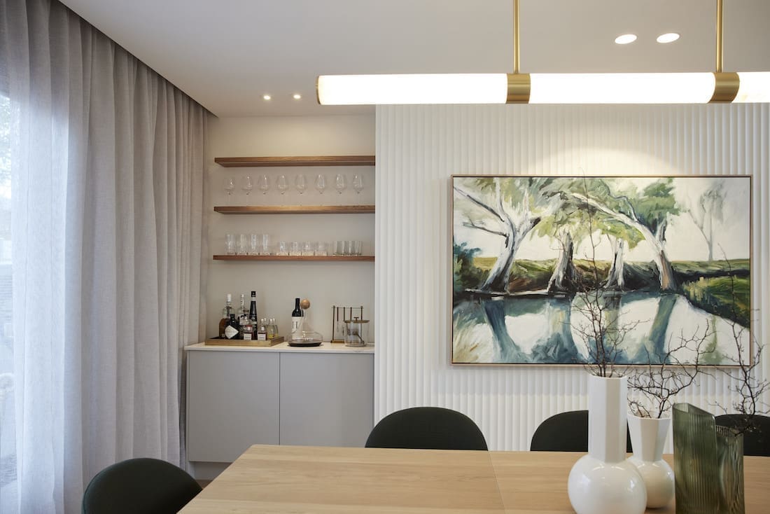
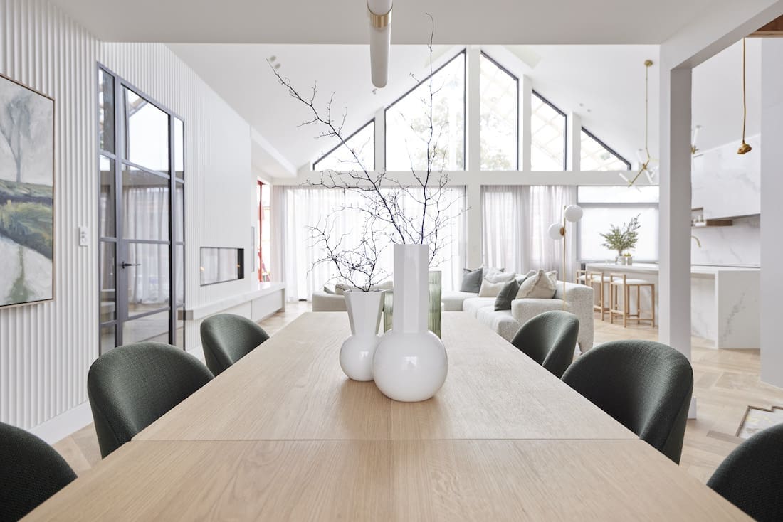
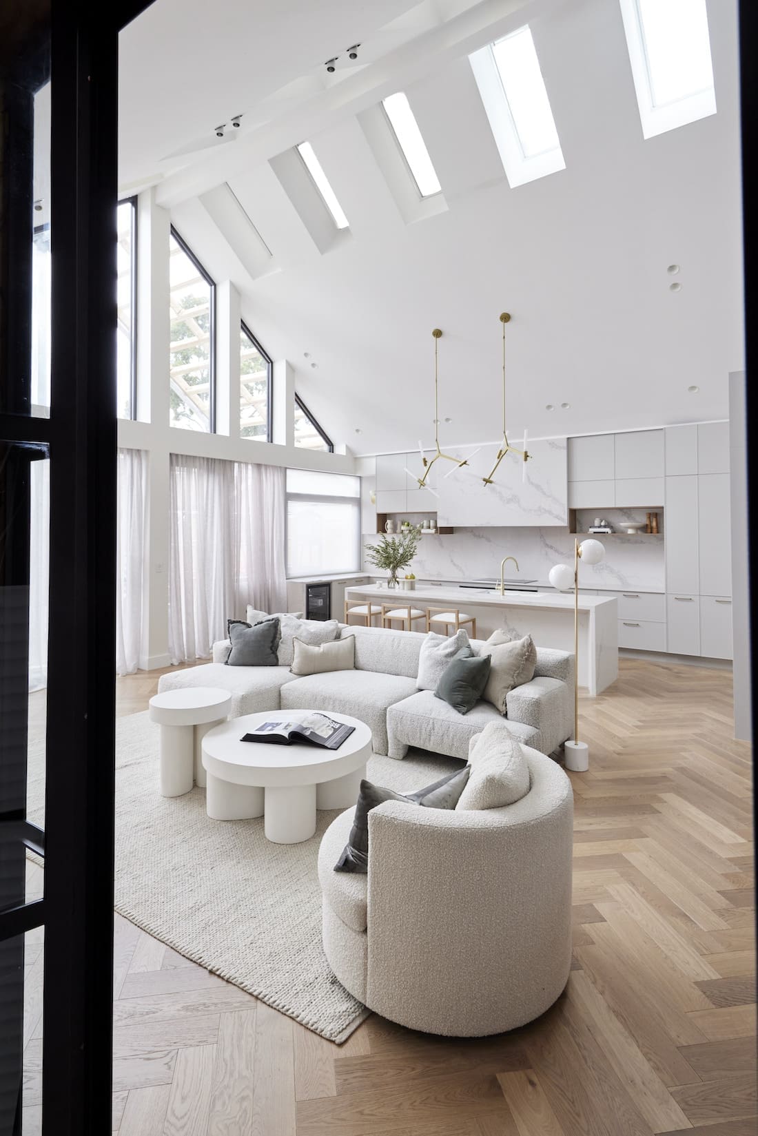
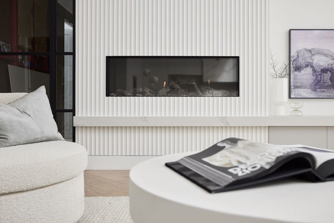
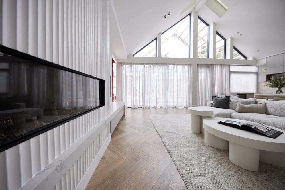
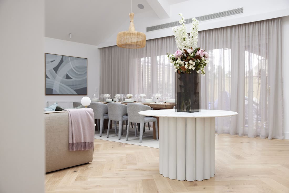
Stop it! Just STOP IT! Ronnie and Georgia keep on creating the rooms of our dreams! From that scalloped wall (a thousand times yes), their stunning lighting choices, the colour of the dining chairs, textures in the use of the Bouclé sofa, and just the overall flow of the rooms. Ok. It was everything! We loved everything.
The judges called it, “Classic, contemporary luxury, all combined for a beautiful space for life.” They also swooned over the perfectly placed tv and fireplace with a stone plinth matching the Caesarstone from their kitchen.
They commented on the lowered ceiling in the dining room with bar space. It created a feeling of intimacy, with the perfect execution of the grand, sky-high roofline being savoured for the living and kitchen space.
Cost: $47,001
Score: 29½ / 30 (judges score of 28½ + the gnome point, giving them joint 1st place)

Mitch and Mark
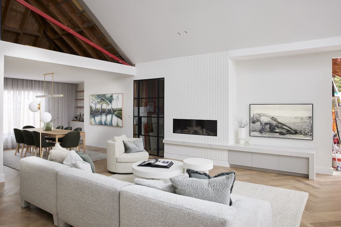
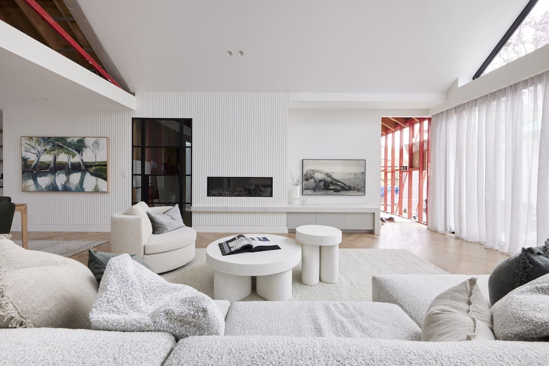
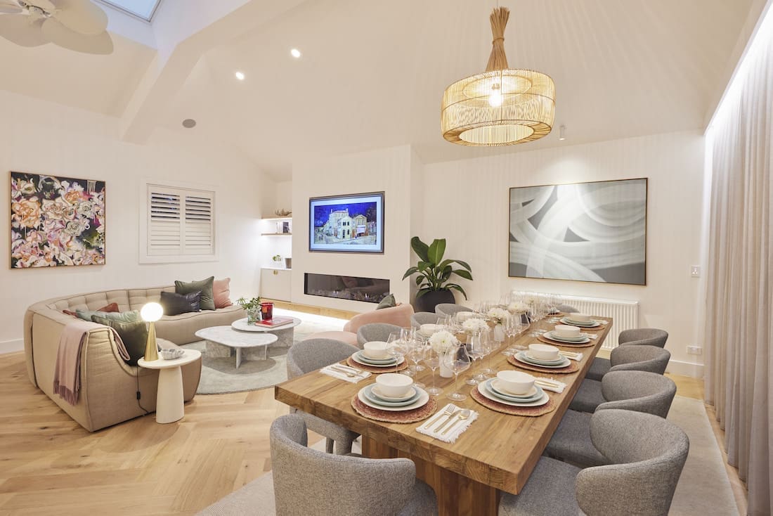
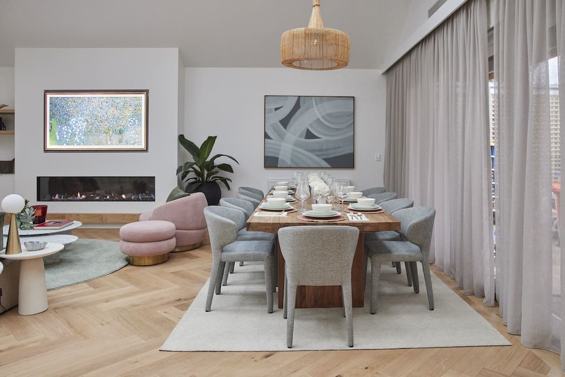
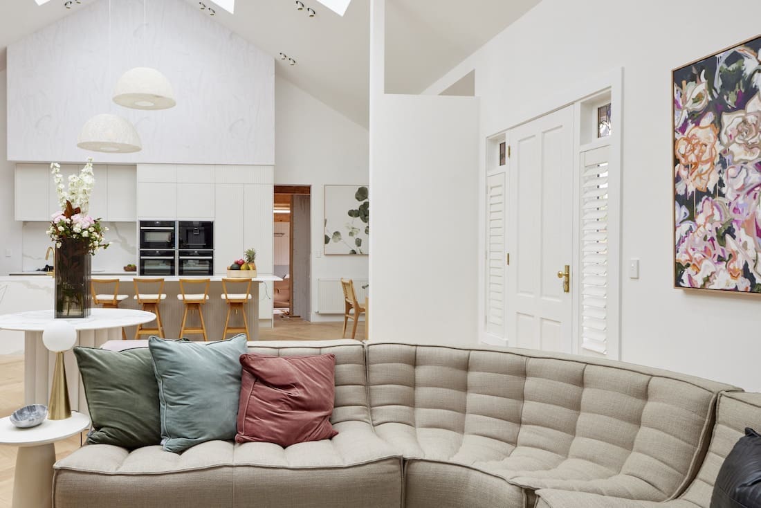
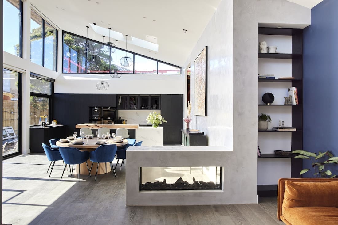
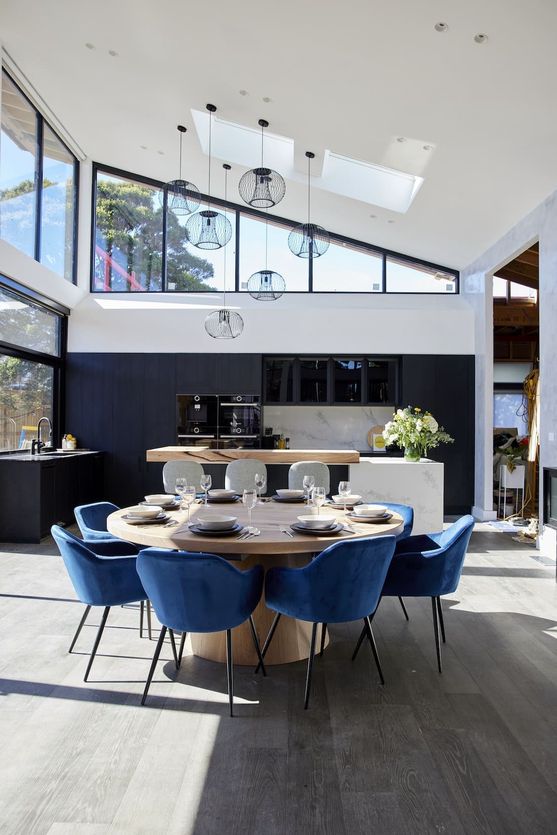
That ceiling! It feels like living inside a garden greenhouse, don’t you think?! The striking row of Velux skylights flood the living and dining rooms with natural night. It certainly gives the wow factor the judges were looking for.
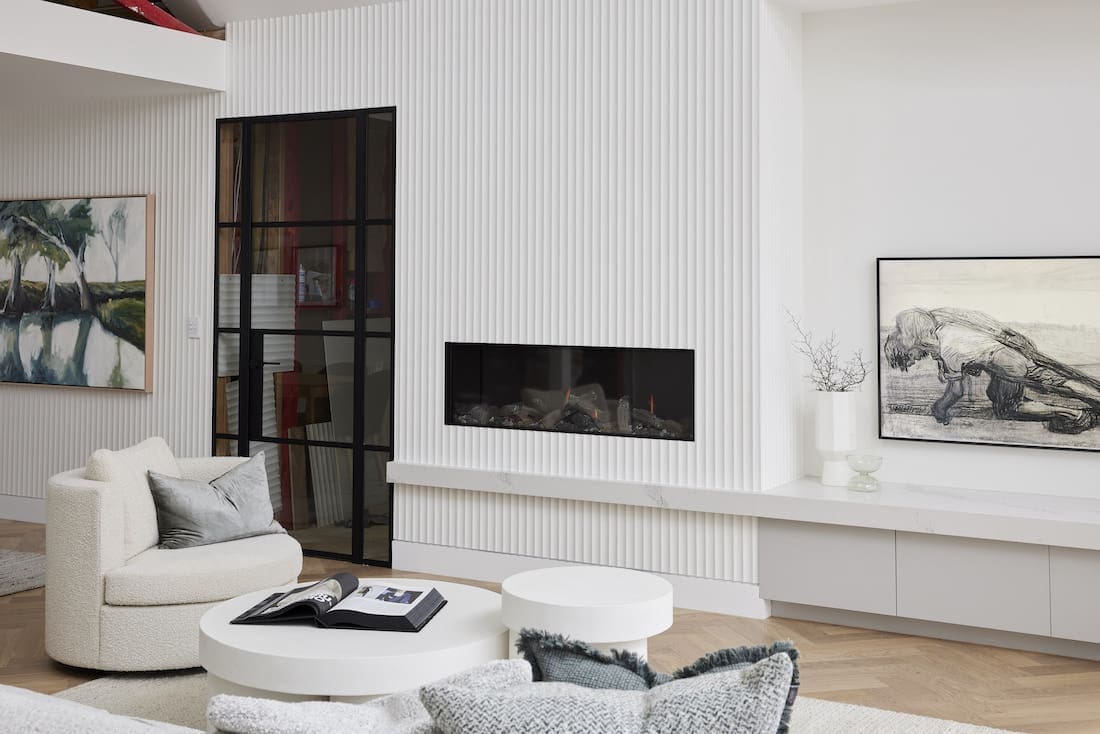
Mitch and Mark delivered another two spaces that felt very them. We appreciate they’re in keeping with the rest of the home’s look and feel which is clearly an important factor. And it just wouldn’t be Mitch and Mark without too much styling, now would it?!
We weren’t too crazy about their furniture choices. They felt a little heavy in the space.
The judges pointed out the space between the kitchen and living dining space felt a bit odd, too. Shaynna suggested a partition to create a hallway from the front door could help divide the space and give it a better sense of zoning.
Cost: $37,691
Score: 24½ / 30 (4th place)

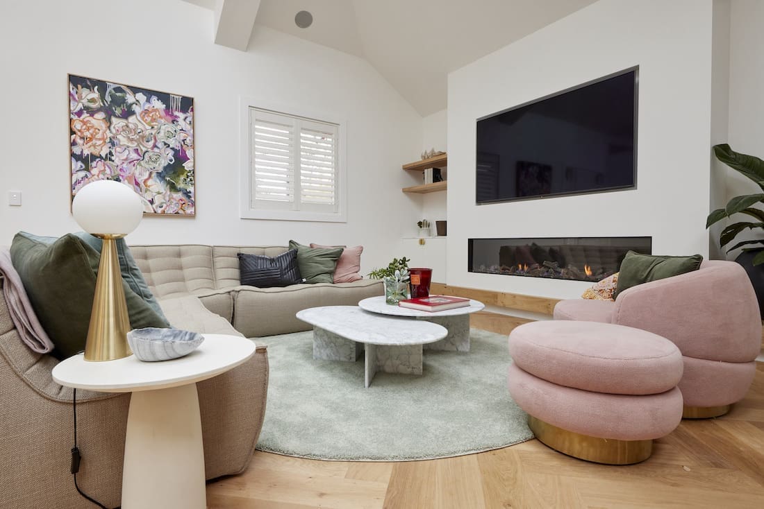
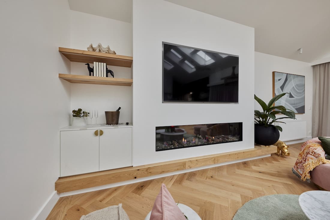
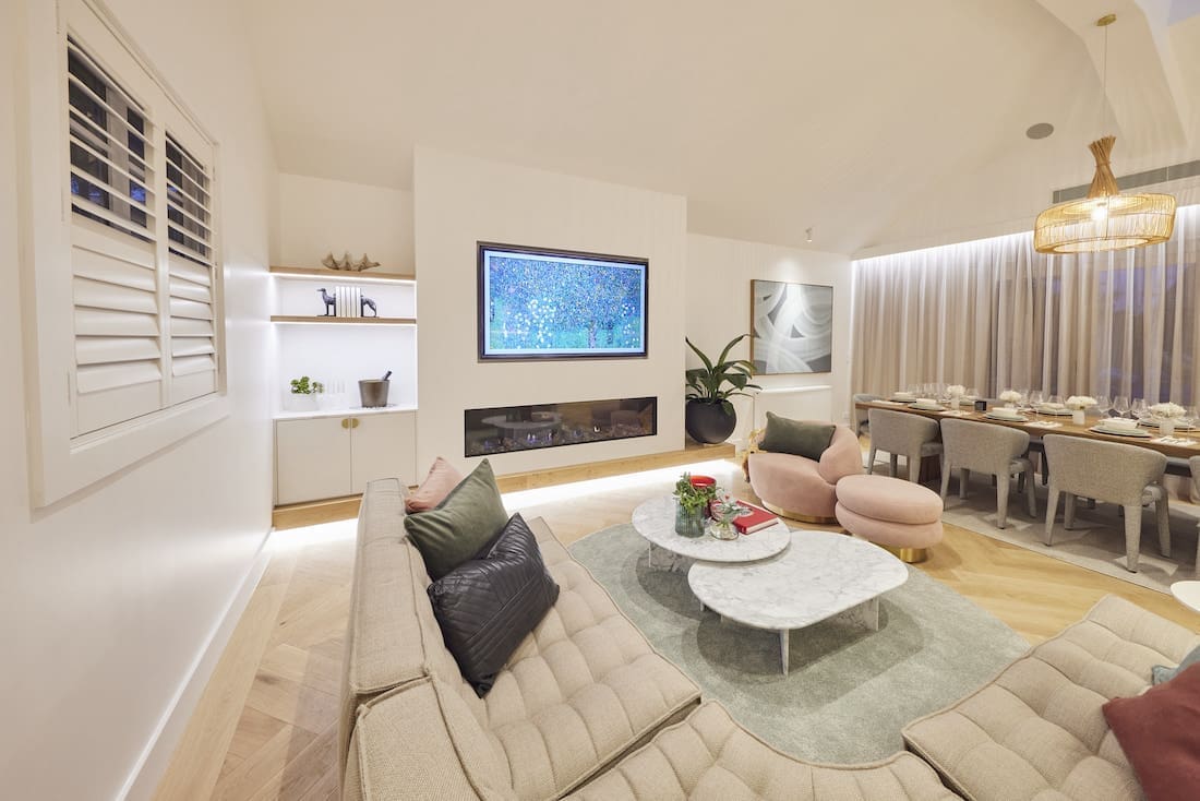
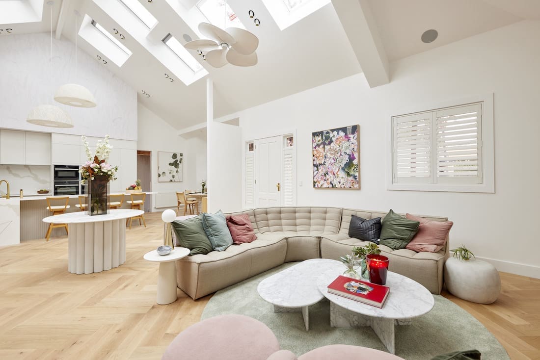
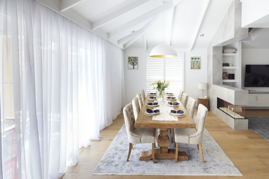
Tanya and Vito
Eight weeks in and Tanya and Vito FINALLY took out a win! It’s a pity they had to share the podium with Ronnie and Georgia (even if they were our fave space, yet again!) but hey, a win is a win!
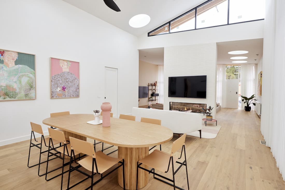
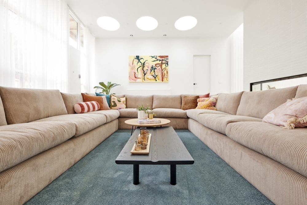
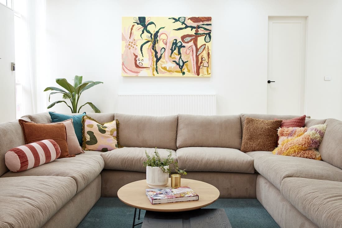
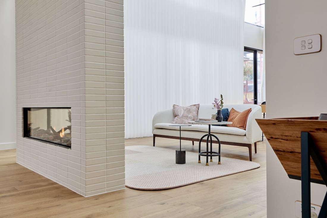
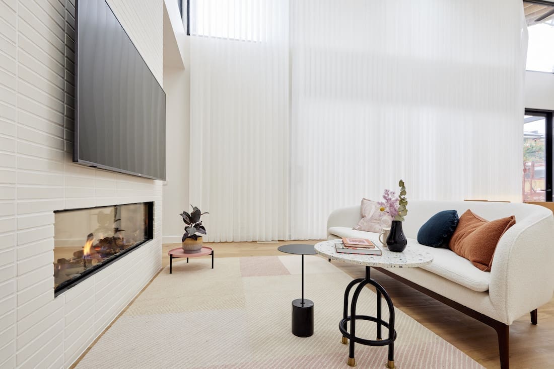
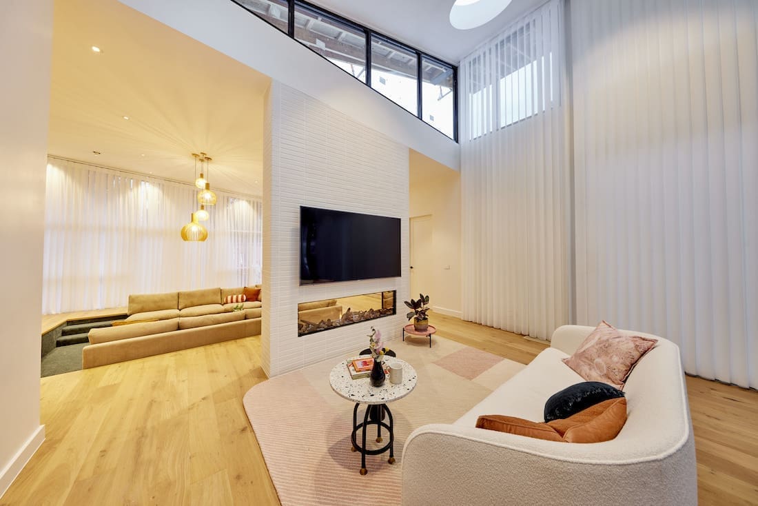
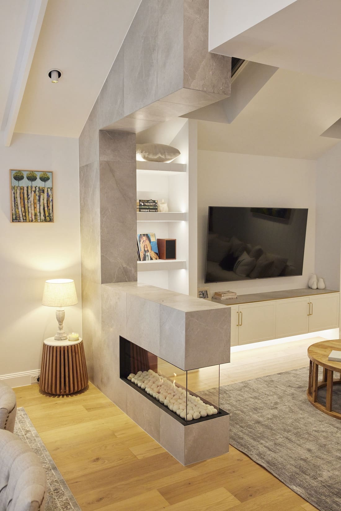
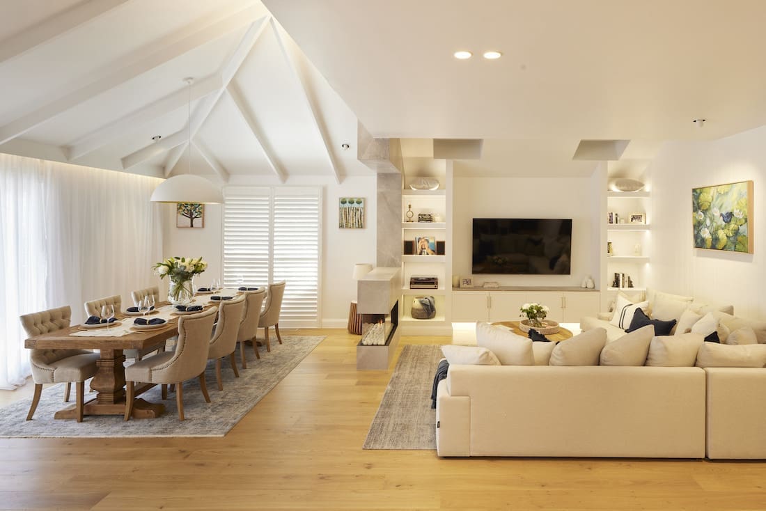
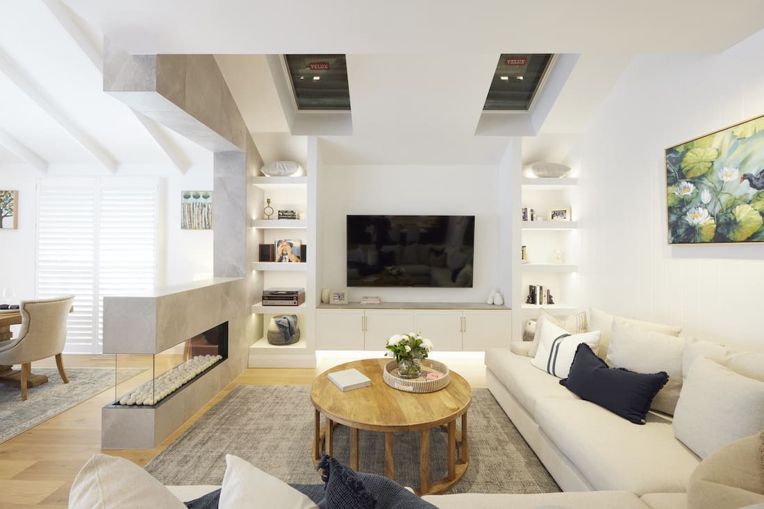
Their sunken lounge, which greets you upon the homes entry was so cool with Darren calling it, “Fun, playful, cool and retro.” Shaynna loved the ‘work of art’ 5 round Velux skylights stating, “You guys have nailed it.”
The double-sided fireplace was our fave feature and we also loved the stylish shelving unit. The sheer curtains of epic proportions were truly dreamy, and we liked that they kept the styling simple and chic. The whole space felt very 1950s without being too over the top. While it wasn’t our pick for the win, we can see why they took out the well deserved top spot.
Cost: $49,618
Score: 29½ / 30 (joint 1st place)


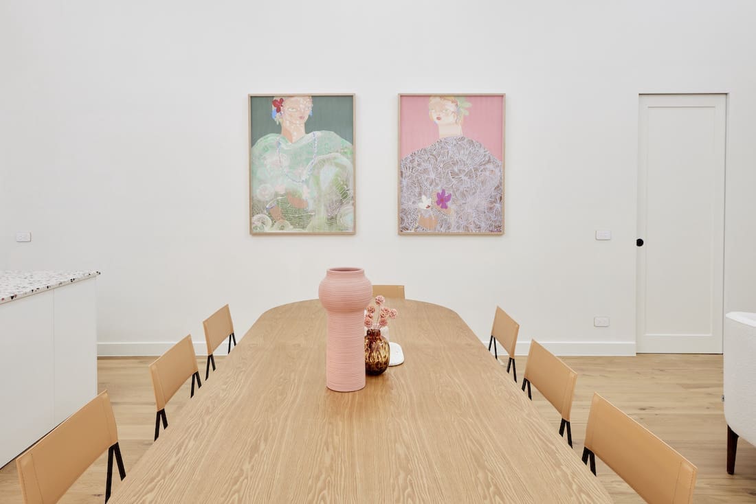
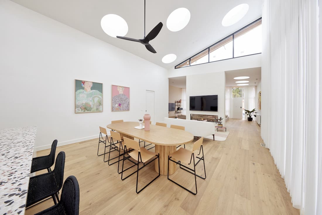
Josh and Luke
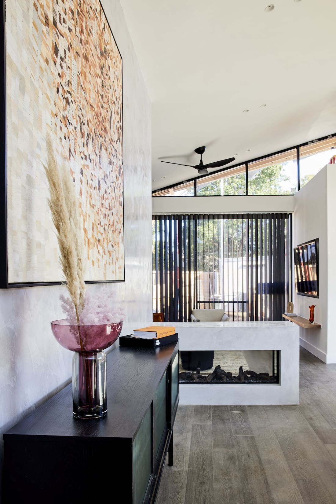
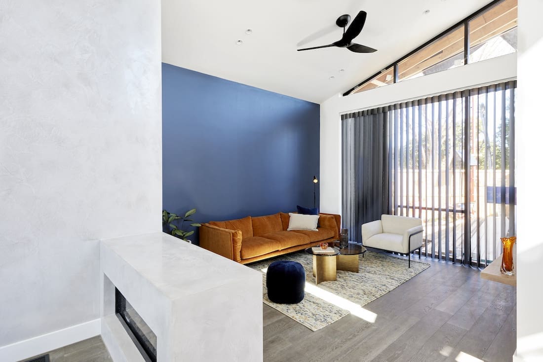
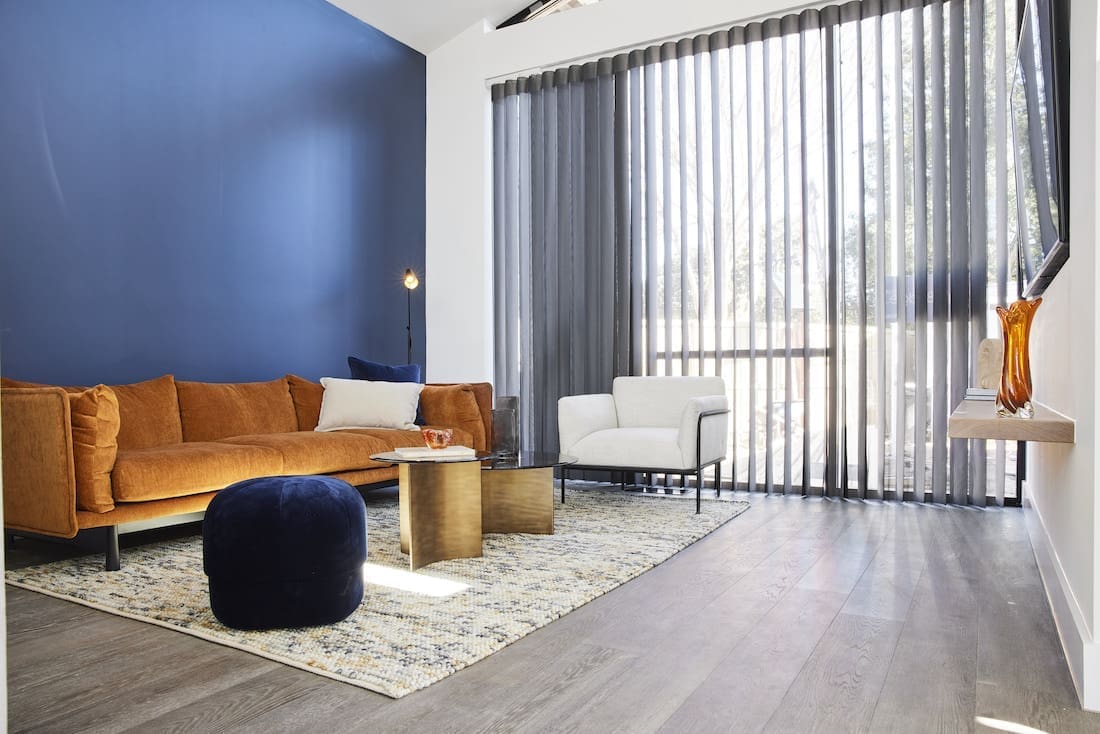
We weren’t really sure how to feel about the living and dining rooms Josh and Luke delivered. While we’re not fans of overstyling (Mitch and Mark spring to mind!) this weeks reveals from the twins felt underwhelming and a little bland.
There’s no denying the star of the show is that Christian Cole dining table. It’s pure craftsmanship and a beautiful piece. The sideboard on the other hand, just doesn’t seem to fit the space. Other than the dining table and artwork, the dining space feels quite cold and dated… sorry boys but this isn’t our favourite.
We agreed with the judges when the said the space as a whole felt a little confused. The dining table, as beautiful as it is, was just plonked in the middle of the room and it just looks a little lost in such a huge space (or “Aircraft-hanger sized” as Neale put it). Darren suggested the boys could flip the dining and living areas, to which Shaynna agreed.
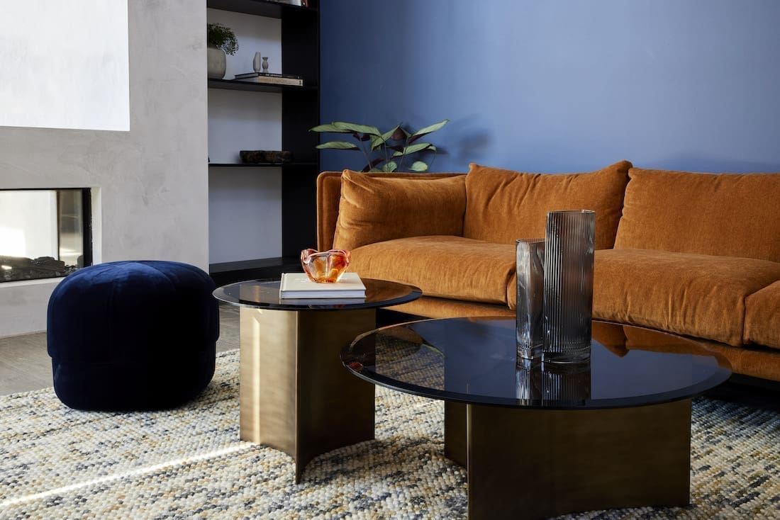
A couple of things we did like were the colour of the sofa and that contrasting light occasional chair. Although we could do without the blue feature wall…
Cost: $37,367
Score: 22½ / 30 (5th place)
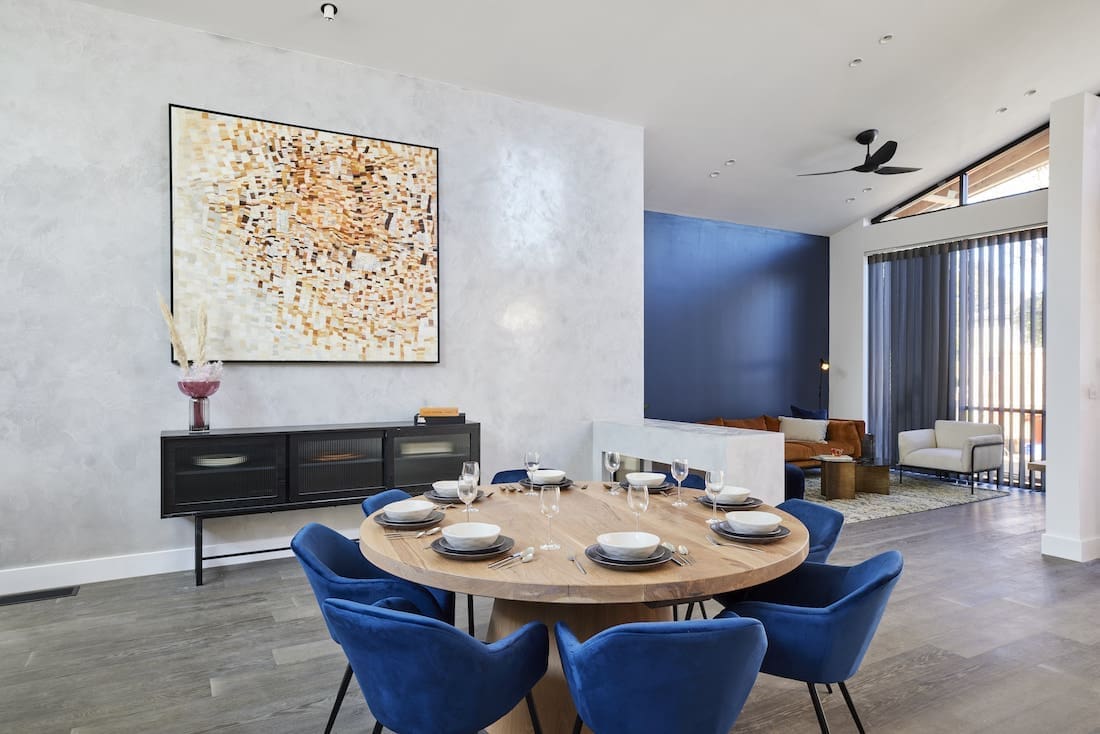
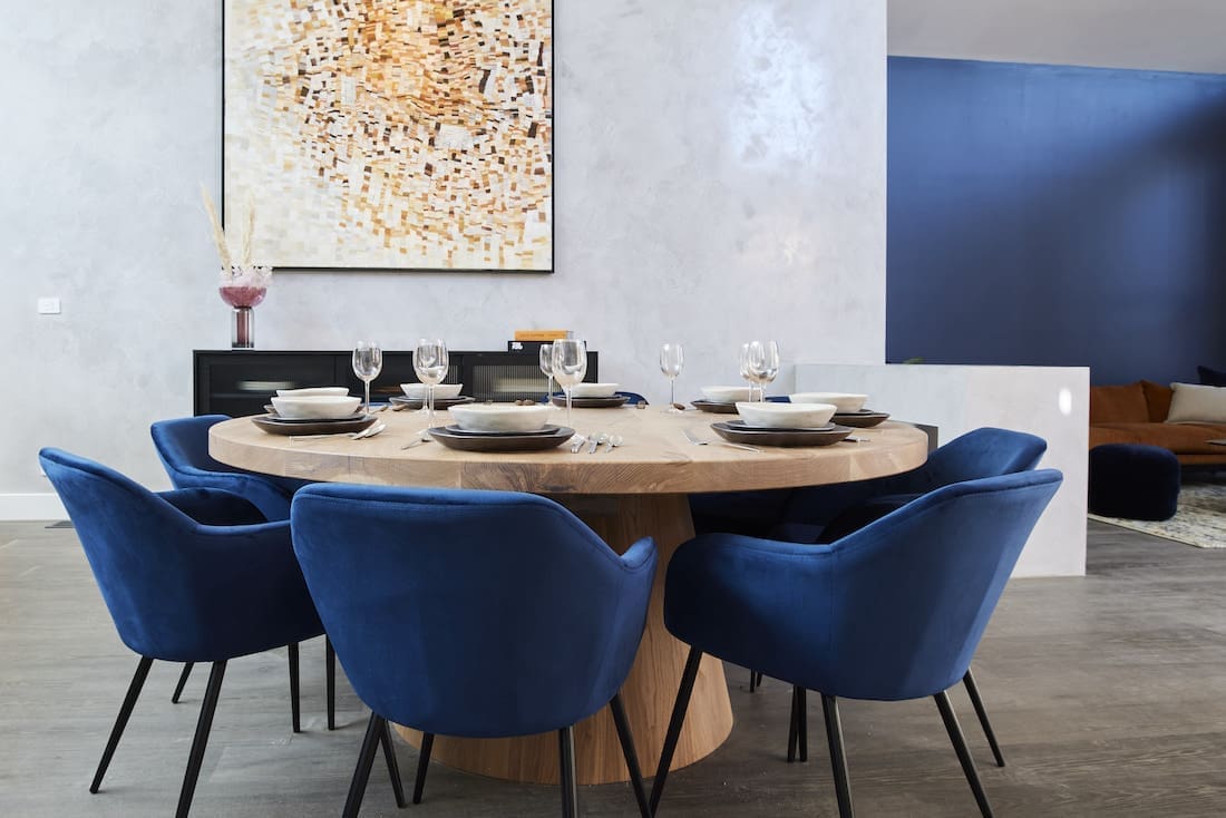

Kirsty and Jesse
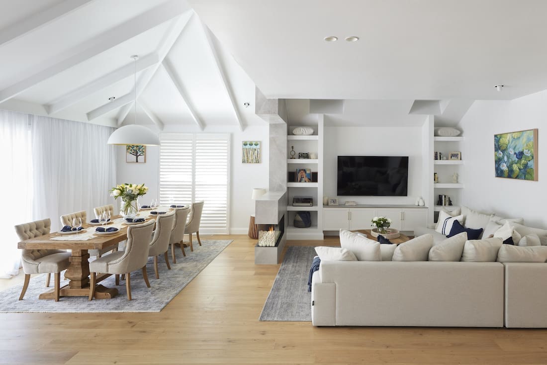
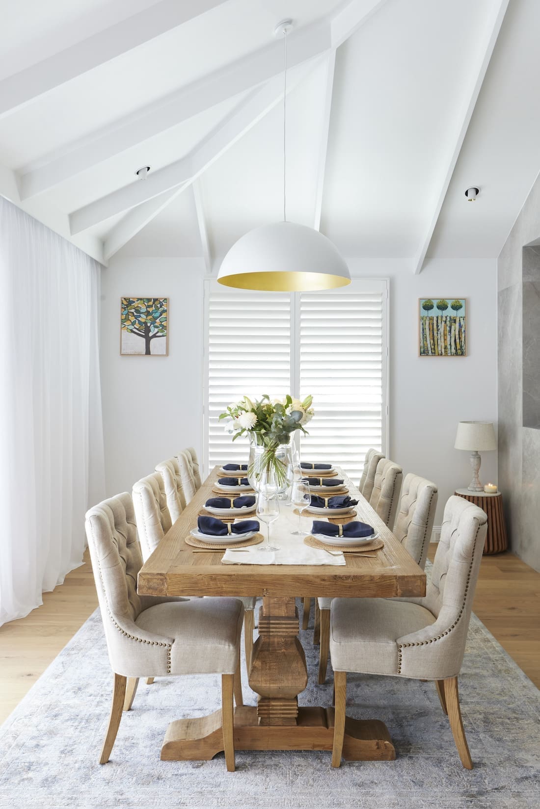
It’s rough that Kirsty and Jesse only came third with an impressive score of 29 out of 30! Just half a point off sharing the win, it was another stellar week from Kirsty and Jesse who are coming in leaps and bounds of late.
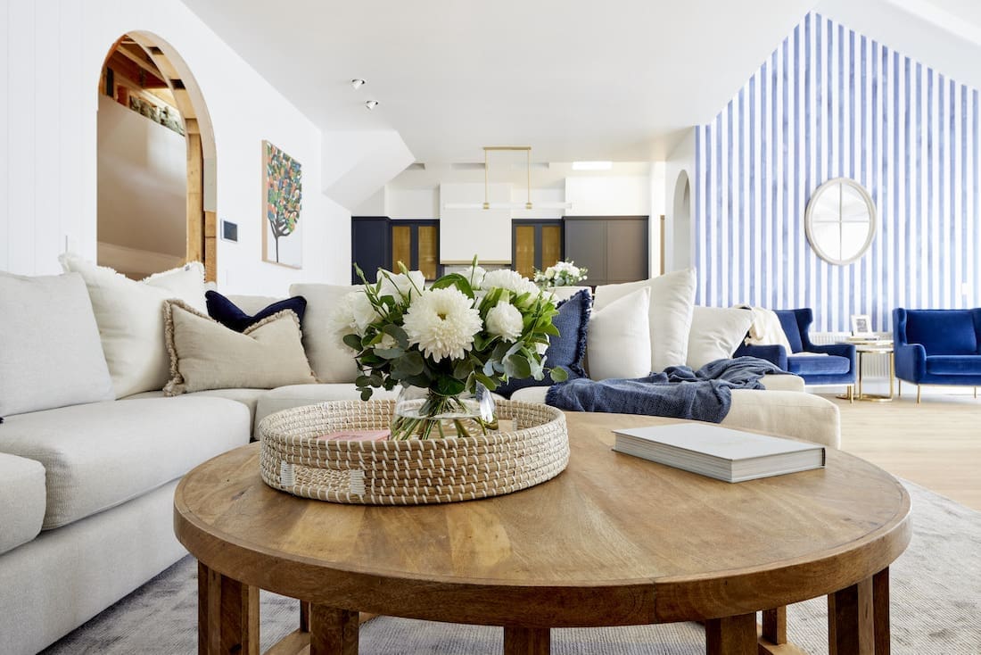
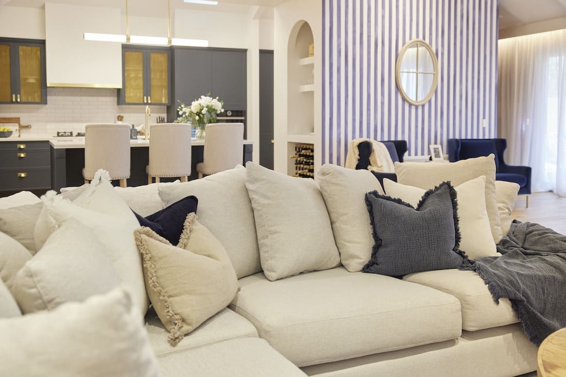
It was described as, “Homely, comfortable and a space that feels like it’s been there forever.” Despite being a much smaller space than Josh and Luke’s, their spacial awareness, styling and furniture placement meant it felt a lot bigger.
We would have loved to see a different style of fireplace that’s more fitting with the Hamptons style but the judges praised the nib-wall two-sided fireplace. What did you think? The furniture choices were right on brief though and that raked ceiling detail is divine.
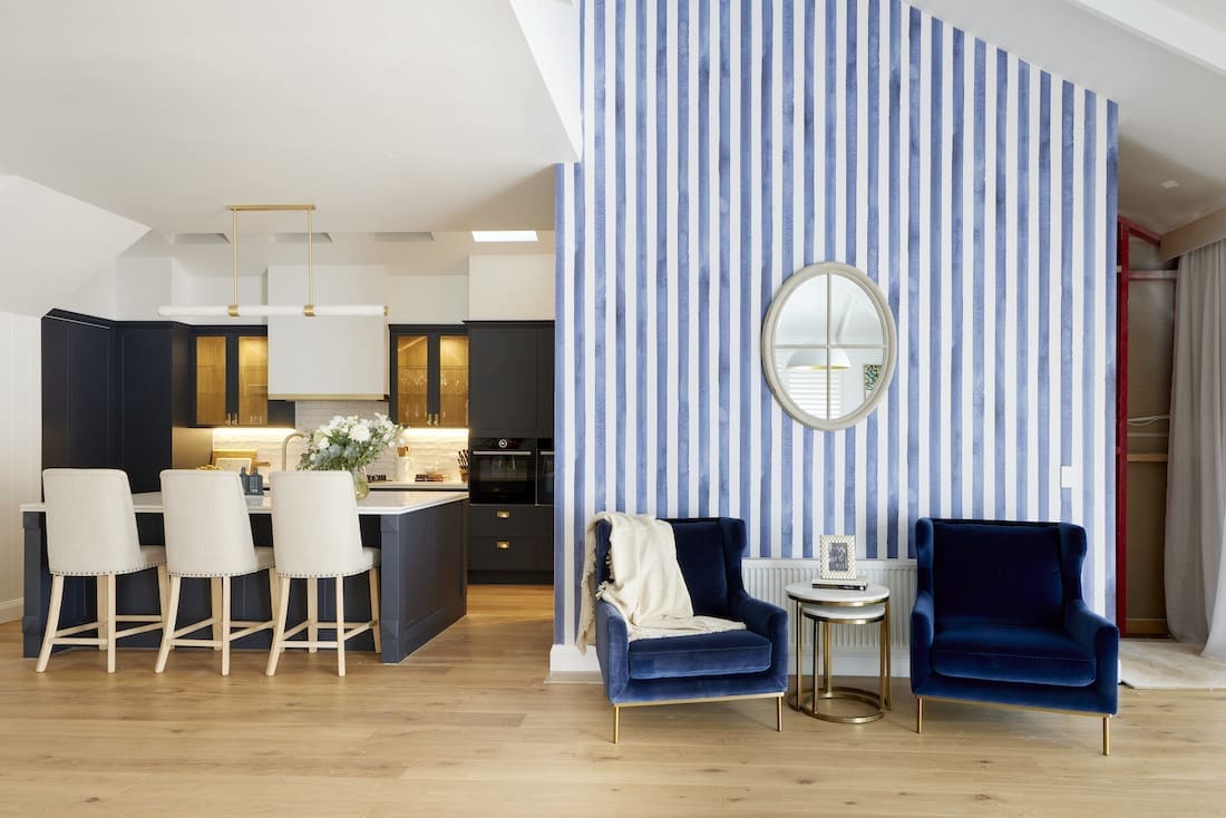
The space as a whole yet again felt very Hamptons, which we’re happy to see as the house feels like it has a cohesive look and feel. They’re also not afraid to do things a little bit outside the Hamptons box, like with their wallpapered sitting room feature wall. Look, it’s not to our taste but it works in the space so hats off to them for keeping things interesting.
Cost: $47,864
Score: 29 / 30 (3rd place)
What were your thoughts on the living and dining rooms? Did your fave win? And did you agree with the judges comments? Chat with us in the comment section below!
Be sure to check out The Block Shop if you’ve spied something you love in this week’s room reveals. And you can catch all The Block 2021 goss on the nine now official website.
All imagery by David Cook Photography
