If there’s one person’s styling that always stops us in our tracks, it’s the work of Michelle Hart from Bask Interiors.
This woman has an eye for colour, layering texture and selecting beautiful pieces like no other!
We’re so excited to have recently sat down with this Melbourne-based Interior Design and Styling expert where we chatted about her recent Bayside home project.
Related article: Statement lighting steals the show in this Californian bungalow renovation
Related article: A laundry makeover that’s practical, functional AND beautiful
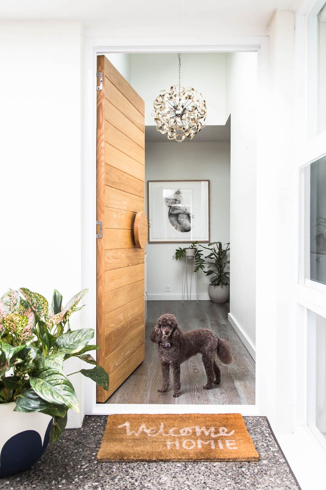
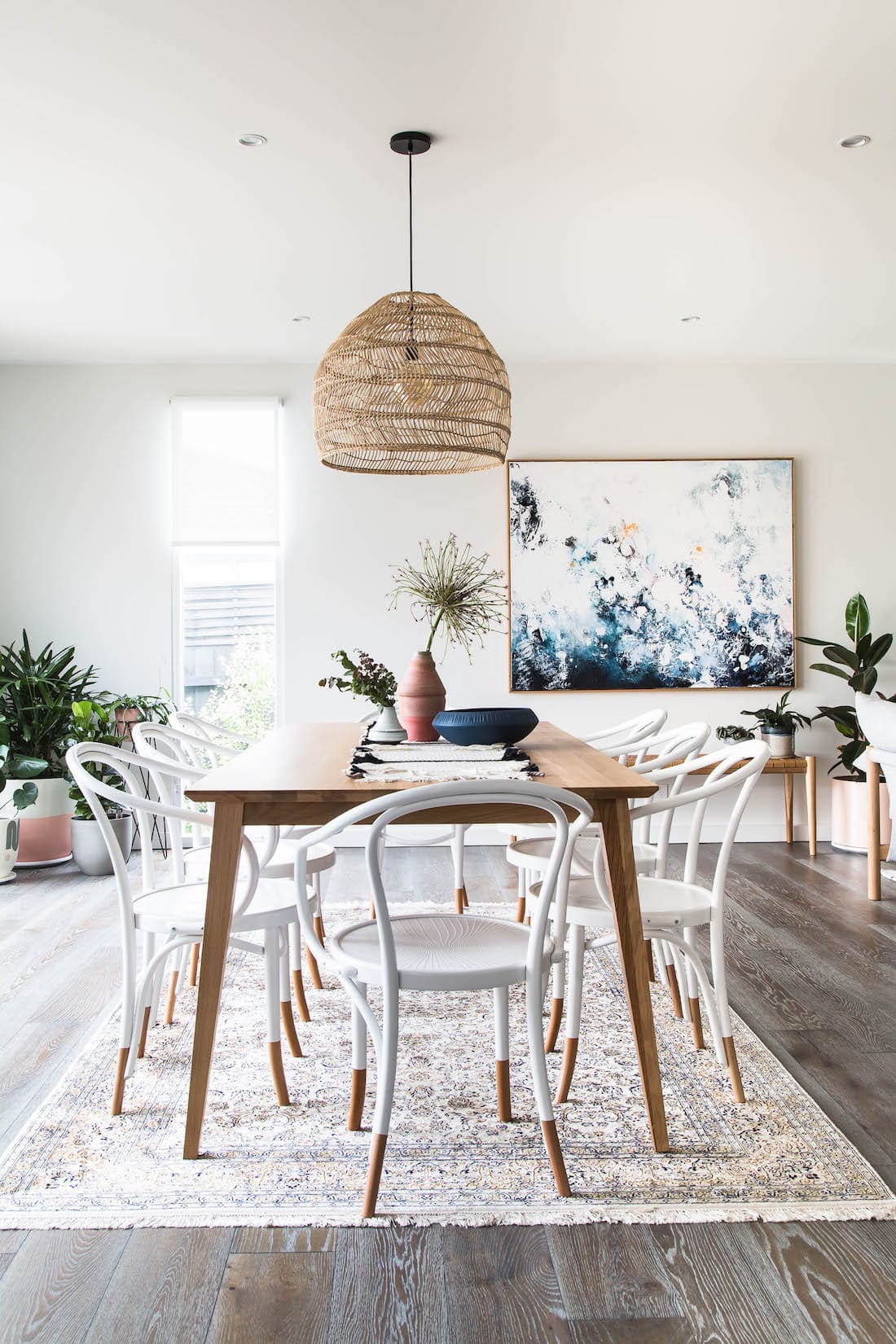
This home oozes a contemporary Australian-coastal-Scandi fusion style that we just love. Can you tell us about the scope of the project?
“This lovely family had just moved from a traditional period style home into this contemporary house and their old furniture didn’t suit the style of their new abode. They wanted to work together to create a relaxed and welcoming home for them all to enjoy while keeping it practical for a family with growing young children.
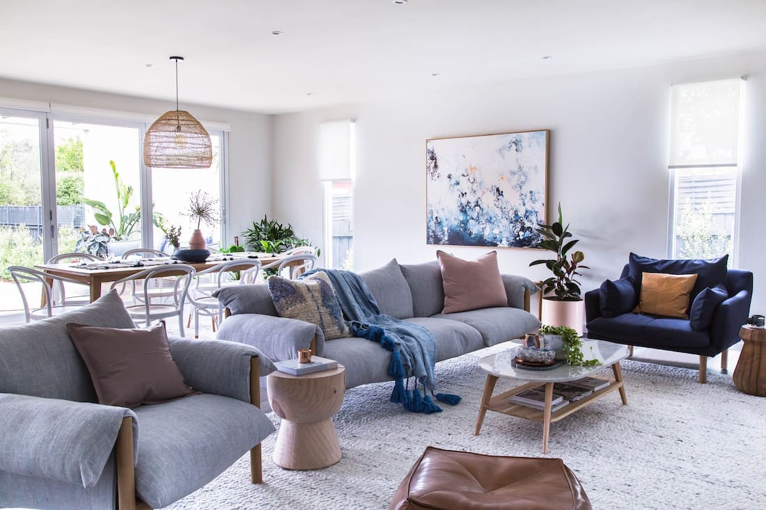
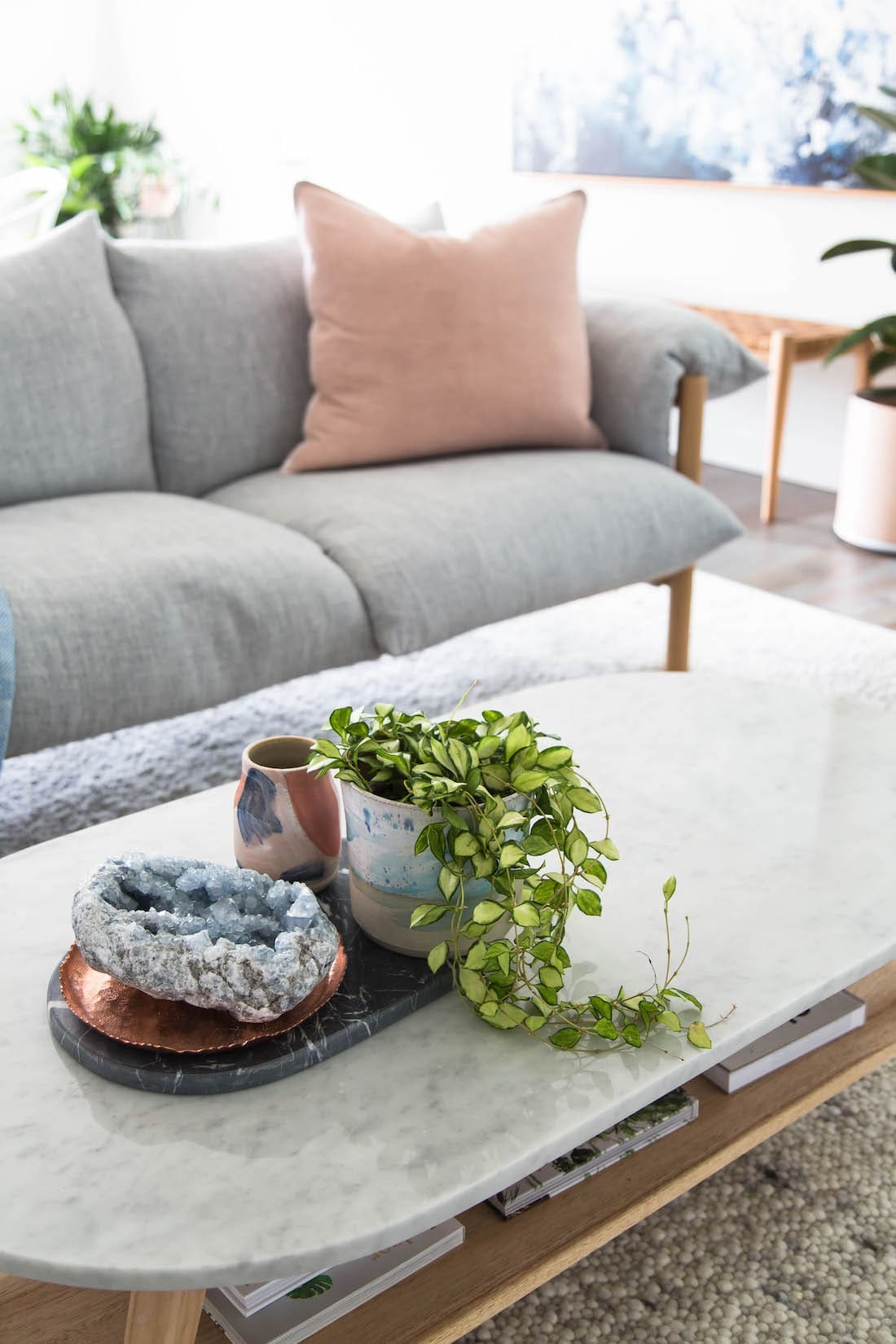
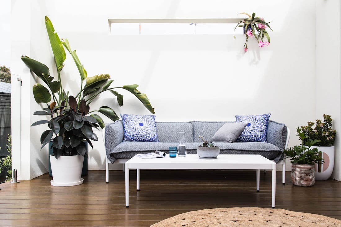
“They live in the Melbourne Bayside suburb of Black Rock so the aim was to create a Scandi Coastal vibe using light timber furniture, with pastel colours and textured elements in their accessories and furnishings.
“The owners were also keen to inject a lot of greenery into the home in the form of indoor potted plants and we also looked at commissioning a large piece of art by artist Michael Bond to be the focal point of the living/dining spaces.
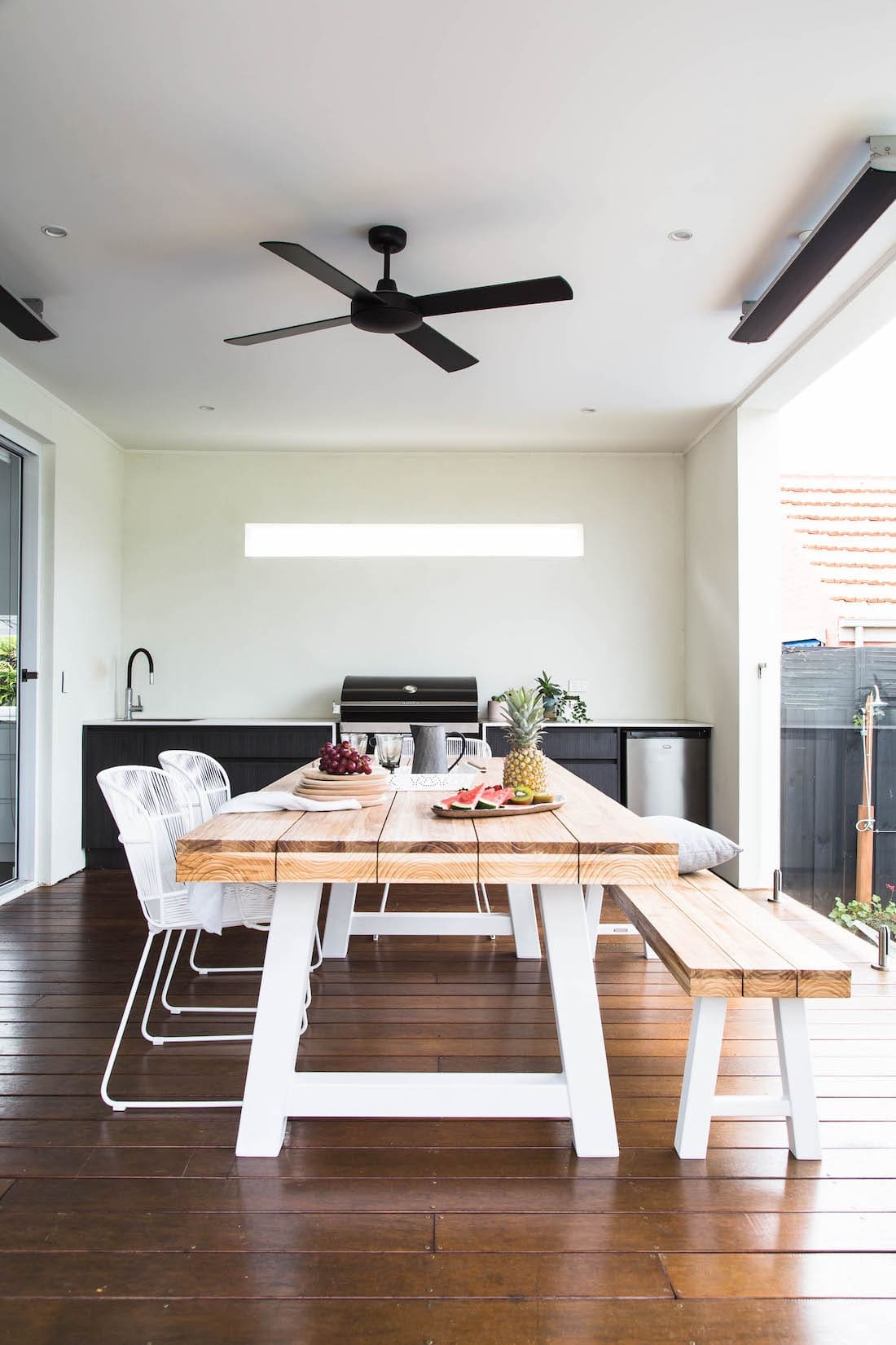
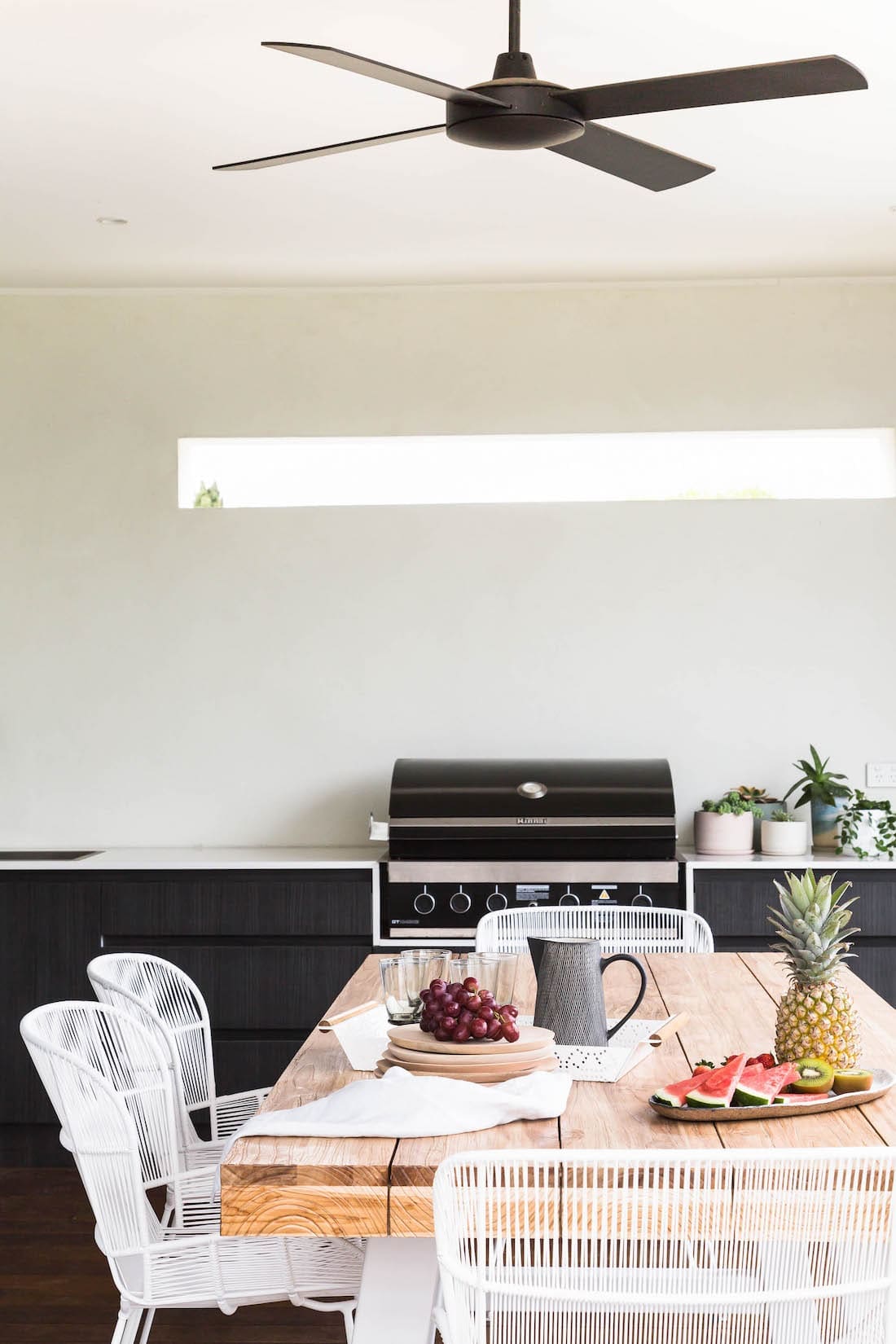
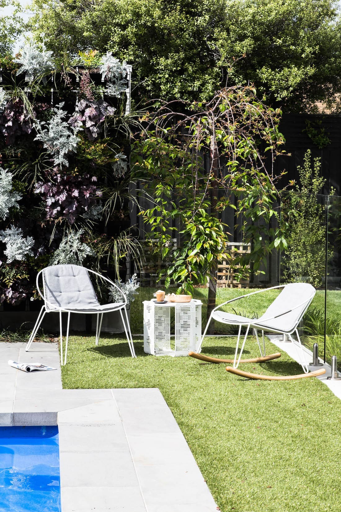
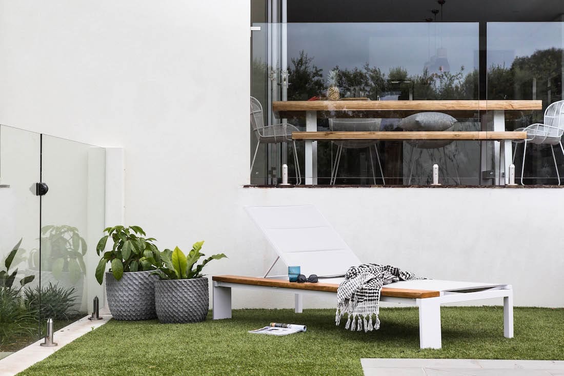
“The brief included setting up the master bedroom as a parents restful retreat, furnishing the kitchen, living room, dining room and outdoor areas as well as the entrance. The owners were happy for me to use a lot of Australian brands and artists for commissioned work, where the furniture was designed and made here in Australia. This was a real joy for me to have been able to support our local designers, makers and artists working on this project, I was indeed very lucky!”
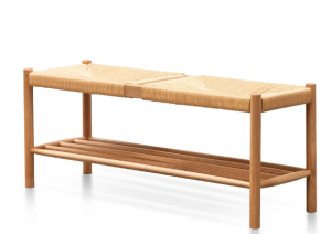
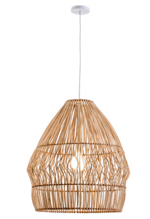
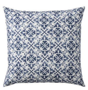
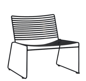
Shop the bayside look
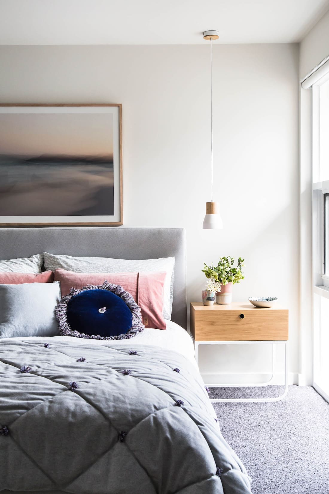
“The colour palette of the home was set after the first brief. I knew the furnishings in the home were to be predominantly light grey mixed with pastel blue, blush and also include navy. The challenge was getting the mix right so it didn’t feel overly feminine or masculine.
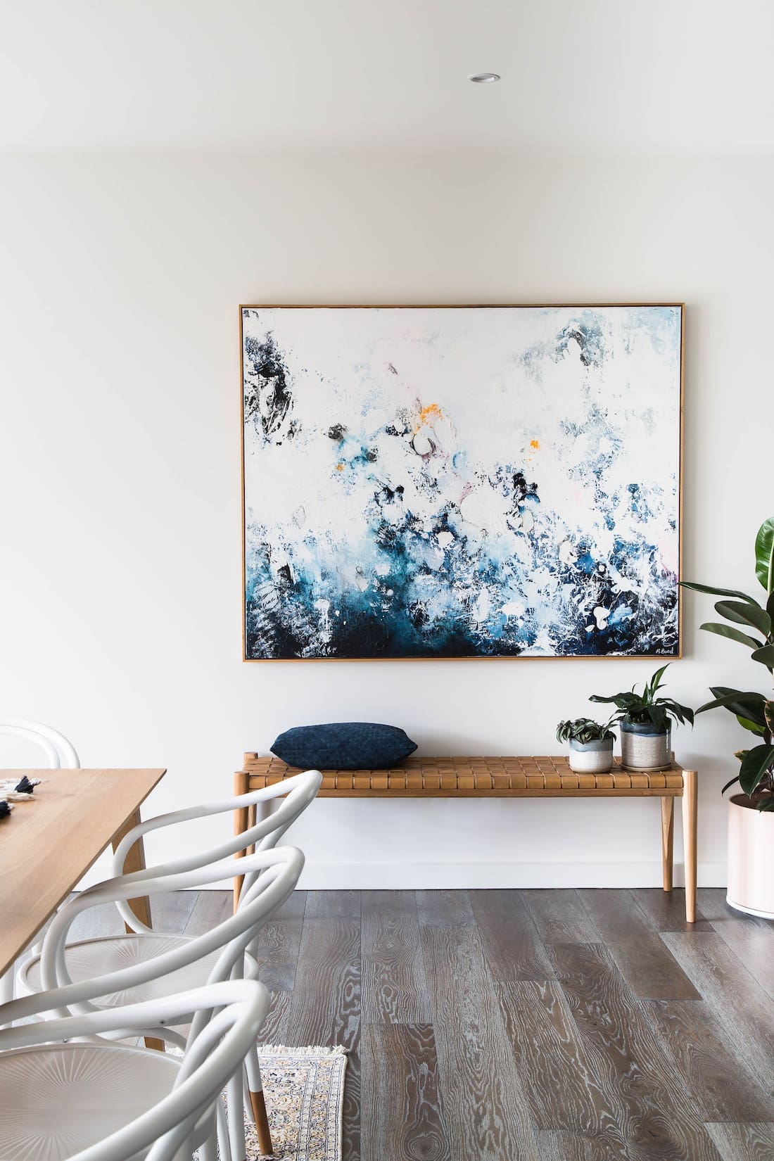
“We had the artwork commissioned for the living room pretty soon after working out a style for the home. I put forward Michael Bond’s work and my client’s loved his abstract style and use of colour — it set the tone for the open planned living and dining spaces,” she explains.
Of course, all projects have challenges and we were keen to know what obstacles there were in furnishing this home.
“The living room, being part of an open plan dining space and kitchen was the most challenging, as two long, thin windows along one wall interfered with the placement of a storage sideboard. If a console or sideboard was to be placed between the two windows, we realised it was going to look displaced as it would’ve been half way in the living room and half way in the dining room — not looking like it belonged to either room.
“In the end, to unify both areas I suggested this is where an oversized piece of art would become the focal point of the whole space, and instead of using a storage piece of furniture opted for a low leather bench seat to sit underneath the painting as an anchor point.”
And her favourite aspect of this Bayside home project?
“I just love how this home feels overall now. It was such a change from when I first visited.
“Layering the home with indoor plants made a huge impact, and being able to include some lovely pieces from some great furniture suppliers just made it feel relaxed, warm and inviting without being pretentious.”
Our favourite aspect is how she has furnished the home with beautiful pieces that look as though they belong without being matchy-matchy. We asked her to share her advice on how to select furniture.
Michelle’s top tips for selecting furniture
“It’s important to use a range of suppliers to pull together a room, that way it ends up looking more unique, relaxed and layered rather than being too contrived.
“Collecting samples of fabrics, colours, materials you are planning to use and keeping these samples for your ‘mood board’ and taking them out with you whenever you are looking for interior related items is always a fabulous way to ensure you are on the right track to creating a cohesive space that flows well.
“If you also have a specific style in mind, it becomes easier to eliminate items that just won’t work — although it’s always good to throw a quirky piece or two into the mix.
“Being able to visualise a space in its entirety is a bonus because you then automatically know if things will work together well. A lot of people struggle with visualising so that’s why they engage help!”
Michelle totally nailed this brief of creating a welcoming, warm and relaxed family home, and we’re sure many of you will find more than a few images to pin from this Bayside home to your inspiration board!
If you’d like help to style or design your home, contact Michelle via her website or connect with her on Instagram here.
Check out more home tours
Shop the bayside look
Disclaimer: This post contains some affiliate links. This means that when you click on a link and purchase something from that site, we may make a small commission at no extra cost to you.




Comments are closed.