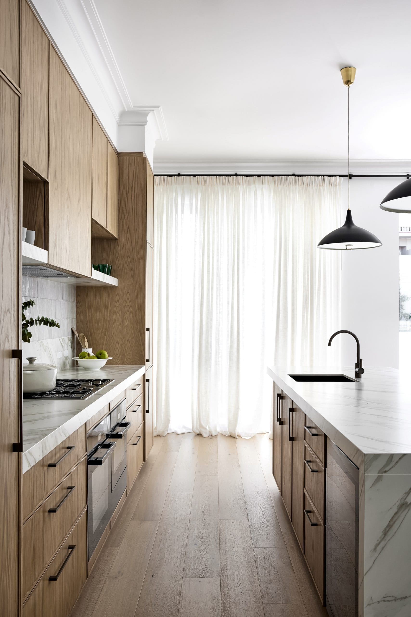
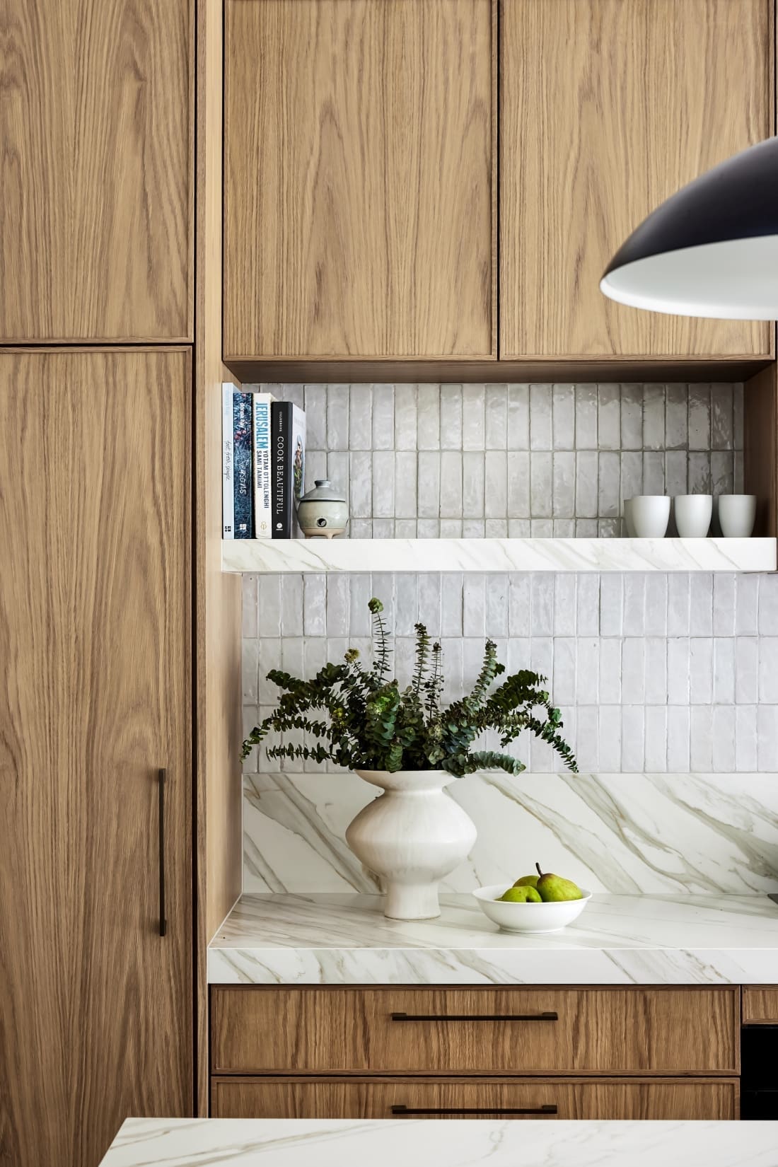
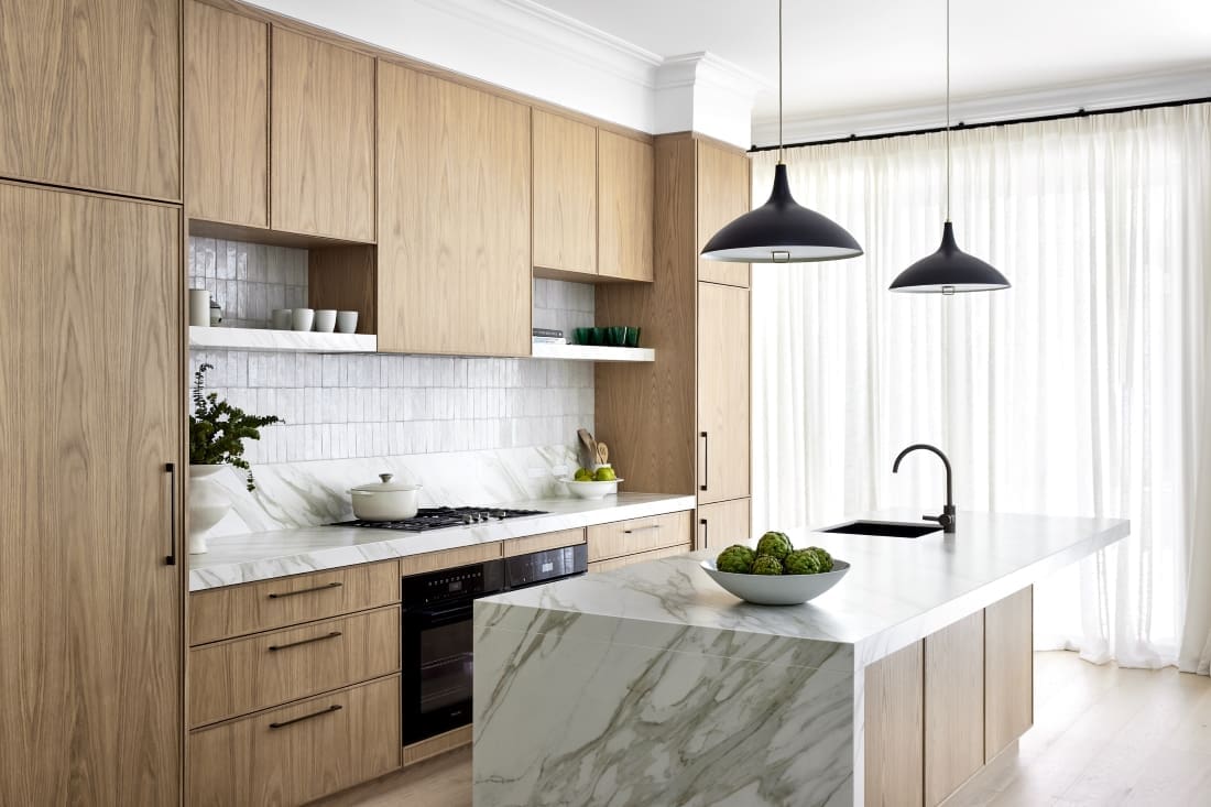
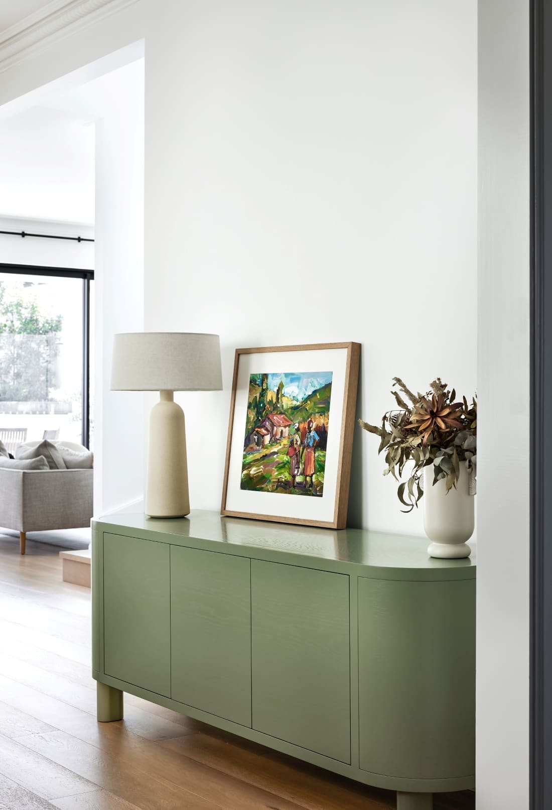
We always love seeing how period homes are transformed to meet modern day living. And this coastal federation home renovation by Interior Designer Lori Murray is hands down one of the best we’ve seen! Featuring bright, open spaces and a tactile, neutral palette throughout, she and her team worked wonders to bring new life to this dilapidated federation home. Renovated with a contemporary approach in mind, we find stunning details like the handmade kitchen splashback tiles and a beautiful blue guest bathroom.
So sit back, relax and enjoy our tour of the gorgeously renovated Mosman Residence III with Lori.
Related article: The epitome of island living: Exploring Nannygai
Related article: Wall-to-wall windows and cathedral ceilings: The breathtaking features of Botfield Residence
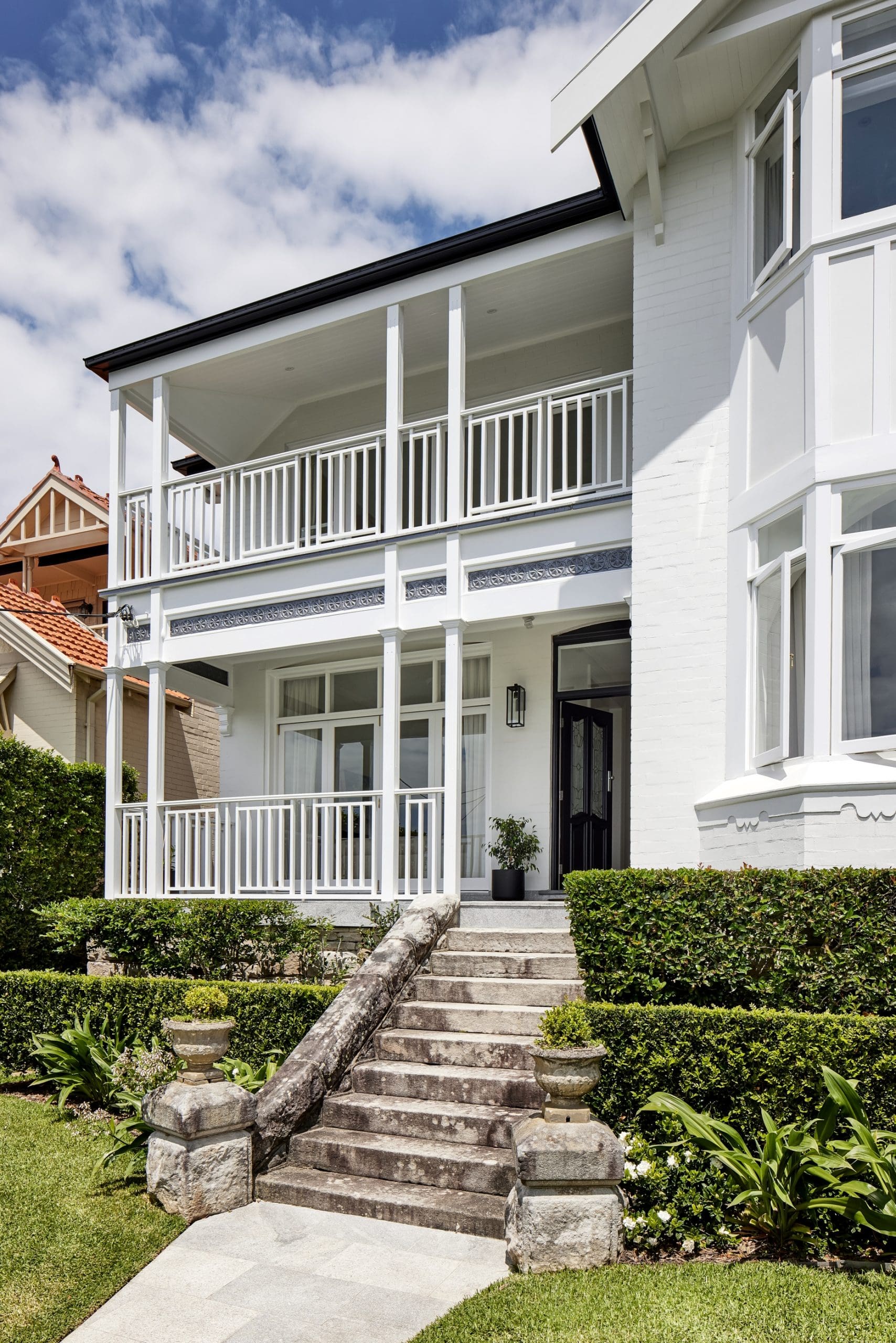
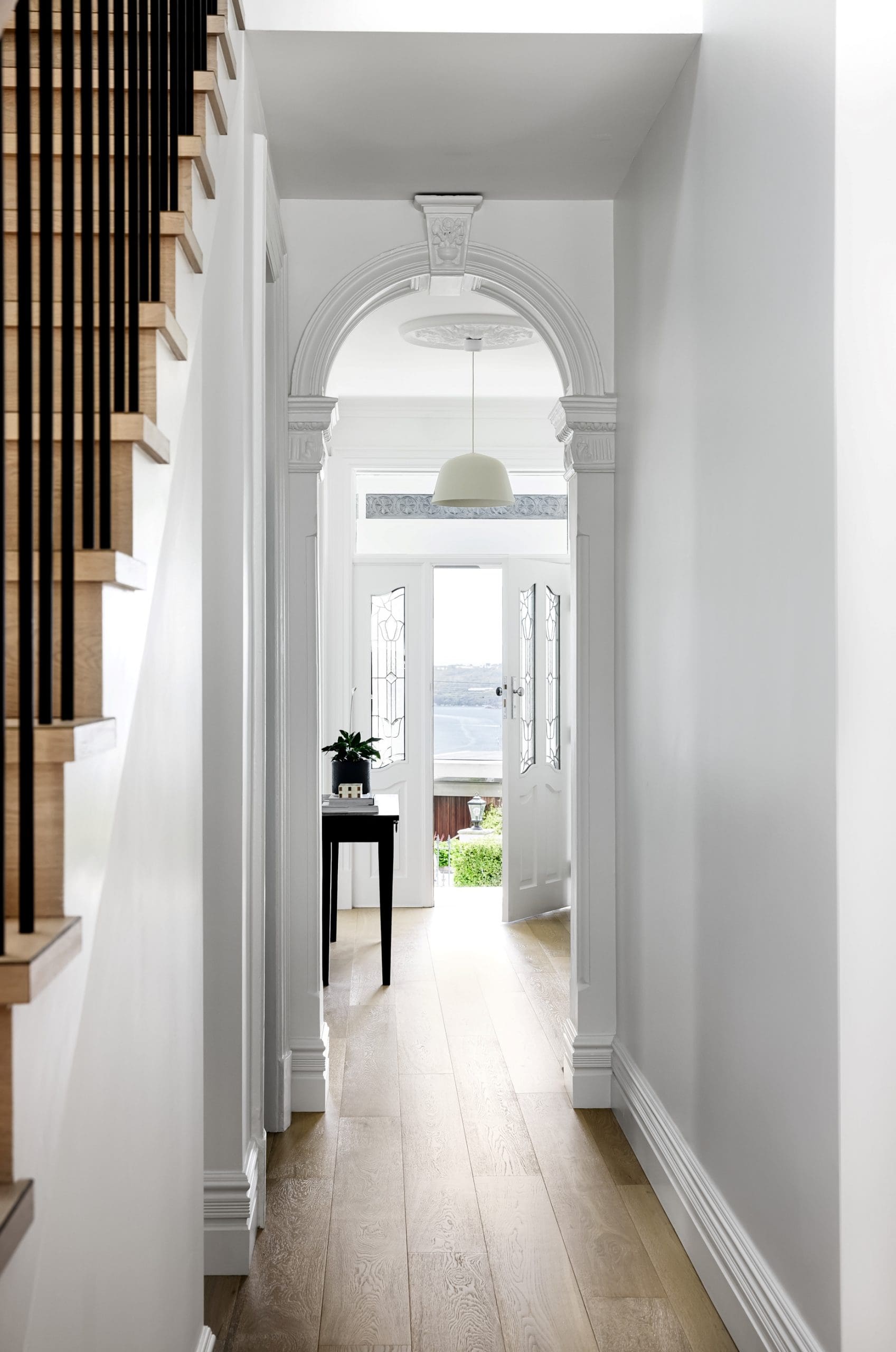
Located on the Balmoral slopes near Sydney, this home renovation was all about bringing new life to a tired space.
“Our clients were returning to Sydney after years spent in various countries abroad, ready to embrace retirement. This house was in an ideal position for them — however the interior was dated, closed in and cold, both literally and figuratively!”
This is where the team at March Twice Interiors stepped in to introduce contemporary upgrades while being sympathetic to the traditional architecture.
“The brief was to bring a contemporary approach to the renovations, whilst still ensuring the home remained timeless yet interesting. We were to provide a design that opened up the home, to allow light to enter all living spaces.
“This client talked to us about their favourite colours and materials. They also showed us a few images that they liked of homes that mixed contemporary updates with traditional architectural details. It’s an area we love to work in, and a balance we are always trying to achieve. Our clients only specific directive was that it was not to be too traditional, and not to be a ‘farmhouse’ or ‘Hamptons’ aesthetic.
“We began by preparing some high level concept boards, using reference imagery, which we felt reflect the desired look and feel in key areas. Once we were all on the same page, we got moving on the project.”
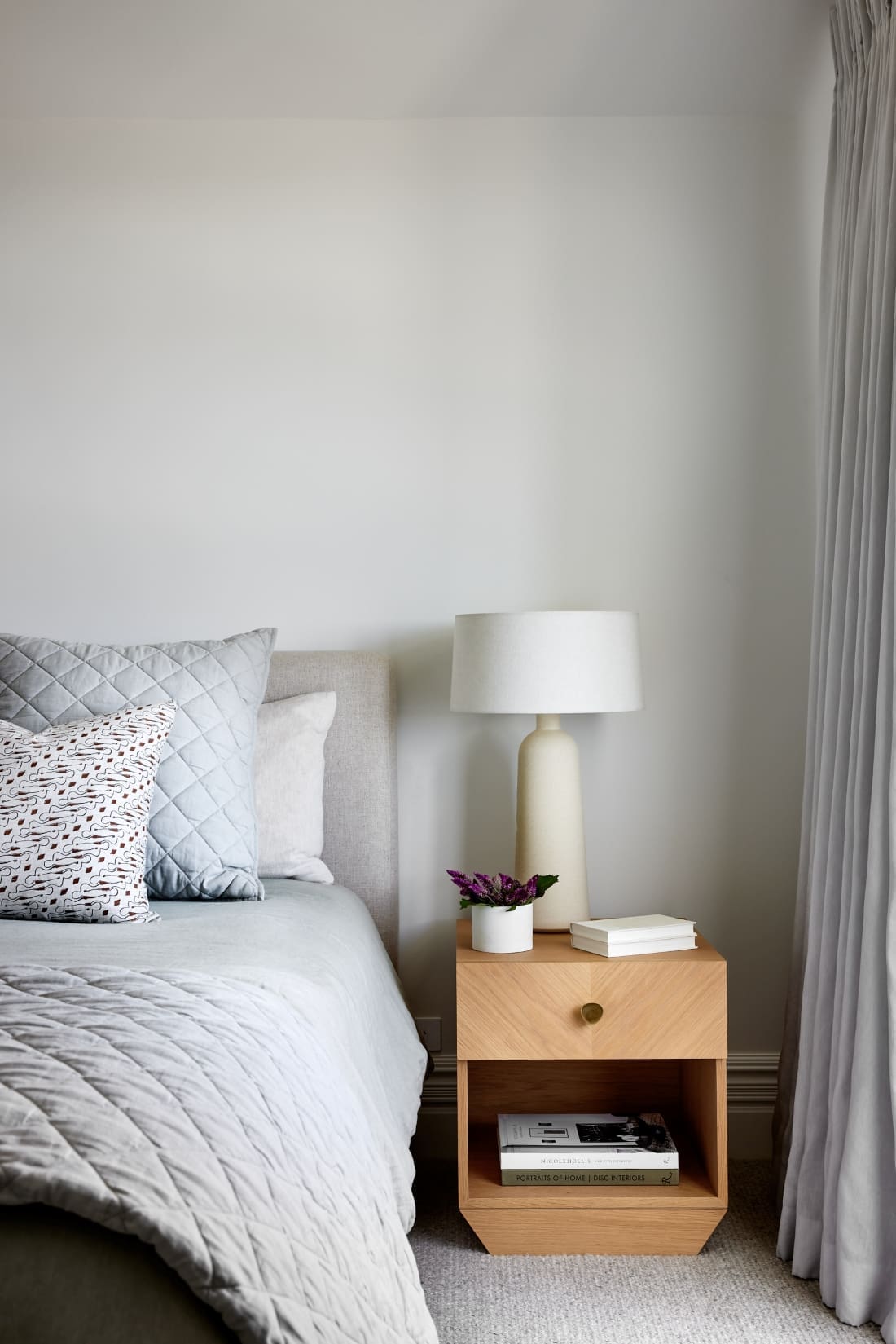
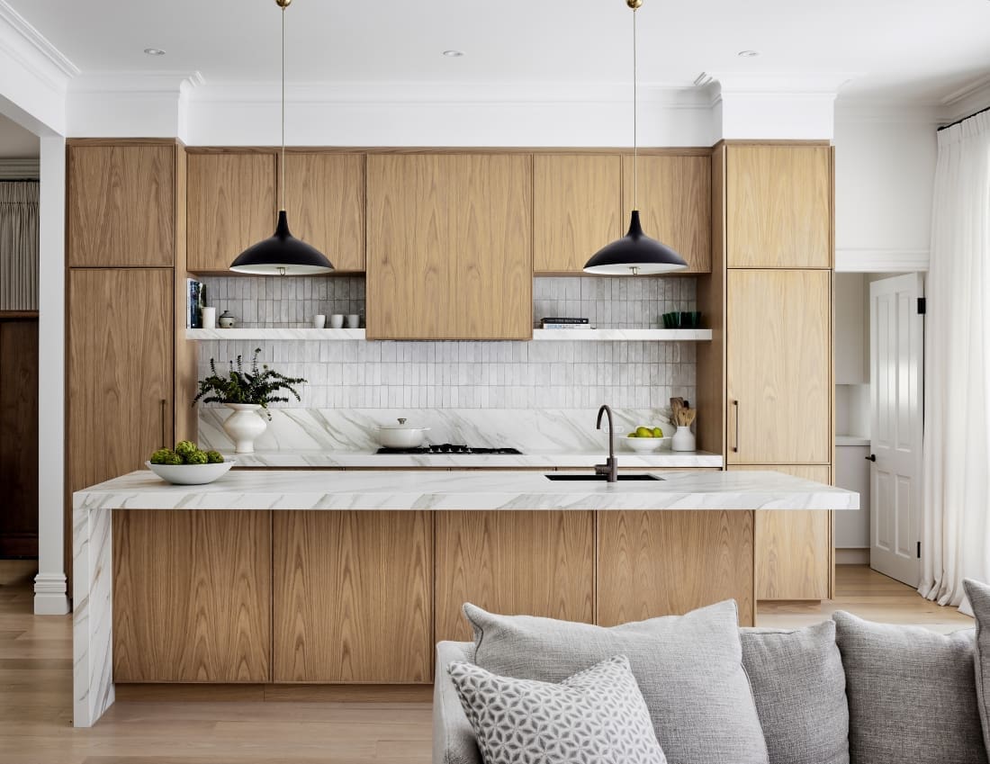
The renovation was extensive with the entire home being reimagined.
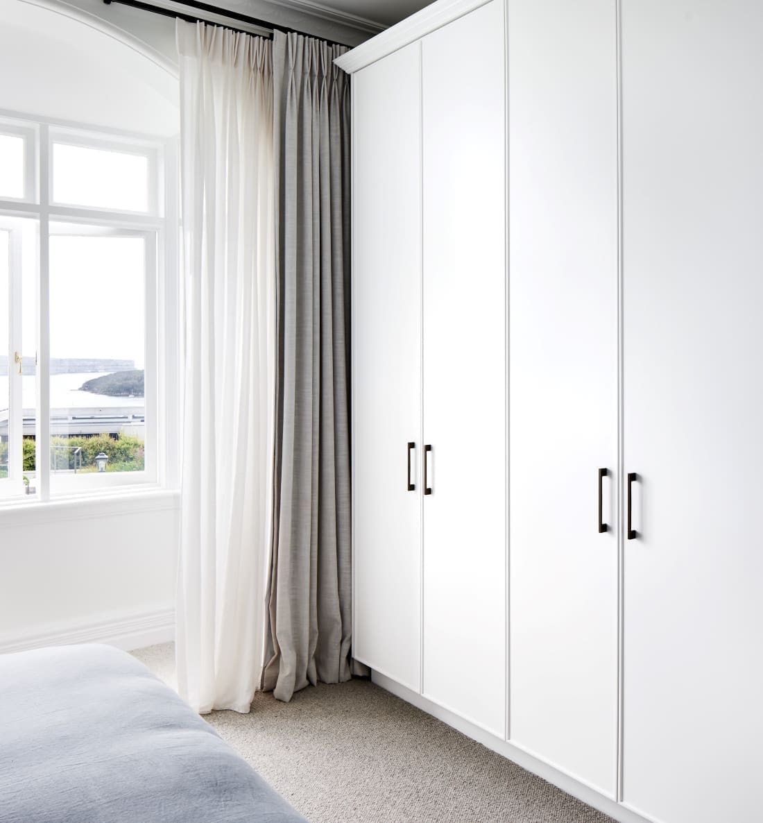
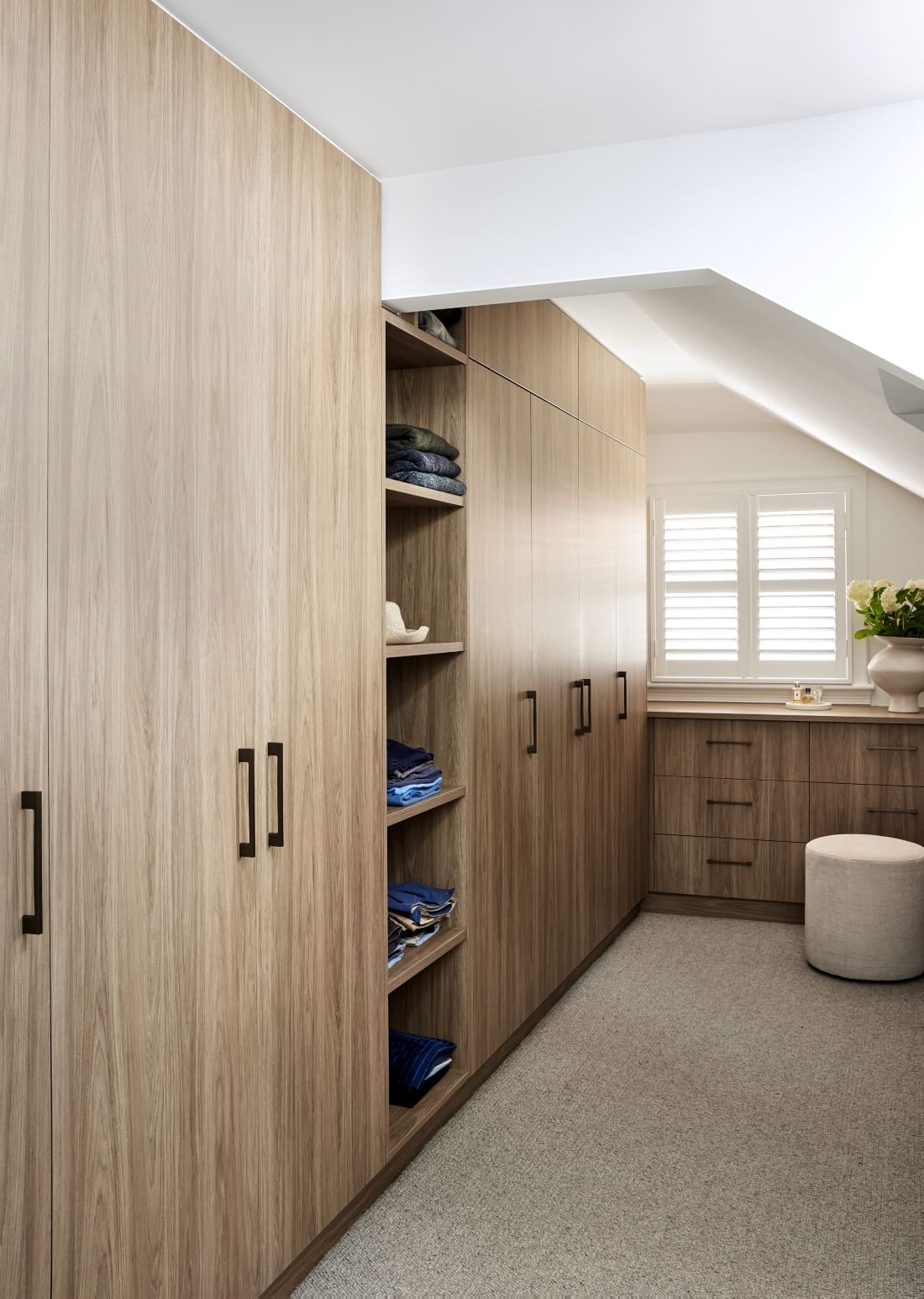
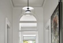
“Internally, everything was touched or updated in some way. However, it was all kept in the existing footprint of this lovely federation home. We opened up closed-in formal front rooms so you could see the view from the kitchen all the way through the living and dining areas. And we also re-configured internal walls upstairs to allow for a walk-in robe and a separate sitting area near the master bedroom.
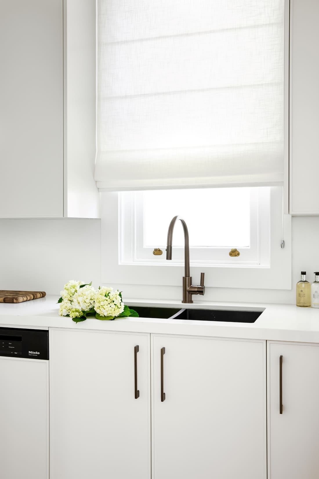
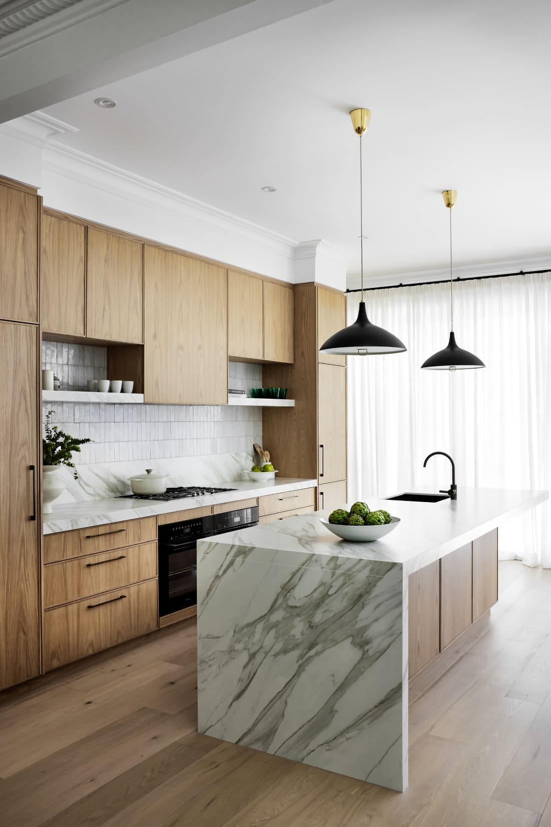
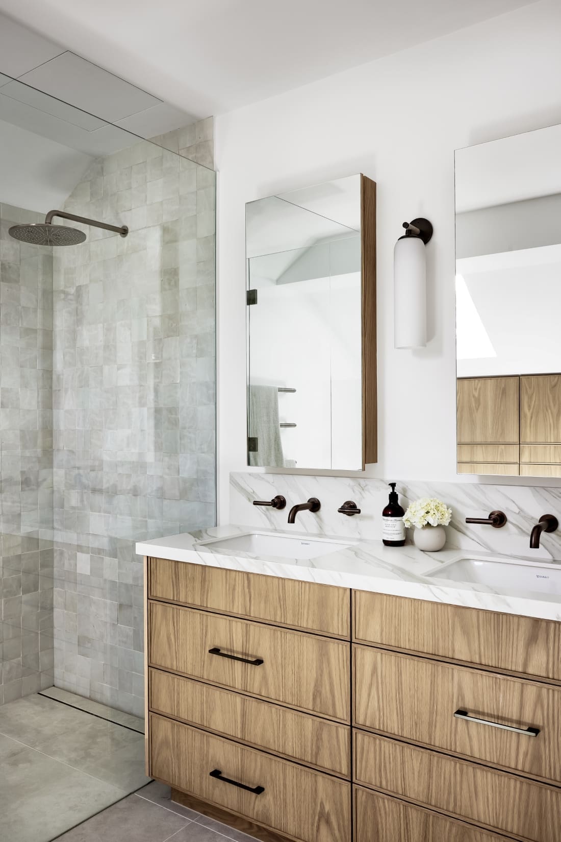
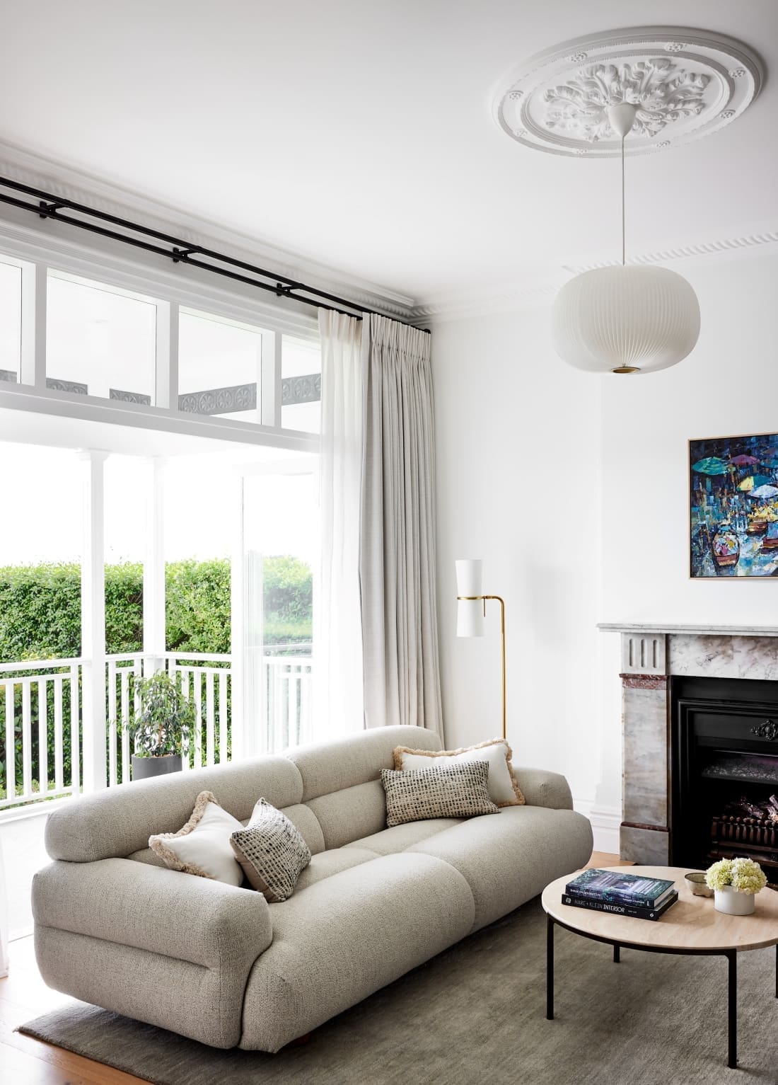
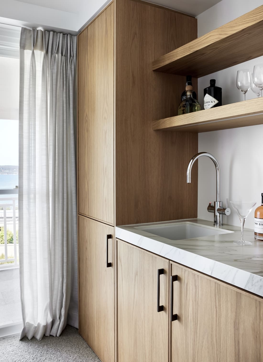
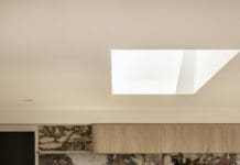
“The kitchen and living room followed our neutral and natural base palette. This provided consistency and flow in these areas, which are all connected. We wanted to ensure we brought in areas of interest and contrast. Handmade tiles on the kitchen splashback provide a textured counterpoint to the clean and simple lines of the joinery. Dark bronze tapware, black framed doors and delicate black lights provided some much needed contrast and points of interest.
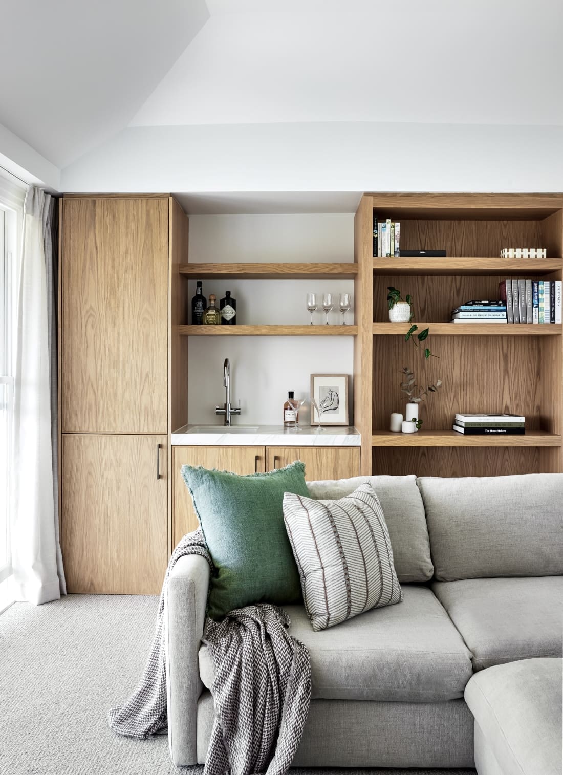
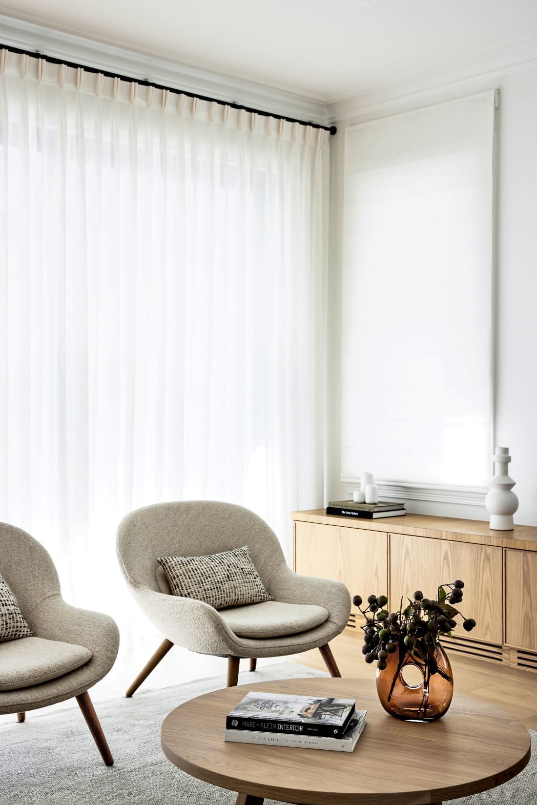
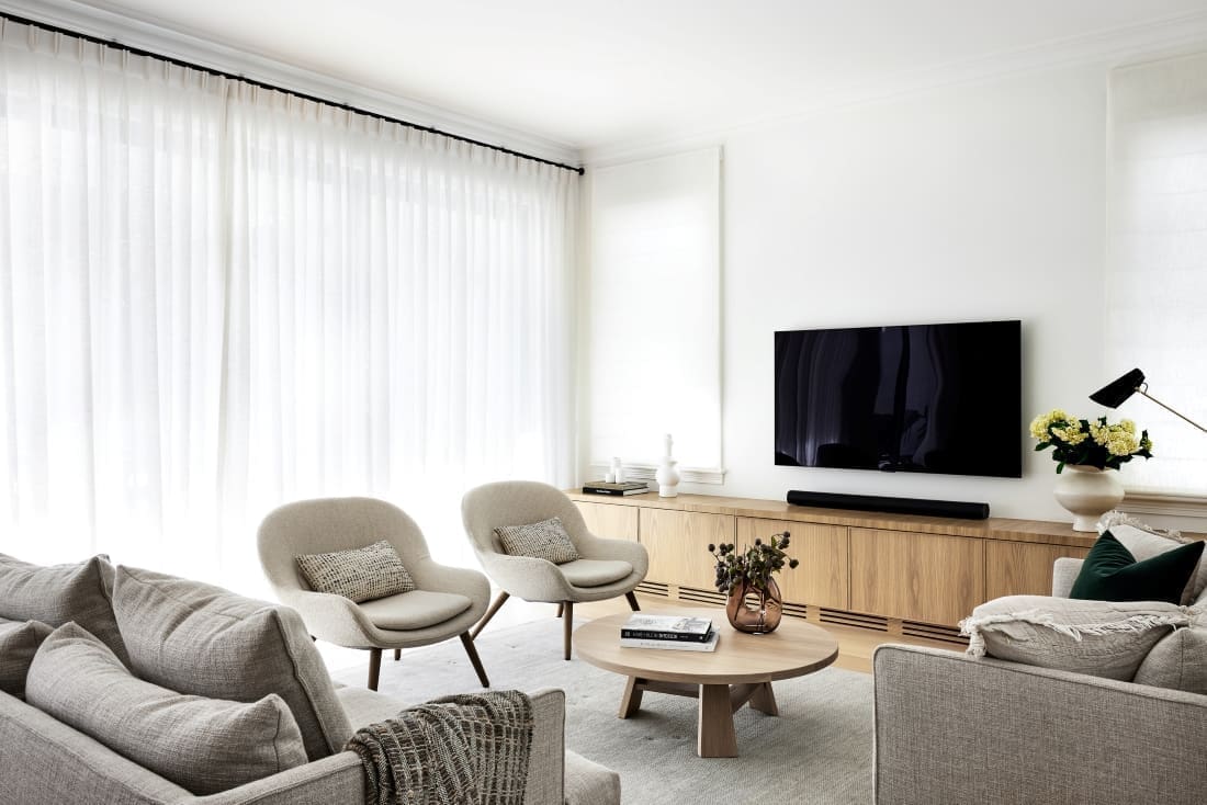
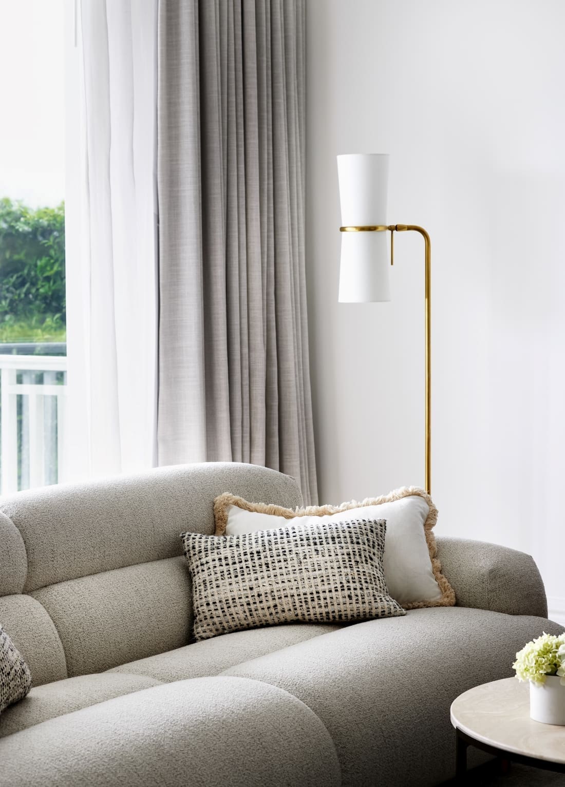
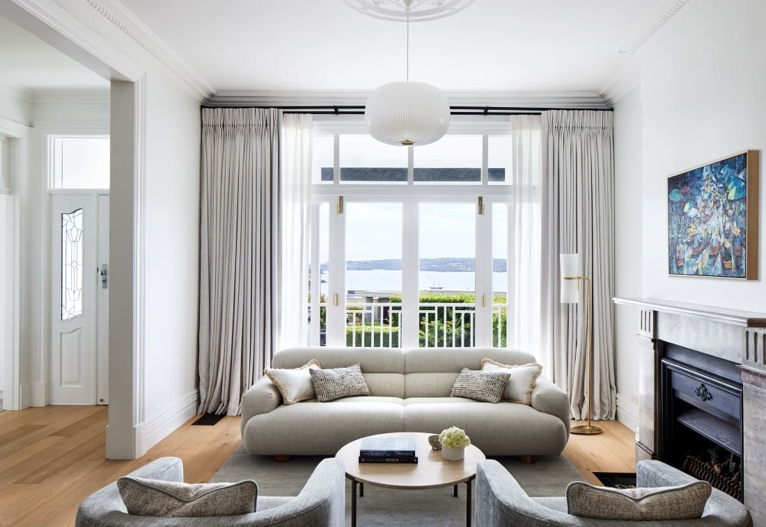
“The living room with its beautiful ocean views is now an open, bright, contemporary and a well used space. Furnished with timeless, quality Australian made pieces, it’s one of my personal favourites.”

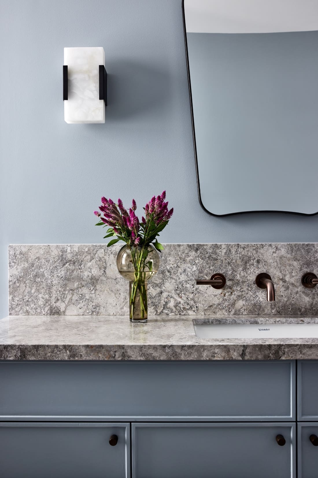
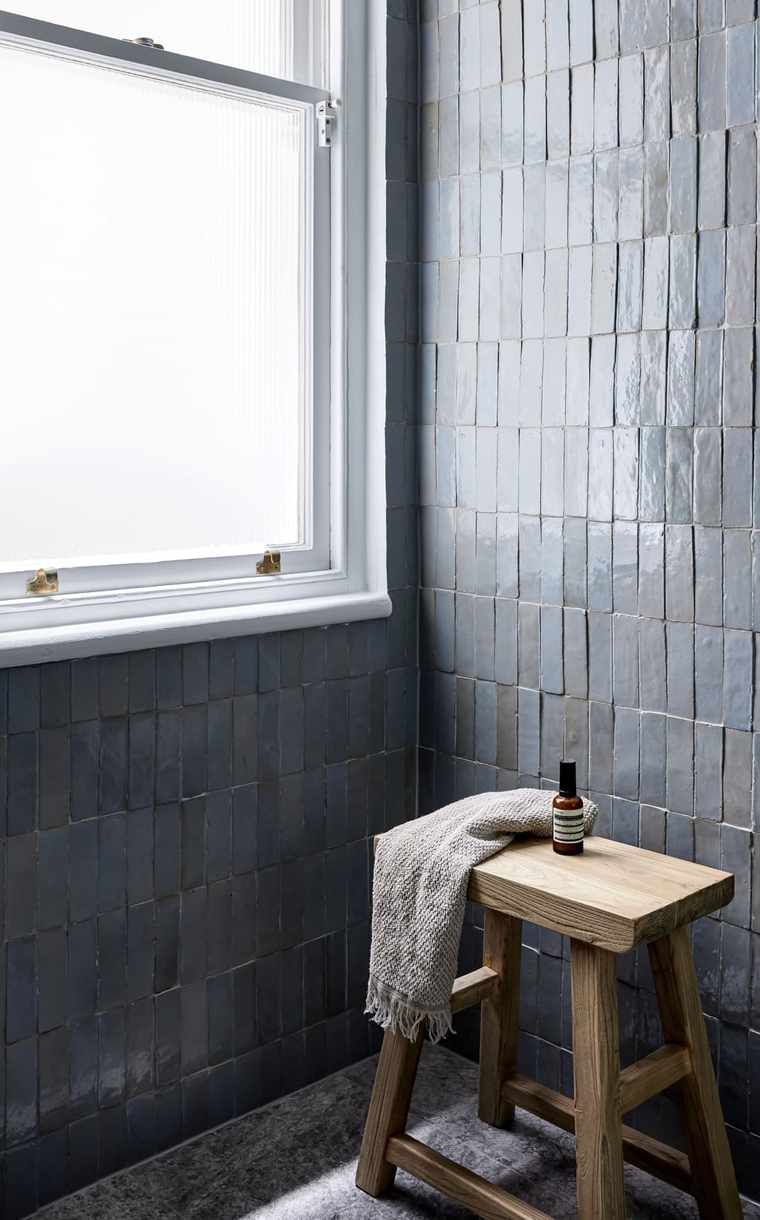
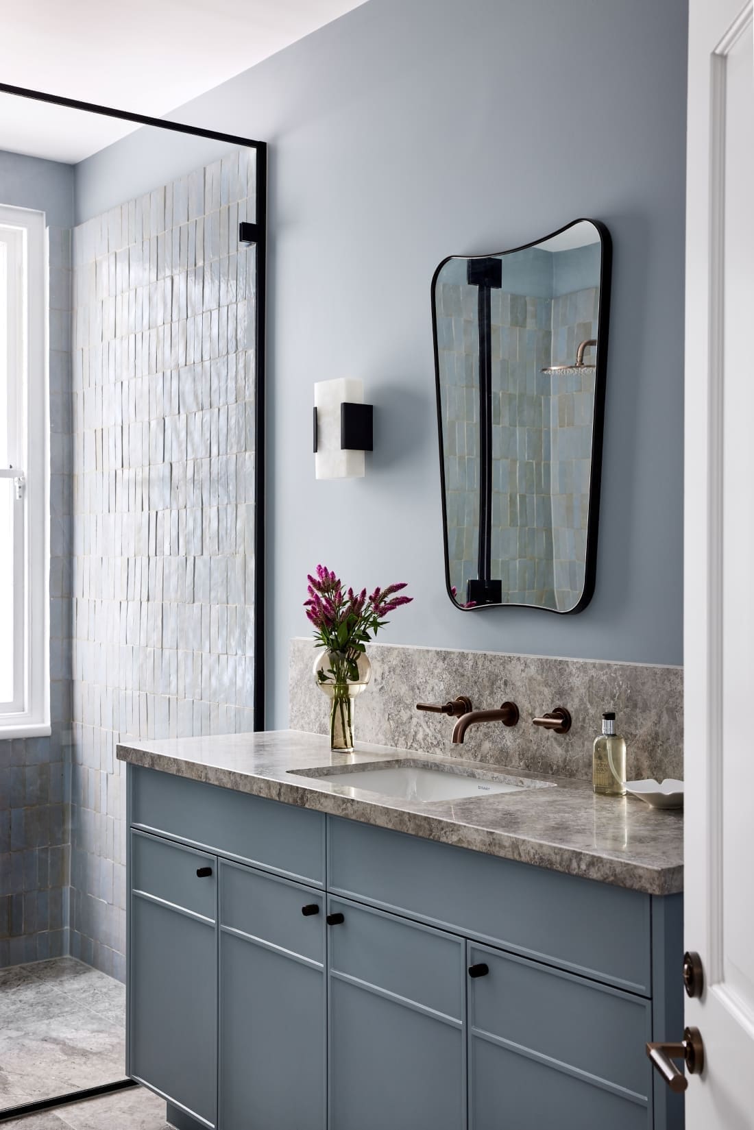
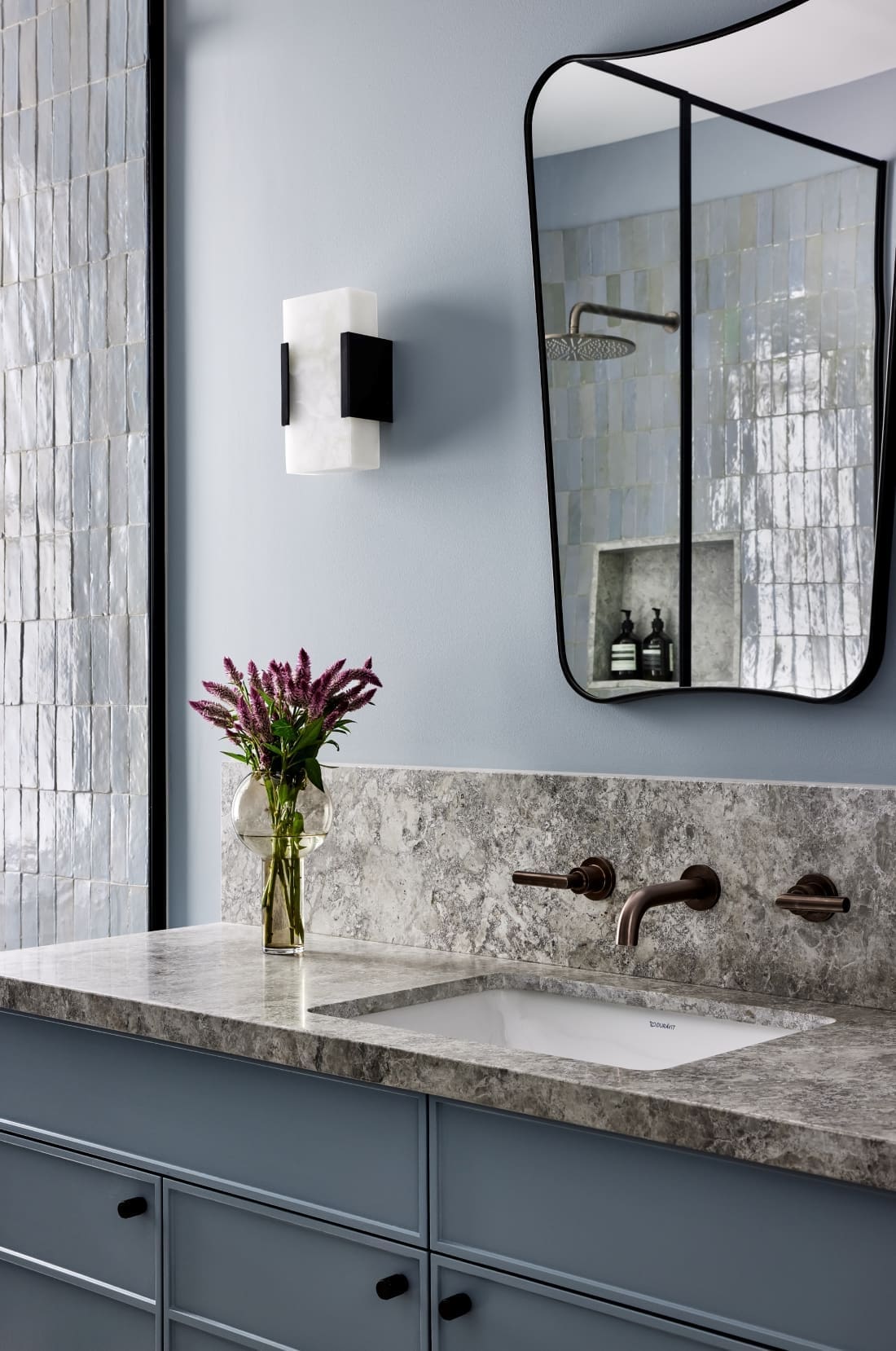
The guest bathroom with accents of blue is our favourite room of the home — and Lori’s too!
“I love the guest bathroom and its beautiful blue tones. Generally any room where the client — or us, as designers — have stepped out of their comfort zone turns out to be the favourite!
“The beautiful guest bathroom is the only one on that level, so we treated that as a powder room — and we love powder rooms! The clients and guests love this jewel-box of a room.
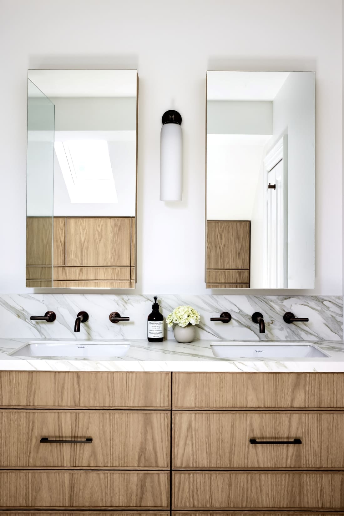
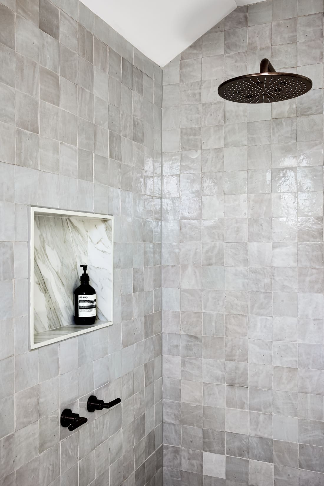
“We also selected a dusty ocean-blue handmade Moroccan tile for the walls. It matches the style used in other areas of the home, although with more neutral tones. Layered with matching painted walls, a moody grey marble floor and stone benchtop. It also has the same bronze tapware used throughout the home.”
We couldn’t let this talented Interior Designer go without asking her to share her top renovation and styling advice.
“Being given a budget up front, as this client did, is essential in how we design homes and each space. That way we can approach our design for the whole home cohesively with a budget already in mind, and not scramble to cut corners down the track.
“As a general rule, we advise clients not to skimp on important items that are used every day. Quality joinery is very important to us, as is tapware, and professional high quality paintwork — especially in federation homes such as this one, where ornate period details need to be often repaired and treated with love.
“It is worth paying more for a quality sofa in a beautiful fabric, a well made rug, and a dining table that you will keep forever. Pay more now with many of these things and you won’t be paying to replace them every few years.
“Add a percentage onto your budget for the unexpected, especially in a period or federation home. As with all federation homes you really have to expect the unexpected. It also helps to have quality trades and partners to navigate the work with you.
“From a design perspective, once you have your overall look and feel decided on, trust yourself and don’t deviate. If you do, it will likely be costly and time consuming. If you don’t feel brave committing to colours, or an unusual stone or materials, pick one area and go to town.”
Interior Design — March Twice Interiors
Builder — Built By Dezign
Photographer — Ryan Linnegar
We loved talking to Lori about Mosman Residence III. You can find her full portfolio on her website, or connect with her on Instagram. What are your thoughts on Mosman Residence III? Do you like the blue bathroom as much as we do? Let us know your thoughts in the comment section below!
Find more home tours here
