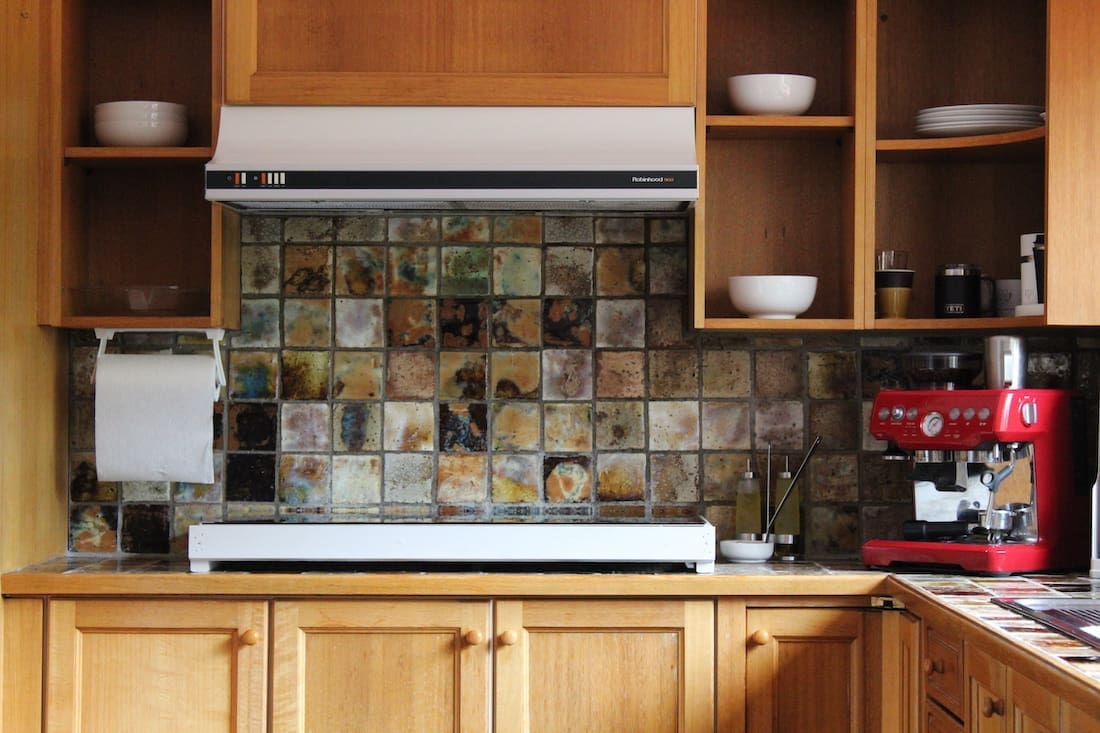
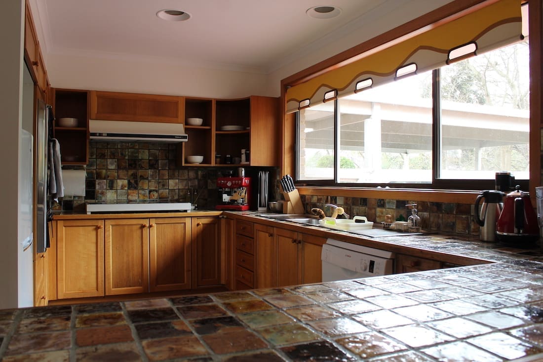
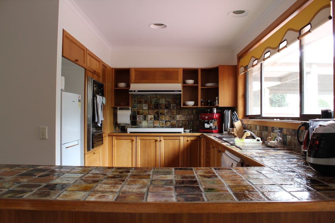
While 70’s design influences are trending (in the way of terrazzo and earthy shades), this original 1970’s kitchen was due for a remodel! And who doesn’t love a good kitchen makeover? Especially when it’s at the hands of Interior Designer Jacqueline Chen from The Glade Design. You may remember Jacqueline’s Japanese bathroom design and budget laundry renovation.
We’re thrilled to welcome Jacqueline back to the blog to share this kitchen project where she blends Japanese design with 70’s style.
Related article: 7 tips for updating your kitchen: Best cosmetic kitchen upgrades
Related article: The kitchen design measurements you need to know — from an Interior Designer!
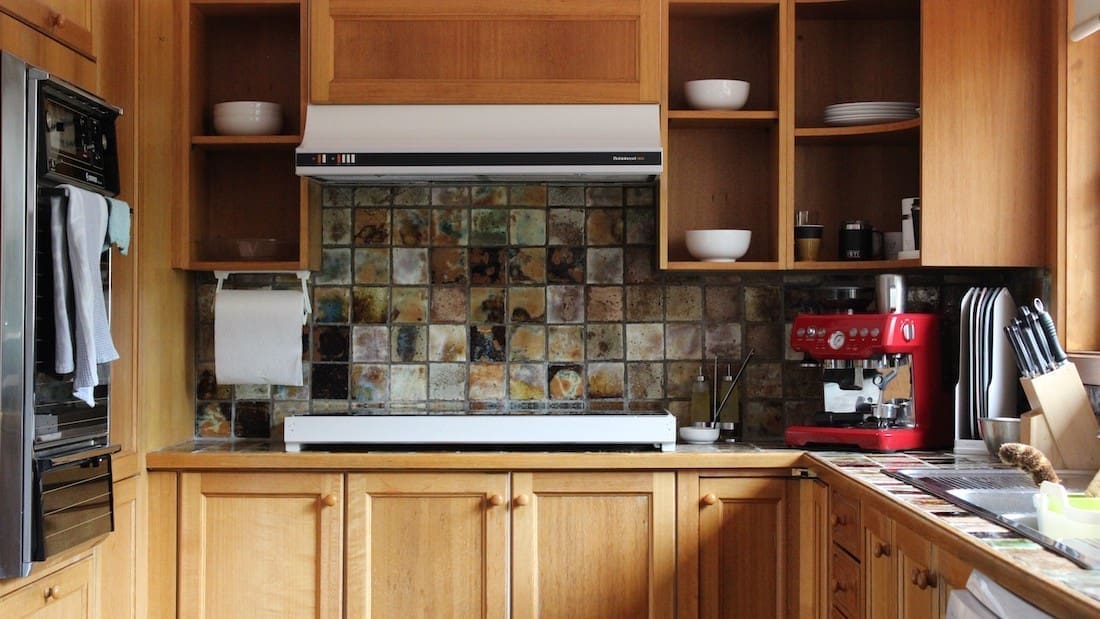
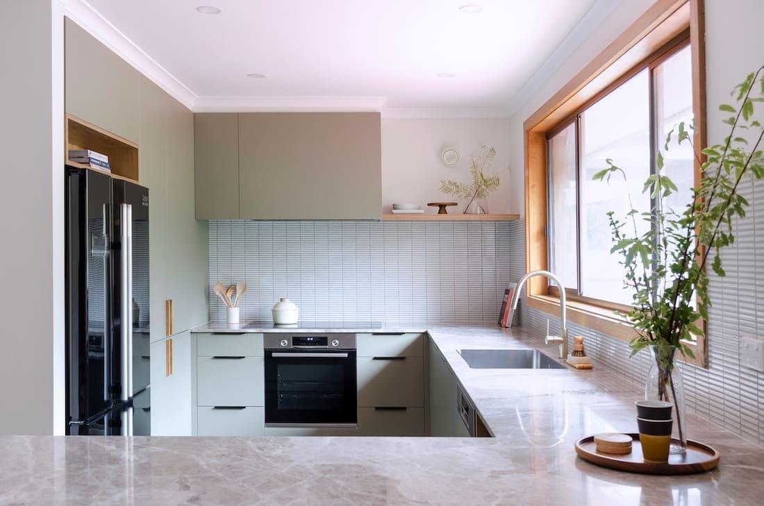
Even though Jacqueline and her partner liked the original kitchen design, the dark tiles and orange timber had to go.
“We loved the 70’s warmth and design of the original kitchen. So when I started designing the space, I focused on recreating this feeling but with a new look.
“There were a variety of smaller issues we had to fix or remove. The kitchen counter was a shallow depth. The fridge space was too small. The pantry was hard to access. Those kinds of things.
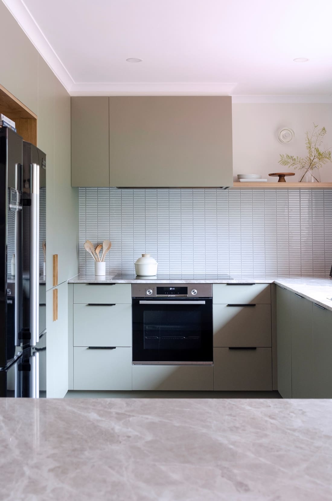
“Luckily we could keep the cooktop, sink and dishwasher in the same position. We only moved the oven under the cooktop. Besides the electrical and plumbing layout, we kept the windows and timber panels to maintain that 70’s vibe.
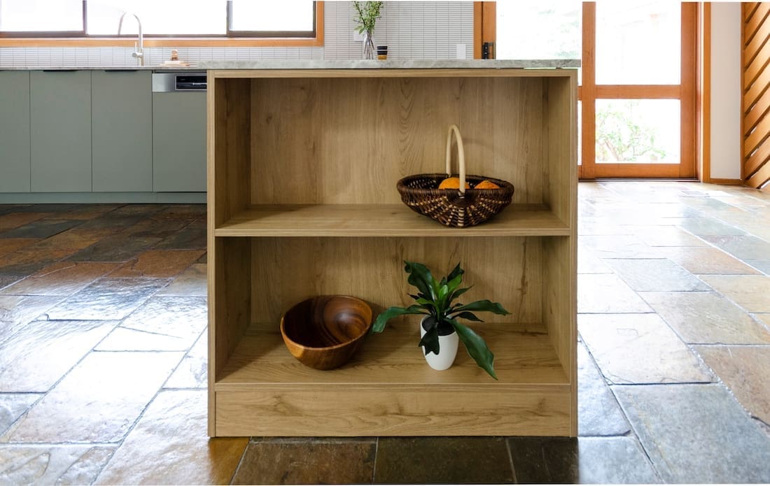
“We also kept the slate floor. We love it! It’s super easy to maintain and it’s also connected to other areas of the home. As such, the entire colour scheme was chosen based on the floor.”
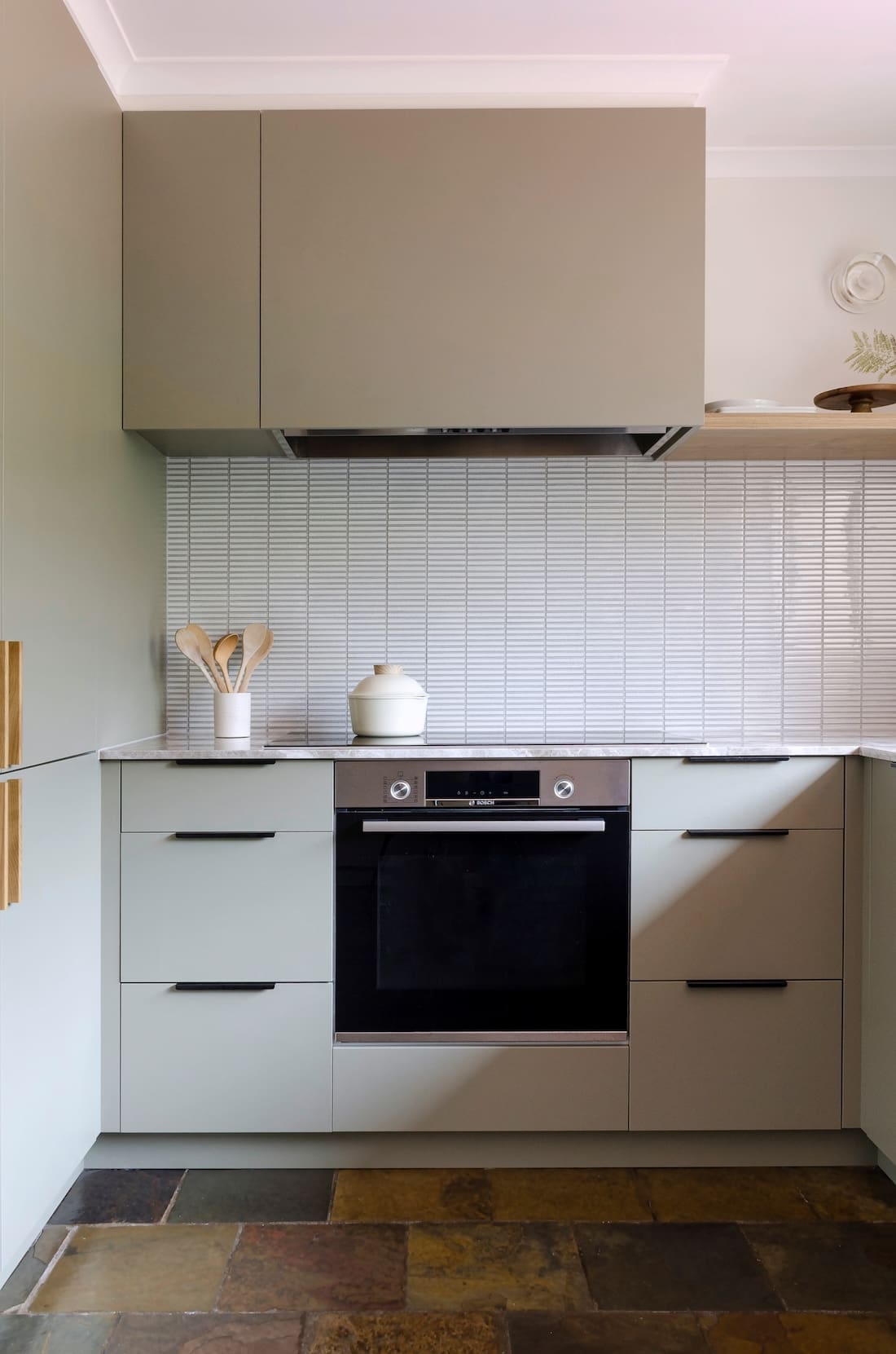
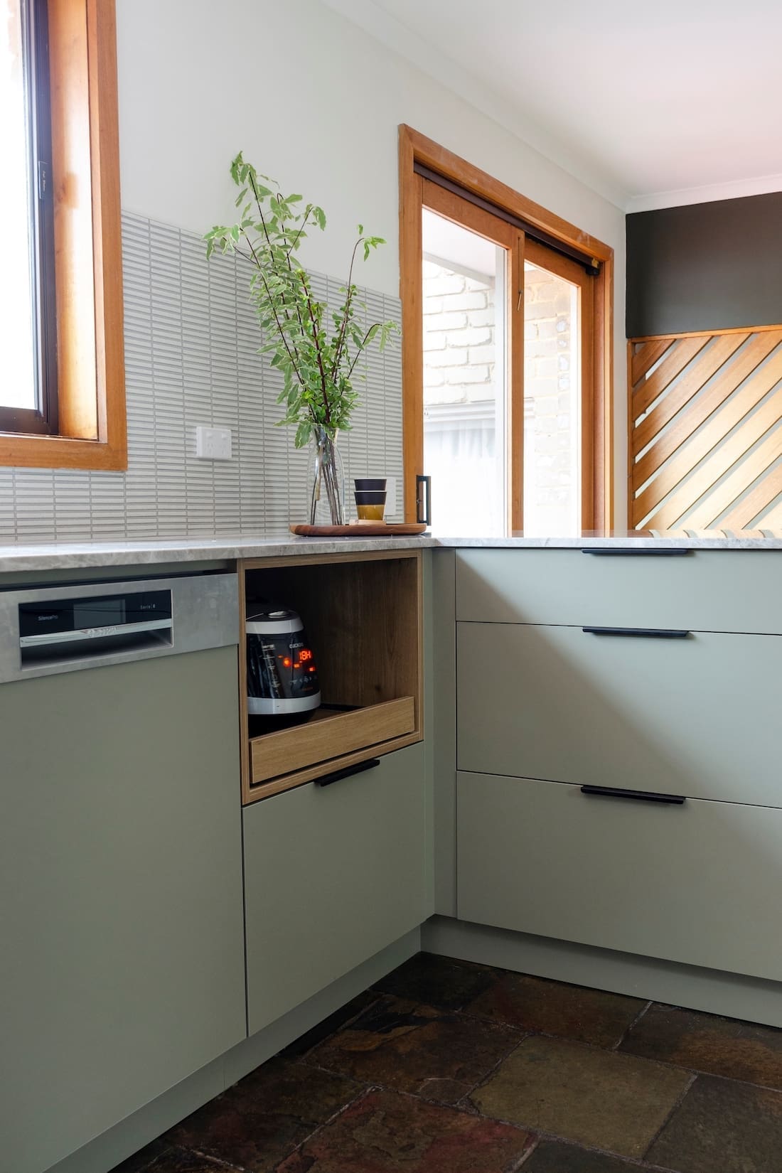
This kitchen could definitely be described as a fusion of styles, something Jacqueline also managed extremely well in the Japanese Morecombe bathroom.
“I think this kitchen is a mixture of minimalist, Japanese, oriental and 70’s design. You don’t see it all at first, but when looking closely you see all the elements of it.
“I guess this is my style — I like to mix things in but still stick with a calm aesthetic.
Some people would not recommend mixing more than two styles in one space, but I never think about rules when designing. If it looks right, it is right.
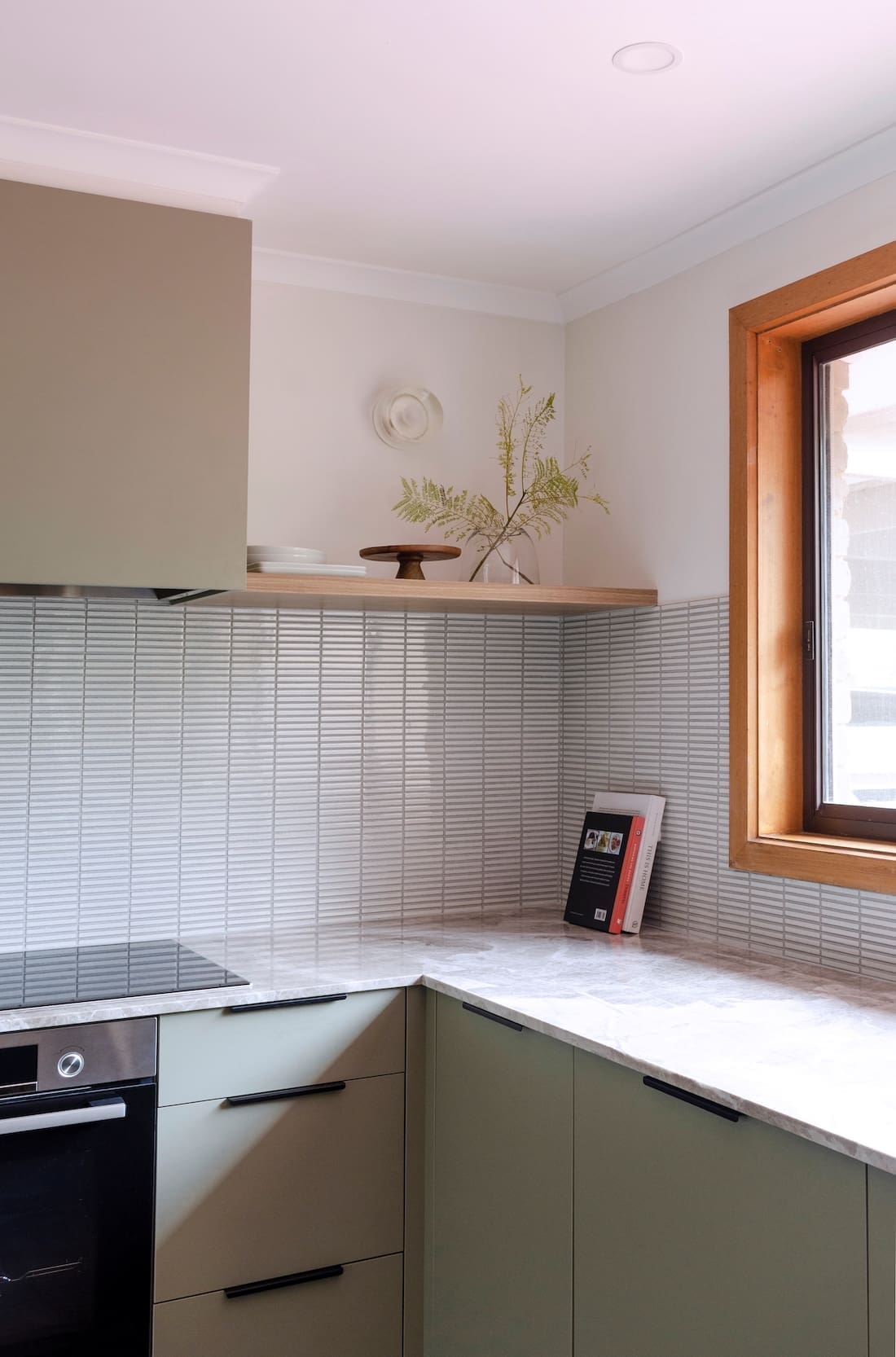
“I always start with the layout. Once I have that sorted, I can start picking colours. As I was basing the colour off the floor, I knew it had to be green, yellow and brown. Hence we decided on the sage green and teak.”
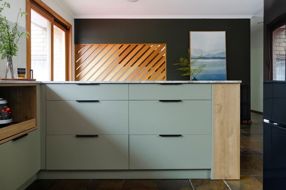
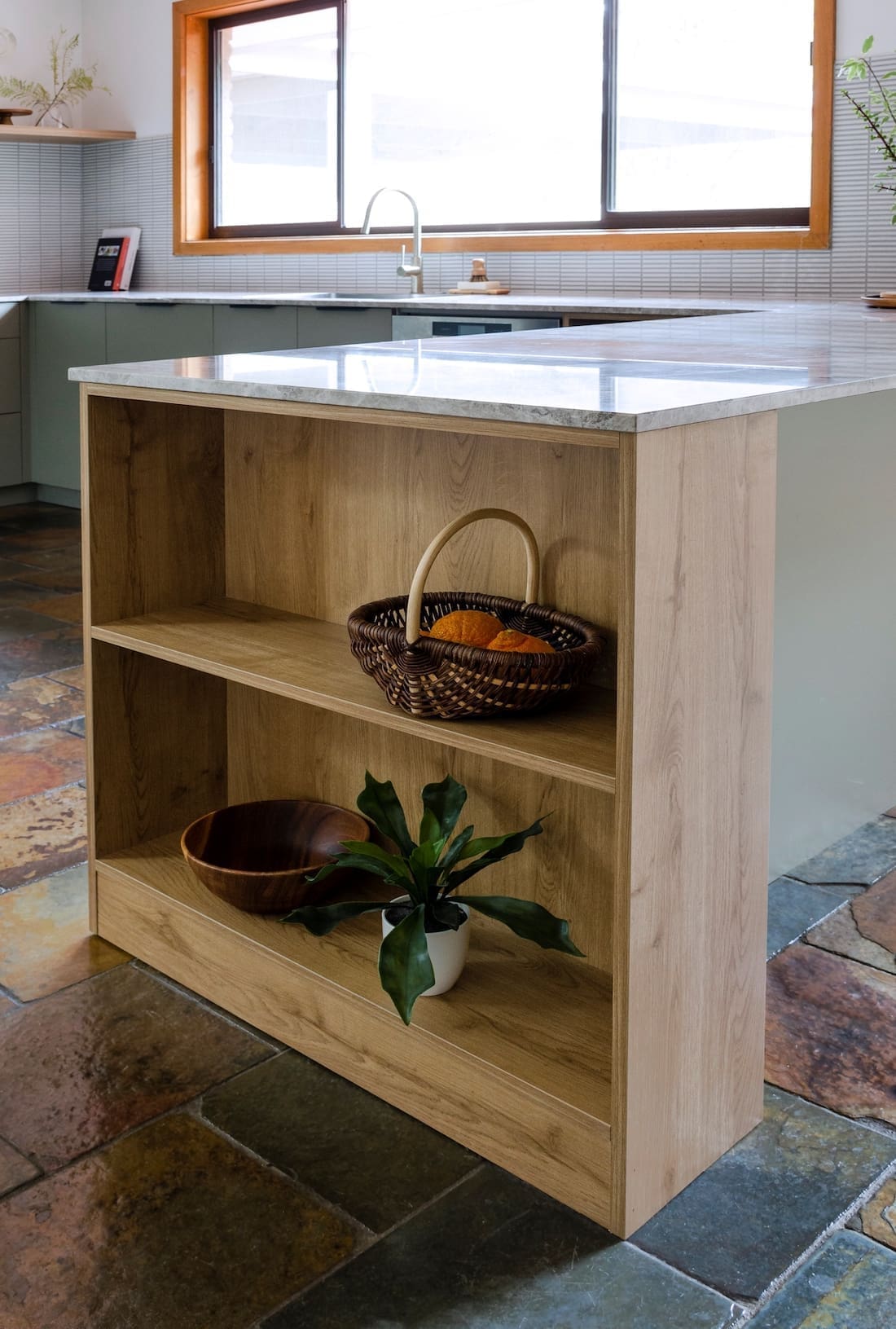
The material choices in this minimalist kitchen makeover were all about fitting in the budget.
“While we had the same goals of beauty and functionality, there had to be some compromise between my partner and I. My partner wanted more, newer appliances which left me with a smaller cabinetry budget.
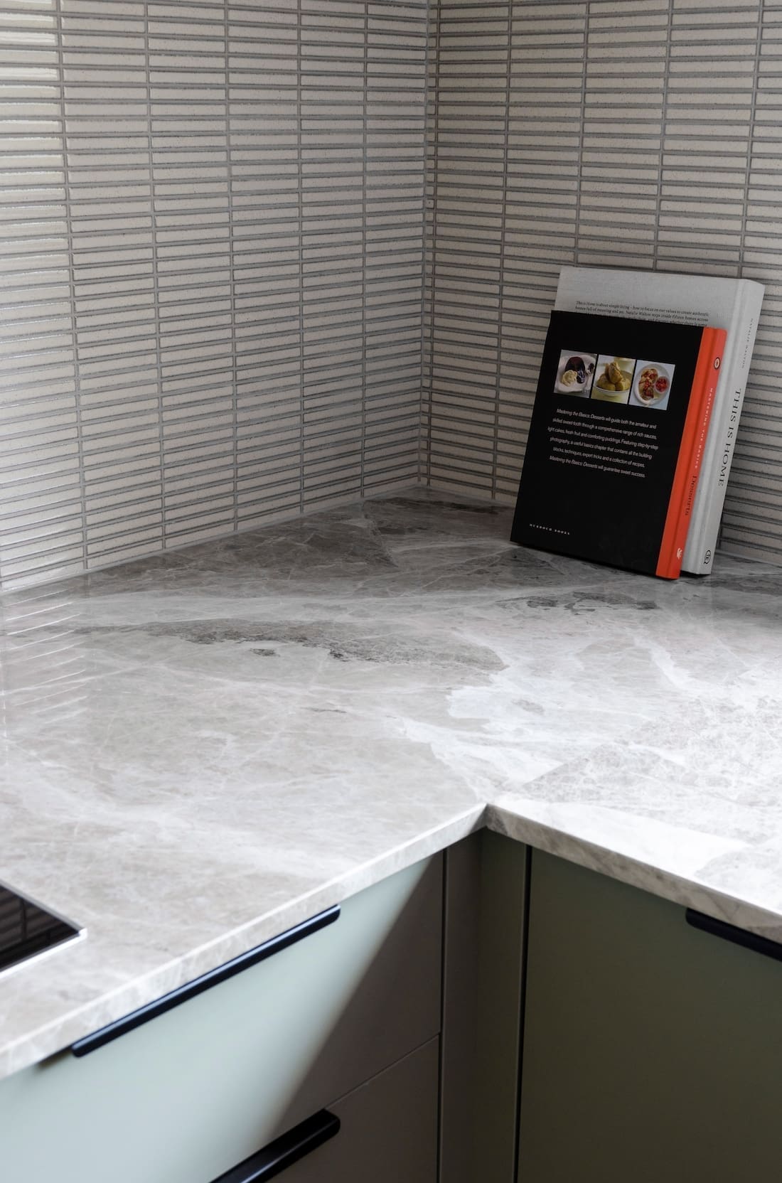
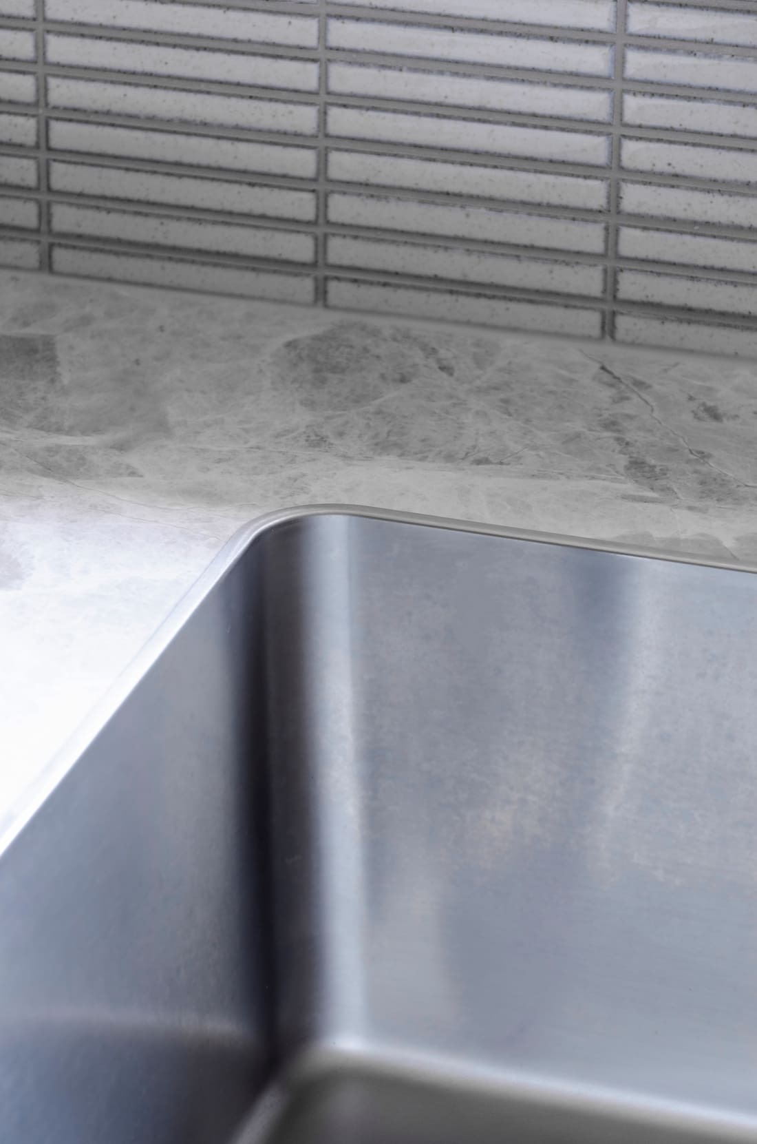
“That’s why I went with the Laminex Possum benchtop. 2PAC would not only have been too expensive, but I’d probably scratch the door within a week. The sun through the north-facing window may also alter the 2PAC colour in the longterm.
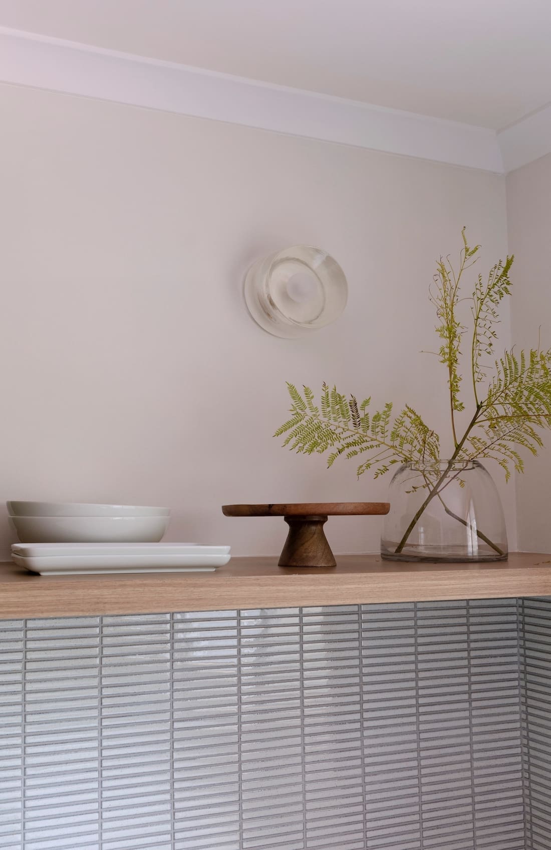
“The finger tiles in the splashback were actually the result of an accident. I was originally using a stone splashback like the bench top, but there was a serious fault with the stone. We found a big crack in the stone above the stovetop.
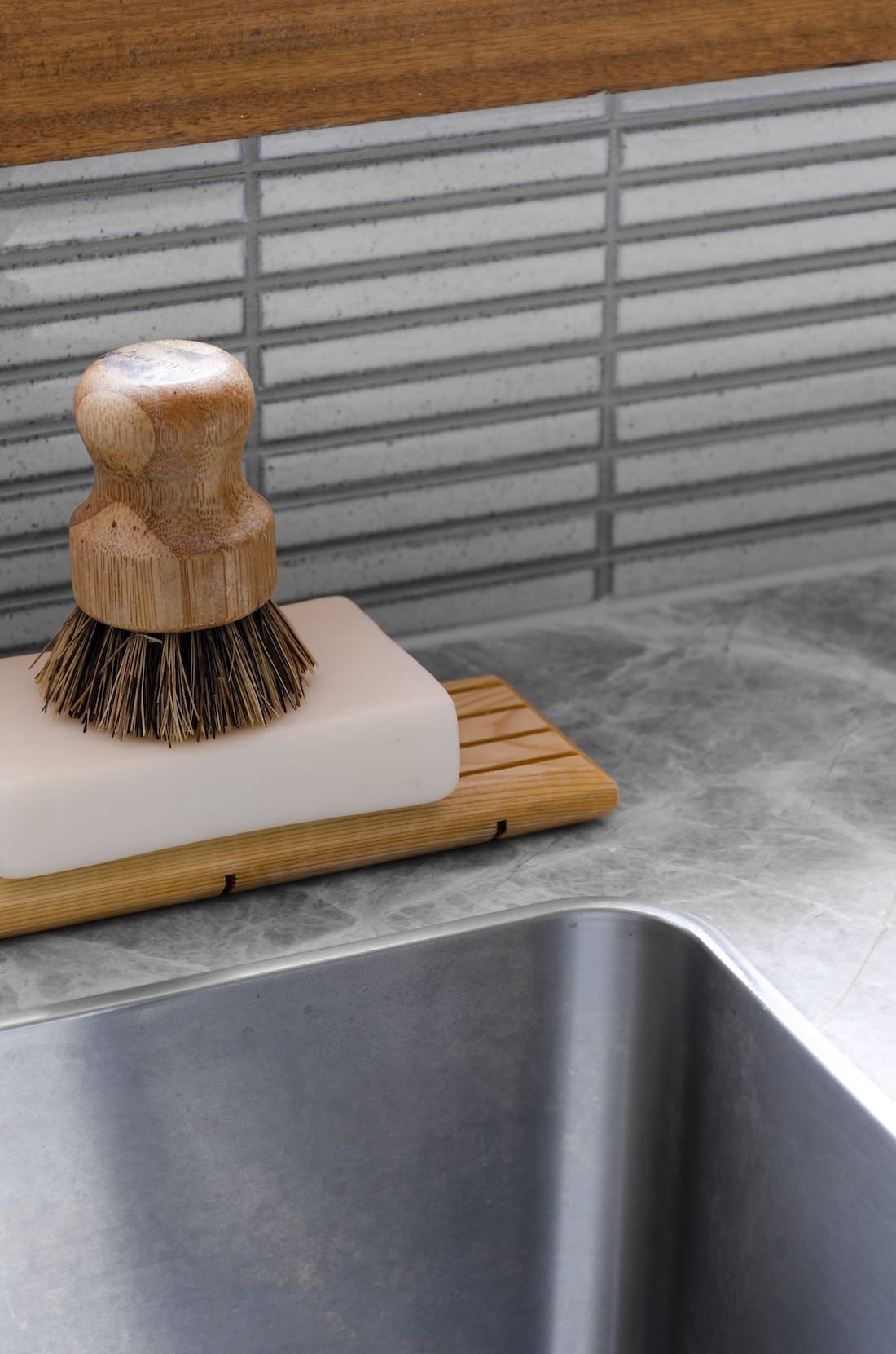
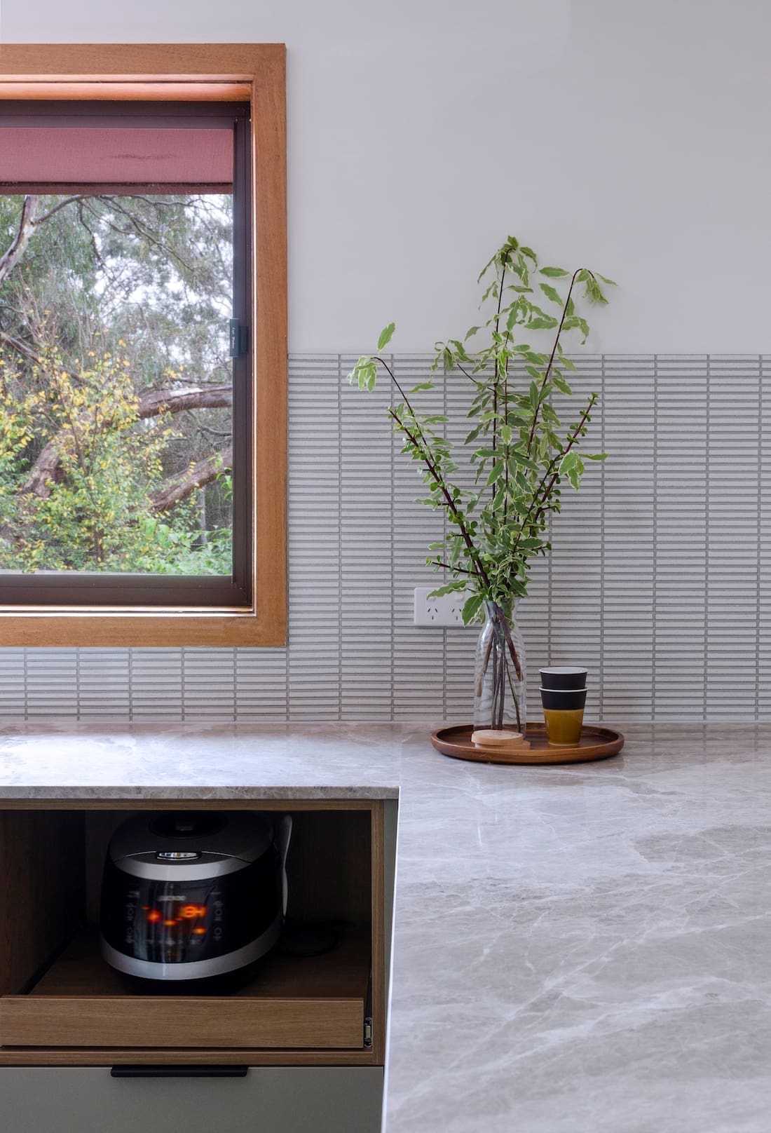
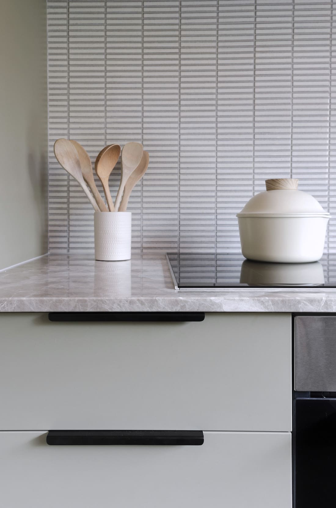
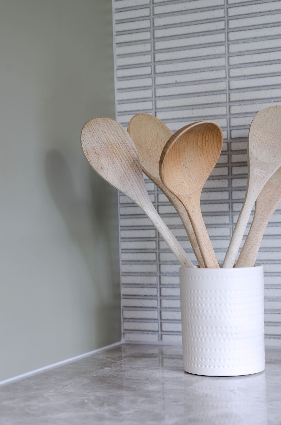
“After 2 weeks of trying to get the stone suppliers to take responsibility, we decided to demolish the splashback and put the white kitkat tiles instead. Now I’m glad we did! The tiles create a more cohesive feel.”
As an Interior Designer, it is important to admit to problems and look for the best solution. Mistakes lead to a better outcome.

Sticking to a budget is hard enough without broken stone but Jacqueline still made it work by only splurging on a few select items.
“We cook every day so good appliances make a big difference. The Qasair rangehood was the most expensive of all the appliances but it’s been so worth it.
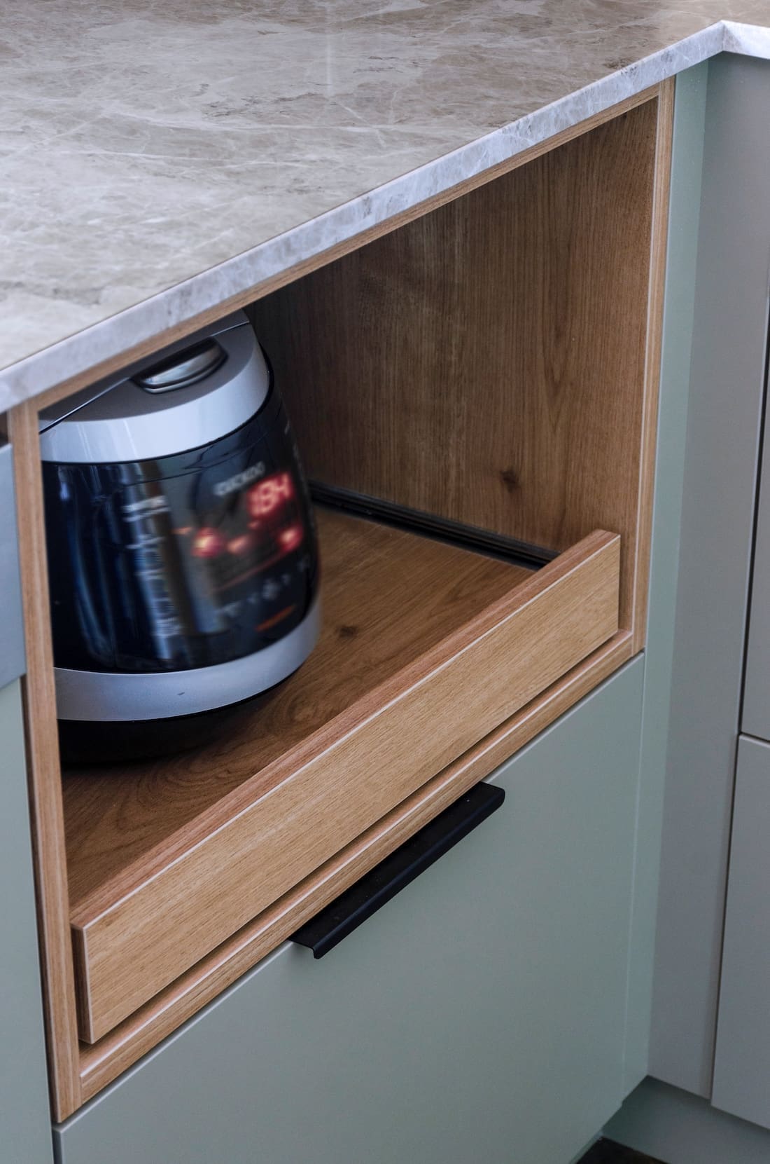
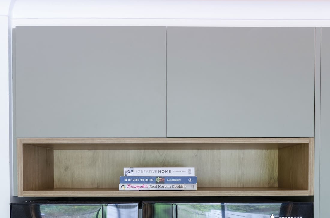
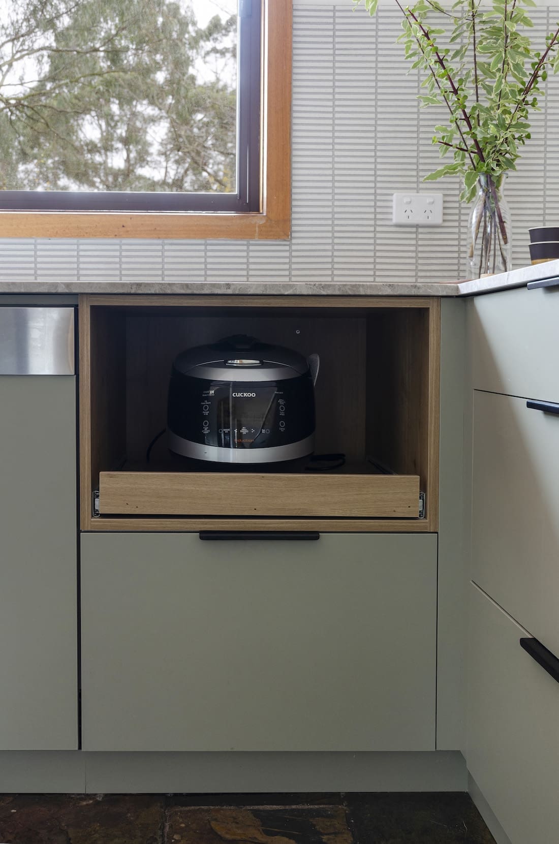
“We both love rice and cannot live a day without it. We always have this giant rice cooker on the countertop that needs to have ventilation for the steam. So we added a special drawer for the rice cooker that can be removed and fit a standard-size microwave.
“Even though the limestone splashback was a mistake, it was love at first sight for my benchtop. The warm grey works so well with the warm brushed nickel tapware and window.
“It was a great choice because the colour variation and unpredictable patterns work well with plain cabinetry.
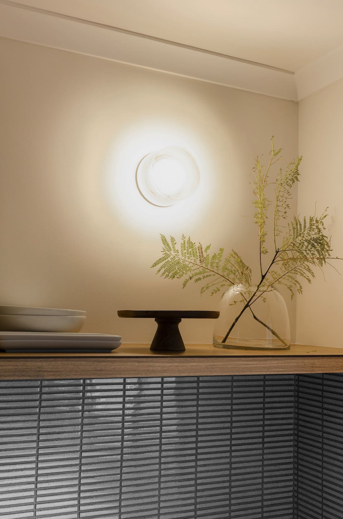
“Finally, this kitchen wouldn’t be finished without a nice wall light above the shelf. I selected the Volker Haug cast glass light, which I think completes the oriental fusion look.”
Photography — FLAVIA DI BELLA
We’d like to thank Jacqueline for sharing The Sage minimalist kitchen project with us. You can find more of Jacqueline and The Glade Designs project on their website or follow them on Instagram here. You can also see the full process of this kitchen makeover in The Glade Design’s video below!
Find more kitchen inspo here
