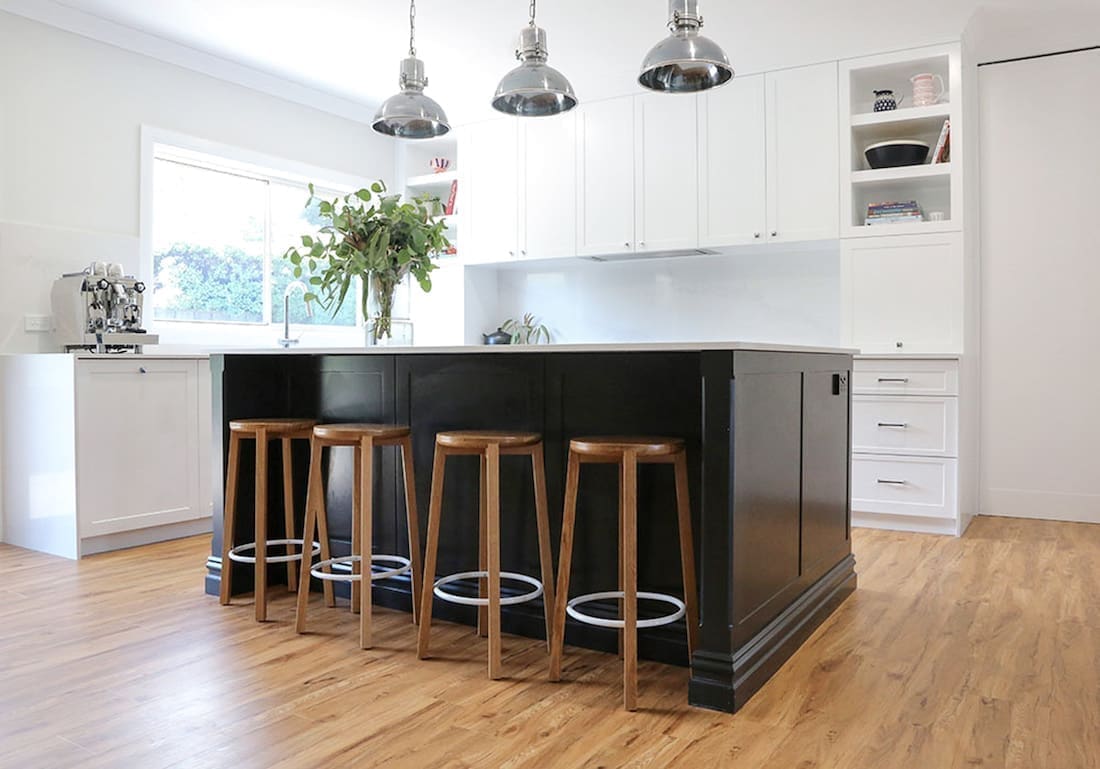
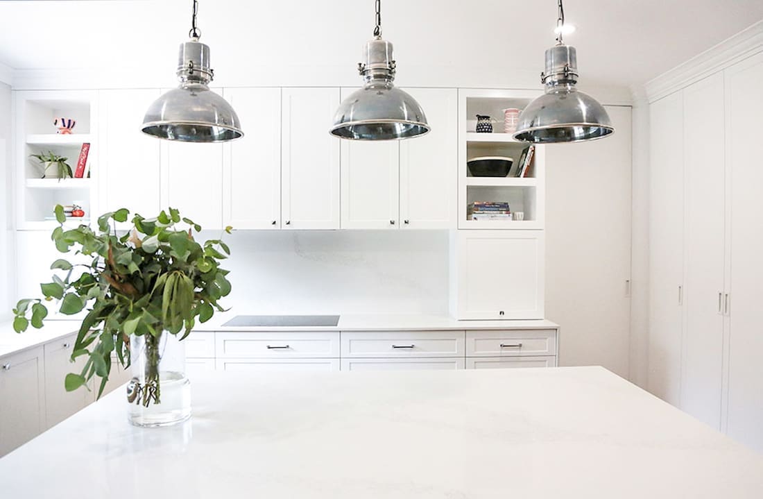
Before and after transformations are always popular and we’re sure you’ll find more than a few ideas to steal from this kitchen reno for your next project!
Designed by Christine of Christine Ghrayche Interiors, she not only gave this space a fresh new look but also made it more functional by tapping into the hallway space to open up the kitchen.
“It was a massive transformation, especially with the demo of a wall. We also stripped out that ugly orange timber veneer and replaced it with contemporary black and white joinery,” says Christine
We chat with Christine about this project and get her top tips when renovating a kitchen.
Related article: Before and after: See how this kitchen was renovated for $5000
Related article: The kitchen design measurements you need to know — from an Interior Designer!
What was the brief for this project? And can you describe the work undertaken.
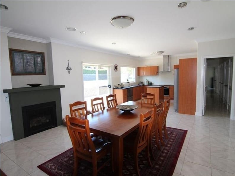
“The brief for this project was all about functionality. Before the renovation, the kitchen was small and pokey, and simply didn’t provide enough space for a family of five,” explains Christine.
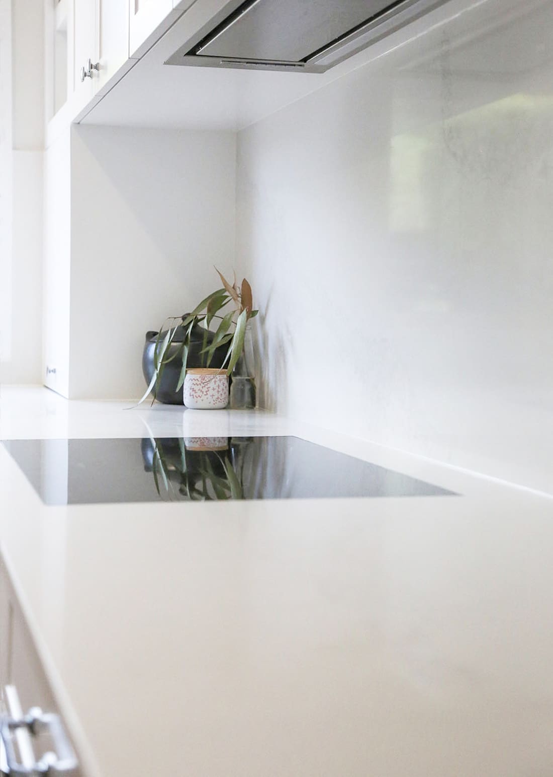
“The wish list included induction appliances, double ovens, double dishwashers, and more prep space for cooking.”
Christine took the wish list and developed a presentation which included a revised floor plan, rendered drawings and materials palette.
“The inspiration started with the house itself. The house was built in 2008 in the style of a traditional country homestead. But unfortunately, this style was not carried through to the interior. My client, who purchased the property in 2012, wanted a style that complimented the traditional country style of the house.”
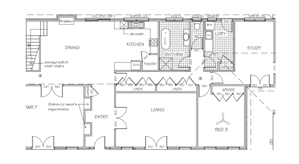
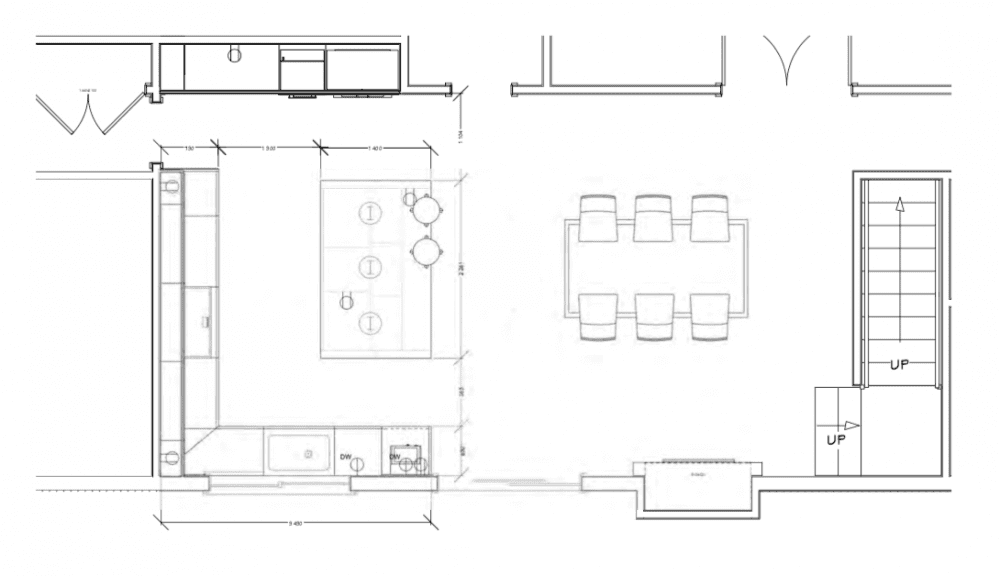
You can see from the before and after floor plans below how she was able to tap into the hallway space and old linen cupboard to completely open up the kitchen, allowing for a far more generous island, more joinery and also a more open plan, livable space.
Did you face any unexpected challenges and how did you overcome them?
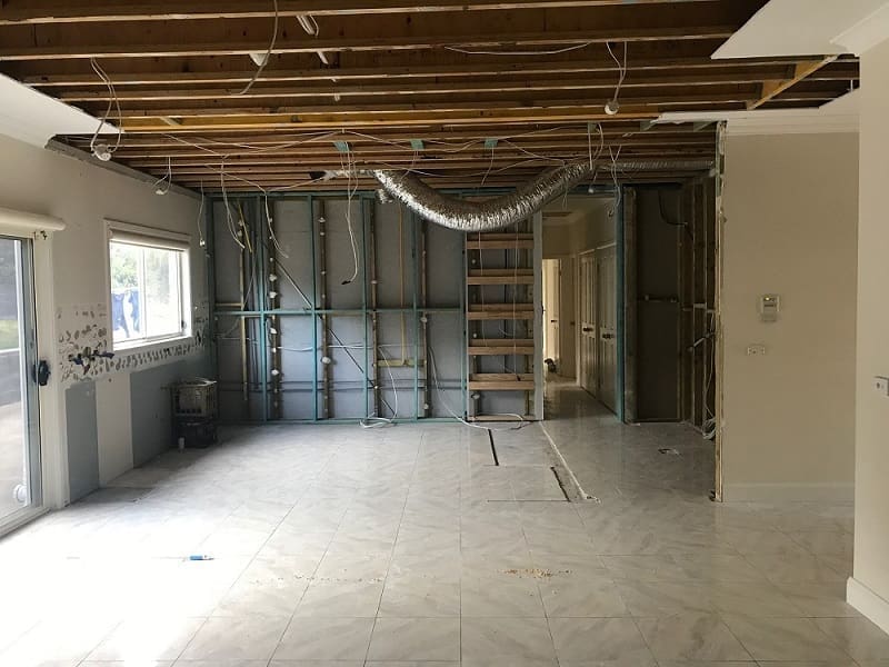
“Not so much unexpected, as more of a waiting game,” says Christine. “The wall we wanted to demo was structural and was also the ground floor of a 2 storey house, so pulling it down without getting an engineer involved was out of the question. No one wants to renovate their kitchen and have the house fall down on top of them!”
“The second issue was the cavity sliding door. To install the door we had to be build out the wall and this was a concern because of the kitchen window. The builder had to be careful, if he built out the wall too far it would have caused a snowball effect in allowing the overhead cabinets to be functional.”
To allow for a supporting beam to be installed, the ceiling Gyprock was removed. You can see the extent of the demo below.
What’s your favourite aspect of this project?
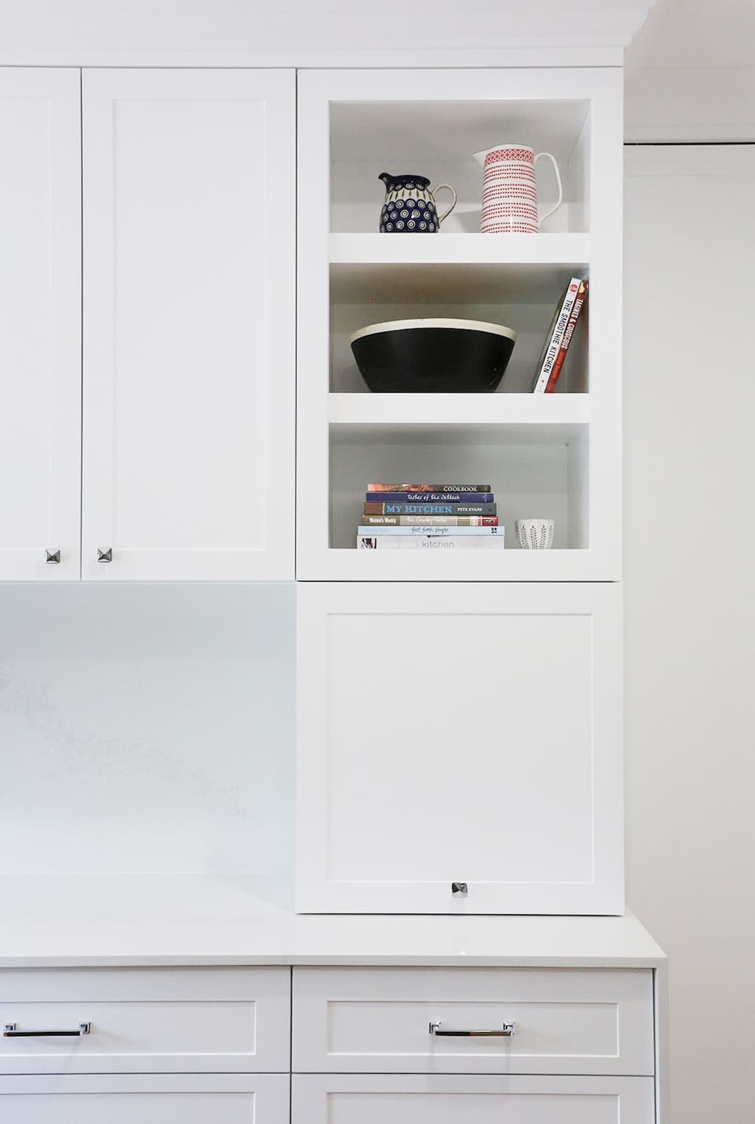
“My favourite aspect by far has to be the hinge up doors that sit below the open shelves. Both cabinets have power installed in them and house everyday items such as the toaster and kettle.”
You’ve got to love clever storage solutions that also look great! Our favourite feature is that oversized kitchen island – it creates a design statement and puts a modern twist on this traditional style of kitchen.
What are your top tips or main things to consider when renovating a kitchen?
“Planning! It’s my number one tip in any design, but especially kitchens,” she says.
Christine says increasing functionality is also important. Maximising bench space for food preparation, using clever storage solutions (always choosing drawers over doors where ever possible), and smart inclusions like adding a filtered tap and additional powerpoints are just a few of her top suggestions.
“One thing I say to my clients often is, there’s a reason why kitchens sell houses.”
Thanks Christine for sharing this fabulous kitchen transformation with us. Visit Christine Ghrayche Interiors website for more of their latest projects or connect on Instagram.
More kitchen inspiration
