Today’s home tour just feels grand. This sense of grandeur has been achieved thanks to clever design techniques, including internal voids and a connection to outdoors. With us today is Wayne Greenland, Principal Architect at Habitat Studio Architects, to share his secrets on how to create small spaces that feel bigger.
Related article: ab House: A new build with playful and sentimental elements
Related article: Sorrento House: A unique 1960s home with timber panelled walls and a view worth celebrating
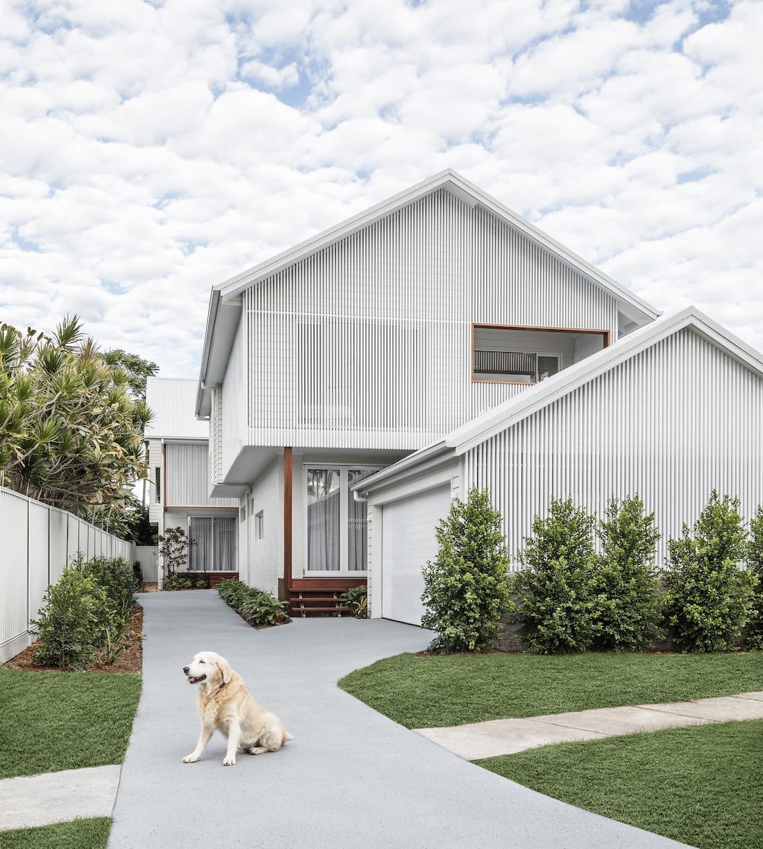
Giving the impression this home is much bigger than it seems, is just one of its many hidden talents.
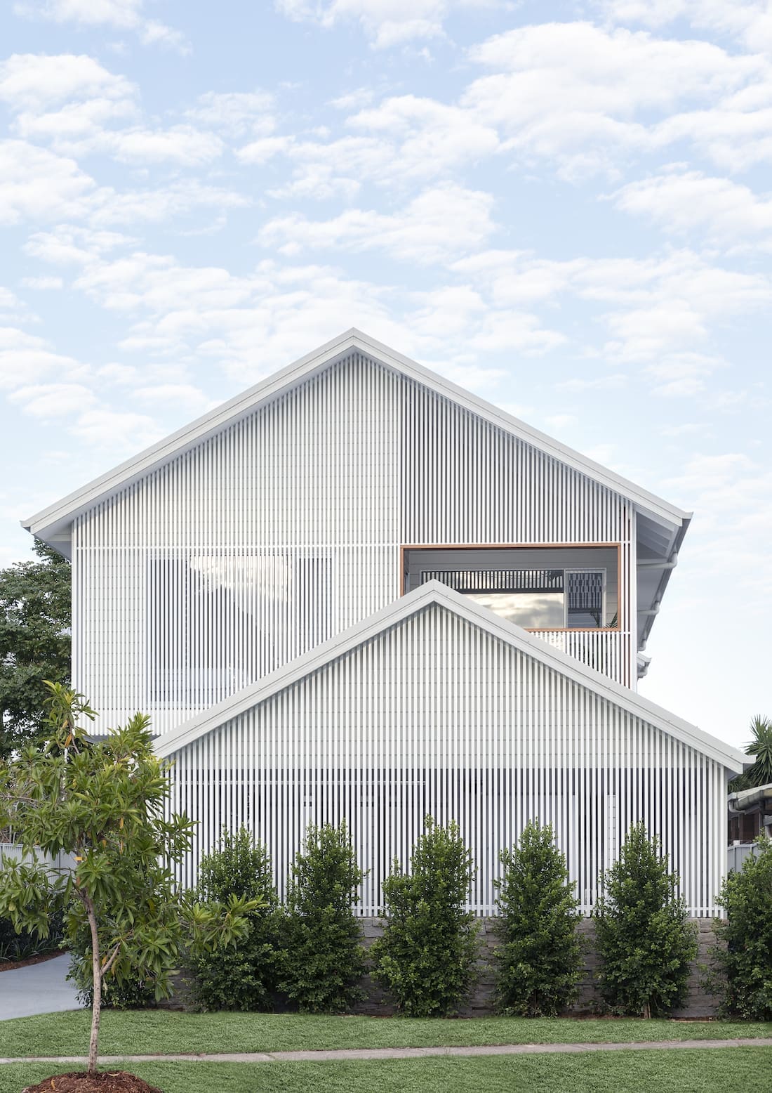
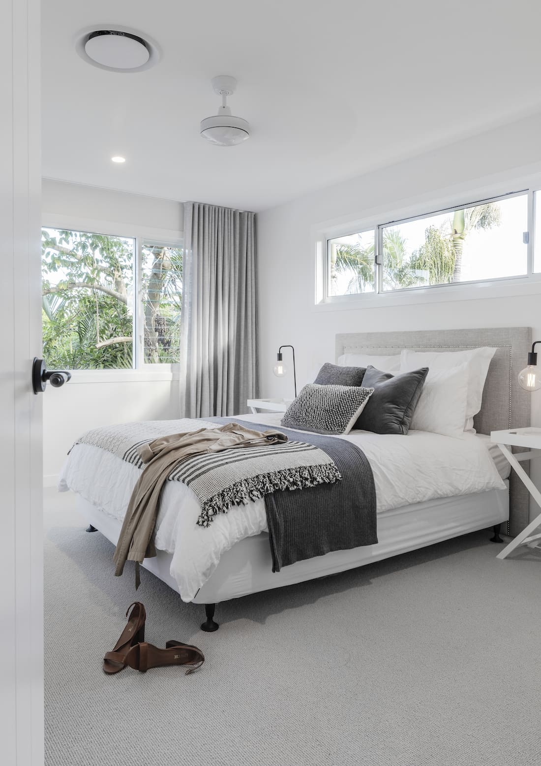
“This block is a duplex, located in Miami on Queensland’s Gold Coast. The two homes are both 2-storeys with 4 bedrooms and 3 bathrooms,” says Wayne.
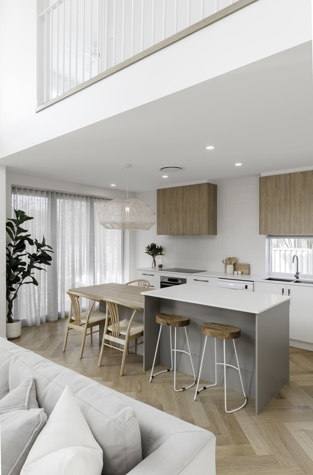
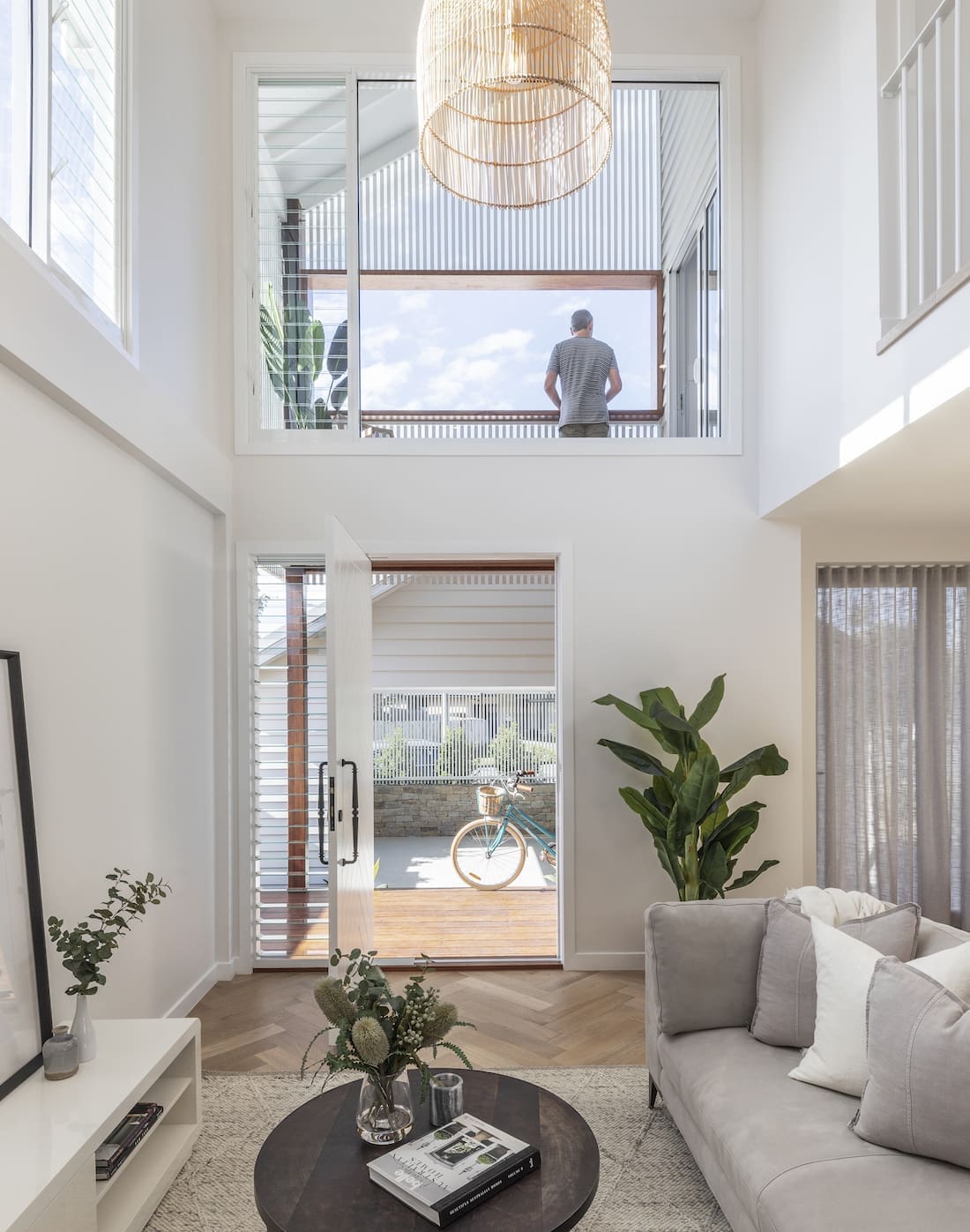
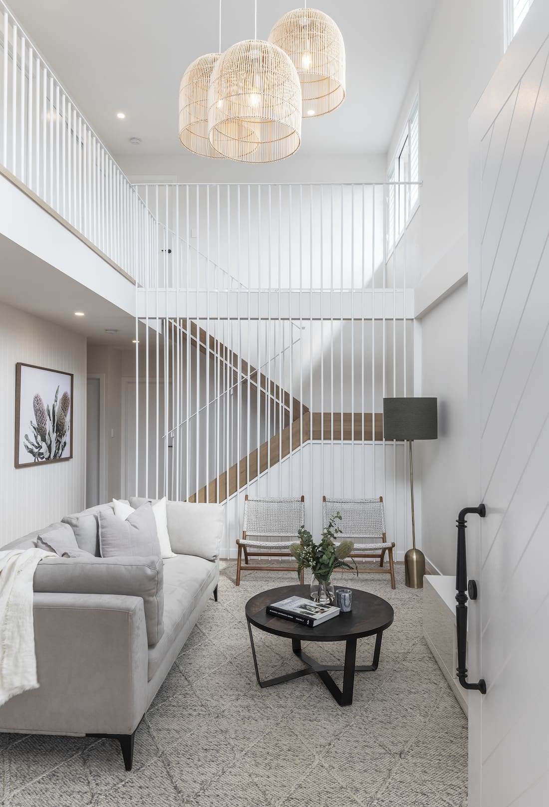
“The home could have been even bigger if we’d filled in the void. Many developers would have infilled the voids in a heartbeat to get in another bedroom or second living space. But to us, they are what makes the property.
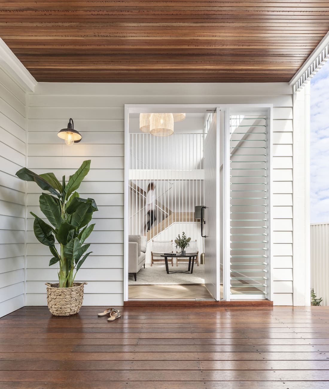
“The void spaces are immediate on entry and provide a sense of grandeur in what could otherwise become really constrained dark planning.
They provide beautiful northern light to the lower living spaces and great cross-flow ventilation in their coastal environment to help keep things naturally cool.
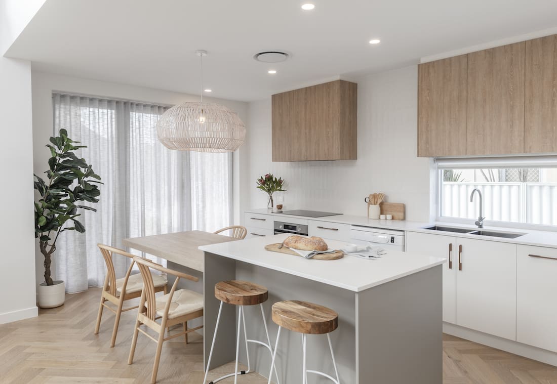
The clever features to make small spaces feel bigger continue throughout the home.
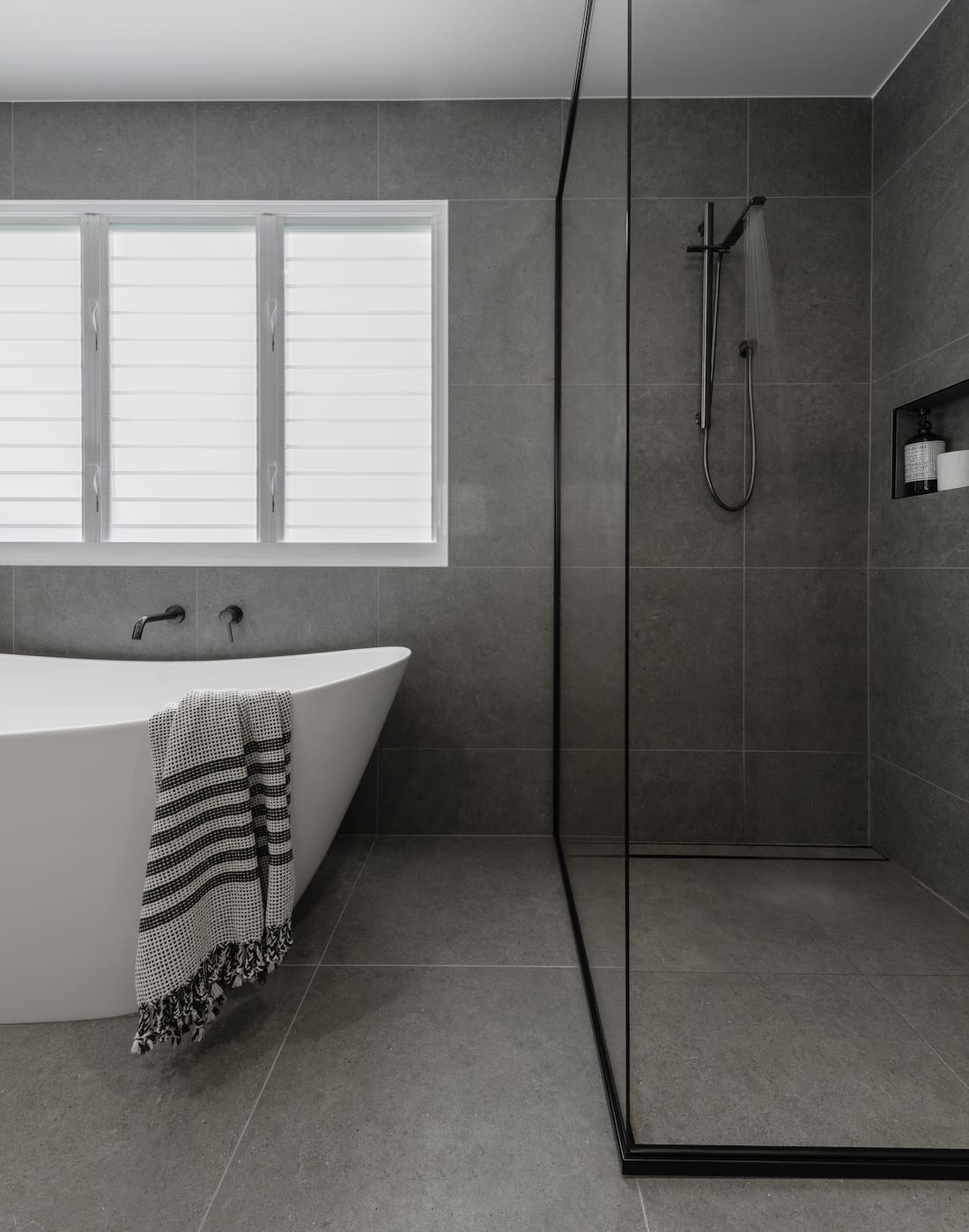
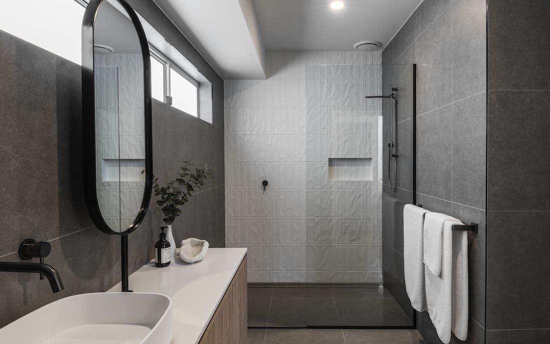
“To save on space, the dining table is connected to form part of the kitchen island bench. Other aspects include 2-way bathrooms to act as a guest bathroom and also a powder room for guests. This helps save on the doubling-up of these spaces,” explains Wayne.
“The openness of the front facade to the deck space also increases the perception of the internal space. The most difficult part of this project was the planning. Fitting in the functional aspects we needed to work with the site and footprint we were given.”
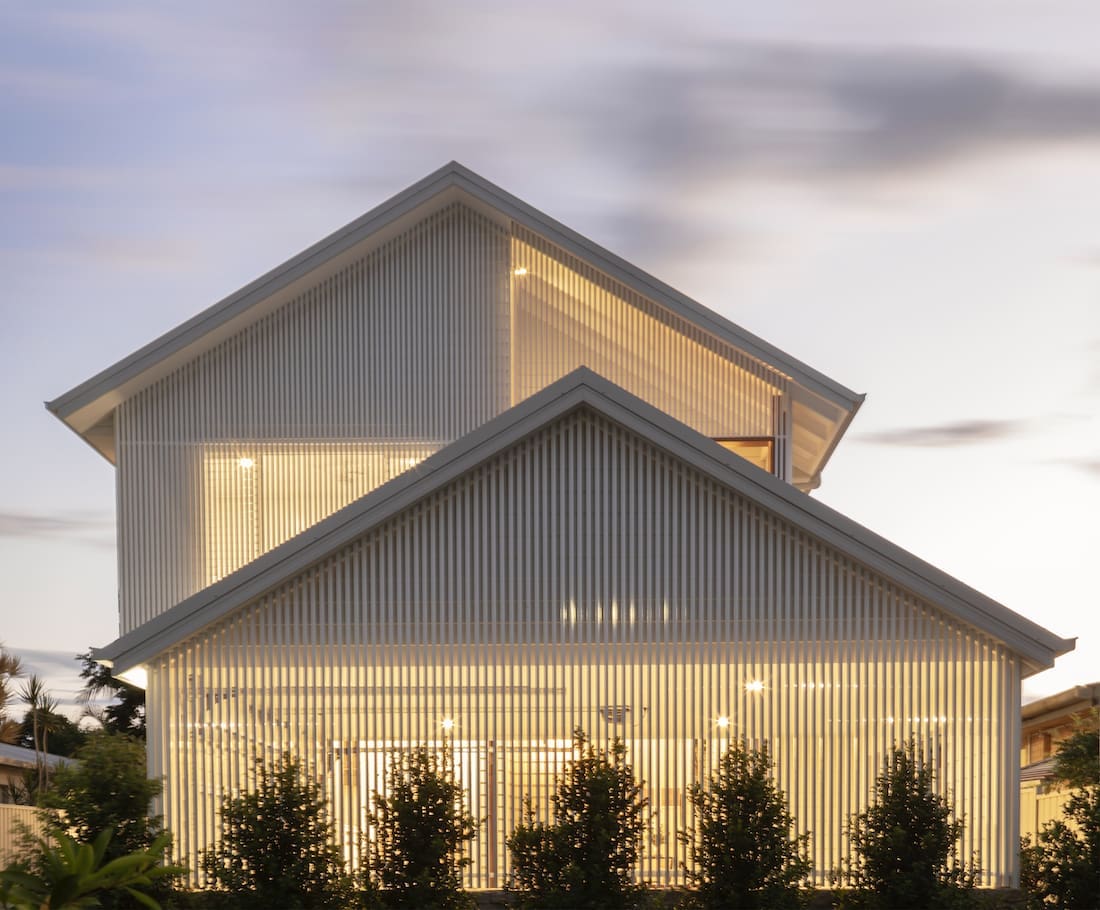
This home’s grand facade provides beautiful filtered light but what’s even more impressive is it’s equally functional too.
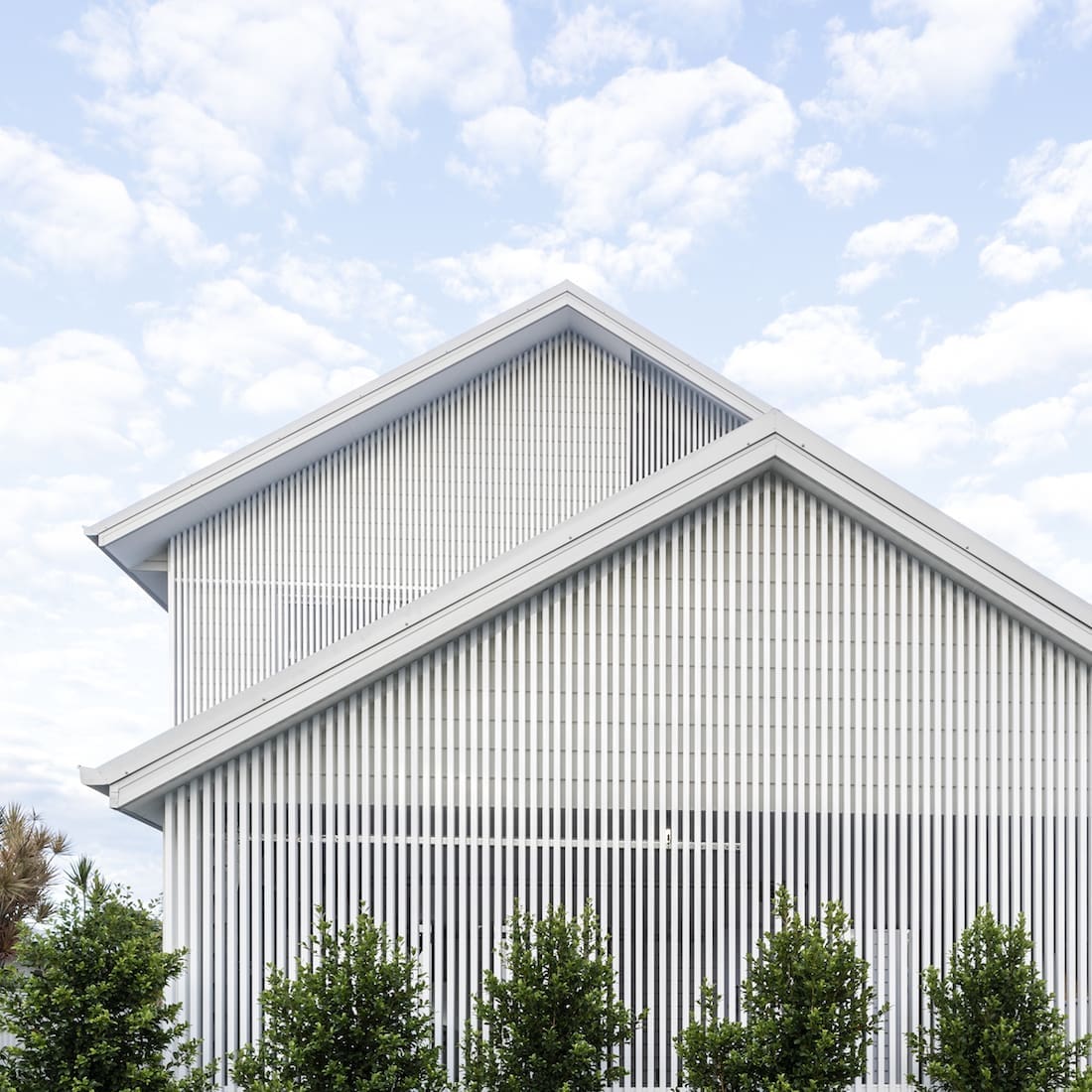
“The facade battens have a few functions. They provide privacy while still being a permeable facade for cross ventilation.
“Ideally, we wanted to have surveillance and a connection to the street. The battens allows this to happen while maintaining privacy. They also allow beautiful filtered light and sea breezes to penetrate,” says Wayne.
The aesthetics is just a bonus. We love the idea of fine elements or a lightness in our architecture.
Thank you so much to Habitat Studio Architects for showing us around this stunning duplex home. We love how it celebrates natural light over extra rooms, and the clever features that make the small spaces feel bigger. Which space or feature was your fave? Tell us in the comment section below.
Builder — Makin Constructions
Photography — Amber Toms Photography
Interiors — Evoque Interiors
Discover more home tours here
