The teams had two very different briefs again this week — ‘Art Deco’ and ‘Mid-century American’ — and we showed you a peek of the renovations mid week as the bedrooms were revealed.
Now it’s time to see the Reno Rumble week 4 full house reveals, which tested the design and styling skills of both teams!
Related article: Reno Rumble week 4 bedrooms
Related article: Reno Rumble week 5 bedrooms
Blue team
The Blue team had a mighty challenge on their hands this week, transforming a dark and pokey house into an Art Deco home with one less couple than the other team. They trailed mid-week and were not confident going into the judging. They fought hard and managed to finish with a half point lead seeing both couples stay in the competition this week.
Carly and Leighton
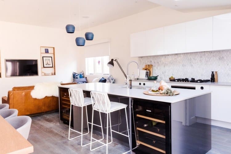
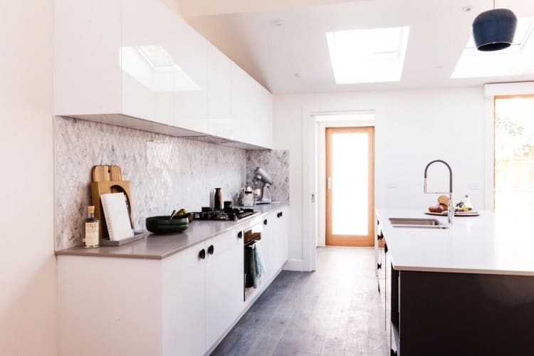
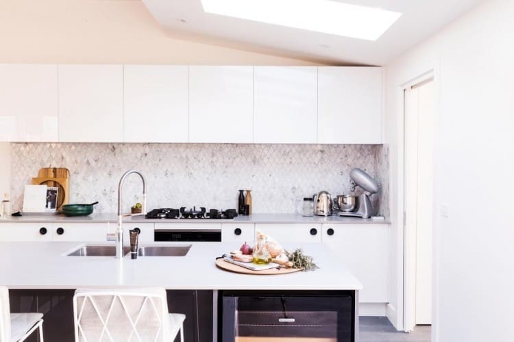
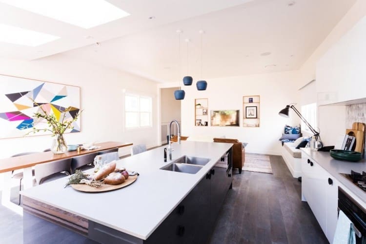
The judges were immediately drawn to those stunning blue pendants as they entered Carly and Leighton’s kitchen. These guys delivered an open plan and crisp kitchen that’s perfect for entertaining — just what the homeowners asked for!
It got a lot of ticks from the judges for its functionality, including generous storage and deep pull out drawers. But there were some aesthetic things they would have changed — including matt cabinetry instead of gloss for a more modern look, and a larger oven so it was the same size as the cooktop.
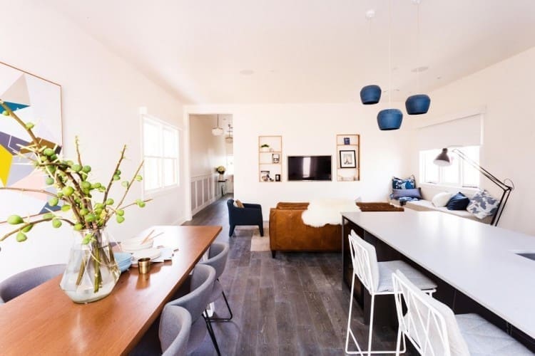
We loved that diamond marble splash back, those bar stools and cluster of blue pendants. We also thought the dining space was a winner! Especially with that geometric artwork that seemed to reference the patterns in the stained glass windows.

Jess and Ayden
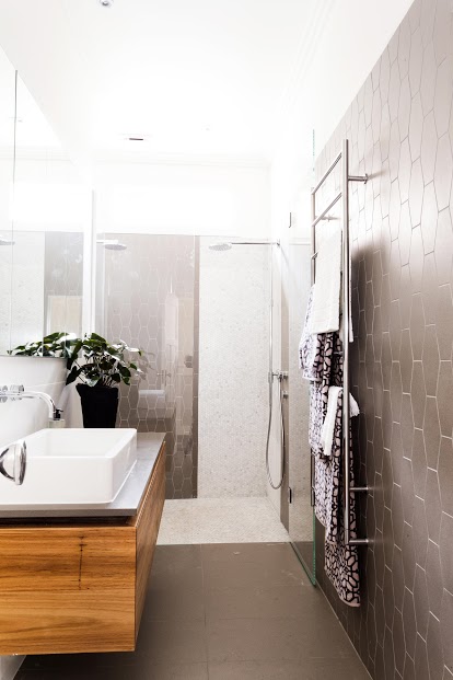
You’ve got to love Jess, she’s so down to earth and isn’t afraid to have a laugh at herself. When the judges critiqued her tile choices in their bathroom this week, she admitted she’s got no idea when it comes to selecting tiles and had a chuckle. Other than the interesting tile choices and shower screen that was higher than the tiling, the judges thought the bathroom was very functional and well laid out. They loved the dual shower and generous storage.
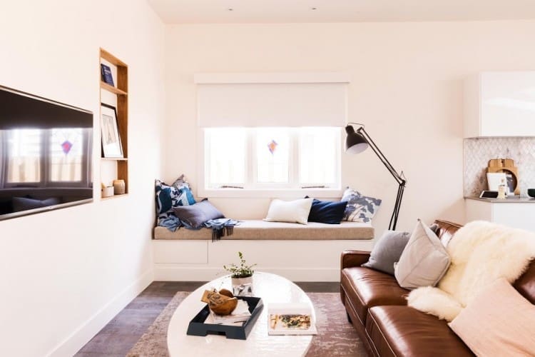
Their lounge room got a slightly better reaction from the judges with Romy loving their sofa, saying it would only get better with age. Parts of this room did come under question though. Including the bench seat under the window with Darren saying it wasn’t ideal for watching TV or entertaining and the high TV which they thought was getting lost amongst the wall niches.
Red team
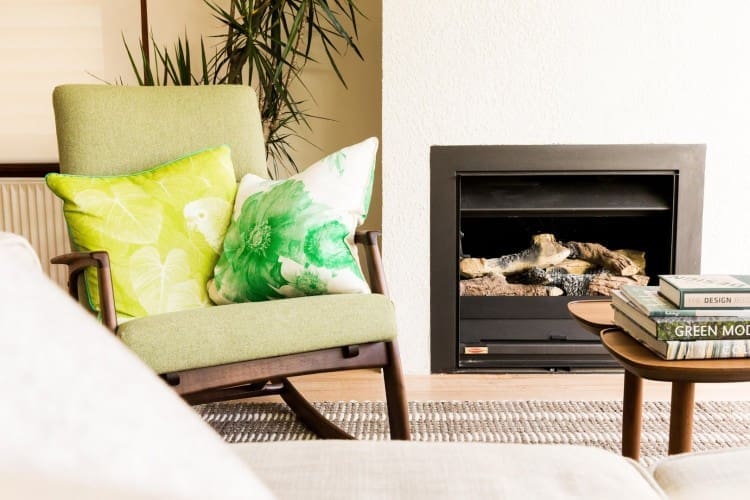
Mid-century American is a tricky brief to nail! So much of the mid-century furniture and decor available has more Scandinavian influences. Ben and Jemma in particular struggled with selecting pieces that met the brief and in the end, they scored the lowest and left the competition this week.
Josh and Jenna
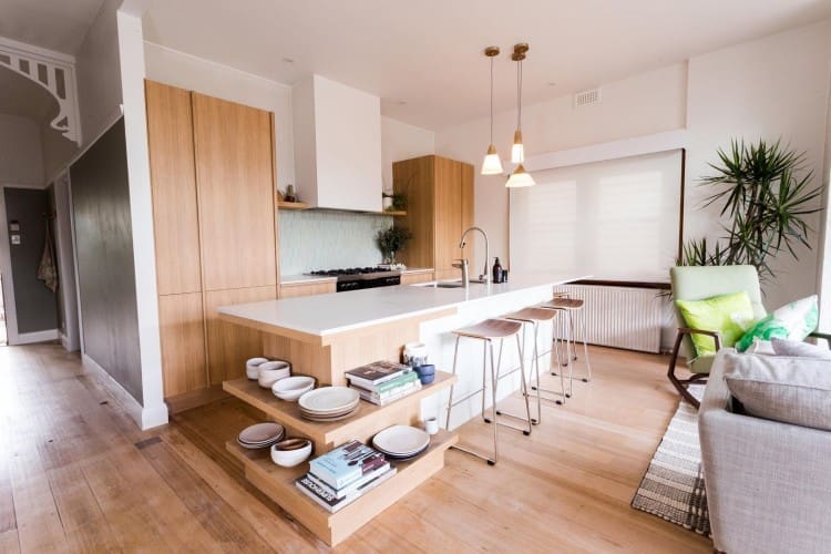
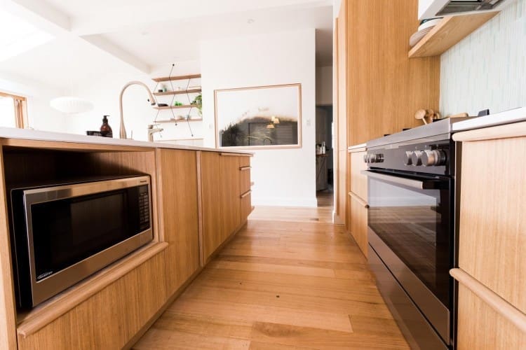
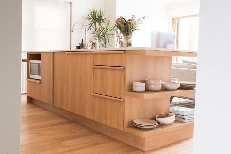
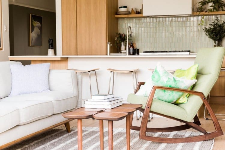
Team captains again this week, Josh and Jenna were responsible for the kitchen reno. We loved the look of the kitchen with the clean line timber and those bar stools (hot!) but the judges felt it was too current for the brief.
It also fell short on functionality — the judges had to search high and low before finding a powerpoint which was tucked away in a drawer! The double integrated fridges were a luxury this kitchen couldn’t afford because it came at the cost of a pantry or sufficient storage.
Kyal and Kara
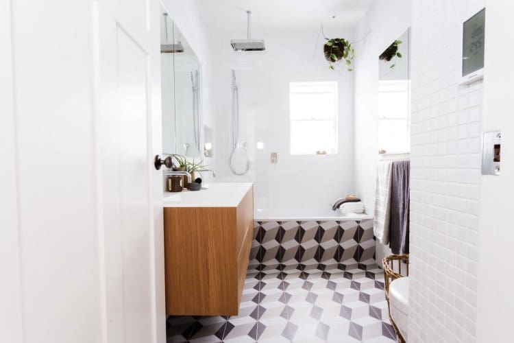
Kyal and Kara took a big risk with their bold geometric tiles but the judges thought it was a great choice. Romy would have preferred to see it used on the floor only though as she felt it was too much carried up and around the bath. They got big points from the judges for their storage and functionality, and from us for their fabulous styling (that Sedonia hand wash will be our next one to try).

Ben and Jemma
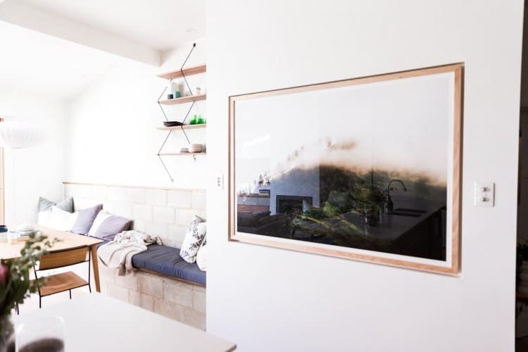
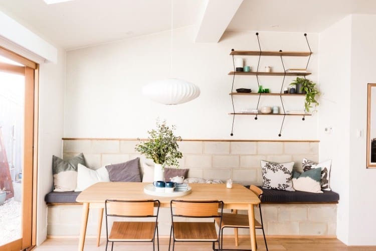
Ben and Jemma were hoping their Besser block dining area would be a risk that could save them their spot in the competition. While the judges thought it was ‘brilliant’, it wasn’t enough to keep them in the competition. Romy felt many of the furniture choices (including that beautiful dining table) were more mid-century Danish than mid-century American.
Overall the judges loved the feeling of the Red team’s house but just didn’t feel it was that practical.
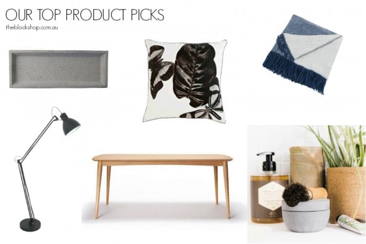
You can find our top product picks, along with loads of other fab decor and furniture, at The Block Shop.
Which Reno Rumble week 4 full house Reveals design style do you prefer? Mid-century American or Art Deco? Tell us in the comments below!


Comments are closed.