
When Jemma Mrdak and her family purchased this 1966 ex-government home in Canberra, there wasn’t a whole lot to get excited about. But what it lacked in inspiration, it made up for in potential. Including a raked kitchen ceiling that, post-renovation, completely steals the show.
Let’s explore this before and after kitchen project, that reshaped how the entire home functioned. Here’s how they did it.
Related article: From a disjointed kitchen to a quietly considered haven
Related article: The secret to timeless interiors: Why natural stone is the ultimate investment for your home

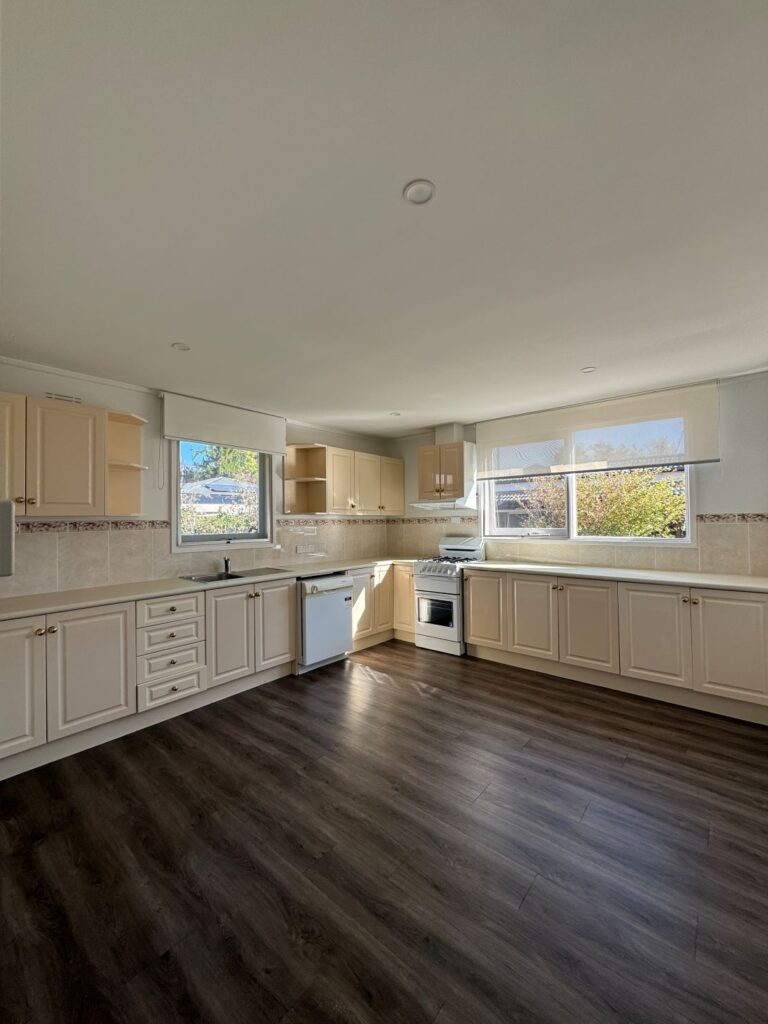
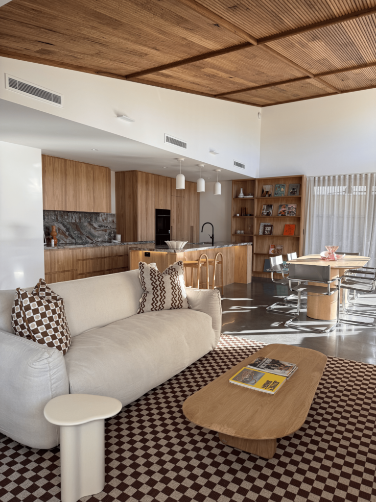
This home needed a fresh start, not just a fresh coat of paint.
“The biggest challenge we faced wasn’t necessarily the kitchen itself,” Jemma, Director of boutique marketing agency Dak & Co, explains. “It was where it sat within the home. It felt disconnected from the spaces where we actually spend our time, so cooking often meant being separated from everyone else.
“That disconnect became the catalyst for a much bigger project. The original kitchen sat within the older part of the house. It was wrapped in perimeter cabinetry and had plenty of wasted floor space in between.
“We actually knew before we bought the house that we wanted to renovate it one day. But rather than making small updates over time, we decided to commit to a full renovation and extension so we could create a home that truly reflected how we wanted to live.”


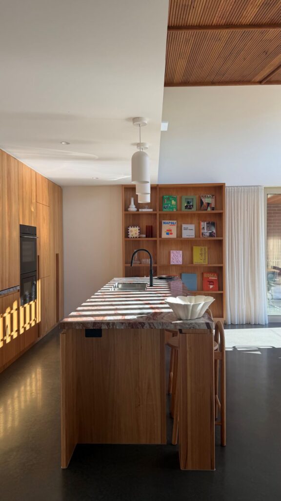
With a full renovation on the table, Jemma had the freedom to define a completely new style for her home.
“Our architect really helped us rethink how we wanted to live rather than simply where cabinetry should go,” Jemma says.
“The new layout revolves around the island, flowing directly into the dining, living and outdoor entertaining spaces. Now it’s where everything happens.
“Whether it’s making breakfast, having friends over, sitting at the island while we’re cooking, or simply having a coffee in the morning. The kitchen has become the place we’re naturally drawn to throughout the day.
“We wanted to acknowledge the age of the original home without creating something that felt like a replica. We’re naturally drawn to warm tones, timber and natural stone, and layered different textures throughout the space to create warmth.
“It was important that everything felt calm, timeless and easy to live in rather than trend-driven. The style that we landed on is somewhere between mid-century modern and contemporary.”

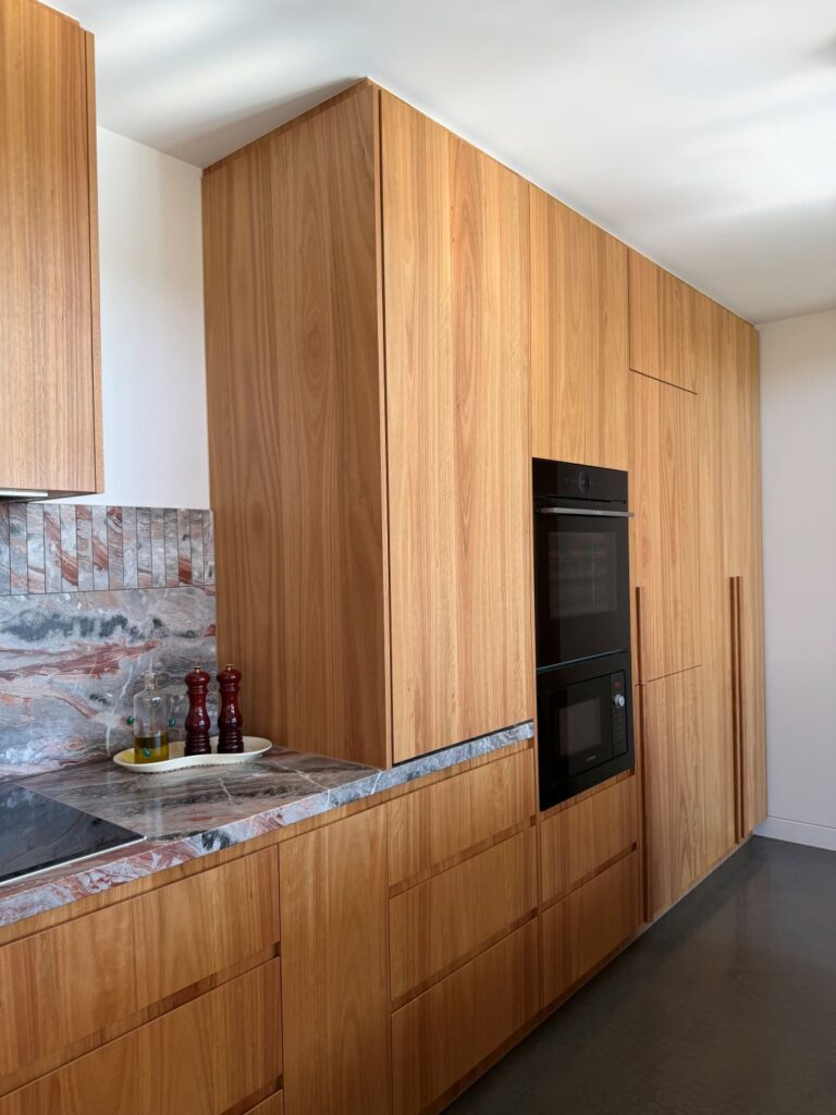
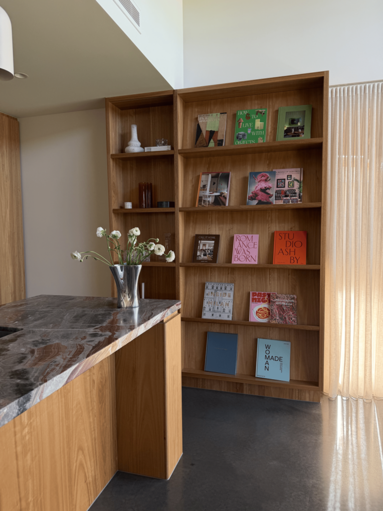
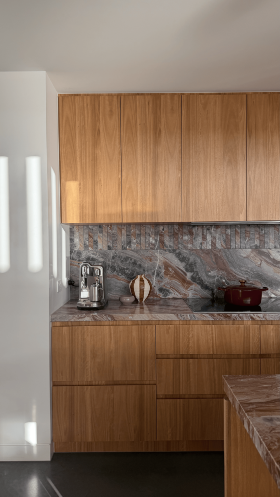
Warmth and texture were key drivers when it came to selecting materials for this dreamy kitchen.
“Timber and natural stone were the two non-negotiables from the outset,” says Jemma. “We wanted warmth, texture and materials that would age beautifully.
“Rather than relying on lots of colour, we let the natural variation in the timber and stone create interest. The island was an absolute must! It was always going to be the centre of the space.
“The movement through the stone gives the kitchen so much personality. It almost feels like a piece of artwork. We carried it across the benchtops and splashback and paired it with mismatched tiles.
“It immediately stood out to us because we’d never seen it done before. It’s such a unique detail that adds so much character to the kitchen while still feeling timeless.
Every decision we made was driven by a simple goal. Create a kitchen that felt like furniture, not a workstation.
“We really focused on concealed storage to keep the kitchen feeling uncluttered. Large pantry cupboards, deep drawers and integrated appliances mean we can keep everyday items tucked away. This allows the timber joinery and stone to be the hero.
“A favourite detail of mine is the concealed appliance cupboard, hidden behind a retractable sliding door. It means everything we use every day is easily accessible, but it can all be hidden away again.”
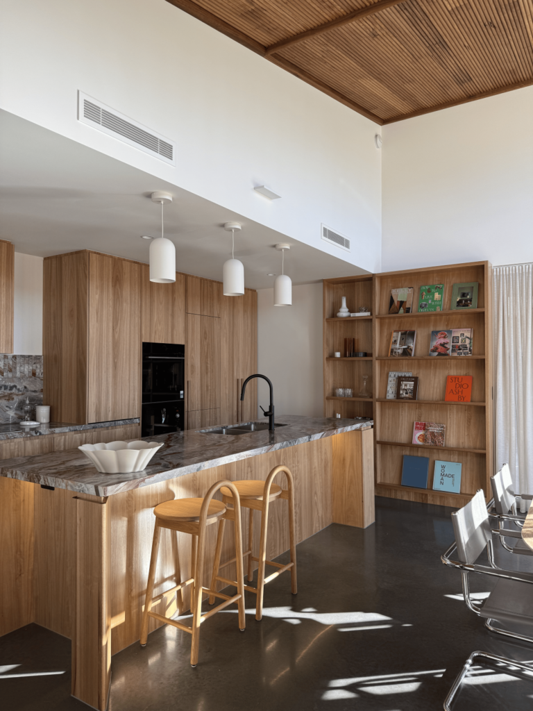
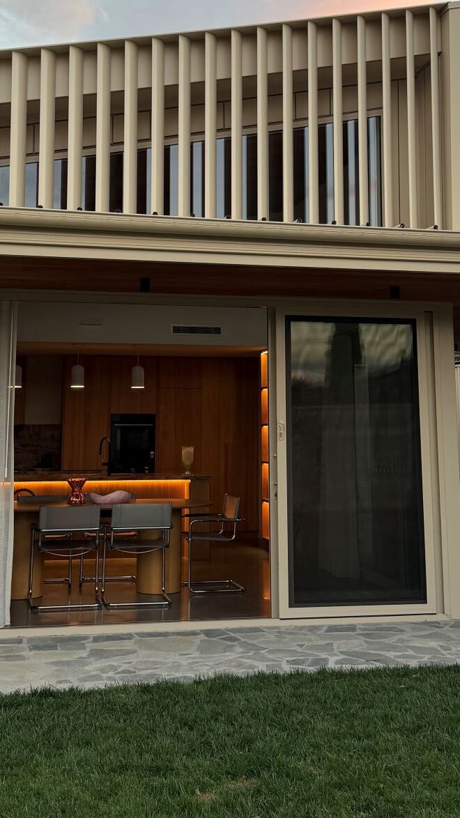
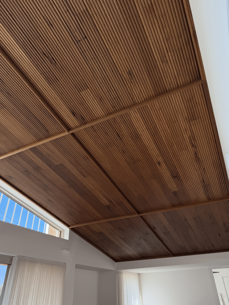
Now a moment for that ceiling. The raked kitchen ceiling, punched up and lined in timber, has become the defining feature of the entire house.
“This was really the vision of our architect, Mark Brook from mymymy Architecture. It’s one that we’re so grateful he encouraged us to pursue,” Jemma smiles.
“From the beginning, he saw the potential to create something much more than a standard ceiling. Bringing light and volume into the new extension was one of our biggest priorities. And the raked kitchen ceiling delivered on both fronts.
“Opening the ceiling created an incredible sense of scale. Lining it in timber softened that volume and added so much warmth, so despite the height, the space still feels incredibly inviting and comfortable.
“A custom joinery bookshelf was also on my wishlist from the very start of the design process. I love interiors and design books. I really wanted somewhere to display the pieces we’d collected over the years, rather than hiding them away.
“Beyond styling, the bookshelf earns its keep in functionally too. It helps with the transition between the kitchen and dining zones, while breaking up the timber joinery. It’s one of the first things you see as you walk into the home.
The comment we hear most often is how warm and welcoming the space feels. I think that’s the biggest compliment because creating a home that feels inviting has always been our goal.
Credits
Architecture and interiors — Mark Brook, mymymy Architecture
Builder — Symmetry Building Services and Lagana Projects
Joinery — Blackbutt timber joinery from Top Shelf Joinery
Stone — Rosso Orobico natural stone from Vero Galleria
A huge thank you to Jemma for taking us through her stunning kitchen transformation. That raked kitchen ceiling proves that rethinking a floor plan, rather than simply renovating what’s there, can completely change how a family lives in their home.
Explore more home tours