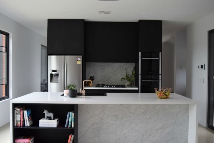
Today I’m (FINALLY) sharing our kitchen room reveal with you!
Firstly, I’ve got to say huge thanks to all the readers who shared their tips and ideas for this space! I found the kitchen planning a bit daunting because I knew I didn’t want to go all white but wasn’t sure how a mix of finishes would turn out. It’s safe to say I couldn’t be happier with the results!
I took all your feedback on board and in May last year, I shared a moodboard of what I was planning for the kitchen. Now today I’m excited to share my kitchen room reveal so you can see how those ideas turned out…
Related article: Take notes: 7 great ways to style your kitchen
Related article: How to light your kitchen: Different kitchen lighting options
Design decisions I’m most happy with
I know many readers are renovating or building so I thought it would be helpful to talk a bit about the decisions I’m most happy with and anything I would have changed.
Layout
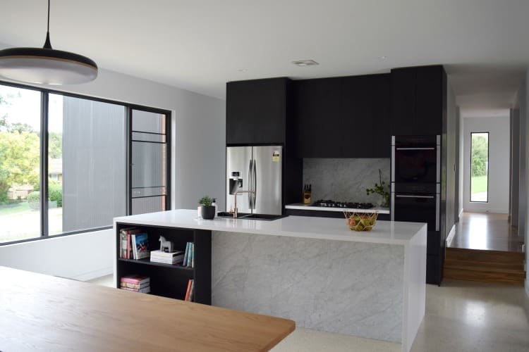
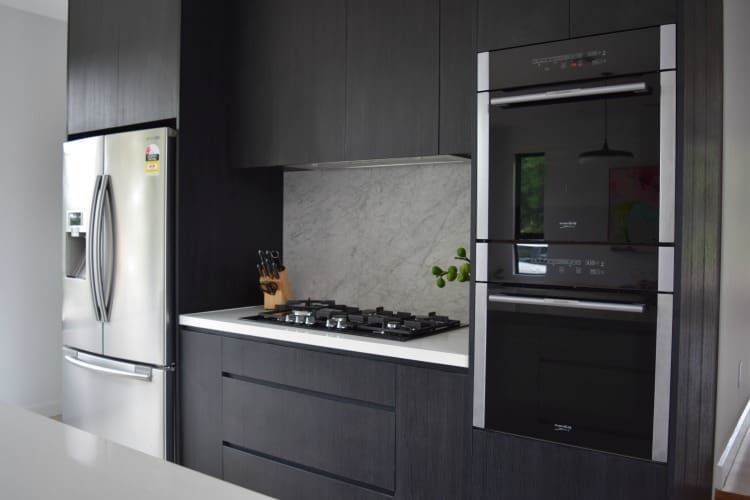
I’m so glad I took the time to consider the layout of our kitchen and have the fridge, sink and ovens within a few steps of each other. This is often called the triangle layout and you can read more about it in my kitchen planning post here.
Cabinetry
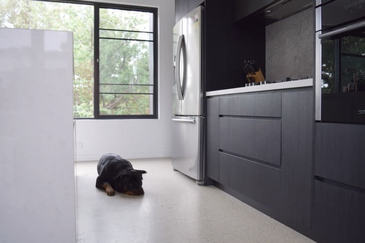
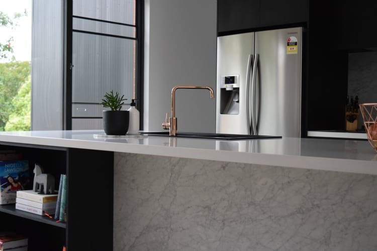
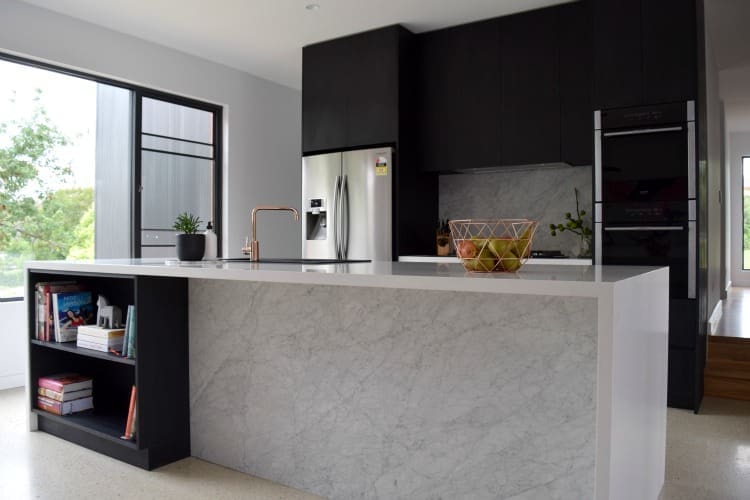
To say I was nervous about using black cabinetry was an understatement but I’m so glad I did! The timber grain in this product adds softness and I love the impact of it. And white cabinetry on the island works well to balance the space.
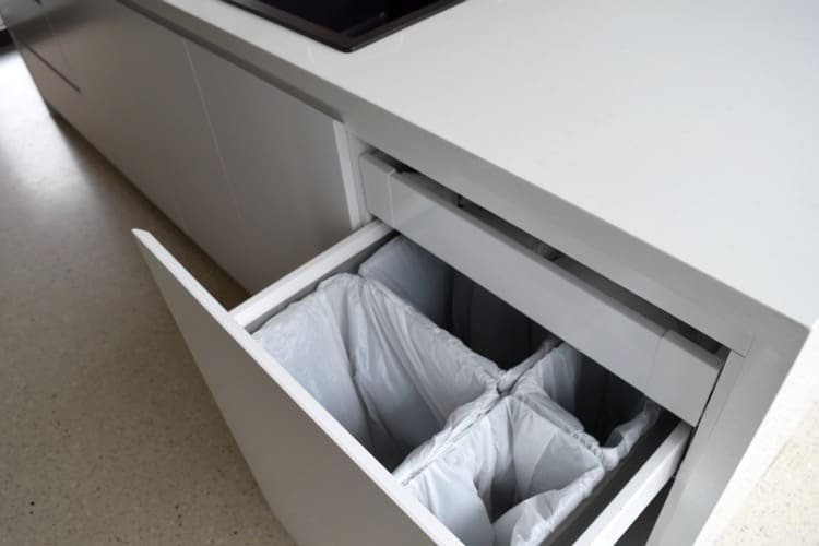
The deep drawers and high overhead cupboards are also great as I’m never struggling for storage space.
Stone
When I started planning the kitchen, I had my heart set on natural marble benchtops but I cannot tell you how many horror stories I heard about red wine, beetroot juice or turmeric completely destroying the stone. The last thing I wanted was a display kitchen that I wouldn’t be able to use and enjoy.
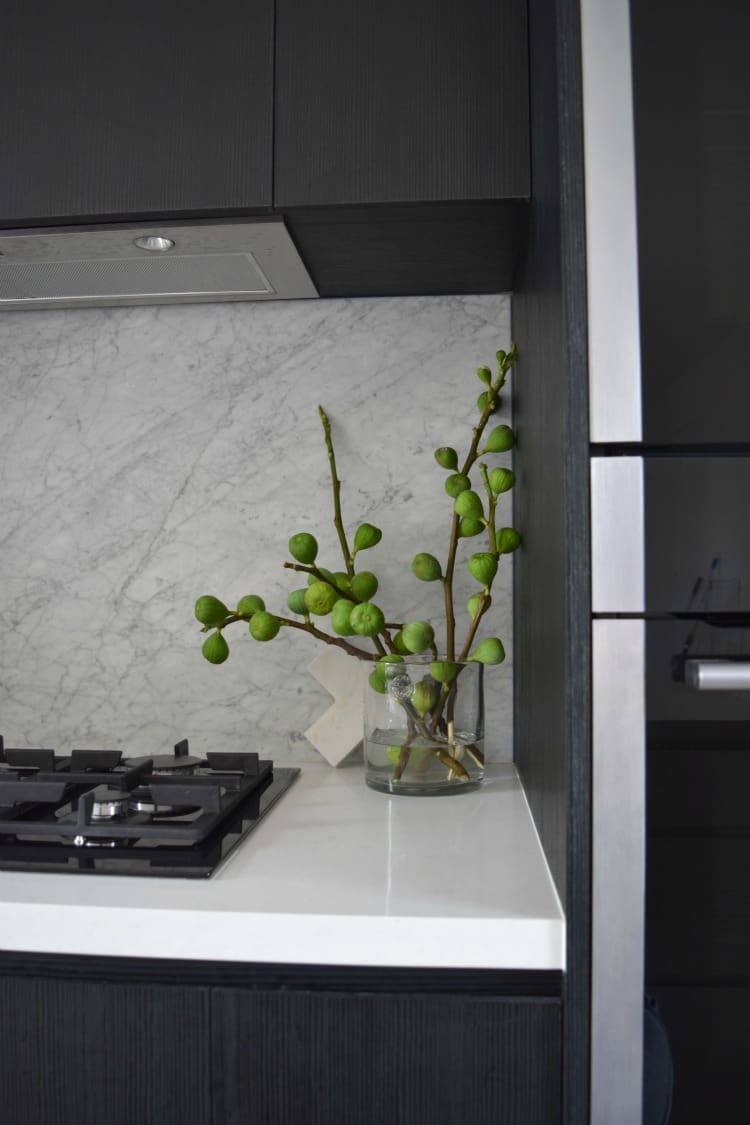
I came up with a solution of Caesarstone benchtops and natural stone splashback and kickback, and I think I love this combo even more than I would have an all-marble benchtop.
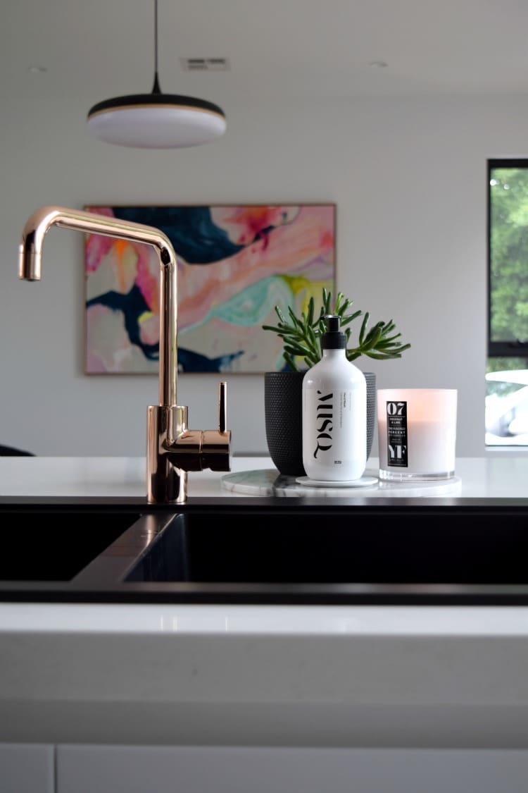
That copper tap!
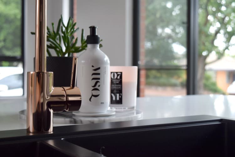
Last but not least, I’ve got to mention the copper tap. It was a splurge buy (and it took a bit of negotiating to get) but it adds just the right amount of bling, and the combo of marble and copper is just so dreamy!
Anything I would have changed
I’m honestly really thrilled with this room and have to think hard if there’s anything I would change.
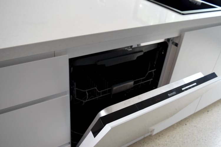
If I were being picky, perhaps I would have selected a larger sink with a drying rack area as I prefer to hand wash rather than use a dishwasher.
And the only other thing I may have done is add a powerpoint in the island bench. Most of my appliances are in the butler’s pantry (which I’ll reveal another time) and there are powerpoints along the kitchen wall but a powerpoint in the island could have been something I’d use if it were there.
The only thing I need to finish this space are some bar stools — got any suggestions?? I’d love you to share them in the comments below!
And I’m still considering if we need more lighting over the kitchen bench. Originally we were going to have extrusion lighting but with the dining pendant so close, it wouldn’t look right. At the moment I’m happy with the amount of light in our kitchen but who knows…
Update: I’ve since installed a ceiling mount black track light in my kitchen and you can see how it looks here.
Hi! Found your post as I was searching for black sinks and light counters. Beautiful! If you are still around and don’t mind me asking, I can barely find any pictures online of sink on stone that are not undermount, would you mind sharing how come you went with an over mount? Also, do you find it hard keeping the black sink looking clean?
Thanks so much!!
Eva
Hi Eva
Thanks for your lovely comment. We thought about an undermount sink but because we wash a lot by hand, we were worried about chipping the stone around the edges of the sink so went with top mount. I’ve seen so many stone edges chipped and felt that would bother me more than having the edge of the sink showing. And the black sink is so easy to keep clean. It’s a matte finish so it doesn’t show any marks 😉
Hi Gina, you have a beautiful home and a gorgeous kitchen! My question is where did you get your pendant light from?
I am in the hunt for something just like it. 🙂
Thanks
Thanks so much Nadia, I got the pendant light from Copper ID and you can see their range of lighting here https://www.copperdesign.com.au/ 🙂
Hi Gina,
Gorgeous space!
We are going to redo our kitchen and I am reducing walls. We have a galley style kitchen and the wall behind our oven side is load bearing. I had hoped to remove it and make a big kitchen island there as our lounge room is on the other side. Instead we are shaving the wall back so it will be flush with the kitchen bench/cabinets. Open plan so no framed door ways either side. Like yours. My issue now is skirting. I zoomed in and saw you stopped yours at the top of your stairs, ours is all on one level. Do you have more photos of both those walk ways into the kitchen? I desperately need some inspiration on how to do the skirting when the wall will be flush with cabinetry. Thank you.
Cheers, Amy.
Hi Amy, I’ll take some photos and email them to you later today 🙂 Very exciting about your kitchen though, what sort of materials have you selected for the space?
Hi Gina
Thanks for the reply. After reading your comment and looking through other homes home you are right!
I wonder if the white down lights these days don’t go yellow though? I remember years ago people used to complain about that but surely they have made them better by now?
Have yours yellowed at all? We are extending the back of the home, new open space of kitchen, dining and living. Can’t wait!!
Thetis
Ohhhh sounds like a fab project, I hope it’s tracking well! Our downlights haven’t yellowed at all – they are powdercoated rather than white plastic though which may have been the type to yellow? All the best with your extension 🙂
Hi Gina
Just want your thoughts on the white downlights?
Im trying to pick if I get brushed chrome or white?
Is white in at the moment? Is there a reason you picked white downlights?
Thanks so much, you have a beautiful home.
Thetis
Hi Thetis, thanks for your lovely comment. I love white downlights, mainly because they are discreet and blend into the ceiling whereas chrome tend to stand out and become more of a feature. Our white downlights have a fine rim and the lights are recessed back rather than sitting flush with the ceiling. I think it really comes down to personal preference if you go with white or brushed chrome though 🙂 Are you building or renovating?? x
Hi Gina! I have just found your wonderful Blog, and me being me, I headed straight to your kitchen! So glad to see you’ve used black – so stylish! The room looks perfect, such a beautiful look! I’m very black biased – have gone over the top with it in our home (the builders were v v stressed at times!) but I love it! Congratulations on your new home, can’t wait to read more about it on your blog!
Louise (From myglamhome.com)
Hi Louise,
I was nervous about locking in black cabinetry but it’s one of my fave features of the home so I’m so glad I did. I couldn’t find photos of your kitchen on your blog, have you shared it yet? I’d love to check it out 🙂
Your outdoor space is out of this world though! Who would think to add a submerged fire pit in the middle of the pool?!! Crazy cool, xx
Can you please tell me who the artist is the painting is Devine thanks Tracey
Thanks Tracey! The painting is a piece I had commissioned by Annie Everingham and you can find out more about her here http://annieeveringham.com 🙂
Congratulations on your new baby son. Hope all is going well.
I love your choice of colours in kitchen and bedroom and will be adopting some of your ideas.
Thanks and hope you are getting enough rest.
Kerrie
Hi Kerrie
Thanks for your lovely comment. The rest is up and down at the moment but he’s so adorable, it’s worth it 🙂
I’m so glad I could inspire some ideas for your home. Are you building or renovating? I’d love to hear more! x
was going to share tuckbox design. Copper base stools would look devine!
Hi Nicole
Sorry for my late reply and thanks so much for that fab suggestion! I especially love the geometric top of the Rex design by Tuck Box https://www.tuckbox.com.au/ I’ll add it to my shortlist of contenders 🙂
Yep, born and bred 🙂 I know right, the marble in there is lavish! The kitchen: Imagine the same shape as yours but with floor to ceiling joinery on the back wall (pantry/oven/integrated fridge) and then a shorter wall to the right with just a cooktop and range and then a mini butlers pantry beyond that. I was thinking about doing the back wall of joinery in the cladding and then powder grey stone island benchtop with white joinery. I’ve toyed with different splashback/kickbacks including marble (I’m favouring a grey with white vein), raw concrete, or even wrapping the bricks around the corner of the side wall. However, I’m not sure if a whole wall of the cladding in that space may be too overpowering so could just do the cladding on the kickback and then do the powder grey joinery on the back wall with white stone benchtops but I wasn’t satisfied with any of the combinations so I’ve left the kitchen for the moment and as you can see, I still have a lot to work out! My sparkle of choice will almost definitely be brass though 🙂
Well done, Gina, it’s beautiful! I am a massive fan of the black. We are using black cladding on our exterior (shou sugi ban) and considering using a bit of it in the kitchen so your pictures give me more confidence. I actually saw some at Locale in Deakin the other week and it looks amazing! Have you been there? The tap is definitely a showstopper. Love all your choices, you should be very proud! 🙂
Oh wow Jane, I didn’t know you were based in Canberra too, small world! Locale is just around the corner from me and I’ve had dinner there but can’t recall the black cladding – I’ll have to go back and have another look. I think I was too distracted by all the marble when I was there 😉
So tell me more about where you’re planning on using the black in your kitchen? Will you use the exterior cladding inside or a different material? Sounds great!
Hi Jane, I hadn’t heard of ‘shou sugi ban’ before so I just looked it up. Wow, looks gorgeous too!
Hi Anthea, I’m glad you like it! We’re actually planning to do it ourselves so I’m not sure how I’ll feel about it after we’ve fired hundreds of boards 😉
You’re living a dream Gina! The black is to die for, everything is so beautiful xx
Hi Alyson, how are you? I just shot our bedroom reveal today and included one of your gorgeous TANDA candles in it so I’ll be sure to tag you when I publish that one next month. Hope you’re well, xx
Gina, your kitchen is divine!! You must be so thrilled with this space. And the copper tap … love!
I’ll be very interested to see what you come up with for your stools. Stools are also on my wish list. I’m considering these by Tuckbox:
https://www.tuckbox.com.au/
(I’ve also seen them with a foot bar added which I liked).
Thanks for sharing your gorgeous home. Looking forward to the next reveal 😀
Hi Anthea, ohhh thanks for sharing those stools, gorgeous! Some that I’ve looked at are:
http://www.kindesignco.com/products/connect-bar-stool#
http://www.lifeinteriors.com.au/online-shop/bar-stools/miami-counter-stool
http://www.huntfurniture.com.au/collections/furniture/products/tri750-stool?variant=896449101 (with either black or copper frame)
Do you have a favourite from those?
I think a sideboard for our dining area will be my next furniture purchase so I’ve got a bit of time to decide or I was even thinking of trying to design and make my own… ha ha, not sure how that would go! 🙂
Looks fabulous!
Thanks love! x
What a beautiful and calm space. My favourite thing is the copper tap – it adds warmth to the monochromatic scheme. And the figs in the vase……I love them. So gorgeous. I’m sure you will cook many memorable meals in this space.
Thanks for your lovely comment Kirsten, I’m looking forward to making lots of happy memories in this kitchen 🙂