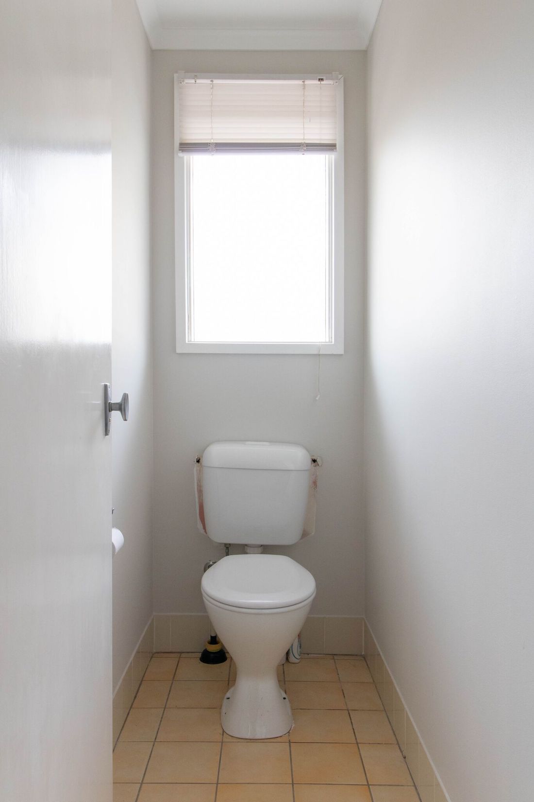
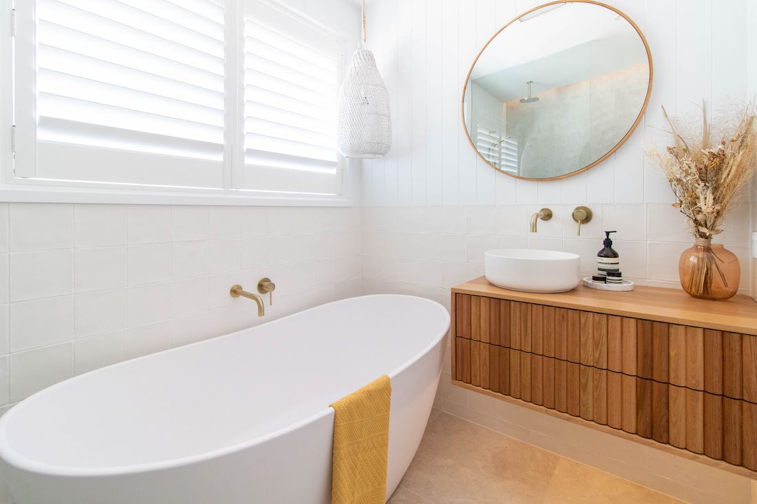
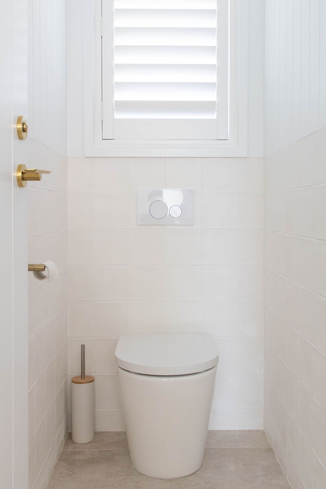
We know how much you love a good before and after and this one is a beauty! Designed and renovated by the team at ACT Renovations, this bathroom oozes sophistication while being inviting and livable. We chat with Craig, owner of ACT Renovations, to find out more about this luxe bathroom reno and of course get all the supplier details because we know you’ll ask!
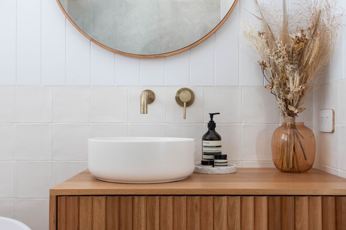
“The brief was to create a light feeling space which we achieved with a soft materials palette including square handmade tiles, Easy Craft wall paneling and that custom made vanity,” explains Craig.
Related article: Top interior designers share their tips on building a Hamptons style home
Related article: Indoor outdoor living with a peek inside the Kedron Street home
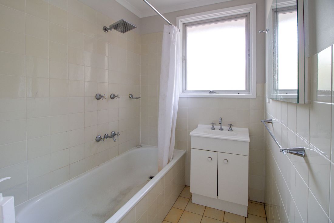
As you can see from those before and after bathroom photos, they transformed a poky bathroom into a spacious, light-filled space.
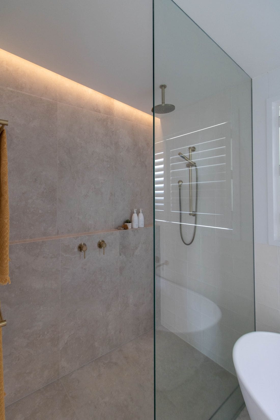
“The original bathroom had a shower over the bath and a goal for the client was to have a separate shower. We knocked out the wall to the laundry to tap into more floor space and created a European style laundry that can be accessed from the living room. This gave us much-needed space to create a generous walk-in shower and free-standing bath while still feeling spacious.”
The team also used a few tricks to create the illusion of space.
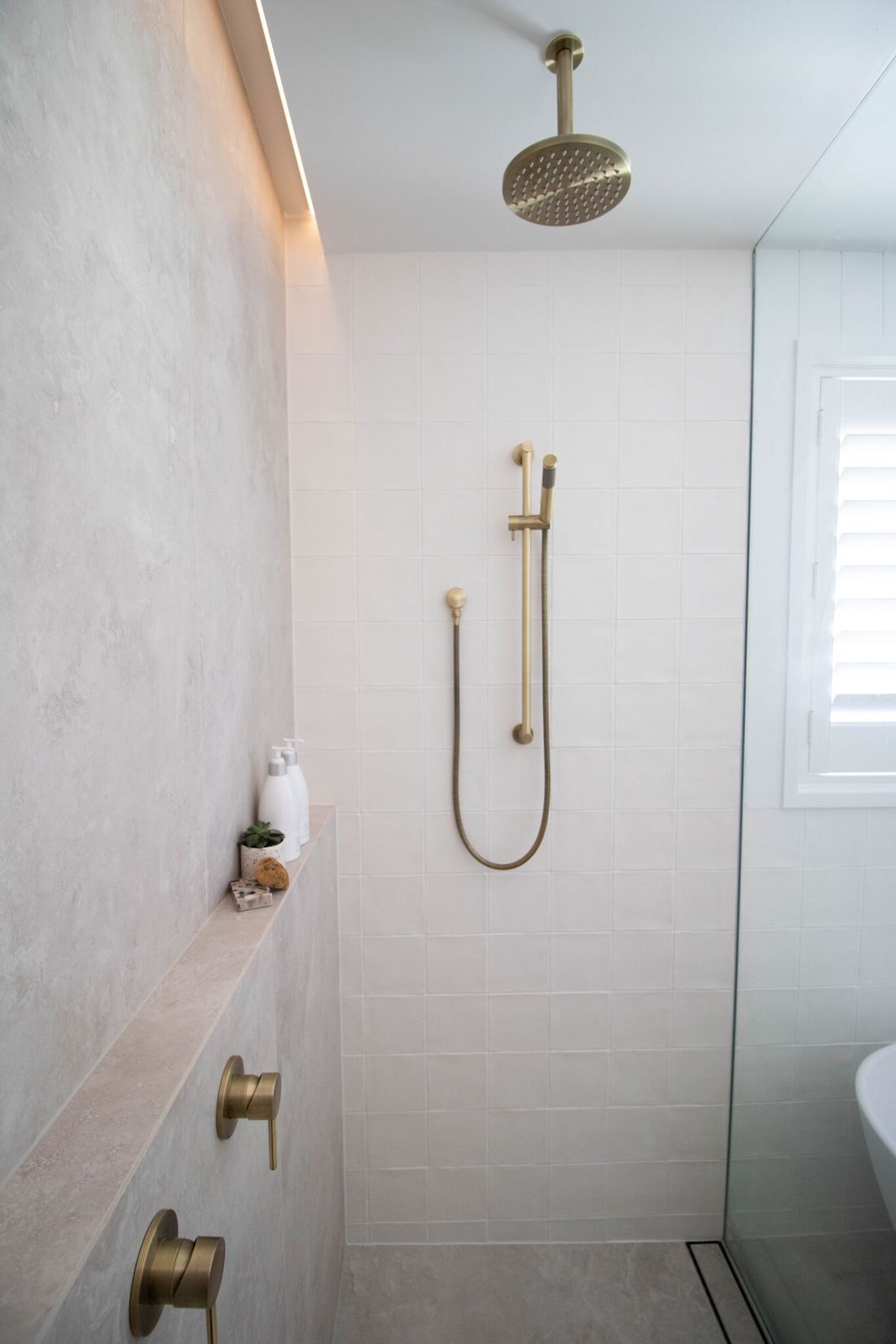
“My favourite feature are those large 1200×600 floor tiles that we ran vertically up the shower wall. It creates such a high-end look and adds to the spacious feel.
“Using blank space is another trick we used — the wall-hung vanity with LED lighting below, free standing bath tub rather than hob style that was there previously, and frameless walk-in shower.”
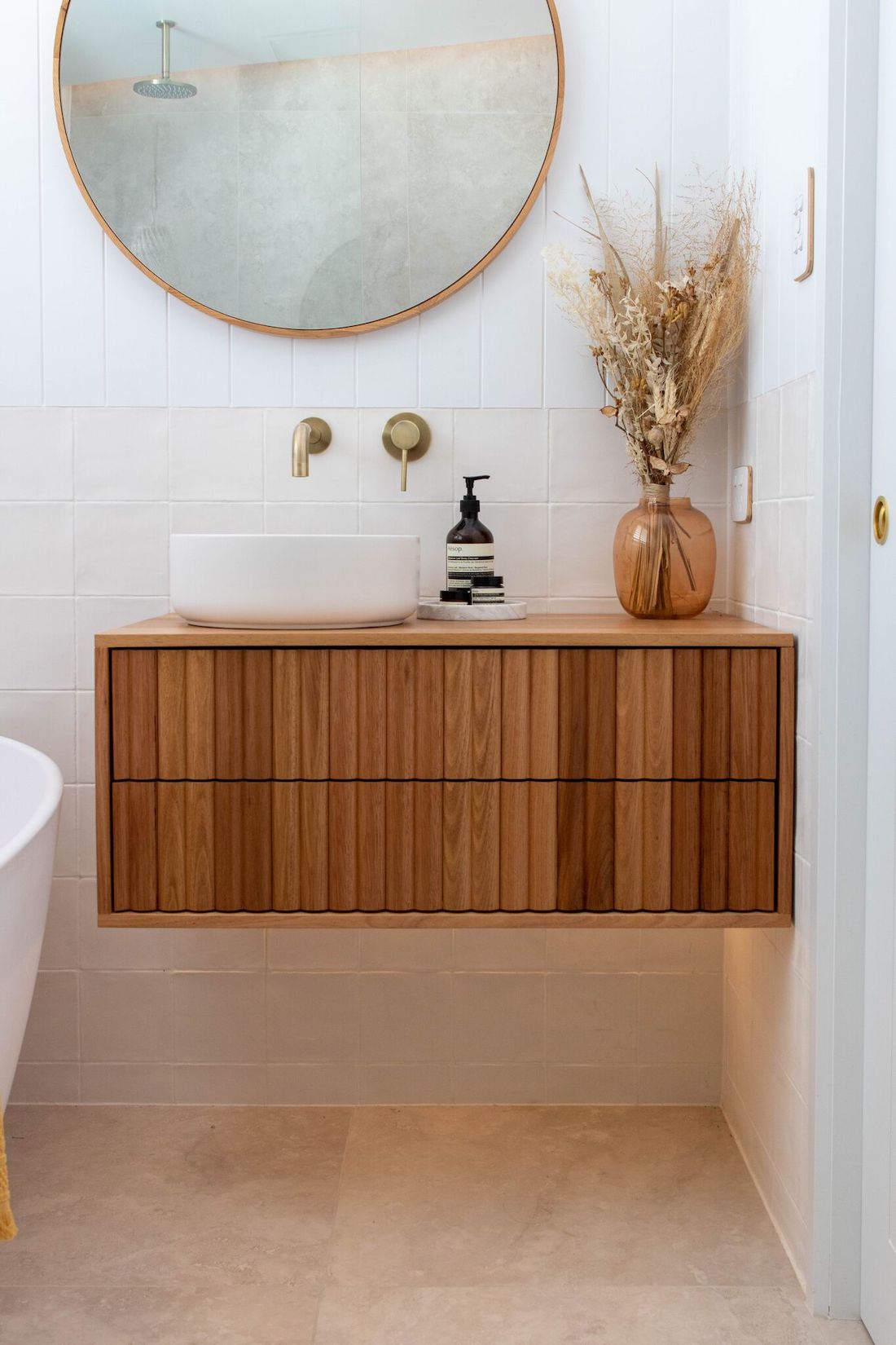
Boy did they nail the Hamptons luxe look, which is a more polished and high-end take on the coastal style.
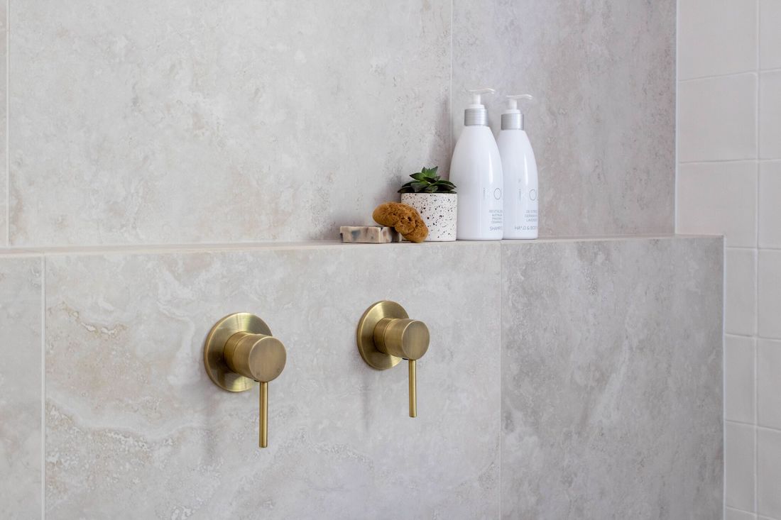
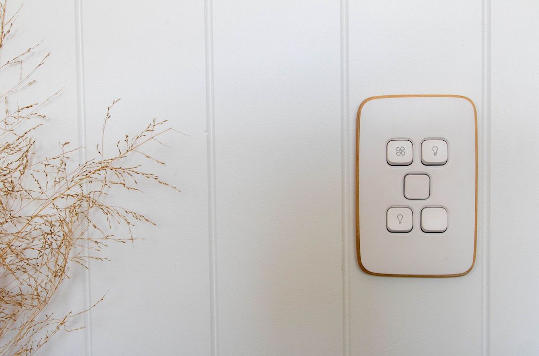
“We kept to mainly an all-white base but used texture to create interest. The metallic accents with the tapware (Tiger Bronze tapware by Meir) and mirror create a higher-end feel while the timber vanity and bamboo details around the Clipsal switches ground the space.”
Lighting plays a big part in elevating this bathroom and Craig explains how they did it.
“The pendant light over the bath from Lighting Collective is a hero element of the space and the client, who is also an electrician and owner of On Point Electrical, had it converted to 12V so it could be used above the bath.
“The more dramatic lighting trick we used was to create a bulkhead over the shower and leave a 100mm gap from the wall where we could recess LED strip lighting. This creates the illusion of the wall tile carrying up into the ceiling while also providing ambient lighting.”
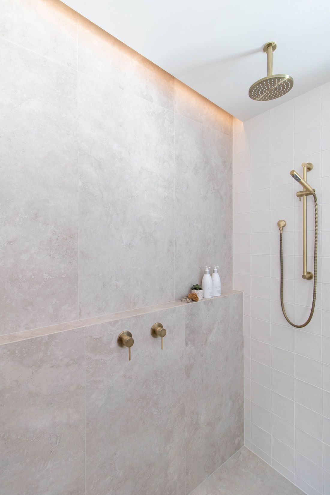
What makes this space feel so luxe to us though is the attention to detail and execution — we’ve seen incredibly expensive bathrooms look meh because of poor trades and vice versa.
“We took our time to get every detail right,” explains Craig.
“One of the biggest challenges was lowering the subfloor so there was no step into the bathroom. We also had quite a job to achieve the shower screen running into the ceiling, which we did by installing the ceiling after the glass was in position. Using tricks of L-beads and movement joints, we were able to keep the glass perfectly in place and achieve a seamless look.
“Lots of details aren’t visible, such as the vents we ran along the side walls to keep them out of sight, and that’s helped us to create a polished, clean look in here.”
Thanks to the team at ACT Renovations for letting us share this luxe bathroom reno. If you’ve got any questions about the project, post them in the comments below. You can also follow ACT Renovations on Instagram for loads more of their reno projects.
HI Gina, absolutely LOVE the light switch covers. Please can you share where they are from? Thanks
Hi Kate, those switches are by Clipsal and you can find more info on their website here https://www.clipsal.com/products/clipsal-iconic-essence 🙂
Hey! Stunning work!
Ive searched far and wide for this vanity and cannot seem to find it or similar anywhere! I don’t suppose you know where it was sourced? Thanks in advance!!
Hi Lucy, thanks for your lovely comment. The team at ACT Renovations sourced this vanity from Ingrain Design https://www.ingraindesigns.com.au/ 🙂
Oh that’s fantastic, thanks so much!
Hi Gina,
What a beautiful look you have chosen for your bathroom! Thank you for sharing!
We are thinking of going with similar floor tile like you did in our bathroom and extending it on the shower floor too. I wanted to ask you if you are happy with your choice. I’ve read that large format tile can be very slippery in the shower and it’s recommend to go with mosaic. I’m really not a big fan of mosaic tile and would prefer to go with large format but I’m a bit concerned about safety. Any words of wisdom here? Thank you!
Hi Victoria, so glad you liked this bathroom by ACT Renovations 🙂 This one isn’t at my house but I did just renovate my bathroom with large format tiles too.
The slipperiness of tiles is determined by finish rather than size. Matt is the least slippery finish you can use in a bathroom, then there’s lapatto (semi-polished) and gloss (polished).
It is true that a small mosaic is generally less slippery as there is more grout (a cement-like substance), however it brings with it other issues… grout is the weakest part of tiling and most prone to cracking and discolouration.
Hope this helps 🙂
Hi Gina,
Just stumbled upon this post as I’m about to commence putting an en-suite in and wanted to know if you have a list of items you used for this project? I love the vanity, fittings and the floor tiles especially. W’re going to do the same ledge style shower & fixed glass panel (hopefully to the ceiling too). We have a long narrow space to work with (1100×3350) so I’m just trying to work out the best use of space for us to make it feel larger than what it is! keeping it light and bright, with white/grey tones and some panelling probably, as well as a skylight above the shower. My major question is – I love the brushed brass/bronze fittings you used here. I would have to carry that throughout the whole house eventually wouldn’t I? Do you think it will date, when compared to brushed nickel? Do I need to keep all metal fittings the same finish – including doors? (our current door handles in the rest of the house are an art deco antique copper but seems to go well with the coastal/hamptons style we’ve got going on).
Looking forward to hearing your thoughts! Thanks!
Hi Jessica,
That’s so exciting about your ensuite! The tapware is the Tiger Bronze range by Meir, the floor tile is called ‘Perugia’ and the wall tiles are 150×150 square handmade tiles called ‘Milano’. ACT Renovations had the vanity custom made by Ingrain Designs.
I don’t think you need to use the same tapware and fittings throughout your whole house so long as there is an overall style or elements of consistency that connects the spaces. It’s common for people to use a different tapware finish for their kitchen, for example, or the tapware in their ensuite where they want to have a luxe feel.
Brushed nickel is coming through as one of the latest tapware finishes and it’s a little more muted so you may get more longevity in terms of what’s ‘trending’. But all finishes have their moment and then there’s a new finish that takes over before they come back in again. Also some finishes are better suited to particular interior styles than others and you can never really go wrong with brass and Hamptons! Ultimately, I generally tell people to pick what they love because then you’ll care less about whether something appears dated or not.
There is a new tapware finish that’s just been released by Astra Walker called ‘Tuscan Bronze’ https://www.astrawalker.com.au/finishes/tuscan-bronze which may be a good fit for your antique copper handles if you do want to keep all finishes the same. Although forewarning, their tapware isn’t cheap!
Hope this helps x
Thanks Gina! Very helpful indeed. I’ll check out all of those tiles and see whats in stock for me now.
Good to know that I don’t necessarily need to keep the same colour tapware throughout the entire house. As you mentioned, the ensuite could be the ‘luxe’ room for us. So i’m thinking the brushed brass would be nice and luxe! I love those Tuscan bronze fittings, but yes, very pricey! Might stick to the brush brass ones from ABI interiors that are much more affordable!
Thanks again! Hopefully it all comes together nicely for us!
Glad it was helpful Jessica and I’d love to see pics of the space once it’s done 🙂