We’ve just returned from the ‘Haymes 2015 colour forecast’ preview and are excited to share with you the hottest colour trends for next year.
At the Den in the Ivy, we were treated to a sensory journey around five stations designed to stimulate our five senses. Each station showcased one of the five trends that make up Haymes’ 2015 Colour Expressions Forecast.
Related article: Top interior designers share their tips on building a Hamptons style home
Related article: Colour and emotion: How to select colour for the mood you want to achieve
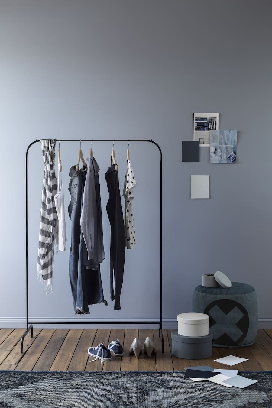
New skin
The muted tones at ‘New Skin’ and ‘Exotic Botanic’ were our favourites and we are already planning some DIYs using these colours!
‘New Skin’ is inspired by the familiarity and comfort that you get from your favourite pair of jeans — a feeling of a second skin. This relaxed, cool theme explores denim-related textures and colour tones and how these translate within the home. Filled with deep blues and greys, it’s hard for us to pick a favourite colour from this luxurious yet homely colour palette!
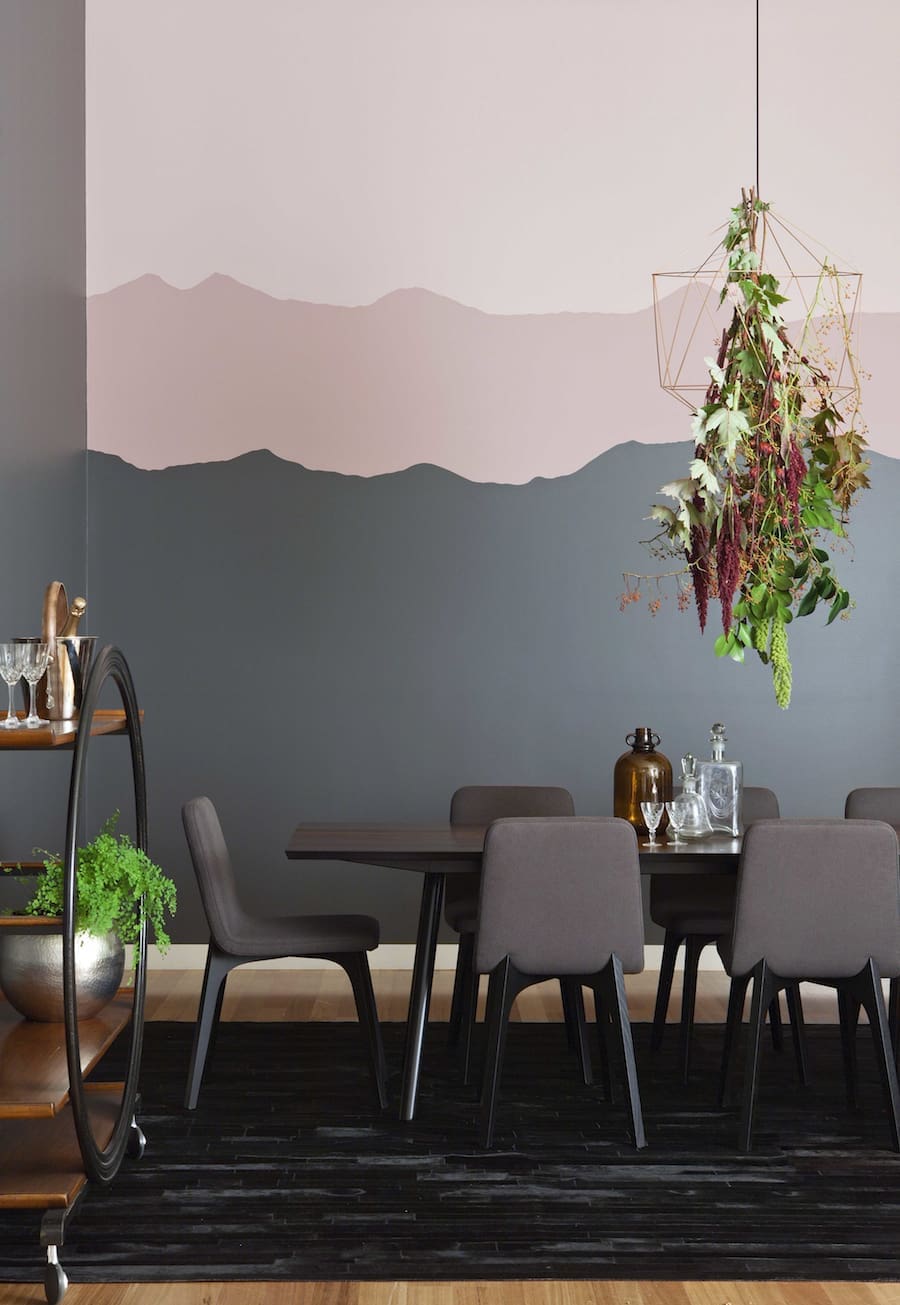
Exotic botanic
Nature’s beauty was the inspiration behind the ‘Exotic botanic’ colour trends. We loooooove ‘Ash Grey’ (a soft blue/grey hue) and ‘Dusty Beige’ (a muted pink) for the home. These tones are ideal if you are creating a space of depth and affluence.
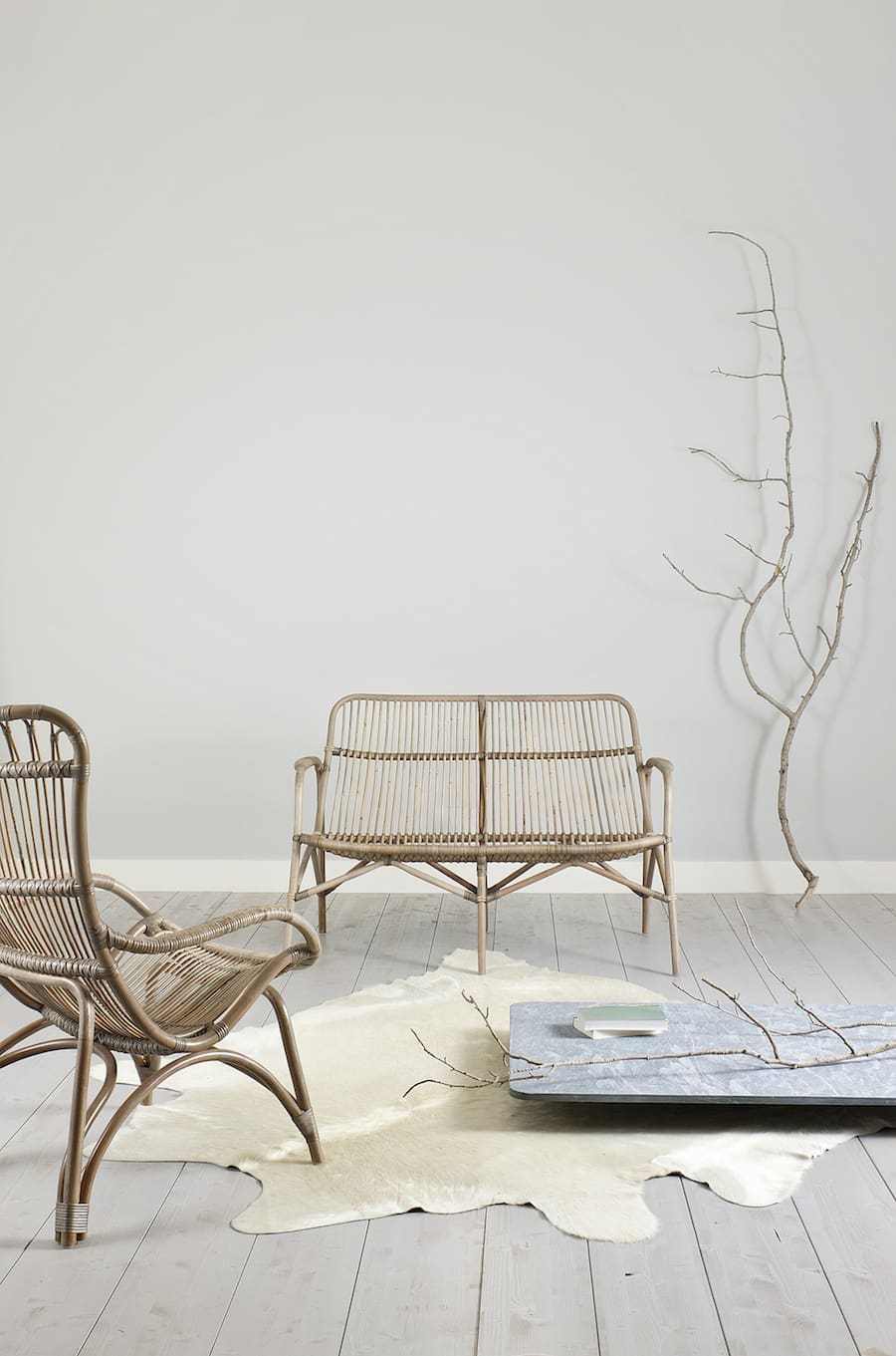
Raw
If you prefer a more earthy and neutral colour palette, the soft hues in ‘Raw’ will be just your thing. This palette, including ‘Phantom’, ‘Rockslide’ and ‘Taupe Shadow’ (our fav), is very subdued and the perfect base for any interior styling.
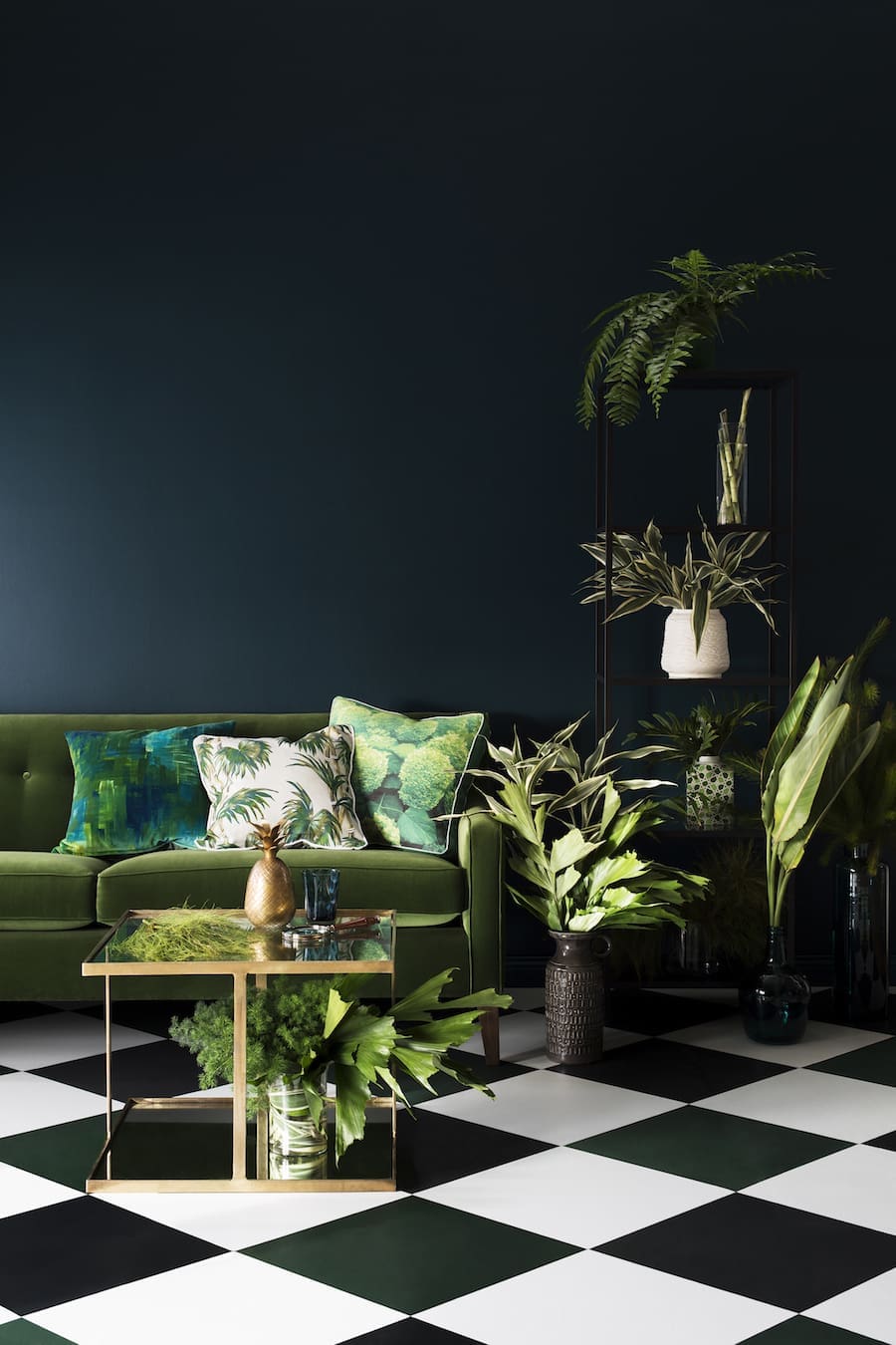
Rhythmic palms
‘Rhythmic palms’ explores the notion of escapism and replenishment through a deep, rich palette that amplifies colour and pattern. Combining dark charcoals and lush greens, this colour trend presents a fresh and crisp take on what lies beneath the treetops.
Relaxed replay
Looking for a burst of bright colour? ‘Relaxed replay’ takes a step back in time to bring a retro revival theme influenced by Miami Beach. Hot pink ‘Charlotte’ and sherbet yellow ‘Sunburst’ are a few of the bold and effervescent colours in this palette.
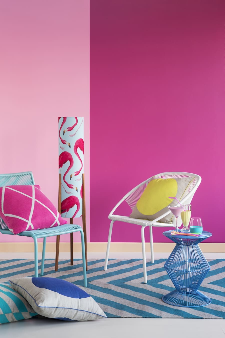
Have we helped inspire you to make a more daring colour choice? Tell us your favourite colours from the Haymes colour expressions forecast in the comments below!
More design inspo
Credit to Ruth Welsby for styling and Martina Gemmola for photography.




The hot pink is my favourite and I could imagine splashes of it working wonderfully with a neutral hue 🙂
Wow Julia, that’s a brave choice! It is a beautiful colour and agree it would look great as a feature wall.
Love these, do you think those blue grey colours will look good with light yellow based cream floor tiles? Looking to paint but worried it might accentuate the yellow too much.
Hi Ashleigh,
Good question! We would suggest using colours from the opposite side of the colour wheel, so those with a blue or purple base, to compliment your tiles. A nice, warm grey colour would be ideal 🙂