
There’s no denying that colour can influence the way we feel. Plenty of studies link the effects of colour to emotion. For example, think of when you stepped into a crisp white interior and the sense of airy calm that washed over you. Or when you’ve entered a dark space and felt the allure and drama.
So how can we tap into colours to set the mood we want in our home? We delve into colour psychology in interior design and explain the links between colours and emotion. Keep reading for tips on how to select colour for the mood you want to achieve in your home.
Related article: How to select paint colours to make a room feel larger
Related article: Deep and moody living spaces: Embracing dark colour schemes
What is colour psychology?
Have you ever walked into a room and instantly felt calm? Or perhaps energised, cosy or inspired? Chances are, colour had a lot to do with it.
Colour psychology is the study of how different colours influence our emotions, behaviour and perception. While our personal experiences and cultural backgrounds all play a role, certain colours are widely associated with particular moods. That’s why you’ll often see calming blues in bedrooms, earthy greens in living spaces and vibrant yellows in creative areas.
When designing your home, colour psychology can be a helpful tool for creating spaces that not only look beautiful but also support the way you want to live. Looking to create a peaceful retreat? Soft greens, warm neutrals and muted blues are all excellent choices. Want your dining room to feel warm and welcoming? Rich earthy tones or terracotta may be a better fit.
Colour is one part of the design story
While colour plays an important role, it’s only one piece of the puzzle. The amount of natural light a room receives, the direction it faces, your furniture, flooring and even the finishes you choose will all influence how a colour looks and feels.
For example, the same deep green paint can feel rich and cosy in a sun-filled living room, yet appear much darker in a south-facing bedroom with limited natural light. That’s why it’s always worth testing paint colours in your own home and viewing them at different times of the day before making a final decision.
We always encourage people to think about colour as part of the overall design. When you combine the right paint colour with complementary textures, lighting and furnishings, you’ll create a space that not only looks beautiful but also feels exactly the way you want it to.
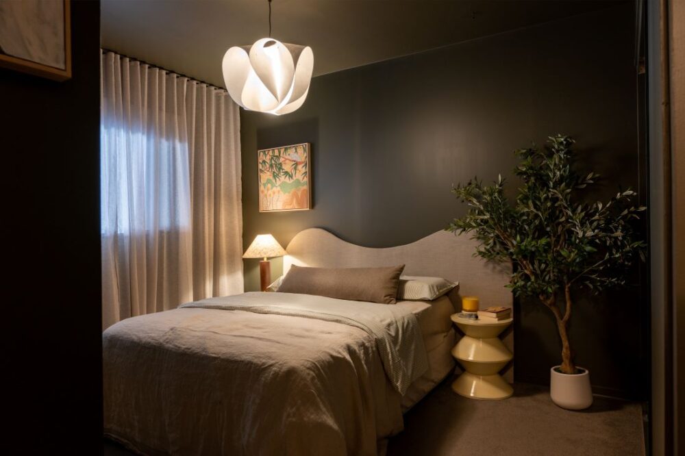
The meaning behind colours
Whites and pastels
Whites and neutrals represent purity and innocence and can be warm or cool depending on where it sits on the colour wheel. Warm whites and neutrals have an undertone of red, orange or yellow. Whereas cool whites and neutrals have an undertone of green, blue or purple.
Pastels can add character and originality to a contemporary home. The soft, muted tones create beautiful spaces. Pastels can create a subtle yet fresh look — ideal in nurseries, living rooms and bedrooms.
Whites and neutrals are timeless, adaptable and help other colours stand out. Many homeowners choose neutral bases and add personality through accents, artwork or furniture.
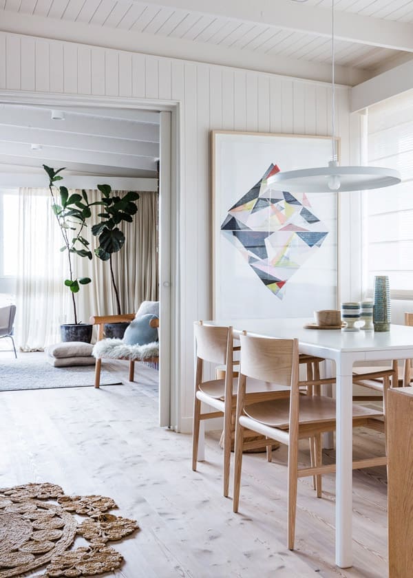
Pinks
Pink is the ultimate colour of femininity. Ranging from soft pink to hot fuchsia, it’s associated with love and romance.
While we often only associate pink paint with nurseries or girl’s rooms, you can find sophisticated shades that aren’t too sweet.
Dusty, coral or beigey pinks look great in any room of the home, like this intimate bedroom.
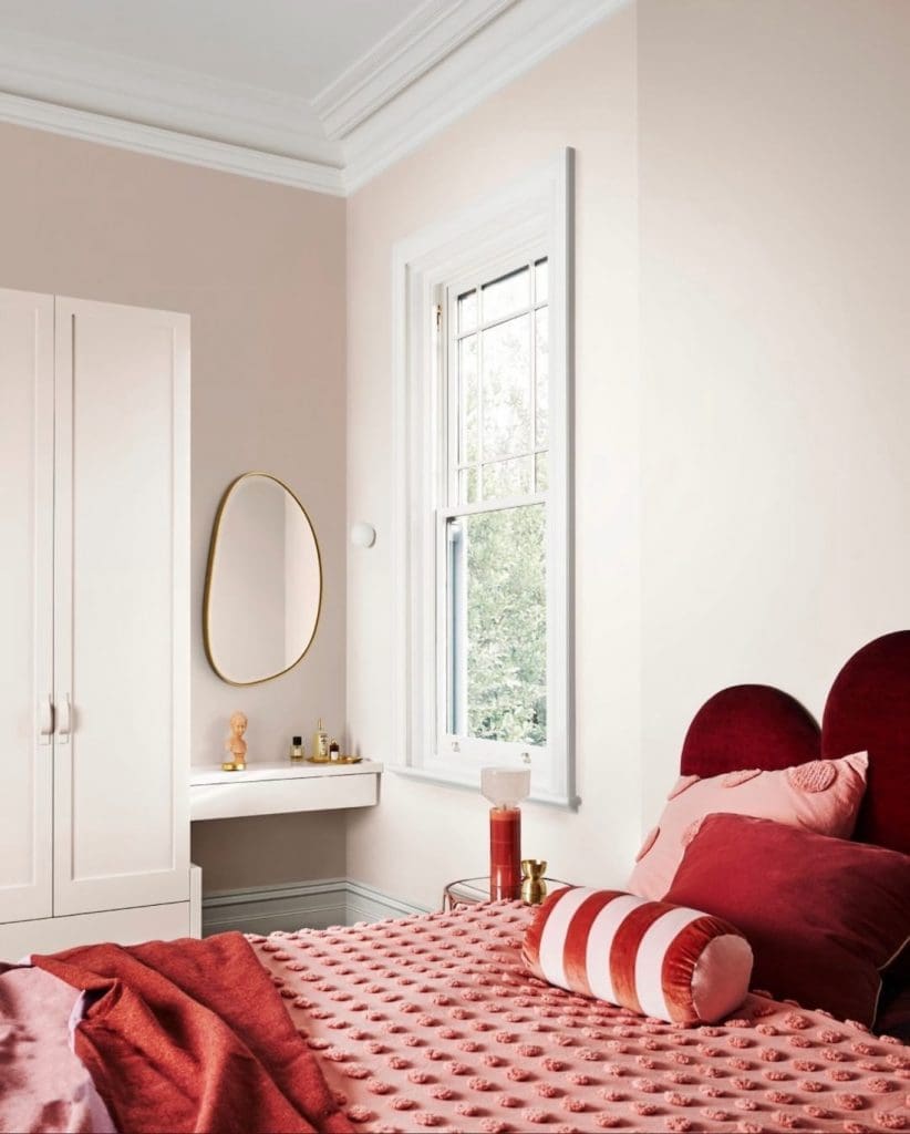
Purples
If you want to create a rich and luxurious interior, opt for purple. It’s known as the colour of royalty and is also associated with spirituality.
While vibrant purple colours may bring back memories of your childhood bedroom, there are more sophisticated shades you could use in main living areas. For example moodier, darker purple-black tones and more romantic mauvey-purple colours too. And at the moment, soft lilac tones are trending.
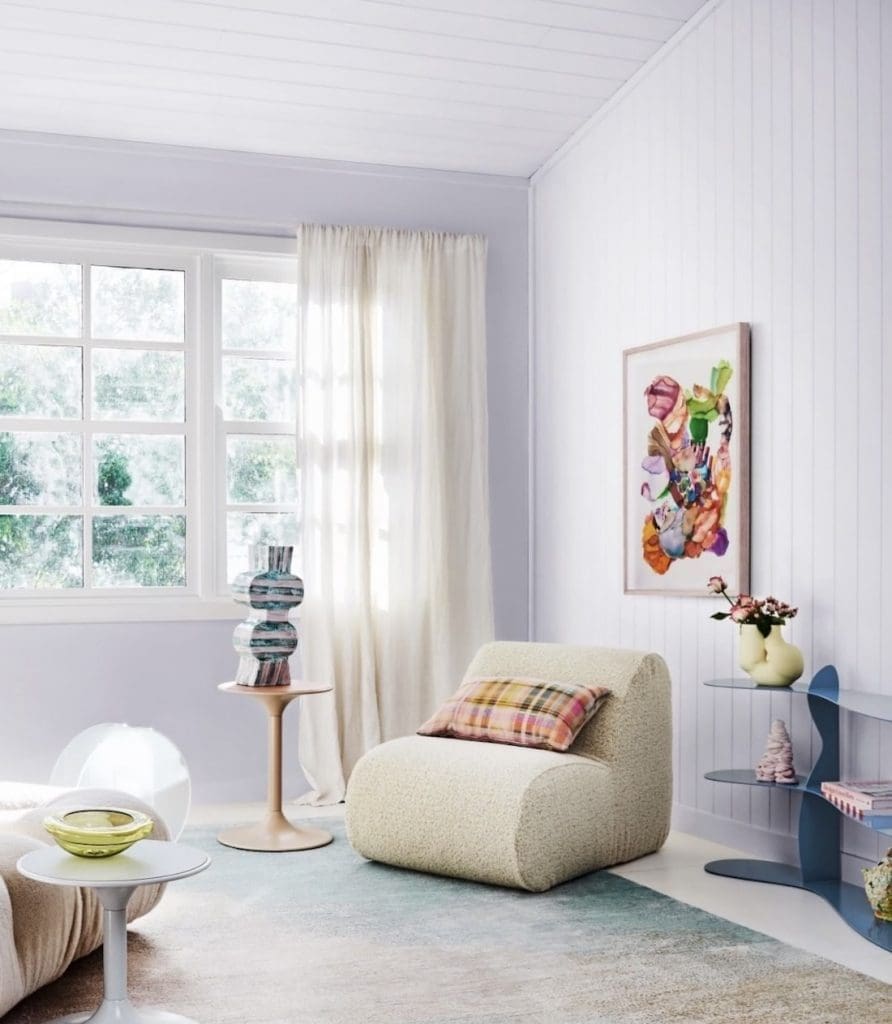
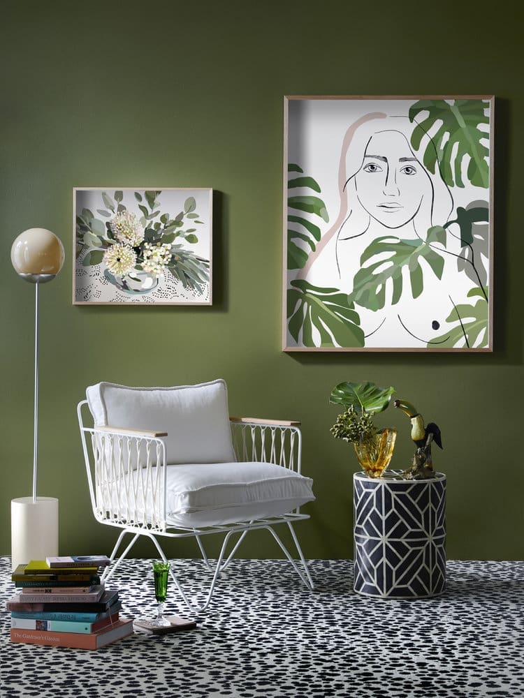
Greens
Green is the most common colour in nature and represents balance. It is considered to have a refreshing, restorative and revitalising effect. Studies show it can ease anxiety and promote feelings of renewal, making it ideal for living rooms or shared family spaces.
Combining the calming quality of blue and the cheerfulness of yellow, green is suited to every room in the house. In the living room it encourages unwinding and togetherness. And in the bedroom it helps to relieve stress — especially when paired with indoor plants. While in the kitchen green is said to cool things down.
“Colour can completely change how you feel about your home,” says Sophie Grover, Owner and Managing Director of SG Coatings. “The right shade not only complements your design but also creates a sense of harmony. We often see clients fall in love with their space all over again once the walls reflect their personality and the atmosphere they want to live in.”
Yellows
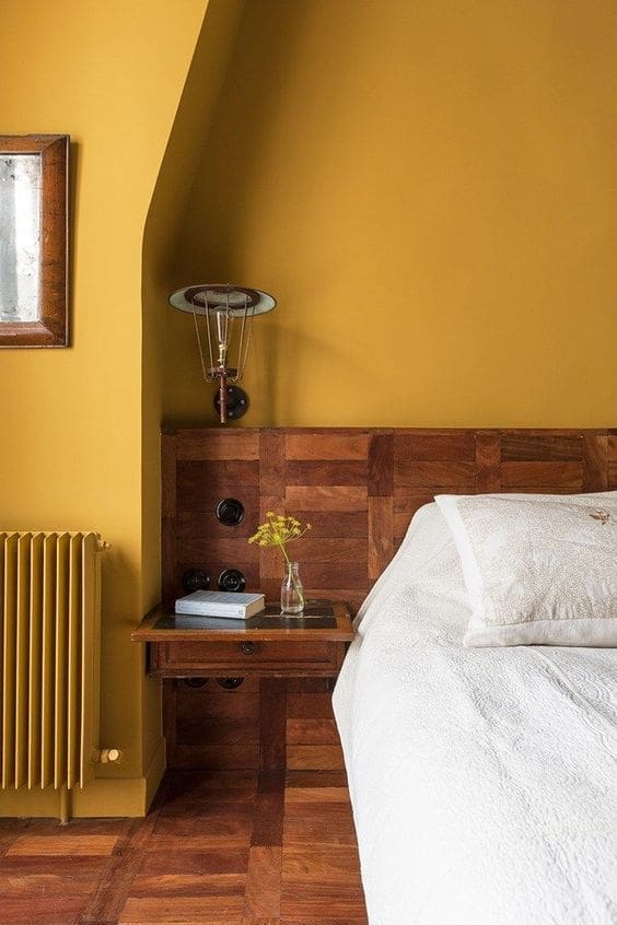
For a bright, cheerful and warm room, select a shade of yellow. This colour is symbolic of optimism and can lift mood. It adds a burst of sunshine when used as a highlight and can be paired with earthy tones to soften the look.
Use yellow carefully. In small doses, it feels welcoming. But in large doses, it can become overstimulating.
While canary yellow might be a bit much for most of us, a more muted tone like this muddy-yellow is an easy way to inject pops of yellow into your home.
Designer tip: buttery yellow is emerging as a trending colour so if you want to introduce hints of yellow, we suggest going for this soft, muted shade.
Oranges
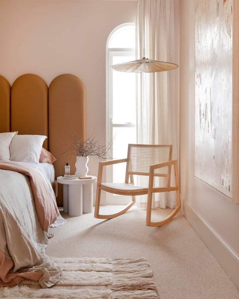
A colour as powerful as orange can create a strong statement. It is emotionally stimulating, energising and vibrant.
Orange may not be the best colour for your bedroom where you want to unwind but the closely related colour peach is a great choice. Just take a look at that gorgeous bedroom by Three Birds Renovations below.
You could use a more intense shade of orange in an art room where you want to promote creativity. Or orange could be used in an exercise room where you want to unleash energy.
Browns
To achieve a feeling of being ‘down to earth’ embrace the colour brown. Brown represents reliability, security and responsibility and creates a feeling of warmth and comfort.
If the sound of brown paint is less than appealing, think again! You can find shades that are grounding and design forward.

Reds
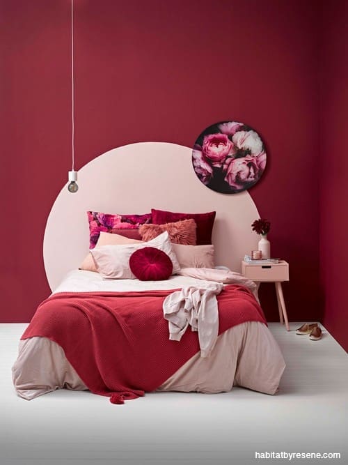
For a powerful colour that manifests feelings of love, warmth, comfort and passion, use red (just be sure to use it well!). This bold, confident and stimulating colour can bring warmth and passion to a space.
Red enhances the appetite, which is why it can be seen in many restaurants. A vibrant, saturated red is said to raise the heart rate and can be quite uncomfortable to live with. However, a muted version is luxurious and cosy.
Red raises energy levels so it can be a good choice in the living or dining room where you want to stimulate conversation, or in an entry to make a strong first impression.
Blues
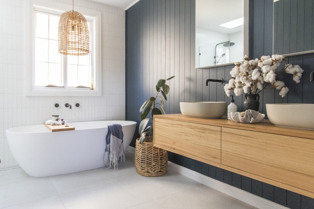
Blue is the most calming colour in the spectrum. It represents security, orderliness and tranquillity. Blue is often used in areas where you want to achieve a calming effect, such as in the bathroom.
Add hints of green for teal which complements any style and creates a feeling of serenity and depth.
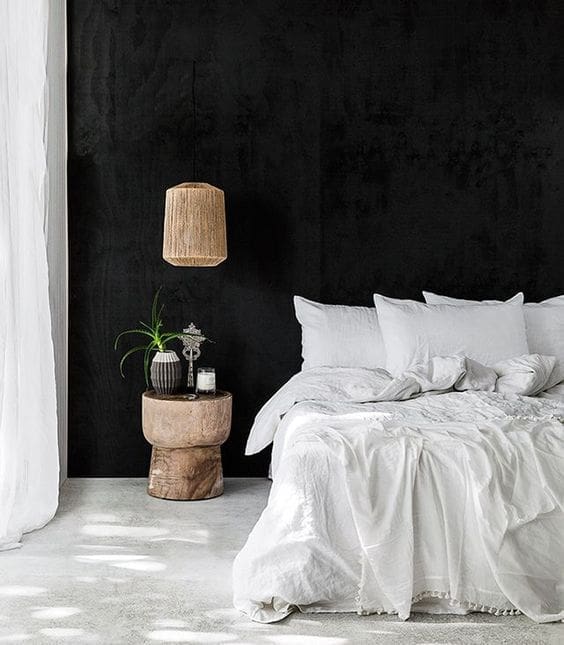
Black
Black is a powerful colour. When softened with other colours it can create the ultimate style statement. Sophisticated and classy, use black as an accent colour to balance and ground a room.
Some interior designers and colour experts believe every room needs a touch of black to ground the color scheme and give it depth.
Check out our round up of the best black interiors.
How colour shapes emotion
Colour psychology has been studied for decades and while personal taste always plays a role, the rules of colour theory remain consistent. Warm colours like reds, oranges and yellows tend to stimulate and energise. Cooler shades like blues and greens help people feel calm and focused.
A study published in Frontiers in Psychology found that blue and green environments can lower stress levels and support relaxation, while warmer tones increase alertness and excitement. It’s one of the reasons professional painters often recommend cooler palettes for bedrooms and warmer, brighter shades for kitchens or living spaces as each supports the natural mood of the room.
Creating balance in every room
Colour affects not only mood but also how we perceive space. Light colours reflect more light, helping smaller rooms feel open and airy. Darker hues absorb light, creating a sense of depth and intimacy.
If you have a smaller room that feels cramped, soft off-whites or pale greys can visually expand it. For large open-plan spaces that feel cold or echoey, deeper tones such as sage, terracotta or charcoal can make them feel grounded and inviting.
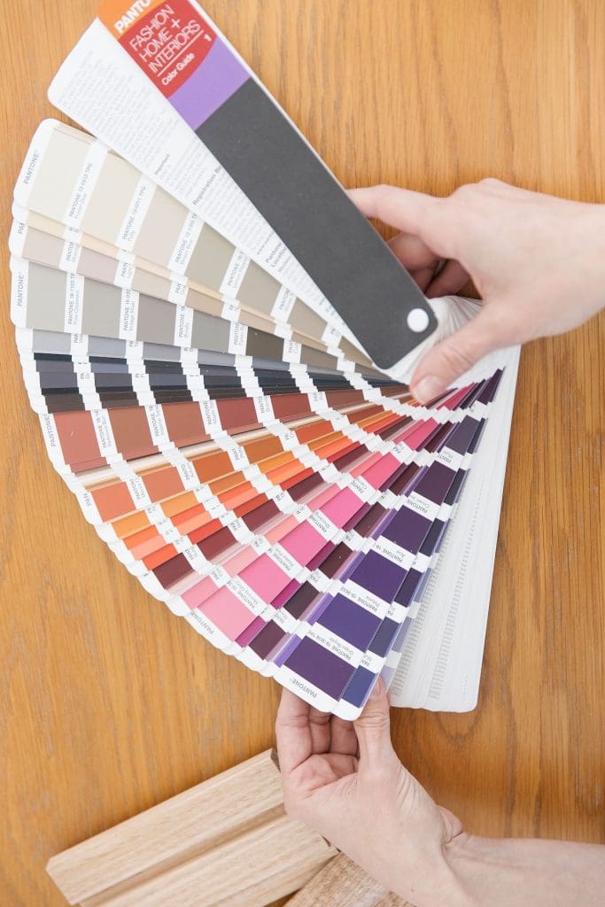
Lighting plays a key role too. Natural light enhances colour differently throughout the day, while artificial lighting can alter tones altogether. Warm lighting softens cool hues, while cooler bulbs make warm tones feel more vivid. When choosing paint, it’s important to test samples at different times of day to see how they shift in your space.
Frequently asked questions
What is colour psychology in interior design?
Colour psychology is the idea that different colours can influence how a space feels and how we respond to it emotionally. While personal preferences vary, colours are often associated with particular moods. For example, blues and greens are typically considered calming, while warmer colours like terracotta and mustard can make a room feel cosy and inviting. When combined with good lighting, furniture and styling, colour can help create a home that supports the way you want to live.
What colours make a room feel calm?
Soft greens, muted blues, warm whites and gentle greys are popular choices for creating a calm and relaxing atmosphere. These colours work particularly well in bedrooms, bathrooms and reading nooks where you want to unwind at the end of the day.
Which colours make a room feel bigger?
Light colours generally make a room feel larger and more open because they reflect more natural light. Whites, off-whites, pale greys and soft neutrals are all excellent choices for smaller spaces. However, this relies on natural light so if your space gets limited sunlight, you may want to take the opposite approach and lean into a moody palette to create a cosy, enveloping feel. Painting the walls, ceiling and trim in similar tones can also help create a greater sense of space.
What colours make a room feel cosy?
Darker, richer colours tend to create a cosy and intimate atmosphere. Deep greens, navy blues, charcoal, chocolate brown and earthy terracotta are all great options for living rooms, bedrooms and media rooms. Layering these colours with warm lighting and natural textures helps prevent the space from feeling too dark.
What colour is best for a bedroom?
The best bedroom colour depends on the mood you want to create, but soft greens, blues and warm neutrals are timeless favourites. These colours feel restful and pair beautifully with natural materials like timber, linen and wool to create a relaxing retreat.
What colours work best in a home office?
A home office should feel motivating without being distracting. Greens are often associated with balance and focus, while soft blues create a calm environment for concentrated work. If you want to encourage creativity, consider adding warmer accent colours through artwork, accessories or furniture rather than painting the entire room.
Can colour affect your mood?
Colour can influence how a space feels, but it’s only one part of the overall design. Natural light, room size, furniture, textures and your own personal experiences all contribute to how you respond to a room. Rather than relying on colour alone, think about how all of these elements work together to create the atmosphere you want.
Should every room in the house be the same colour?
Not at all. While it’s important to create a sense of flow throughout your home, each room can have its own personality. Repeating complementary colours, materials or finishes throughout the house helps create cohesion while still allowing individual spaces to feel unique.
What is the 60-30-10 colour rule?
The 60-30-10 rule is a simple decorating guideline that helps create a balanced colour scheme. Around 60% of the room should feature your dominant colour (usually the walls), 30% should be your secondary colour (such as furniture or rugs), and the remaining 10% can be an accent colour introduced through cushions, artwork or décor.
What’s the biggest mistake people make when choosing paint colours?
One of the biggest mistakes is choosing a paint colour based on a tiny paint chip or how it looks online. Always test large sample swatches in your own home and view them at different times of the day. Natural light can dramatically change how a colour appears, so taking the time to test it first can save you an expensive repaint.
There you have the basics of colour theory in interiors! Did this guide on how to select colour for the mood you want to achieve help you? We’d love to know if you used these tips to select paint colours for your next project. Tell us in the comments below!
More reno tips
This article was first published in January 2019 and continues to be updated with latest information and images