

When you walk into a room, you may not notice the exact hue of the walls but you often immediately feel something. Some spaces feel calm and relaxing, others energising or uplifting. Much of that comes down to colour. The tones we surround ourselves with can subtly influence mood, behaviour and even how big or small a space feels.
The team at SG Coatings see this every day across homes and businesses in Melbourne and the Mornington Peninsula. The right colour choice can completely transform how people experience their environment. It’s not just about aesthetics — it’s about how colour shapes the way you experience your space, creating environments that feel comfortable and connected.
Related article: 5 most popular house facade colour schemes in Australia for 2025
Related article: 2025 design trends: 5 interior wall colours you will love
How colour shapes emotion
Colour psychology has been studied for decades and while personal taste always plays a role, the rules of colour theory remain consistent. Warm colours like reds, oranges and yellows tend to stimulate and energise. Cooler shades like blues and greens help people feel calm and focused.
A study published in Frontiers in Psychology found that blue and green environments can lower stress levels and support relaxation, while warmer tones increase alertness and excitement. It’s one of the reasons professional painters often recommend cooler palettes for bedrooms and warmer, brighter shades for kitchens or living spaces as each supports the natural mood of the room.
The meaning behind common colours
Blue
Often associated with calm, trust and balance, blue tones work beautifully in bedrooms, bathrooms, offices and corporate workspaces. They create a sense of stability and are great for spaces where focus, rest or calm is important.
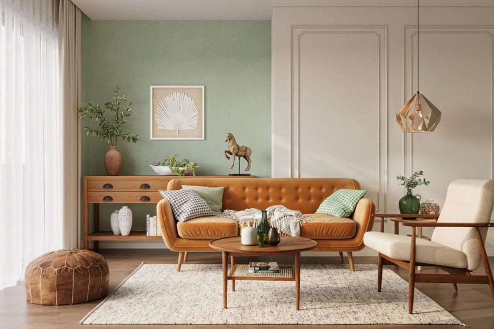
Green
Connected with nature, green feels fresh and restorative. Studies show it can ease anxiety and promote feelings of renewal, making it ideal for living rooms or shared family spaces.
Yellow
Symbolic of optimism and light, yellow instantly brightens a room. It reflects natural sunlight and can lift mood, but should be used carefully. In small doses, it feels welcoming. But in large doses, it can become overstimulating. Soft yellow and warm peach is often used to create a warm and welcoming atmosphere in communal or reception spaces.
Designer tip: buttery yellow is emerging as a trending colour so if you want to introduce hints of yellow, we suggest going for this muted shade.
Red
Bold, confident and stimulating, red can bring warmth and passion to a space. It’s often best suited to social areas like dining rooms or feature walls where you want to spark conversation, and within gyms and food service areas to boost energy.
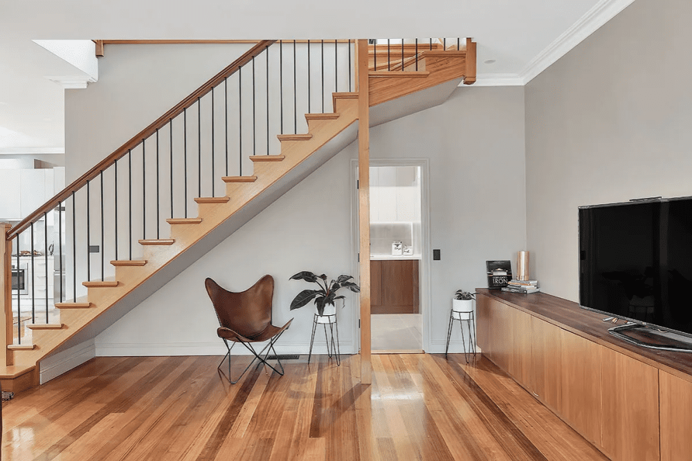
Neutrals
Whites, greys, taupes and beiges provide balance and simplicity. They’re timeless, adaptable and help other colours stand out. Many homeowners choose neutral bases and add personality through accents, artwork or furniture. Whereas the clean and fresh atmosphere of bright whites and creams within offices and clinics are often paired with earth toned colours and textures to avoid an environment that feels too sterile.
Creating balance in every room
Colour affects not only mood but also how we perceive space. Light colours reflect more light, helping smaller rooms feel open and airy. Darker hues absorb light, creating a sense of depth and intimacy.
If you have a smaller room that feels cramped, soft off-whites or pale greys can visually expand it. For large open-plan spaces that feel cold or echoey, deeper tones such as sage, terracotta or charcoal can make them feel grounded and inviting.
Lighting plays a key role too. Natural light enhances colour differently throughout the day, while artificial lighting can alter tones altogether. Warm lighting softens cool hues, while cooler bulbs make warm tones feel more vivid. When choosing paint, it’s important to test samples at different times of day to see how they shift in your space.
Colour and lifestyle
Choosing colour isn’t just about trends, it’s about lifestyle. A young family might prefer lively, durable finishes that add warmth and energy, while a coastal home might lean into breezy whites and sea-inspired blues to echo the surroundings.
“Colour can completely change how you feel about your home,” says Sophie Grover, Owner and Managing Director of SG Coatings. “The right shade not only complements your design but also creates a sense of harmony. We often see clients fall in love with their space all over again once the walls reflect their personality and the atmosphere they want to live in.”
Why it matters
The right paint colour can do more than refresh your walls, it can genuinely improve how you feel in your home, workspace or commercial setting. When people walk into a space that reflects their personality, lifestyle or brand, they instantly feel more settled and connected.
Finding the right colour palette can be harder than it looks. A shade that feels perfect in theory can shift dramatically once it’s in your space. With more than 20 years of experience, SG Coatings helps homeowners and businesses across Melbourne and the Mornington Peninsula choose colours that truly work, blending expert advice, personal colour consultations and quality finishes that transform the mood and character of every property.
Whether you’re feeling brave enough to try something bold or simply want to create a space that feels more you, colour has a way of making a space feel alive. It tells your story, lifts your mood and brings character to every wall.


