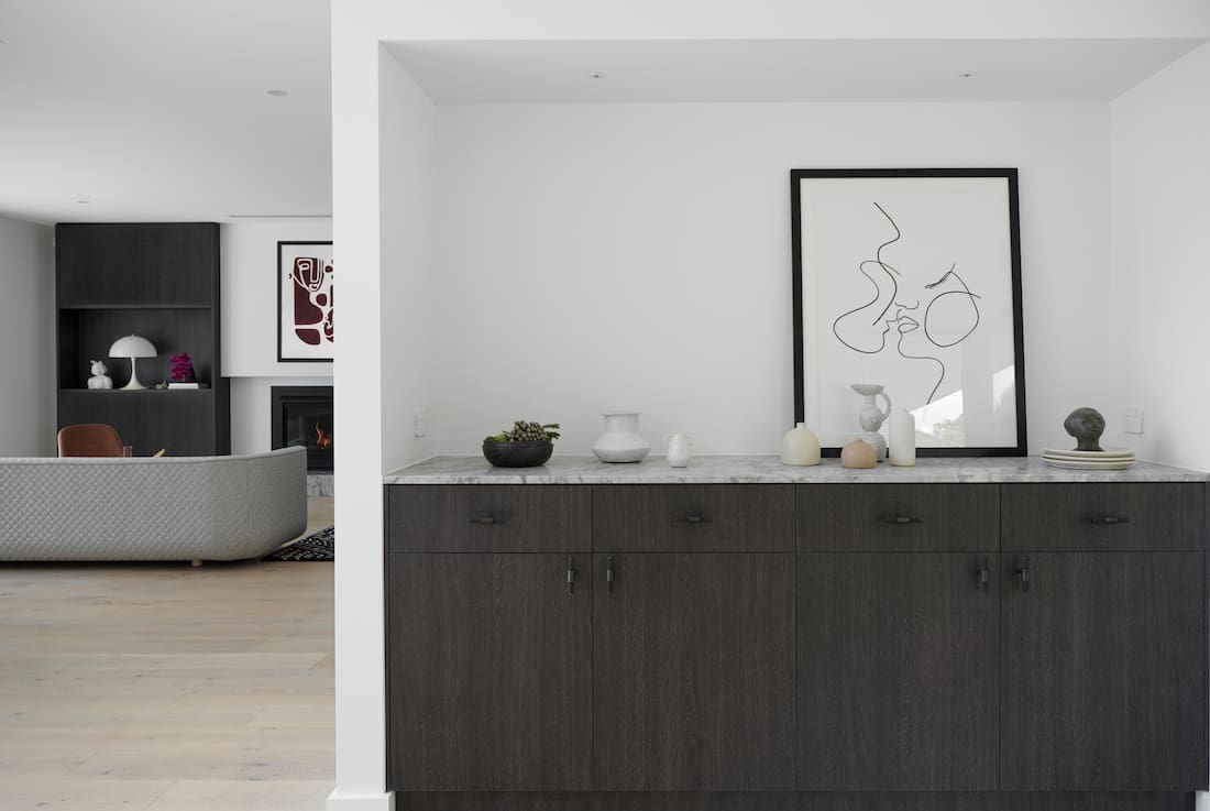
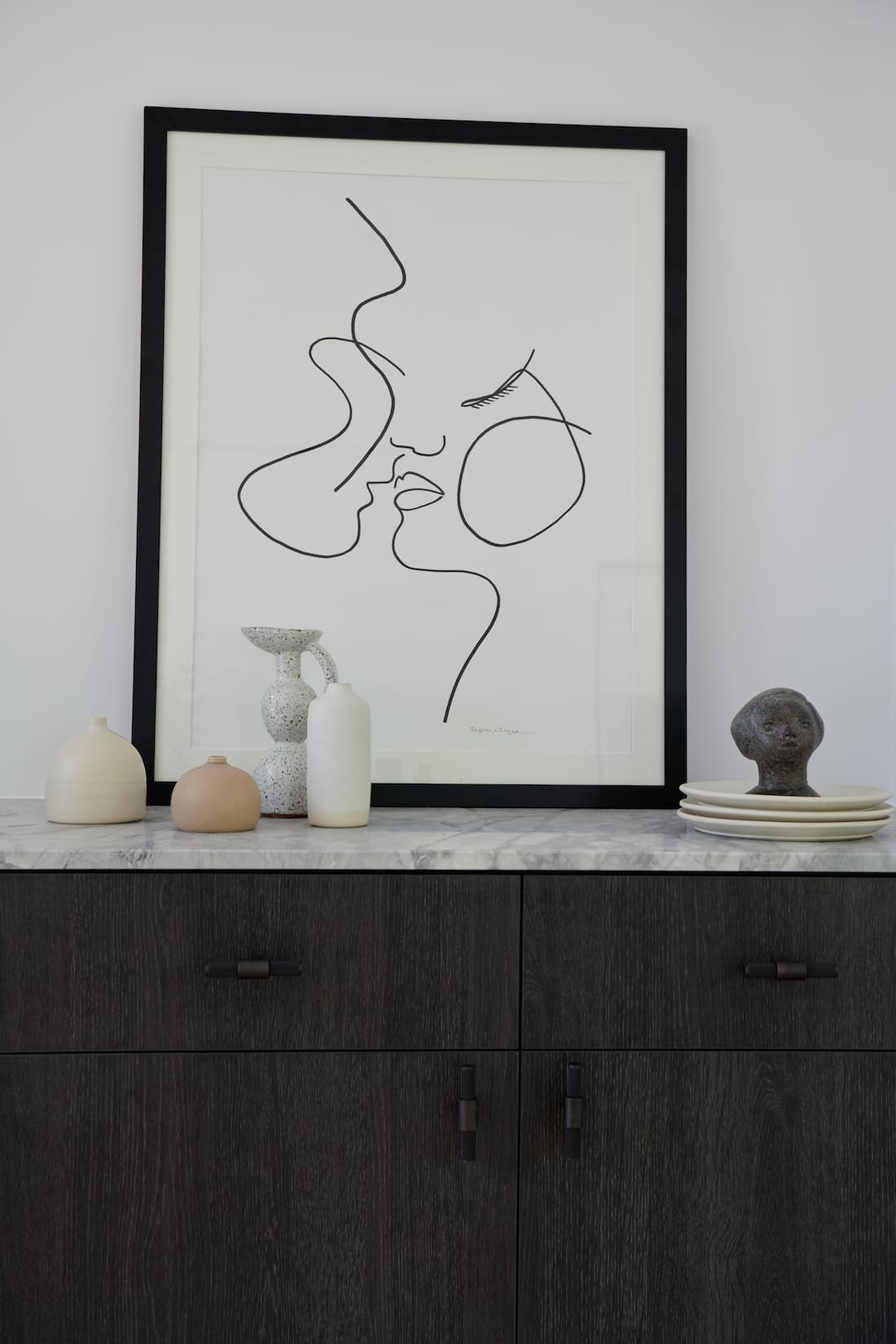
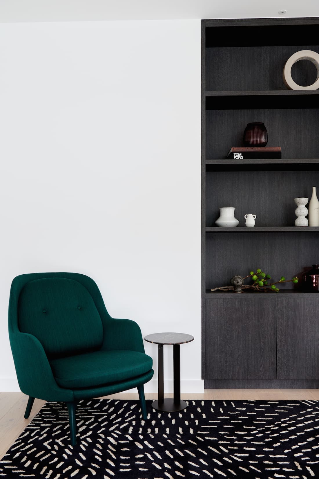
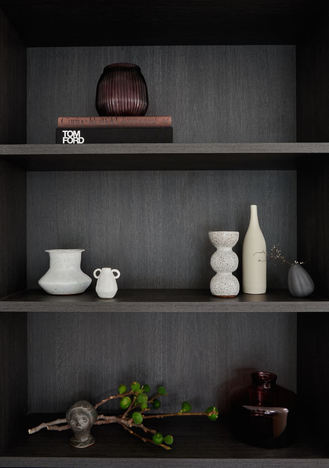
Creating a timeless house design that’s also modern, clean and architecturally beautiful is no easy feat. But the latest home we visited is all those things and more. Multi-disciplinary interior designer and architectural consultant, Alexi George, takes us through one of her stunning new homes in the Canberra suburb of O’Connor. And a standout feature of this project is the joinery perfection!
We’re sure you’ll get plenty of design inspo from this project. Come on a tour with us as Alexi talks through her design decisions.
Related article: The dos and don’ts of custom joinery
Related article: Dark joinery and pops of terrazzo steal the show in this modern home makeover
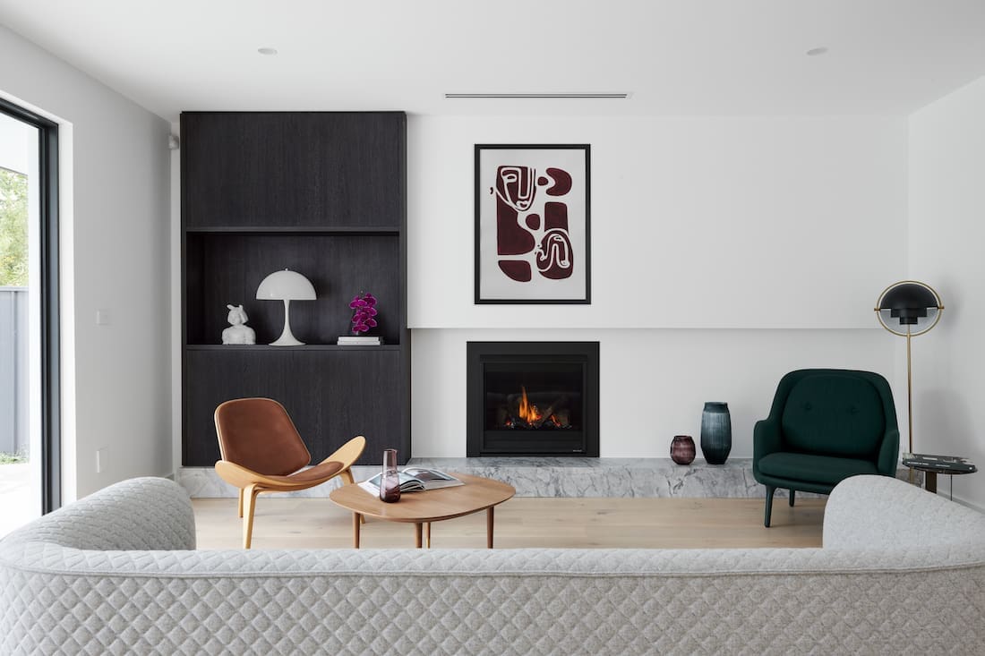
“I knew the house would be a fairly simple design from an architectural perspective. Then I made it a point to push the client to focus on the joinery.
“I am a huge fan of joinery, it finishes a room and makes the whole space feel well though out and refined — it makes a space.
“I actually designed all the joinery myself, drawing and sketching my ideas and working together with the joiner. The client is thrilled with the results, and so am I,” Alexi says proudly.
Having Alexi involved from the early stages of the build proved to be very beneficial.
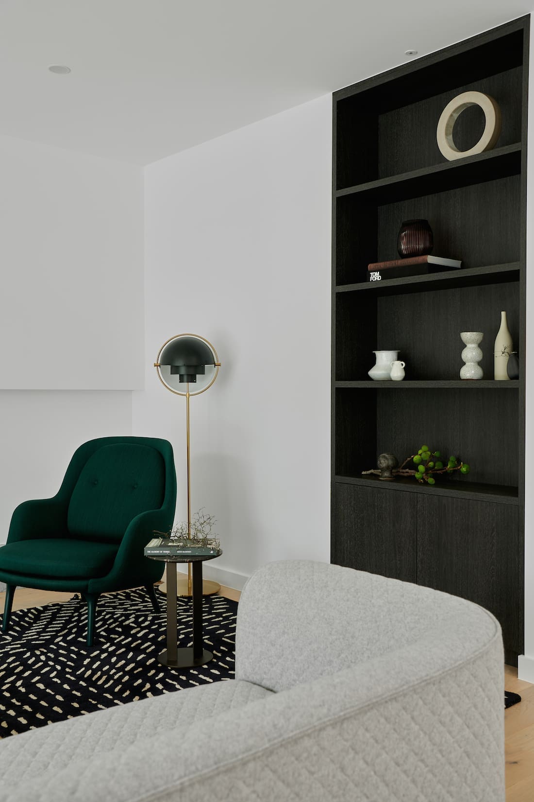
“The project took 2 years. I was involved in the initial floor and spatial planning stage, which ended up being really important as we were able to plan out the joinery from the beginning.
“Often architects don’t think about joinery and its requirements such as wall depths and inserts, so we were able to consider these elements on a preliminary level,” Alexi explains.
Invest in joinery, it takes an interior space to the next level.
Thinking outside the usual joinery box, Alexi says her designs proved somewhat challenging.
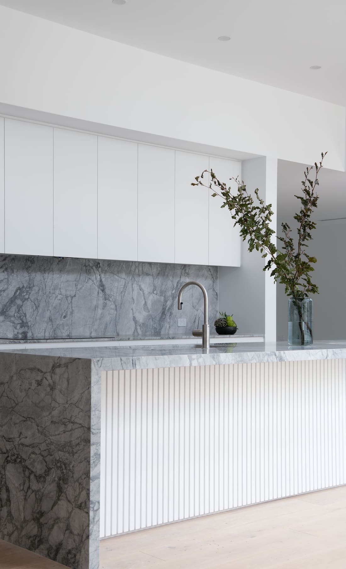
“It certainly tested the joiners skills and pushed the boundaries. The rebated polyurethane kitchen cupboards had to be attempted four times!” she laughs.
In fact, the joinery proved to be so important that Alexi insisted on additional budget to be included.
“I stipulated to the builder early on that there had to be certain allowances in the construction budget for joinery.
“It was way higher than he had accounted for and funnily enough, my calculations were spot on.”
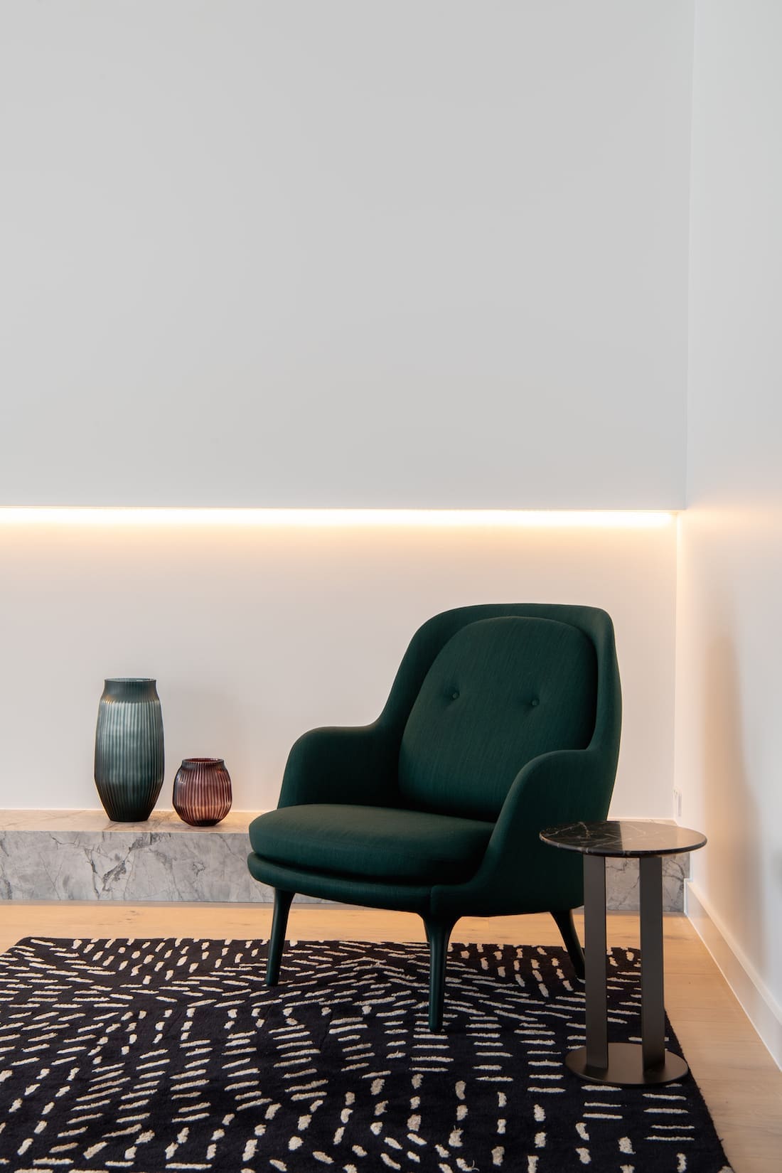
And the results? Well, they just speak for themselves. From the beautiful kitchen cabinetry to the rebated plasterboard with the cupboard sitting on a plinth of stone in the living area, it’s clear Alexi knows her stuff when it comes to interiors and design.
“The design inspiration evolved over time, as it always does. The house itself is a fairly simple design so we wanted to focus on the highest quality interiors.
“Originally the material finishes were a little more ‘on trend’ and risked dating quickly. But as time passed, I managed to encourage the homeowners to go with a simpler, timeless finish. This was important as I knew the family would be unlikely to build a house again,” Alexi explains.
Asked to choose her favourite space in the house, Alexi heads straight for the kitchen.
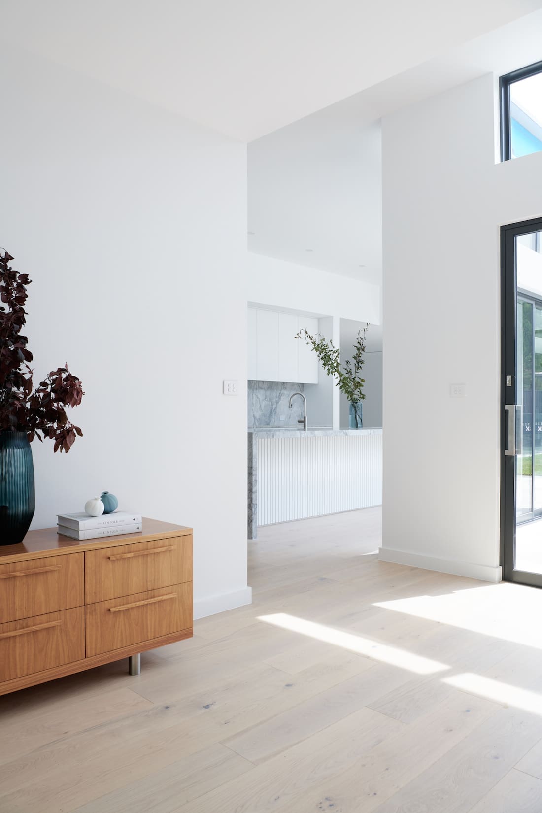
“I really love the kitchen. Since this home was finished, I’ve had a lot of further interest in kitchens like this one.” She adds, “I also love the lounge room, too.”
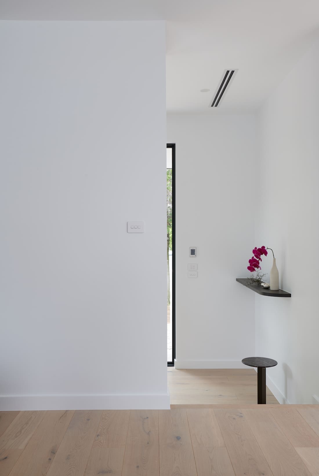
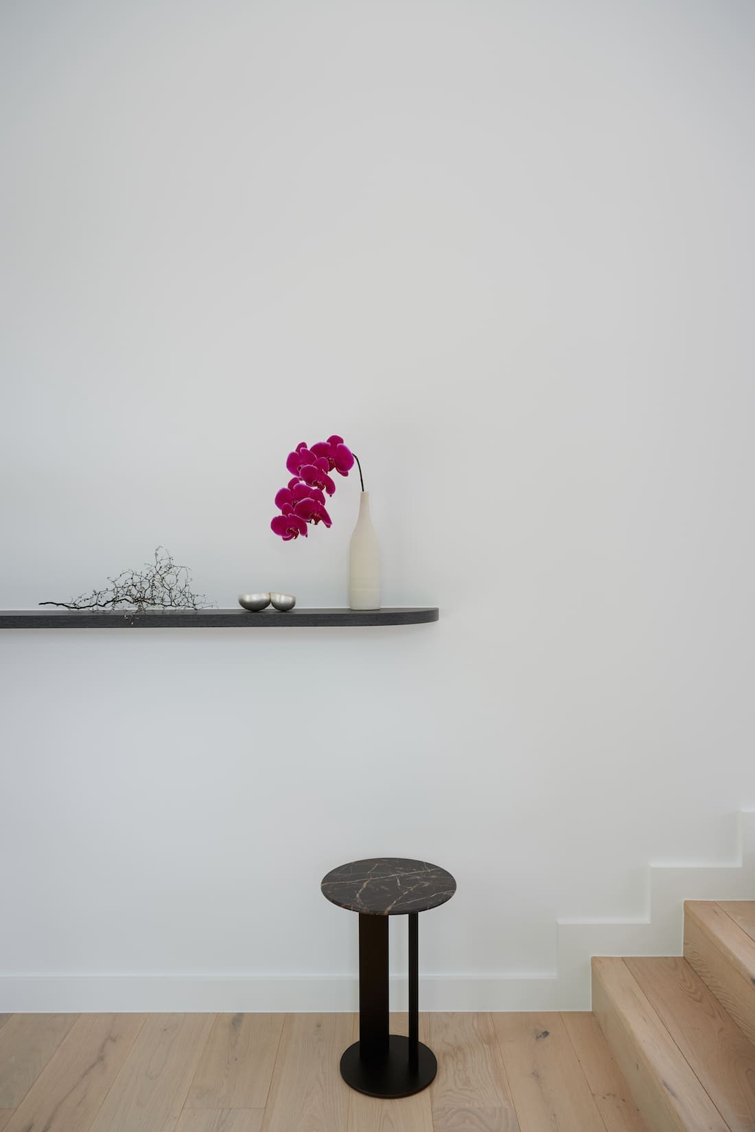
Sticking with the design brief to keep things minimal and timeless, Alexi said this guided her use of white walls and darker veneer accents.
“I chose a white palette for the kitchen to give it a fresh and relaxed feel, and added dark veneer to the bedrooms and living spaces to give these spaces a focal point.
“The stone we used is ‘super white’ from CDK stone. The client and I went to the warehouse and choose the four slabs ourselves. We just love it.”
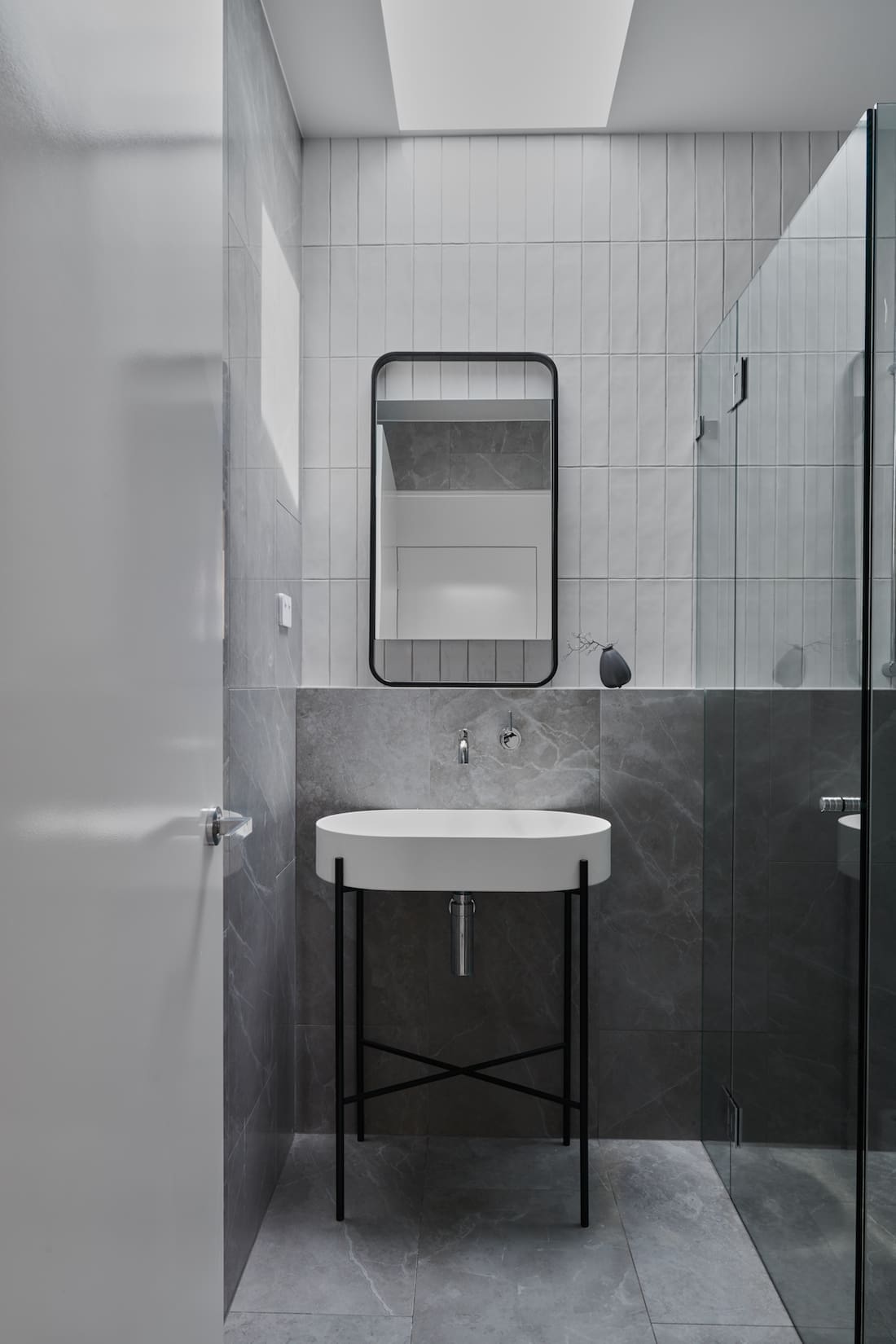
Our favourite space of the home has got to be the guest bathroom though. Featuring a luxe grey marble-look floor and half wall tile and vertical straight stack handmade subways above, this space oozes design cool.
“Being the guest bathroom, I wanted to add a special touch to this space. That’s why we did the tiles the way we did, and also why we selected that amazing sink.
“Sure, it’s not the most practical for an everyday bathroom, but it’s just perfect for a powder room,” Alexi says.
What’s clear in this home, is that Alexi has kept things simple with an emphasis on clean and modern design.
I’m a pared back kinda gal and much prefer simple, clean, neat lines and the same look and feel. I really feel it makes a space feel elegant yet relaxed.
“Sometimes layering the interior elements is important, but not in this project.
“With the large windows and so many of them, the space needed to be clean. This also fits with the aesthetic of a new home.”
And finally, we asked Alexi why people should invest in an interior designer and architecture consultant.
“For this project, I got involved at a very early stage to assist with spatial planning and therefore was able to foresee some functional challenges with the kitchen, mudroom, laundry and pantry the client didn’t see,” Alexi explains.
“Also, I was able to help map out the joinery requirements and then I came back on board later on for things like finalising the finishes.
“This is not the traditional way an interior architect is utilised but it was worth it and certainly something that’s happening more and more.
“Architects and interior designers are working much more collaboratively these days to achieve the best outcomes for clients.”
Thank you to Alexi for sharing this stunning home with us. Check out her website for more inspo and to find out more about her services. But for now, keep scrolling for more of this beautiful home.
Check out more interior tours
