It was an emotional room reveal episode last night as two more deserving homeowners saw their transformed houses for the first time.
Both teams gave it all they had to overhaul the houses — not only were they completely redecorated, they were also redesigned with internal construction changes too. Let’s check out all the Reno Rumble week 2 rooms!
Related article: Reno Rumble week 1 in pictures and our highlights
Related article: Reno Rumble winner announced and week 5 reveal!
Blue Team
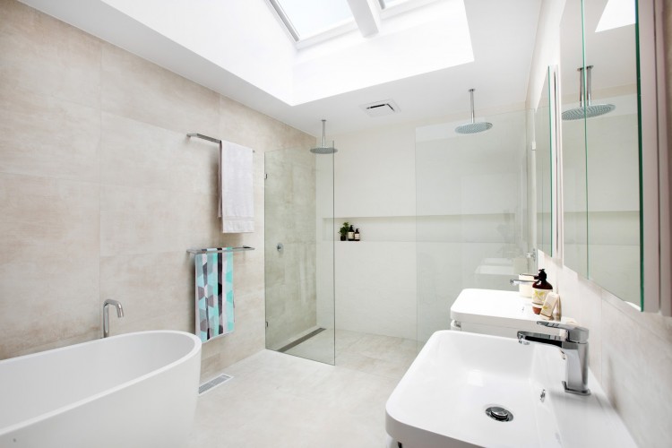
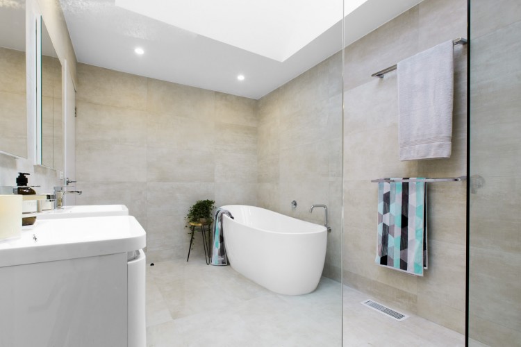
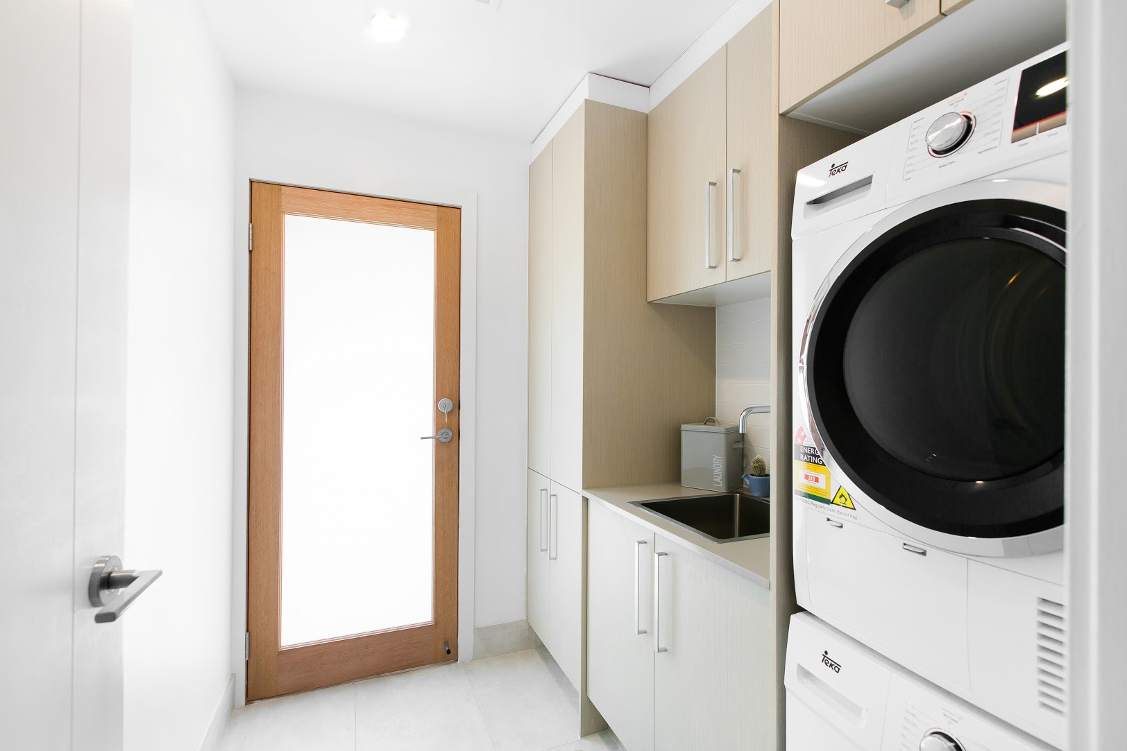
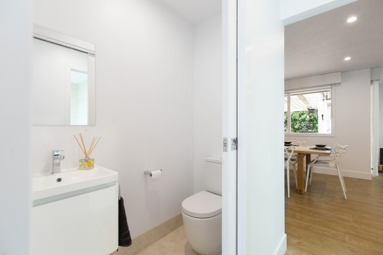
Bathroom, powder room and laundry
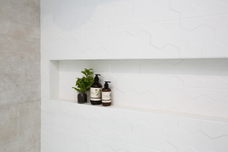
This bathroom has an impressive feeling of space and is beautifully executed. With ample storage, it’s also ultra practical, and the neutral floor and wall tiles will stand the test of time. It would have been great if they would have fitted a second toilet in here to make the space even more practical for a family.
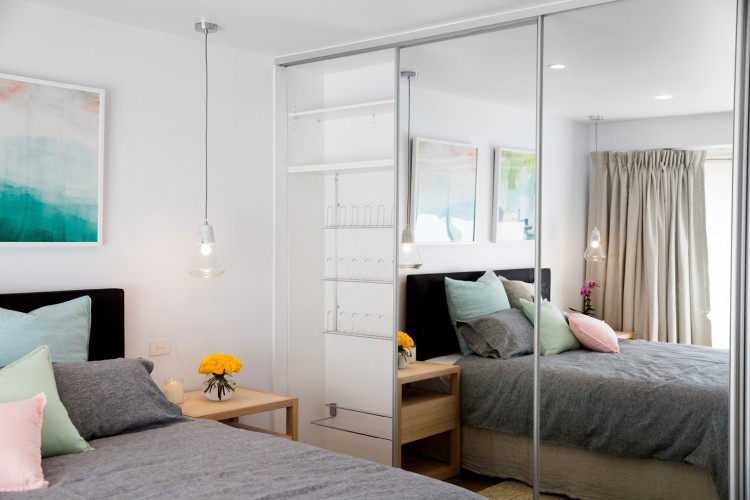
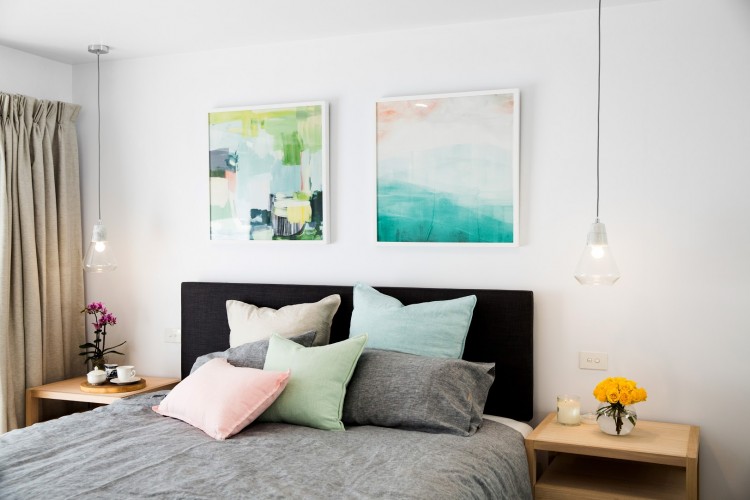
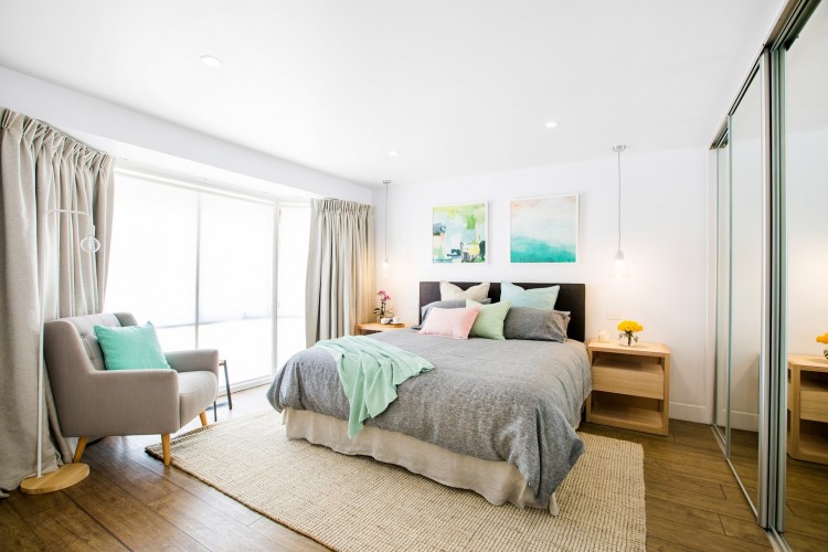
Main bedroom
Talk about a winning colour combo, this pistachio and blush bedroom is heavenly! Love the artworks above the bed which give dramatic visual interest and tie the whole colour scheme together. We have nothing to fault in this bedroom (except to say we agree with the judges’ comments about changing the window treatment to avoid the bend in the rail).
Kid’s bedroom
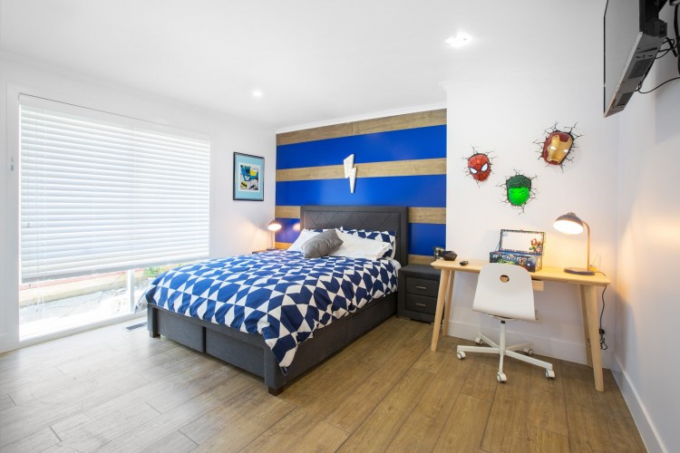
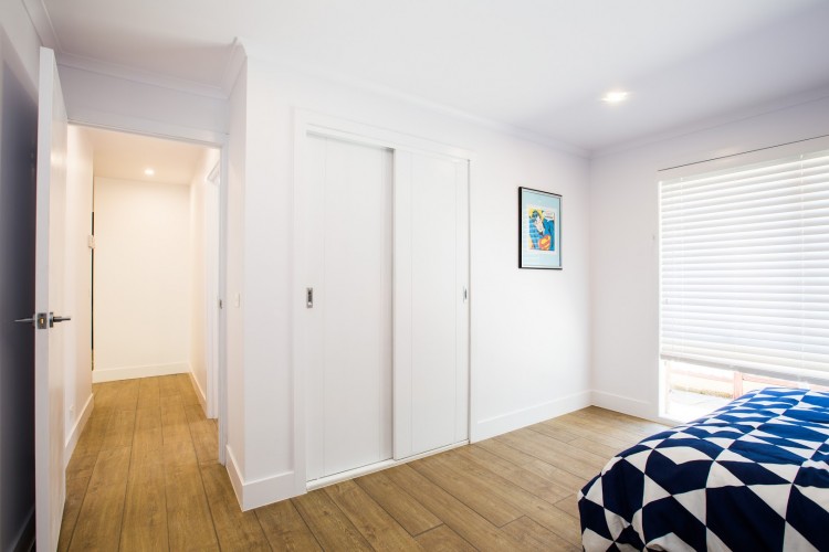
That feature wall really packs a punch and the superhero wall got an excited ‘wow’ reaction from Blake. The space in front of the bed could have been better utilised though because it feels a little empty, perhaps a play mat and a small chest below the artwork near the wardrobe?
Kitchen and dining
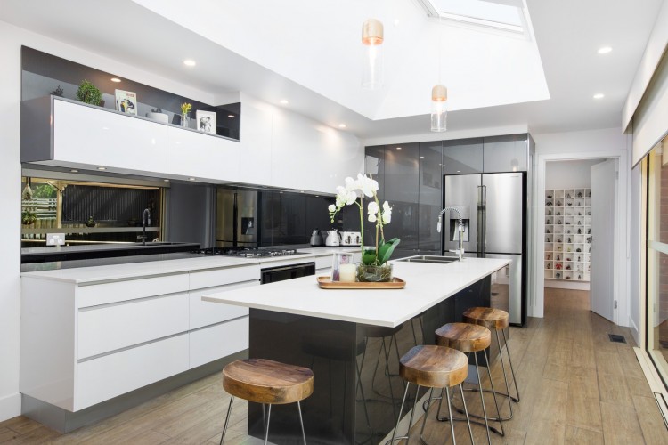
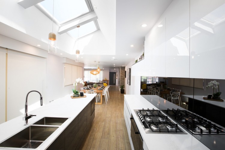
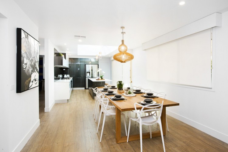
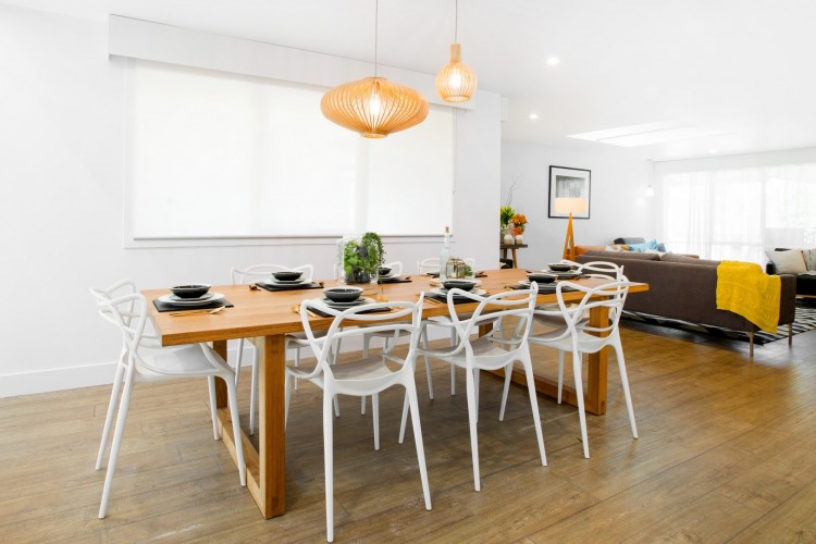
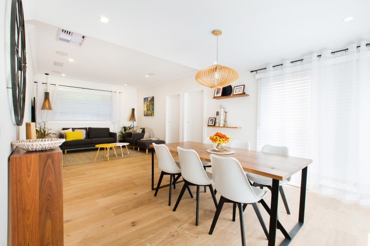
This high gloss kitchen divided the judges and we sided with Justin, feeling all those reflective surfaces were just a bit cold. Some timber grain in the cabinetry, a different splashback or even some more open shelving could have softened the space. The dining area on the other hand feels much warmer — that large timber table is gorg and those pendants create real interest.
Living room
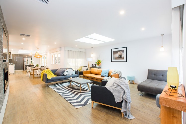
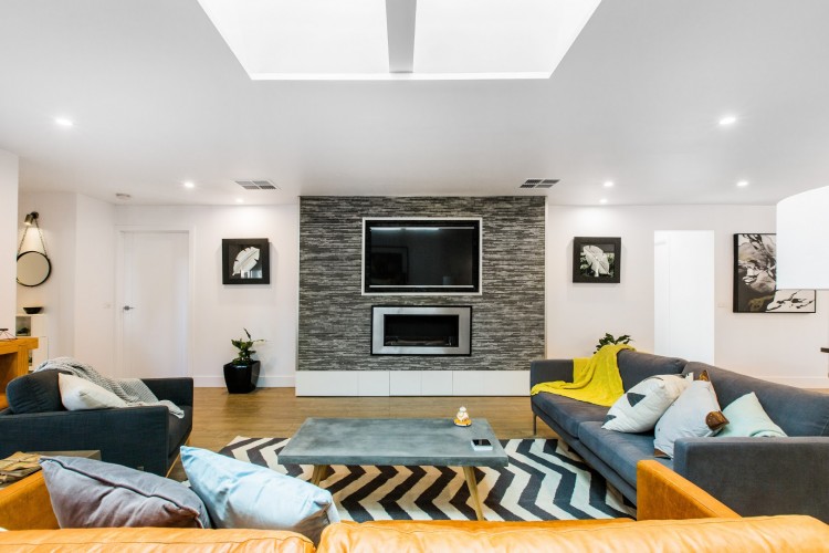
Love that tan sofa! Unfortunately that’s where our love of things in this space ends. The finish on the feature wall feels dated and is it just us or does it seem like someone just scattered a heap of furniture in this space?
Rumpus
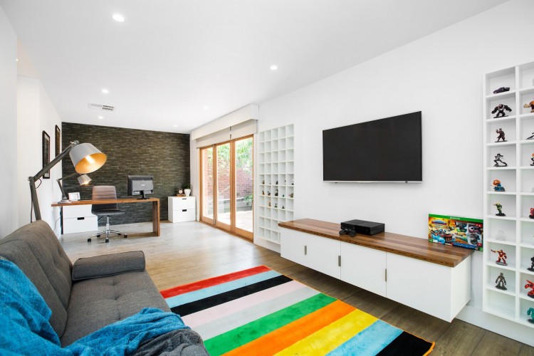
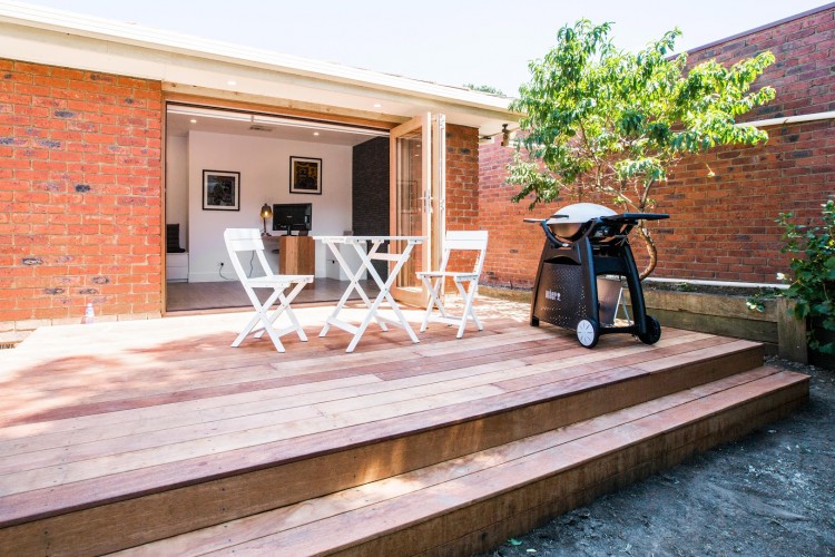
It can always be tricky to design a multipurpose space and this man-cave-meets-play-room-and-study had a lot of boxes to tick. The style of the office space and the lounge area seem quite at odds though… perhaps this would have worked if there were more defined separation of zones? Would have loved to see more happening on the balcony too. Did someone say vertical garden?
Red Team
Bathroom
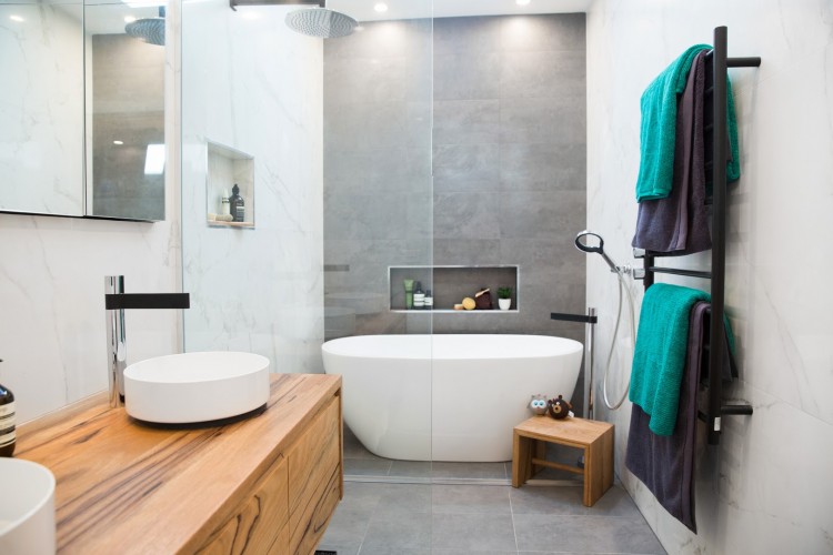
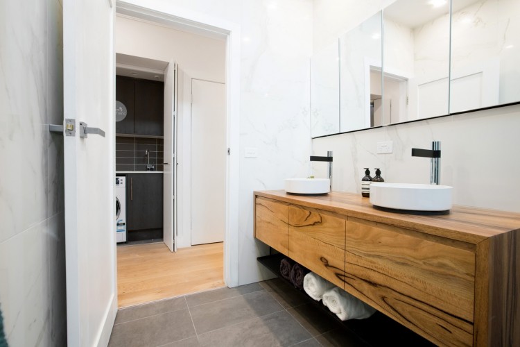
Thumbs up to the couple who pulled off this bathroom! The grey and marble-look tile combo is a winner and loooooovvveeee that bath! You don’t really need any other hero features when you have that bath but this couple also wowed us with that timber vanity. OMG!
Ensuite
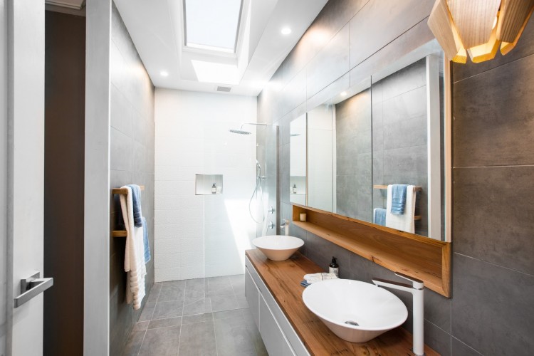
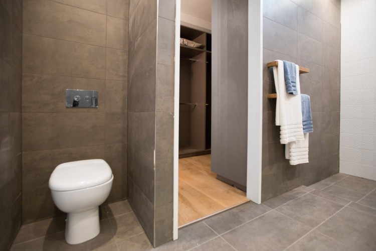
Grey, white and timber, simple and elegant. The timber towel rails are a lovely touch that we haven’t seen on The Block or Reno Rumble before, amazing how something so small can lift a space.
Master bedroom
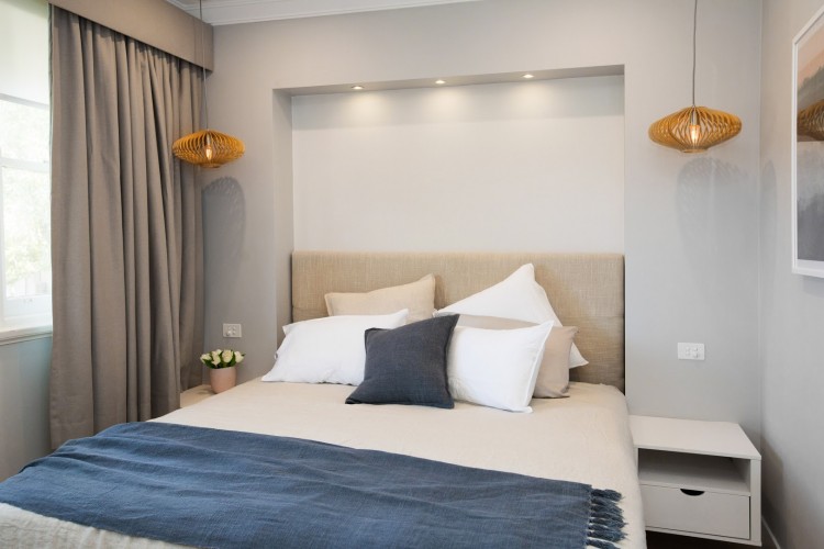
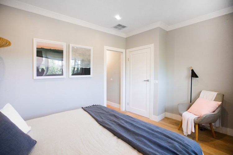
The couple sacrificed space in here to make way for a walk-in wardrobe and ensuite, and you can certainly feel the squeeze. We would have replaced the bulkhead around the bed (which only seems to emphasise the tightness of the space) with a feature wall that could have helped to create the illusion of space.
Kids’ room
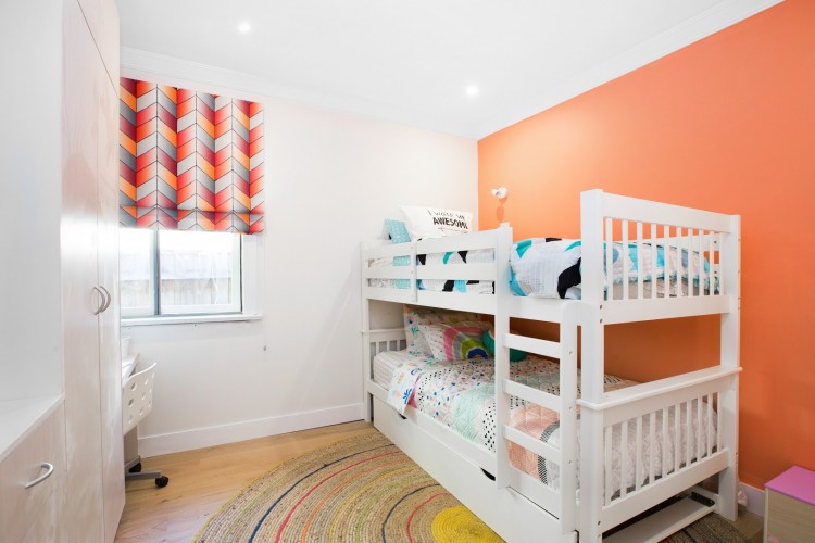
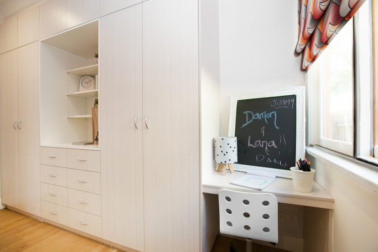
Peach wall — don’t do it to us! Ha ha! Other than that wall colour, the rest of the room is quite simple and practical.
Kitchen
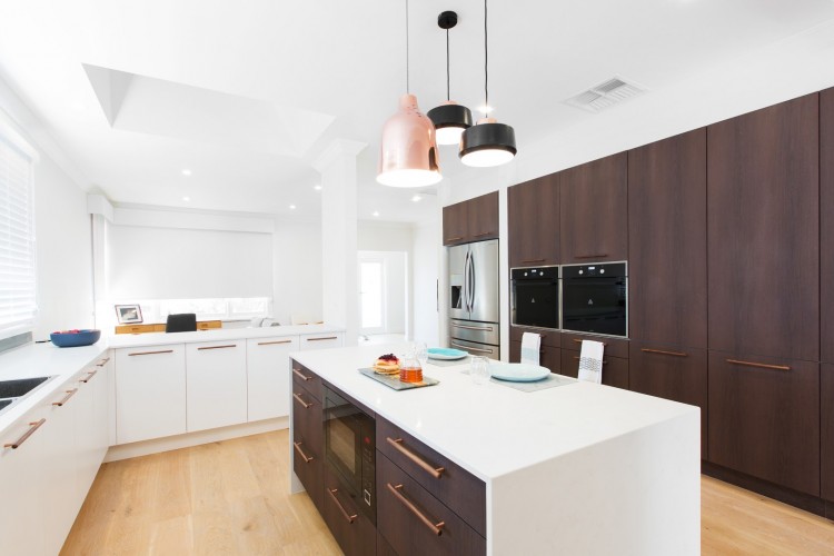
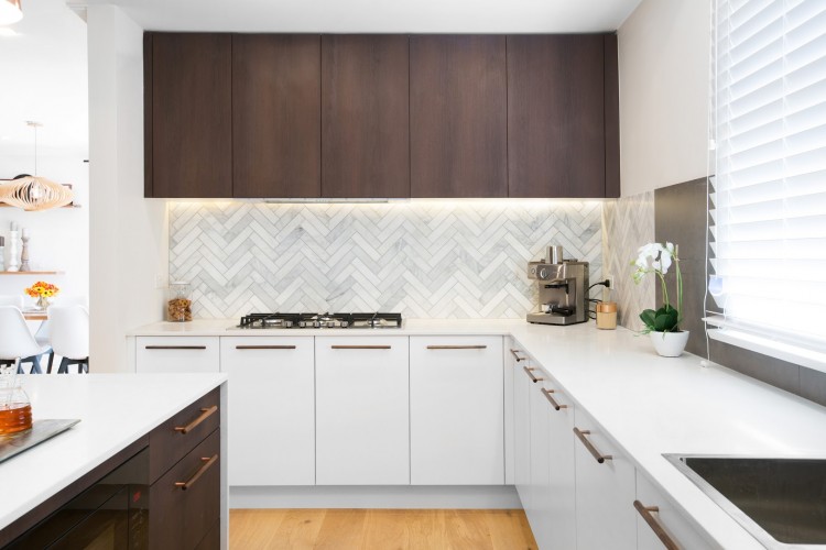
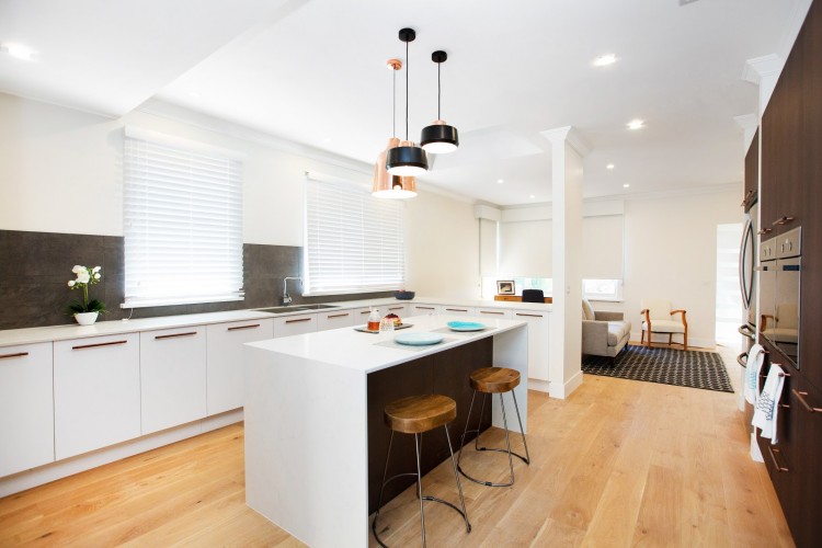
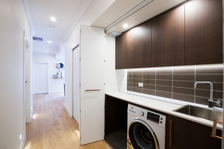
Talk about a massive kitchen for Reno Rumble week 2! The use of dark and light cabinetry is a winner although given the number of cupboards we would have used some open shelving to give the kitchen less of a filing room vibe. And when the couple realised they didn’t have enough marble tiles to do the full splashback, we think they should have only done one wall marble rather than one and a bit walls which makes it obvious something went wrong.
Lounge and dining
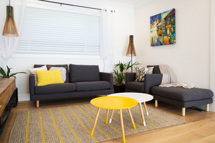
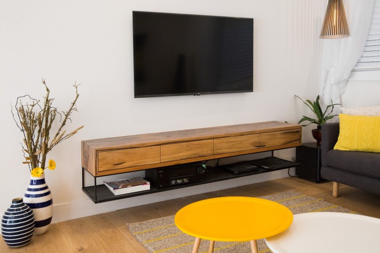
The judges gave this space an ok score which surprised us because we weren’t wowed by it at all — especially not the random fake Gerbera flowers in the pot by the TV! An entertainment unit that hides the electronics and a more generous L-shaped sofa are the first changes we’d make here.
What did you think of the Reno Rumble week 2 rooms? Tell us in the comments below!



Comments are closed.