The always highly anticipated Block kitchen reveals were aired last night and while they’re being called ‘the biggest and the best’, we couldn’t help but wonder if The Block has taken their goal of creating aspirational spaces to such unattainable heights that it left us feeling alienated?
We mean, a $200,000 kitchen?!! That’s just crazy!
That said, there were some show-stopping moments and plenty of kitchen inspiration, so let’s take a look at each couple’s space and talk about the good and the bad.
Related article: Kitchen cabinets other than white
Related article: The Block 2020: Week 6 — Kitchen reveal
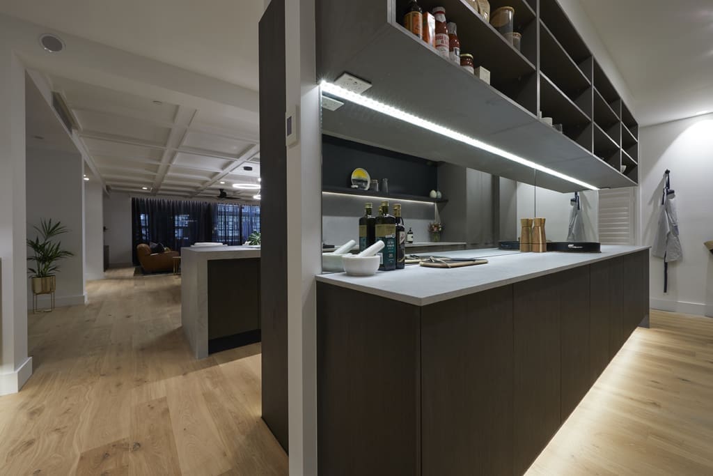
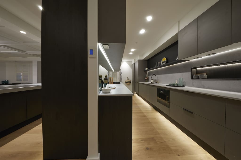
Hans and Courtney
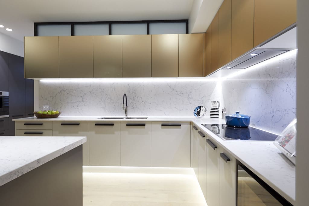
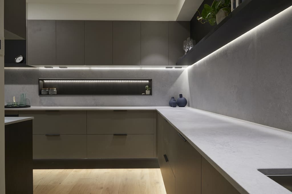
We’ve dubbed this couple the ones who are obsessed with over lighting every space in their apartment and of course they didn’t hold back in their kitchen, ha ha!
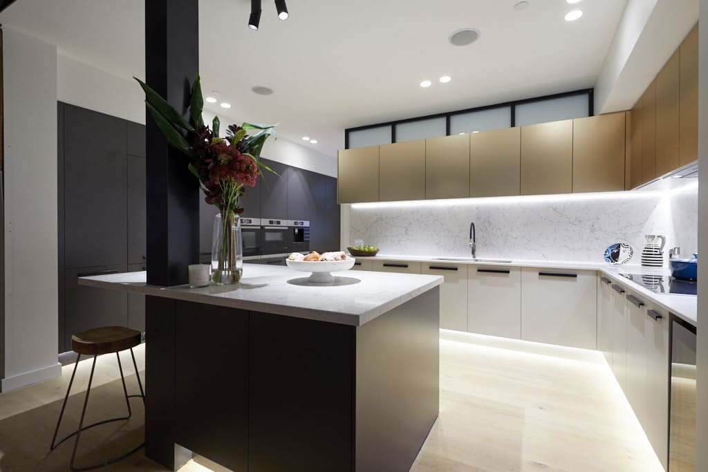
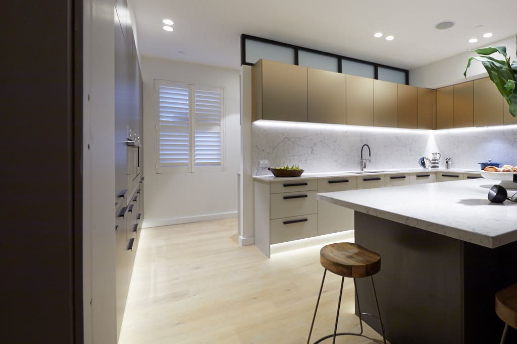
Just check out those downlights galore, feature spotlights, and LED strip lighting under all overhead cupboards and lower cabinetry too — because, you know, we all want to highlight the crumbs on our kitchen floor!
Lighting issues aside, this kitchen was slammed for being in the wrong spot in the apartment and having a poor layout too, and we have to agree with the judges on this. The pole in the centre of the island bench is an eyesore and that island hardly seems functional with just two bar stools.
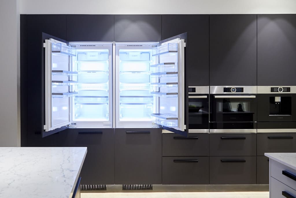
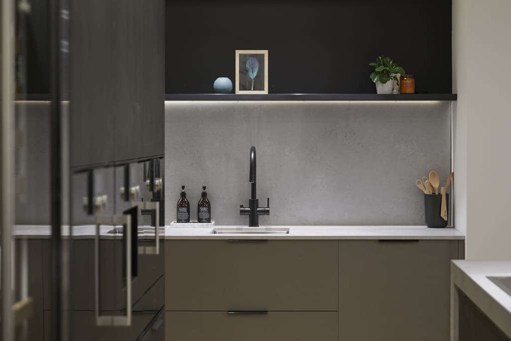
Looks-wise we unfortunately don’t have many compliments either. The black wall of joinery with integrated appliances is stunning but the full L-shape of overhead metallic cabinets gives off filing room vibes. Some feature shelving or open shelf pockets would have broken things up and enhanced this space.
Are we being too harsh? What did you think of this kitchen?
Kerrie and Spence
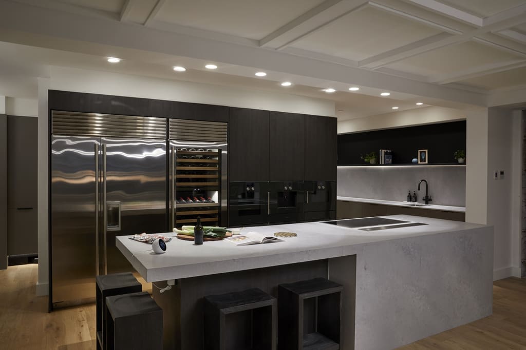
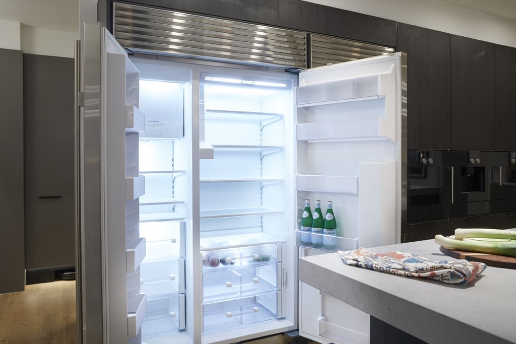
Here’s that $200k kitchen we mentioned and it also happened to be the winning kitchen last night with a perfect 30/30 score. Did you agree with the judges?
While the finishes were amazing — particularly that island bench! — and it has all the very best Gaggenau appliances, the space as a whole didn’t overly wow us… In fact, it felt a little bit like an appliance display kitchen. Perhaps we’re out of touch with what high-end apartment buyers are looking for but this wasn’t the winning kitchen for us.
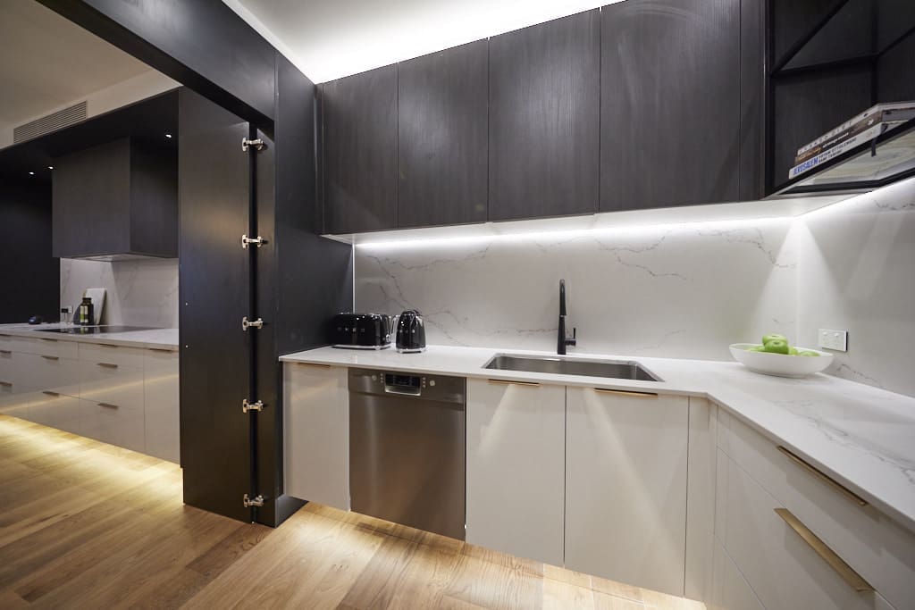
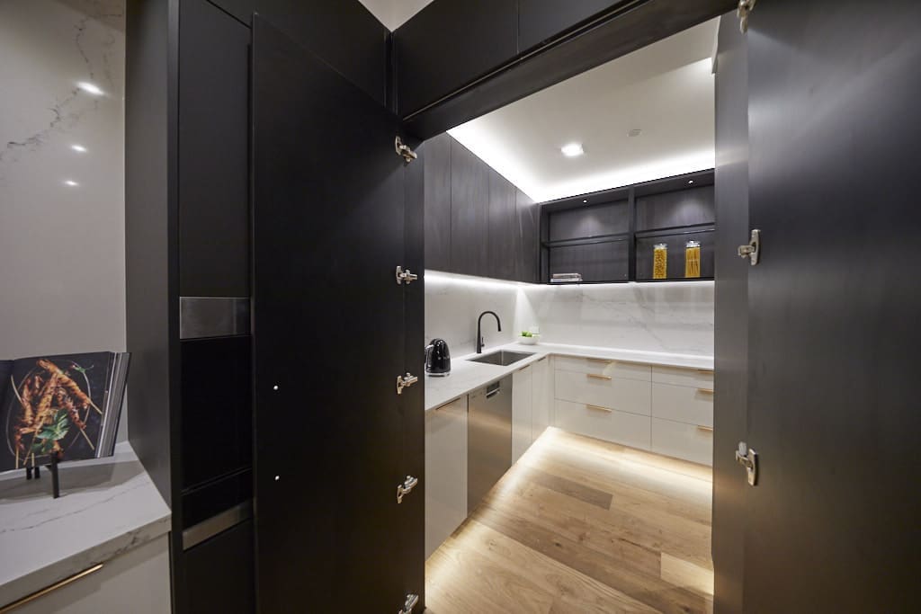
Sara and Hayden
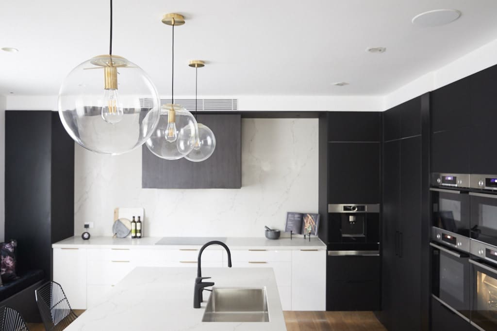
We actually have a lot of positives to say about Sara and Hayden’s kitchen.
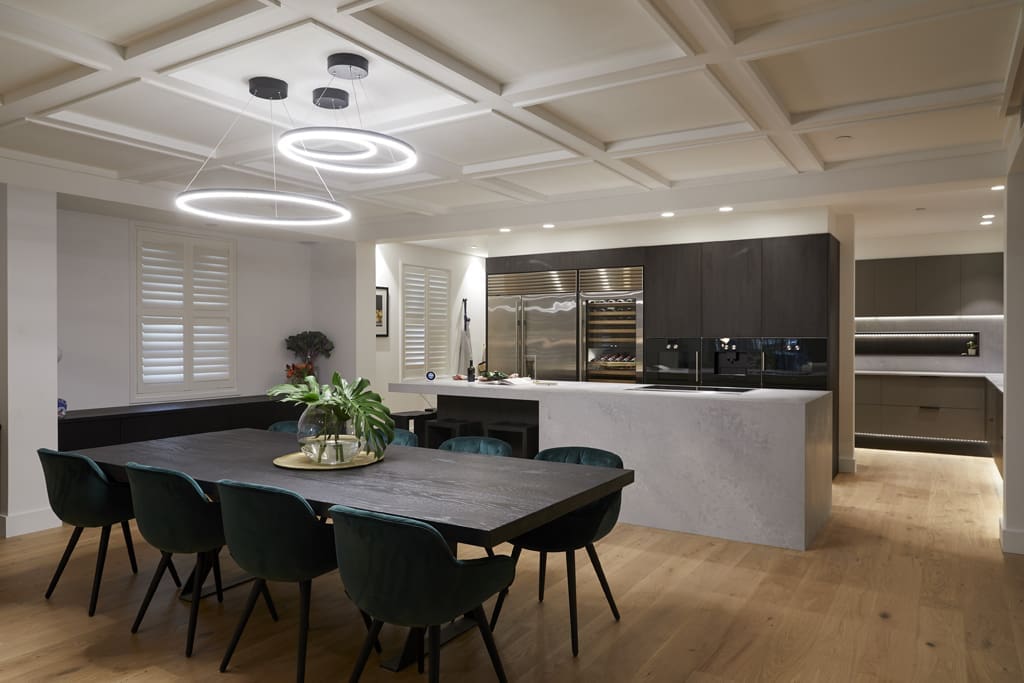
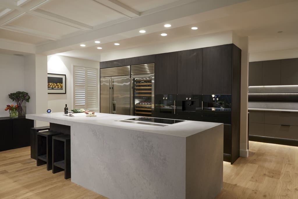
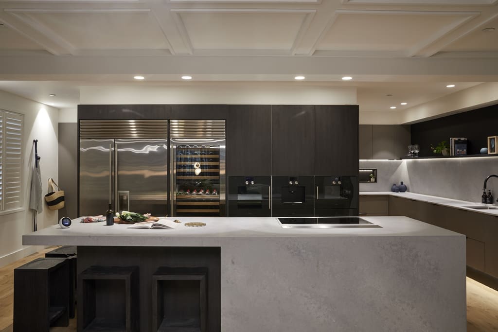
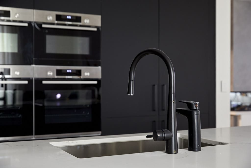
The layout really worked for us, when you enter the kitchen you aren’t smacked with a dozen appliances in your face and it flows well to the adjoining living spaces. We also love the generous island bench which is ideal for entertaining and the way the sink looks out. Big ticks for layout all round.
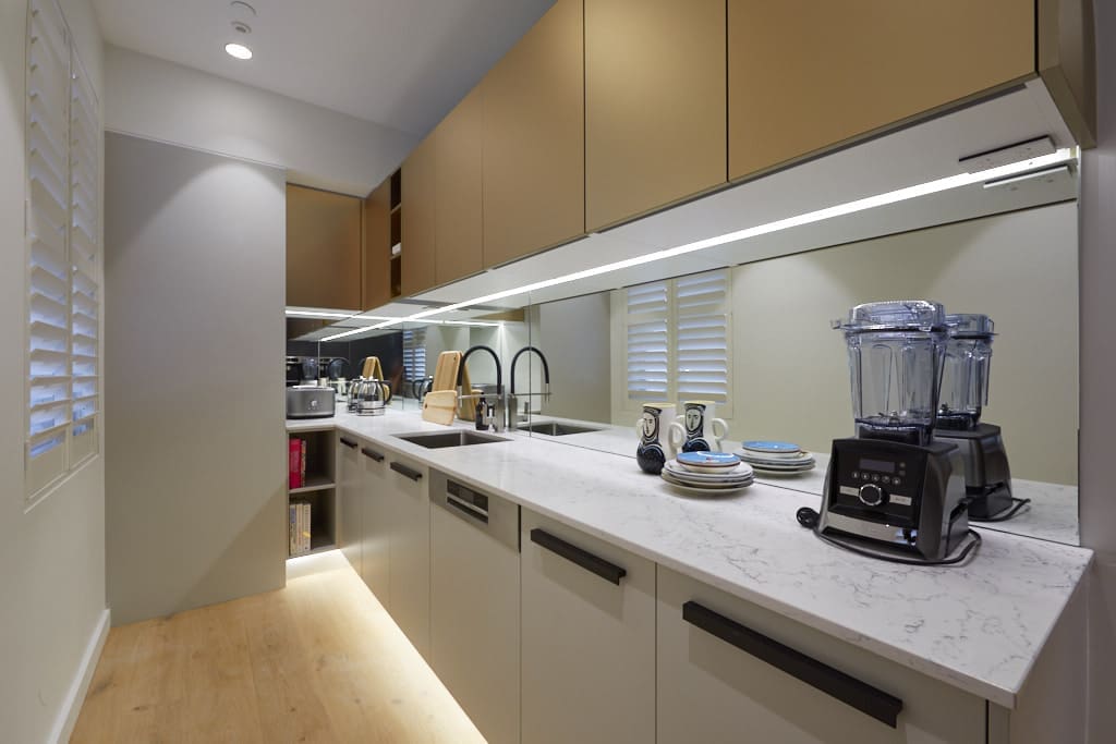
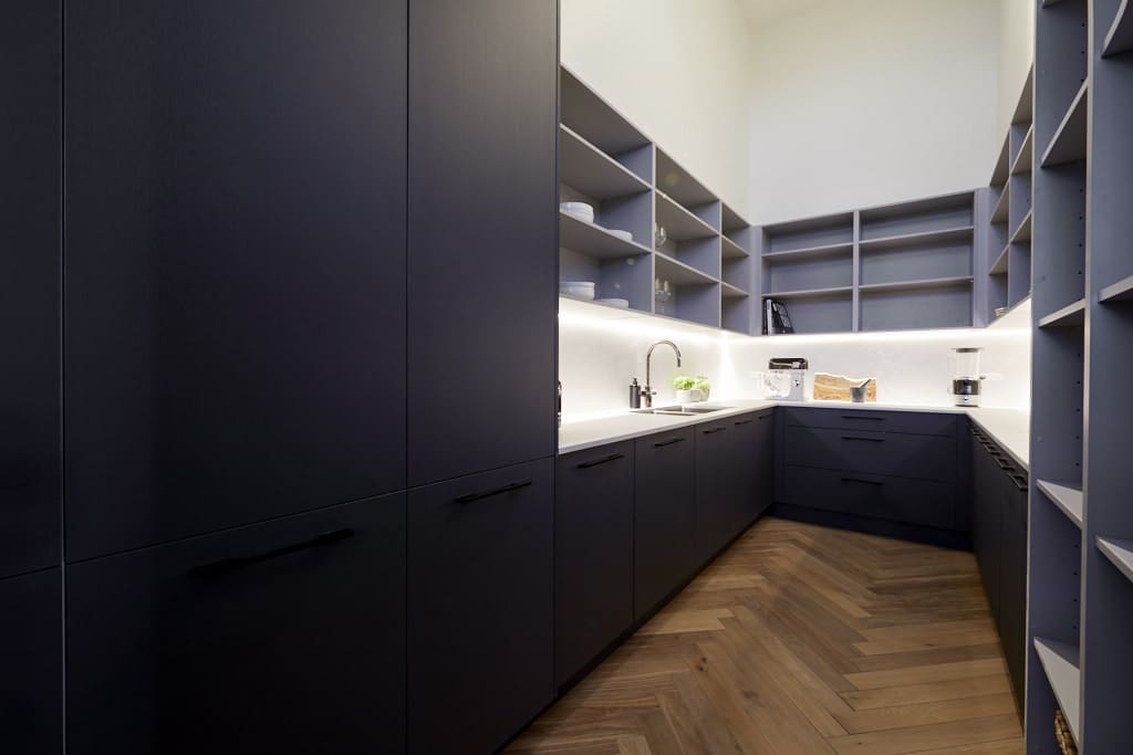
We’re also loving that rangehood solution — it’s become a feature of the space — and the mix of dark and light cabinetry to soften the space. Their walk-in pantry is also total goals and feels very luxe.
You can find tips on how to design the ultimate butler’s pantry here.
Norm and Jess
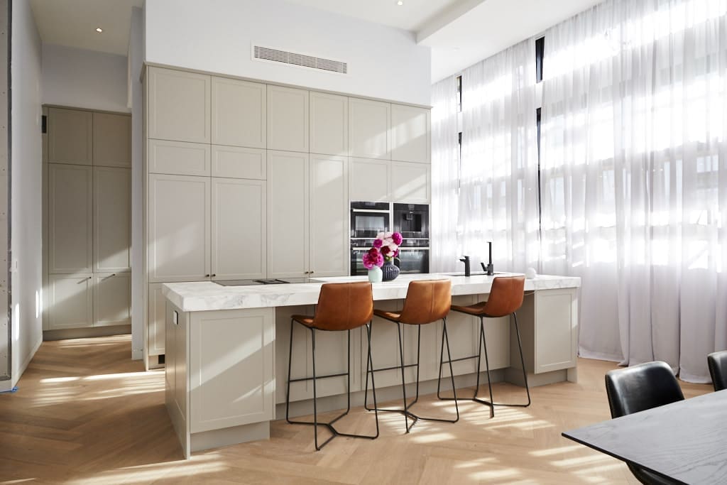
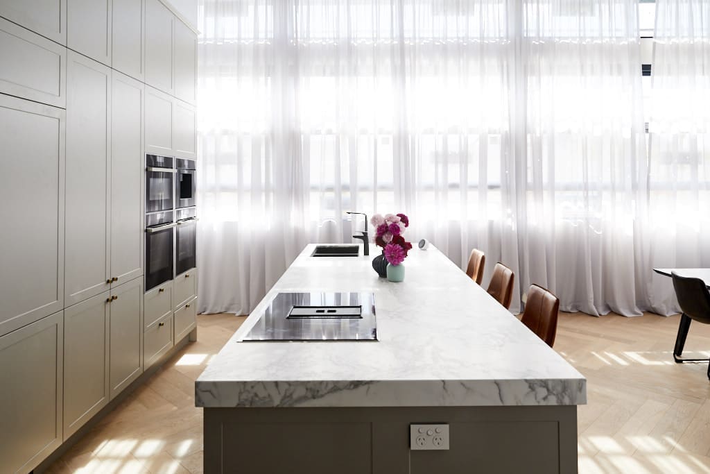
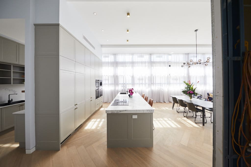
Now this is the kitchen that got us excited — talk about freakin’ stunning!
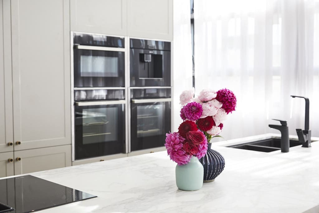
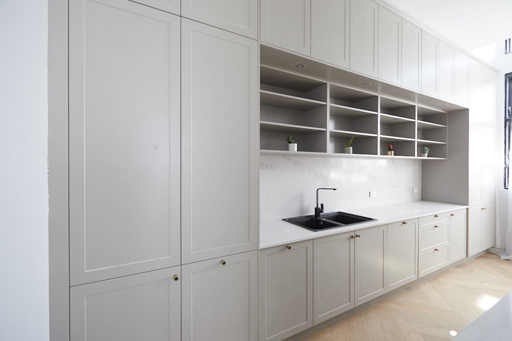
The cabinetry and flooring totally made our hearts skip a beat. It isn’t trying hard to be OTT tech clever, it’s just a serene and beautiful kitchen.
We know there were a few functional things that peeved the judges, like the sink directly across from the ovens so it makes it awkward to take hot things out of the oven, and the small cutlery drawer, but these are relatively minor in our opinion given the island is plenty big enough to place hot items right next to the sink.
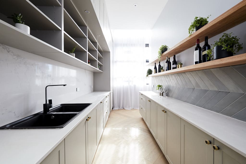
The pantry also had so much going for it. Really loved one half of it but was a little bewildered by the use of tiles and timber shelving on the other wall. We get that mixing materials adds character and warmth but it did feel a little out of place and the timber shelves don’t seem overly practical. Overall though, they were the definite standouts!
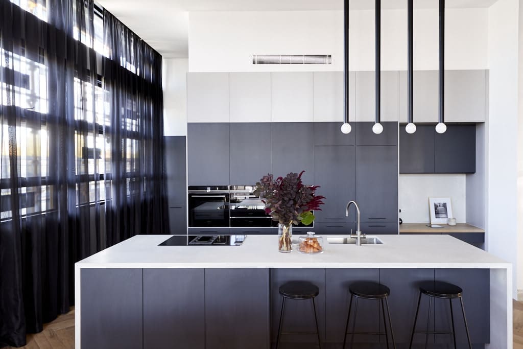
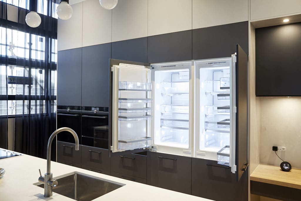
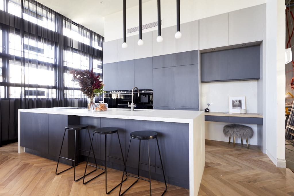
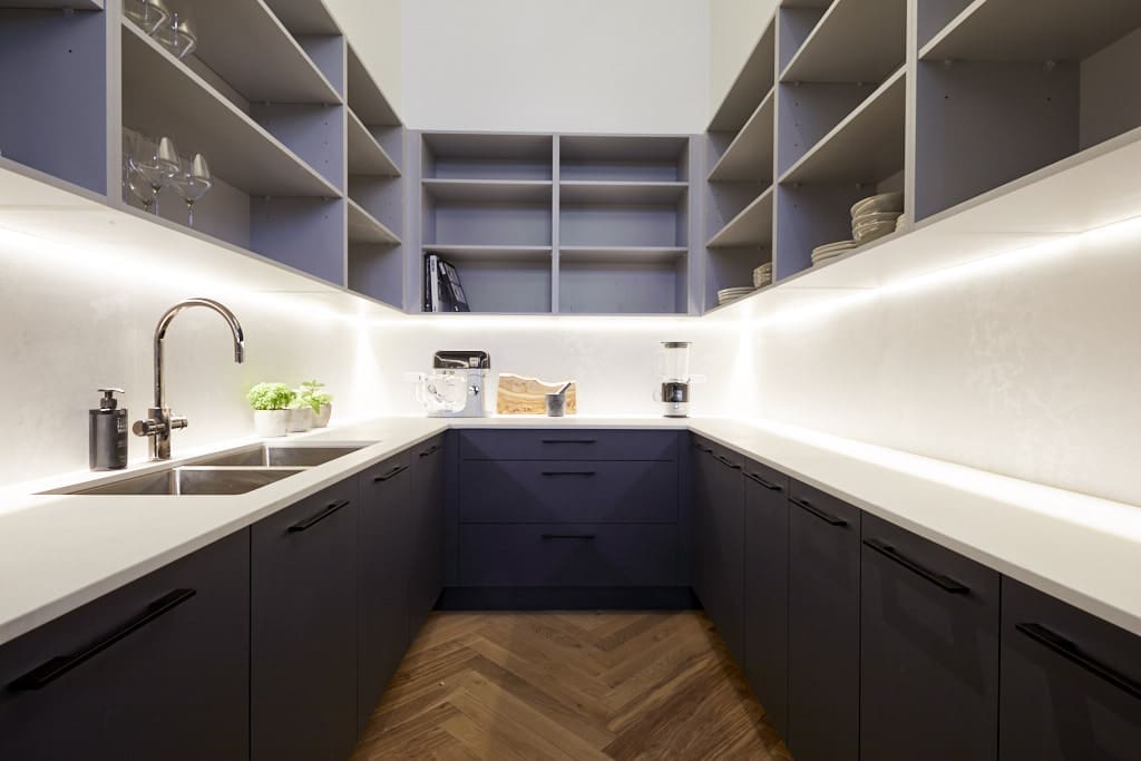
Bianca and Carla
This kitchen also got us really excited! Loved that these ladies always push the boundaries with lighting and those exclamation style pendants over the island are an understated architectural feature that we haven’t seen before.
While some people thought the study nook in the kitchen was an odd choice, we think it’s super functional. How many of you charge your phones and devices in the kitchen after work?! And that small pop of timber and stone breaks up the cabinetry, adding warmth. This feels like a kitchen you’d call home while still being super sleek and high end. Loving it sick!
What did you think of the kitchens? Be sure to check out The Block Shop if you’ve spied something you love in this week’s room reveals. Tell us your fave kitchen in the comments below!


Comments are closed.