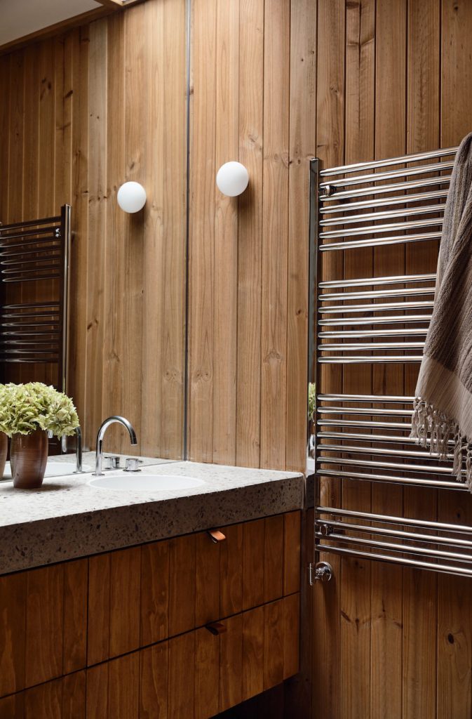
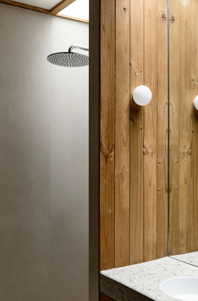
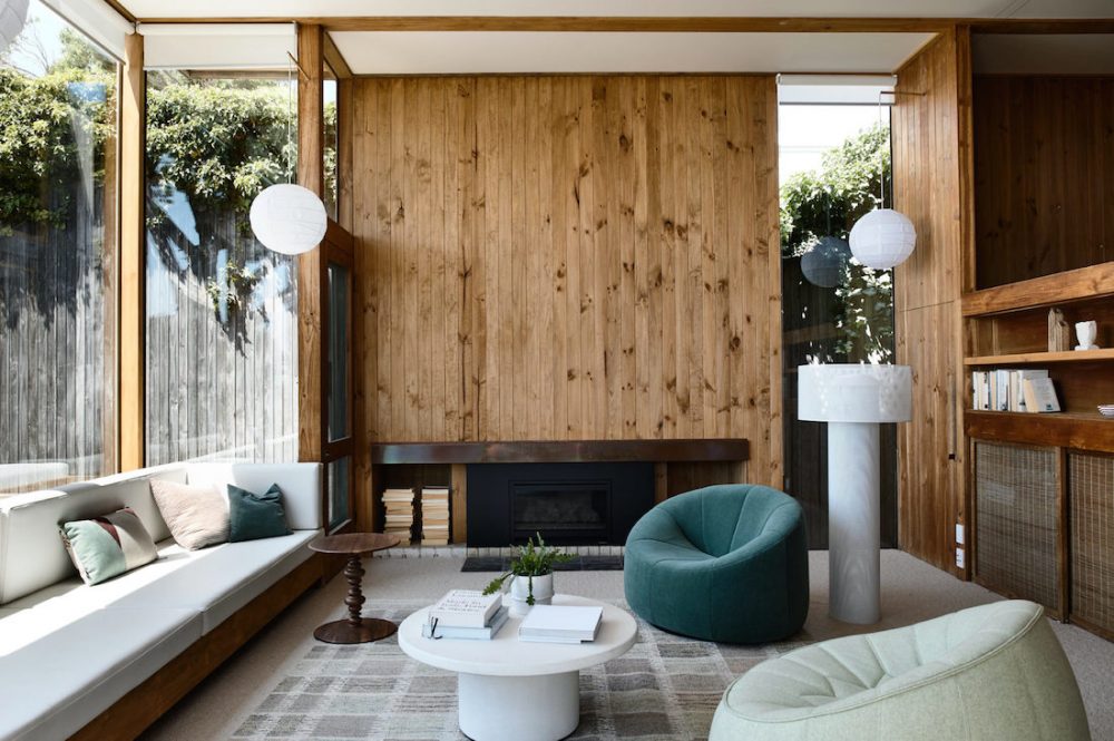
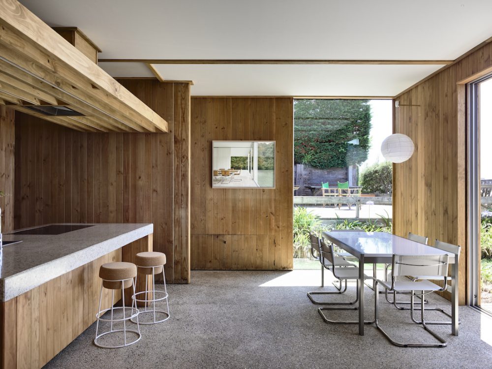
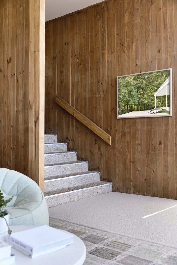
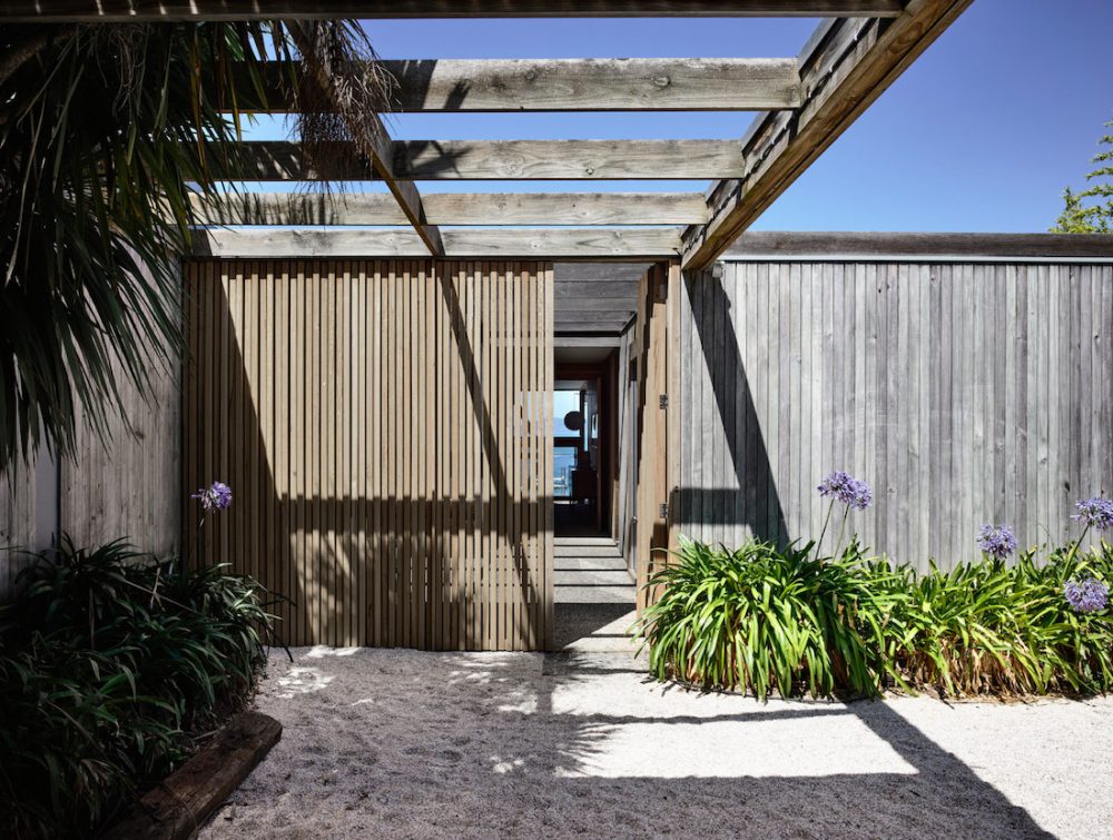
Today’s home tour is certainly unique. Built in the 1960s, with retro features such as timber panelled walls and pebblecrete floors, Sorrento House is like no other home we’ve visited.
We take a wander through with the team at Cera Stribley, the architects behind the recent works — re-imaging zones of the home and adding modern comforts while staying true to the original design.
Related article: The sleek and contemporary lines of Concrete House
Related article: Palm Springs vibes with a visit to the Suncatcher House
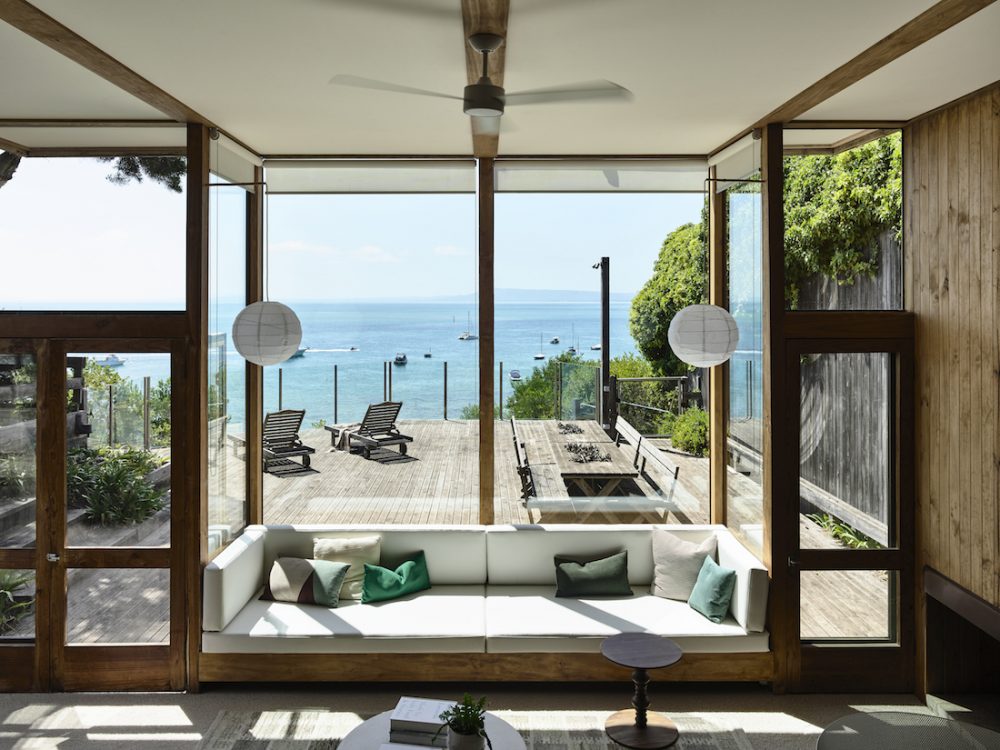
Originally designed in the 1960s, the owners wanted to upgrade the home with modern comforts but keep its unique features.
Originally designed by McGlashan Everist Architects, the owners were conscious of the significance of altering their architecturally designed modernist home.
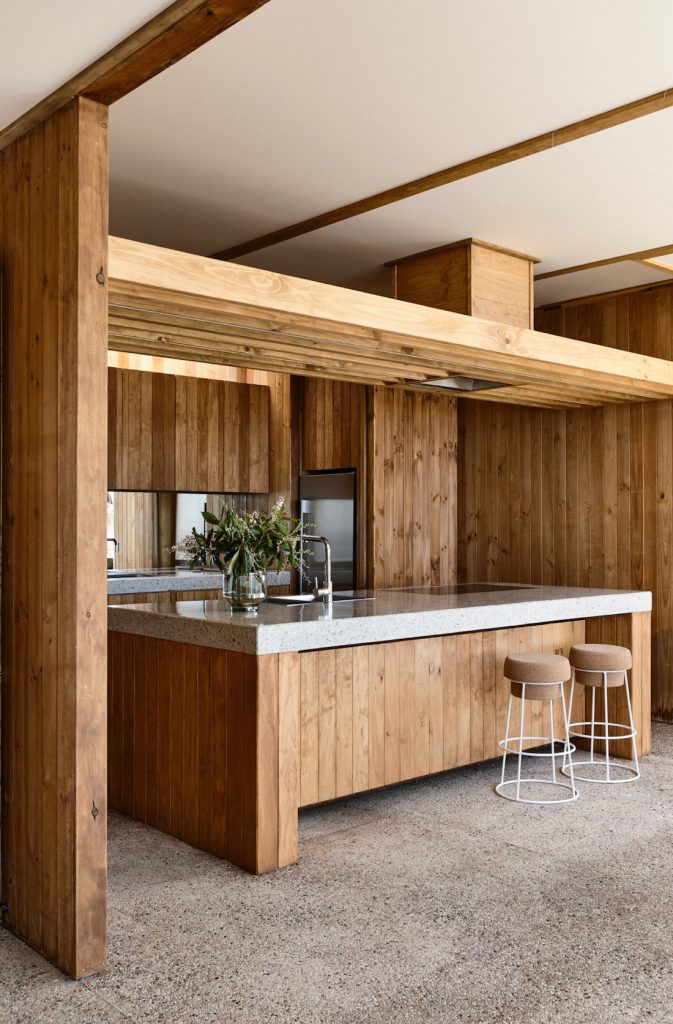
They wanted to retain as much of the character of the original home as possible, while updating it to accommodate modern living needs. The upgrades included the kitchen and bathrooms, installing hydronic heating, and removing a heavy end wall to free up circulation.
They added new joinery and renewed the stained timber walls and stretched canvas ceiling. All the improvements were in line with the aesthetic and intentions of the original home.
In an age where it can be tempting to build an elaborate, over-scaled beachside villa, this project did quite the opposite.
Preserving the original aesthetics was key to this renovation (take a look at the amazing original photos here), with subtle modern touches added throughout.
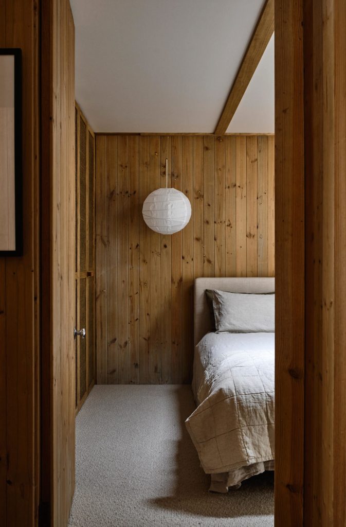
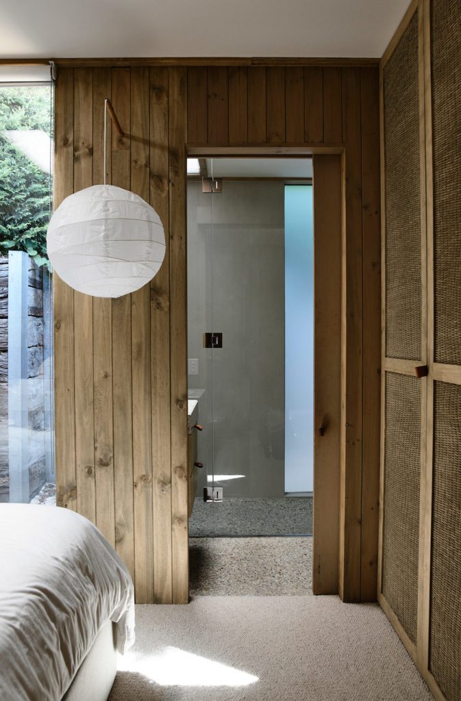
The home features 4 bedrooms, each with its own bathroom. A second lounge / guest bedroom off the entry courtyard acts as an additional self-contained room. Each of the rooms is modest in size, which is quite typical of the 1960s era.
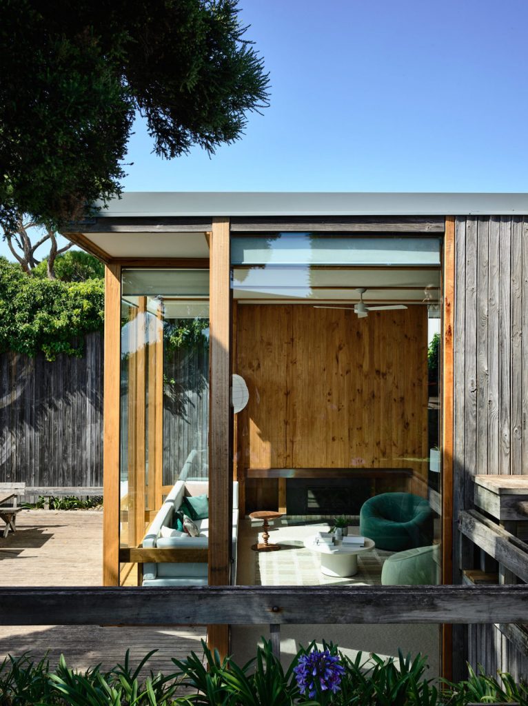
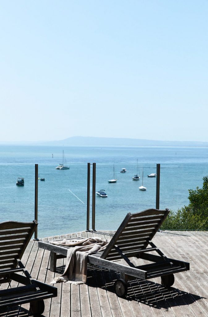
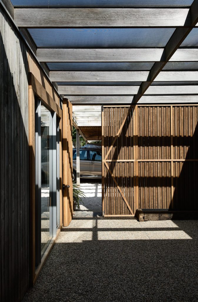
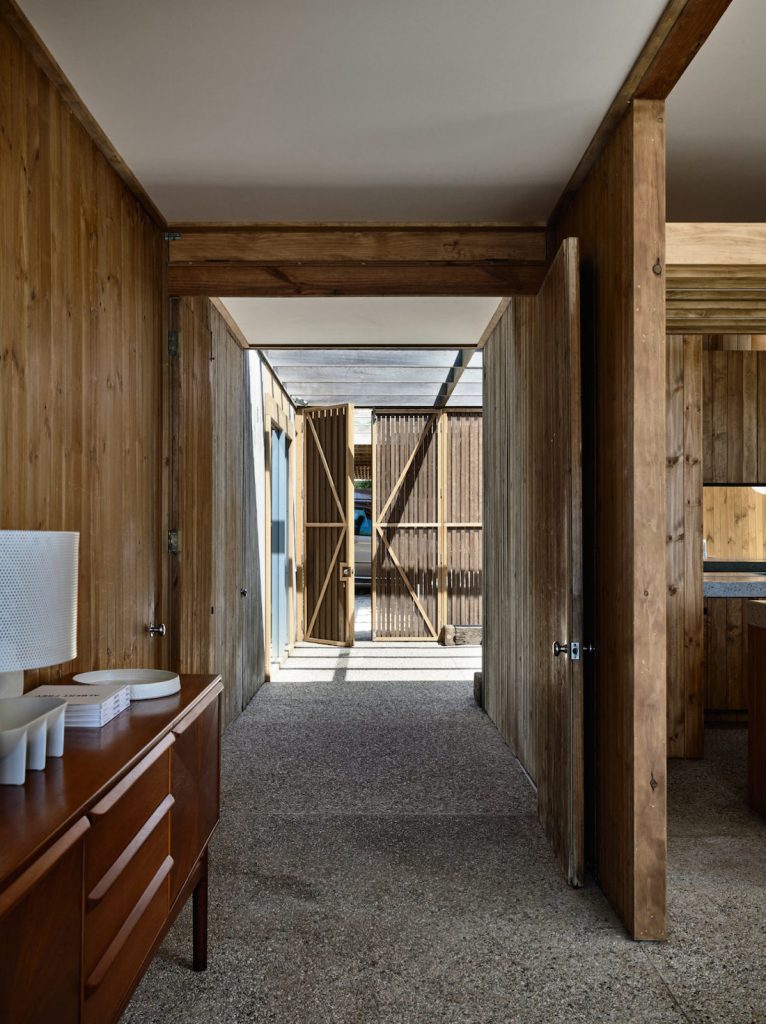
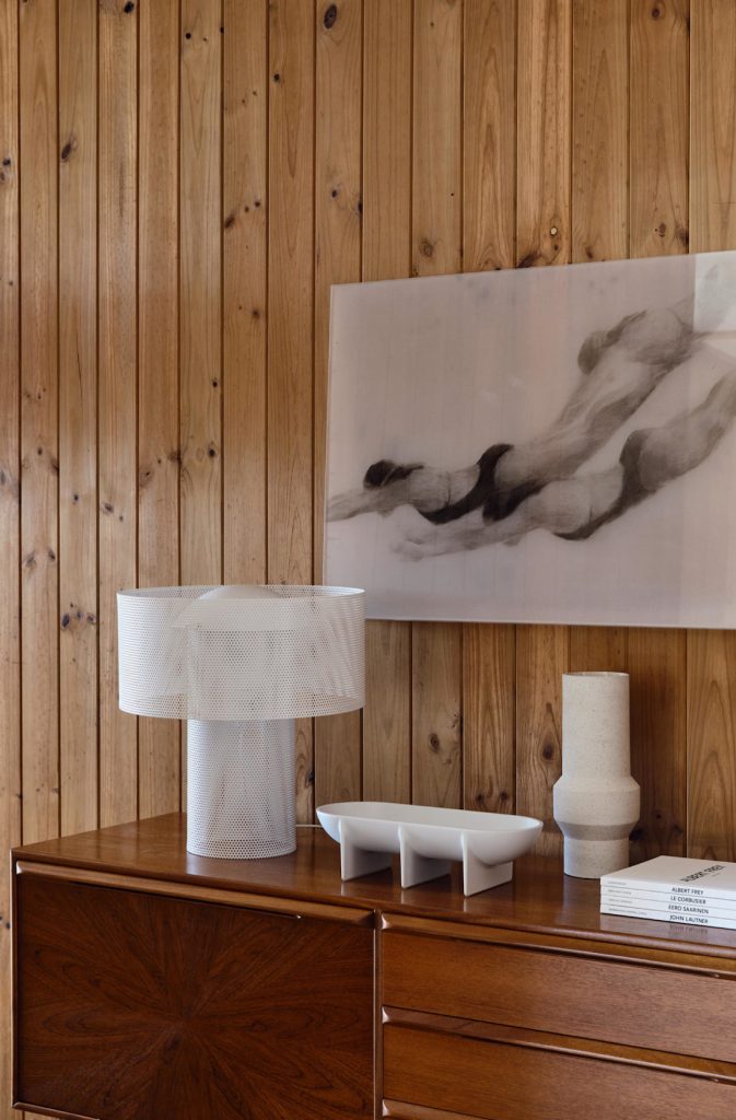
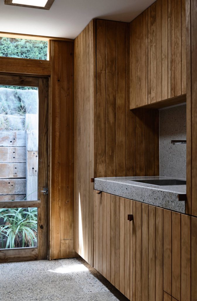
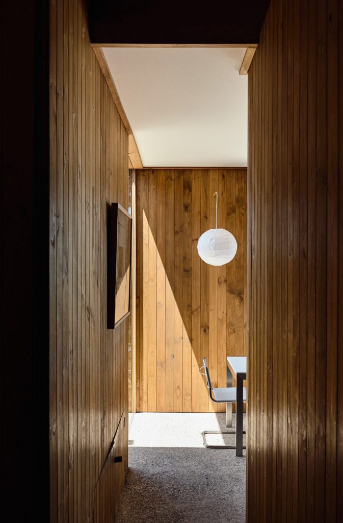
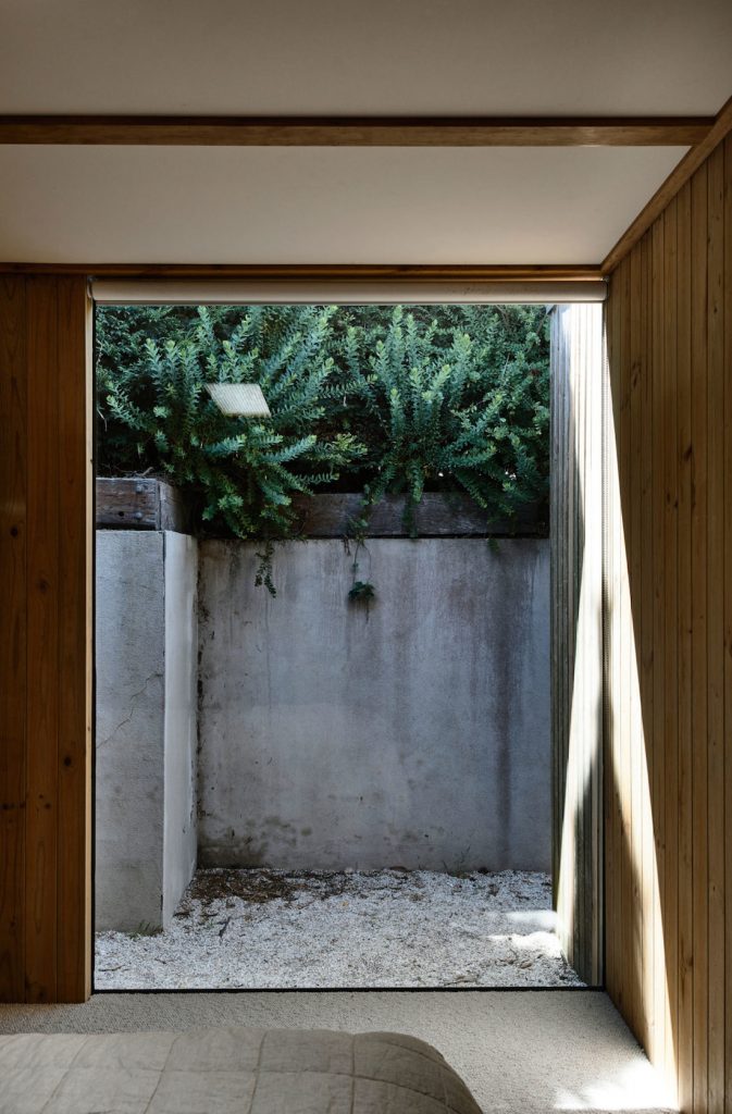
The home is built across 3 slightly cascading pavilions. Pebblecrete slab floors and timber panelled walls link the pavilions, cleverly encapsulating the stunning views of the bay. It’s believed these original materials were chosen to blend with the Moonah trees growing on the cliffside.
For the upgrades, the Cera Stribley team felt it was extremely important to preserve the original aesthetic, mimicking the original joinery and keeping the colour palette of timber and concrete. They took notes from the design values of a bygone era and made small but noticeable adjustments.
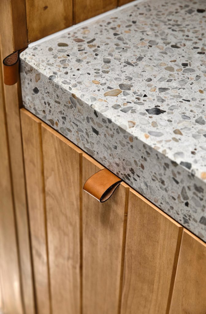
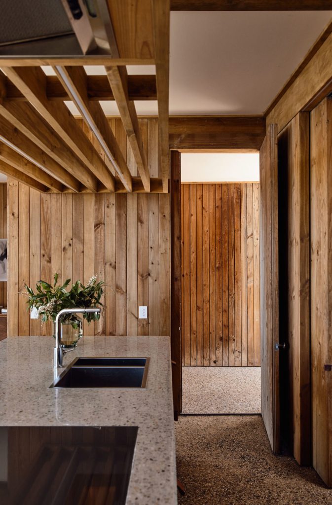
Such as the inclusion of the new leather hand pulls. These were designed to look as though they could be part of the original home.
Another example is the overhead lighting in the kitchen. It was built and concealed in the timber ceiling to ensure the contemporary fixtures would not be overbearing.
From the outside, the upgrades to this home look simple enough, however the renovation was not without its challenges.
The project gave Cera Stribley a rare opportunity to work and preserve a building within its original condition. A key challenge of the renovation was integrating contemporary living needs within a floorplan with a concrete slab floor.
The design would have been ruined if another look or design genre was applied to the house. It’s what makes Sorrento House truly unique. It retains its past.
The specialist artisan trades worked with incredible care to install the hydronic heating behind the timber panelled walls. They had to remove them piece by piece, before re-instating them.
The stretched canvas ceiling also had to be meticulously re-worked. It was the level of care and detail on such important components of the project that helped achieve the final results.
Big thank you to the team at Cera Stribley for allowing us to take a look around this modern classic. To see more projects from Cera Stribley, visit their website or take a scroll through their Instagram.
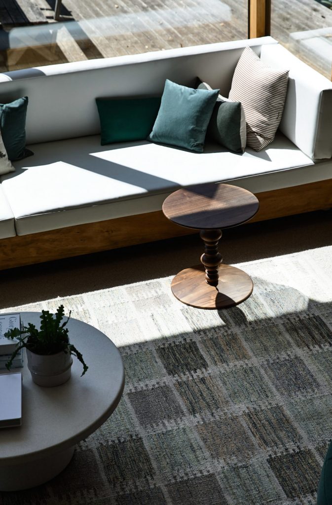
What a home! We loved visiting the 1960s yet admiring those modern features. What was your favourite? The view? That fabulous original built-in lounge? Or perhaps those unique timber panelled walls!? Tell us in the comment section below!
Builder — Leone Construction, together with artisan crafts people
Photography — Derek Swalwell
Styling — Bea & Co
More home tours here
