Kitchen week on The Block is always one of our fave reveals. The kitchen can make or break a home, so we were excited to see what the teams delivered.
From pill-shaped windows to perforated metal cabinetry, there were lots of new design ideas this year. Sit back while we take you through each room, judges’ comments and our fave features…
Related article: The Block 2020: Week 6 — Kitchen reveal
Related article: The Block 2021: Week 6 — Bedroom and re-do room
Ronnie and Georgia
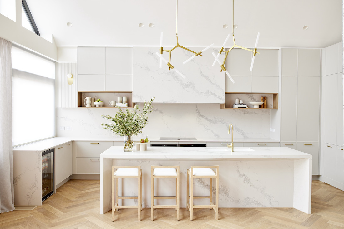
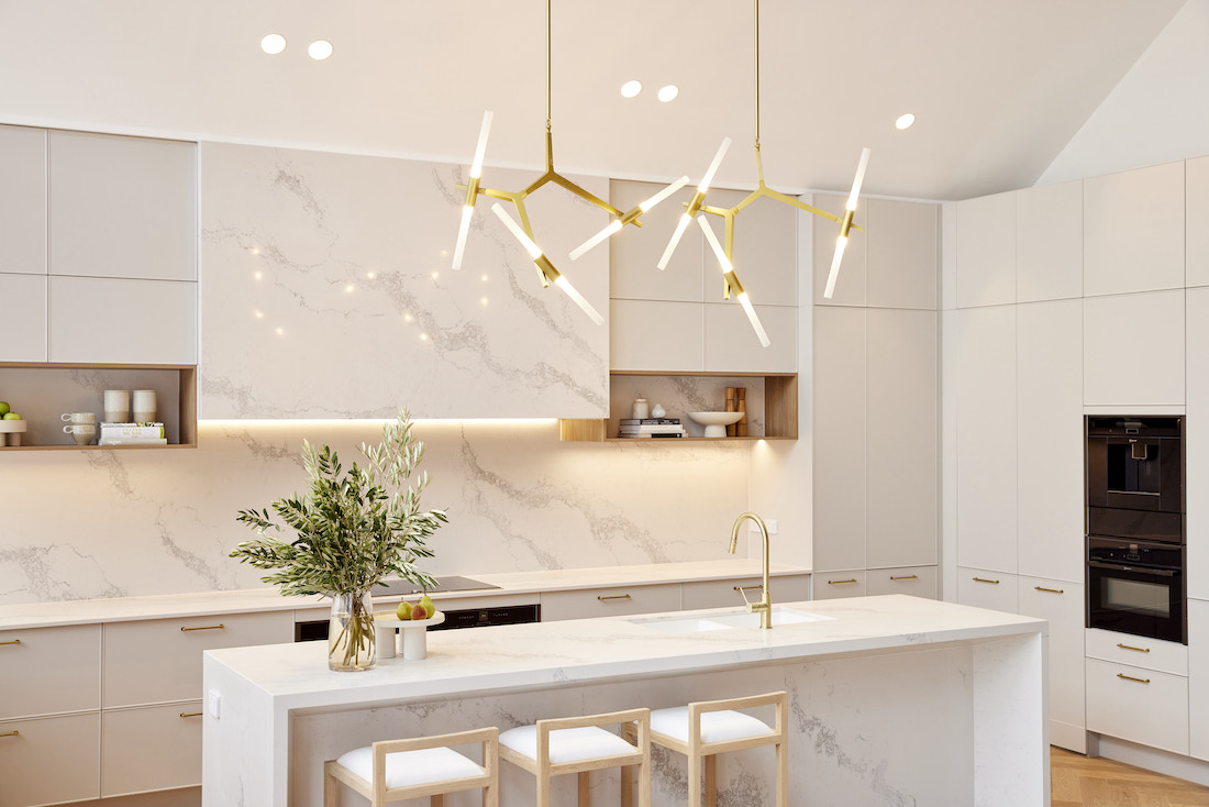
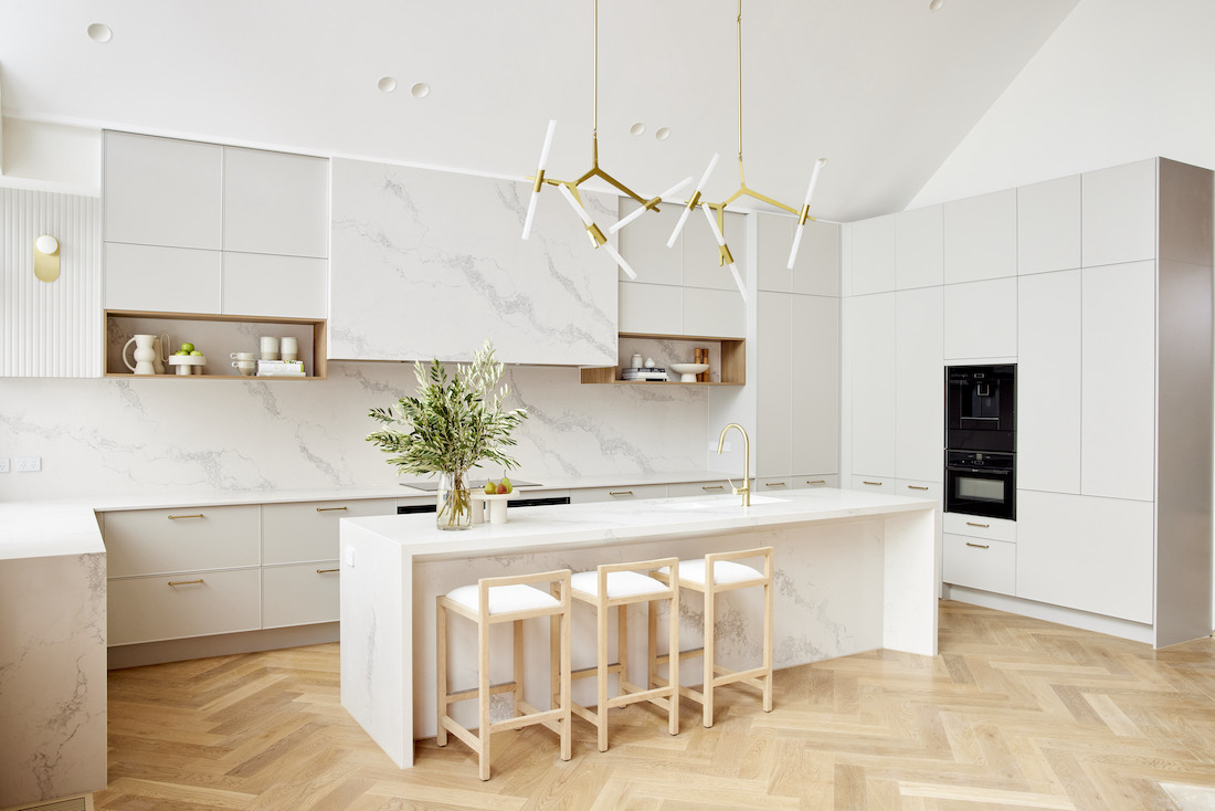
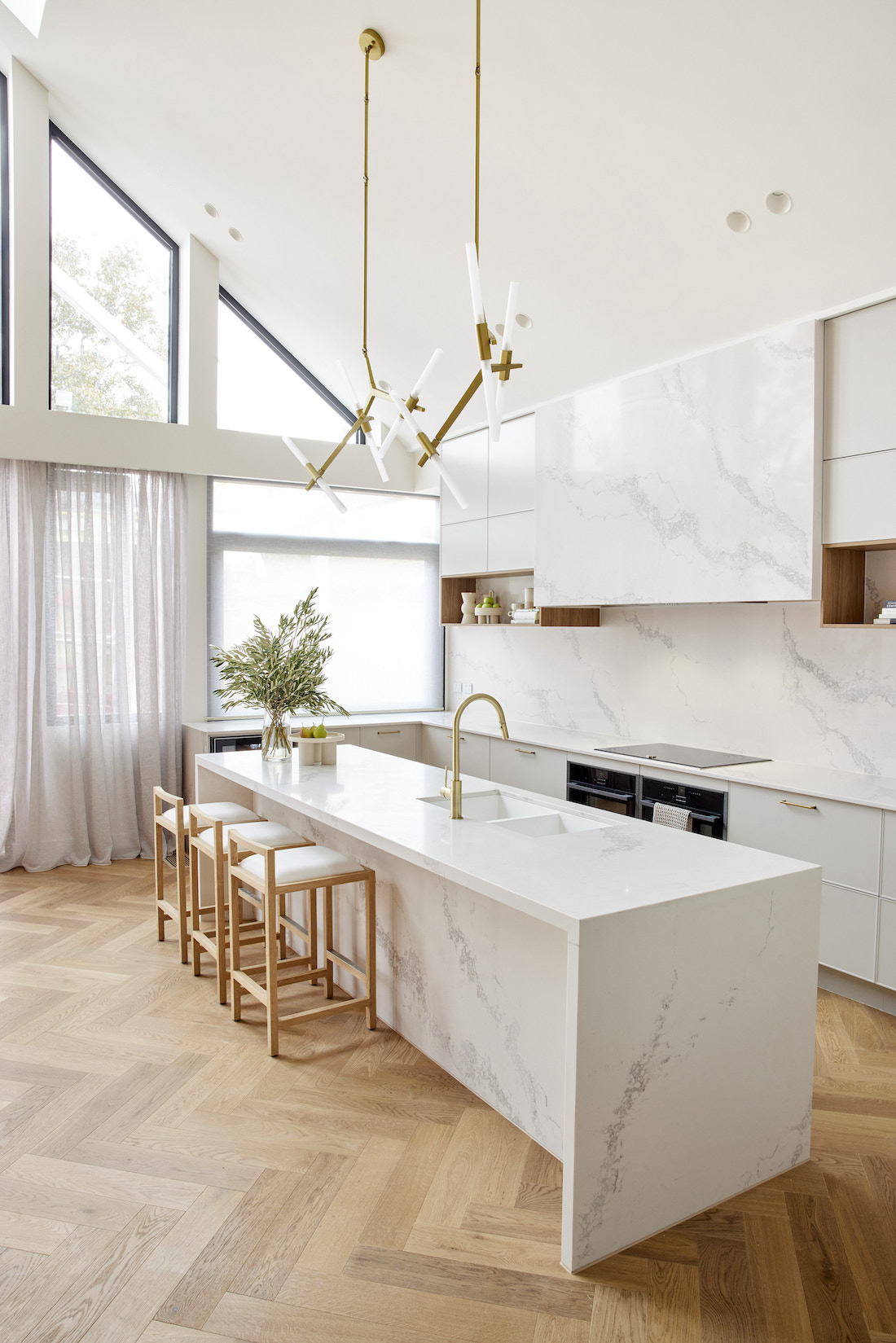
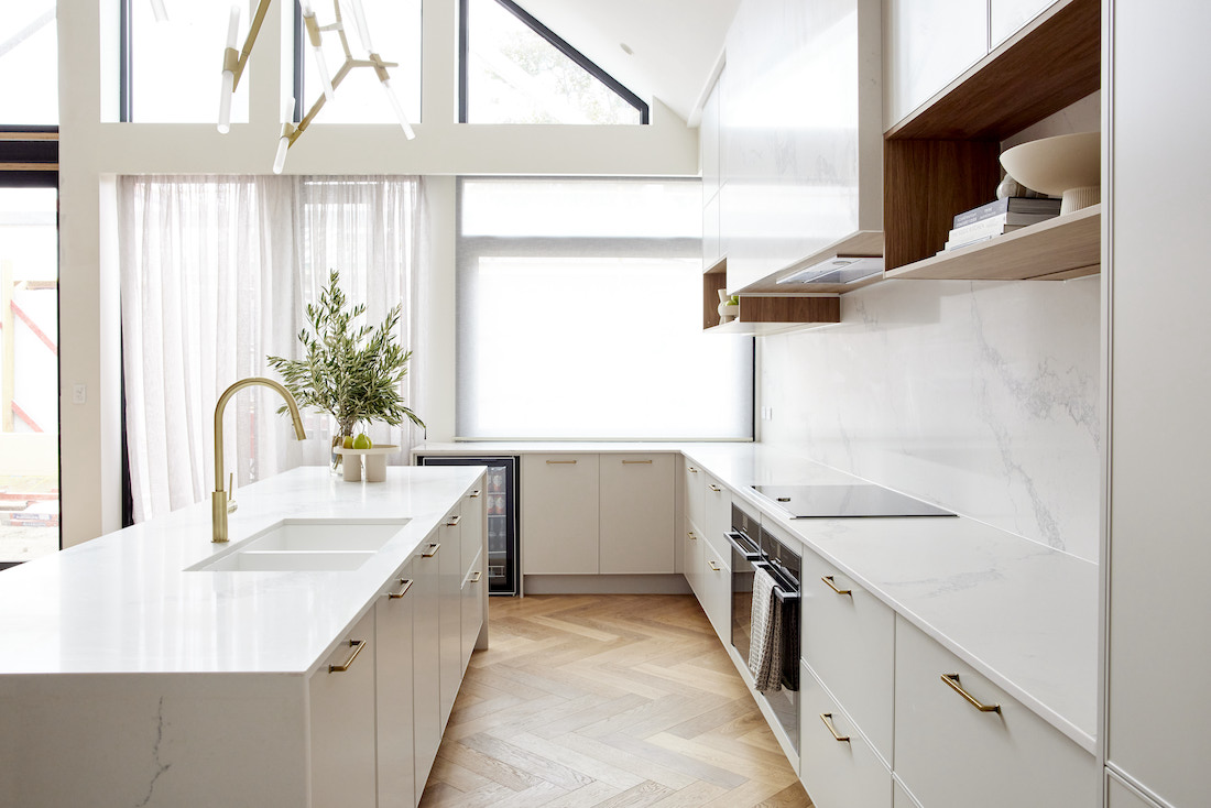
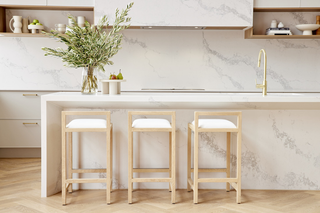
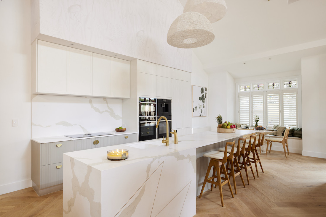
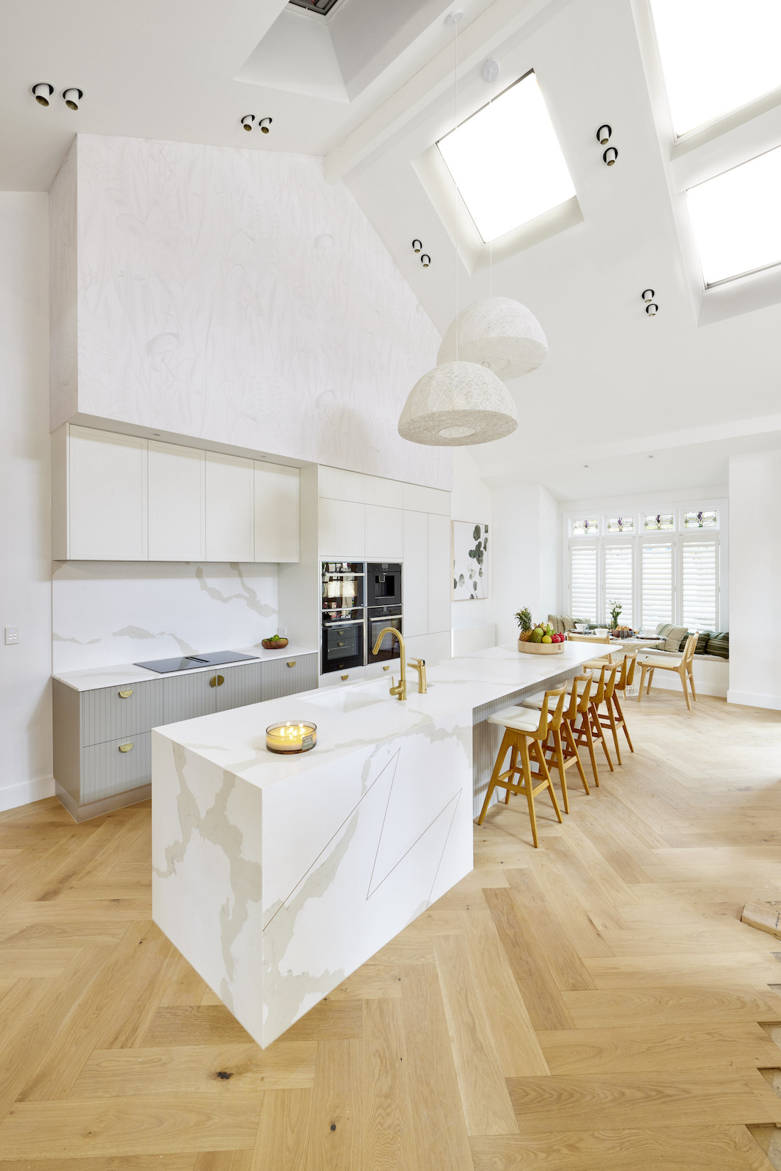
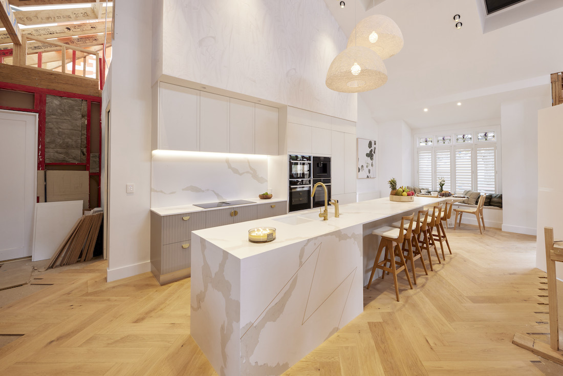
Gorgeous, gorgeous, gorgeous! Our feedback on Ronnie and Georgia’s reveals week after week is repetitive but warranted! For kitchen week, it was simplicity done to perfection.
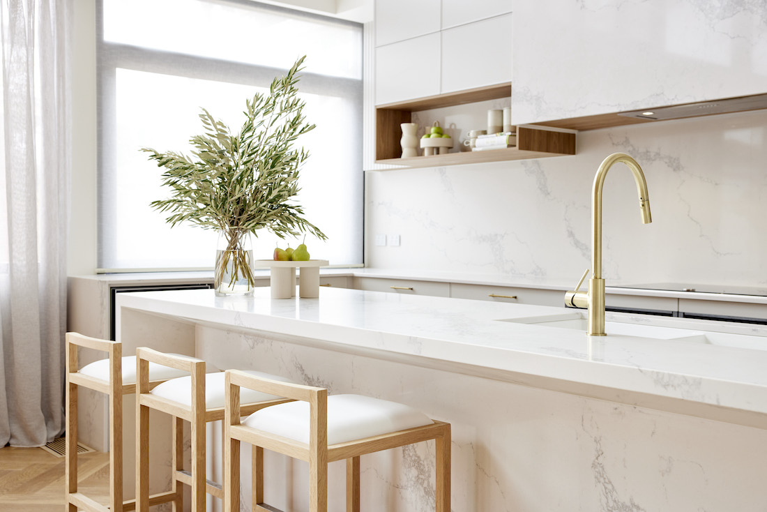
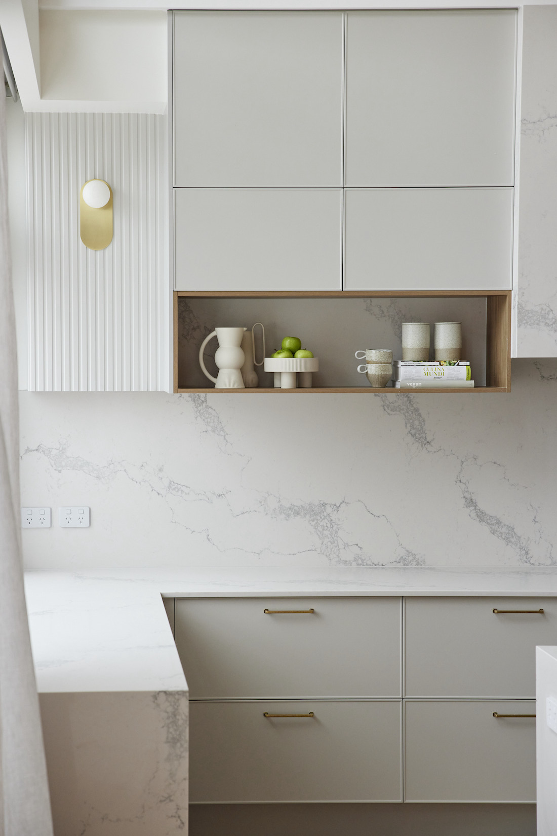
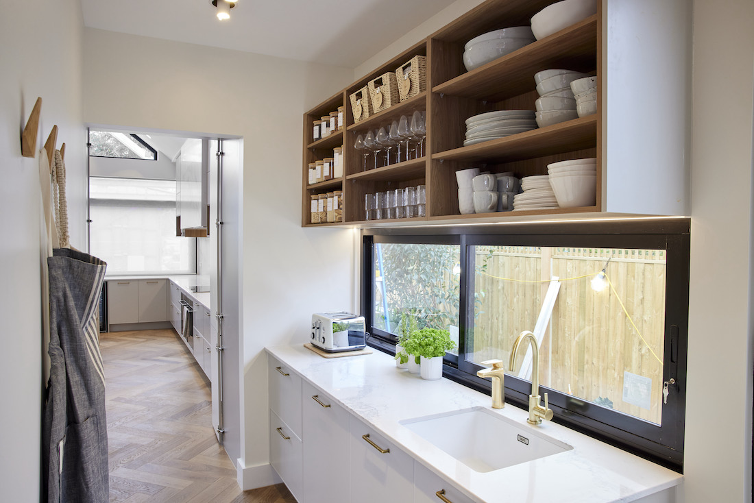
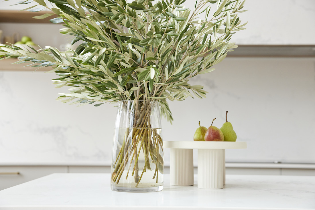
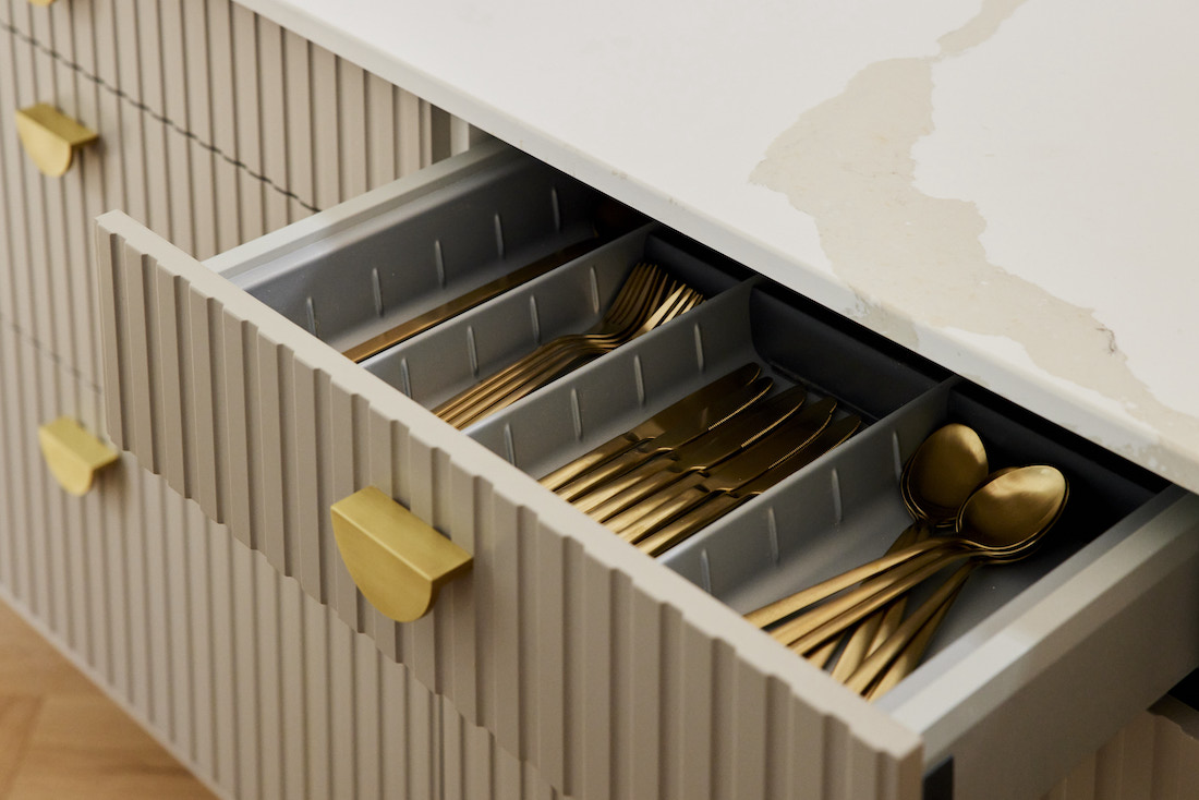
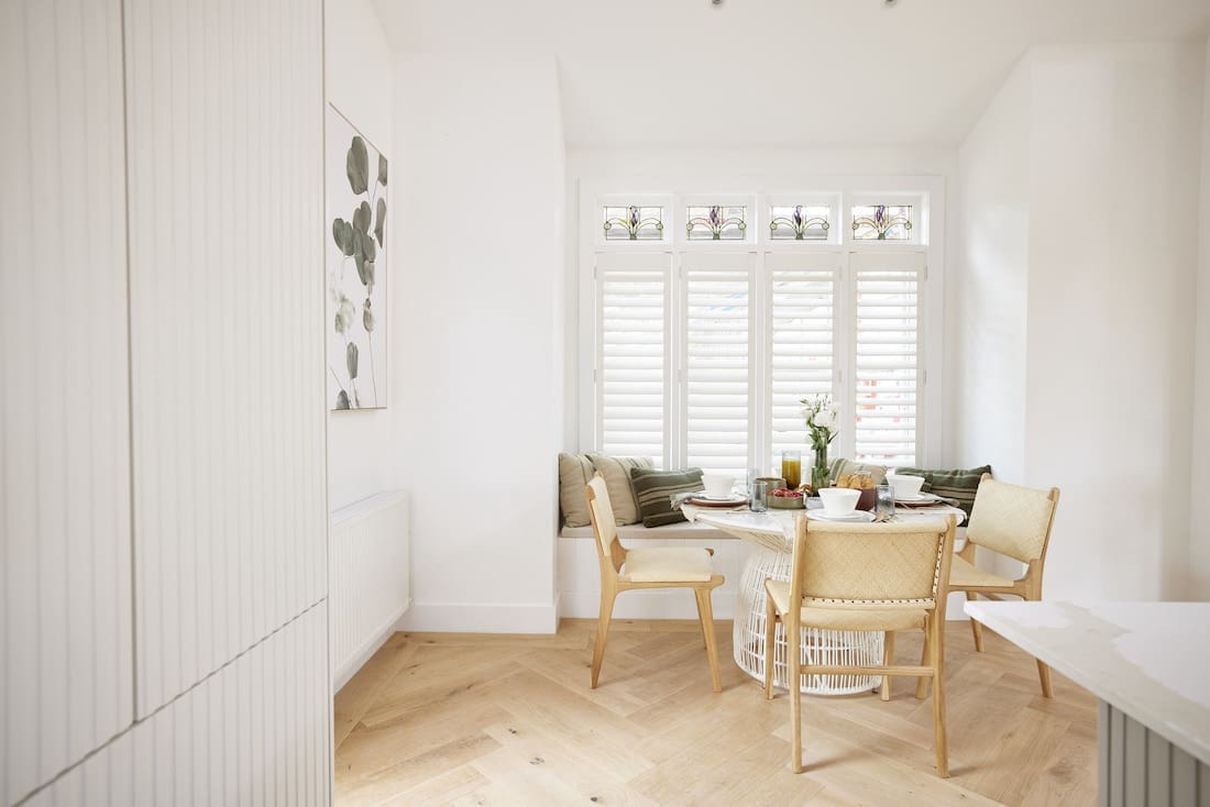
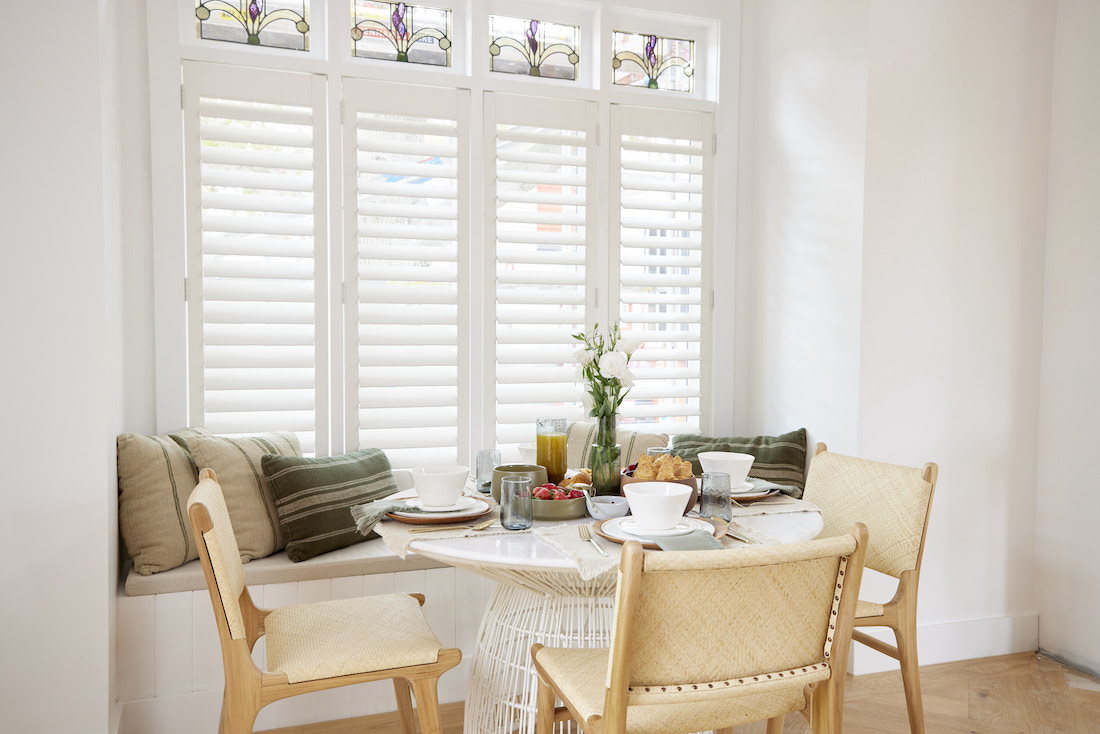
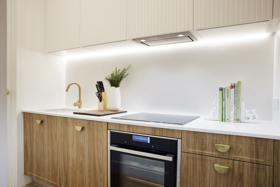
Ronnie and Georgia carried their Caesarstone benchtop up for their splashback and wrapped it around the rangehood too. It creates a big statement that oozes luxury. The profile on their cabinets, subtle scalloped detailing and open kitchen shelves add texture and soften the space. Gold hardware, tapware and that statement pendant light are the jewellery of the space. Oh, and we can’t forget the timber herringbone flooring — beyond dreamy!
The judges agreed, calling their kitchen ‘impeccable’ and ‘the new classic’ with Darren stating it was, “A kitchen to fall in love with.” And fall in love we have!
Cost: $39,396
Score: 27 / 30 (2nd place)
Mitch and Mark
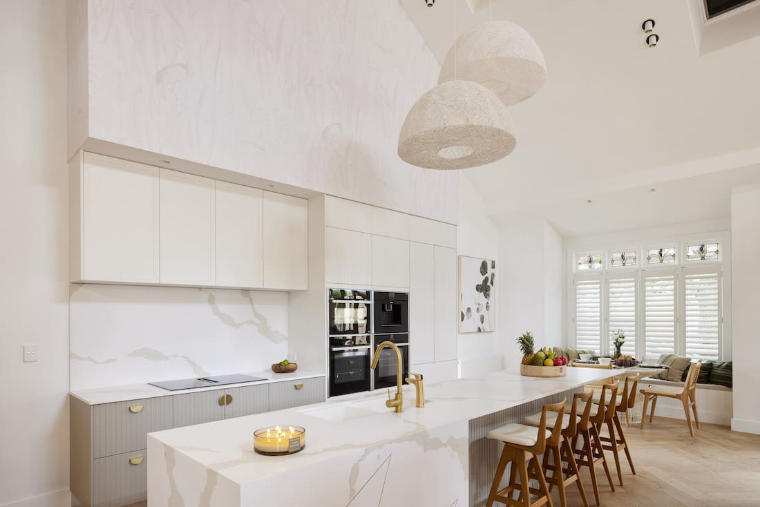
There were so many features of Mitch and Mark’s kitchen we loved… yet somehow all together, they didn’t haromonise.
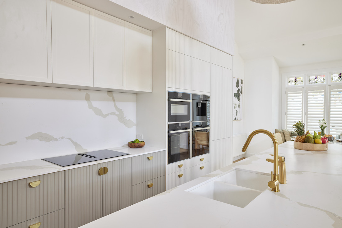
Let’s talk things we loved first. That grooved joinery — tick. The muted joinery colour — tick. Those brass handles — tick. Functional layout of appliances — tick.
Buuuut what is with that bulkhead?! It draws your eye up and away from the kitchen. This space would look 100% better if they painted it the same as their walls so it drops away. The ‘M’ in their island also gets a hard no from us.
We also didn’t understand the rationale behind the different cabinetry profiles — why are most grooved but the overhead cabinets have a shaker profile? This space would have been a lot more successful if they either used grooved door-fronts in the whole space OR only used grooved on the island and then shaker for the entire wall of the joinery. Same goes for the colour — either take it all the way or just use it on the island.
The judges were impressed with this kitchen, Darren declared “Just breath taking” when he saw it and went on to say it has the kind of appeal buyers want. However, as they didn’t present a pantry, they were punished harshly and came in last place. Surely this will be fixed later on because it would be the world’s biggest sin to have such a stunning kitchen without a pantry!
Cost: $33,768
Score: 22½ / 30 (5th place)
Tanya and Vito
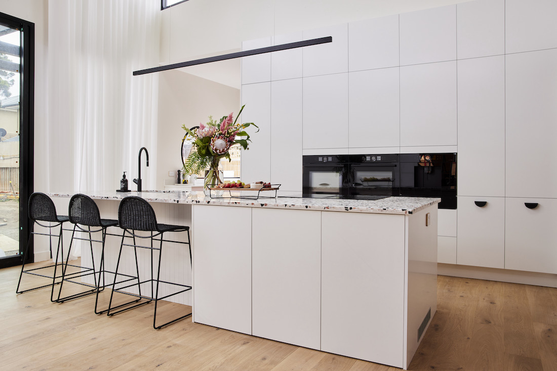
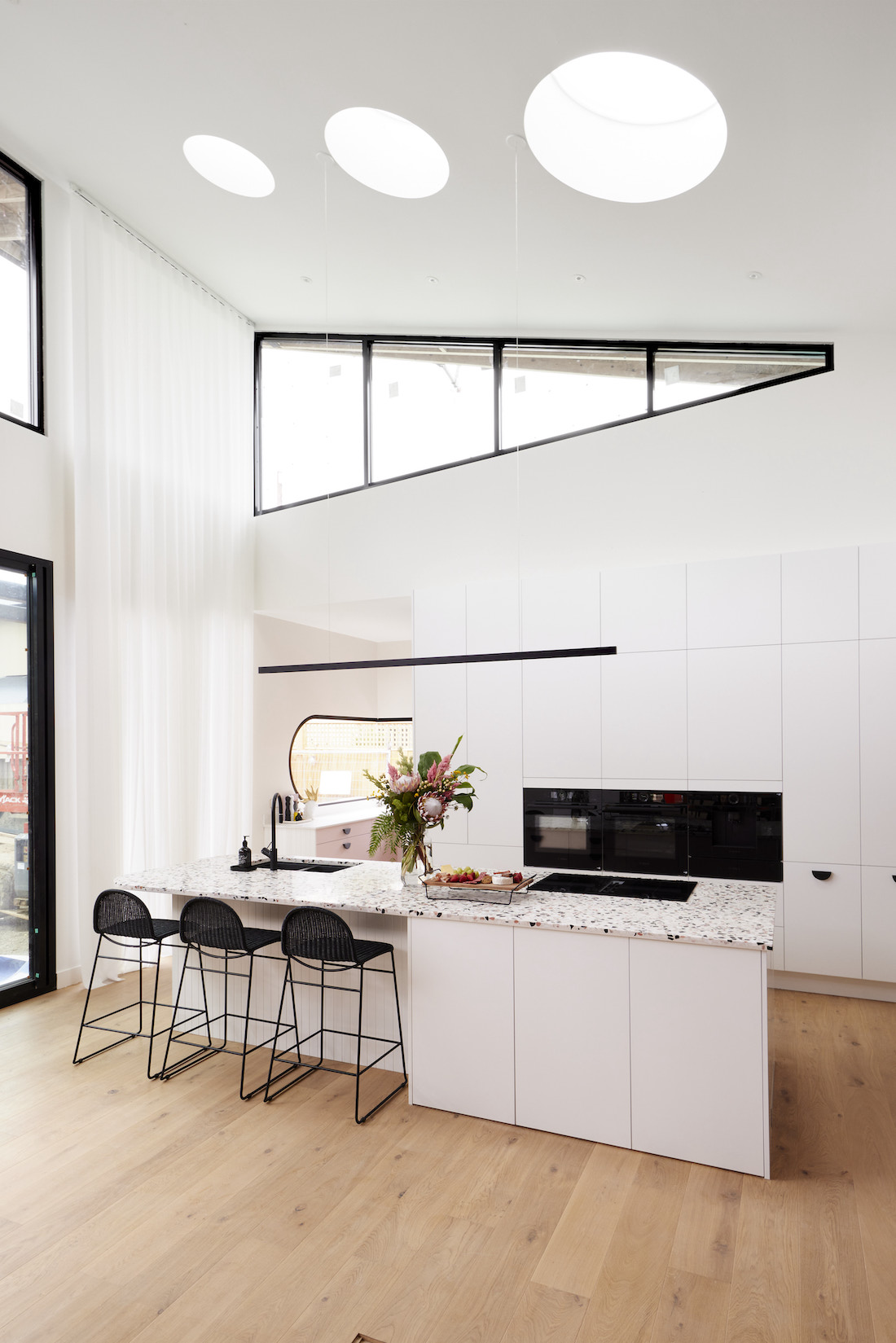
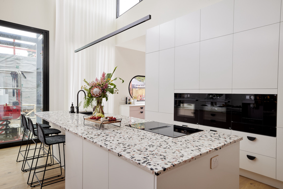
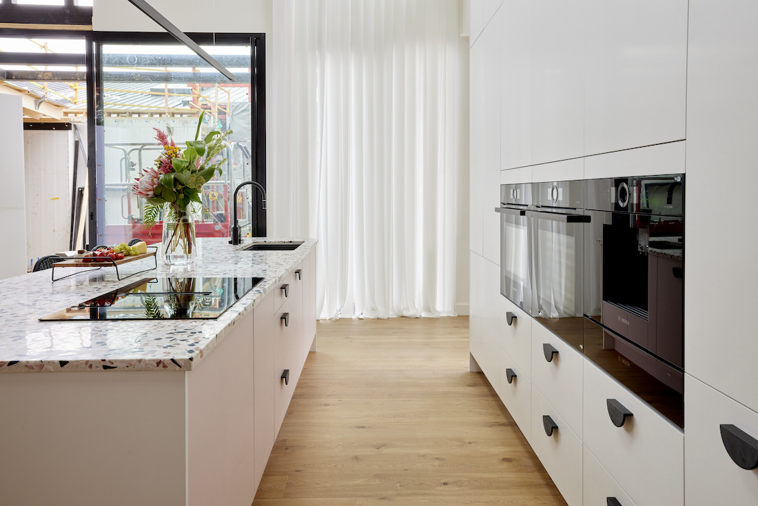
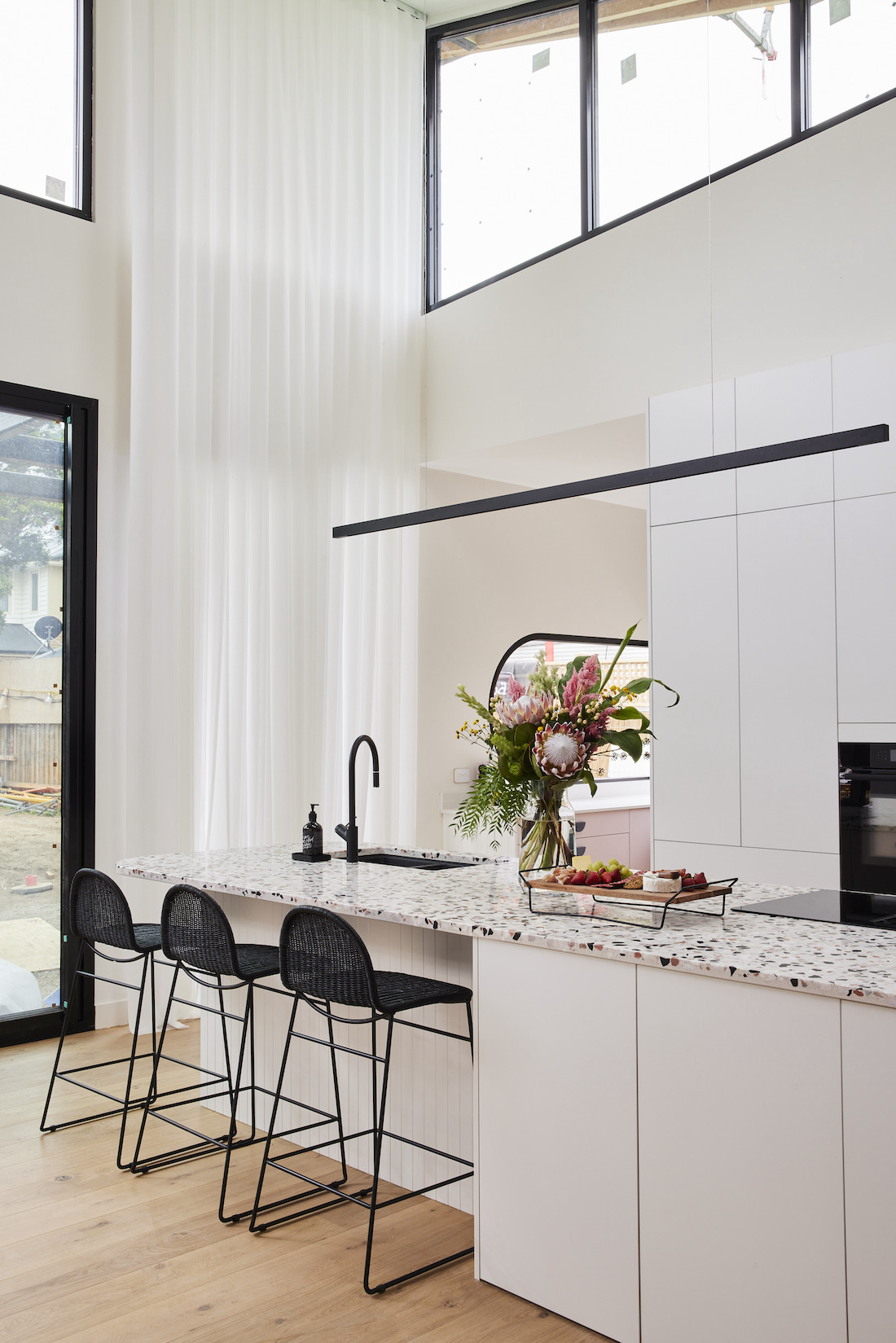
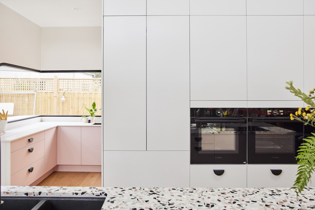
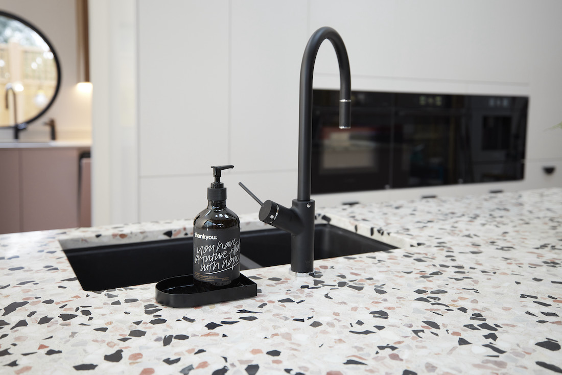
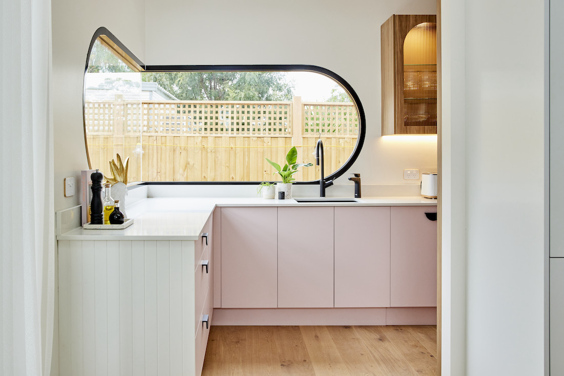
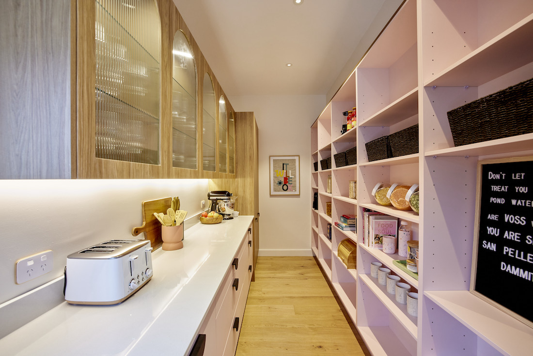
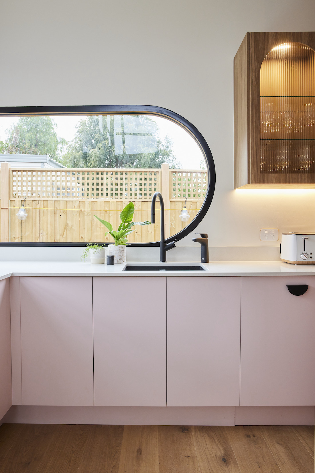
Not afraid to do things a little differently, Tanya and Vito pushed the envelope again for kitchen week. Their fun and playful terrazzo benchtops took centre stage with unique windows and a pink butlers pantry. Yes! Pink!
Neale had it right in saying, “This is a kitchen that says love me or hate me, but don’t ignore me.”
The windows are what sold us, bringing in ample natural light and the combination of their unique shapes is a nice addition without being too polarising. And there’s just something so beautiful and whimsical about those circular skylights, don’t you think!? We’re also lusting hard for that black extrusion pendant light which looks as if it’s simply floating over the island bench.
Then we move into the pink butlers pantry. Pink is a colour which buyers could love… or hate! Jimmy and Tam’s mint green kitchen from last year got people talking but they still took out top prize on auction day, so perhaps it IS what people really want! Personally, it wasn’t to our taste and felt like it belonged in a different house — what did you think?
Cost: $27,083
Score: 25½ / 30 (4th place)
Josh and Luke
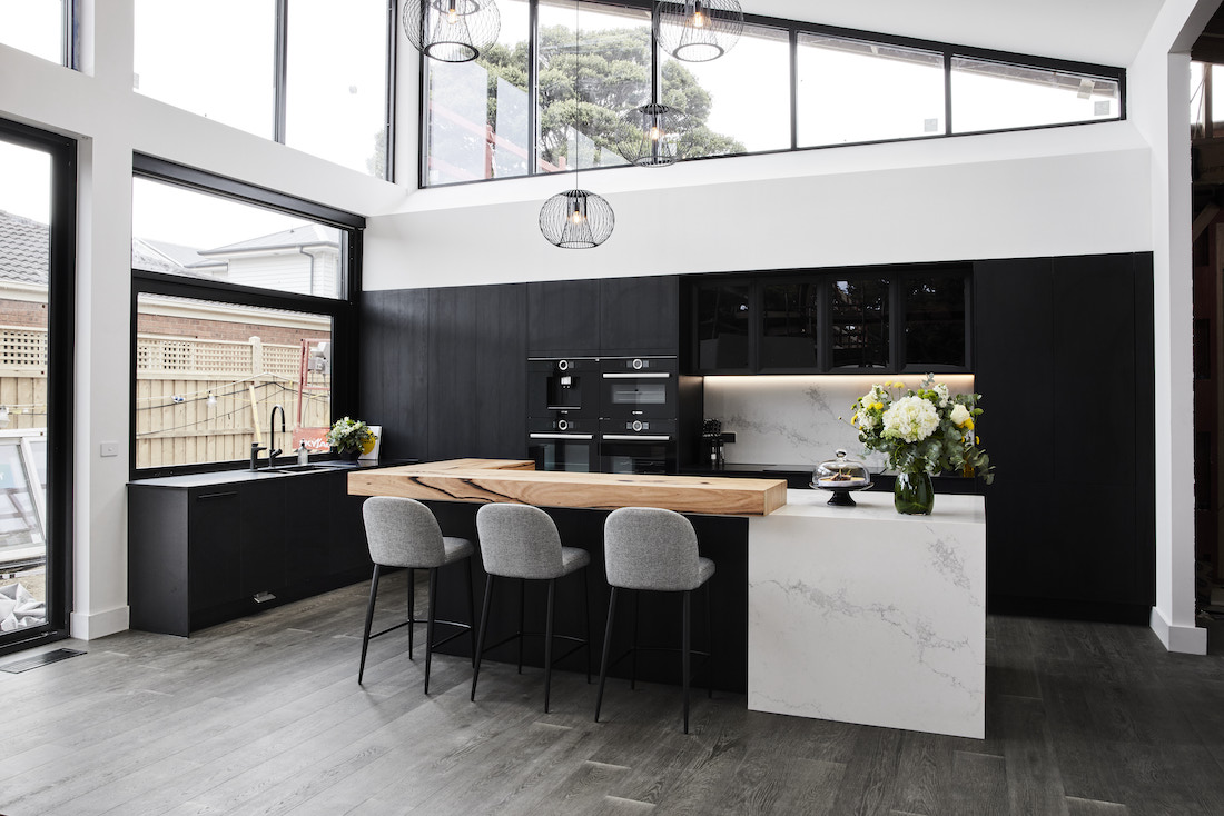
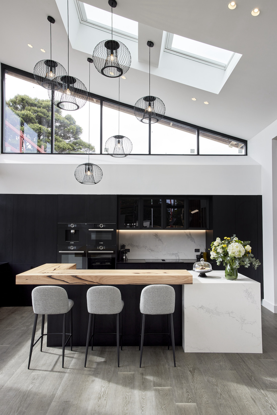
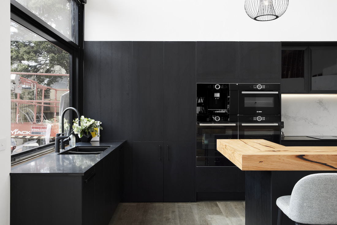
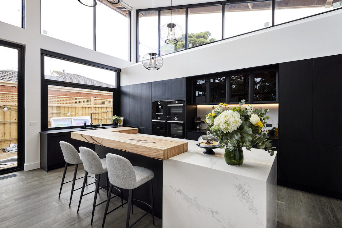
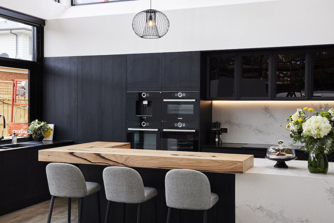
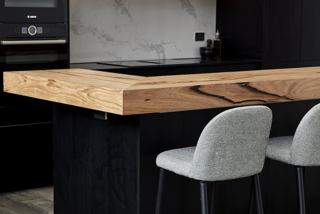
“It’s sexy and refreshing,” said Neale of the boys kitchen. The judges had a lot of good things to say about this space, pointing out the walk-in pantry and state-of-the-art appliances. They also welcomed the Christian Cole timber benchtop feature which softens the hard materials in this space.
Overall, we felt this was a big step up for the boys. It’s well executed and is sure to appeal to buyers come auction day — especially with that beautiful green outlook.
Of course there are some things we would have done differently… mainly a different flooring material and doing away with the glass door fronts (these guys just LOVE glass doors!).
The dark joinery, concealed pantry and appliances are giving us Guy Sebastian kitchen vibes. Take a look at Guy’s kitchen here.
Cost: $33,024
Score: 26 / 30 (3rd place)
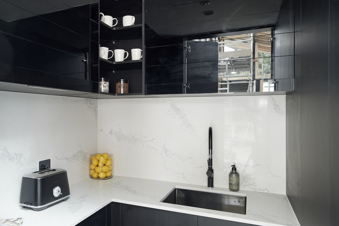
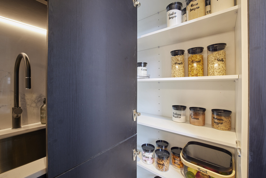
Kirsty and Jesse
It cost them a pretty penny, but it paid off with Kirsty and Jesse taking out the win for kitchen week. Just half a point off the perfect score, it was clear to see why the judges loved House 5’s kitchen.
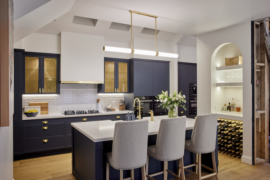
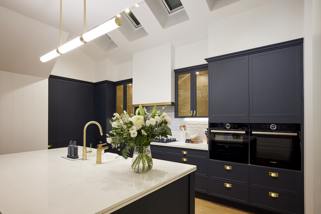
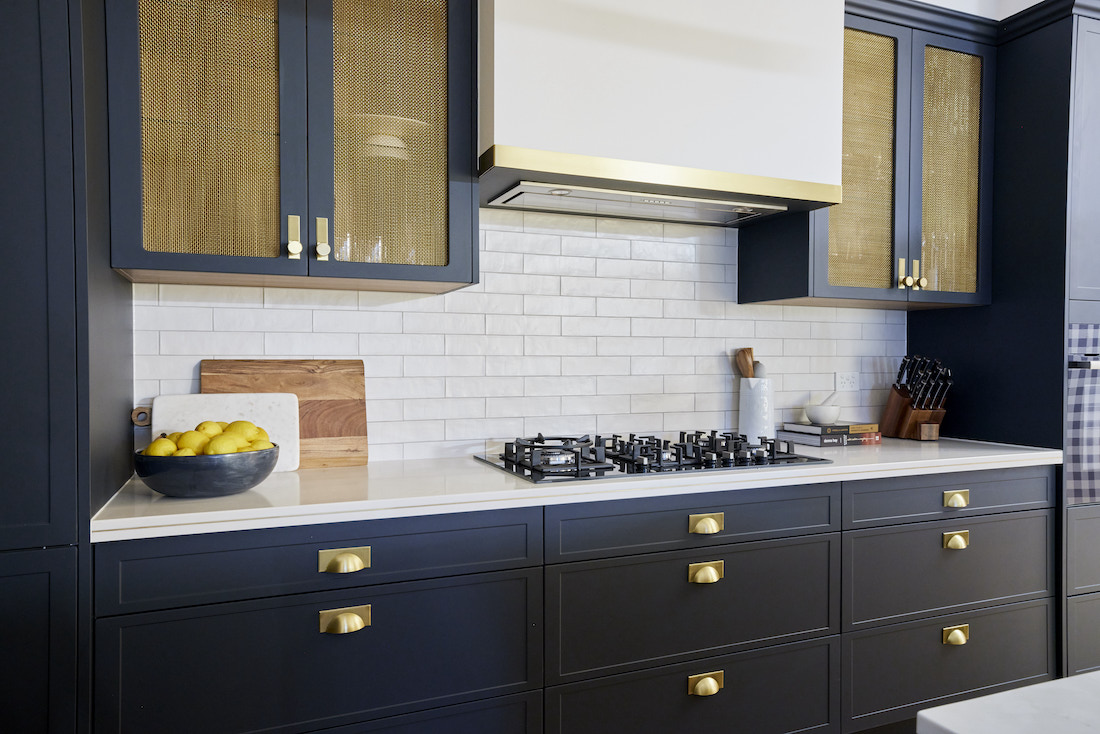
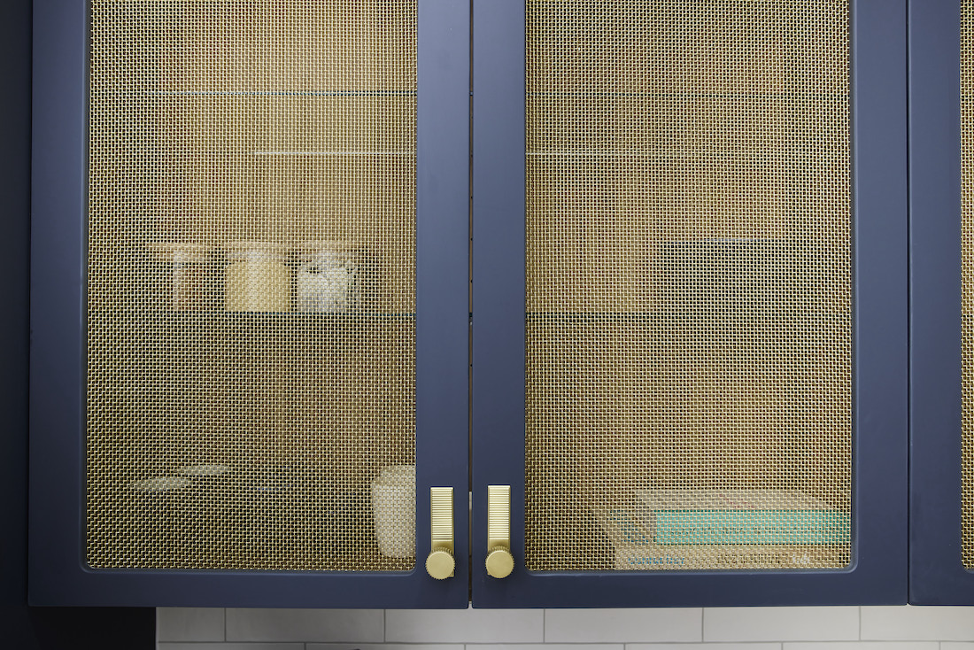
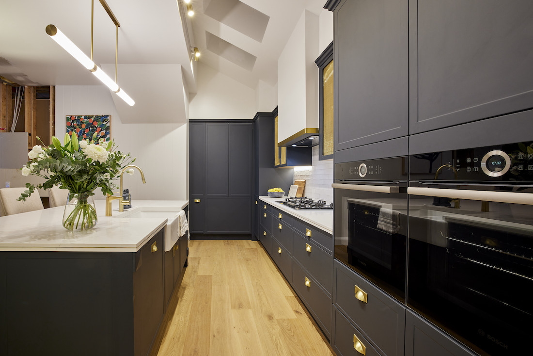
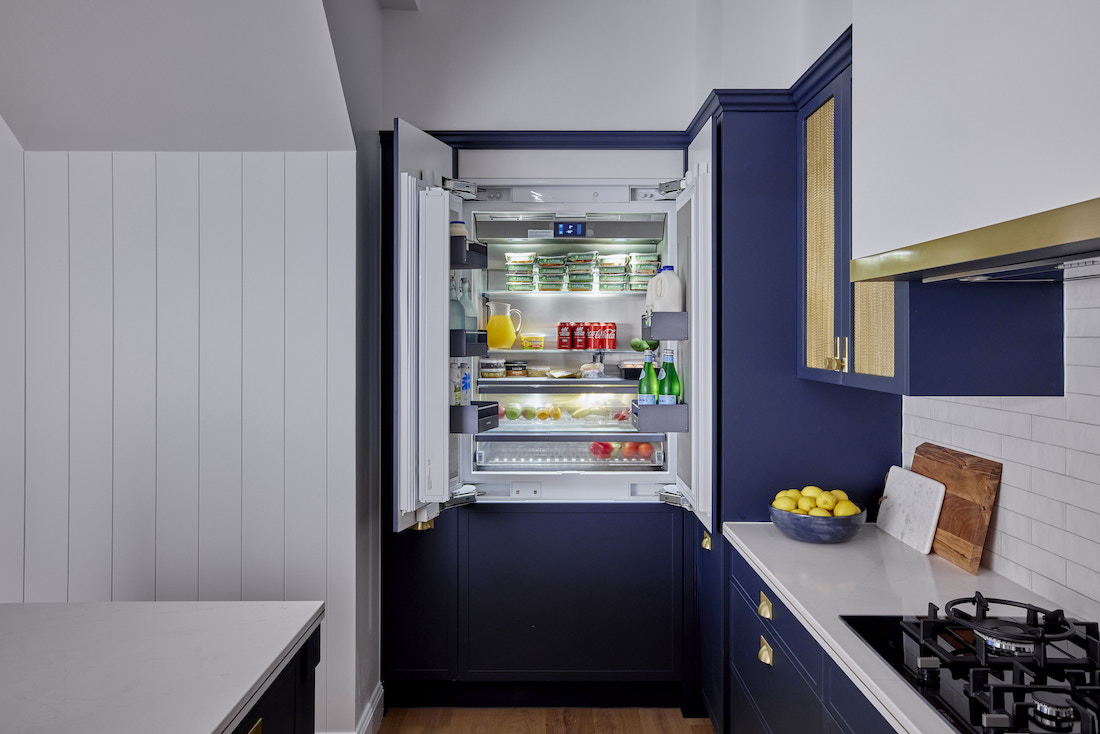
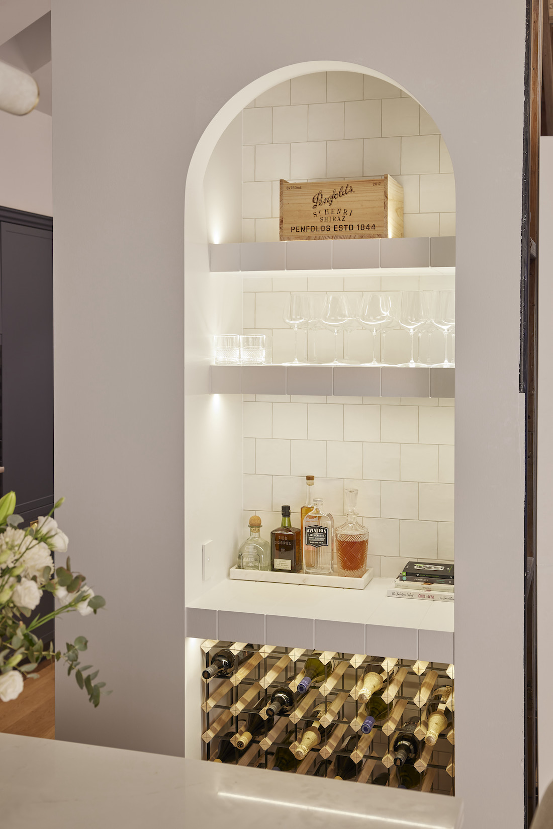
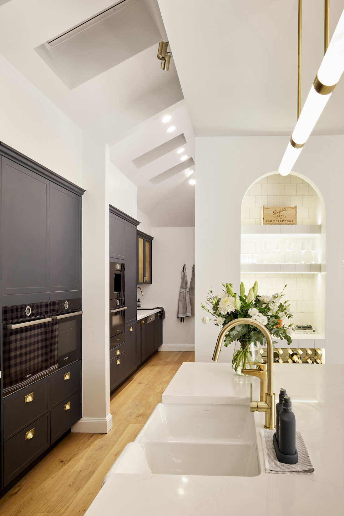
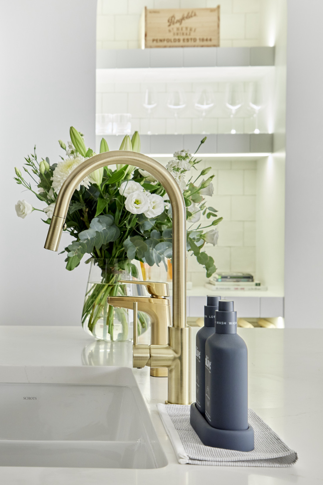
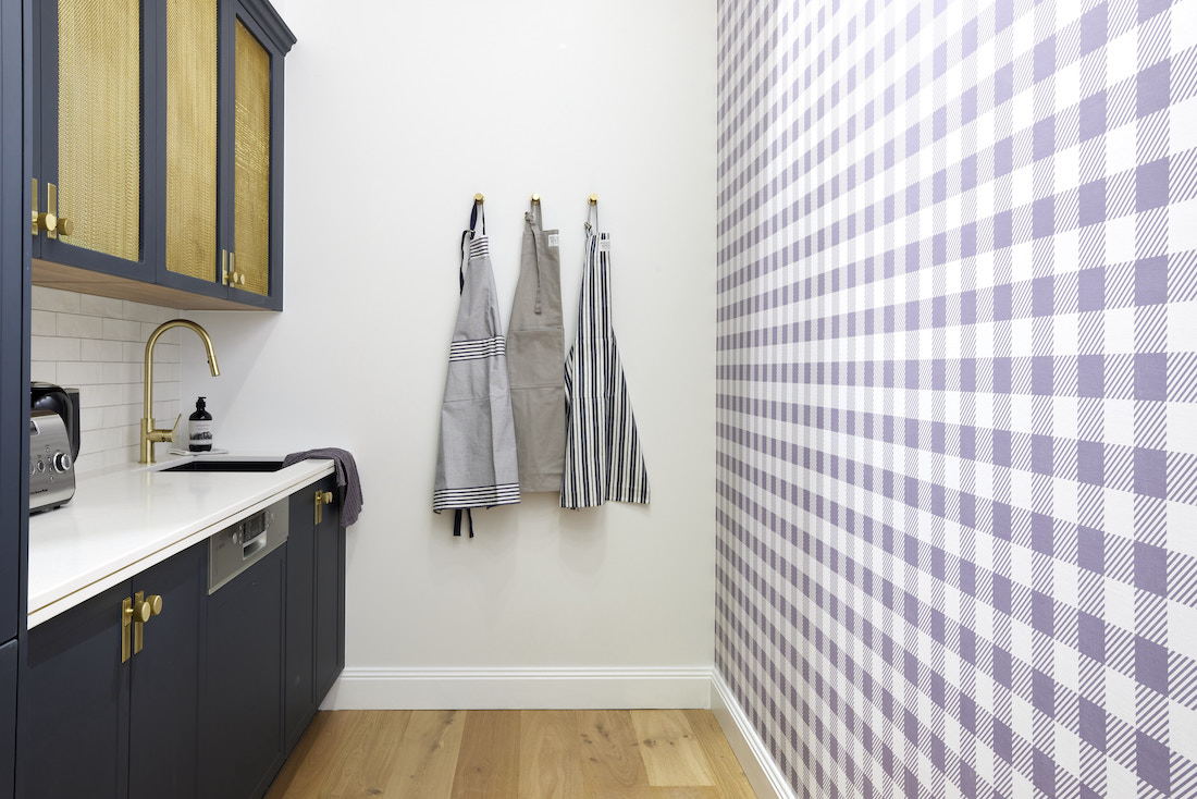
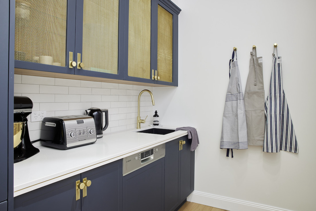
Elegant, sophisticated and perfectly in keeping with their Hamptons-vibe of a home, it’s a kitchen sure to appeal to buyers. Boasting navy blue cabinetry with brass inserts and a brass accent in the Caesarstone, it was oozing style.
Shaynna loved the functionality of the entire kitchen, “The island bench is so expansive and so functional.” Darren was equally as impressed saying, “Here we are standing in a room that has every single thing we’ve been looking for.”
While we weren’t the biggest fans of the gingham wallpaper in the butlers pantry, everything else got big ticks from us! Those perforated brass doors on either side of the cooktop are unexpected and add to the textural quality of the kitchen. Not going to lie… that arch bar totally won us over. The whole space was well thought out and super stylish, and these guys totally deserved the win.
Cost: $49,085
Score: 29½ / 30 (1st place)
What did you think of kitchen week? What did you love or loathe! Tell us in the comment section below!
Be sure to check out The Block Shop if you’ve spied something you love in this week’s room reveals. And you can catch all The Block 2021 goss on the nine now official website.
All imagery by David Cook Photography


