There’s a trend in nurseries towards more gender-neutral, sophisticated styling that we just love! Forget your traditional girly pinks and baby boy blues, 2015 is the year to embrace unisex nursery styling.
For those of you about to plan your nursery, we’ve curated some fabulously sophisticated nursery inspiration!
Related article: Boho sanctuary boy’s bedroom: Take a tour of Archer’s nursery
Related article: Make a sweet rainbow wall hanging for your child’s room or nursery

Monochrome nursery
Monochromatic nurseries don’t have to be dull — far from it! — and the easiest way to add interest is by layering. Soft felts, layered over chunky sheepskin mixed with light cottons and linens has instantly added softness to this nursery above.
Pair that with an adorable polka dot feature wall and some wall art and you’ve got yourself a sophisticated, gender-neutral nursery that’s bang on style for 2015.
Taking the monochromatic theme up a notch, you can create a bold black and white nursery by mixing patterns and prints. Featuring triangle wall decals, geometric carpet and graphic cushions this nursery packs punch without being cheesy.

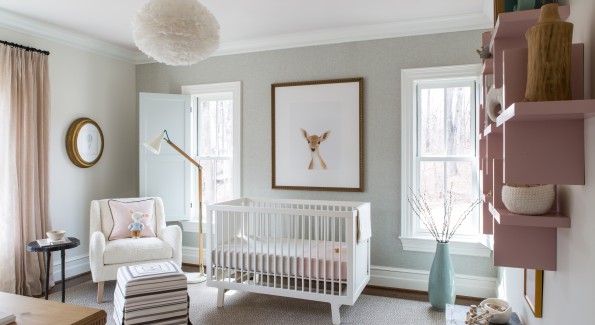
Muted pastel nursery
We’re not saying sophisticated nurseries can’t feature colour. Not at all.
How perfectly balanced does this nursery feel? Designer Nancy Twomey has worked her magic to create an elegant and sweet nursery.
“It’s a nursery with a very sophisticated vibe,” says Nancy. “It’s a mix of Scandinavian country with a modern feel.”

Contemporary colourful nursery
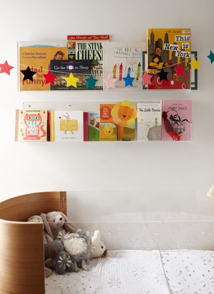
Zoe Foster (journalist, author and wife of Hamish Blake) has embraced colour to create her fun animal-themed nursery.
“I chose the Ubabub cot because it’s beautiful, the Perspex is fun for Sonny to look out of, and also, I love the bath/boat shape. It seemed so much softer and gentle than prison bars and sharp corners,” says Zoe.
“I also got their Booksee shelves to display Sonny’s gorgeous books. They’re art, after all.”

Natural wanderlust nursery
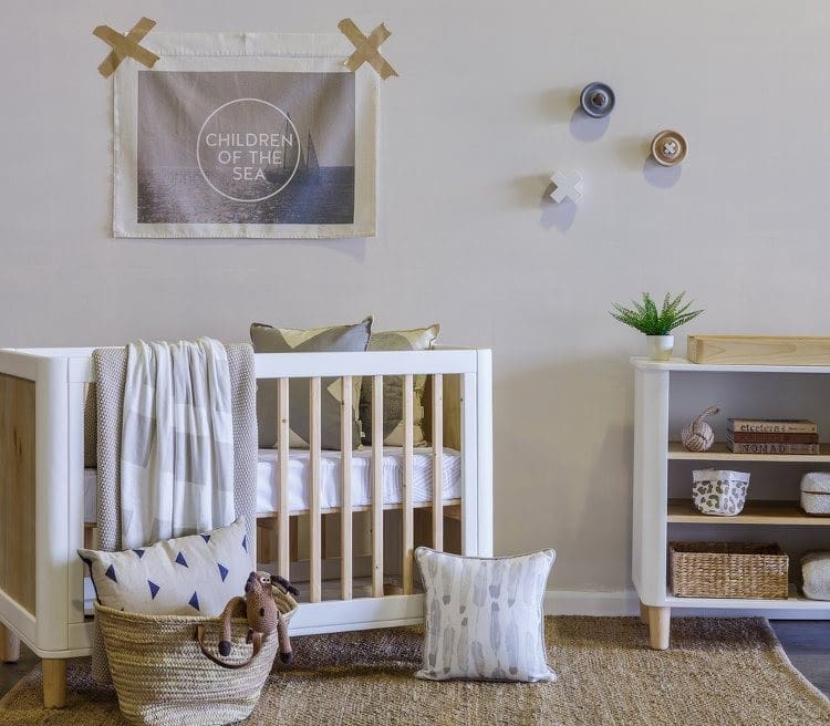
Another way to create a sophisticated gender-neutral nursery is by using natural materials like jute and timber.
Warmer than the oh-so-popular monochromatic look, the use of natural materials has got to be our fav nursery look for 2015. Add interest and colour through stylish wall art, fun wall hooks, and by displaying some of your favourite nursery treasures.

Top tips to create a stylish and sophisticated nursery:
- consider having a theme or cohesive colour palette that you can carry throughout the space. For example, your theme could be Australiana, circus or nautical. You don’t have to go OTT but having a theme will help guide you to create a cohesive space
- keep it simple. The nurseries we’ve featured are decluttered and restrained. Often less is more!
- create a visual point of interest by layering. Just take another look at how that simple layering of blankets on the cot in the first image creates that lovely inviting feeling
- don’t forget your walls! Flags, banners, garlands, wall art or hooks can all add wow factor
- add accessories like a mobile or display of toys to bring personality to the space. The best nurseries are those that are personalised.
What’s your favourite from our round up of sophisticated nursery inspiration? Or have you seen a nursery you just love? Share it with us by linking to it in the comments below! We’d love you to tell us about!


Comments are closed.