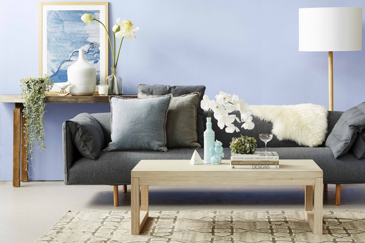
Where the heck do you start when styling a room? It’s a question we get asked a lot and we’re so excited to have Jessica Bellef, head of styling at Temple & Webster, here today to help break the styling basics down for us.
When you’re starting out, try to keep things simple. Minimise your colour palette to just 2-4 colours — using key colours and highlight colours — and keep patterns simple and of a similar scale.
Related article: Where I started when designing and building our new home
Related article: Secrets of coffee table styling from the experts

“Texture palette is also important. Too many shades of timber can make a space feel hectic, try to stick to no more than 2 or 3.
With furniture and artwork scale is key. If anything is too big or too small, it can seem wonky and make you feel uneasy.
“Look at your floor plan and take note of the entry and exit points. What’s the function of the room? What do you need to use the room for and arrange the furniture accordingly with seating in a conversational layout.
“It’s not just about the floor plan though, look that the height of the ceilings. If you’re blessed with high ceilings, consider ways you can take advantage of that so not everything is anchored to the floor. Some ideas could be resting a decorative shelf ladder on a wall, hanging pot plants or having a tall floor lamp.”

“A lot of people have dark furniture in their homes which is beautiful but too much of it can feel heavy and cramped. Again, scale is important and consider how you can balance with lighter, brighter décor and rugs.
“It’s important to think about your focal point in the space — the thing that draws your eye and please don’t make it your TV!” laughs Jess.
“Having a focal point such as beautiful artwork in highlighted colours or an armchair in a gorgeous print, can break the monotonony of a room, especially if you get into the trap of a beige-out.”

“Once you play around with those basics you can get more adventurous and add to your space over time — balance is key.”
Thanks so much Jess for sharing all these great styling basics and tricks to create a winning interior. We certainly learnt a few new things and hope you did too! Do you have any other questions or what’s your take away from Jess’s advice?
Check out more styling tips
Disclaimer: this article was originally published in September 2015 and has been updated with new information and images. It contains some affiliate links. This means, if you purchase an item we may receive a small commission on the sale of that product at no extra cost to you.


