The team at Zou Build have an eye for fabulous renovation projects. They have the ability to see past the ugly, the confusion and the mess and see the shining potential underneath. Which is exactly how they tackled this before and after renovation project.
We know how much you love a before and after home tour, especially when there are lots of ‘before’ pics to compare it to! And this one has got plenty, so let’s take a look around!
Related article: Before and after home renovation: An original home gets a spectacular makeover
Related article: A modest extension to create a dream home: Visiting Dot’s House
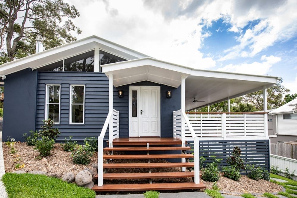
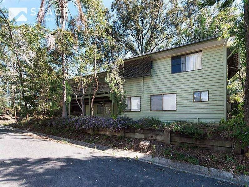
The Bardon home is a true beauty both inside and out… but this wasn’t always the case.
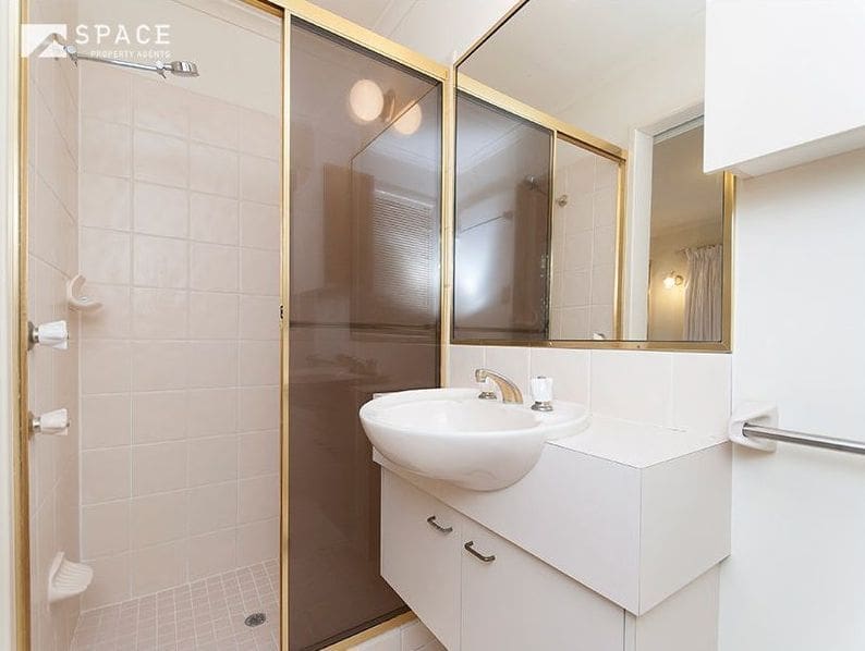
“The original home was a bit of a rabbit warren with lots of room but not a great flow,” explains Christal Fysentzou, Interior Designer and Consultant (and one half of the Zou Build team).
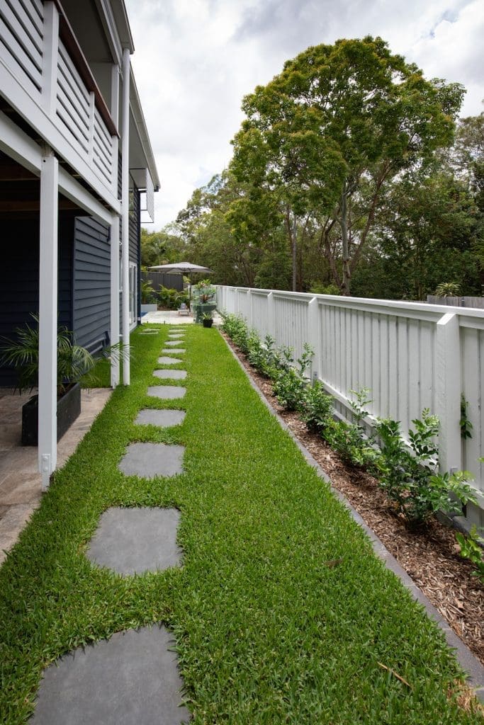
“The renovation was all done in the original footprint of the home, creating beautiful open plan living and wonderful manicured gardens to what was a very dated home.”
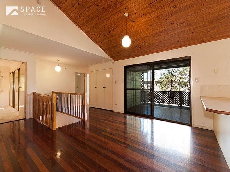
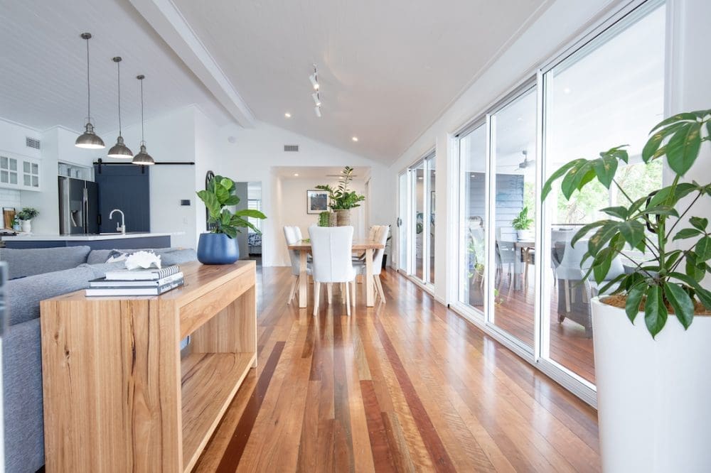
Home to a professional couple in the Brisbane suburb of Bardon, this was one before and after project that went without any major setbacks.
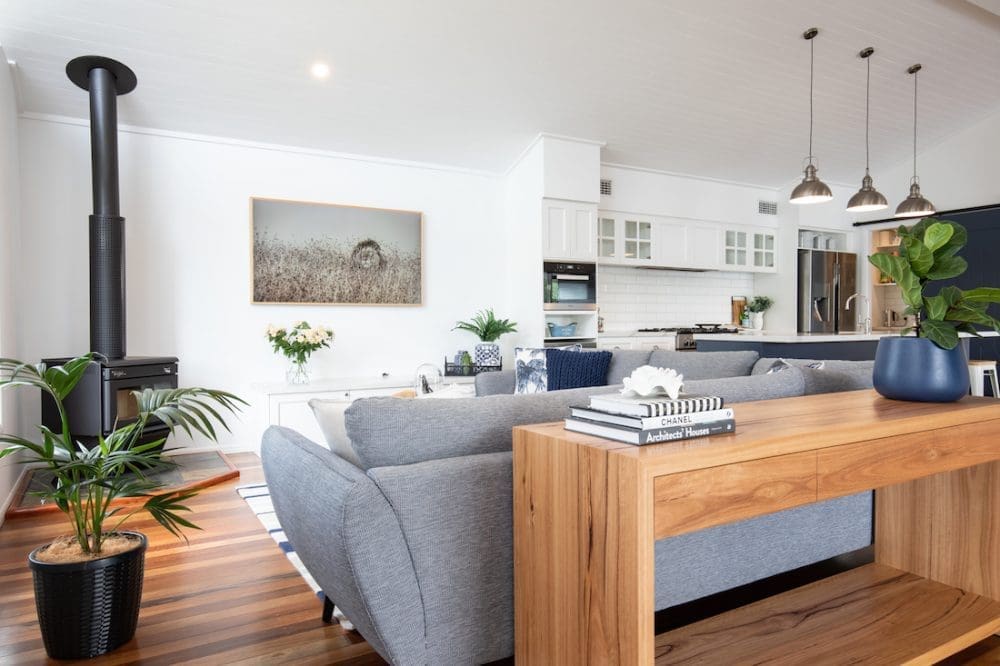
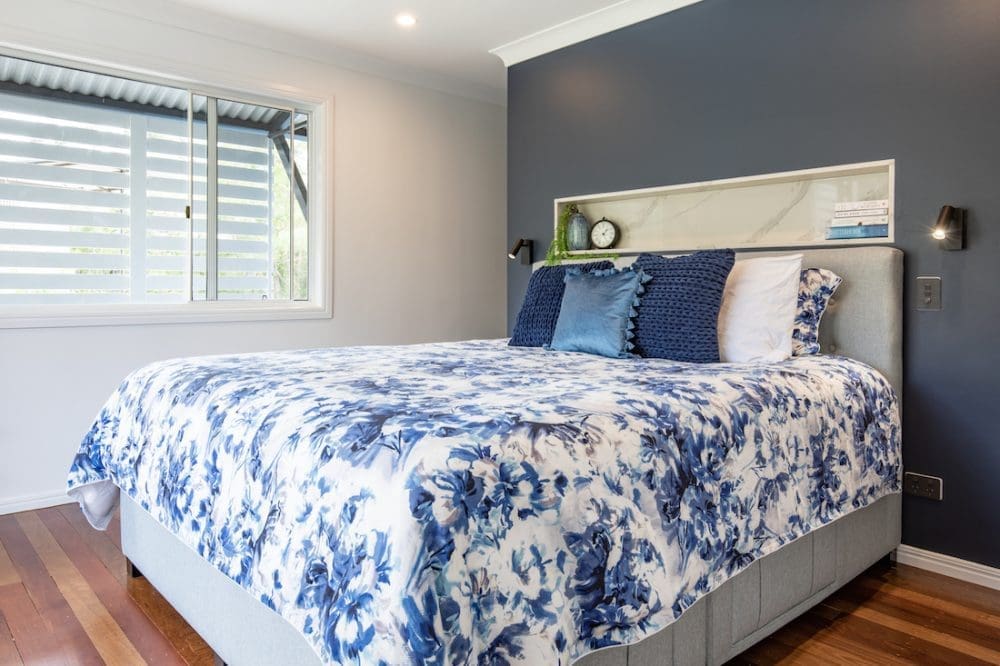
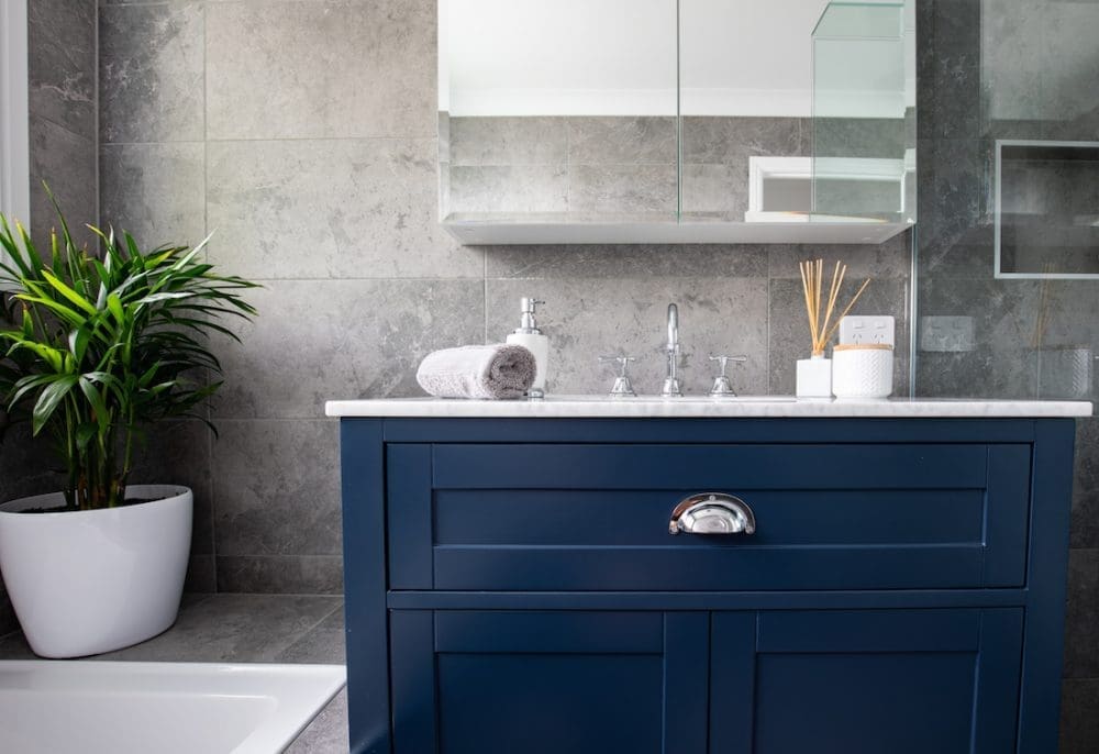
“Our brief was to create a modern, open plan home with some Hampton’s touches,” says Christal.
“They loved the idea of a Hampton’s farmhouse, but also didn’t want to go too overboard with the classic look. I’d say it would be best described as a contemporary home with a twist of Hampton’s.
“As far as renovations go, this was actually a pretty good one to work on as it was just like a revamp to the existing home. It was actually one of our smoothest ever renovations which made for a nice change!
“Plus it helped that our clients were absolutely lovely to work with.”
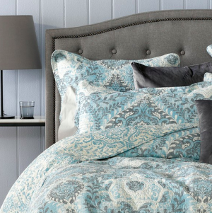
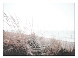
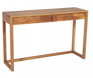
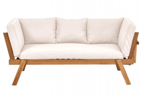
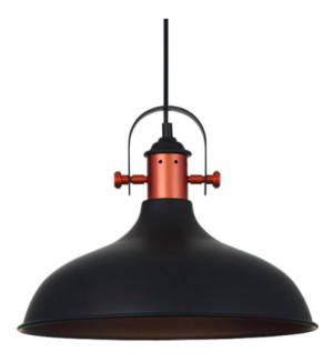
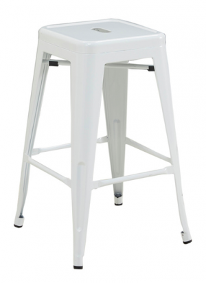
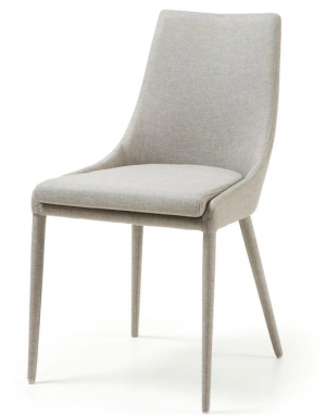
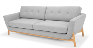
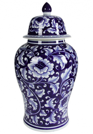
Shop the look: Modern Hampton’s
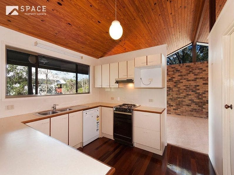
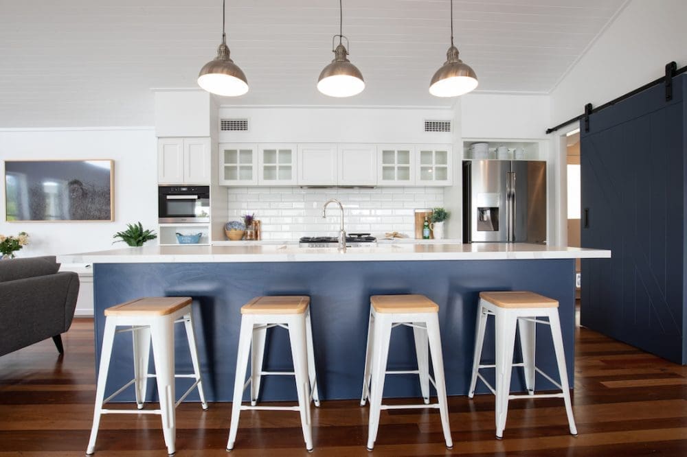
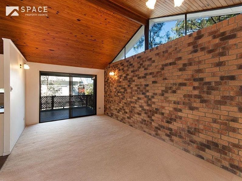
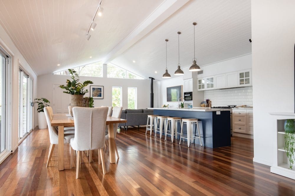
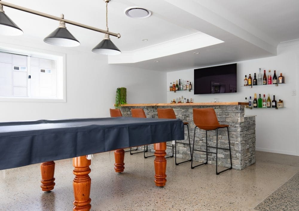
The before and after transformation took a maze of rooms and opened it up into an expansive open plan concept.
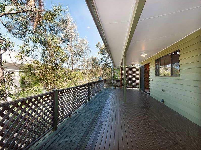
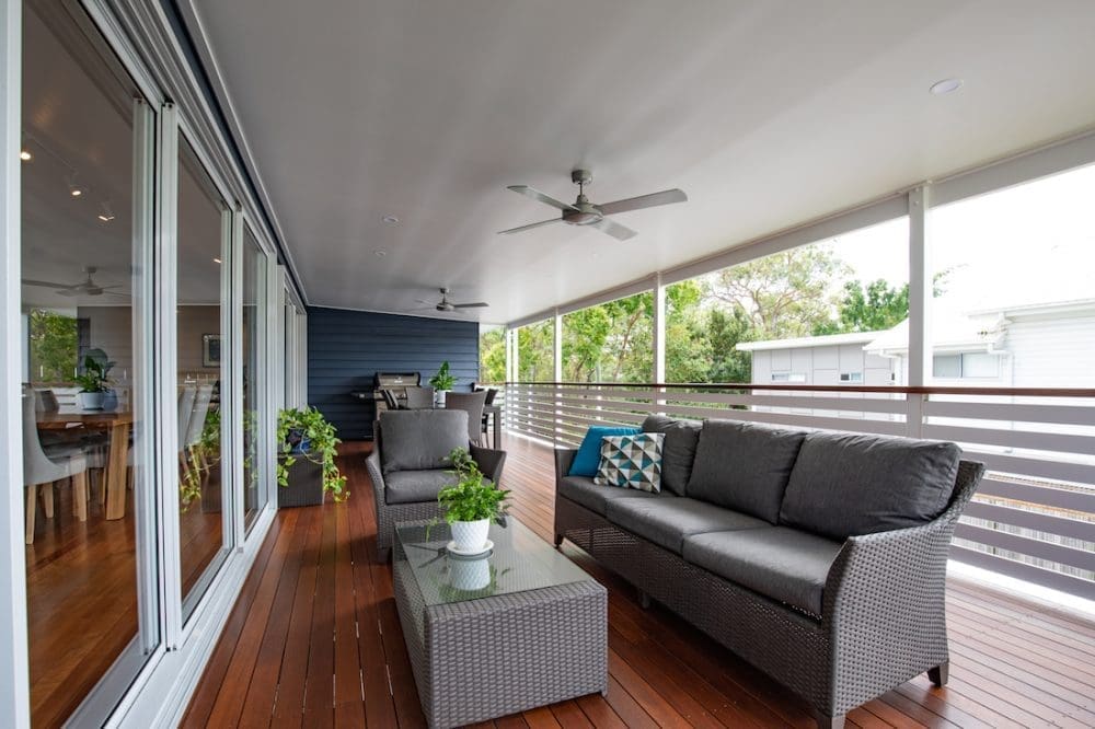
“The upstairs wasn’t very functional in its original form. Our clients really wanted to open the house right up to create a beautiful open plan kitchen, dining and living space. They also wanted to maximise the use of their deck and indoor / outdoor living by adding the large stacker doors,” says Christal.
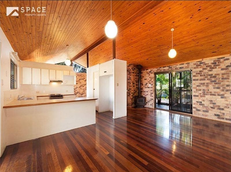
“Previously, the ceiling was all natural pine, which only closed up the space. By painting the pine boards pure white, it created a beautiful, light-filled and welcoming feel throughout the whole house.”
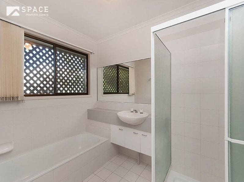
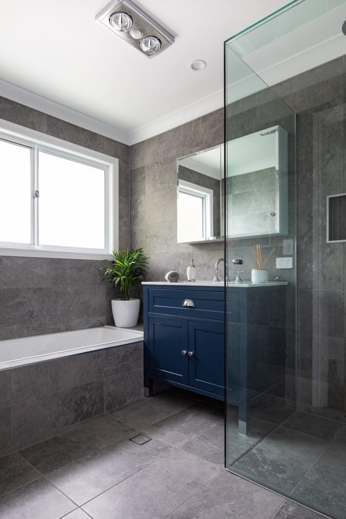
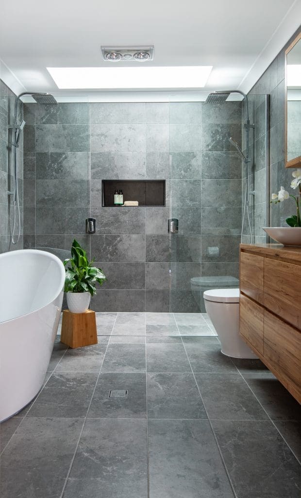
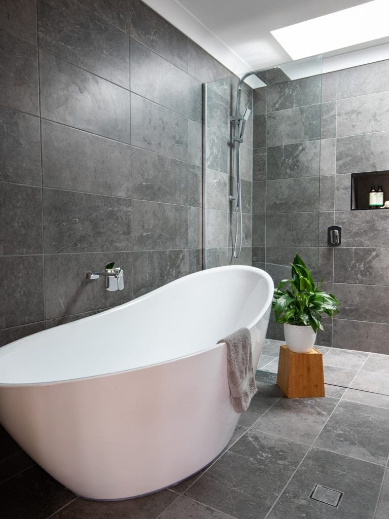
With free reign to do as they pleased (within reason!) Zou Build took this home from tired and dated to modern and chic.
“Our clients were so great! They had complete trust in us and were really flexible with ideas and suggestions we put to them. It made the process really easy and the finished product is amazing.
“They, and we, love it!
“My favourite element is the front facade. Street appeal is so important and in the beginning, this home didn’t really have any.
“The outdoor transformation is also pretty amazing. The new pool and outdoor spaces were designed for easy living and entertaining.”
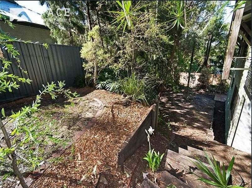
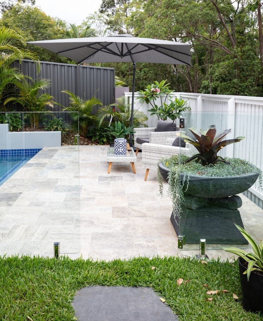
Thank you to Christal for showing us around this before and after transformation project. To see more from Zou Build, take a look at their website or Instagram page. What was your favourite part of the transformation? Tell us in the comment section below!
‘Before’ photos — via realestate.com.au
‘After’ photos — Rachel Lane Photography
More real home tours here


Shop the look: Modern Hampton’s
Disclaimer: This post contains some affiliate links. This means when you click on a link and purchase something from that site, we may make a small commission at no extra cost to you.


