There’s nothing more satisfying than a before and after home renovation reveal, is there?! We take a look around this fabulous Canberra home, and see how it went from a small and poky home to a modest, modern farmhouse.
Interior Designer and Stylist, Meg Campbell from Neon White Design takes us through how she transformed this tired space into a unique, country-living inspired home.
Related article: From worst to first: An incredible before and after home transformation
Related article: Amazing home transformation: Before and after renovation of the Bardon home
Home to a family of 3 and a gorgeous — yet slightly chaotic — border collie, the original home was in desperate need of a makeover.
“In this home renovation, the floorpan changed dramatically,” explains Meg. “It required a full redesign of everything, except the bedrooms. We retained walls where possible, but not if they jeopardised the overarching design.
“In its original design, there were important rooms that were awkward, and separate to the main living areas. We changed out some of the entryways and this helped completely open them up. It allowed the light to pour in, and provide a better space for the family to connect and entertain.”
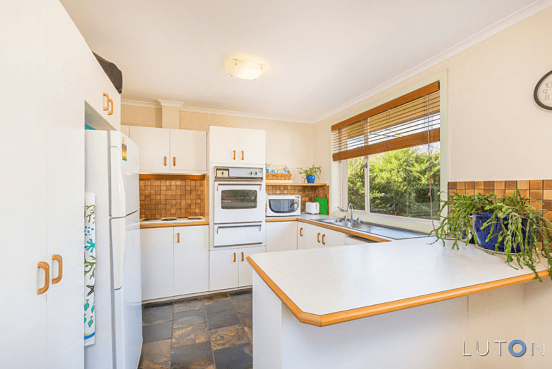
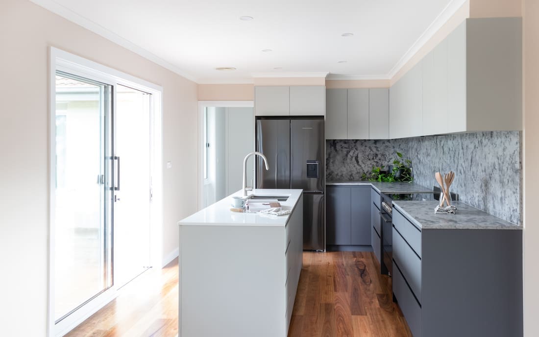
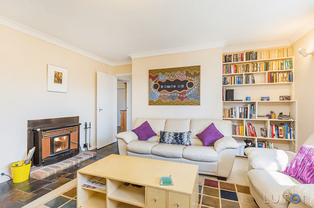
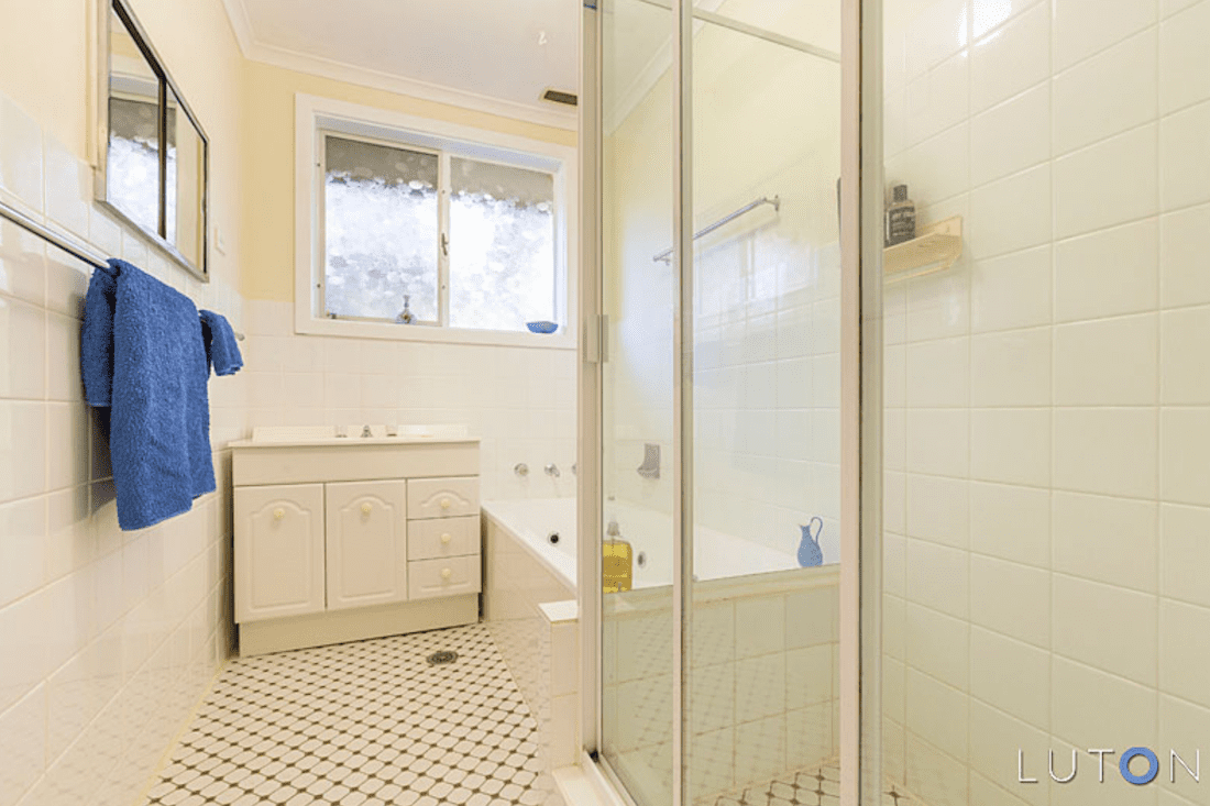
The kitchen, living and bathrooms were all gutted and given a fresh, bright, modern farmhouse look.
“It’s pretty clear from the before photos, that we needed to start again!” laughs Meg.
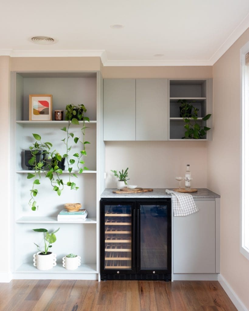
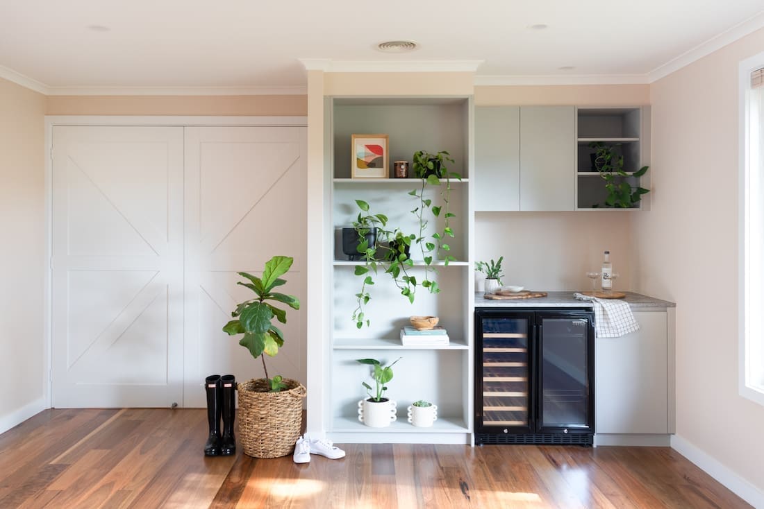
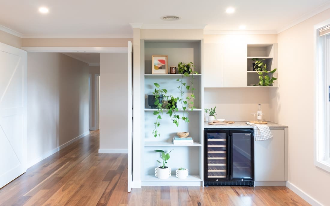
“To the living room, we added those fabulous barn doors, built-in bookshelf and the coolest feature… a new bar area including a wine fridge. My client wanted the space to be open so the kitchen needed to be on the other side of the room to create an open plan.
“Their dog Tommy is an escape artist, so the design caters for him most of all. The big barn doors open into the living area, so if he pushes on them he can’t get out the front door when guest are arriving. The laundry door does the same, and he has entry from the backyard to the laundry so he can retreat from the weather during the day.
“The new floors we installed made a huge difference to the overall space. We said goodbye to the slate, and went for Godfrey Hirst spotted gum.
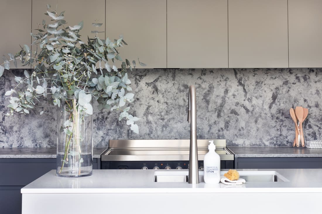
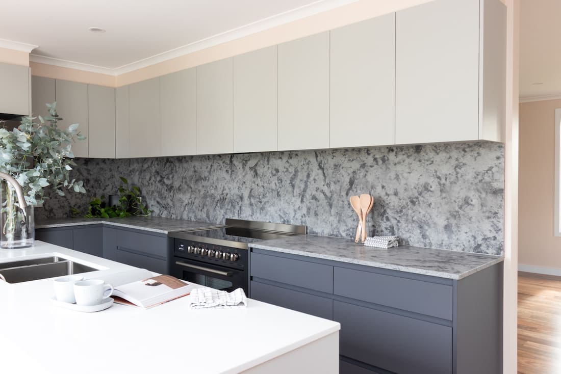
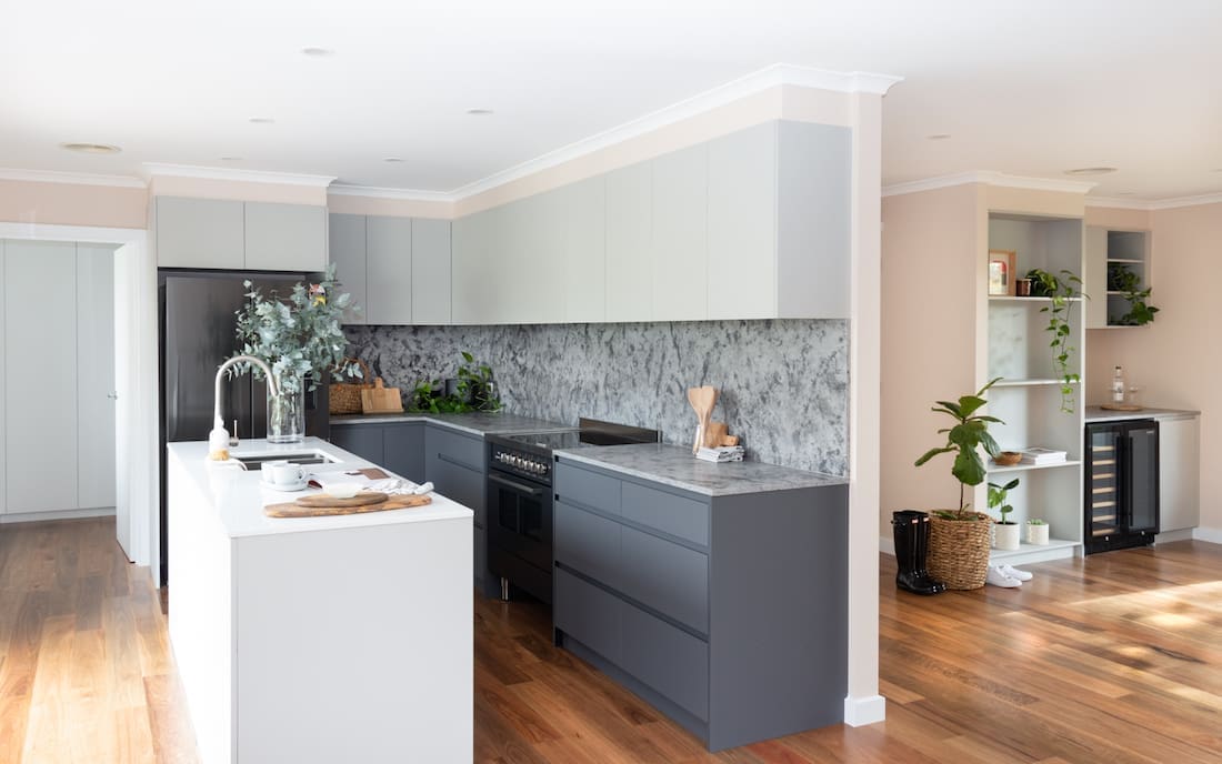
“In the kitchen, everything is new! I really love the long island bench, the different toned cabinetry, and the benchtops and splashback in Essastone Luna Concrete Weathered.
“We also changed one of the windows in the kitchen to make it a sliding glass door. This enabled us to get more visibility and access to the back deck and outdoor area.”
Channeling those modern farmhouse vibes doesn’t mean you have to shy away from bold tile choices or bright colours.
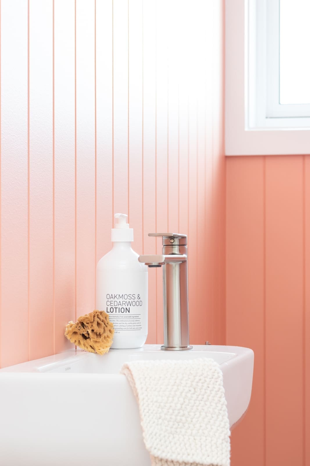
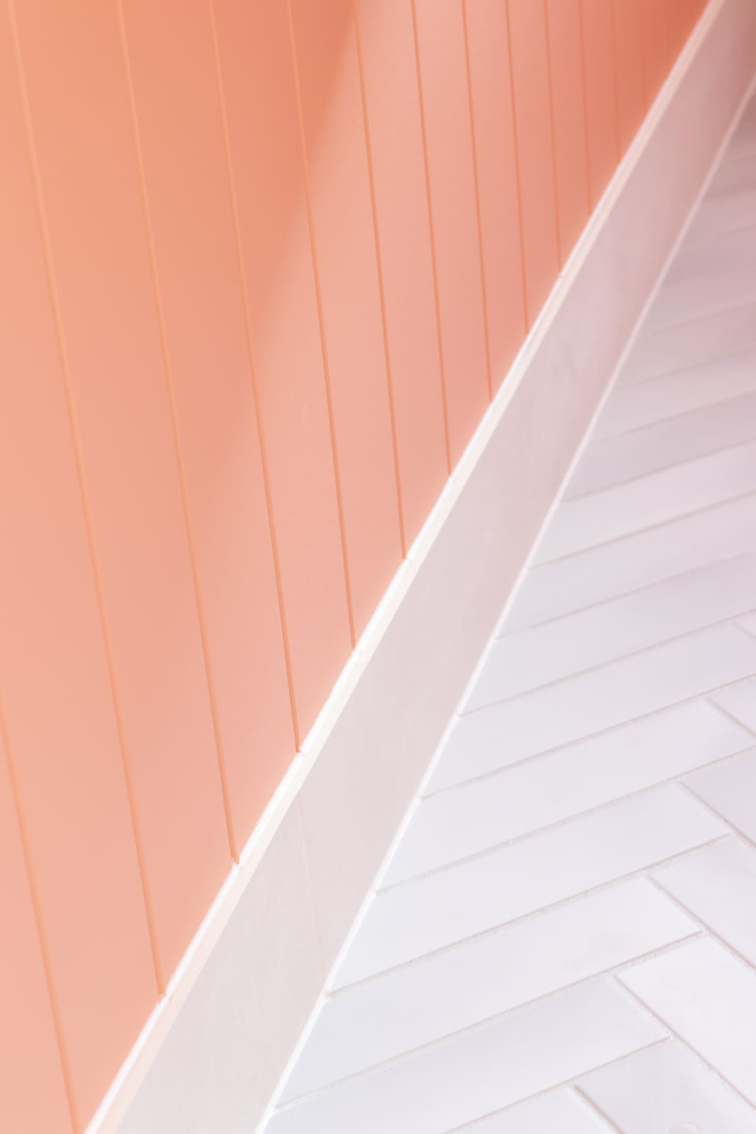
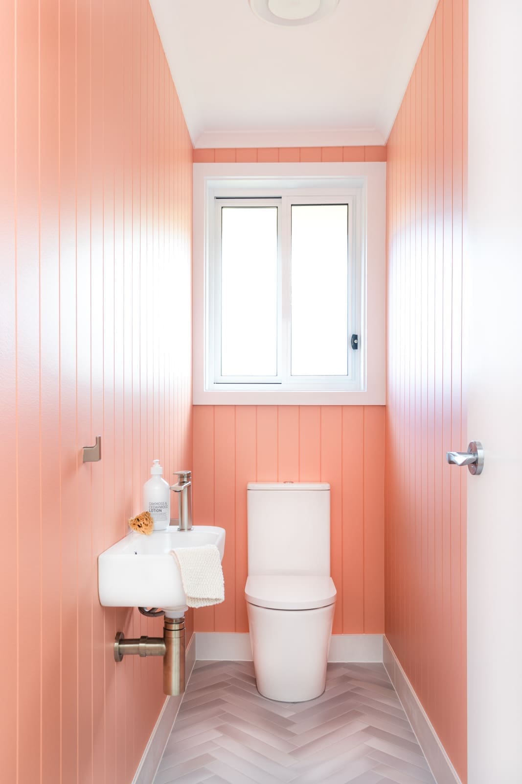
“How good is the powder room colour?! This room was extended to accomodate the vanity. This means there’s no need to walk to the bathroom to wash your hands, it’s a complete room in itself. Plus, it makes a seriously bold statement!” says Meg with a smile.
“The colour is Algerian Coral by Porter’s Paints and I love it!
The modern farmhouse style creates a uniquely fresh take on the country living inspired style. It’s all about sleek clean lines of contemporary design, elegance and comfort.
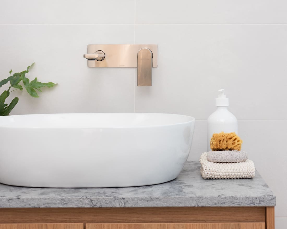
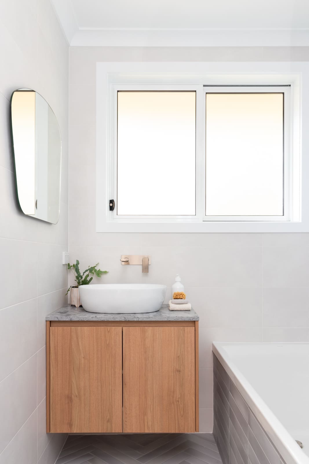
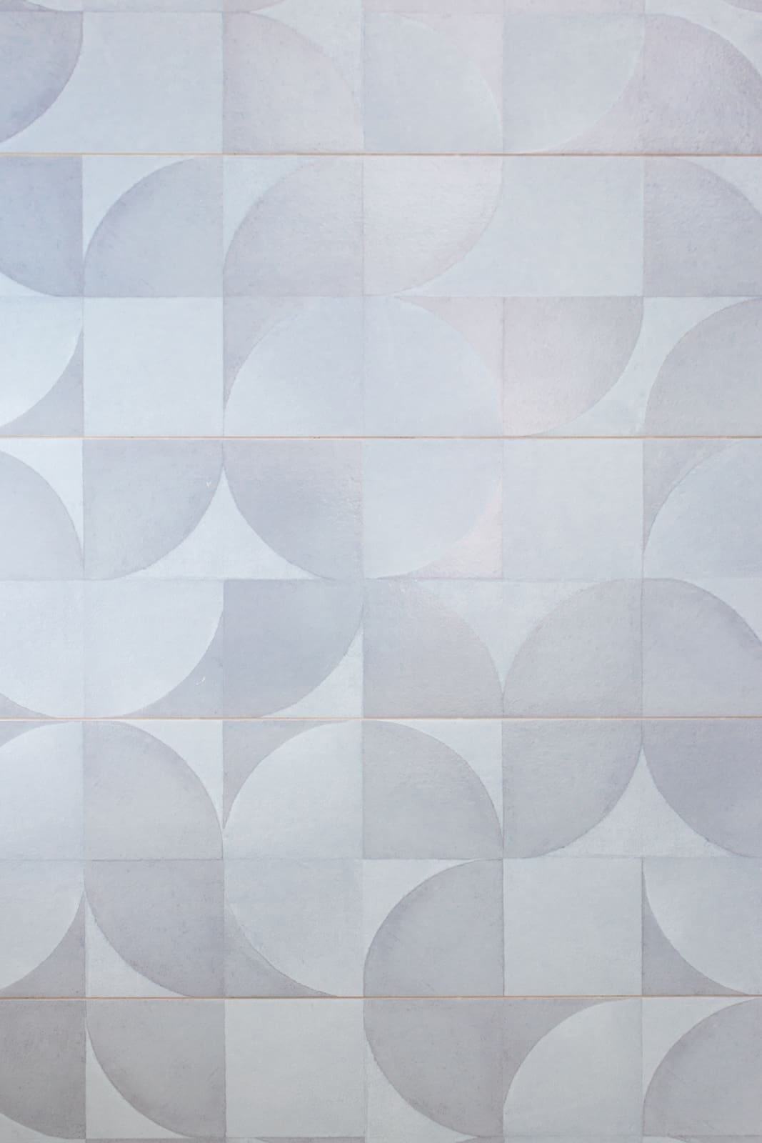
“For the main bathroom, we didn’t play around with the layout too much. The fixtures were all updated, and we added some beautiful tiles to make the room really stand out.”
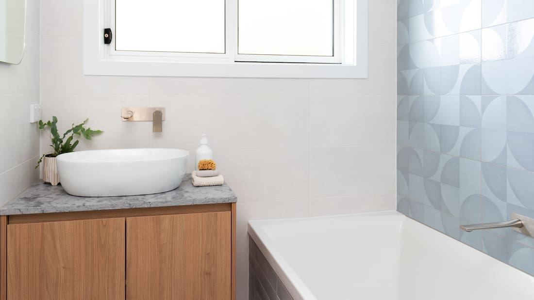
Even by keeping most of the existing walls in place, Meg was able to create a light, bright, inviting interior.
“This home really relies on space planning. This is an essential step when designing a home and it’s really important that you get this right in the early stages to ensure circulation is efficient.
“When it comes to creating a light, bright interior, look at your colour palette. Here, the balance of the colour palette creates a warm space with the general walls painted Porter’s Paints in Himalayan Salt. The texture from the VJ panelling and bold colours draw the eye up to key ares such as the kitchen and bar.
The warmth and simplicity is characterised by natural textures and materials.
“The open connection of the kitchen, dining and living spaces is a favourite of mine. The new design has really changed the way the family can use the space. Plus it provides a space that reflects light and has great sight lines to the beautiful trees in the front garden.”
Photography — Taylah Cunningham
Before photography — All Homes
Builder and joiner — CJC Constructions
Thank you to Meg for showing us around this wonderful before and after home renovation. To see more of Meg’s projects, visit the Neon White Design website or check them out on Instagram.
Did you have a favourite feature of this modern farmhouse makeover? Perhaps it was the tiles or fun colour choice! Chat to us in the comment section below.
More home tours here
