It’s week 2 of The Block Triple Threat and we just saw the bathroom room reveals!
Wowee, weren’t there some highs and awkward lows?! We want to know what you thought of the bathrooms — tell us in the comments below!
Let’s check out each room…
Related article: The Block Triple Threat: Week 3 second bedroom room reveals
Related article: The Block Triple Threat: Week 4 cellar, laundry & powder room reveals
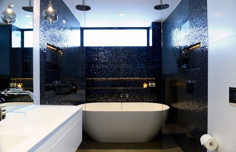
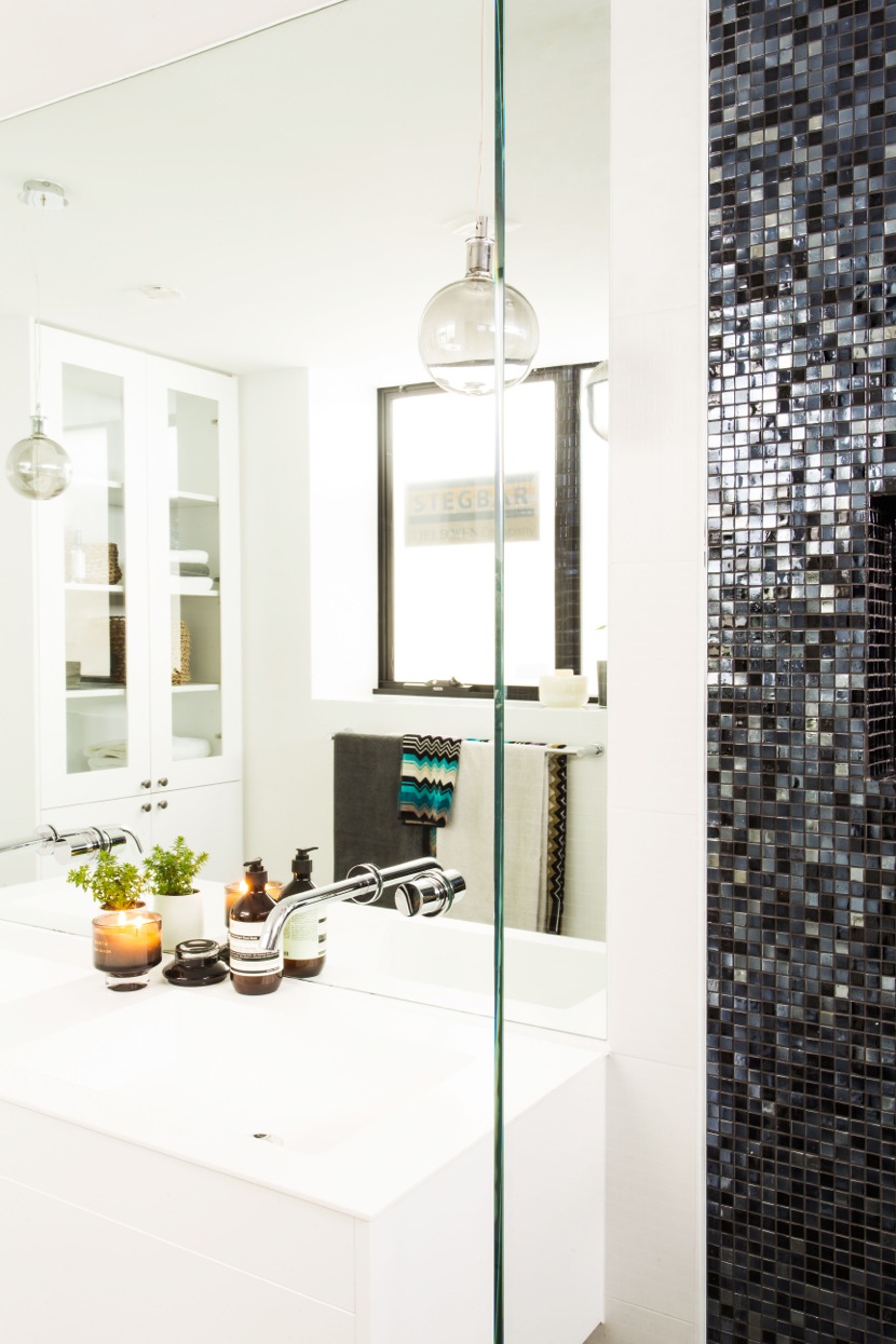
Darren and Dea
Taking out the win with 27 1/2 out of 30 (then minus a point from the challenge so final score of 26 1/2) is Triple Threat couple — Darren and Dea.
“Glamour, glamour, glamour!” said Neale as he entered the room. He also said the bathroom has “oomph” which is his new favourite word for wow factor 🙂
Shaynna loves that it’s instantly different to all the other bathrooms and brings a completely different look to The Block.
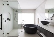
The judges thought the use of black mosaic tiles in the wet area and white tiles for the rest of the space creates the feeling of layers and zones. They also thought they used their bathroom budget well to create a beautiful and bold statement that’s contemporary and feels sophisticated and luxurious.
Some minor things got them down like the placement of powerpoints and possibly not having the most functional shower area.
We applaud Dea for bringing a different bathroom look to The Block — one of our favourite things about the show is seeing new design and styling inspiration — but if we had to pick any of her bathrooms we would still go with that STUNNING ensuite from The Glasshouse!
Tim and Anastasia
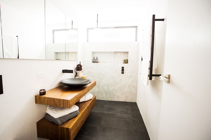
Picking up their game after being ripped to shreds last week, Tim and Anastasia were stoked to come second place with 26 out of 30.
The judges commented that they made a 200% improvement and responded really well to the negative feedback they received last week.
Shaynna got it right when she said the room has “a little bit of individuality” and that she hopes they keep up this style and energy for the rest of the apartment.
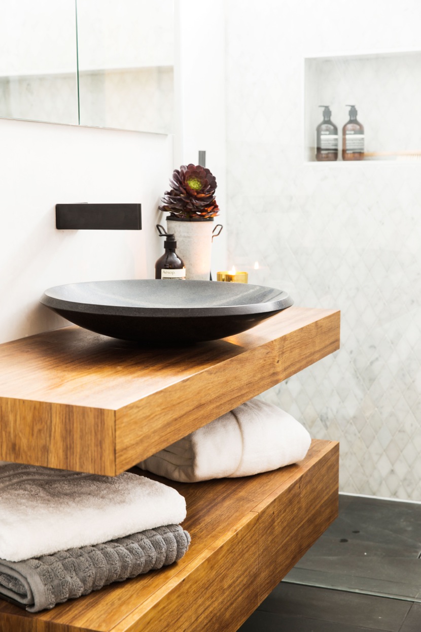
We liked the balance of the dark grey floor tile, feature diamond marble tile wall, and wood vanity to add warmth to the space. The black tapware also got a tick from us and the judges.
They also got scored down for their powerpoints with Shaynna pointing out they used three different types of powerpoints that don’t work together and detract from the features in the space.
Overall we agree with the judges that it’s a big step forward and has given us some hope for what they will bring next.
Charlotte and Josh
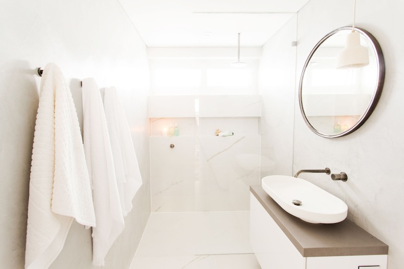
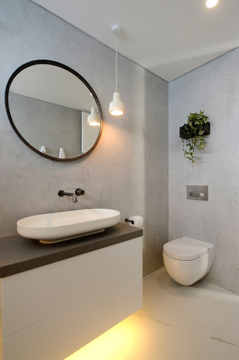
This week Charlotte and Josh went back to basics and delivered a simple and soft bathroom (scoring them 24 1/2). Neale said “simple is good in the bathroom” and was happy to see the couple from the elimination challenges returning!
Their soft and minimal colour palette creates a relaxed feel and that tapware got big points from us!
Despite the judges liking many of their choices, Charlotte and Josh lost points for functionality. Shaynna thought the lighting was poorly planned and was unhappy about the lack of bench space around the basin saying “there’s no space for anything!”.
We liked the minimalist style of this bathroom and breathed a sigh of relief to not see that blue frosted glass anywhere in sight! While this bathroom didn’t knock our socks off, we think it will work well for the couple come auction day.
Ayden and Jess
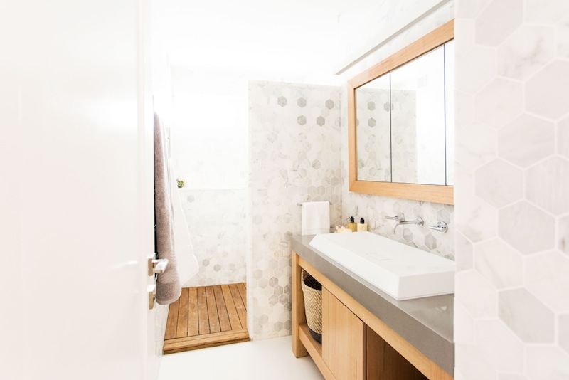
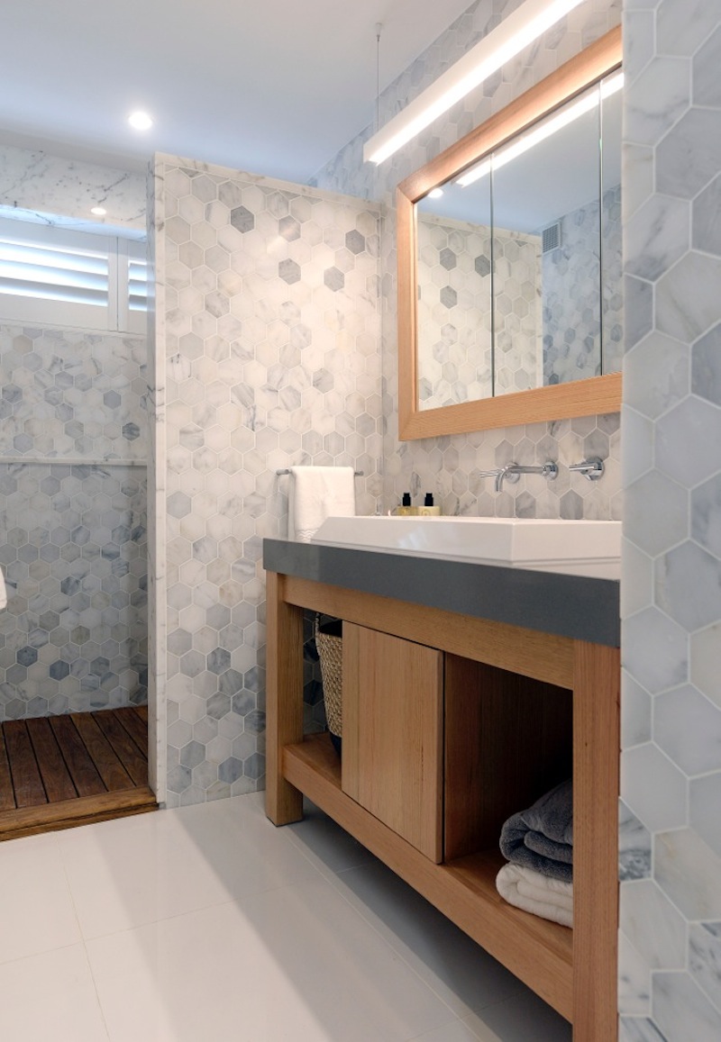
Proving that more isn’t more, Jess and Ayden failed to impress the judges with their floor-to-ceiling marble tiles in the bathroom and toilet.
We’re the first to admit we love marble but these guys went way too far!
It was cringy watching the judges enter the bathroom and be lost for words — ‘overloaded’ they called it.
There’s a good reason a feature tile is called just that — it should be a feature on one or two walls of the bathroom, MAX! They clad all four walls of the bathroom and toilet in the most expensive tile out there — Calacatta hexagon marble tiles — but in doing so made the rooms feel busy and overwhelming, and as a result watered down the beauty and value of these tiles.
Sadly once the judges got over the tiles, the lashings continued with Neale saying the sink is “hopeless and completely impractical” and Shaynna thought the choice of wood around the mirror and vanity was the wrong colour. While Neale liked the lighting, Shaynna thought it was overdone and not needed.
Rather than giving the couple points for putting the toilet in a separate room, the judges thought it was a mistake and that the space could have been used far better (possibly fitting in a bathtub for real luxury).
Neale’s advice to the couple is to “calm down” and to choose your hero in the room and arrange everything else around it.
These guys had way too many ideas going on and unfortunately it left them in last place with 21 out of 30.
What were your favourite features from this week’s bathroom room reveals? Tell us below!


bit late to the party here, but by any chance does any one know the mosaic tile Darren and Dee used? is it still available?
Hi Rob, that’s a black glass mosaic but unfortunately I haven’t been able to track down the exact same version. Most likely, it was from Beaumont Tiles as they sponsor The Block. Although the closest I could find in their range online was this black textured glass mosaic https://www.beaumont-tiles.com.au/product/tile/1001986?postcode=5067.
Decor8 has a few similar versions too:
– Black mosaic glass mix https://decor8tiles.com/collections/mosaics/products/5086
– Black textured glass https://www.everstone.com.au/catalogue/product/laser-glass-midnight-25×25-glossy-mosaic/, and
– Moonstone mix (although lighter, it has more variation between squares similar to Darren and Dee) https://www.everstone.com.au/catalogue/product/metalplus-moonstone-20×20-mixed-mosaic/
Hope this helps!
Hi there, do you know where Josh and Charlotte bought their custom tapware?
Hey Ed, we’re 99% sure it’s from Reece as they sponsor the show and give contestants vouchers but we’ll see if we can track down the brand of tap and the name of the finish 🙂
Hi Ed, just confirming their tapware is from Reece, called ‘Sussex Pol Basin Outlet 250 Brushed Gunmetal’ 🙂