The Block ensuites have just been revealed and given that the couples had already completed their main bathrooms, we had high expectations for tonight!
While there were definitely some hits… there were also some major misses for us in the ensuite reveals and we’d love to know what you think — tell us in the comments below!
Related article: The Block 2020: Week 4 — Master ensuite reveal
Related article: The Block 2020: Week 2 — Guest ensuite reveal
Hans and Courtney
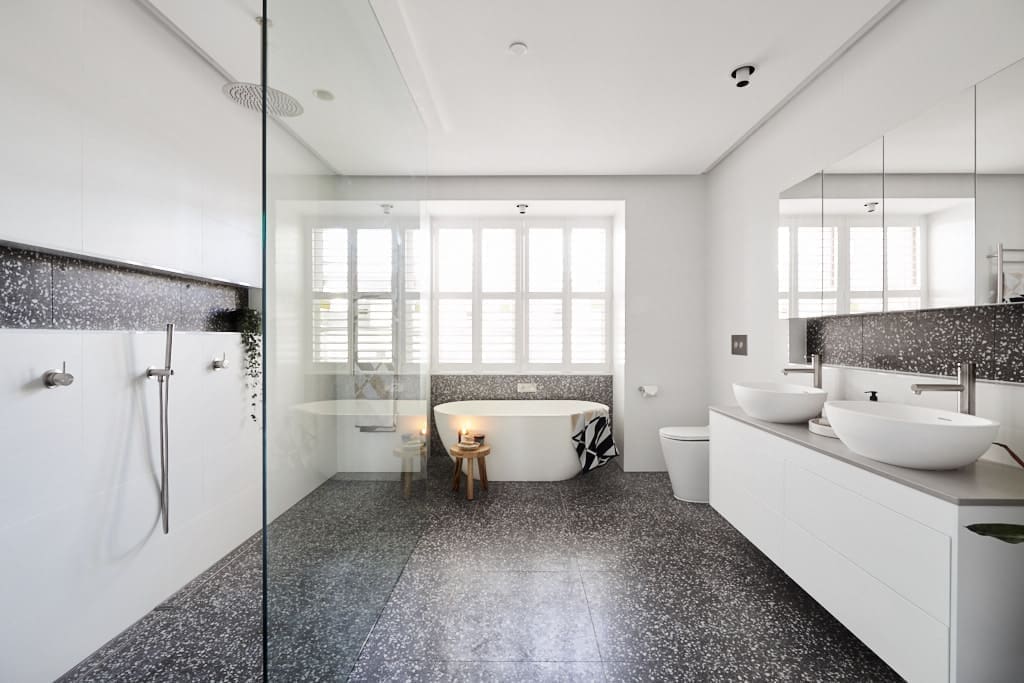
You may recall this couple won the main bathrooms with that stunning white terrazzo floor tile.
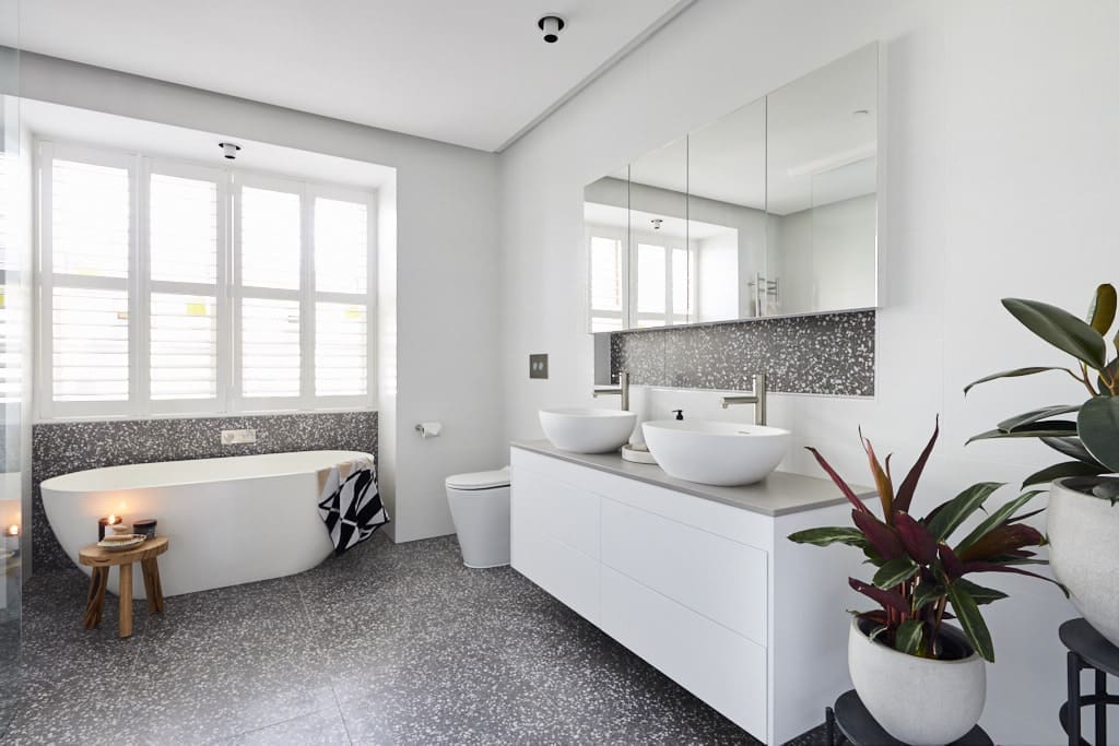
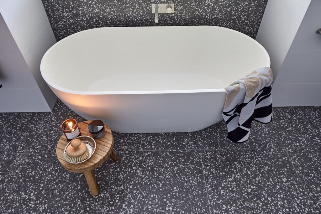
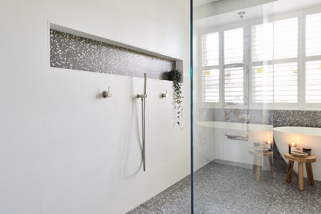
For their ensuite, they kept with the terrazzo theme but this time dialled up the drama by opting for a black terrazzo tile. Ordinarily we would have loved this but the use of it behind the wall niches on either side of the bathroom takes away from the beauty of the floor. There’s no need to make a feature of a wall niche and this space would have looked a million times better if they used the simple white wall tiles in there instead.
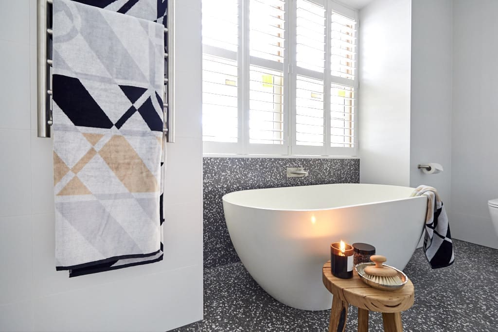
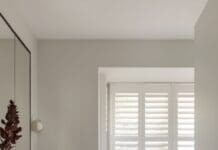
Other than that, we give huge ticks for that stunning bath under the window, the plantation shutters, divine styling arrangement on the vanity (actually how they styled the whole bathroom), sleek oversized shower and layout of the space!
Kerrie and Spence
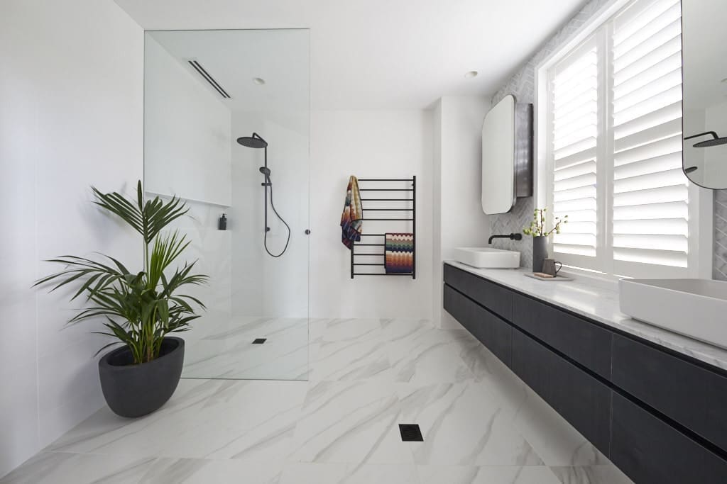
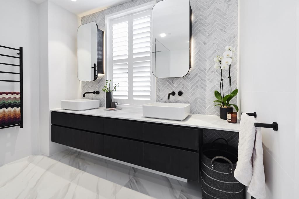
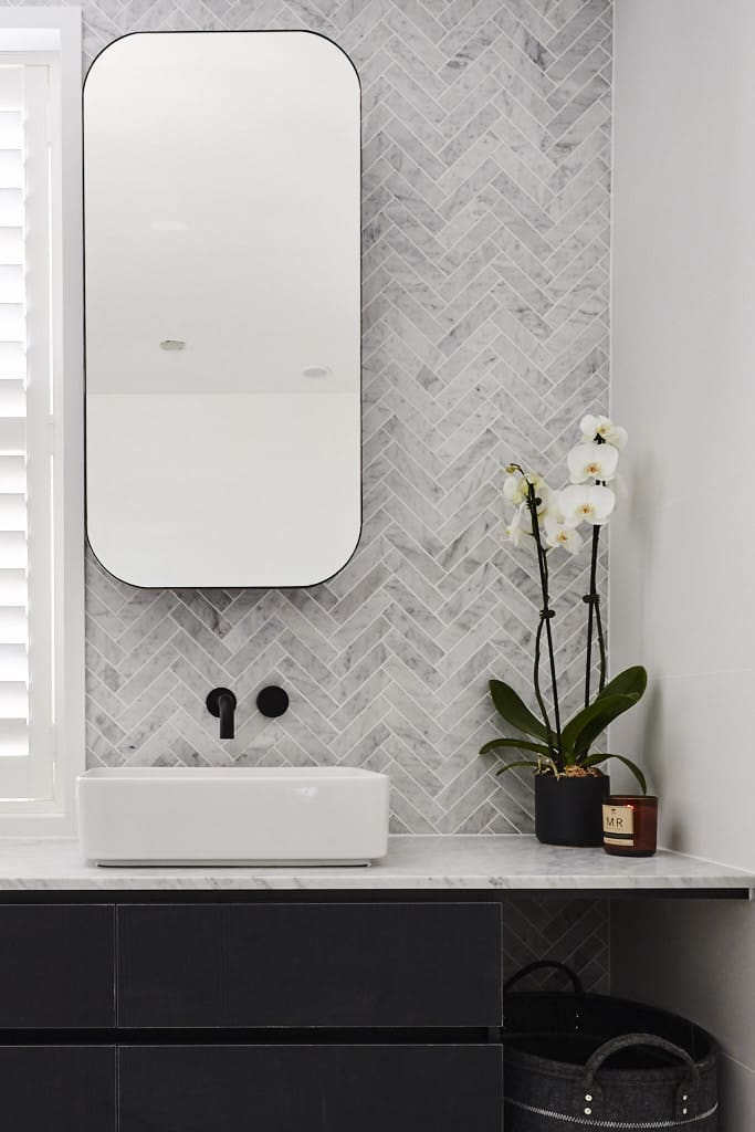
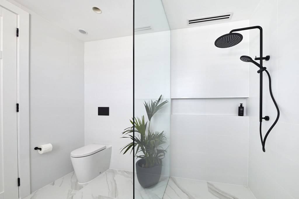
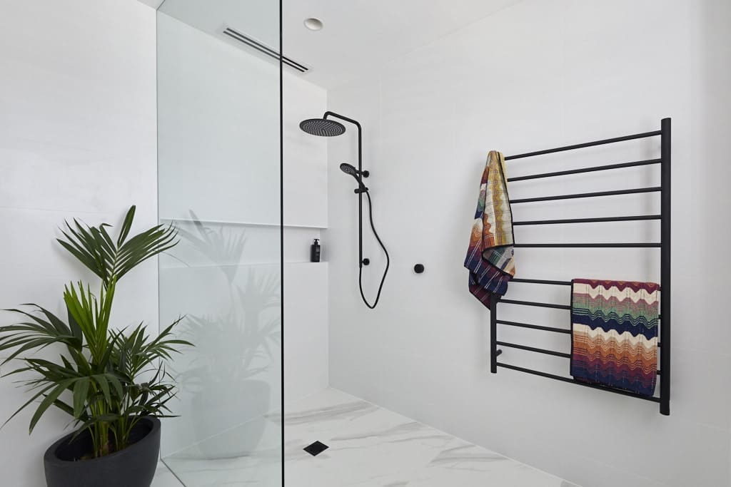
Winners are grinners! Kerrie and Spence took out the win tonight for this sophisticated bathroom.
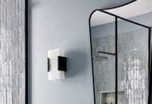
We love how they kept things sleek, simple and refined. The herringbone feature wall is a standout, as are those mirrored storage cabinets. (See how much better their shower looks with a simple white tile behind the niche?!) The black joinery is also a stroke of genius, really emphasising the length of the room to make it feel much larger.
Sara and Hayden
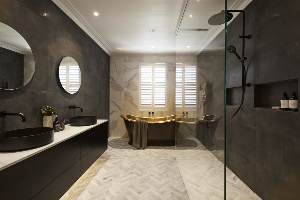
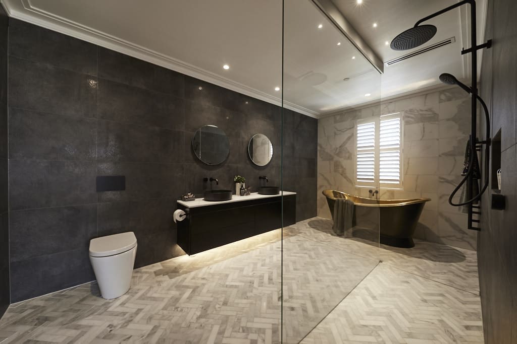
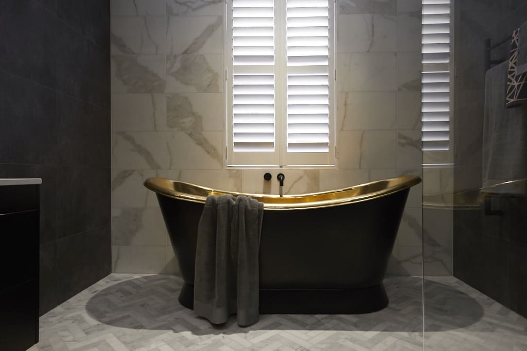
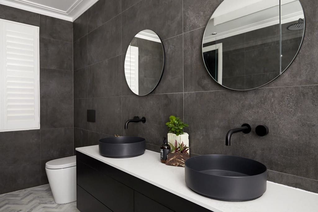
This ensuite had so much promise with that spectacular marble herringbone floor but other elements of this space really didn’t work for us — mainly that feature bath and the marble tile wall behind it (why-oh-why not carry the herringbone floor tile up the wall or use the same darker wall tile?). On a positive note that black vanity with black basins is so hot and love that they created a moodier vibe in their ensuite.
Norm and Jess
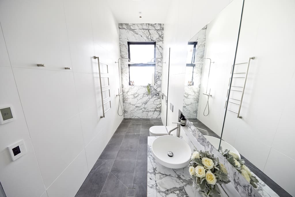
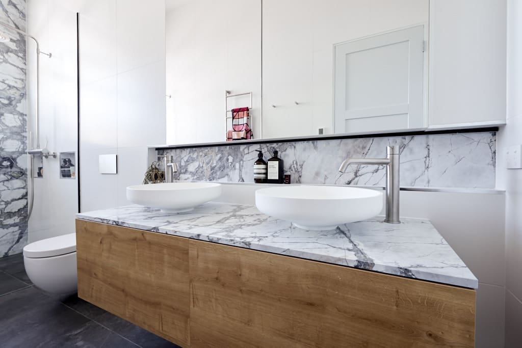
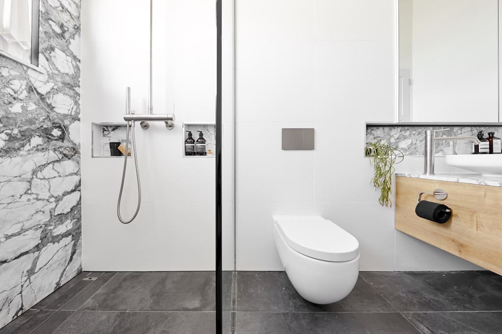
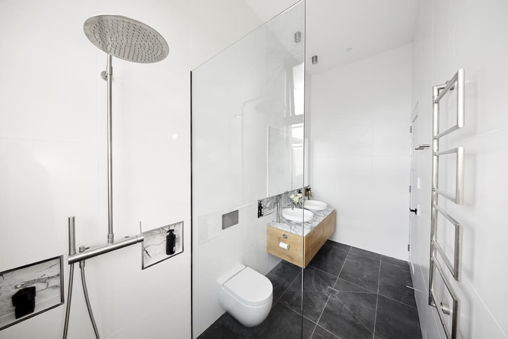
This couple were at a disadvantage from the get-go, having to work with the smallest space of all the couples. So they went for big impact by choosing a four-metre piece of marble for a feature wall that they matched with their vanity top and niche.
Personally, we feel that the marble feature wall accentuates the narrowness of the ensuite and that it would have been far more successful along the vanity wall.
An absolute miss for us were the chrome angles around the niches, whyyyyy? Again this would have looked so much better with simple white tiles and white angles rather than trying to make a feature of them.
Had they run the marble along the vanity wall, we could imagine this space looking divine and feeling far more cohesive and spacious. What do you think?
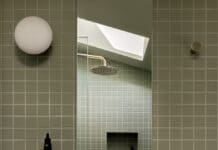
Bianca and Carla
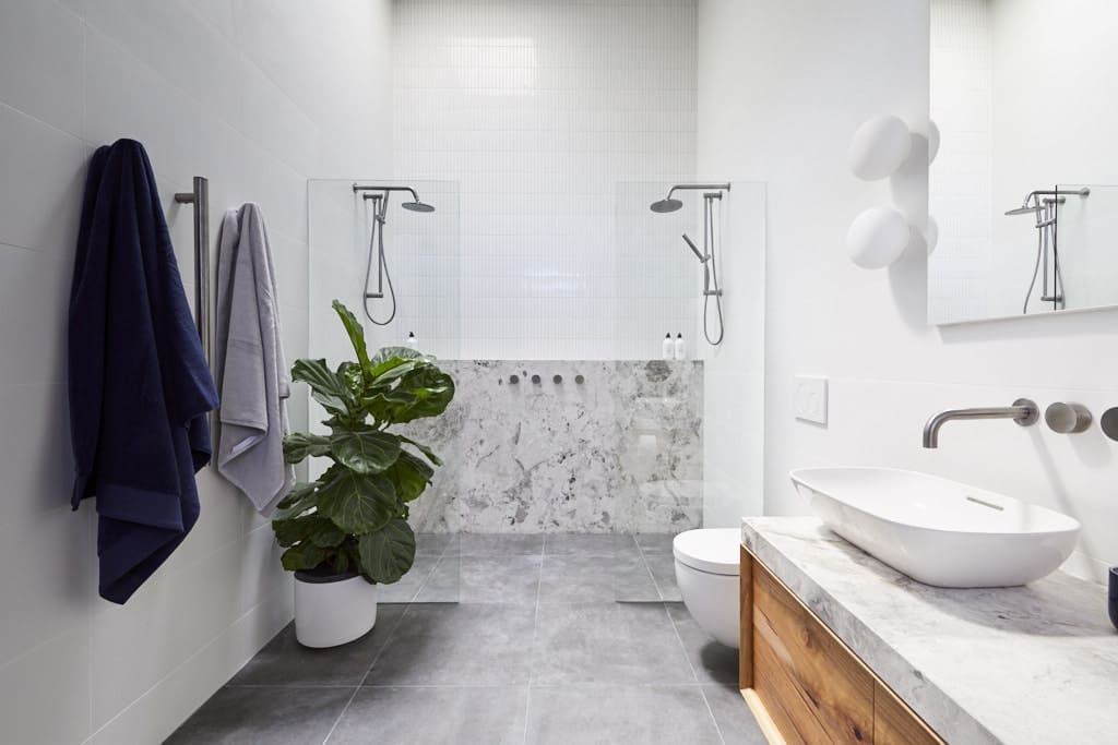
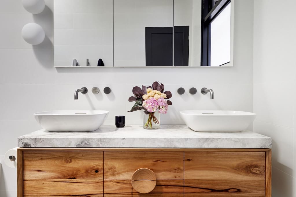
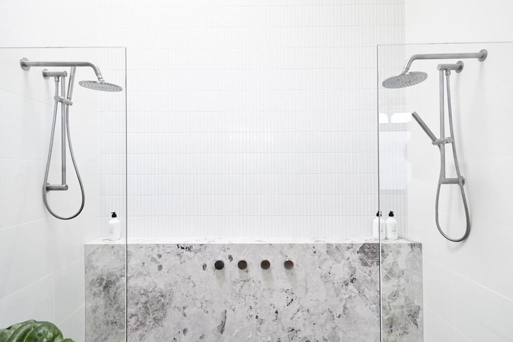
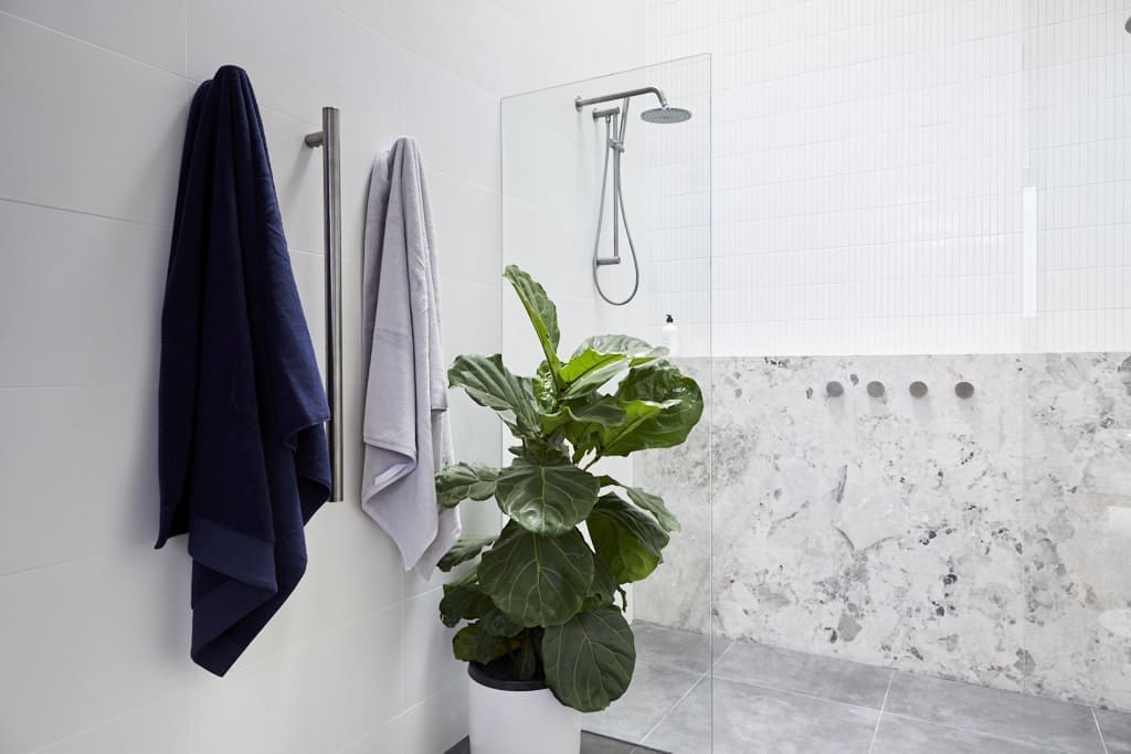
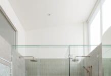
Another stunning bathroom space by these ladies. Absolutely LOVE the marble built out shelf in the shower (who else has ‘Pinned‘ that pic for their next bathroom?), the wall hung custom vanity and tapware.
The layout of the space is great too, the towel rails are perfection… it’s hard to find a fault in here!
Were there other aspects of tonight’s ensuite reveals that had you cringing or swooning? Tell us what you loved in the comments below!


Love kerrie and spence bathroom. Would it be possible to know the brand of the mirror cabinets??
Hi Agnese, isn’t it beautiful?! I’m not sure where that particular cabinet is from but I did find this similar one… https://www.adpaustralia.com.au/pill-shaving-cabinet Hope that helps 🙂
Loved the bath in Sara & Haydens bathroom .I would have continued the dark tile on the wall behind the bath. Making the bathroom dark & moody .Though the judges didn’t seem to like the dark tiles at all…maybe they didn’t look so good in real life, as on tv. Would have also used brushed brass tap wear instead of black would have amped up the lux look.
Hi Kerry, totally agree with you about continuing the black tile behind the bath. It’s quite common to dial up the drama in an ensuite and opt for a darker and moodier look so not sure why the judges were so hard on that either. Love your suggestion about changing the tapware!
Totally agree about the wall niches. It’s a dated look to make a feature out of them and the chrome angles were just wrong!!! I really loved the smaller white mosaic tiles Carla and Bianca used above the stone in their shower too. It played with texture without introducing another colour or making the space feel too busy 🙂
So true, that white tile was another swoon-worthy addition to their bathroom. If only they didn’t have a bonus point used against them, they would have won!