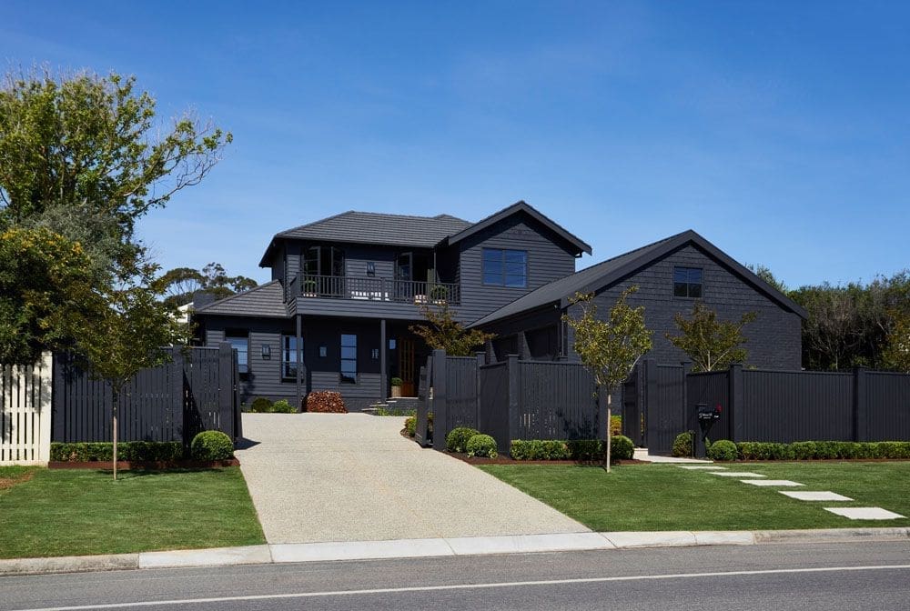
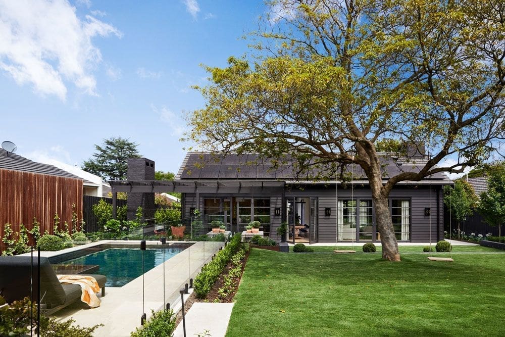
In today’s home tour, we explore the charm of Black Beauty. A home channeling the European Farmhouse aesthetic hidden in the streets of Mornington, Victoria. With an emphasis on arches, symmetry and texture, this house is a visual masterpiece that’s sure to inspire.
We take a look around this beautiful home with talented designer Kate Walker from Kate Walker Designs (KWD) and owners Lucy and Steve.
Related article: Sage green and marble laundry and mudroom oozing modern farmhouse vibes
Related article: The Georgian style home given a lockdown makeover: A tour around Belle Vue Apartment
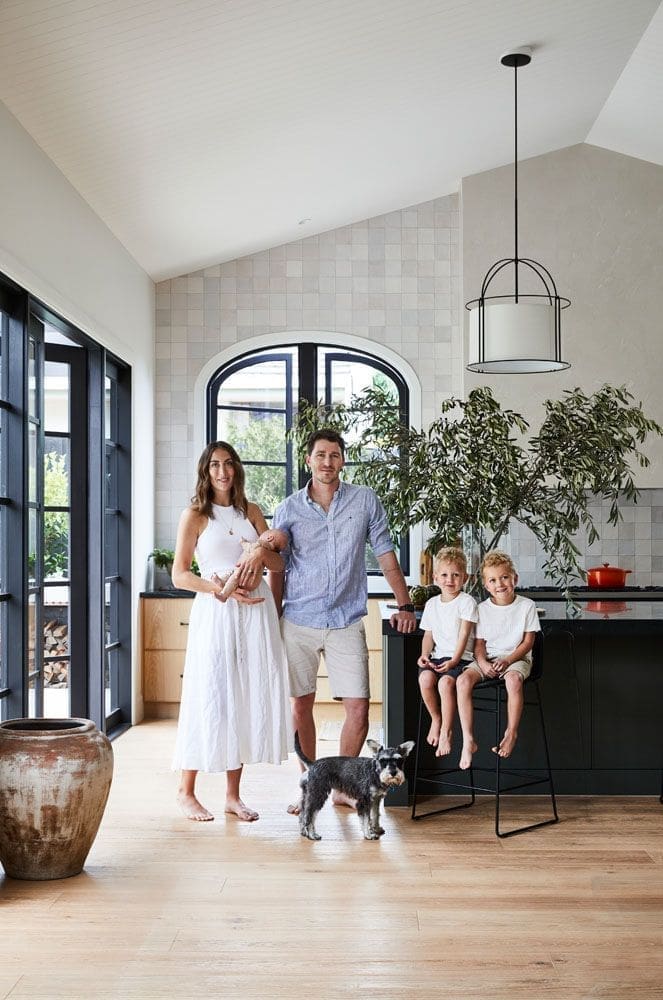
Designed for a family of five, this home is the perfect mix of relaxed yet elegant European architecture.
“The house has two storeys with a master suite and ensuite, two bedrooms for the kids, a family bathroom, a guest bedroom with an ensuite, and a powder room,” says Kate.
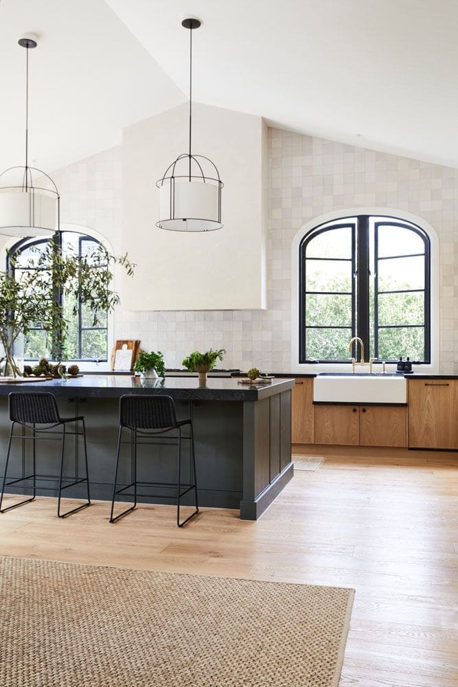
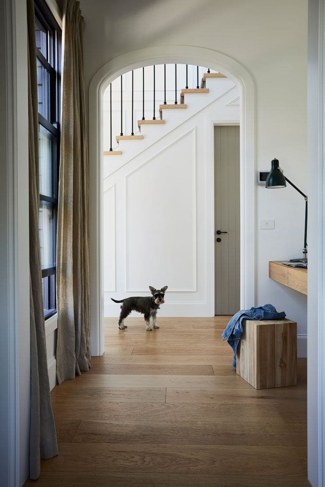
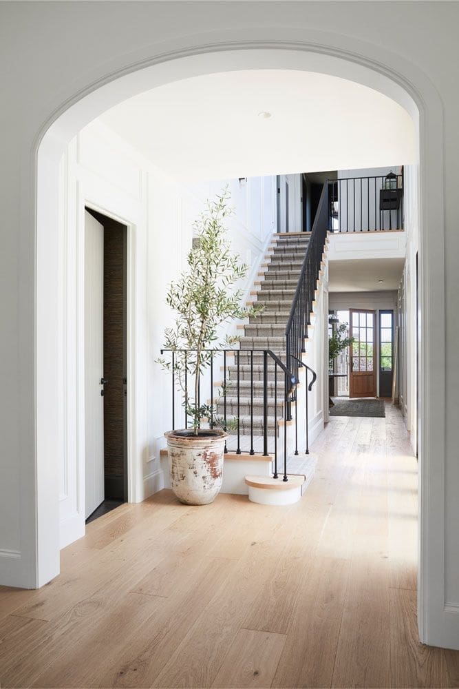
“The brief was very much based on a European Farmhouse aesthetic. We wanted to emphasise the symmetry and the arches within the architectural design.
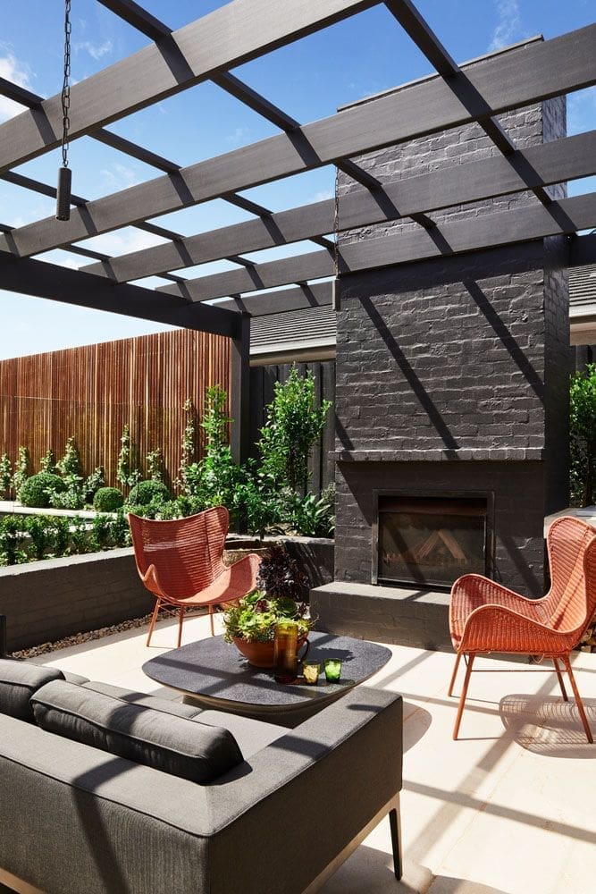
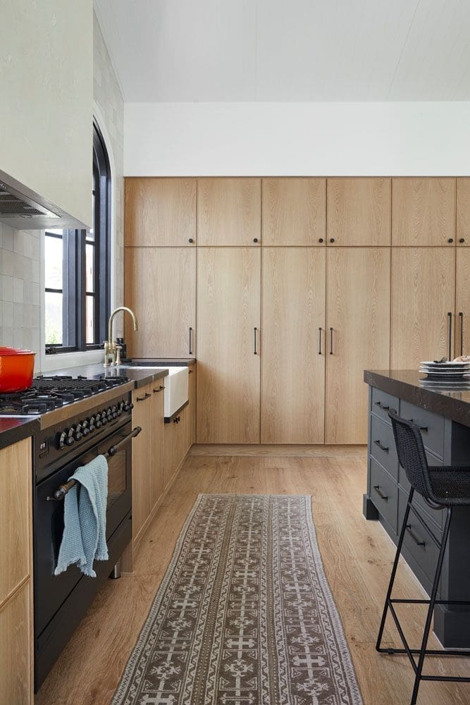
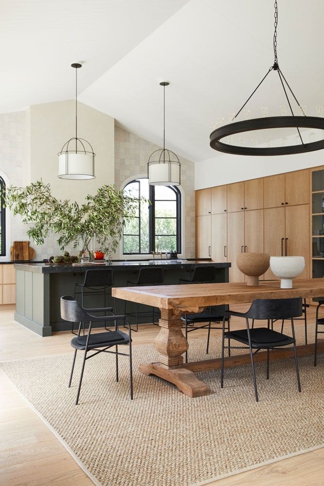
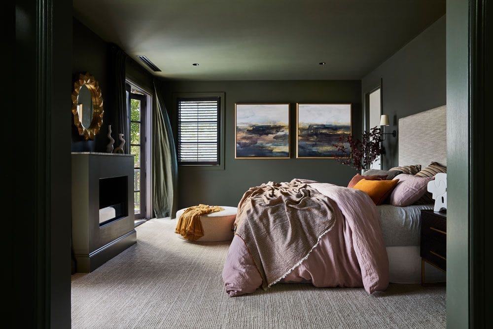
“We lined up the kitchen detailing and rangehood with the lounge room detailing and the fireplace. They are a mirror image of each other. Having a really big island bench was important because we wanted it to be an entertaining space, a prep space and a dining space as well.”
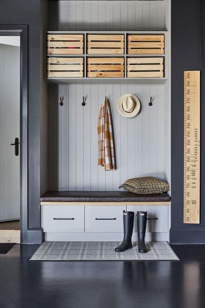
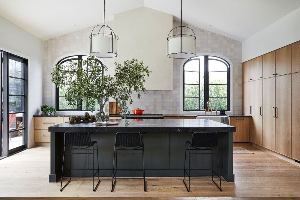
Black is a bold colour choice, but Kate insists using a mix of textures throughout the home ensures the colour never gets dull.
“Black houses are the epitome of the European Farmhouse aesthetic, so we knew it was the right foundation.
“We also really wanted to use texture as colour throughout the home. The house has a myriad of textures, including two roofing materials — standing seam and a roof tile both in black. On the exterior of the building, we added shingles, weatherboards, timber windows and bagged and painted brick. All of the texture ensures that the monolithic black tones don’t look flat.
“The home sits beautifully in the landscape, contrasted against the verdant green gardens. It was less about making the home stand out in the street, and more about it blending in with the streetscape.”

Giving a design team such as KWD authority over a house build requires a lot of trust but can ultimately lead to a magical payoff.
“It actually surprised me and surprised Kate to a degree. That we were prepared to push the boundaries and step out of our comfort zone and agree to the whole specification. We trusted in Kate and her team and were invested in the process from day one,” says Steve.
“We knew we wanted a farmhouse-style home and had a vision for the floor plan, but we wanted Kate’s direction and input on all the hard finishes and the colour palette. Kate helped us focus on the best aesthetic for what we wanted to achieve. She had this incredible way of drawing out exactly what was inside my head,” adds Lucy.
“I feel like we’ve both got so much more confidence to make those tricky decisions about what colours and styles and textures work with each other. I’ve been like a sponge soaking up Kate’s ideas, advice and inspiration.”
When clients are open to ideas and they place their trust in us as designers, we can create magic together. It adds an extra layer of design that creates a result less ordinary, and that delights and surprises.
Kate Walker
With such a beautiful build, we thought we’d ask Kate for her tips on where to save and when to splurge.
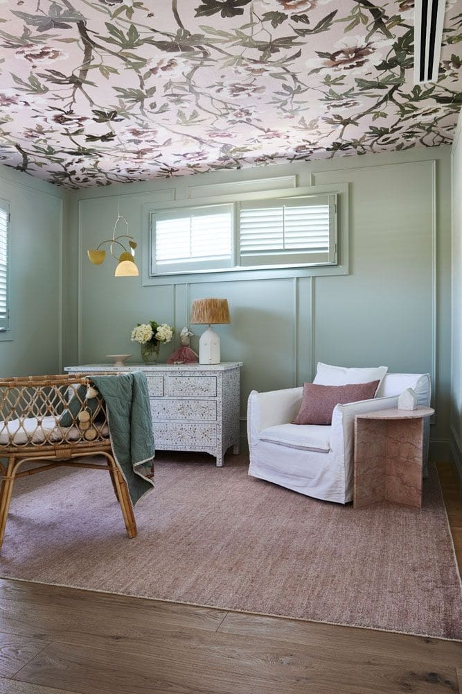
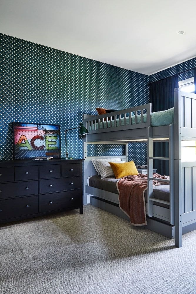
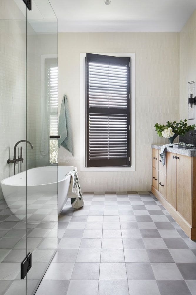
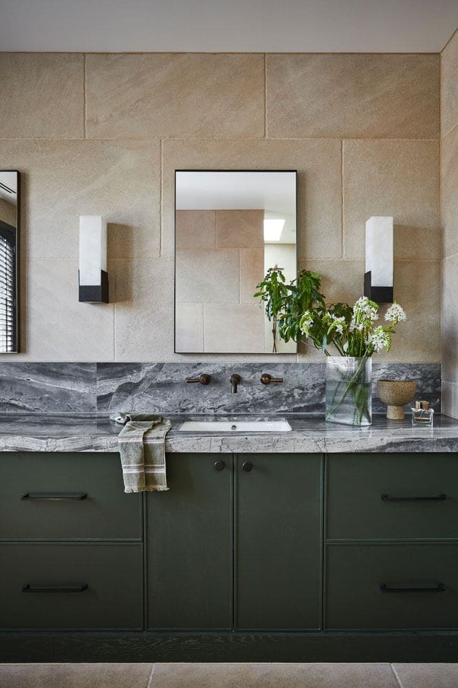
“It’s the quality finishes, innovative design elements and attention to detail that make a space beautiful. I like to consider every aspect of the design in the early stages. I will add natural stone wherever possible. Tiles on the bathroom ceiling if the space warrants it, or in this case, wallpaper on the ceiling.
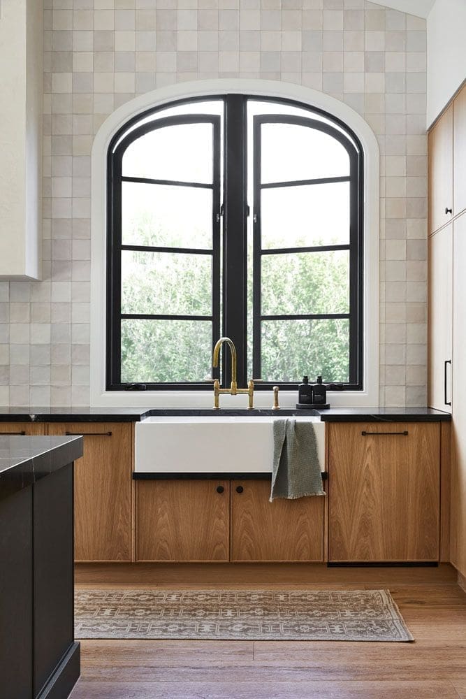
“Focus your spend on the areas of the home that you will see the most, use the most and can get the most joy from. For example, the kitchen tap. If you think about how many times you turn the kitchen tap on every day, you can understand why it’s important to splurge on a quality fitting as opposed to the taps in the children’s bathroom.
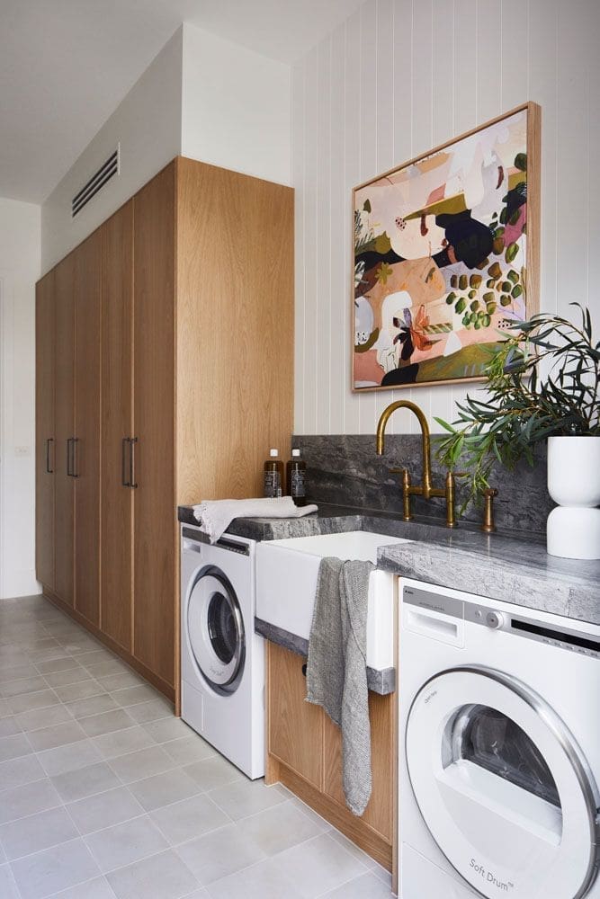
“If you looked at a heat map of your home, the kitchen would be bright red and knowing that, it makes sense to spend more money on your kitchen joinery versus your laundry joinery. You would splurge more on your kitchen island benchtop than on your ensuite stone. Add the best quality finishes that your budget will allow.”
Builder — Cahill Building Group
Photographer — Armelle Habib
Stylist — Julia Green – Greenhouse Interiors
We can’t get enough of this colour dark yet homely colour scheme! To see more projects by the KWD team, visit the KWD website or take a scroll through their Instagram. What do you think about this European Farmhouse style? Would you use black as the main colour for your home? Tell us in the comment section below!
More home tours here
