
You’ve got the Pinterest folder sorted, three paint samples taped to the hallway wall, and a shortlist of tiles saved on your phone. The direction feels clear. Then the project starts to take shape and your confidence wobbles. Will that dark green really work in here, or will it swallow the space? Is the sofa you love going to fit without blocking the walk-through to the deck?
A mood board can show the feeling, but it cannot always show the room. And in a renovation, that distinction gets expensive fast — because the decisions we’re talking about aren’t cushions and candles. They’re flooring, joinery, tiles, lighting positions and major furniture, all of which are difficult and costly to undo once they’re in.
Related article: How to create a mood board to achieve your home design goals
Related article: A guide to the 10 most popular interior design styles
Why inspiration images only take you so far
Saved images are genuinely useful for working out what you’re drawn to. Where they fall short is that they were all photographed in someone else’s house or showroom.
That gorgeous coastal living room had four-metre ceilings and a north-facing wall of glass. Whereas your place may have standard ceiling height and one window that gets sun for three hours. The sofa looked perfectly scaled in the photo because the room was twice the size of yours. The timber flooring sat beautifully with those cabinets because the undertones happened to agree — yours might not.
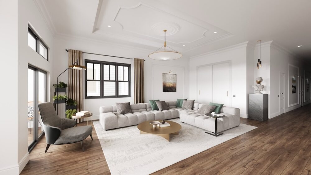
None of this is visible from an inspiration image. When a renovation involves new flooring, cabinetry, furniture, lighting, tiles, paint colours or built-ins, interior rendering services can help turn drawings, mood boards and references into realistic room visuals before the work begins. It’s the difference between hoping a scheme works and actually seeing it in your own space.
What a render actually shows you
The value is in seeing everything together, at real scale, in your room. That means the layout and how the furniture sits within it. The lighting, both daylight and evening. Paint colours across whole walls rather than on a swatch. Flooring and tiles at full scale. The joinery and cabinetry finishes. Curtains or blinds, artwork, the styling layers on top.
Most importantly, it shows the combinations. Individually, most of your choices are probably fine. It’s how they interact — the flooring against the cabinetry against the wall colour under your actual light — that either sings or quietly clashes.
Which renovations benefit most
Renders earn their keep where the decisions are permanent and the budget is real. Kitchen renovations, where cabinetry, benchtops, splashback and flooring all have to work as one. Bathrooms, where tile choices are unforgiving and the room is small enough that mistakes dominate. A living room refresh built around a major furniture purchase. Bedroom redesigns with built-in joinery. Laundry updates, open-plan reconfigurations, a flooring change running through the whole house, new lighting positions, or window treatments across a large glazed area.
The common thread is that the visible result is being locked in before you can see it. A render lets you test that result while it’s still just an image.
Designer tip: In bathrooms, pay close attention to how different tile selections interact at junctions and corners. Two tiles can look beautiful side by side on a sample board but feel much busier once they’re repeated across an entire room.
Testing colour and materials
This is where most renovation regret originates, and where seeing things in context makes the biggest difference.
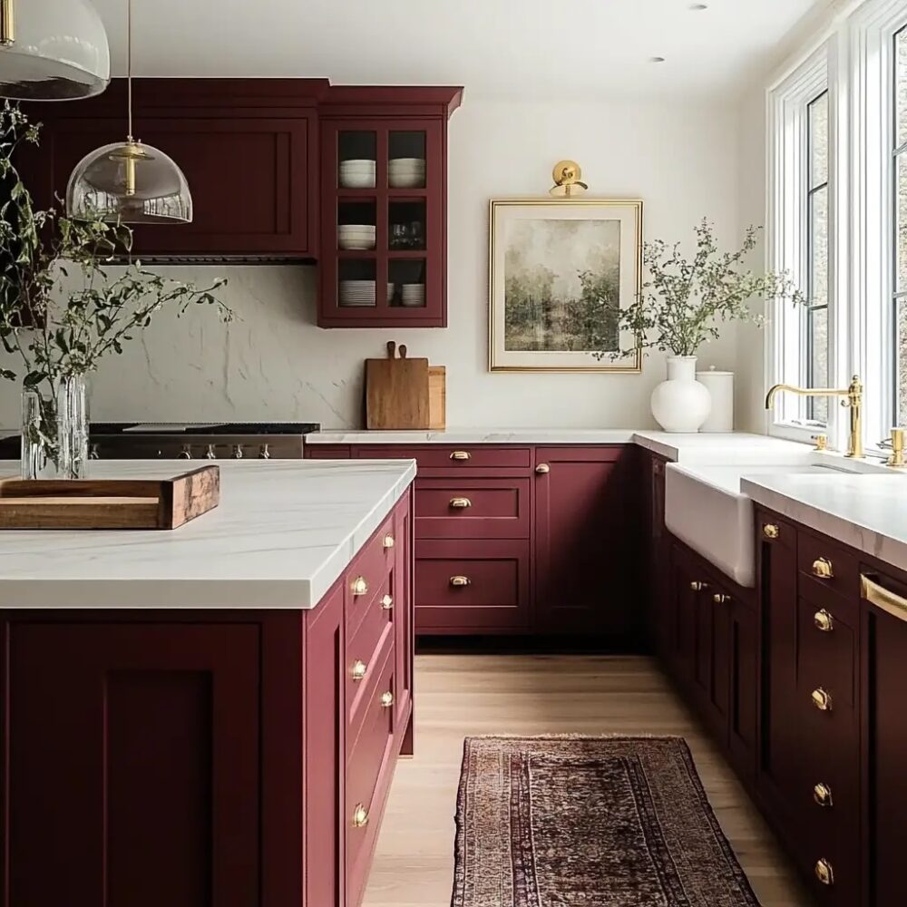
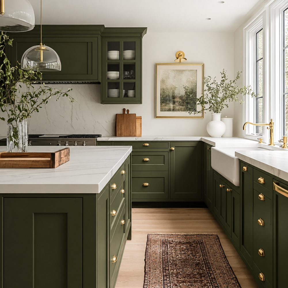
Paint behaves differently depending on light. A colour that reads soft and warm on a card can go cold in a south-facing room, or take on a green cast bouncing off your garden. Feature walls can feel bold and intentional or slightly random depending on what’s happening around them. Tile combinations shift enormously at scale — a pattern that charms on a sample can overwhelm a whole bathroom.
Then there are the material relationships. Timber tones that clash rather than complement. Stone that reads warmer or cooler than expected against the cabinetry. Laminate that looks convincing in a showroom and flat under your downlights. Rug and sofa combinations that work in a catalogue and fight each other in your room. Warm versus cool lighting, which changes every single one of these choices. And matte versus gloss surfaces, which affects both look and how much your kitchen shows every fingerprint.
Designer tip: Joinery colour is another decision that’s difficult to judge from a small sample. When you’re applying the same finish across several metres of cabinetry, what looked subtle on a sample can suddenly dominate the room. On the flip side, if you’re thinking of embracing a bold colour, a render might just give you the confidence to lock in that brave decision!
Furniture scale and how the room flows
Scale is the other big one, and it’s remarkably hard to judge from product photos.
Check the sofa size against the room, and whether there’s a path around it. The rug — too small is the most common rug mistake going, and it makes everything else look adrift. Dining table clearance so chairs can actually be pulled out. Bed placement with room to walk both sides. Where the armchairs, side tables and console land. Hallway flow, particularly in older Australian homes with narrow entries. Whether the storage is reachable. Which way the doors swing and what they hit.
A sofa that looks perfect online still has to work with real windows, doors and walkways. A room can be beautifully styled in a product collage and awkward to live in every day.
Designer tip: Always pay attention to the negative space around furniture, not just whether the piece technically fits. A sofa might fit within the room dimensions, but if it leaves an awkward walkway or crowds nearby furniture, the room can still feel cramped. This is where seeing furniture to scale in a render can be especially useful. As a general rule, allow at least 70cm for comfortable circulation anywhere someone regularly needs to walk. Furniture that doesn’t form part of a walkway — such as a coffee table in front of a sofa — can sit closer.
Renders and mood boards work together
We’re not saying for a second that renders are better than mood boards. They’re the right tool for the first stage and nothing replaces them.
You can pull together a mood board quickly while you experiment with different ideas and feelings. They are the ideal tool to sort out your style direction, your colour palette, the products you’re drawn to, the materials, and the overall feeling you want. It’s how a scheme finds its personality.
A render tests that scheme in your specific room — the scale, the layout, the light, the proportions, the actual combination of products, and whether it holds up well enough to approve. They are time intensive to create and you can think of them as a way of testing your mood board concept. Remember, board first, render when you’re close to committing and the stakes are high.
Getting everyone on the same page
Something worth anticipating: you, your partner, your designer and your builder are almost certainly imagining different versions of the same scheme right now, and all of you have agreed to it.
A visualisation studio such as archicgi.com can be useful when a homeowner, designer or developer needs to turn sketches, floor plans and material references into clear images that are easier to review than separate samples and drawings. With one shared visual, the conversation changes completely. Your partner can see what you’ve been describing for three weeks. Your builder and joiner understand the intended result rather than interpreting it. Your designer can point at a specific element and explain the reasoning. Disagreements surface now, while they cost nothing to resolve.
When it’s genuinely worth it
Renders make most sense on an expensive renovation, a custom joinery project, a kitchen or bathroom update, an investment property being styled for sale or lease, a new build, a significant open-plan reconfiguration, a whole-house flooring change, a bold or dark paint choice you’re nervous about, a feature tile, a major designer furniture purchase, or any project where several people need to approve the same design.
For repainting a bedroom, test pots and an afternoon of watching the light will do the job perfectly well. Or for restyling a room where you only intend to update textiles and decor, a mood board should also be enough.
What a render can’t do
We’ve shared lots of reasons why a render is a good idea… but it can’t do it all. A render doesn’t replace real material samples handled in your own daylight, or paint test pots on your actual walls — screens render colour differently and no image conveys texture. It doesn’t replace site measurements, your builder’s advice, joinery drawings, electrical or plumbing plans, structural review, or proper budget quotes. And it certainly doesn’t replace your own instincts about what makes a home feel like yours.
What to prepare before requesting one
Gather this first and you’ll get something genuinely useful:
- Room dimensions and ceiling height
- Photos of the existing space
- A floor plan if you have one
- Window and door positions
- Your mood board
- Links to the furniture you’re considering
- Any furniture you’re keeping
- Paint colours with actual names or codes
- Tile and flooring references
- Lighting references
- Notes on joinery or cabinetry
- Styling references
- What the render is for — your own decision, client approval, a builder discussion, renovation planning or marketing.
Even 2D drawings, rough sketches or photos of the existing space are enough to start from, provided the dimensions are accurate.
An interior render isn’t just a polished picture to admire while you wait for the builder. Used properly, it’s the point where a stack of separate decisions becomes something you can actually judge as a whole — and where you find out whether the scheme will feel right, function well and suit the way you genuinely live. The goal is not a flawless picture. The goal is a home that feels right and works every day.