We recently scouted around Canberra, looking for interiors inspiration from some of the coolest cafe fit outs.
From feature walls to lighting, there’s so much inspo to be found in commercial spaces. Here are some of our top ideas to steal from cool Canberra cafes!
Related article: Boutique creative signage George & Willy: Stylish display boards and signs
Related article: Robert Gordon Australia x The Design Files = Too Good
A luxe entrance
They say first impressions count and we were certainly impressed by the luxe black marble brick floor tiles out the front of Urban Pantry!
Goes to show a little bit of luxe can go a long way.
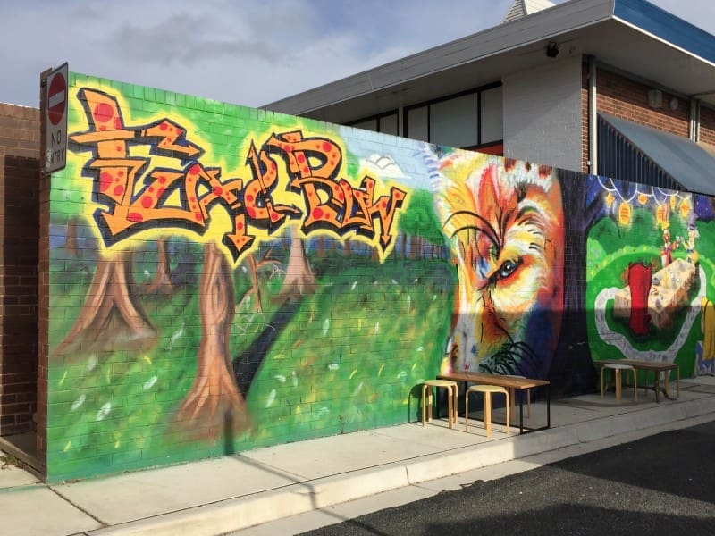
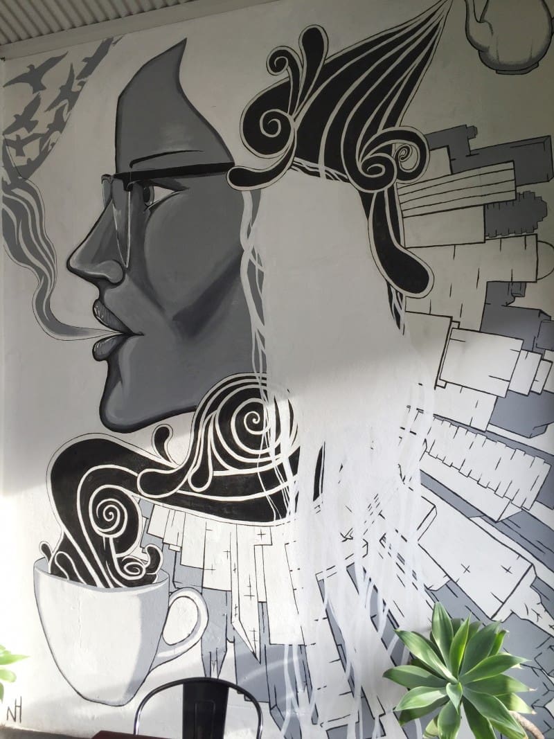
Mural
Increasingly, street art or murals aren’t just for laneways — they’re making their way into commercial and residential settings too.
Artists like Daisylegs can create a custom design to suit your home and individual style.
White tiles and dark grout
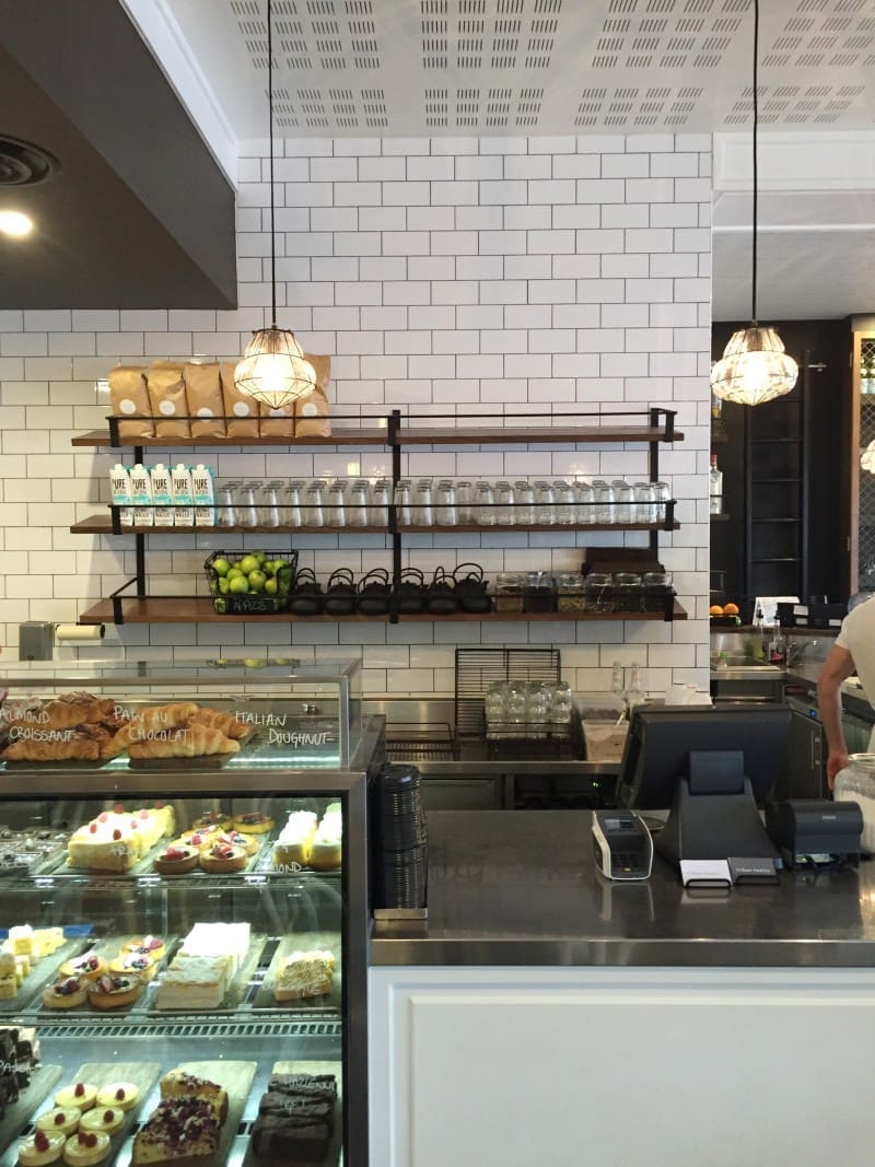
An interiors trend we’re loving right now is white tiles with dark grout — they really make the tiles pop and add a tasteful hint of industrial luxe.
Here you can see how white subway tiles look with dark grout but we’ve also seen it look fab with white hexagon tiles too!
Wall hung planter boxes
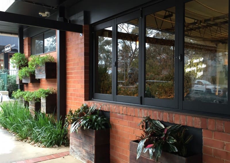
Short on backyard space? No problem! The guys at Double Shot show how to maximise outdoor wall space with planter boxes.
Perfect for herbs, succulents, ferns or other smaller plants, planter boxes will add life and interest to your outdoor space — no matter the size!
Cluster of pot plants
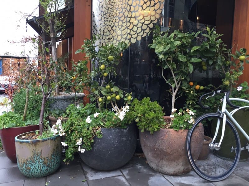
Keeping with the outdoor vibe, how cool does this cluster of pot plants out the from of Mocan and Green Grout look?
We love how each pot is filled to the rim and dripping in greenery, and the mix of pots looks fab too!
Feature walls
Looking for feature wall inspiration? There are so many ideas to be found in cafes!
Painted feature walls were a little overdone for a while there, taking a back seat to timber panel and concrete rendered walls, but now they are back in all their glory. At Celstino’s, they’ve added a punch of colour with this bright turquoise wall.
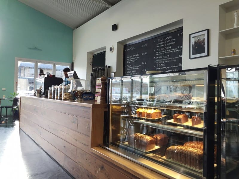
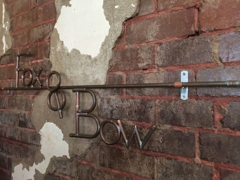
Or if you’re looking to add warmth and a touch of rustic glam, you can’t go wrong with a red brick feature wall.
The guys at Fox and Bow show how it’s done and they’ve even added their own copper pipe artwork over the top.
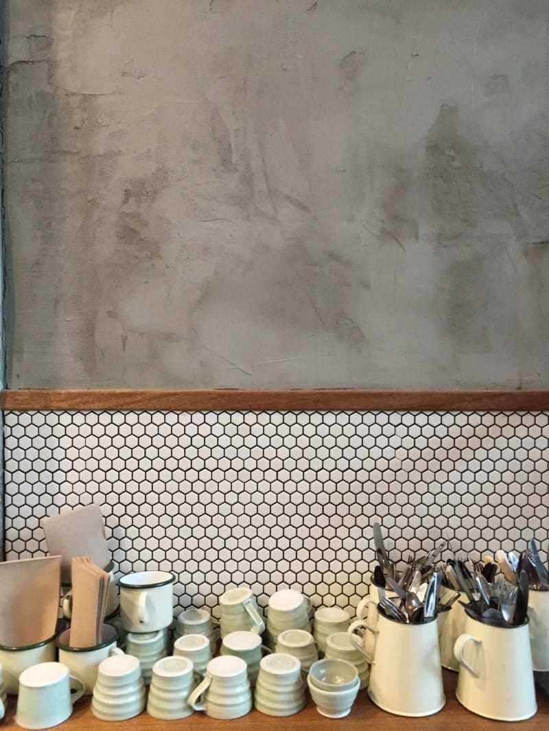
Concrete is still trending hot.We love how the team at Barrio created a feature wall using concrete render, timber panel and white hexagon tiles.
It’s an unusual combination but we think it really works!
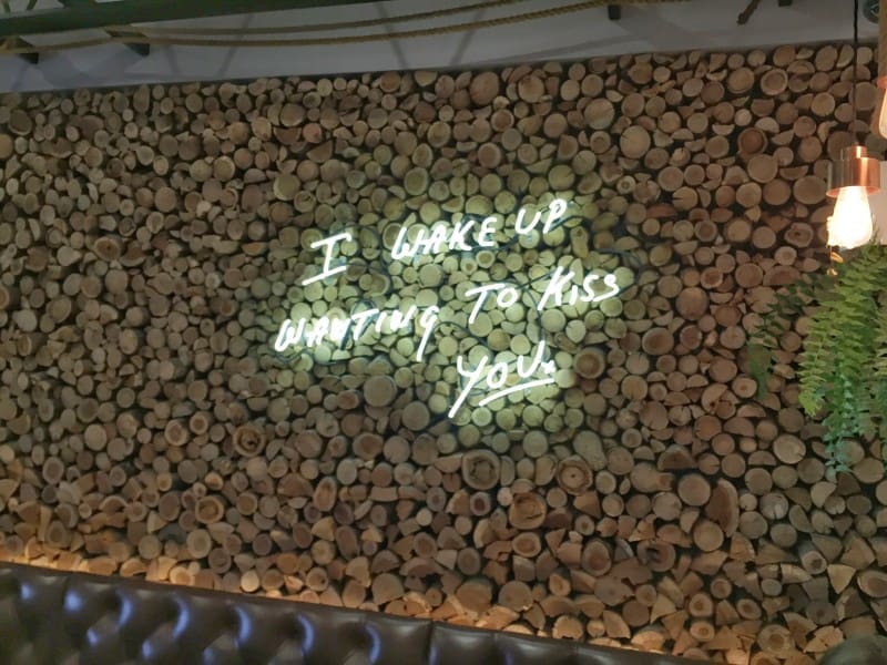
And for something totally out of the ordinary, check out this log feature wall at Double Shot.
It took them days to create the wall. But they say it’s the one feature of their cafe people comment on the most!
Do you think you’ll try any of these ideas in your home? Tell us in the comments below!




These ideas are great and I think I’ll do the cluster of pot plants as my weekend project tomorrow 🙂
So easy to do and makes such a great impact. Would love to see pics of your finished space x
Love all these details, especially those marble tiles at Urban Pantry! Have you been to Monster? What do you think of the interior? It’s a bit eclectic for my liking but the terazzo looking tables made me feel a bit nostalgic for Woden plaza in the late eighties/early nineties 🙂 I also like the Pedlar in Campbell – I still can’t get enough of concrete!
Hi Jane
Yes, love the fit out at Monster too. Like you, it’s a lot more eclectic than our style but they pull it off so well (like that suitcase wall by the lift!). Haven’t been to Pedlar yet so will need to add that one to the list, thanks for the tip!
Looks like your reno is progressing well! Hope this rainy weather hasn’t caused too many delays 🙂