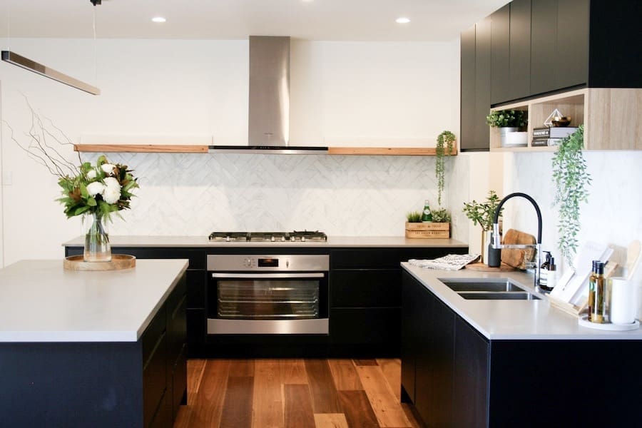
The other week we shared a navy blue and grey bathroom that Maria of Studio Black interiors designed and today we’re taking you into the client’s matte black and timber accent kitchen!
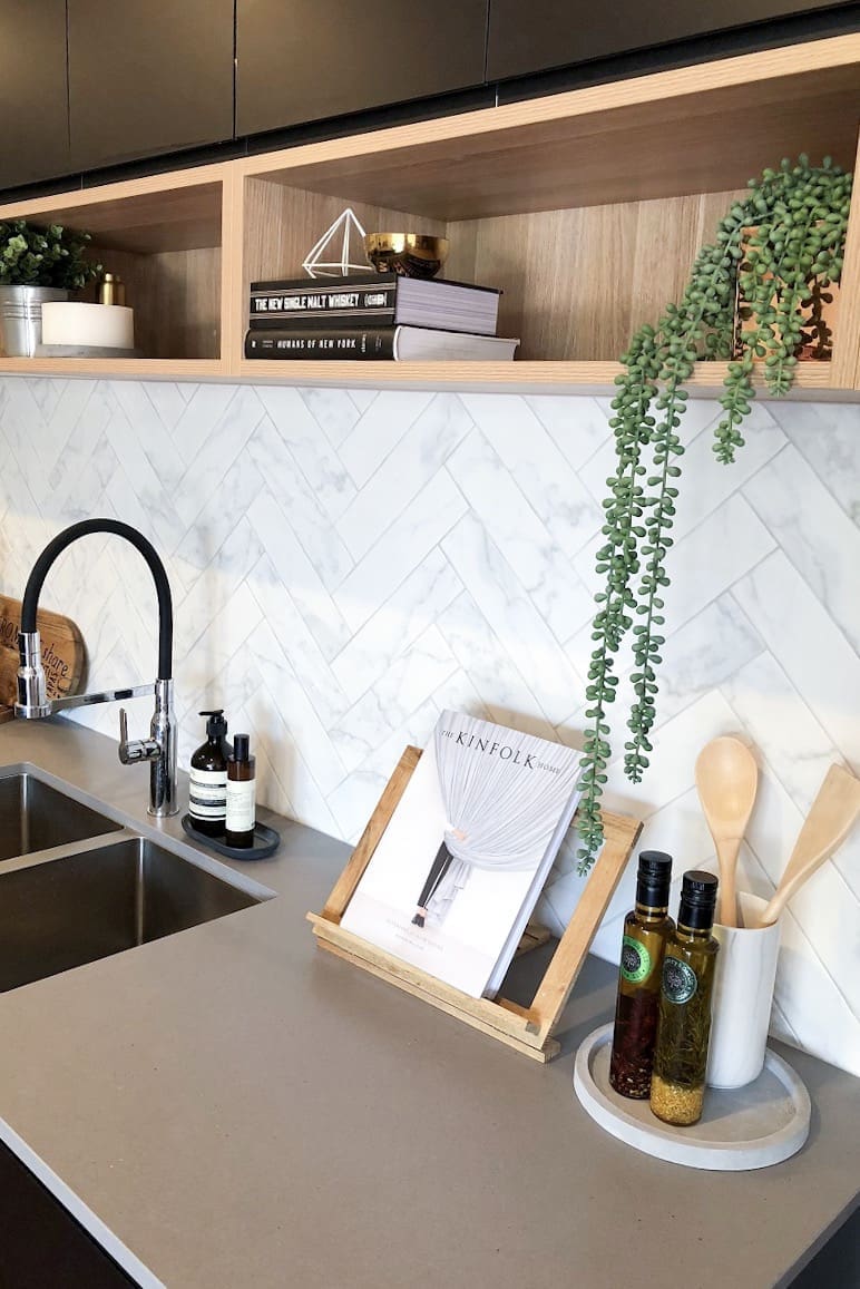
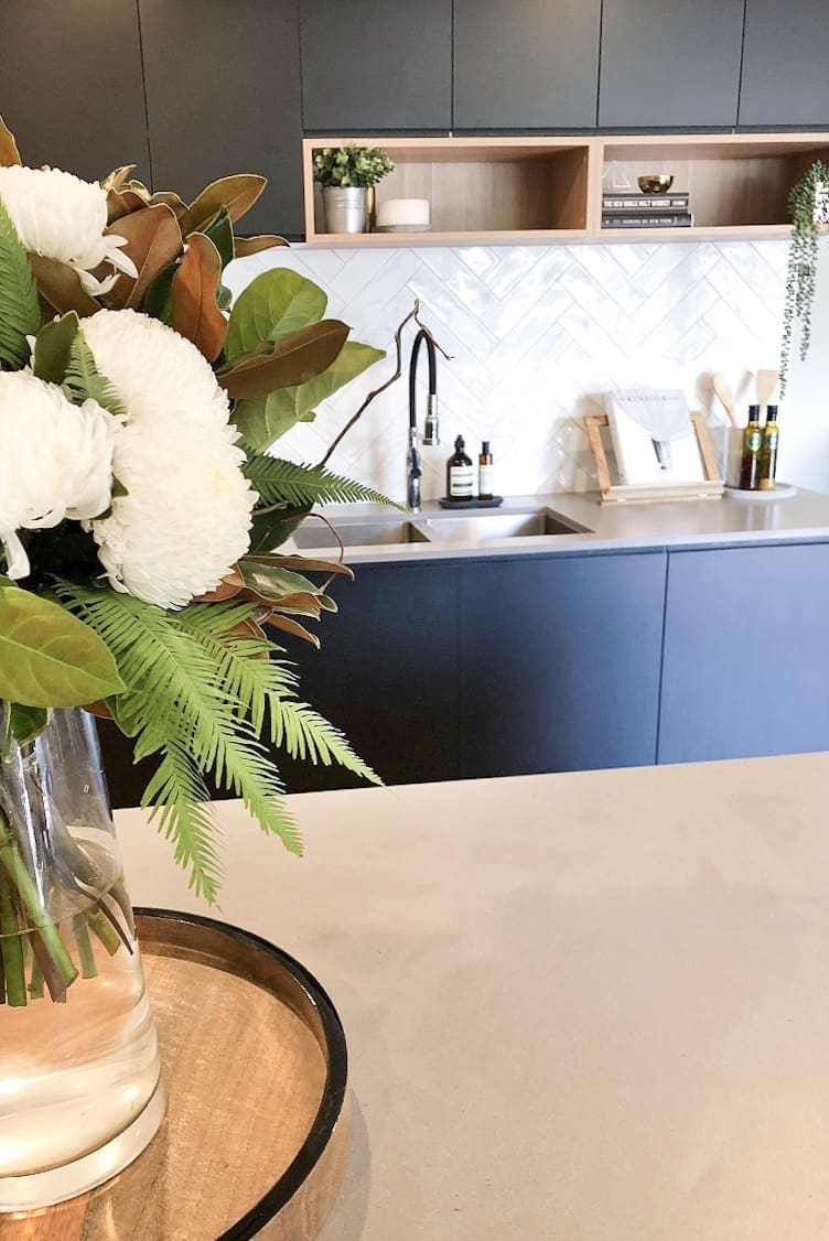
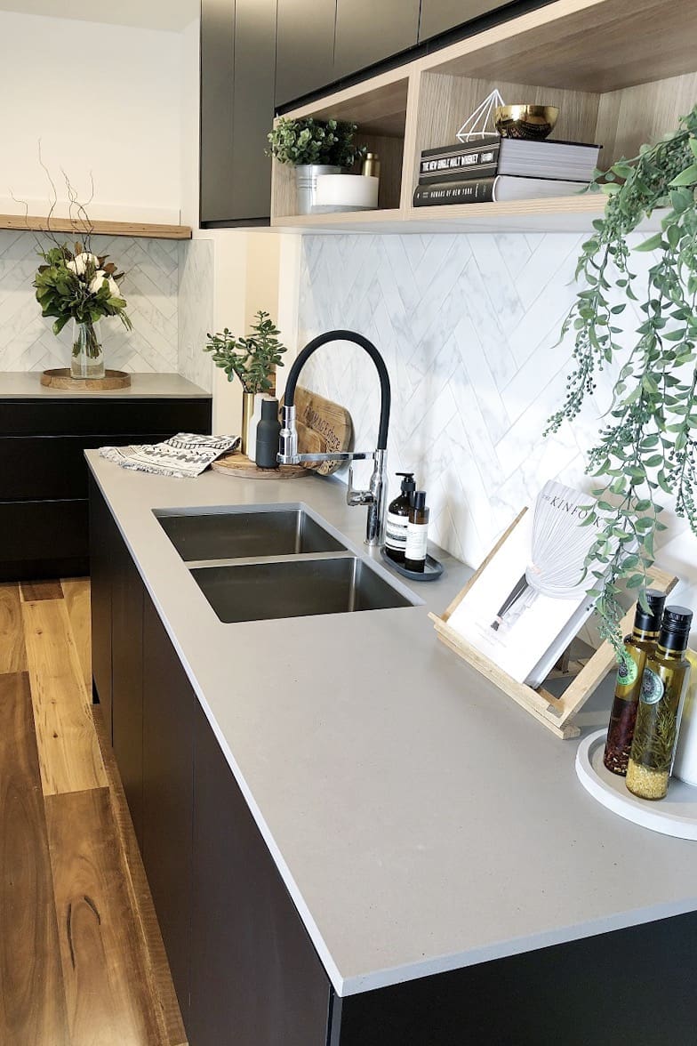
Featuring open pocket shelves, marble look herringbone splashback, and of course black joinery, this kitchen serves up a big dose of design inspo.
Related article: Design inspo: Beautiful black kitchens
Related article: Where to splurge vs save in your kitchen reno: Inside a sophisticated black kitchen
Words by Maria Cerne
Kitchen inspiration
The client had clear vision for this kitchen and wanted matte black joinery and concrete look benchtops.
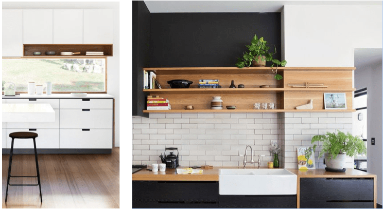
I love a black kitchen, but I was keen to add a bit of warmth and interest to the joinery. So I pulled together a mood board of ideas which I find is an effective way to explain your design concept to a client.
I was inspired by these images of integrated shelving. Not only do they provide visual interest, they’re a wonderful way to add a touch of your own personality by styling with cook books, kitchen trinkets and plants.
Project challenges
The kitchen had a L-shape format, and the concern was having everything in black which we thought may overpower the space. I suggested, removing the cabinetry along the left-hand side wall to open the space and opt for a floating timber shelf as an alternative. The client already had a very large walk in pantry, so we were fortunate enough to be able to remove this joinery from the kitchen design. We also added little timber box features to the back wall, to break up the black and add visual interest.
Favourite features
I love the herringbone splashback! That pop of white is a lovely contrast to the black and grey palette. The benchtop is also one of my favourite features. The bench top is ‘Sleek concrete’ by Caesarstone. It’s a warm grey and looks like concrete without the maintenance.
Suppliers
Kitchen – The Good Guys
Kitchen splashback – Rivoland Tiles
Benchtop – Caesarstone ‘Sleek concrete’
Timber shelving above gas top – Thor’s Hammer
Pendant – Beacon Lighting
We hope you enjoyed this matte black kitchen tour. What was your favourite feature? We especially loved those pocket shelves to add interest and soften all of the black joinery.
More kitchen inspo
About the author
Maria is the Interior Designer behind Studio Black Interiors, a boutique residential design practice in Canberra. Known for her modern and paired back aesthetic, her design style is inspired by the balance between function and simplicity. Maria has a passion for architecture, design, styling and homewares. She loves keeping up to date with the latest design trends and products and sharing this with other interior enthusiasts. When not designing, she’s a mum to two beautiful young girls and married to Michael, her sports obsessed husband.
Web: studioblack.com.au


Comments are closed.