The girls at Three Birds Renovations have done it again. Totally nailing their latest home reno, creating a stunning family home for owners Cath and Sarah.
Featuring peachy pink tones and luscious curves around every corner, this one is a true beauty. Let’s take a look!
Related article: Amazing home transformation: Before and after renovation of the Bardon home
Related article: Blue Lagoon: Curved features and Mediterranean vibes in the latest home by Kyal and Kara
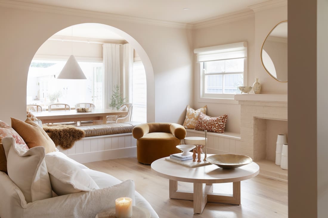
For their latest project, House 12, the Three Birds team wanted to create a family home for their clients. Cath and Sarah and their two young boys, handed the keys, budget, and complete control over to Bonnie, Erin and Lana for them to do as they pleased.
A risky move for some, but seeing the back catalogue of renos from these girls, they knew they were in pretty safe hands!
“It’s a true renovators delight — it was a pretty dated home,” says Bonnie. “When it came to the design, it was really important to me that the home feel warm.
“I wanted lots of creams, nudey-peachy tones and warm timber flooring with lots of texture to it.”
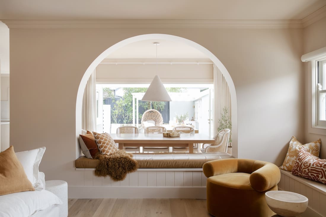
The home, situated in the historic town of Windsor, NSW was tired and somewhat dated. Thanks to the renovation, this little cottage has been transformed into a modern home with curves galore.
“We put more than a few arches in this home,” says Erin with a smile.
“The original home already had quite a few curves so the main reason Bonnie wanted to add more was to pay respect to that.
“One of the key things we did was remove a wall from the living room.
We’re massive fans of open-plan living for families and in a home of this size, removing a wall to increase the living space made the world of difference.
“Once the wall was down, the rest of the changes were cosmetic. It’s the perfect example of a cosmetic reno and what can be done on a smaller, more achievable scale with less budget but BIG impact.”
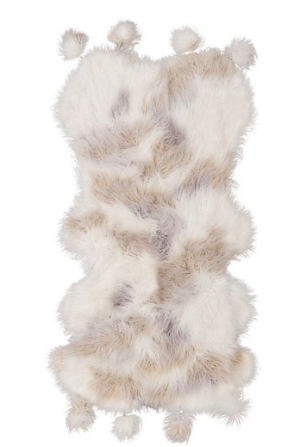
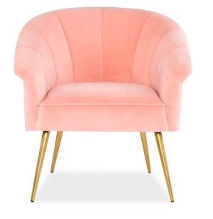
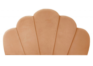
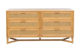
Shop the look: Peaches and curves
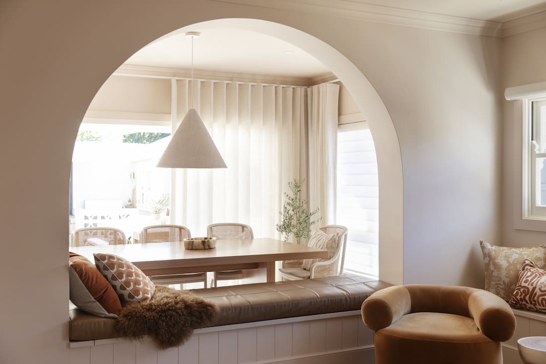
Doing what some might call a controversial move, the Three Birds team added a bench seat under the archway of the living room, closing it off as a thoroughfare.
“We’re really happy with how the rooms turned out,” says Lana.
“The lounge room is my favourite room in the whole house. The arched wall beautifully frames the dining area and automatically injects versatility into the property. The space is now multi-functional, offering rooms to entertain or relax.
“We’ve never plonked a bench seat smack bang in the middle of an arch before, but I’m sold.”

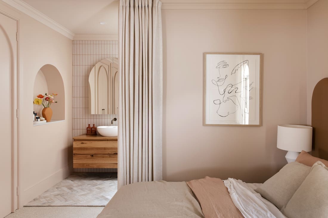
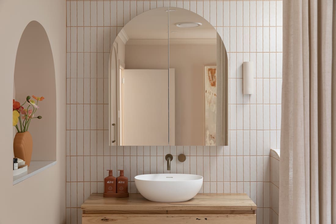
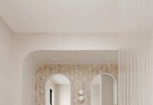
The curves just keep on coming, continuing into the main bedroom and bathroom.
“We wanted to spoil these lovely mums with a super-spesh parents’ retreat of their very own,” explains Bonnie.
“In the master ensuite we created a curved recess shelving unit using Gyprock Flexible and finished with a Talostone engineered stone bench top, delivering a high-end look that also provides a gorgeous nook for special pieces.
“To make the wardrobe doors look extra luxe, we simply added the trim detailing to create the dual arches. What a transformation!”

As an older home, it was important to create as much liveable space as possible but without sacrificing that all-important storage.
“We built in some storage in the seating under the windows in the living room. Storage was scarce in this home so wherever we were able to get some in, we did!” says Erin.
“Now, there’s a lot of storage! Everything opens and has storage in it. The bench seats all lift up and are the perfect opportunity for more storage!”
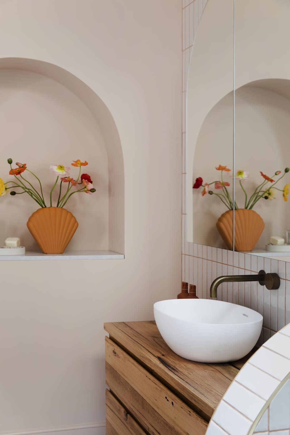
With the exception of rejigging the position of the ensuite, what’s most impressive about this renovation, is that most of the work was just cosmetic.
“For the living room especially, previously it was dark and dingy. It had heavy drapes, dark colours and oversized furniture. Basically we took out a wall and we transformed the space with colour, texture and furniture. It’s a whole different world now!” smiles Erin.
We loved taking a look around the latest Three Birds project and can’t wait to see the rest of the room reveals in the coming weeks. To follow along, check out their website and Instagram page.
More real homes here




Using peachy tones really gave off a warm vibe, it looks spacious and the variety of curves gave personality to the whole house.
Great job three birds! your renovation works are inspiring.
Looking forward to seeing the rest of the room.
Thanks Ava, they sure did a great job!