Reno Rumble is back for another season and this time with a whole new format!
The experienced ex-Block contestants are no more, replaced instead by two teams of amateur renovators who are flipping two houses of deserving homeowners each week. Despite their lack of reno experience, we were pretty blown away with their work in Reno Rumble Week 1!
You can recap the show online so rather than relaying the judges’ feedback, we’ll share our Reno Rumble Week 1 highlights.
Related article: Reno Rumble week 2 photos and our highlights
Related article: Grand finale! Reno Rumble week 6 full house reveals
Red Team
The Red Team gave Sarah and Gavin’s tired home new life and the couple were overwhelmed by the transformation!
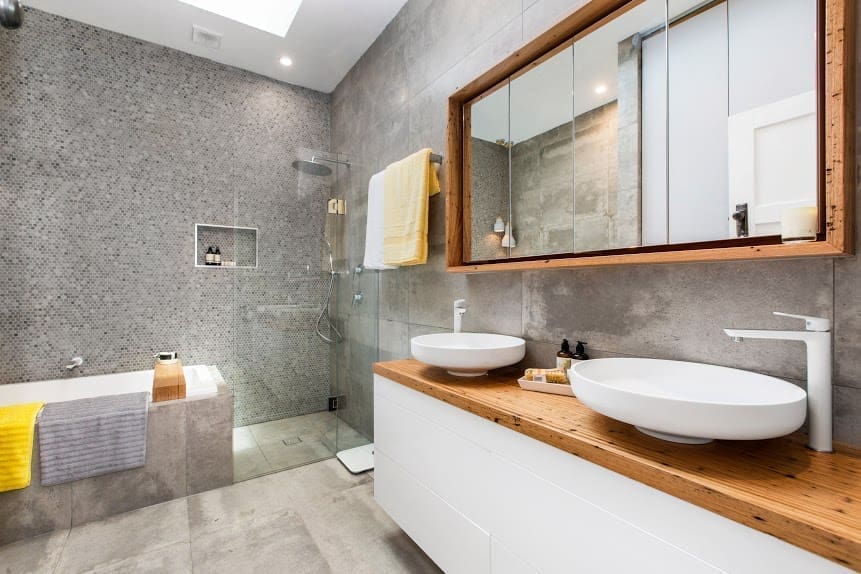
Bathroom
Brilliant. Seriously, how fab is this bathroom?!! Not only a great use of space, the mix of finishes creates such warmth. Love the use of timber around the mirror and bench top, and talk about great storage!
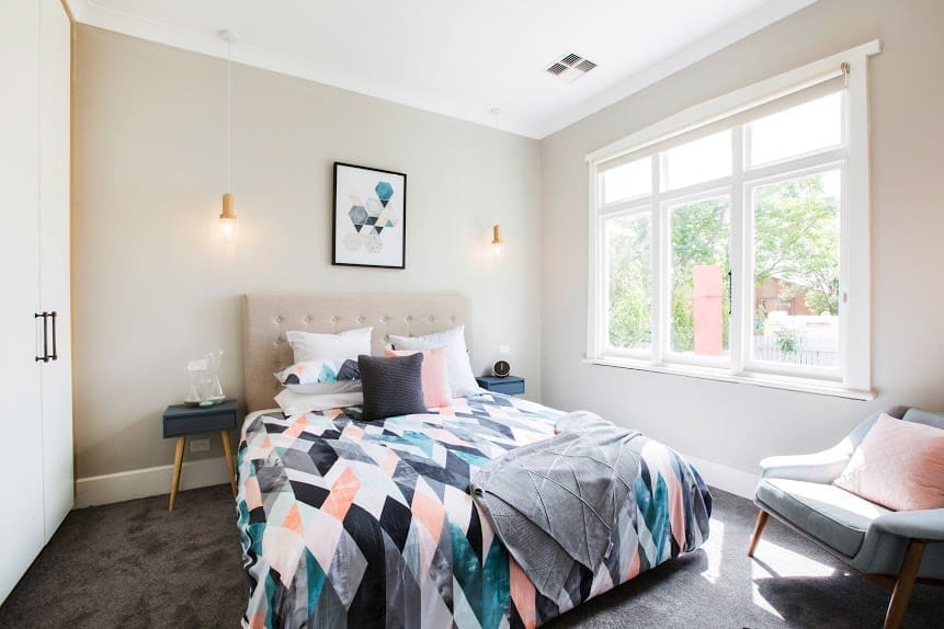
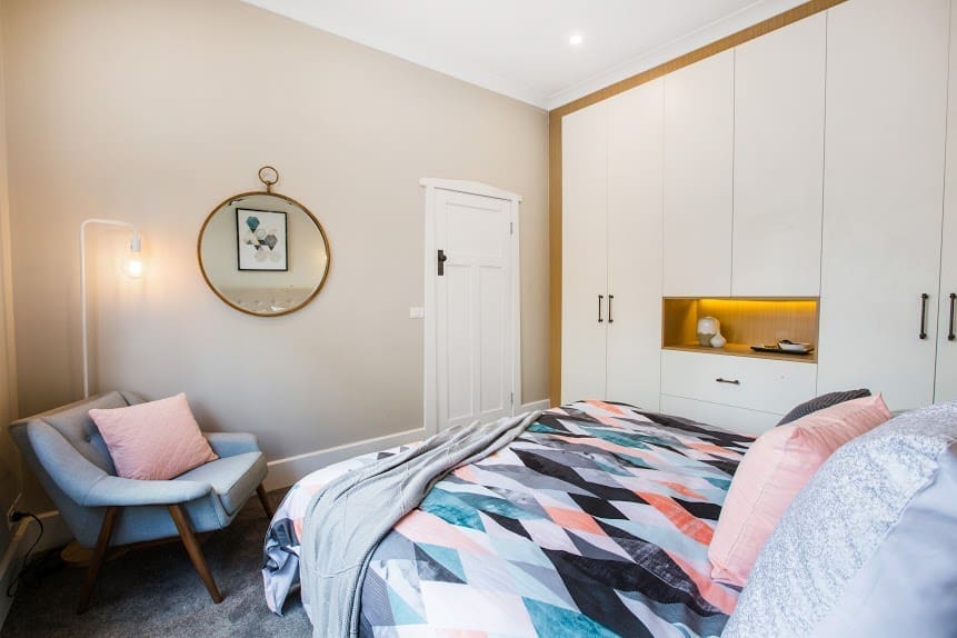
Master bedroom
The judges called this bedroom a teen room rather than a master bedroom but simply change the bedding and artwork and the room will have a whole new feel. Overall we give this room two thumbs up! The cabinetry is divine and that armchair is heavenly.
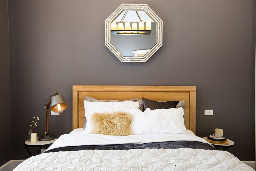
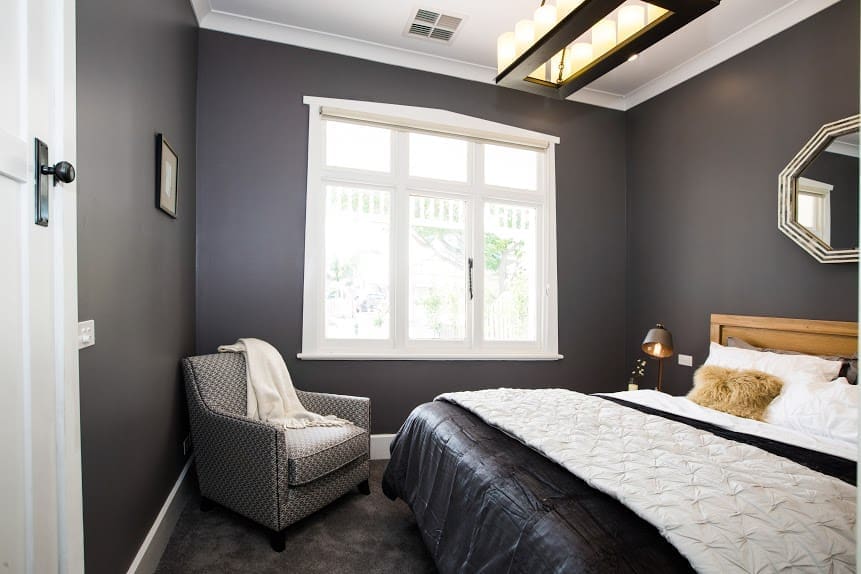
Guest bedroom
A much moodier room, the grey colour palette and timber bedhead is gorgeous. Some of the choices (like the chandelier and armchair) aren’t our style but the room has a luxe vibe.
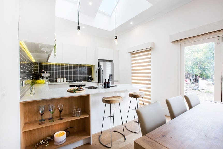
Kitchen and dining
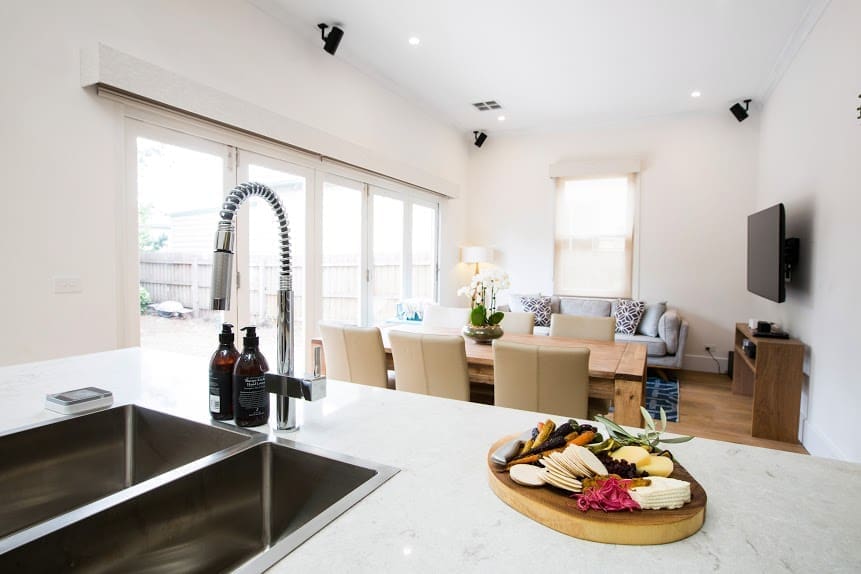
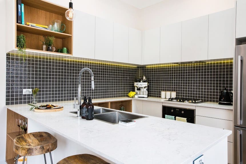
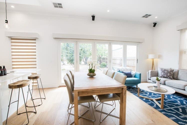
This u-shaped kitchen uses some clever design tricks like a mix of materials and open shelving to add interest and make the space feel larger. And the simple dining area that flows to the outdoors is perfect for entertaining.
Living room
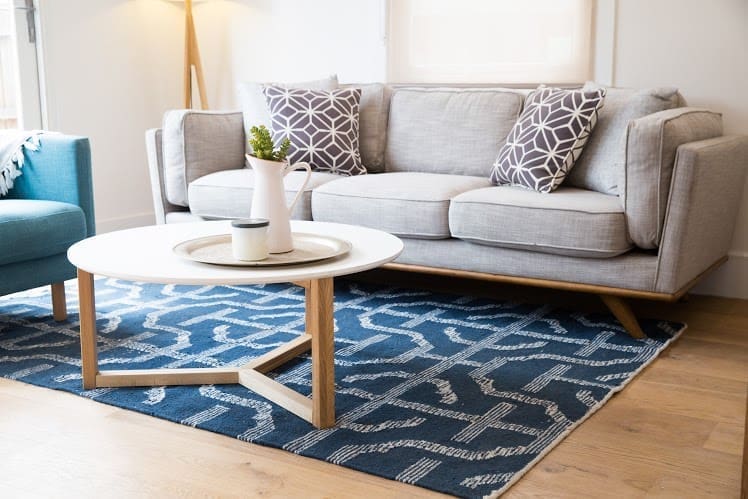
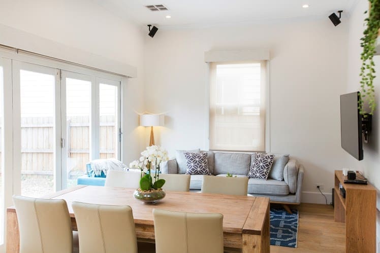
Soft and inviting, the furniture choices are right for this small space but we would have liked to see a larger rug and artwork on the wall.
Study
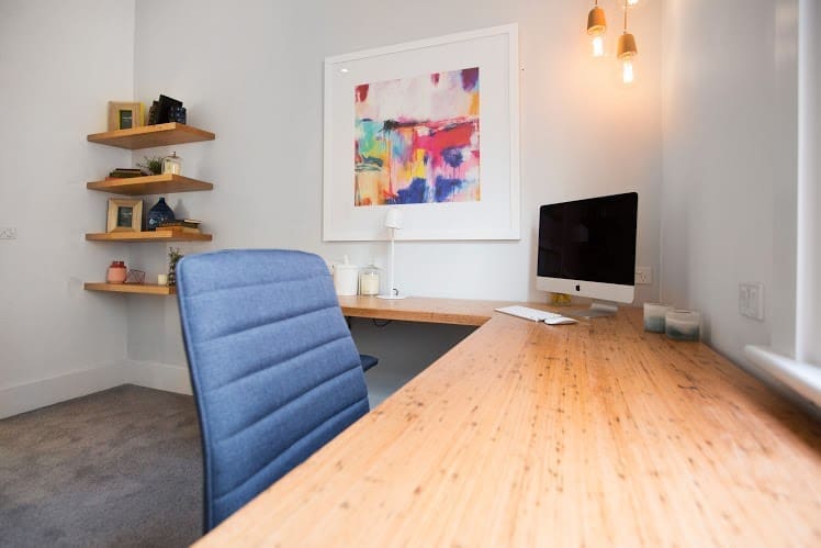
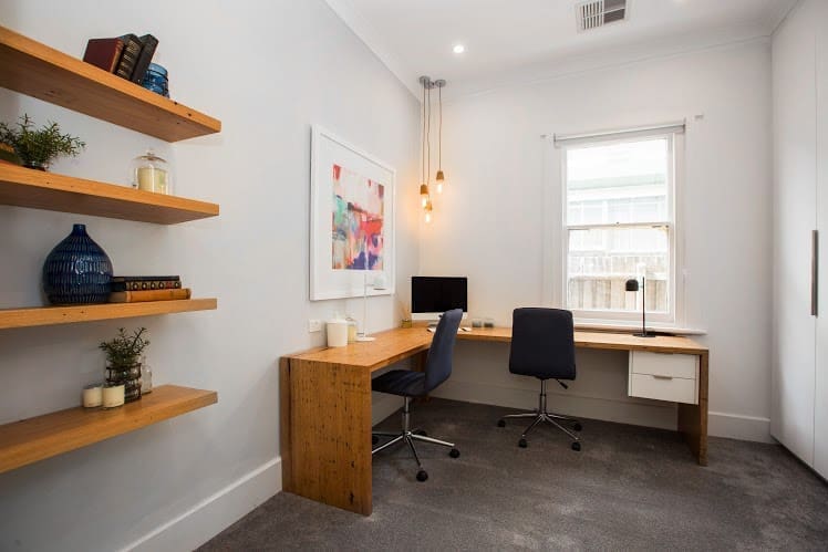
This study has some great things going for it — gorgeous timber table and bold artwork — yet overall the space feels somehow disjointed. Perhaps it’s the void areas (like the space around the shelves) or the lack of layering (a floor rug or throw on the chairs would have softened things) but we can’t help but want to see more here.
Blue Team
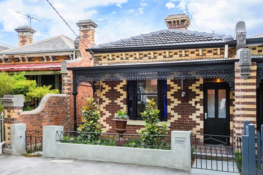
The Blue Team renovated the charming heritage home of Maddy and David, best friends of Sarah and Gavin who raised important funds for Sarah’s cancer treatment.
Bathroom
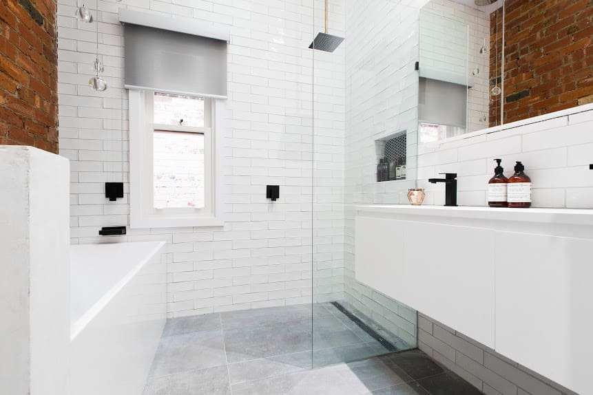
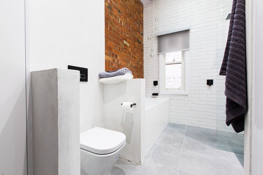
We loved the black and white bathroom with exposed red brick wall! Sleek black tapware, open shower with black penny round wall niche, and streamlined hanging vanity were a winning combo.
Master bedroom
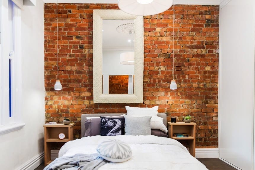
This bedroom showed signs of character but it didn’t amaze us. We would have much preferred to see a large artwork (in landscape format) above the bed than the long, oversized mirror which didn’t suit the space at all. The bed styling could have also done with a little more luxe by introducing different textures or richer colours. Absolutely love that exposed brick wall though!
Guest bedroom
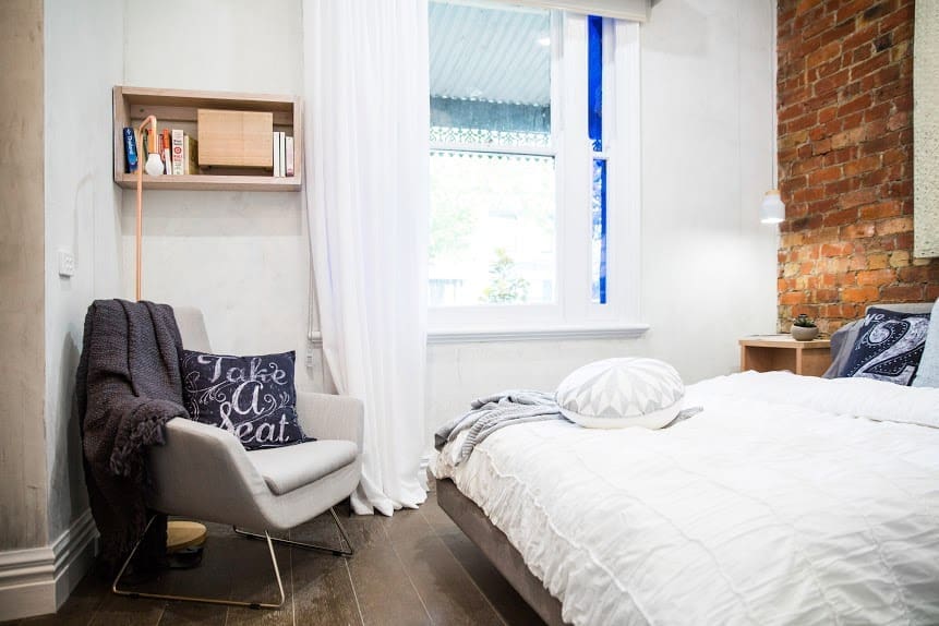
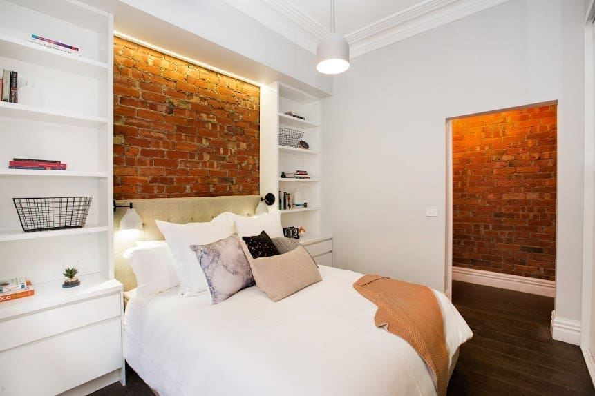
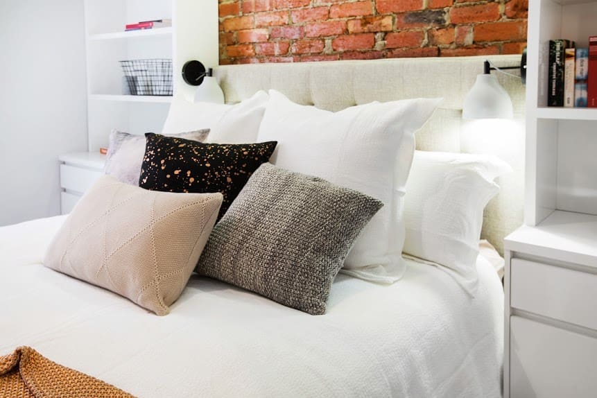
Now this feels like it should have been the master bedroom! Just look at that bed styling, love, Love, LOVE! The couple who styled this room certainly have an eye for mixing colours and textures, and we love that they’re not afraid to mix prints.
Kitchen and dining
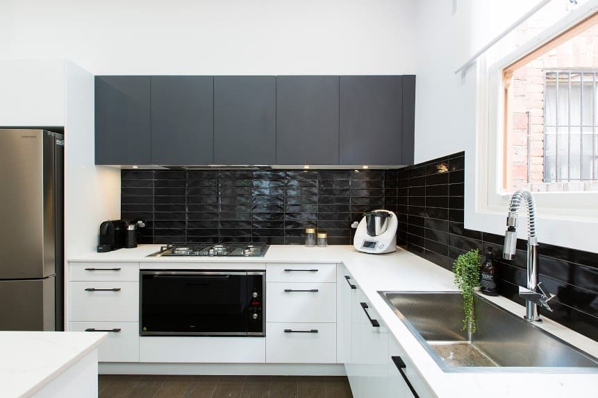
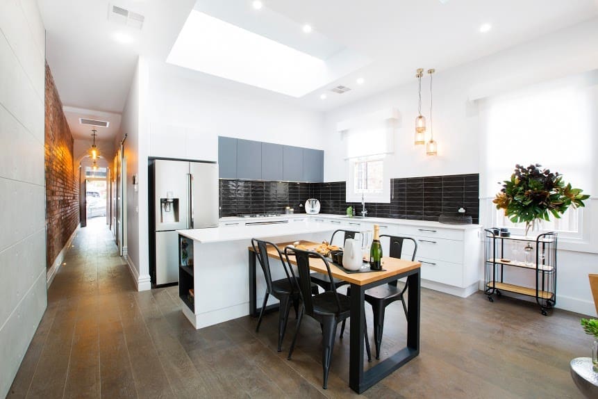
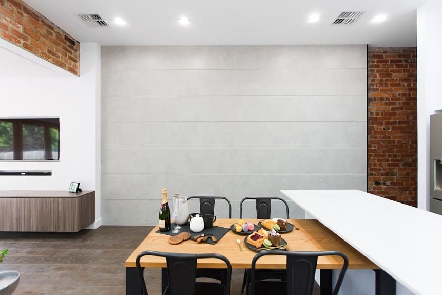
Continuing with the black and white colour palette, this space ticks a lot of boxes. Integrated kitchen appliances, mix of black and white cabinetry, modern and sleek cabinet handles, huge sunlight… talk about dreamy! Would have loved to see a matte black subway tile used on the splashback though and we can’t help but feel that the dining space could have been better maximised with a different layout (seems a tad odd that only a 4-seater table fits in this large space?).

Living room
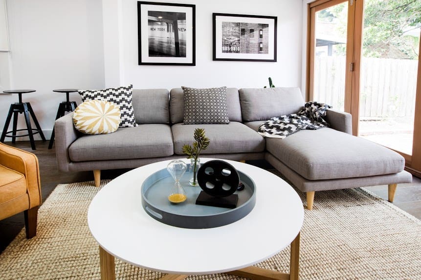
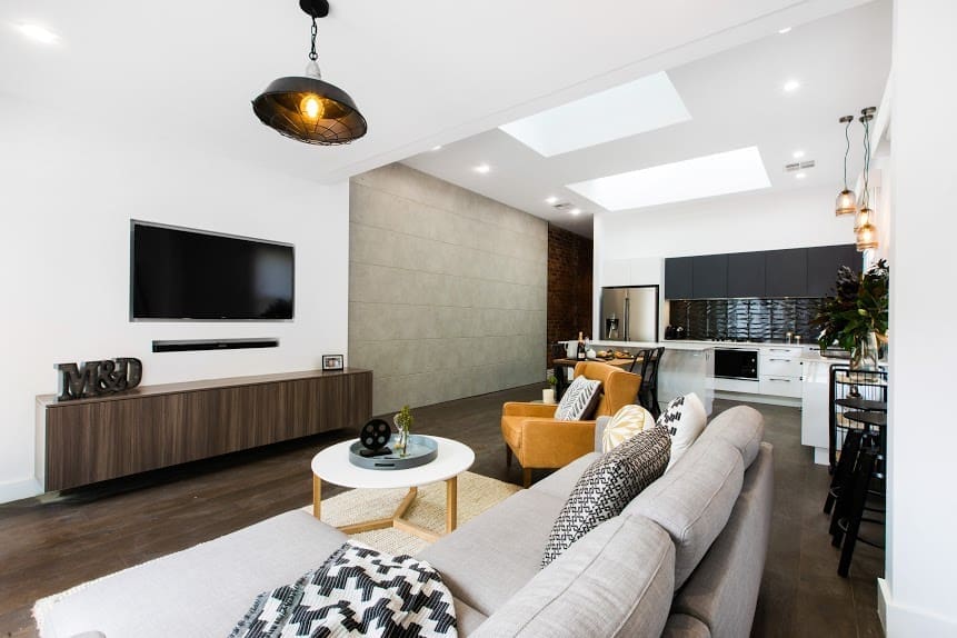
This is a gorgeous, light-filled space with bifold doors opening to the outside but it could have been so much more… Imagine a larger rug, more seating (at least two armchairs and get rid of the bar stools along the wall), perhaps a side table and an ottoman too. The wall hung cabinetry is a great idea but would have been divine in the same black as the overhead kitchen cabinets. We’re big fans of the couch and coffee table though, and the black and white photography.
What do you think of the new show format? And more importantly, what did you think of the Reno Rumble Week 1 room reveals? Tell us in the comments below!


I so agree about this last space. Put the bar stools against the breakfast bar. Move the table out and swivel it around. Match the entertainment and kitchen cabinetry. Place a large floor lamp adjacent to the sofa. Another arm chair, art and a large area rug.
Easy to fix up though.
Love your suggestions to add warmth and balance the space, Caroline!