Wow! Did anyone else have to pick their jaw up off the ground during last night’s Reno Rumble week 2 full house reveals?! In terms of design ideas, styling and finishes, it was one of the top renovation reveals we’ve seen.
We celebrated that no one on the Red team got sent home last night (hooray!). Josh and Jenna’s blue kitchen was a hit with the judges (double hooray!). Let’s check out the rest of the houses we showed you the bedrooms of mid week.
Related articles:Reno Rumble week 3 bedrooms
Related articles: Reno Rumble week 2 bedrooms
Blue team
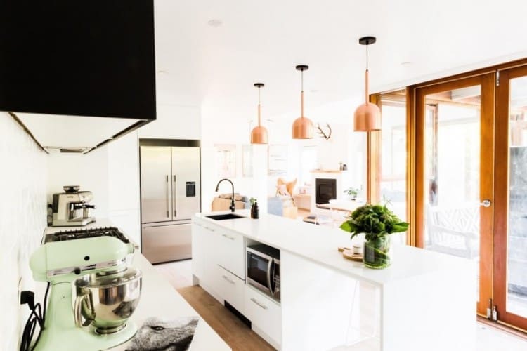
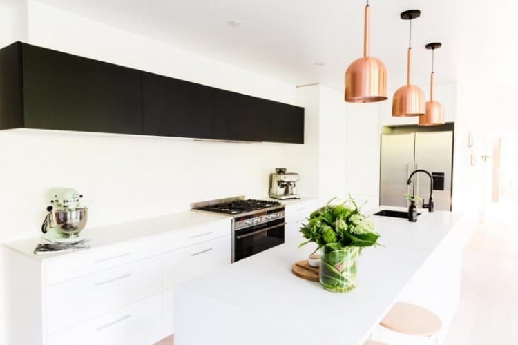
This team seriously impressed us this week! Not only did they make the house look ah-mazing with their modern Scandinavian renovation, they also helped it to function better by moving the narrow kitchen (and replacing it with a laundry) and opening out the living space.
Ben and Jemma
These guys have no idea about managing a budget (failing terribly at that as team captains) but they sure can pull off an impressive renovation!
That kitchen is so HOT! They transformed the dated galley kitchen with canary yellow benchtops into this open plan, traditional Scandi white kitchen. They also added super matt black overhead cabinets and copper pendant lights for a modern edge. The Caesarstone benchtops in ‘Frosty Carrina’ fit perfectly to soften the monochrome colour scheme.
Carly and Leighton
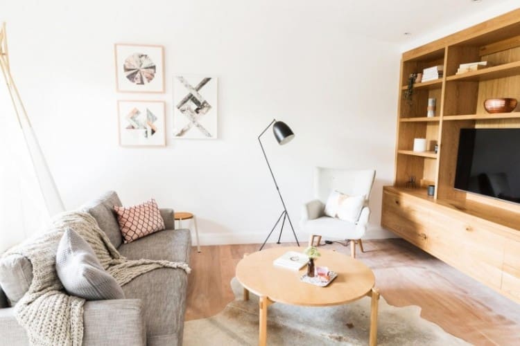
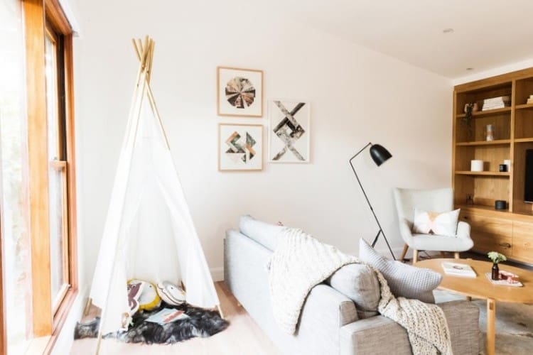
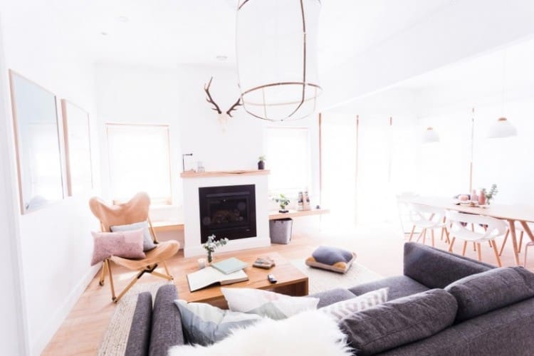
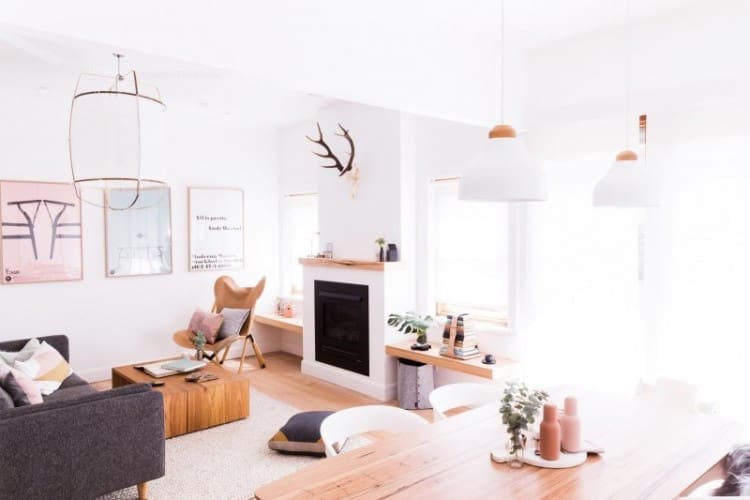
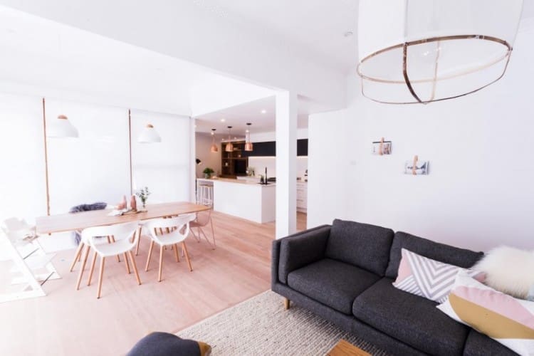
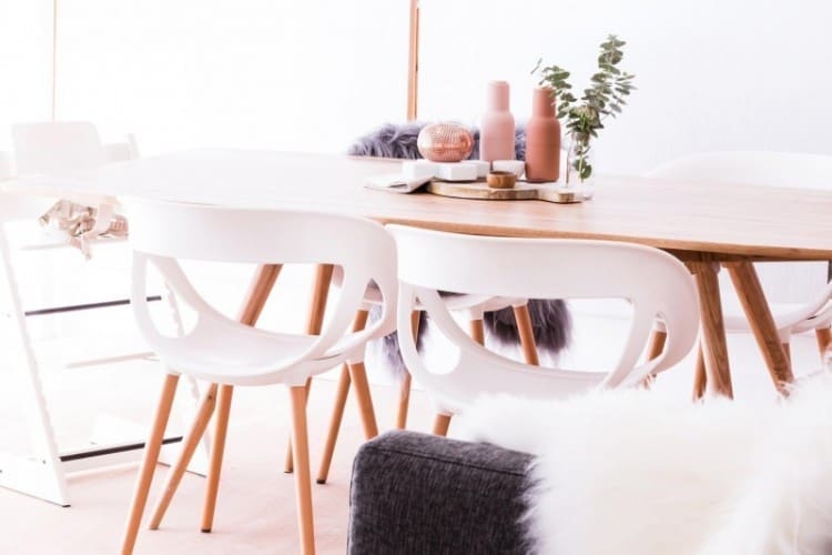
Carly and Leighton wowed the judges with this fresh and Scandi living and dining area. The fireplace was a big hit and Darren loved the blush and copper accessories. Romy did wonder how practical the light rug would be with a young toddler though.
Michelle and Steve
Stressed they wouldn’t be able to impress with such small spaces, Michelle and Steve just stayed in the competition this week.
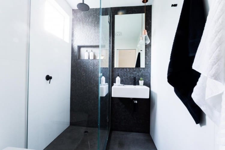
The judges really liked their laundry and powder room, saying it’s ‘got soul’ and even their ‘bogan’ cool drawer in the laundry was a hit!
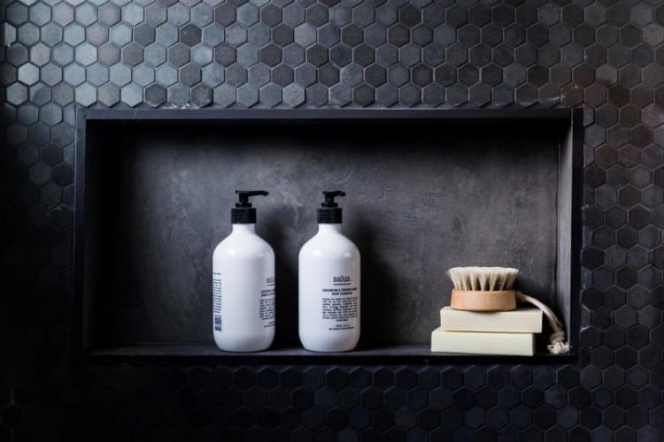
Darren loved the texture of the hexagon wall tiles in the powder room but Romy pointed out the lack of storage.
Nick and Chris
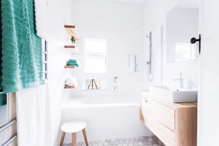
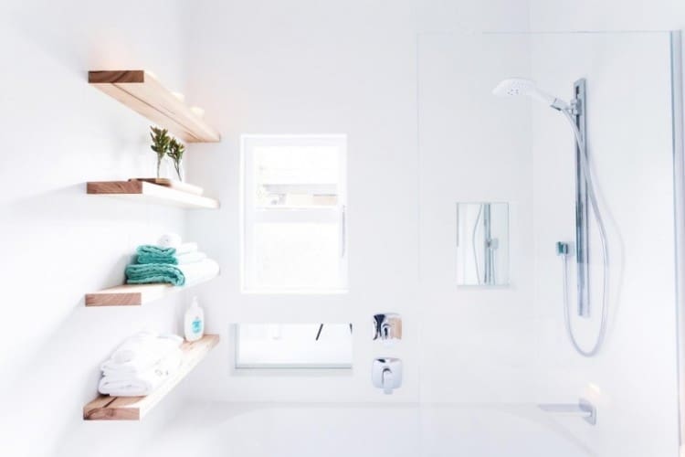
Really not sure what these guys were thinking to lay some white wall tiles stack-bond and others brick-bond… it’s a #designfail that cost them the competition.
Despite that weird decision (and the wall niches which we’re not loving), the rest of the bathroom is a light and airy space that ticks a lot of boxes. We especially love that timber custom made vanity!
Red team
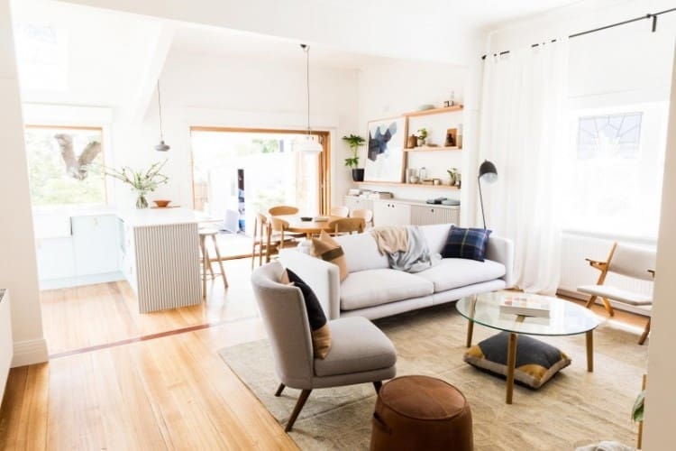
The red team worked hard to support each other this week with a game plan that if the whole house does well, no one will go home — and it worked! Their ‘Modern Vintage’ renovation was a huge success that brought the homeowners to tears.
Jess and Ayden
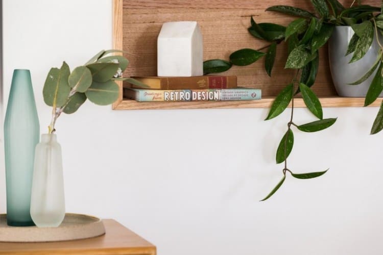
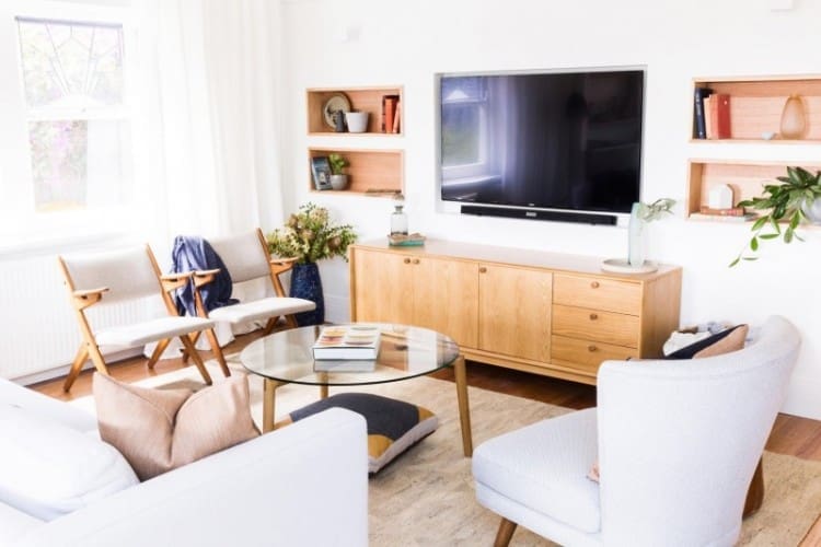
Jess has really found her confidence and she’s getting better each week. This living room scored a near perfect 19 1/2 out of 20 and gave Romy tingles.
We love it all, especially the warmth of the space and gorgeous mid-century furniture!
Kyal and Kara
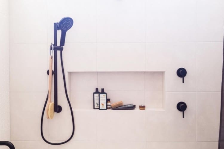
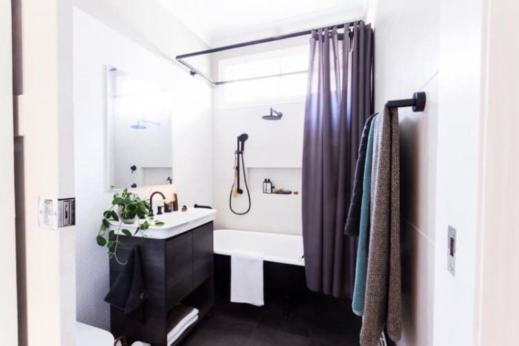
Kyal and Kara’s elegant bathroom was an immediate hit with the judges. Darren said the black details were contemporary and the embossed tiles were a great choice. However, then he stood in the shower which was far too low and the couple started losing points for functional oversights. We’d happily take that bathroom any day and duck to take a shower 😉
Josh and Jenna
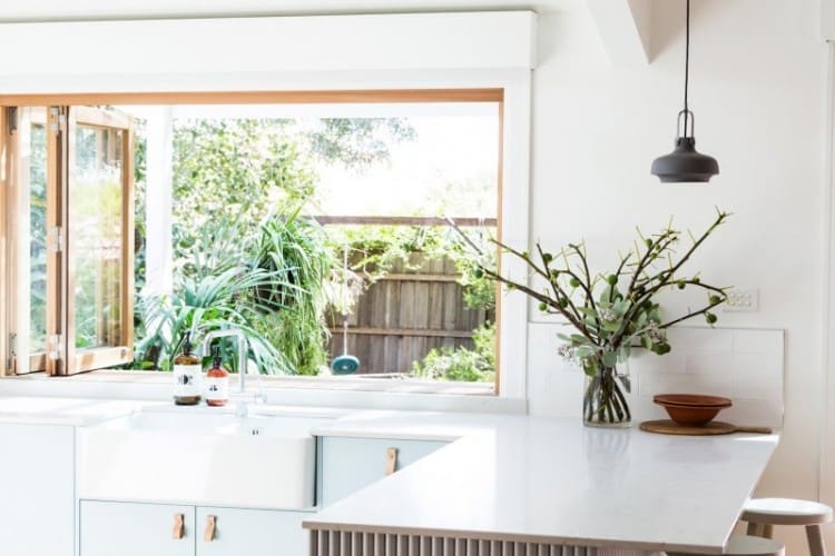
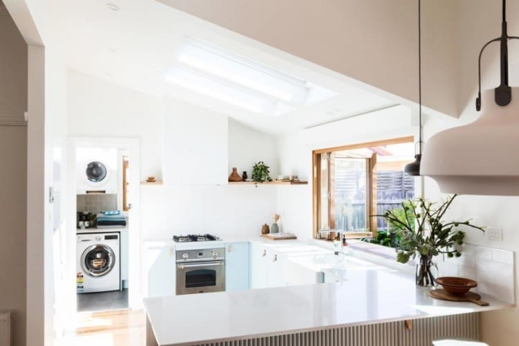
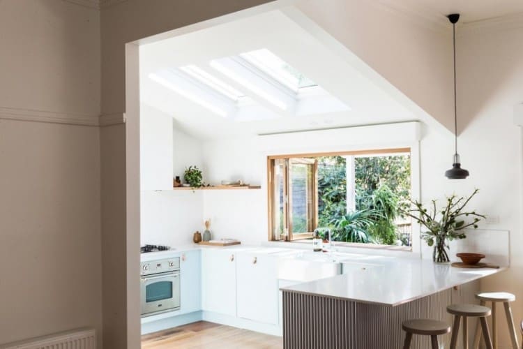
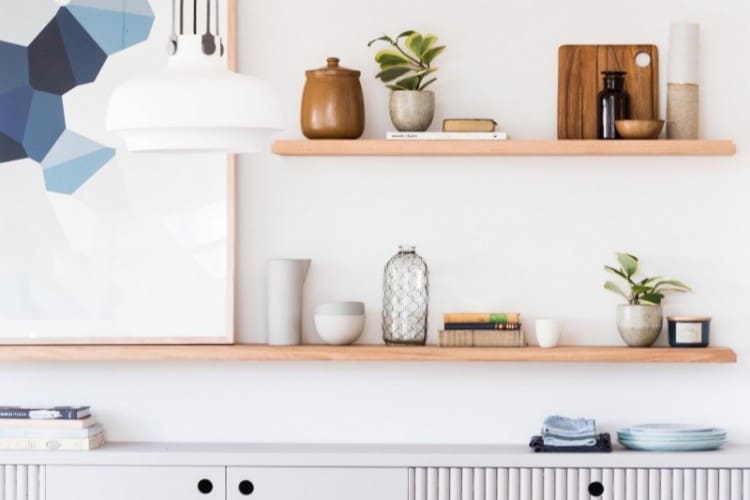
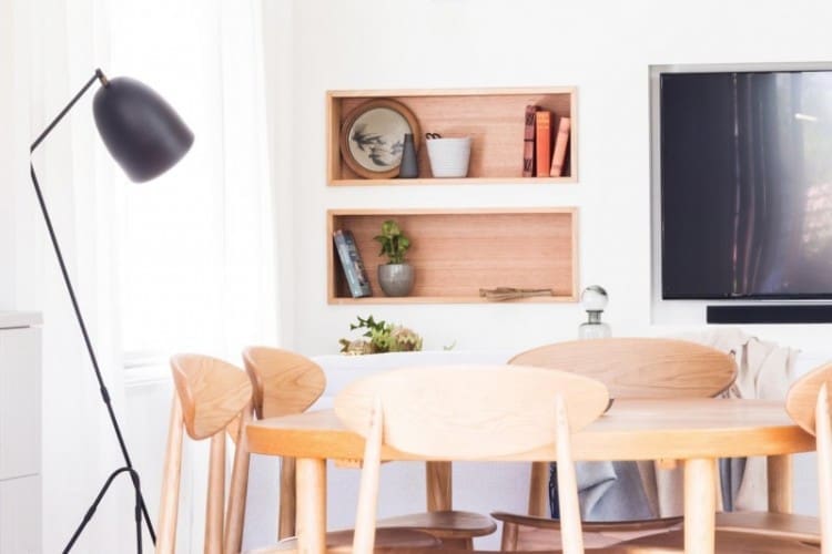
These two just won’t stop being fabulous and we love it! They took a big risk using blue kitchen cabinets but it paid off. The judges thought it was ‘perfectly retro’ and ‘unreal’ how they paired it with those leather handles.
The kitchen has a real freshness about it and great connection to the dining area, outdoors and even the laundry with matching cabinetry. And that geometric artwork from The Artwork Stylist was another winner.
Shared laundry
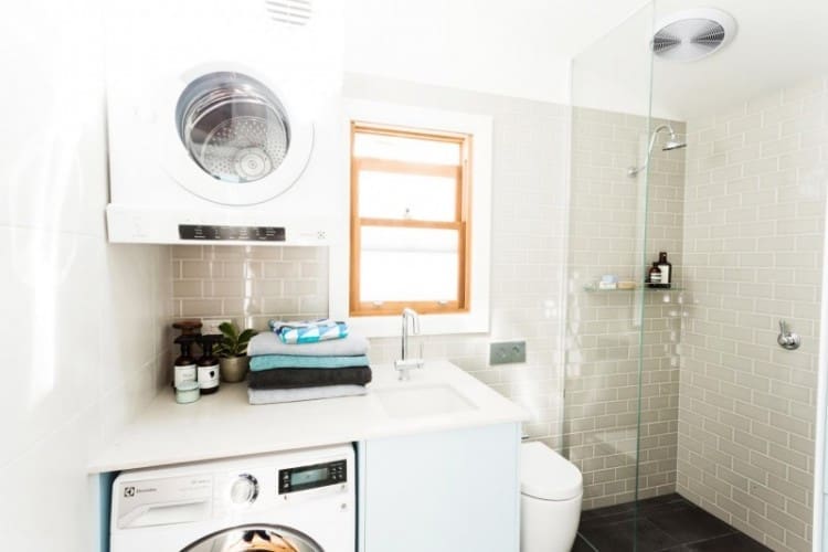
Love the look of this laundry with blue cabinets and subway tiles but the team did lose points for not putting in a shower screen and making the toilet a bit tight.
What did you think of the Reno Rumble week 2 full house reveals? Which house would you rather live in — ‘Modern Scandinavian’ or ‘Modern Vintage’? Tell us in the comments below!


Comments are closed.