Located just outside Adelaide, the dreamy Coach House is a gorgeous sandstone building overlooking the Kangarilla Valley. With muted pops of blue in the kitchen, a Japanese-inspired bathroom and sweet bench seat nook, there are many design moments to love in this renovated sandstone house.
Today we chat with Interior Designer and Fabrikate Director Kate Harry to find out more about this South Australian holiday home and her design process.
Related article: Blurring the architectural lines: A charming Federation style home gets a modern makeover
Related article: Take a look inside Mosman Residence IV: The sophisticated federation family home renovation
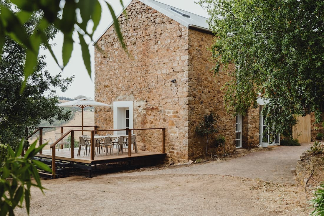
The Fabrikate team was tasked with updating this sandstone house while responding to the limitations of an ageing building.
“We had wonderful clients who are currently residing overseas who leaned into the process and trusted us. The only direction was to honour the building and the surrounds while creating a ‘beautiful designation’ for guests.
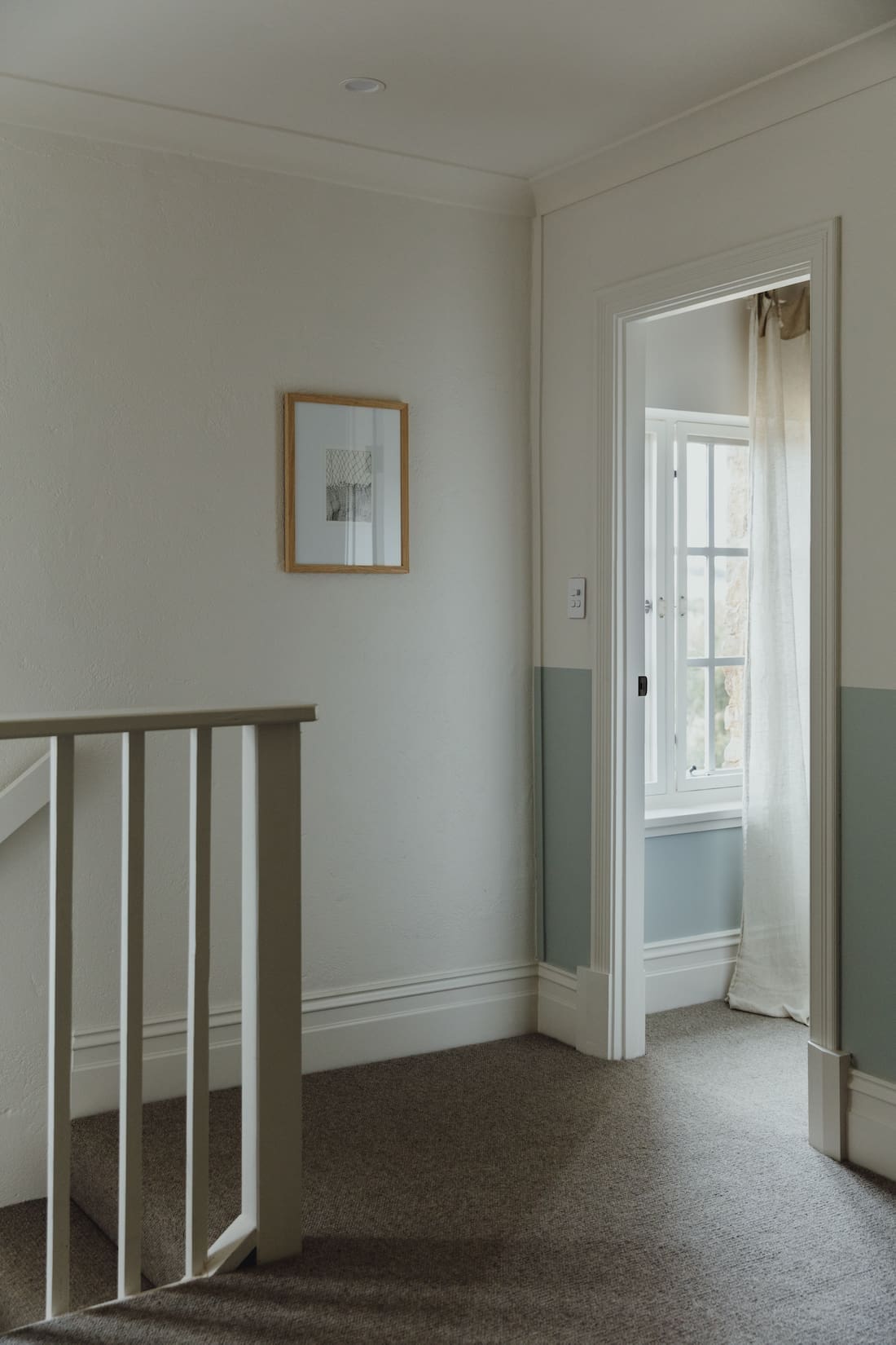
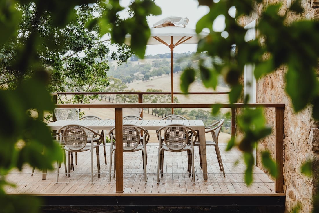
“Renovated in the ’90s, the house was functional but lacked any charm or connection to the countryside right outside.
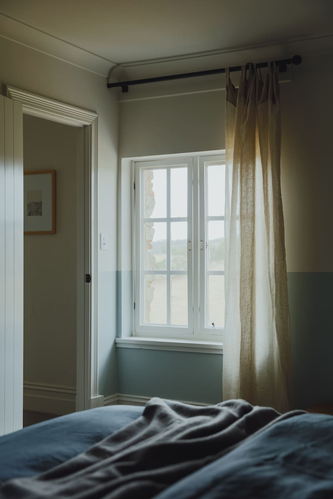
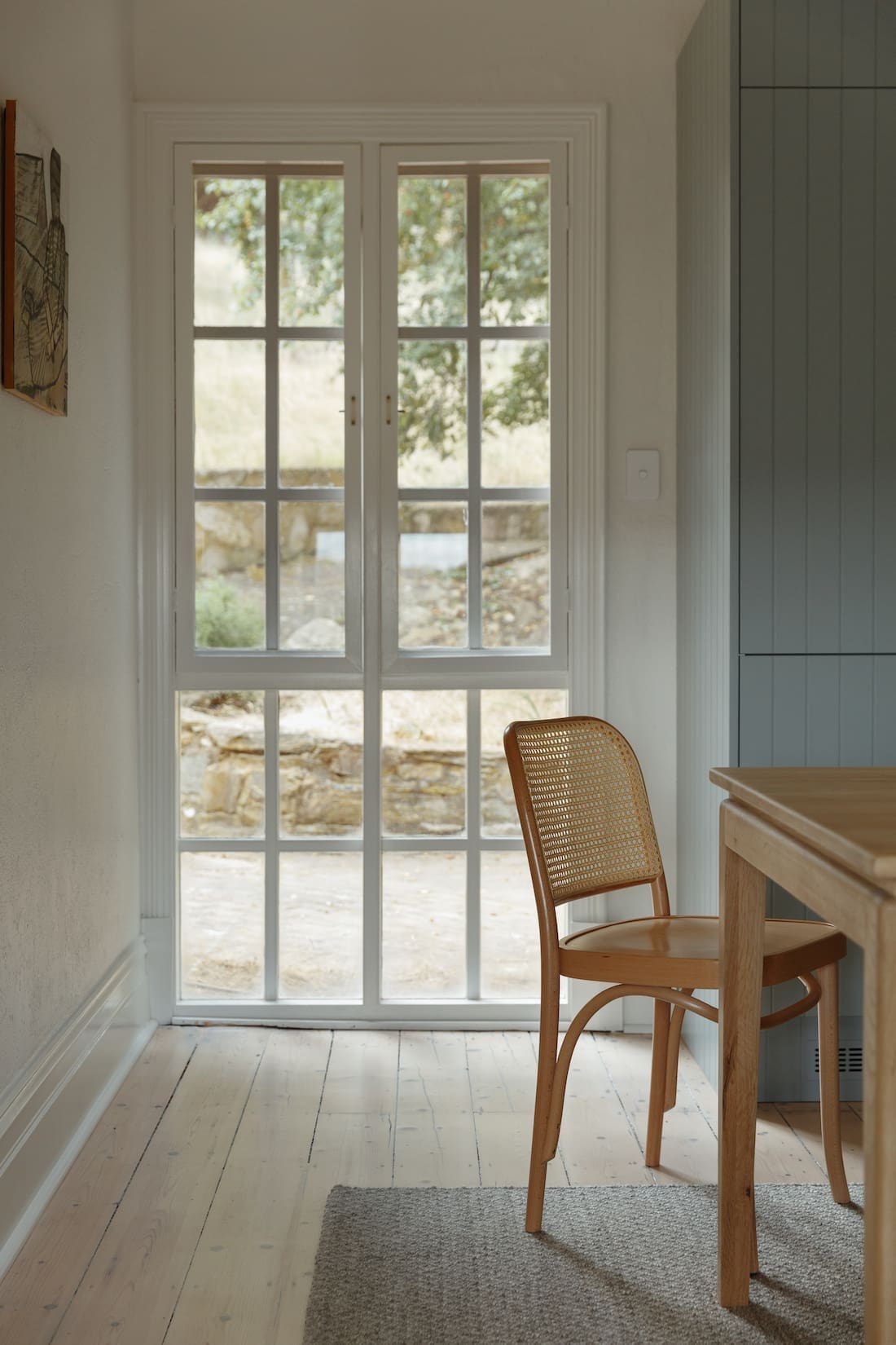
“Unable to open up the small windows, we had to focus on bring the mood and emotions through the interiors.
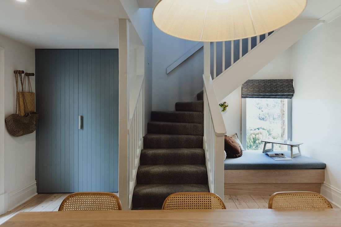
“There were only two significant changes to the house. The gorgeous bench seat nook that replaced a door to nowhere is probably the most noticeable one! The other is the spacious bathroom, transformed from a small, pokey space.”
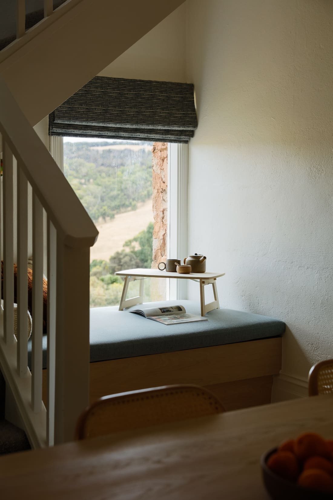
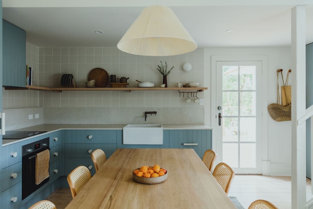
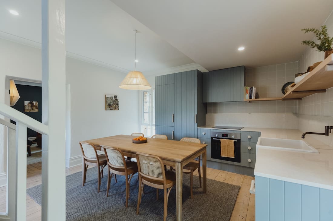
Hues of blue and green are dotted throughout the renovated sandstone house, particularly noticeable in the blue kitchen joinery.
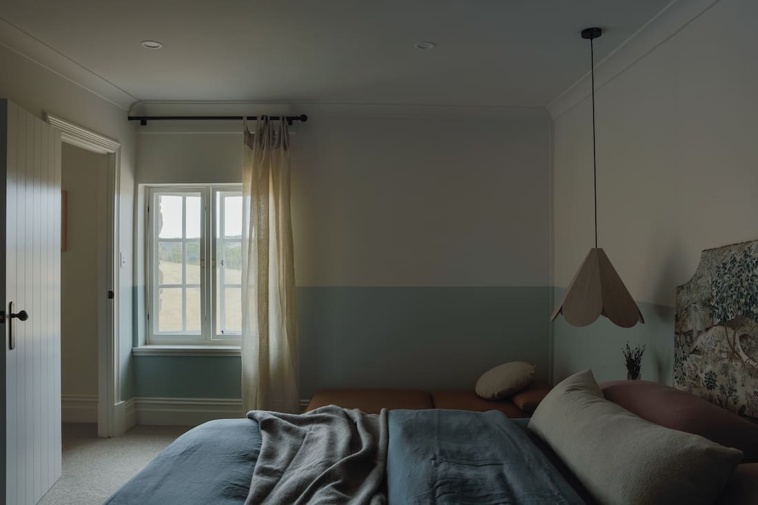
“In true Fabrikate fashion, we worked the soft hues and open skies of the valley into the home. Now there is definitely a sense of connection to the surrounding Kangarilla Valley.
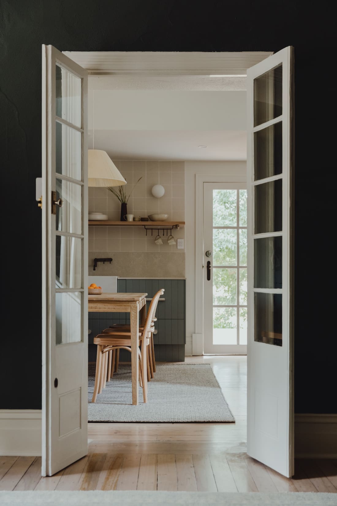
“The kitchen is not a large area and needed to be functional whilst anchoring the lovely open plan area. We settled on a softer palette with deep hues of blue and sage highlights. Further, we furnished with soft milked floorboards, oak furniture and locally made ceramic dinnerware.
“We did have to be careful in the kitchens, especially where joinery hung off the walls, so engaged heritage builders G-Force to help. It required some repointing and delicate stonework to the exterior.
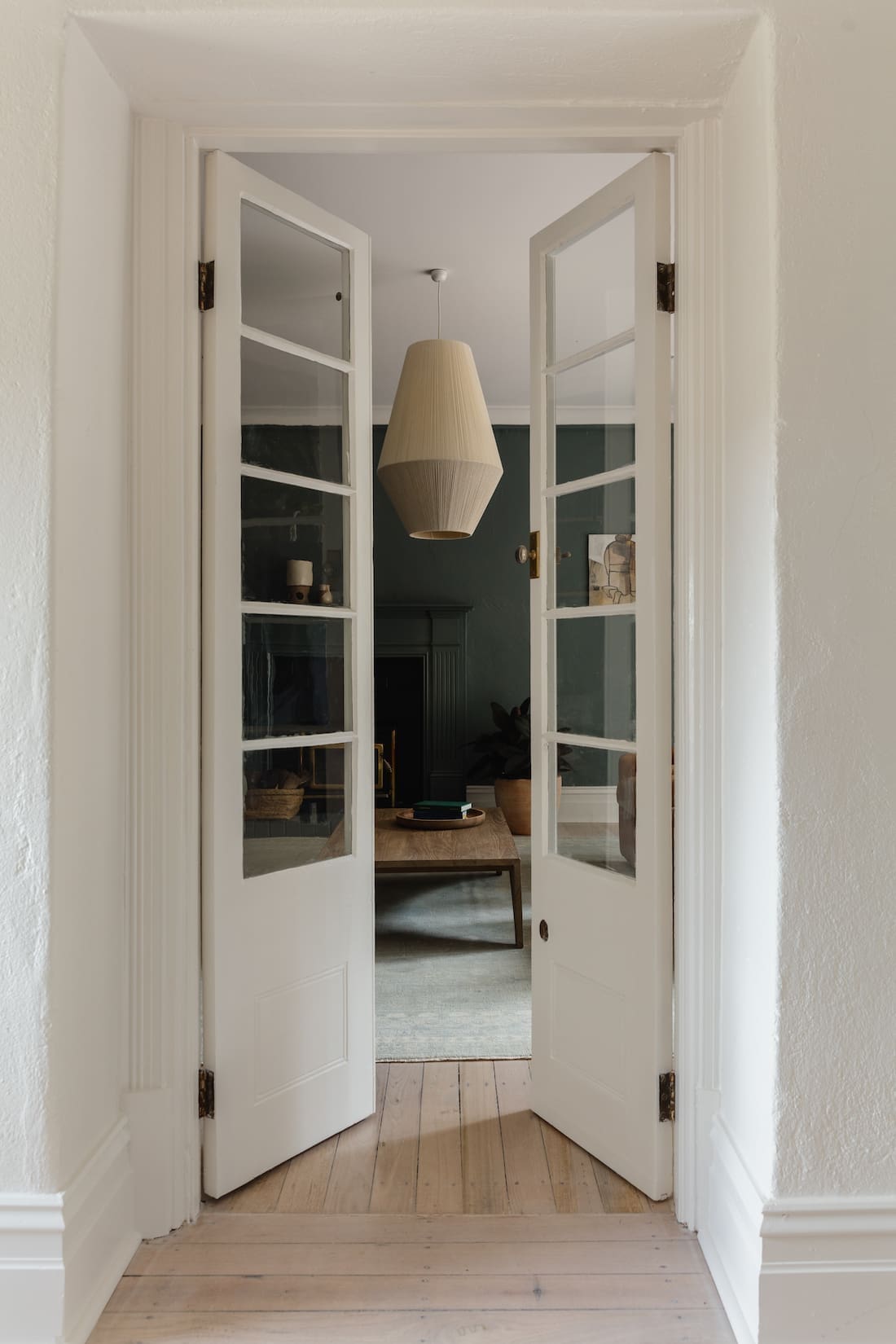
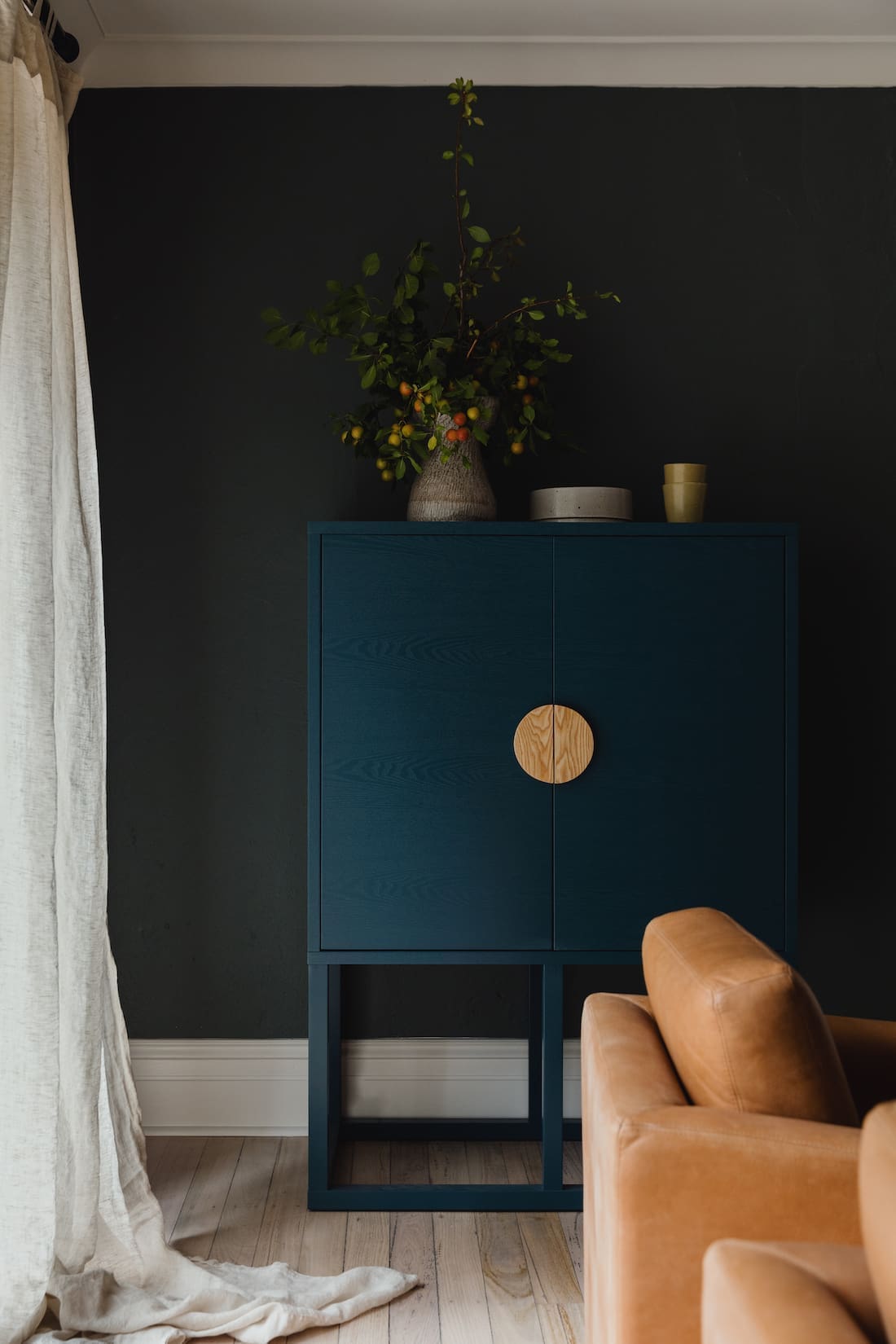
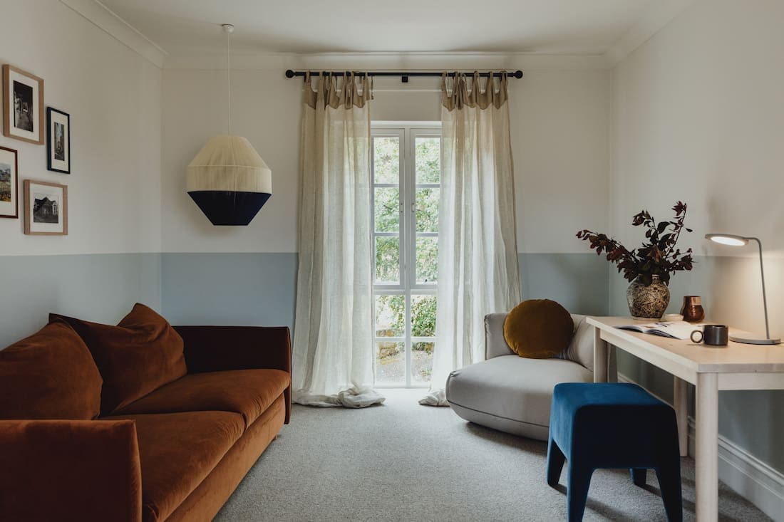
“The living room didn’t boast the same views and needed atmosphere and connection. We chose a dark and somewhat dramatic colour to create personality and a cocoon vibe for this reading fireside space. Just imagine relaxing there with a lovely glass of local red!”
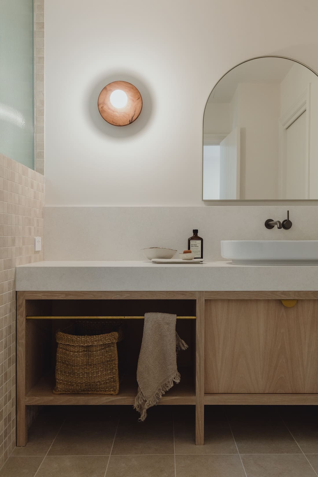
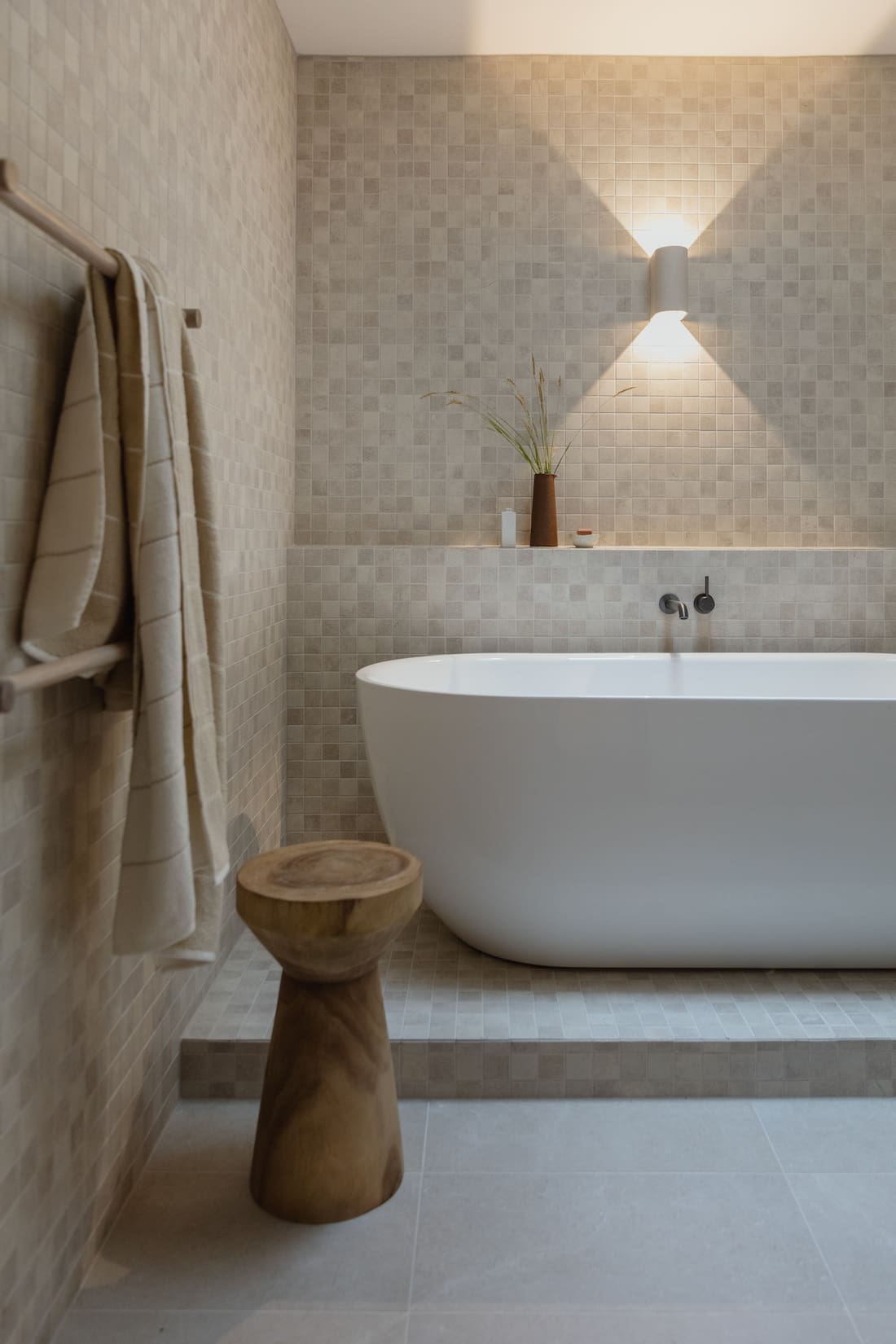
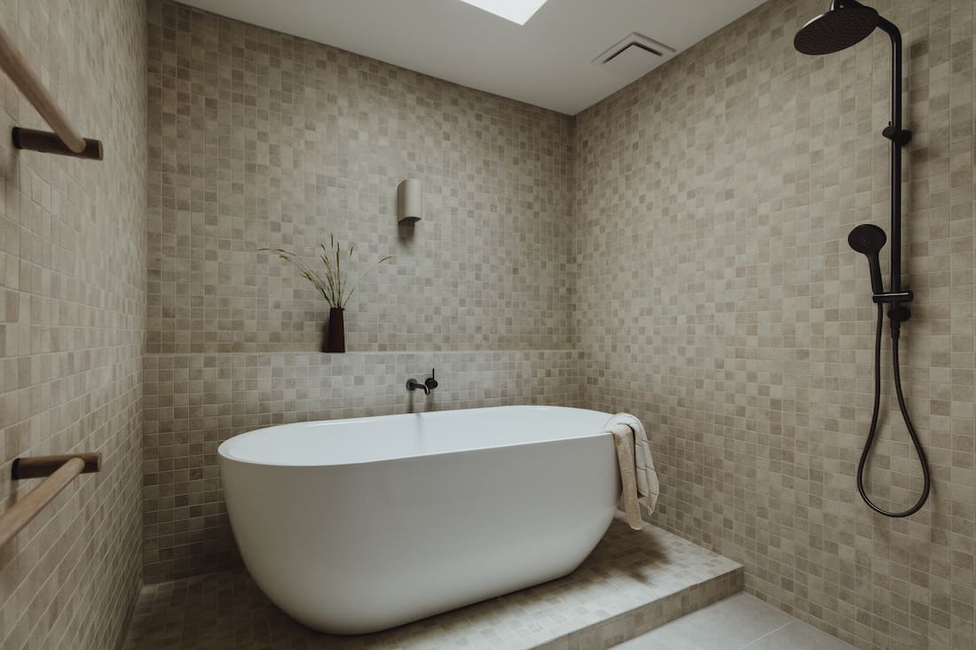
The Japanese-style bathroom is a truly unique feature and one that certainly sets this heritage holiday home apart.
“Our clients have spent a lot of time in Japan. As such, Japanese bath houses inspired the design. This, in turn, inspired the selection of the beautiful mosaic tiles.
“Windows weren’t an option. The bathroom doesn’t have a window and due to the heritage nature of the building it wasn’t possible to install any. Instead, we created a beautiful skylight over the stepped up bath and introduced a shower — it’s a seamless and truly restorative space.”
Another key part of this home was supporting local artists and makers as much as possible.
“We love to support local artisans and businesses when possible so our design is often considered with them in mind. You’ll see curated pieces throughout this house that create a sense of elegant ‘home away from home’ comfort.
“The gorgeous handwoven livingroom pendants from our friends at Pop and Scott. Handmade tactile door hardware for the kitchen by Handmade. The small textile brands featured here with Walter G and Pampa.
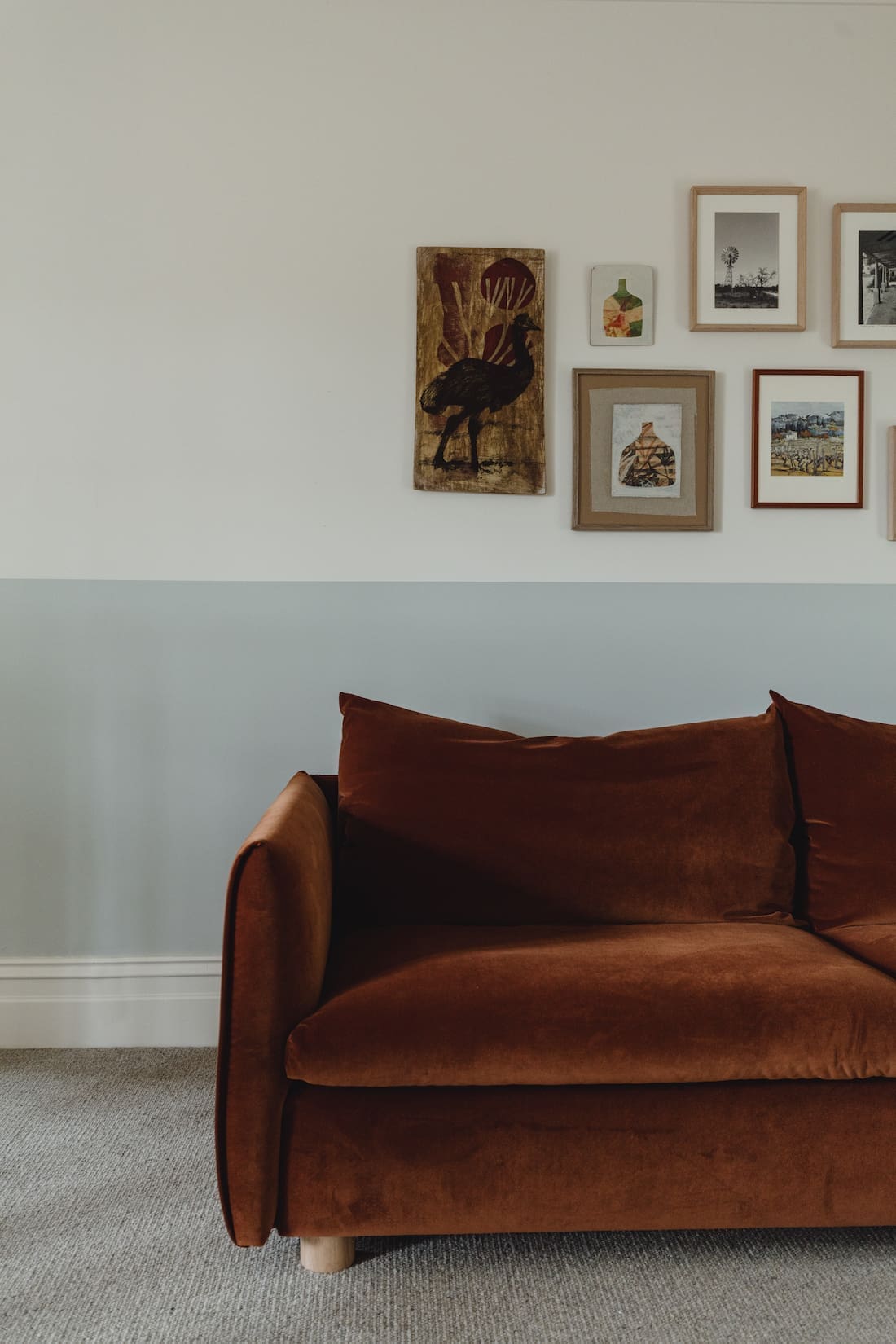
“Classical Thonet Hoffmann dining chairs from local SA business 1K Chairs bring a classical touch with a nod to country. Local artist Jacob Logos graces the walls with his lovely sketch inspired work from countries abroad.
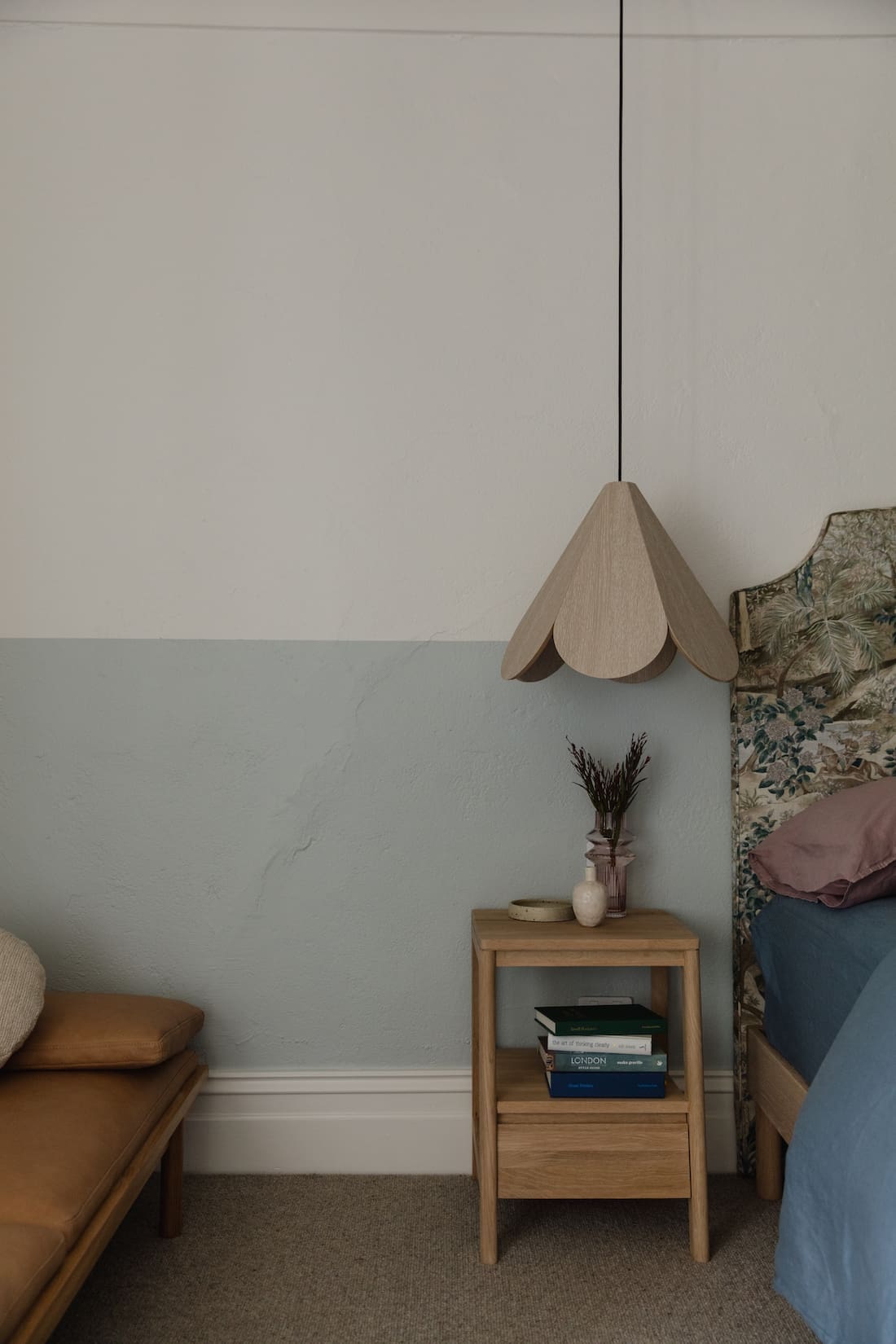
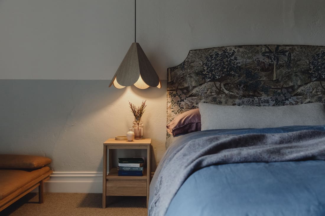
“A personal favourite was the king size custom bedhead with GP&J Baker Ramayana fabric — a wonderful surprise in the main bedroom.”
Introducing bold colours to any space may feel overwhelming, so we asked Kate for her advice.
“Colour can be so wonderful in spaces and as we see in Coach House, it can really enhance the space.
“I know it normally comes down to confidence and the question — Can I live with it?
“If you’re attracted to it, there’s a good chance you like it enough to live with it. I’ve never had a client who was brave with colour regret it, as long as it is considered with the other elements in the room and house.”
We’d like to thank Kate for sharing this renovated sandstone house project with us. If you’d like to see more from Kate and the Fabrikate team, check out their website and follow their Instagram. So what did you think of Coach House? Have you got plans for a historic home makeover? Want more heritage homes featured? Let us know your thoughts in the comment section below!
Find more home tours here
