We’ve just wrapped up our latest kitchen renovation project and this one was extra special as it was for my mother-in-law. It’s not often you get a ‘client’ who pretty much gives you free rein to do whatever you want. My only brief was for it to be white.
This kitchen came up a treat — even if I do say so myself! — and I’m delighted to take you on a tour. Featuring slim shaker cabinets and that gorgeous marble splashback, let me share all the details of this kitchen renovation with you.
Related article: 11 types of white kitchen splashback tiles: Add interest with shape over colour
Related article: From 90’s nightmare to a dreamy coastal boho kitchen
New layout
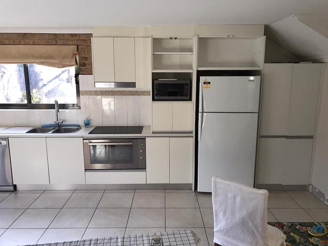
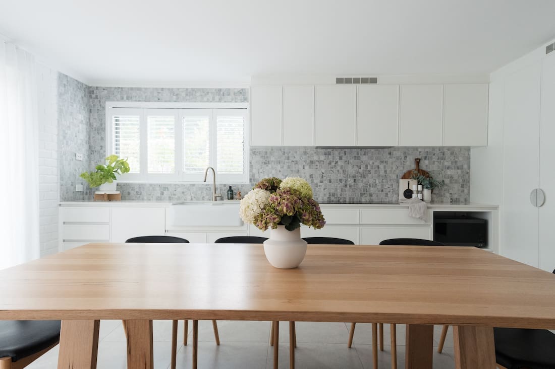
One of the first things you may notice is that I changed the layout from a single wall to an L-shaped kitchen.
This was to resolve a few issues with her previous kitchen design by:
- offering her some much-needed bench space for preparation (you’ll see there’s almost none before)
- giving her a pantry! She had been storing food in the cupboards of her laundry so it was time to give this kitchen a proper pantry, and
- hiding that unsightly diagonal bulkhead.
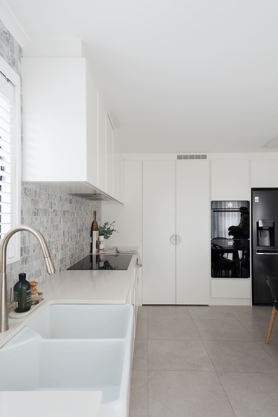
The kitchen now has plenty of bench space and a large corner pantry, which neatly hides that bulkhead issue.
Despite the larger footprint of the kitchen, this room feels larger and more spacious.
Kitchen cabinets
Now let’s talk finishes, starting with the kitchen joinery. Overall, the vision for this kitchen was to be timeless and a little bit luxe. My mother-in-law doesn’t intend to renovate it again so the aesthetic and materials needed to offer longevity.
For the door fronts, I selected a new slim shaker door profile. It’s called ‘Sussex’ by Polytec and I love how it’s a modern and less ‘in your face’ take on the traditional shaker door. It ticks the brief of a white kitchen but the subtle texture gives the room more interest. I really love this door profile, which I could see working well in a range of kitchen styles from traditional to contemporary.
You can get these doors vinyl wrapped but we spent a little extra to get the doors painted. Polyurethane paint offers better durability and is less likely to discolour in sunlight. The colour is ‘Snowy Mountains’ by Dulux in a satin finish. It’s a lovely soft warm white.
Splashback
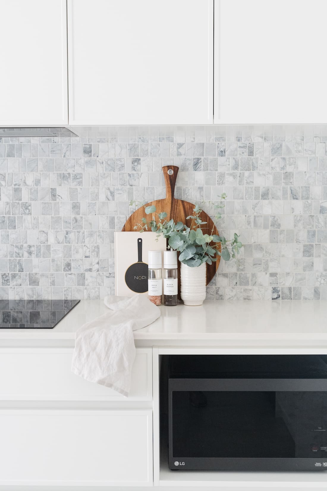
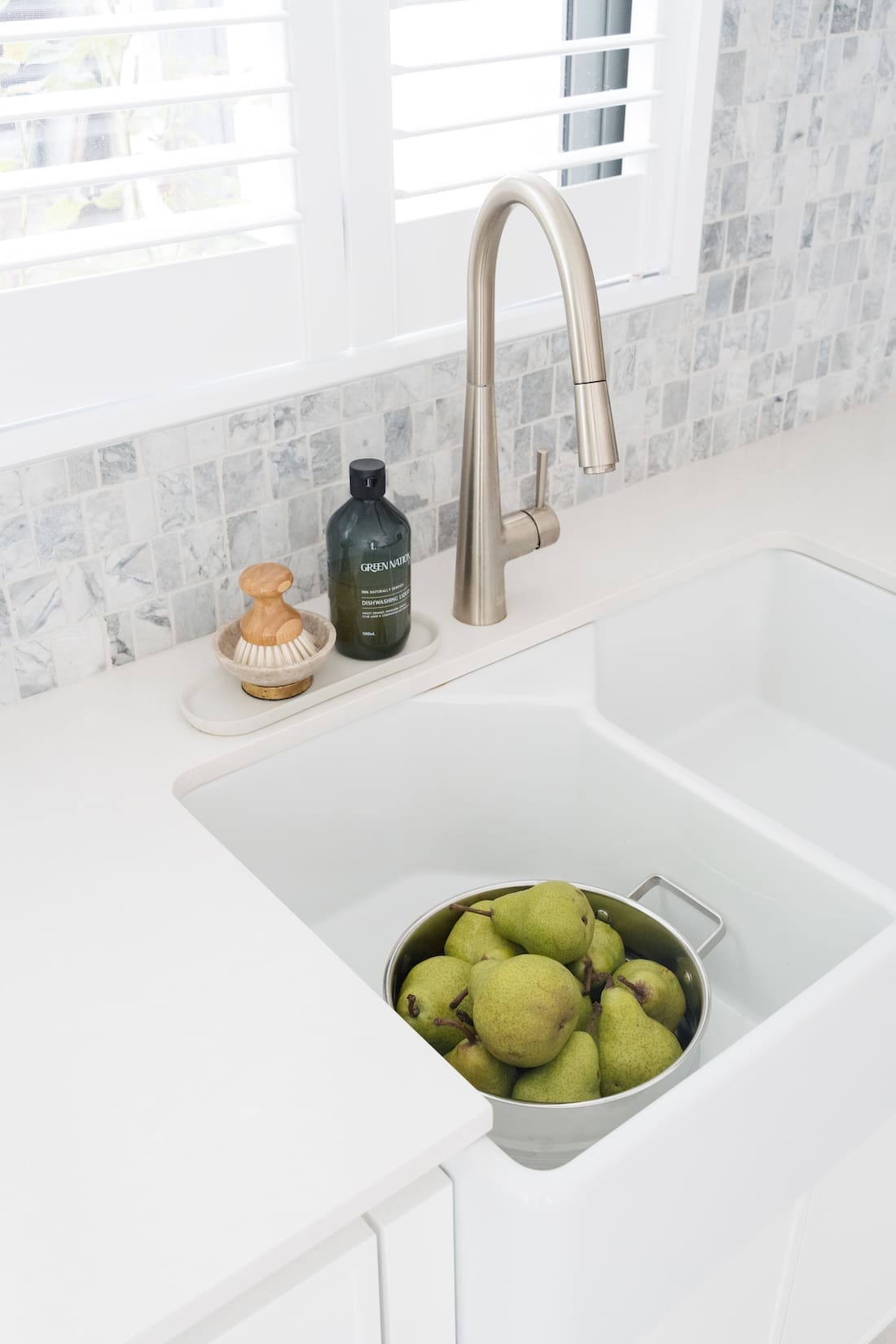
One of the most prominent finishes in this space is the splashback. Called ‘Olivetti’, it’s a marble mosaic tile with plenty of gorgeous natural variation. It’s available in a range of natural stones, including calacatta and travertine. But I fell in love with the super white marble and knew my mother-in-law would too!
For me, the splashback steals the show in this kitchen and gives the space depth and those luxe vibes.
Benchtop
As the splashback is the feature, I wanted a neutral benchtop that would complement. Nothing with a vein that would clash with the natural stone but it also couldn’t be too stark. I opted for ‘Organic white’ by Caesarstone as it has subtle mottling (a pattern that works well with natural stone) and a warm white/soft grey tone that complements the other finishes.
Floor tile
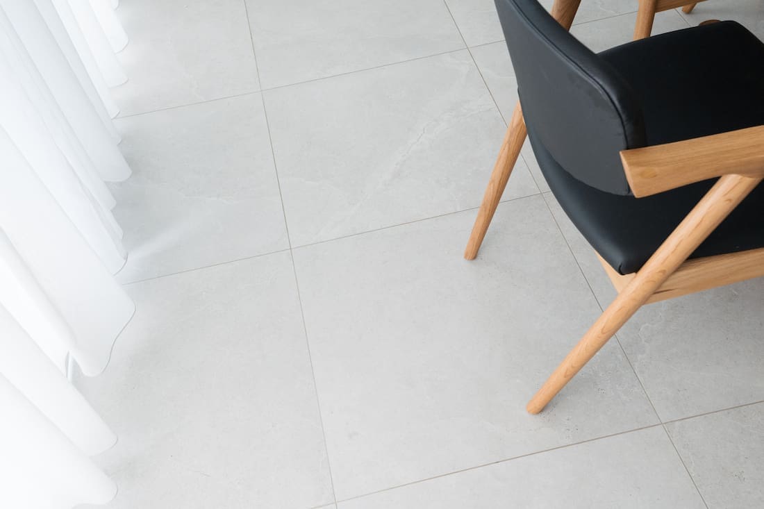
Similarly with the floor tile I was looking for one that would tie in with the tones of the kitchen. My mother-in-law loves terrazzo but as we tiling over an existing floor, we couldn’t go thicker than a standard 9mm tile. We brought many terrazzo-look tile samples to her house but they were all either too busy or threw a lot of blue tones.
After bringing over boot-loads of tile samples, we settled on this warm grey stone look tile which picked up on the undertones of the other materials. I selected a semi-polished finish as it’s easier to clean and this room gets a lot of traffic… mainly my two kids playing out in the garden and trekking dirt and sand inside!
One of the best things about this particular tile is the ability to use it externally too. So we tiled the courtyard outside in the same tile.
Window coverings
I mentioned this room gets a lot of natural light and the soft Roman blinds they had basically melted!
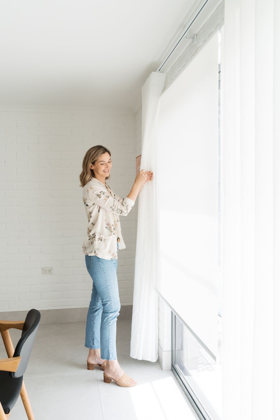
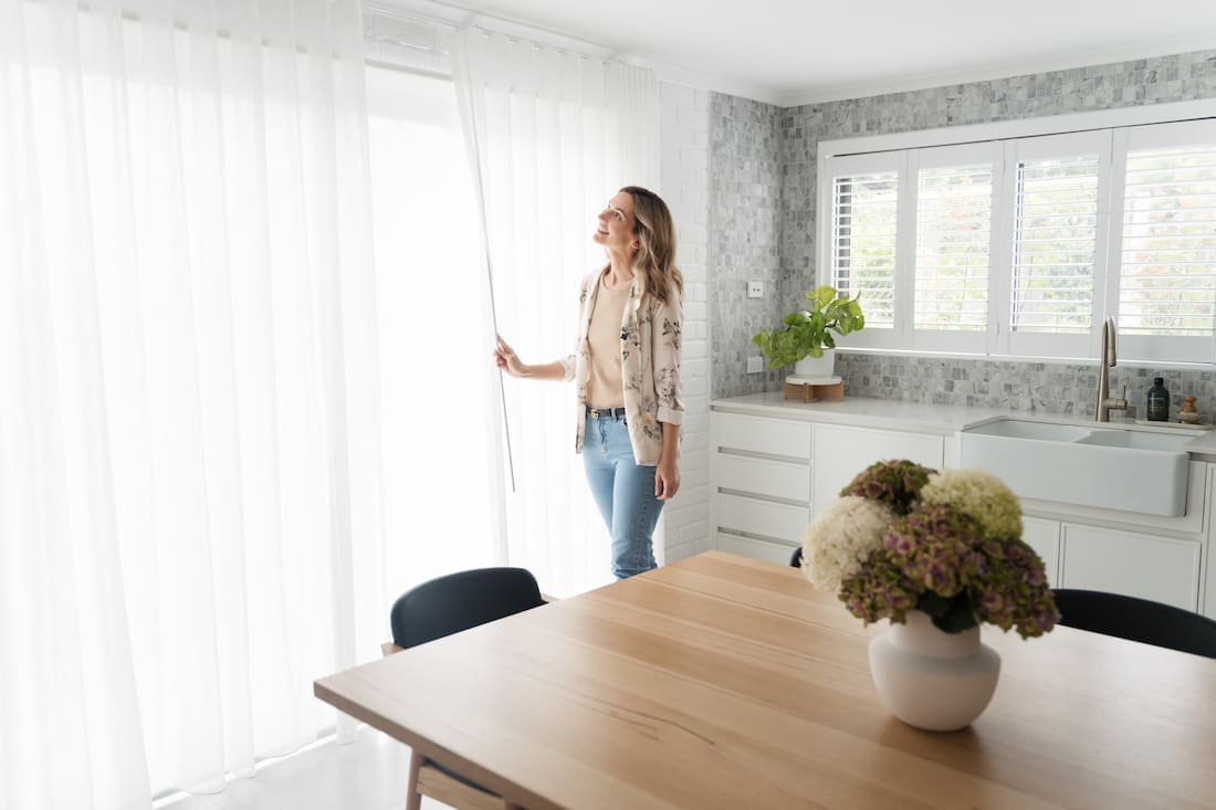
On the sliding door to outside, I selected a combination window treatment. Sunscreen roller blinds from dollar curtains + blinds block out the sun’s harsh UV rays while still giving vision to outside. This means she can keep an eye kids or things happening in the garden while in the kitchen.
To soften the room and also offer more diffused light during the day, we also dressed the sliding door with a sheer curtain. This is a wavefold curtain in an off-white linen-look fabric also from dollar curtains + blinds.
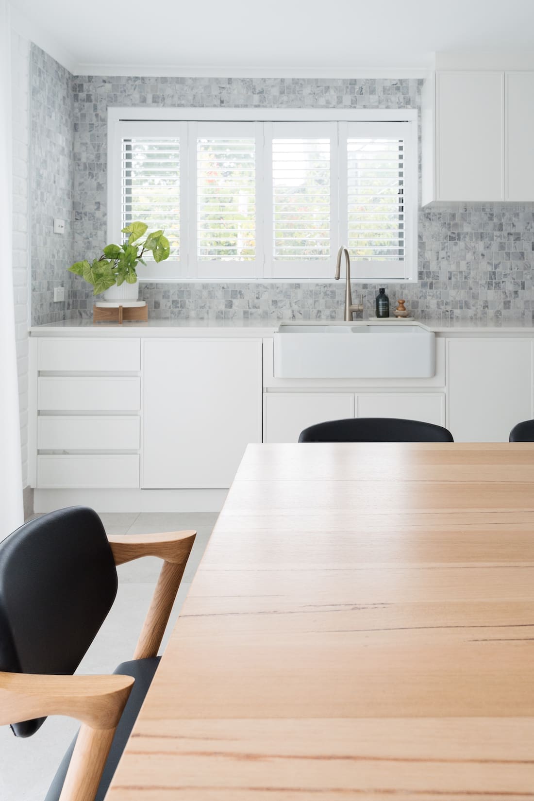
And above the sink we replaced the broken roman blind with a custom bi-fold plantation shutter. Not only does it suit the style of the new kitchen, it’s also water resistant making it the perfect window coverings to use above a sink.
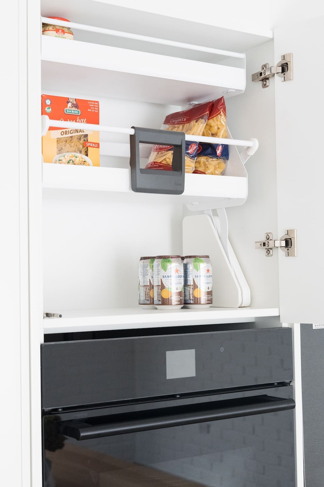
Smart storage solutions
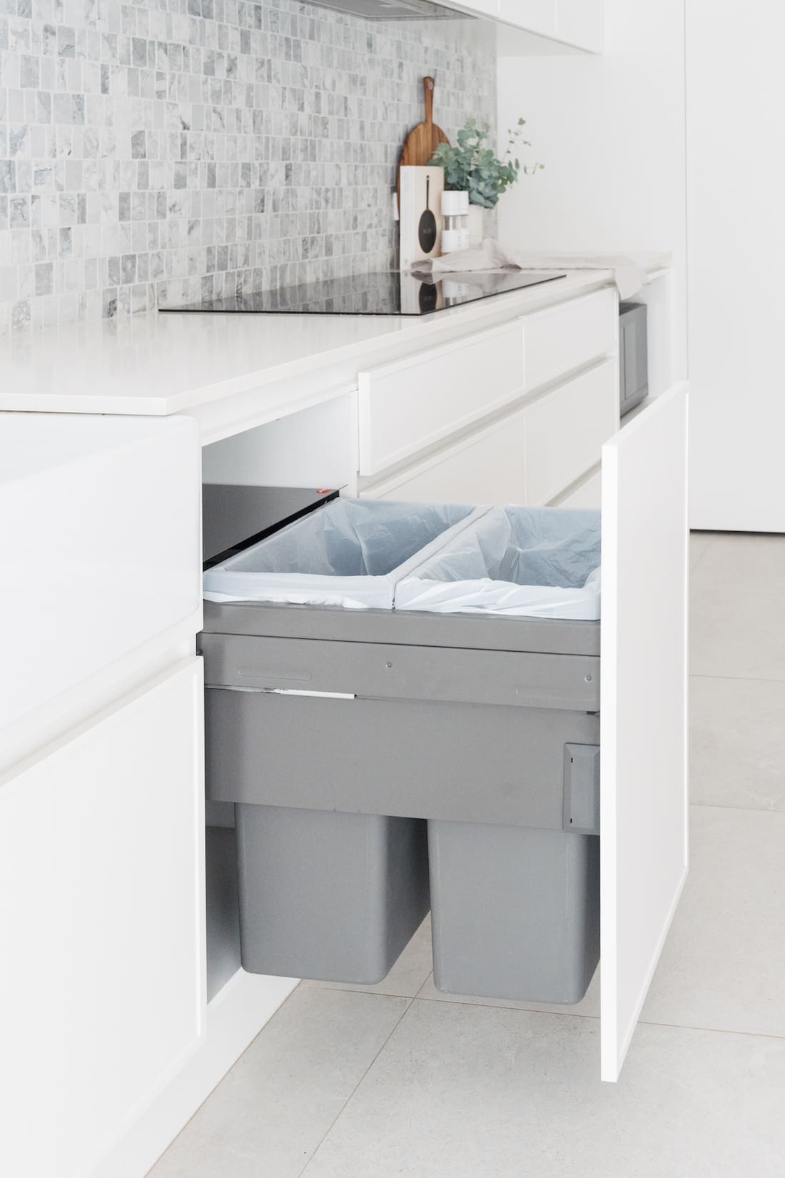
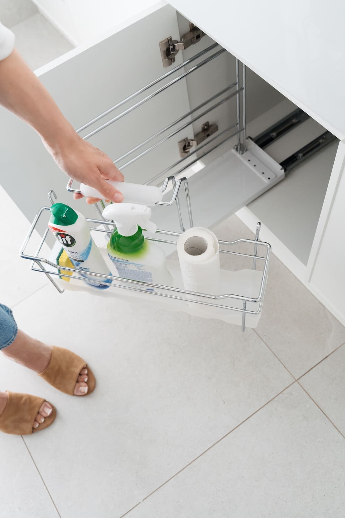
I also added a few smart storage solutions inside the cupboards from Hafele Home. These include:
Because a dream kitchen shouldn’t just look pretty, it needs to be functional too!
Furnishing the room
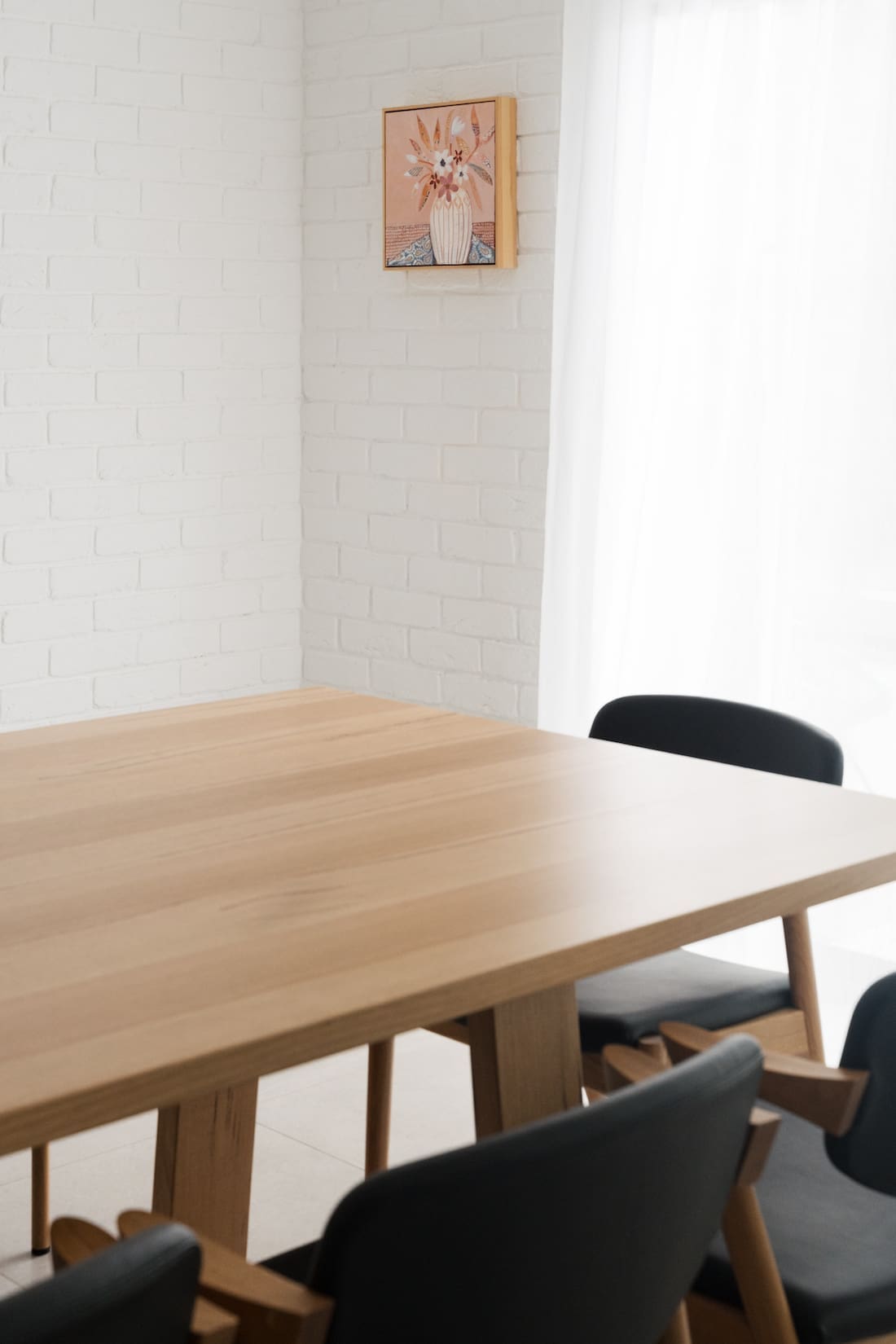
The large timber dining table and the black leather and timber dining chairs are from Nick Scali. The vase on the table is from KAS and you can see how I styled more of their ceramics in this bookshelf reel.
To add a pop of colour, I love this original artwork ‘Indigo Rose’ by Sue Fantine from bluethumb. It’s such a happy colour palette and I can see my mother-in-law adding more artwork to this space over time.
I hope you enjoyed this kitchen tour and it offered you some inspo if you’re about to design a new kitchen. Do you have any questions about the space? Pop them in the comments below and I’ll get back to you asap.
More kitchen inspo


Hi Gina,
The kitchen is beautiful. Did you use Snowy Mountains full strength or half strength?
Hi Kathy
Thanks for your lovely comment. I selected Snowy Mountains half strength and the kitchen still appears pure white – just not a cold stark white like Lexicon can in some lighting conditions. Hope this helps 😉
Hi Gina, beautiful update for your Mother in Law especially the pantry. What layout inside the pantry did you choose?
Hi Lisa,
Thanks for your lovely comment. The pantry is an awkward shape, maximising space under a stairwell. It’s large enough to step inside (not just a regular cupboard) so we wrapped shelving around in a u-shape configuration 🙂
Love this look! How do the drawers and cabinets open without handles? Is it push to open? Thank you!
Hi Erin, thanks for your lovely comment. There is a recess behind the drawers and cabinets so they pull open 😉
Hi Gina beautiful kitchen. 😊 I love the back splash tile and currently building. I worry about the grout on that style. What do you think?
Hi Lina, thank you! If you use a high quality grout and seal it (this splashback was sealed with a natural stone sealer to protect the marble) then it’s fine. You could also consider using an Epoxy grout which is a completely different formula and is virtually stain and crack proof. It’s more expensive to buy and install but worth it 😉
Hi Gina,
This kitchen is to die for! I love your DIYs and inspo so much, thank you.
Could you please tell me where the half moon handles are from on your Mother in Laws pantry?
Thanks!
Aww thanks lovely, that’s so kind of you. I bought the handles from Lo & Co here > https://loandcointeriors.com.au/products/arc-carrara-marble-handle It’s available in a few materials, including black or grey marble, and travertine 😉