Kitchen reveals are always our favourite so we were sitting on the edge of our seats for this week’s Block room reveals!
Despite the judges being super negative (it just kept coming, didn’t it?!) we took away lots of design inspiration so let’s get into the highlights!
Related article: The Block Triple Threat: Week 9 entry and staircase
Related article: The Block Triple Threat: Week 10 outdoor terraces
Jess and Ayden
Hooray! Jess and Ayden came first place this week with 26 out of 30!
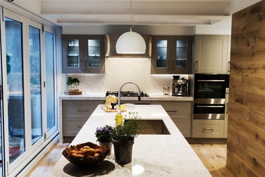
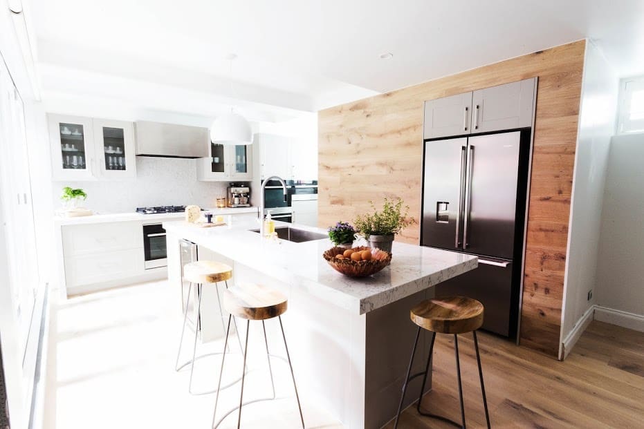
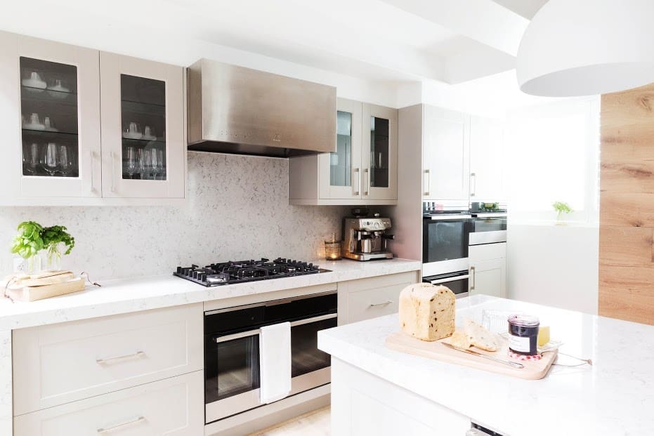
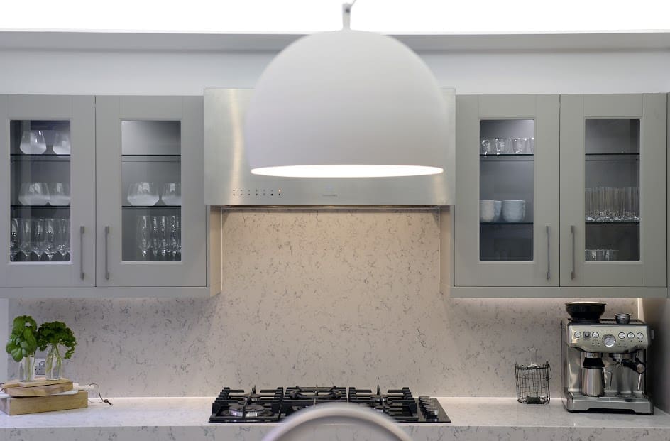
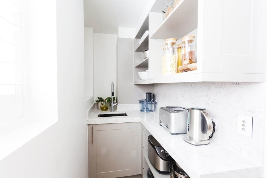
We loved the warmth of their kitchen and how they mixed materials, like the taupe cabinetry and wood feature wall, to create a homely and inviting space.
The judges said it was a serious foodies kitchen and with miles of benchtop space and a butler’s pantry you could sleep in, we couldn’t agree more!
The kitchen doesn’t just look great, it’s also functional with clever design and great use of space. We’re so happy these guys scored another (much needed) win!
Tim and Anastasia
WTF! Sorry, excuse us, we rarely need to use that kind of language but it just slipped out during the show!
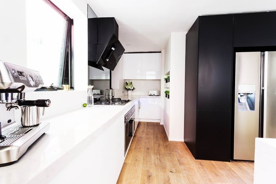
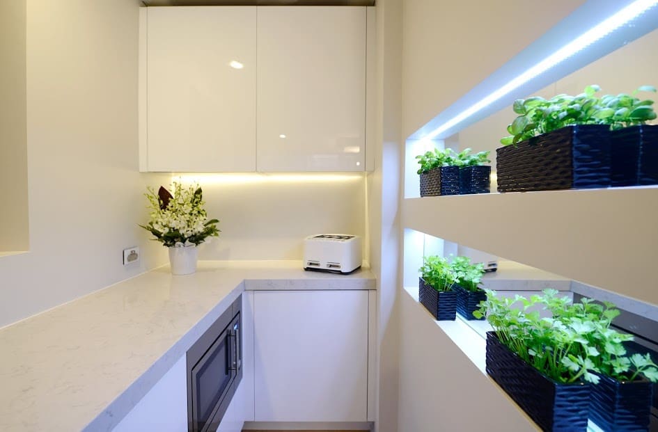
These guys came in second place this week at 23 1/2 points. While the judges were full of praise, saying they loved the proportions, range hood and matt black cabinetry around fridge, we couldn’t help but squirm.
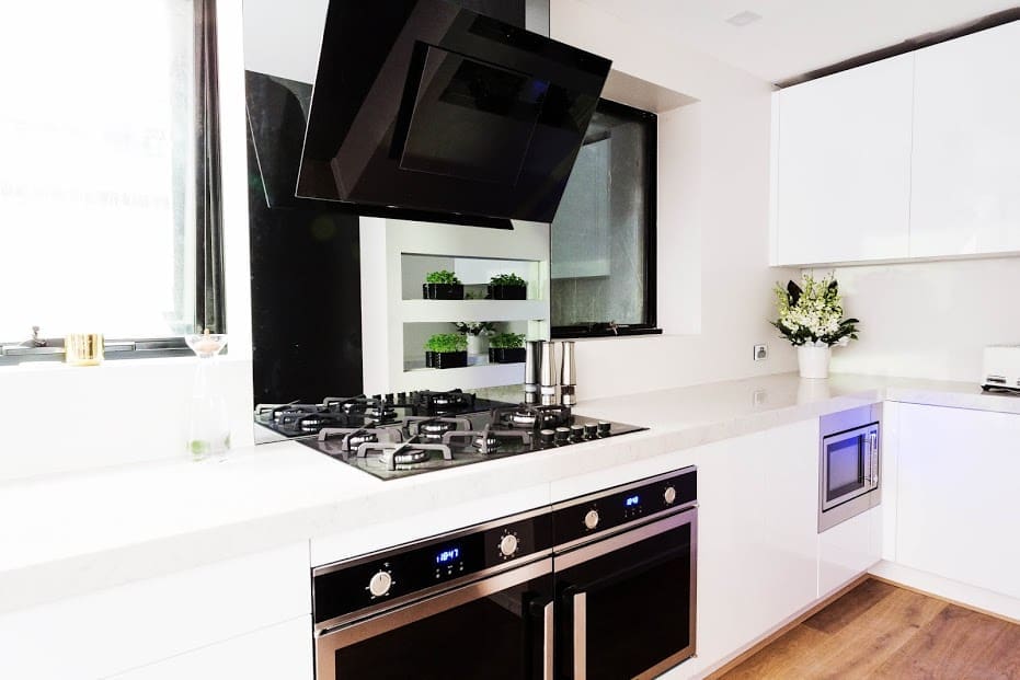
The thing that really didn’t work for us was the wall of plants — it’s as though they are offering potential buyers a hydroponics set up! The judges said Darren and Dea’s kitchen felt like a cheap disco with their mosaic splashback tiles but to us this screams cheap disco way louder. Check out the photo below and tell us what you think in the comments!
Onto the positives though, we do love the matt black cabinetry around the fridge and those door open ovens were pretty darn cool!
Charlotte and Josh
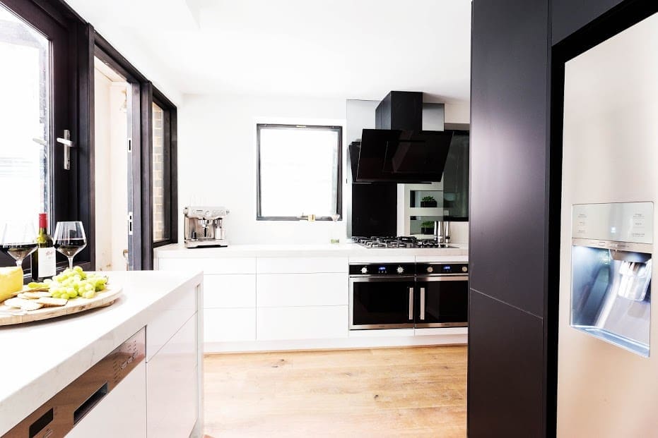
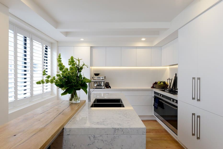
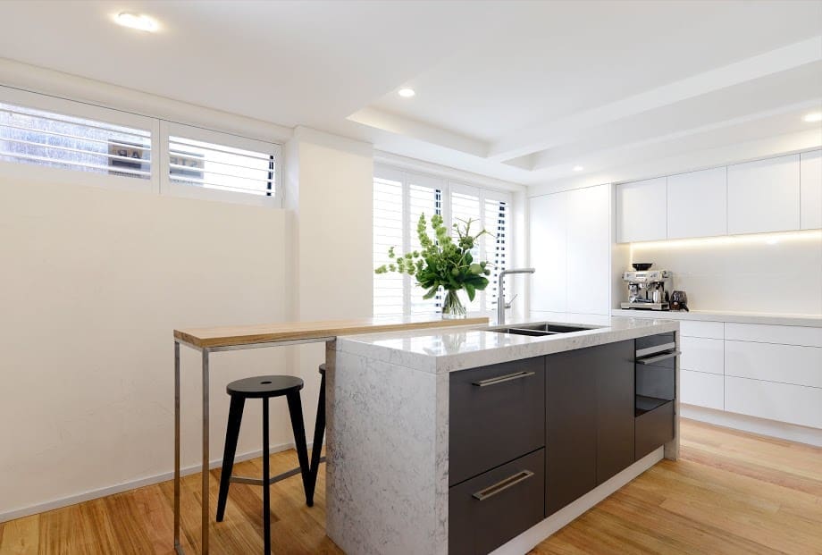
We were fans of Charlotte and Josh’s kitchen — simple and clean line. The mix of cool and warm materials creates a balanced space that you just want to be in!
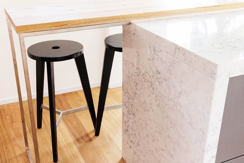
The judges were critical that there were no ‘wow’ features and Neale even said his first impression of the kitchen was a cell — harsh! We can safely say we didn’t get any jail vibes from their kitchen 🙂 Actually we really loved the custom timber bench and how it contrasts with the marble-look bench top.
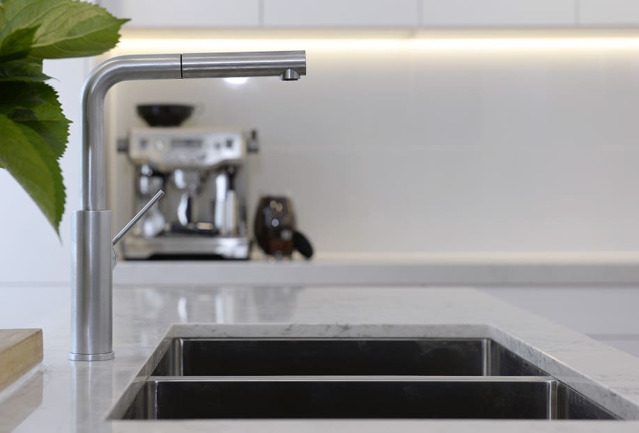
Charlotte said the one thing she would change is the bench top and we agree. For us, nothing is as beautiful as natural stone and would have preferred to see standard Caesarstone than a marble-look product (if they didn’t want to go with the real thing).
The judges said this wasn’t a cook’s kitchen but we disagree — the double ovens, double integrated fridge, double integrated dishwasher and ample bench space are a cook’s dream! From a functional point of view the one thing that didn’t work for us was the lack of lighting above the island bench but that can be easily fixed before auction. We think these guys deserved to come in second place this week.
Dea and Darren
The double Ds were not impressed with the judges’ comments this week and Dea had a response for every comment — ‘incorrect’!
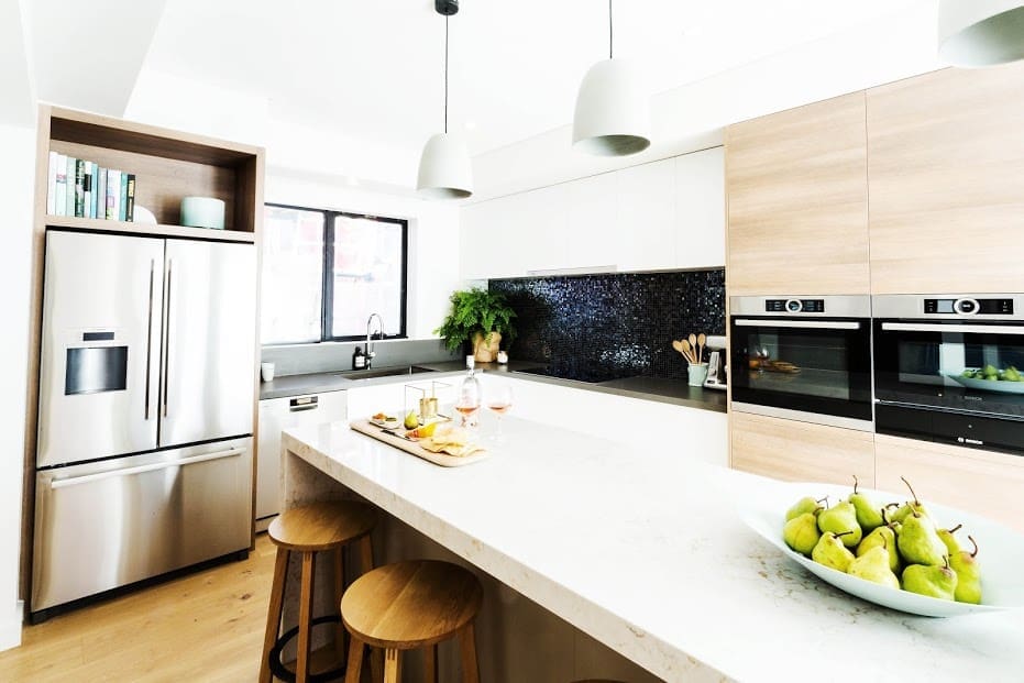
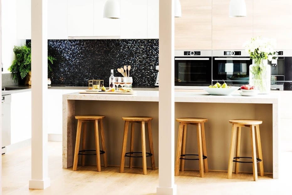
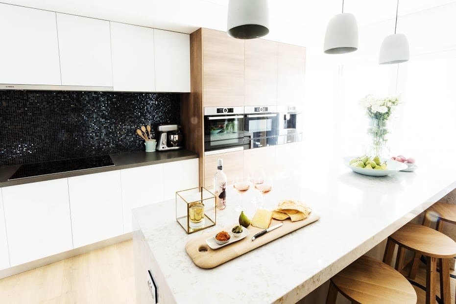
Scoring just 21 points (less 1 point from the challenge so a final score of 20), these guys got immediately pulled up for having ‘goal posts’ in front of their kitchen. And once inside the kitchen, the judges had few positive things to say.
While we disagree with Shaynna’s comment that it doesn’t feel high end, we do feel that some of the materials don’t work as well together as previous kitchens Dea has designed.
We like the mix of timber and white cabinetry but would have preferred to see a simpler tile (or even tempered mirror) used for the kitchen splashback — for us there are just a few too many materials. As much as we love coffee, Shaynna’s comment about removing the inbuilt coffee machine and creating a larger cupboard at the end of the kitchen would be a practical move.
Stay tuned for next week which is stairway, hallway and study week!
Until then, we’d love to know what you thought of the kitchens? Which one was your favourite? What did you love or hate about the rooms? Tell us in the comments below!



Thanks so much Gina, that sounds about right! Definitely helpful 🙂
Oh great, happy to help Nicole x
Late to the conversation, but wondered if you knew or could take an educated guess at the width of the Jess & Ayden’s and Tim & Anastasia’s pantries. We’re about to put in a new kitchen and only have limited room for a walk-in pantry. When I Google it, images of these two pantries keep cropping up. They look narrow but do-able. Maybe 660 standing room (that’s my guess based on the fact that there is a single cupboard at the end, and the widest standard width for a cupboard is 600) and a 450-500 benchtop?
Hi Nicole, hmm tough question! It’s hard to tell from the photos but generally there’s 900 standing room so if it’s a tight space, I’d say at least 750 standing room? And I’d say minimum 500 bench depth… Not sure that’s helpful at all though! Sorry x
Hello,
Really love the marble bench top that Jess and Ayden used for week 8 kitchens.
Could you please help to find out what type and colour of stone bench is it?
Much appreciated
Thanks Steph
Hi Stephanie
Doesn’t it look great? It’s called “Silestone Lyra with 60mm edge” and it’s from The Good Guys (http://www.thegoodguys.com.au/) 🙂
It certainly does! Thank you so very much for passing marble details on.
Much appreciated.
Thanks Stephanie
Ayden and Jess was my favourite kitchen but I did agree with the judges it was a mistake to change the lounge and kitchen, I would definitely prefer a larger lounge. Thought T&A kitchen was just a weird shape. I also could not understand why the architect in J&C kitchen would put a high window in especially when there is a deeper one close to it. Windows like that especially if there is jut one, belong in a bed or bathroom to me. D&D I cant understand putting the same tile (very distinctive) in a bathroom and then repeat it in a kitchen.
So true Gillian! Especially about the layout of T&A’s kitchen – just bizarre!
J&A’s living room is a bit pokey but then they wouldn’t have that ah-mazingly spacious kitchen… hard to decide what would be better/make them the most at auction?
We love natural light so quite like the window in J&C’s kitchen but you’re right, it’s not common to see such big windows in a kitchen.
And D&D, yes, not sure what happened there?? 🙂
Sorri I didnt explain myself to well. I would rather see 2 larger windows in the kitchen of J & C rather than a larger one and then the small high window next to it.
Oh, ha ha, yes that would make sense 🙂
I had mixed feelings. Ayden and Jess definitely deserved to win – I really like this couple. They have been the quiet achivers and I think they might be the dark horse on auction day.
Dea and Darren’s has too many expensive-to-fix faults.
Tim and Anastasia’s oven placement bugs me to no end (why right in front of the wall!) And I don’t like the too-skinny excuse for a butler’s pantry.
Josh and Charlotte’s is just too dull – functional but dull.
I think it was a bad advertisement for the sponsors who were in charge of the kitchen designs – they should have pointed out the mired of design faults in many areas in the kitchens which, with good design, could have been overcome.
Hi Amanda
Great comment! Agree with all the points you made although we didn’t mind Josh and Charlotte’s kitchen – it would have been better if they carried more grey cabinetry through the back wall but overall we thought they deserved second place.
Yeah, we don’t think last night’s episode did any favours for the sponsors 🙁 Especially when Anastasia said they are responsible for all the faults in their kitchen… really?!