We always say magic happens when you get bold with colour and today’s home tour proves just that! Featuring an earthy, muted palette of warm brown and green tones, this home renovation adds heart and soul into what was a very clinical house. It’s the unbelievable sage green kitchen of The Treehouse that made our jaws drop but as you’ll soon see, every corner of this house is worth ooohhhing and aaahhhhing over!
Come with us inside this stunning before and after home renovation with Sarah Yarrow Interiors as she tells us how she convinced her clients to go for a green kitchen over the clean white kitchen they thought they wanted!
Related article: Slim shaker cabinets and marble mosaic splashback are a dreamy combo in our latest kitchen renovation project
Related article: How to: Affordably update your kitchen
Set amongst the gumtrees, this home had great bones but needed to be shown a bit of love. Enter, Sarah Yarrow from Sarah Yarrow Interiors.
“The home is located in the Sutherland Shire, just south of Sydney CBD,” explains Sarah.
“Our clients were a family with 2 young primary school aged sons who decided the time was right to make the move to a larger property with more room for the kids to roam and be active.
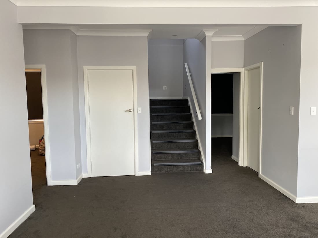
“It’s a 6 bedroom, 3 bathroom home and we kept much of the home the same. What we did do, was reconfigure the layout of the main living, dining and kitchen areas to make better use of the space.
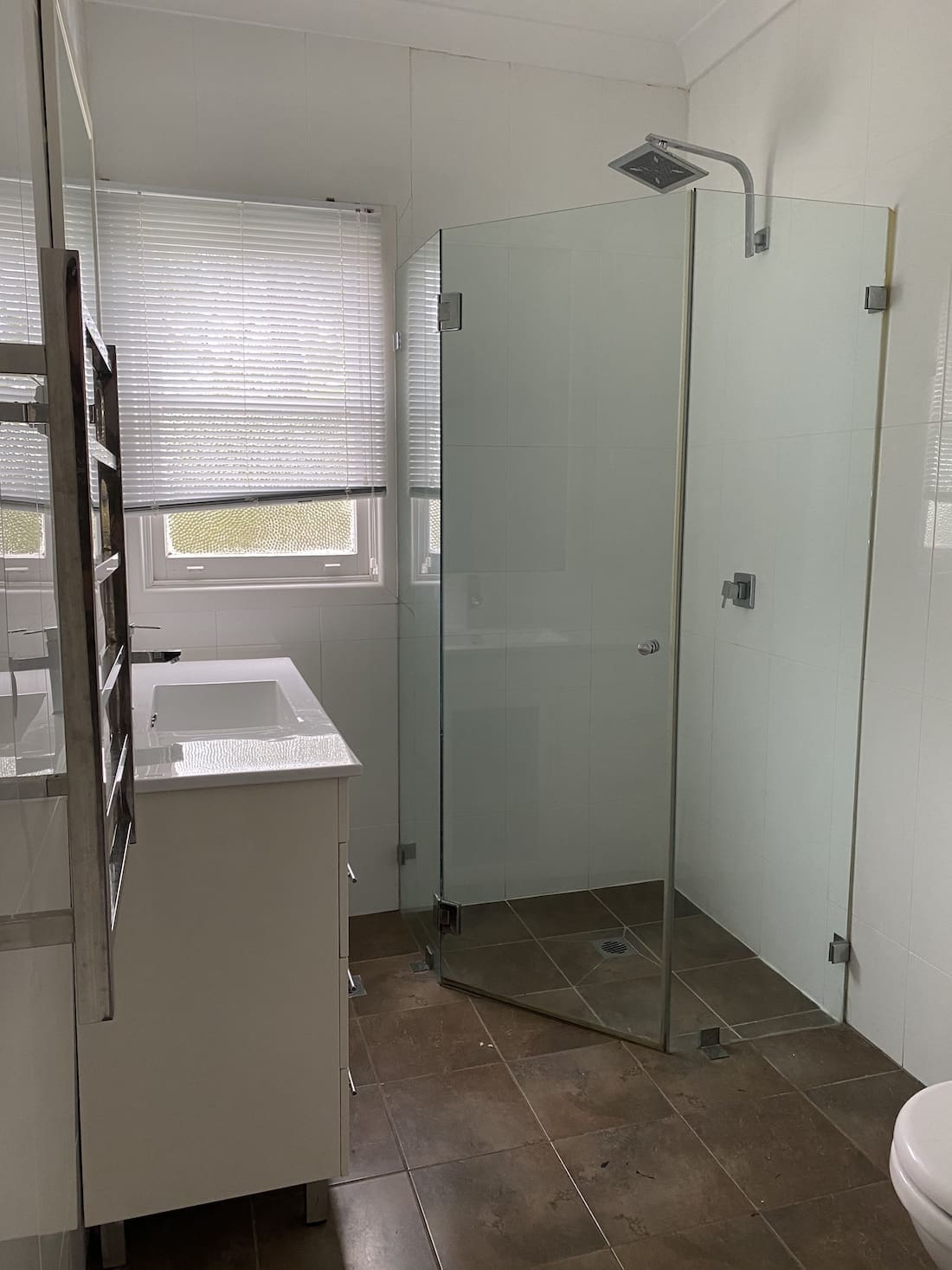
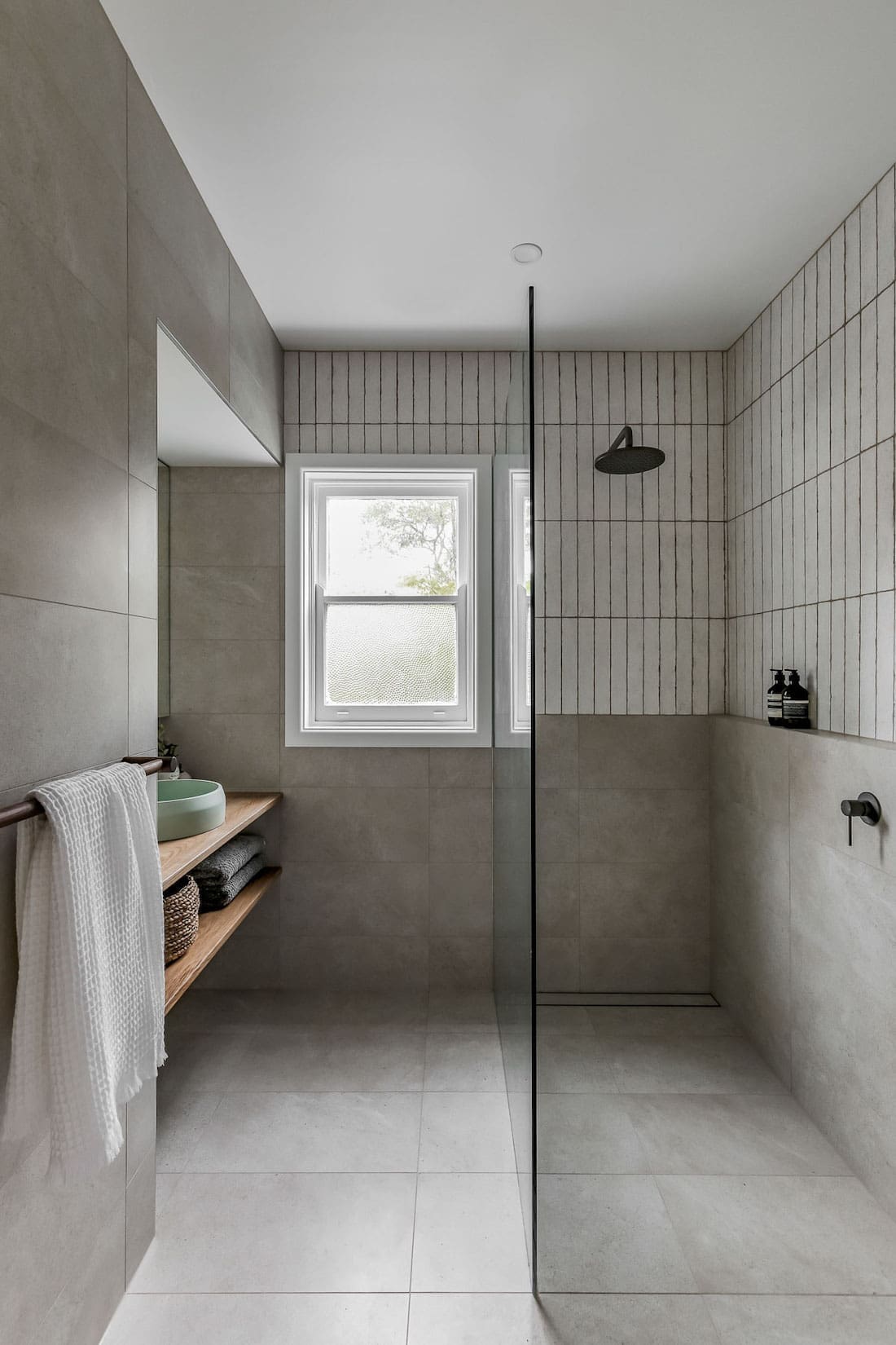
“We also reconfigured the second bathroom to be both a guest bathroom and accomodate a laundry in the adjoining room.”
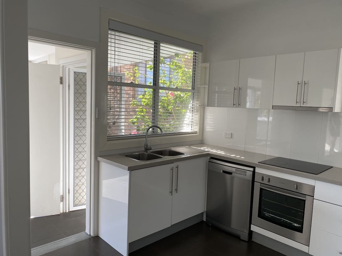
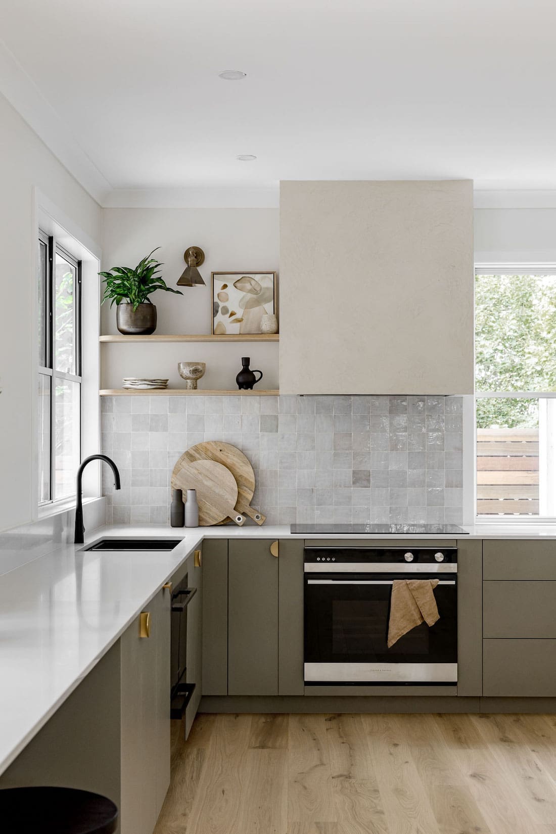
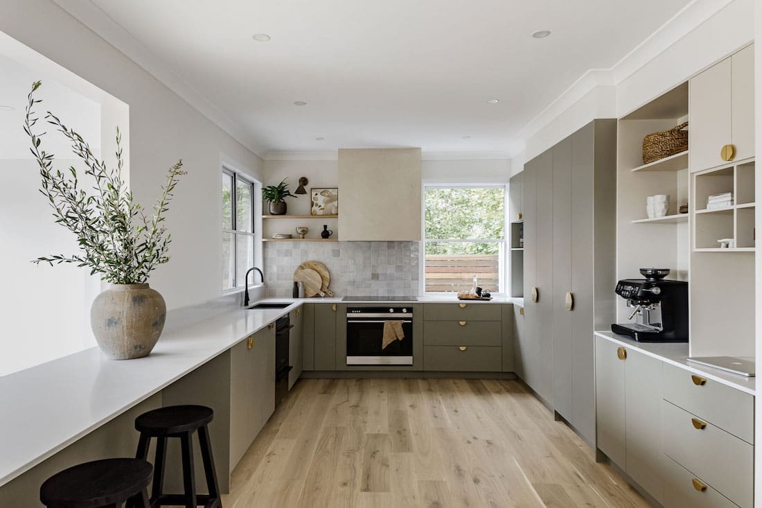
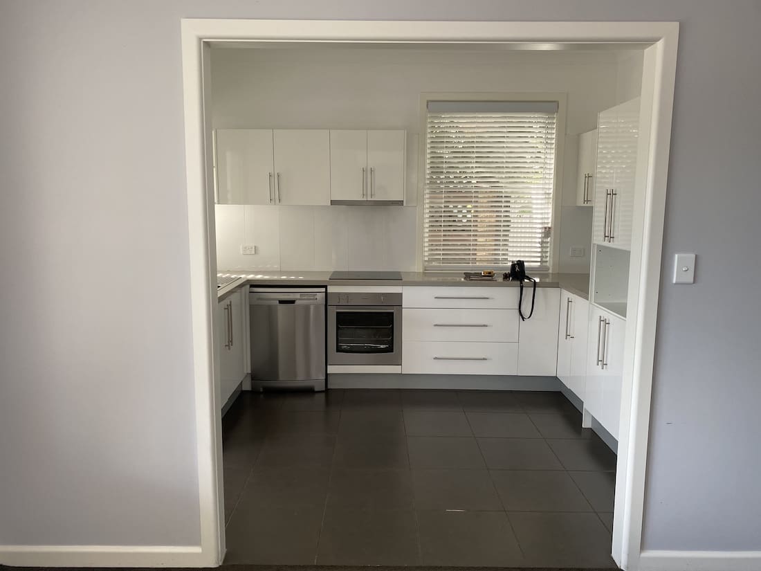
The kitchen is clearly the star of the show, going from pokey and dark to utterly stunning… and green!
“Initially the brief was to create a, ‘clean white kitchen with a pop of colour’ — haha!” laughs Sarah.
“Clearly I didn’t follow that brief! I vividly remember sitting down with our clients and explaining that I respectively took on board their desire for a white kitchen. However… I really thought we could do something so much more special and completely bespoke. Something to suit their family and celebrate the surrounding location of the home.
“They were blown away when I showed them the combination of finishes! They loved the drawings and renders of the spaces and were completely onboard with the muted — but coloured — direction I wanted to take the design.
It really shows what you can create when a great client trusts you to listen, interpret and then envisage something even better than they could have imagined for themselves. Magic happens!
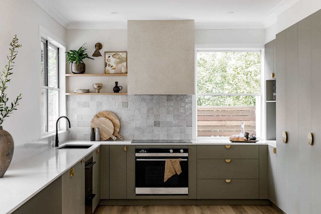
The stunning green kitchen takes its inspiration from the home’s leafy outlook.
“Oh yes! Nature definitely inspired this project!” smiles Sarah.
“The home is literally set up high amongst the gumtrees! So designing something which complimented those natural elements, rather than competing or jarring against them (like a white gloss kitchen would have), was really important.
“The colour of the cabinetry is an obvious parallel to the leaves of the trees. It’s called ‘Possum’ by Laminex — it’s one of my favourites in their range.
“The supporting colour we used in the kitchen design, is called ‘Raw Cotton’ from Laminex. It’s the perfect warm neutral for pairing with accents, or beautifully humble on its own.
“We then layered the design with texture, so there weren’t competing finishes. For example, we used a stucco finish on the rangehood. This gave the surface subtle texture which worked perfectly, rather than adding another colour or a metal.”
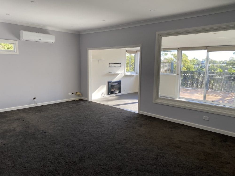
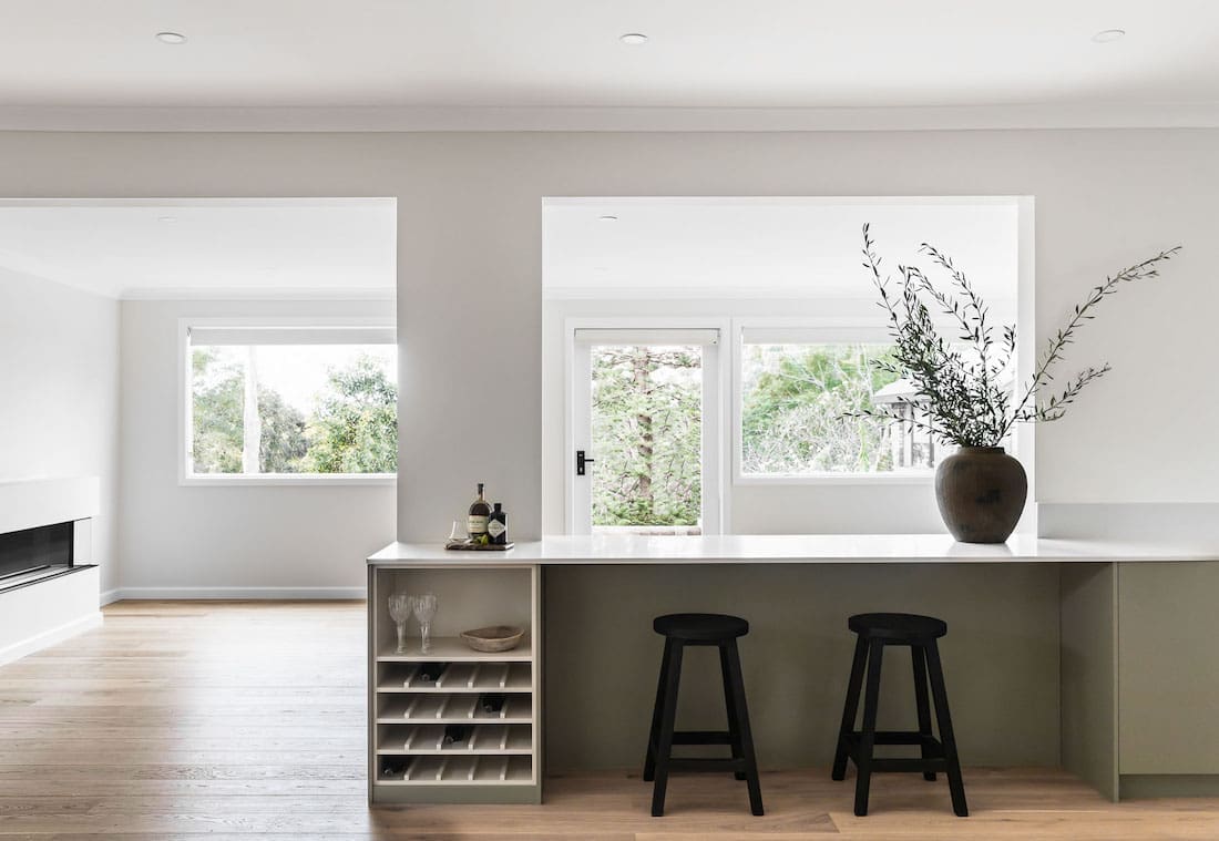
Sarah used clever techniques to draw light into the previously dark living room.
“We opened up some walls to let light in, and evened up the height of the floor between the kitchen and lounge room. It was previously a step down in height. Changing this allowed us to install new windows out to the back deck,” explains Sarah
“We chose matte rather than reflective finishes. And also our change to the flooring made a huge difference. Previously the floors were dark charcoal carpet which sucked in all the light. We replaced them with beautiful oak timber. Stunning!
“Lighting can make or break the feeling within a space. It’s such an important element to get right. And it’s not just about putting in a few downlights and maybe popping on a dimmer.
“It’s about considering the lighting within the whole space holistically. For example in the kitchen, using under counter task lights to see properly when prepping food. Or soft wall light which switch on separately to the main lights and can be left on for mood lighting.”
When a renovation produces a green kitchen this gorgeous, we just had to know what areas Sarah recommends splurging on.
“Flooring is a big one, specifically, hard flooring. It’s difficult and costly (not to mention wasteful) to replace them if you change your mind down the track. So rather than going for an inferior product to start with, I’d say it pays to put in considered flooring.
“We also recommend clients spend a little more on their tapware and lighting to get quality products that will last the distance.
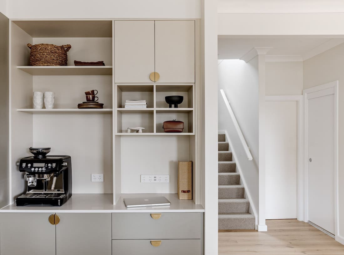
“A cool feature I really love in this home is the ‘Command centre’. It’s an area we designed for the far edge of the kitchen and something I try to incorporate into most kitchen designs, when space permits.
I love the idea of having a contained and dedicated space to put all the ‘life admin stuff’. We all have it — letters from the mailbox, phones and chargers, notes from kids school bags etc.
“More often than not, that stuff ends up on the kitchen bench. I hate that! So I created this zone for The Treehouse, so each member of the house had their own pigeonhole.
“Then there’s an open space for laptop, phones and a powerpoint with a USB for charging. Below are drawers to hide away some of those unsightly things when guests come to visit! It’s a pretty neat set up!”
Builder — Yarrow Build
Photographer — The Palm Co
Big thank you to Sarah for showing us around The Treehouse with its beyond stunning green kitchen. Be sure to check out more of her projects on her website and Instagram.
Has this inspired you to go with colour in the kitchen? Tell us in the comment section below!
More interior tours here



Love the kitchen! What color and brand of paint are the greenish gray cabinets? Thanks so much! <3
Hi Destiny
The cabinets are in a colour called ‘Possum’ by Laminex brand. Have a lovely day!
Stunning finishes! Do you know where the bathroom and kitchen tapware was sourced from?
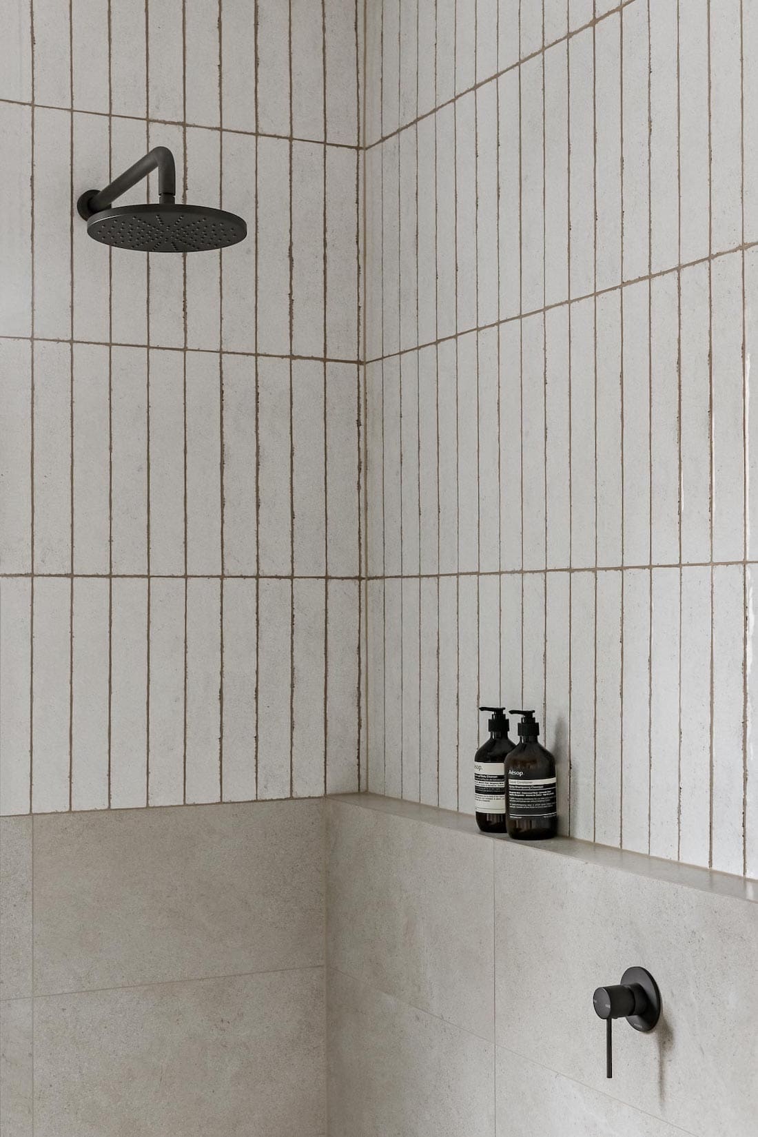
Hi Bailey, thanks for your comment. Sarah hasn’t tagged brands in any of her social posts but I did some online stalking and I think I may have found the kitchen tap here > https://www.winnings.com.au/p/gareth-ashton-gooseneck-pull-out-kitchen-mixer-tap-kta014b. It’s a pricey one but hope that helps 🙂
I love the tiles in this kitchen! Do you know where they are from? We are having a very similar design in our own kitchen.
Hi Abbey, these are the Zellige tiles in Bianco colour. Most high-end tile stores should be able to source these from Vulcano for you https://www.vulcanotiles.com.au/moroccan-zellige/bianco-casa 😉