

Forget Pantone’s safe Cloud White Colour of the Year — in 2026 we want to see people become even more daring with colour! It’s been refreshing to watch interiors move beyond beige-on-beige, and we are absolutely here for this new era of colour-drenching and unapologetic boldness.
Wattyl’s latest colour forecast is a glorious hit of sun-soaked optimism, featuring burnt oranges, sky blues, rich pinks and jungle greens. It’s fun, fearless and full of personality! Their collaboration with Fenton & Fenton shows just how stunning these hues can be when layered together thoughtfully throughout the home.
From terracotta walls to candy-pink furniture and summer-sky blue exteriors, these colours are all about warmth, joy and reconnecting with nature. Here’s how to bring this palette into your own home — with ideas straight from the new season imagery.
Related article: Colour and emotion: How to select colour for the mood you want to achieve
Related article: How colour can transform your home: Insights from a painting expert

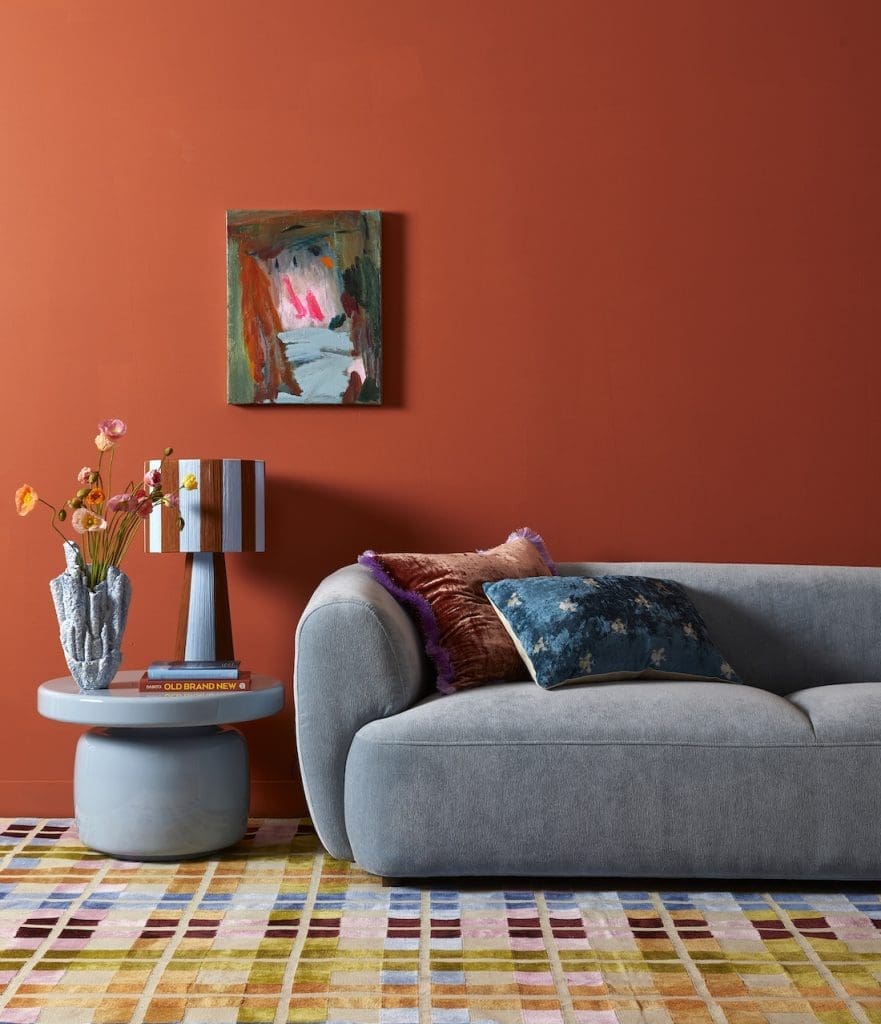
Earthy terracotta + sky-blue calm
One of the most striking looks from the collection pairs Wattyl ‘Burnt Clay’ with pops of ‘Ocean Foam’ — a dreamy, summer-sky blue.
Applied to the walls, Burnt Clay delivers an instant sense of warmth and grounding. In the featured living room, this rich terracotta backdrop sets the tone, while blue furniture and décor pieces cool things down beautifully. The mossy ‘Delicate Vine’ green rounds out the palette, tying the whole scheme back to nature.
The result? A nurturing, comforting room with a gentle sense of balance. Layering pattern and texture (like Fenton & Fenton’s chequered rug) adds even more personality.
Garden-fresh pinks against clear-sky blues
Next up is a palette that feels like stepping into a vibrant summer garden. Deep hibiscus pinks, iced-blush tones and the crisp blue of Wattyl ‘After’ combine to create a playful yet serene aesthetic.
In this room, the rosy lounge chair and pink coffee table bring the ‘bloom’, while the blue walls and trim evoke a perfect cloudless day. If you love the idea of colour but want a look that still feels harmonious, this combo is a winner — optimistic, joyful and welcoming.
The colour scheme could have been plucked straight from a summer garden – think peonies, salvia, hibiscus or azalea – sitting pretty beneath a clear blue sky.

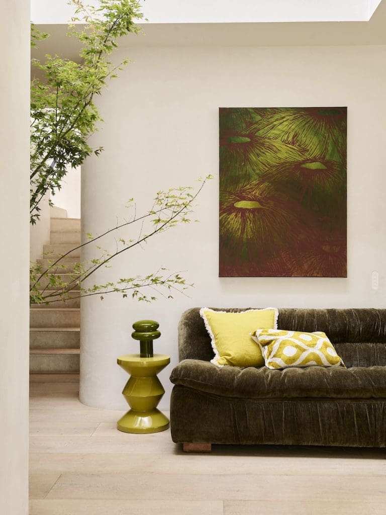
Mother-earth neutrals with jungle greens
If you just want to dip your toe into the bold colour trend, this next palette is the perfect entry point. The walls are painted in Wattyl ‘Bleached Hemp’, a soft sun-bleached stone tone that instantly calms a space.
From there, nature takes over: a deep moss-green velvet sofa, chartreuse accents and sunshine-yellow cushions give the room a fresh, organic feel without overwhelming the senses.
The result is one of optimism and playfulness, creating a space that is at once welcoming and reassuring.
This combination works beautifully year-round — cosy in winter, uplifting in summer — and brings a quiet, grounded confidence to the home.
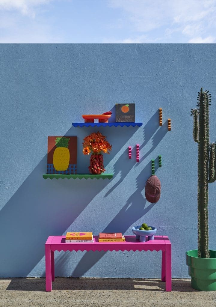
Colourful summer exteriors
It isn’t just inside the home where we’re seeing colour make a splash. Yes, exteriors get the colour-crush treatment too! One standout look features Wattyl ‘Forget Me Not Blue’ on an outdoor wall. It’s a statement that practically melts into the summer sky.
Bright pops of Wattyl ‘Charmed Forest’ green and the fabulous Schiaparelli-inspired Wattyl ‘Birthday Party’ pink bring energy and artistic flair to the alfresco space. For anyone tired of greys and charcoals outdoors, this palette is a breath of fresh (and very fun) air.
The verdict?
Bold, warm and joyful — these sun-kissed colours are set to dominate 2026 interiors. Whether you want to fully embrace terracotta walls or simply introduce a pop of chartreuse or pink, this palette proves one thing: colour is back, and it’s here to make our homes feel happier, richer and more connected to nature.
We hope this trend colour forecast has inspired you. Which colour combo is your fave? Tell us in the comments below!


