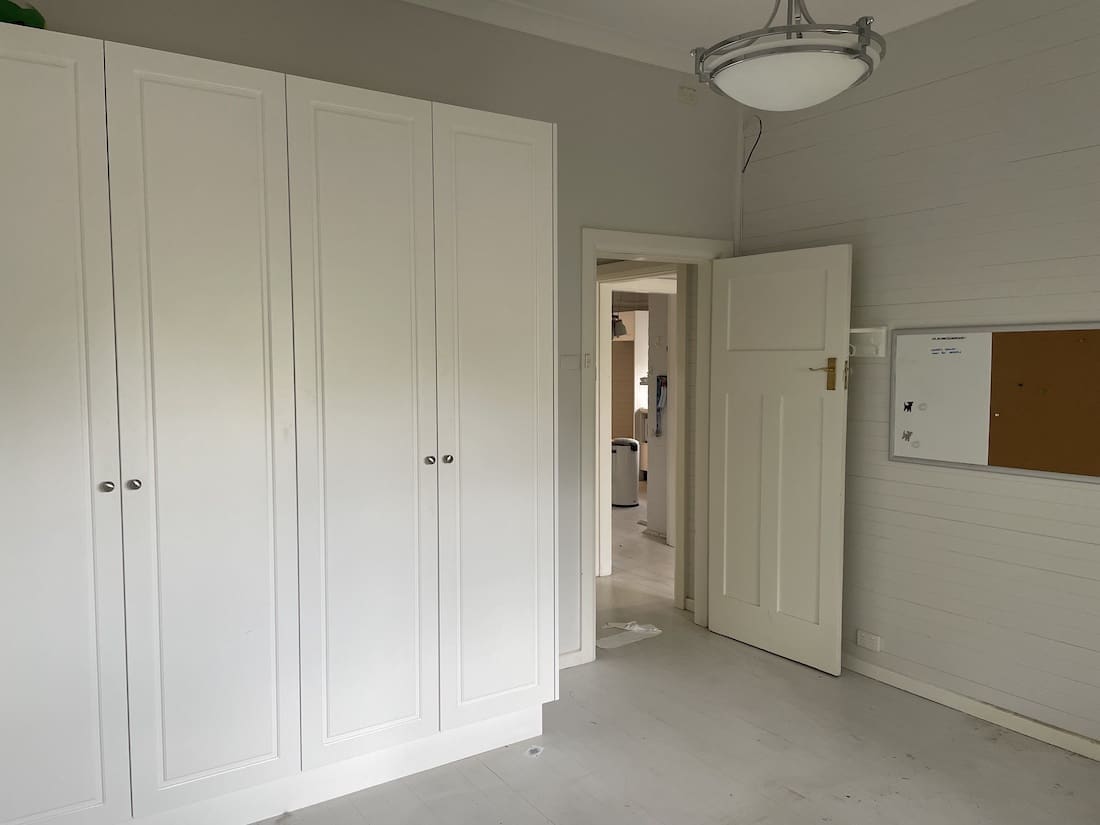
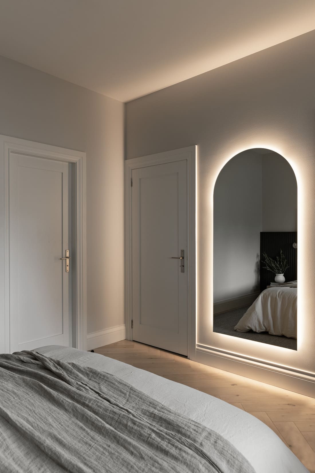
We looooove a before and after home transformation here at Style Curator. From the not so fab ‘before’ to the jaw-droppingly how-did-they-even-do-that after. And Willoughby II is no exception.
Come and take a look around with tonnes of before and after pics of this beautiful home renovation project with us. We chat with Laura Steele, Creative Director at Branche Designs who is behind this stunning home.
Related article: A stunning before and after home transformation: Inside this contemporary Hamptons home
Related article: From dated home to luxe holiday style: Before and after home transformation


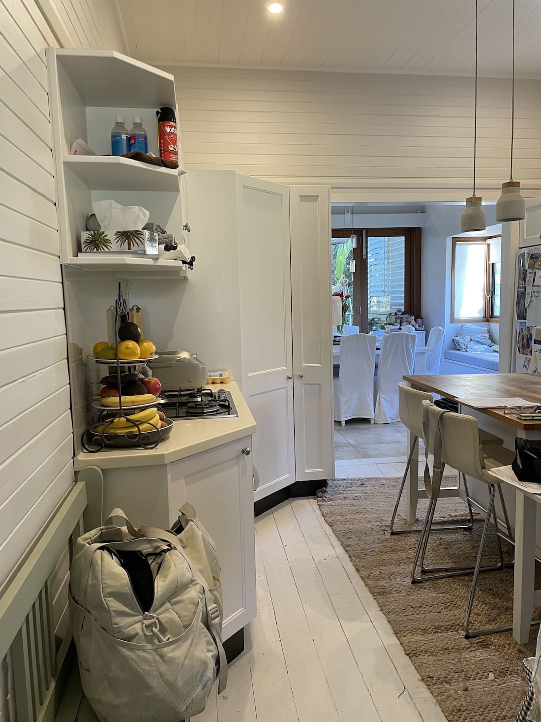
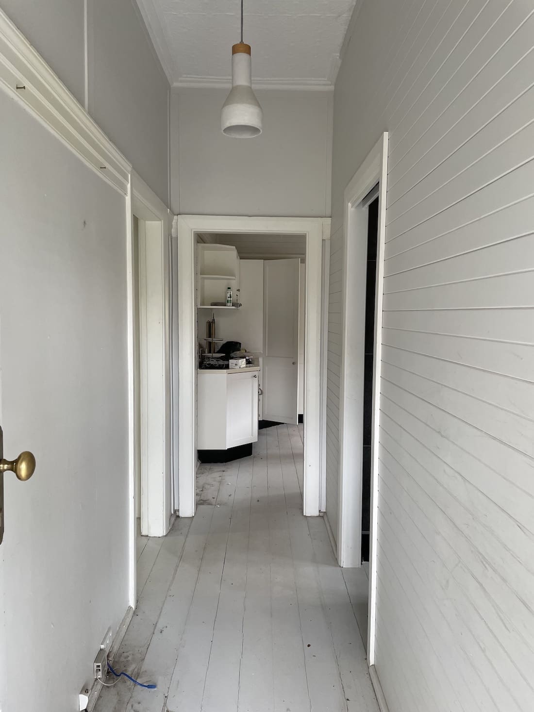
Home to a family of 6, this 1930’s cottage was in dire need of an update.
“This home is located in Willoughby, on Sydney’s lower North Shore. Our brief came from the Mum of the household.
“She was the only female sharing 1 bathroom with 5 males — her husband and 4 teenage sons. So as you can imagine, she was desperate for her own ensuite!” Laura says with a laugh.
“The original brief was to reconfigure the internal layout in the hope to gain enough space to add an extra bathroom. We ended up adding 2 additional bathrooms and another bedroom to the property.”

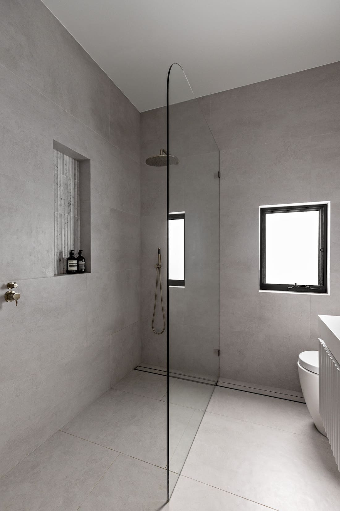
More than just a cosmetic update, the entire home was remodelled.
“The property is now a 5 bedroom, 4 bathroom home. There are 3 bedrooms and 2 bathrooms upstairs, 1 being the master ensuite. Downstairs there is another bedroom with an ensuite,” says Laura.
“We also added the new addition of a granny flat which has a separate bedroom and bathroom.
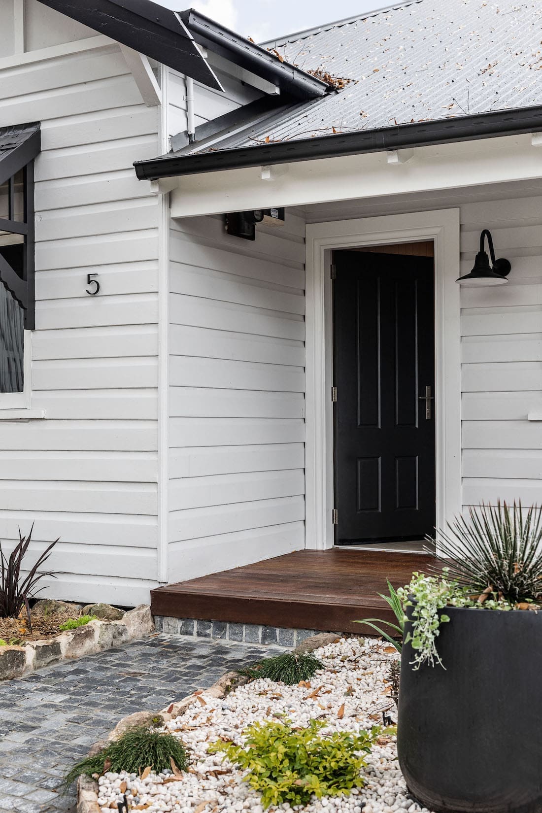
“For exterior of the home, we had to blend a fusion of styles to create a cohesive look. The original home is a 1930’s cottage but a modern addition had been tacked onto the back of the home by a previous owner.
“The home felt completely disjointed and lacked any connection so when we came on board, we were determined to give our clients their dream home. The photos of this before and after home speak for themselves, really!”
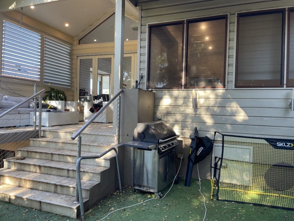
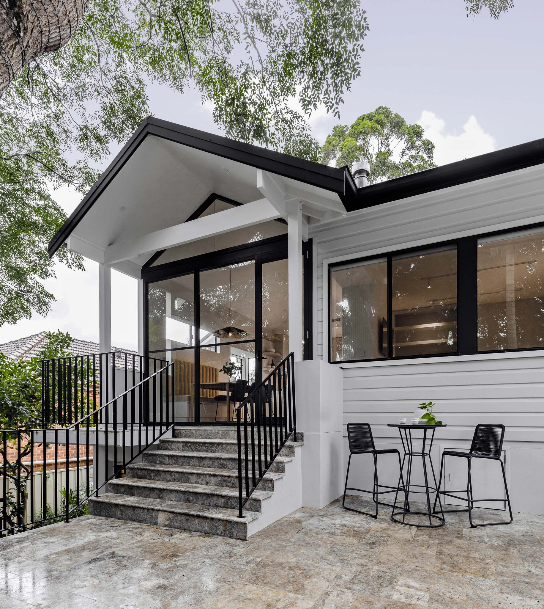
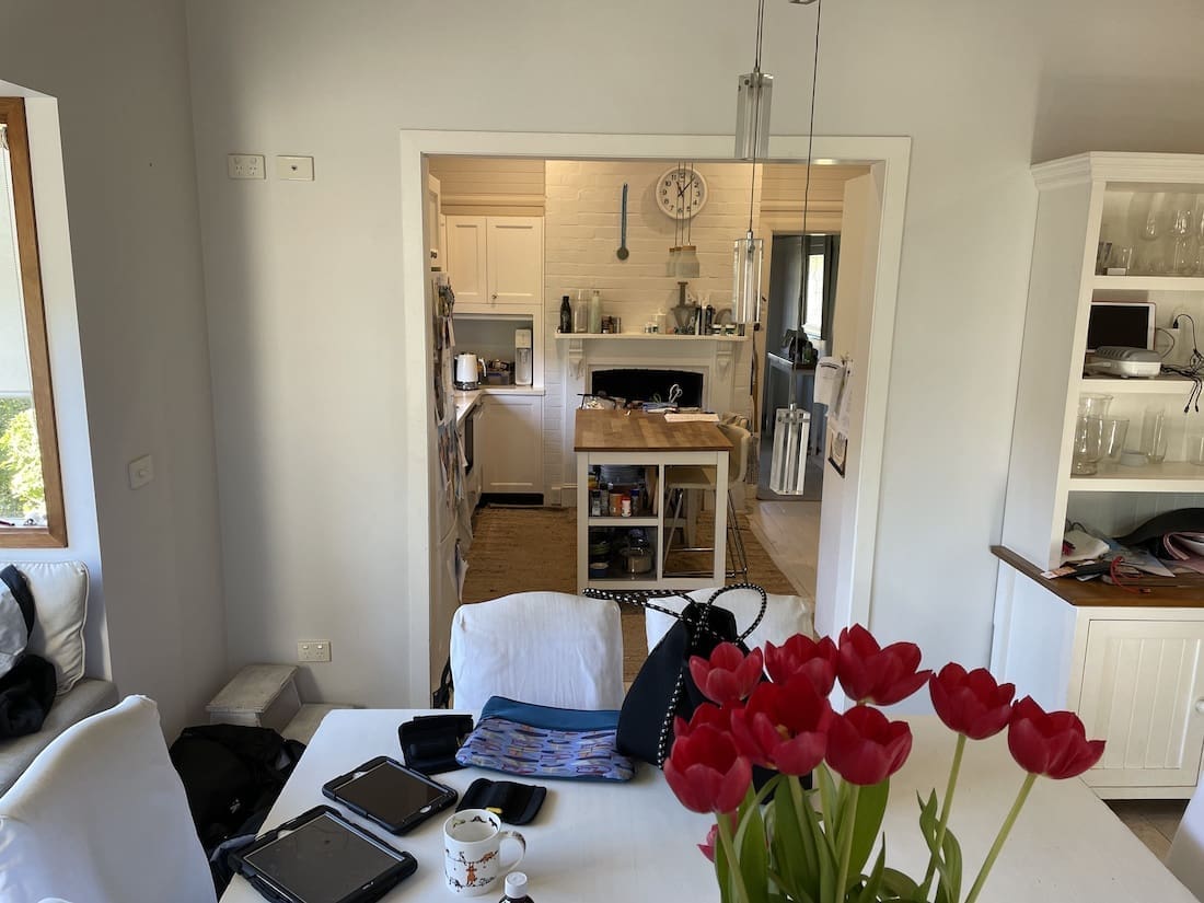
Working with their client’s key renovation request added an extra challenges for the Branche Designs team.
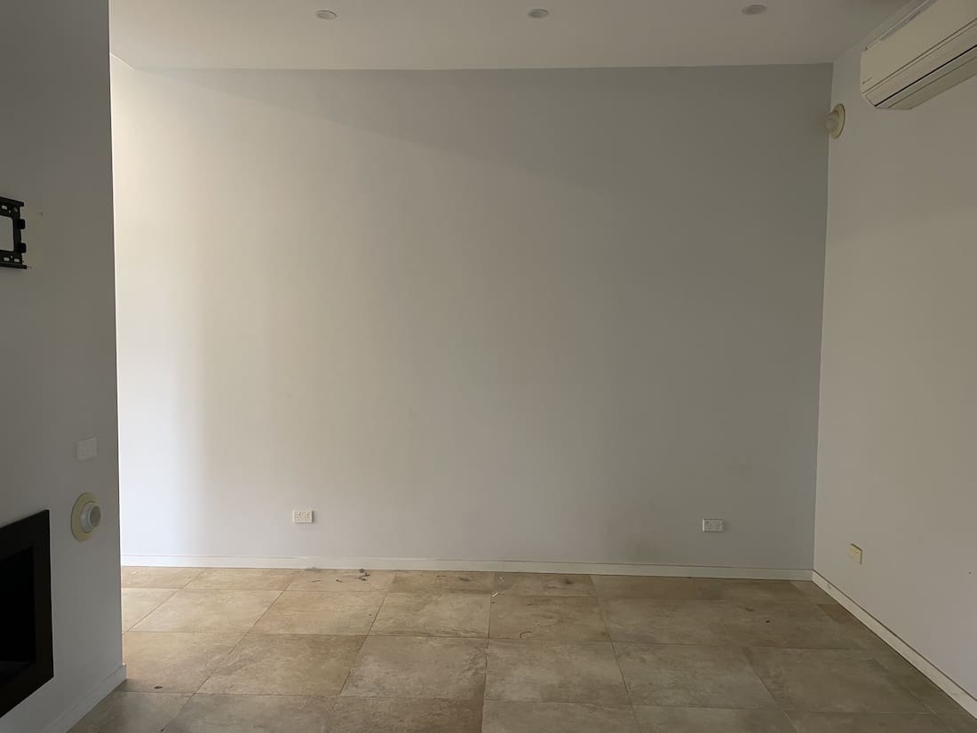
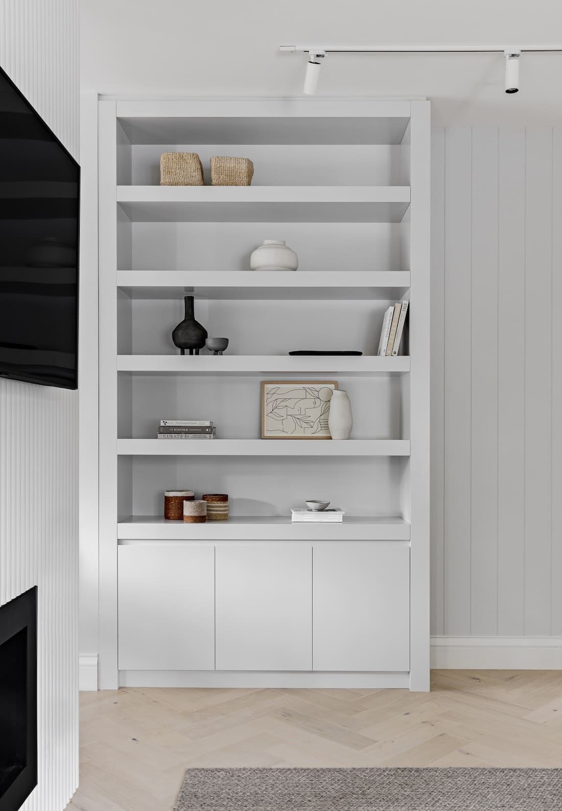
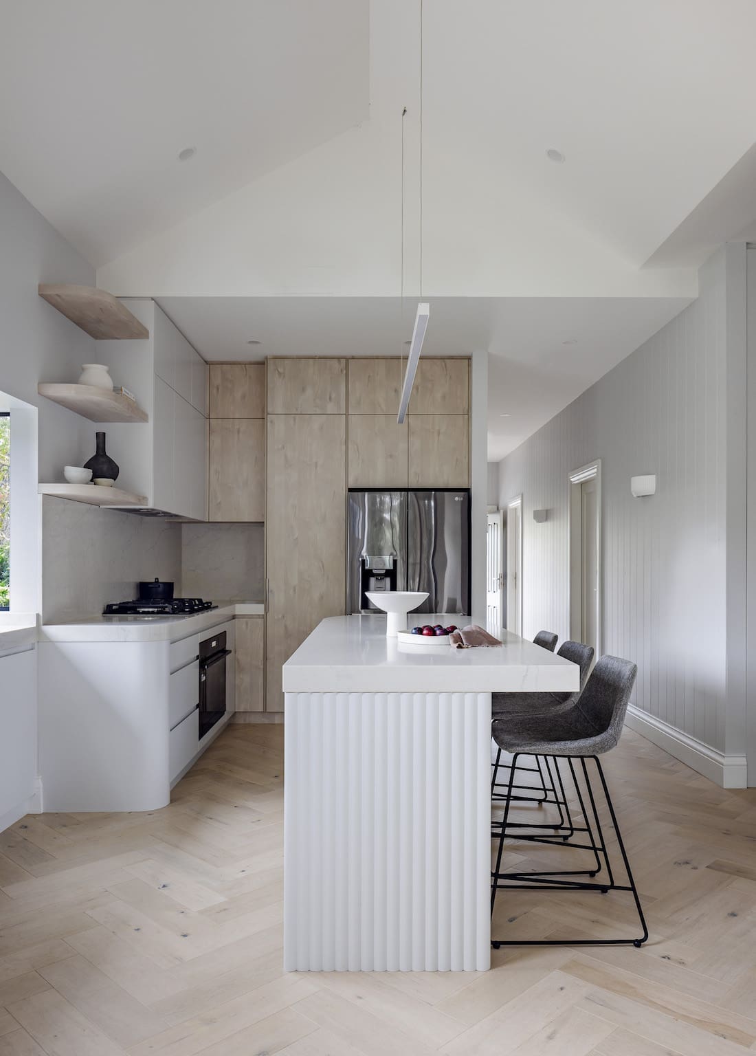
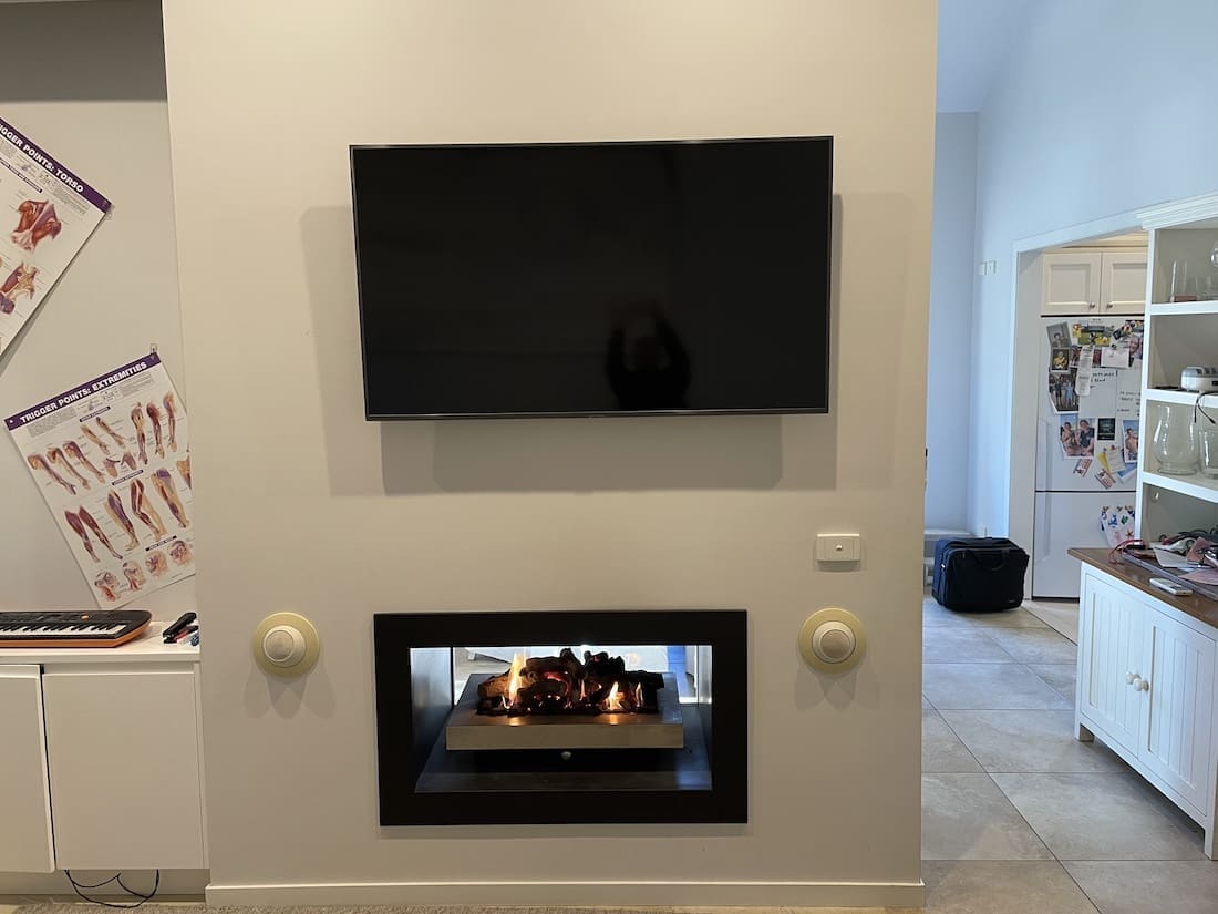
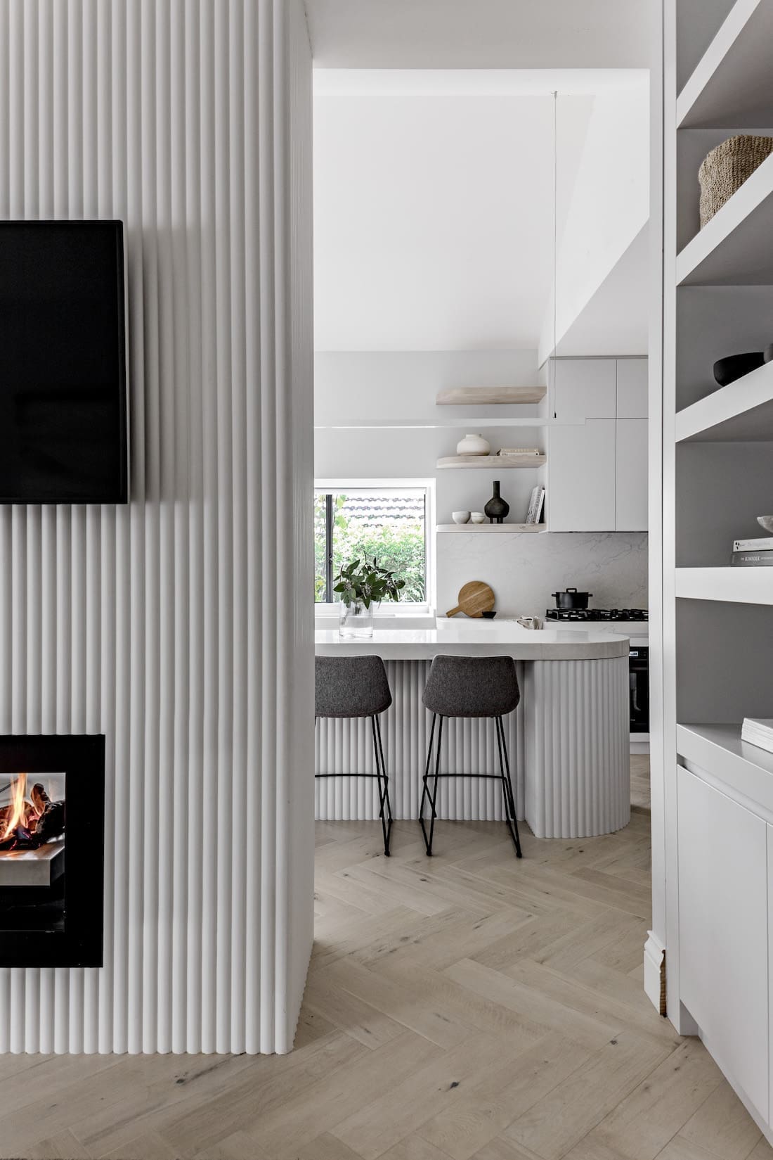
“There was an existing double-sided fireplace in the centre of the home which was the only structure that the owner wanted to keep. Through careful considered design, we worked with the fireplace to subtly divide the living room and kitchen while still keeping an open plan feel to the space,” Laura explains.
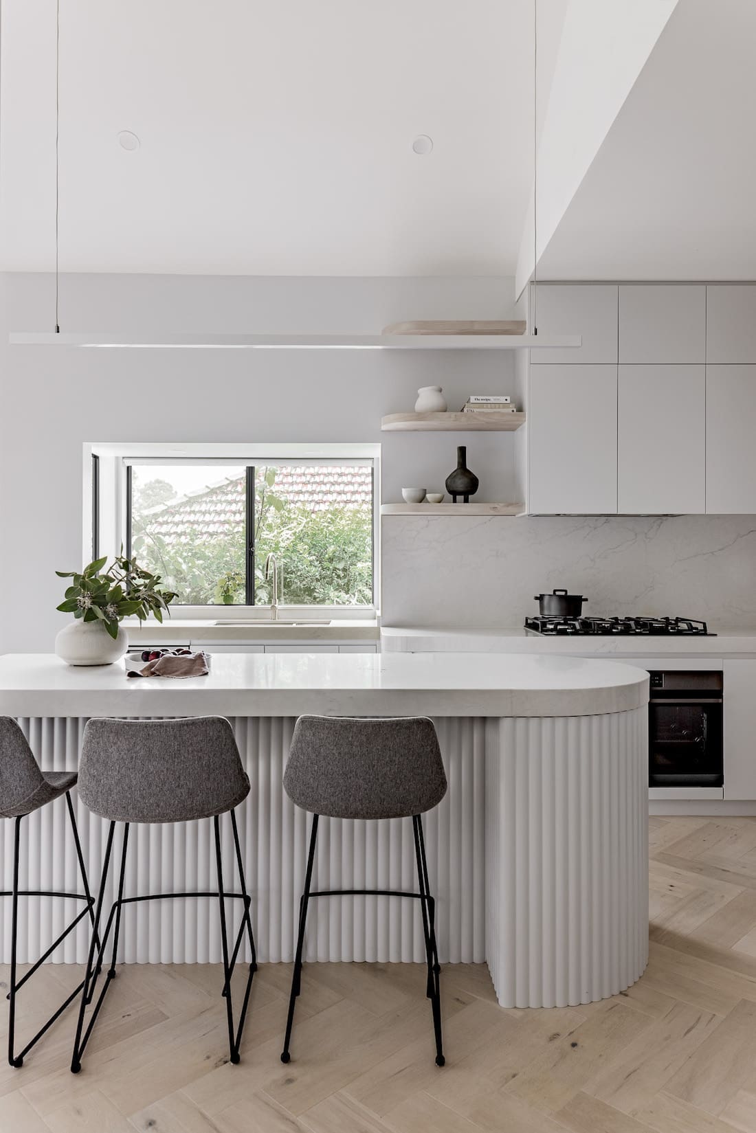
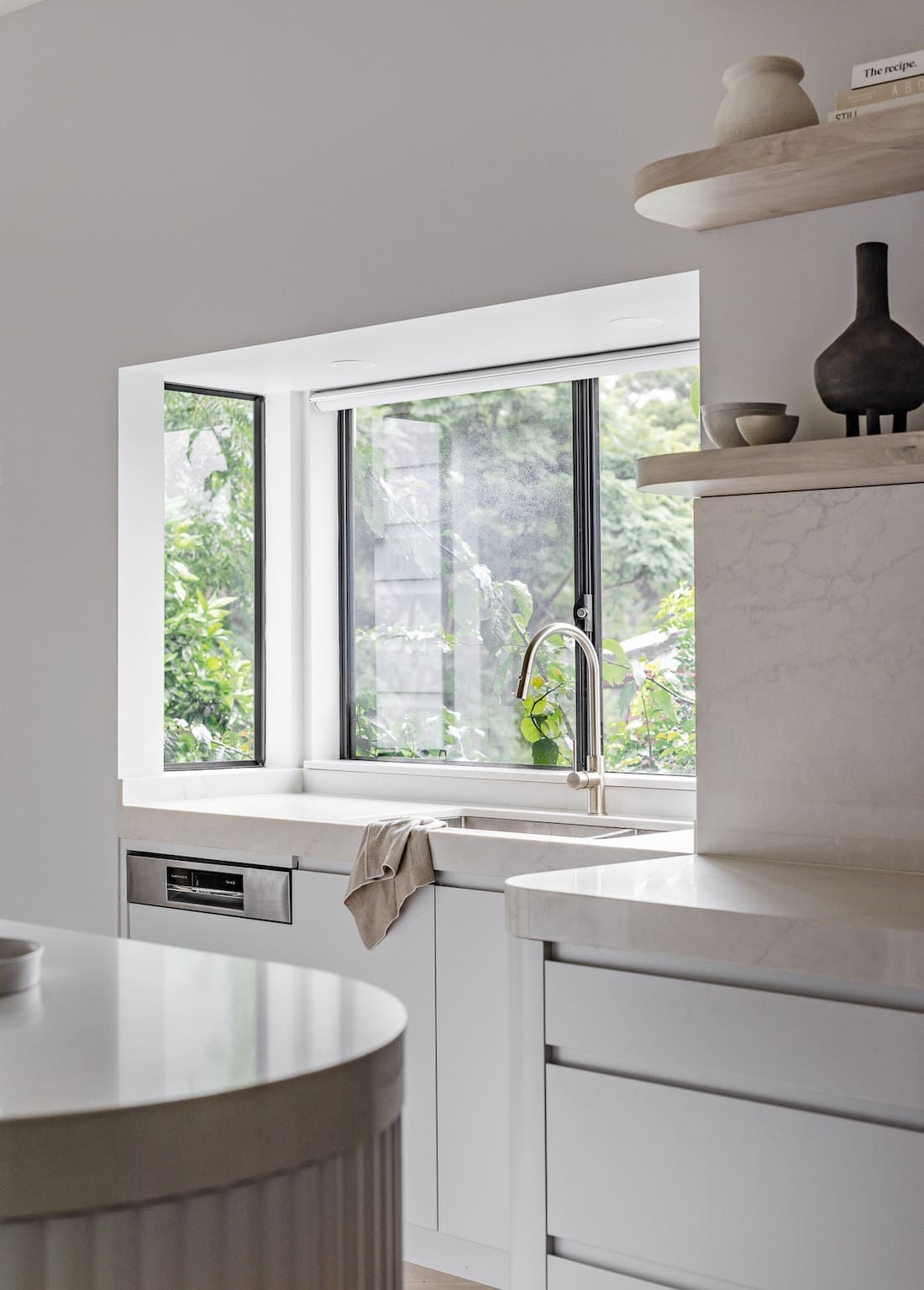
“Because the existing fireplace was a fixed point in a very central position, it was a real challenge when designing the new kitchen. We weren’t left with a great deal of width for the kitchen, so we decided to use the existing bay window for the sink and dishwasher in order to gain the extra space we needed.
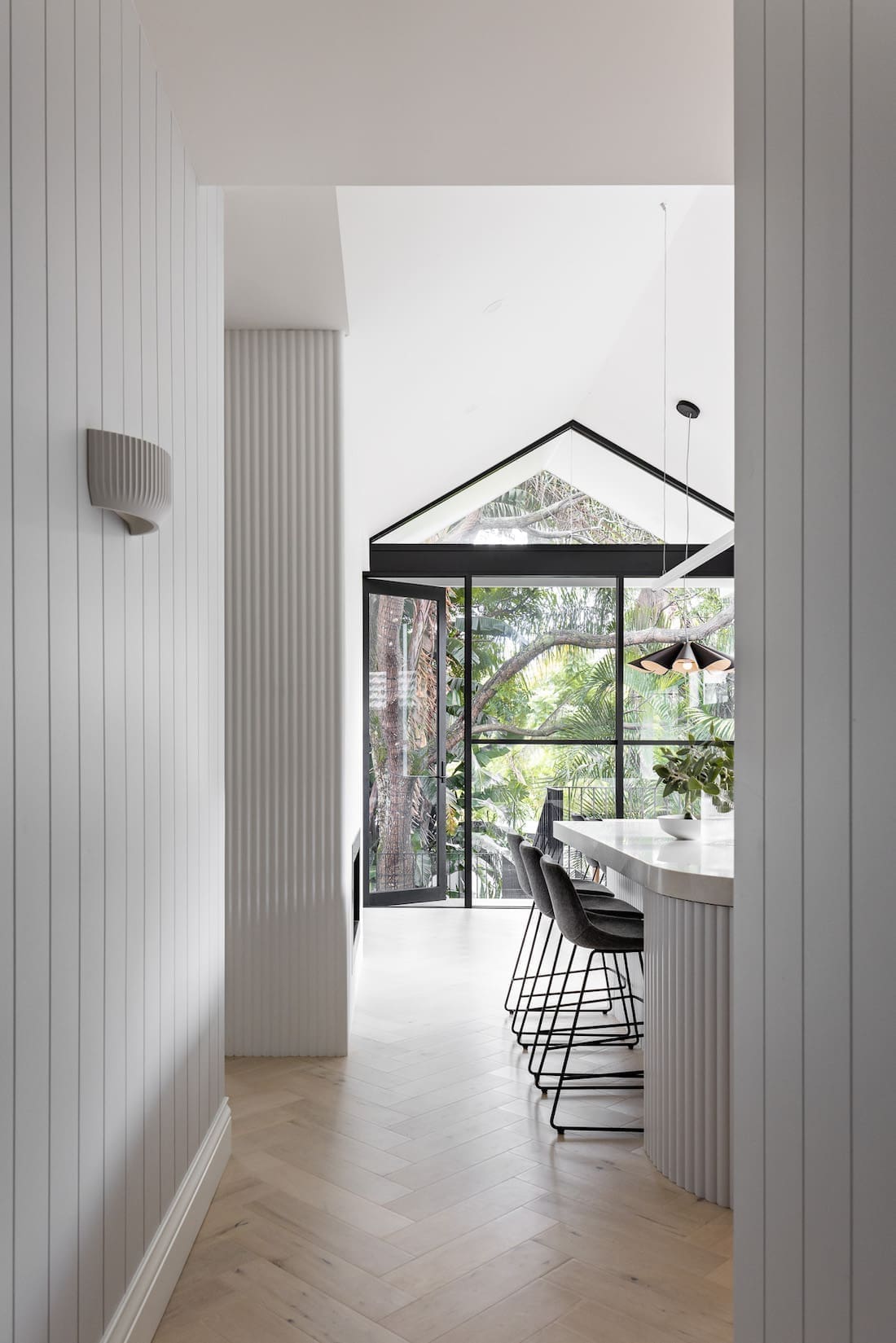
“Another feature in the kitchen design that we love is the perfect curve in the island bench top using 80mm engineered stone.
What most people don’t realise is that this is a highly specialised process! We had to find the right person who had the skills to get it right for us. We were told by MANY that it would be impossible to achieve… but where there’s a will, there’s a way!
The renovation blends traditional elements with modern, sleek design.
“Our aim was to be sensitive to the old cottage,” Laura says.
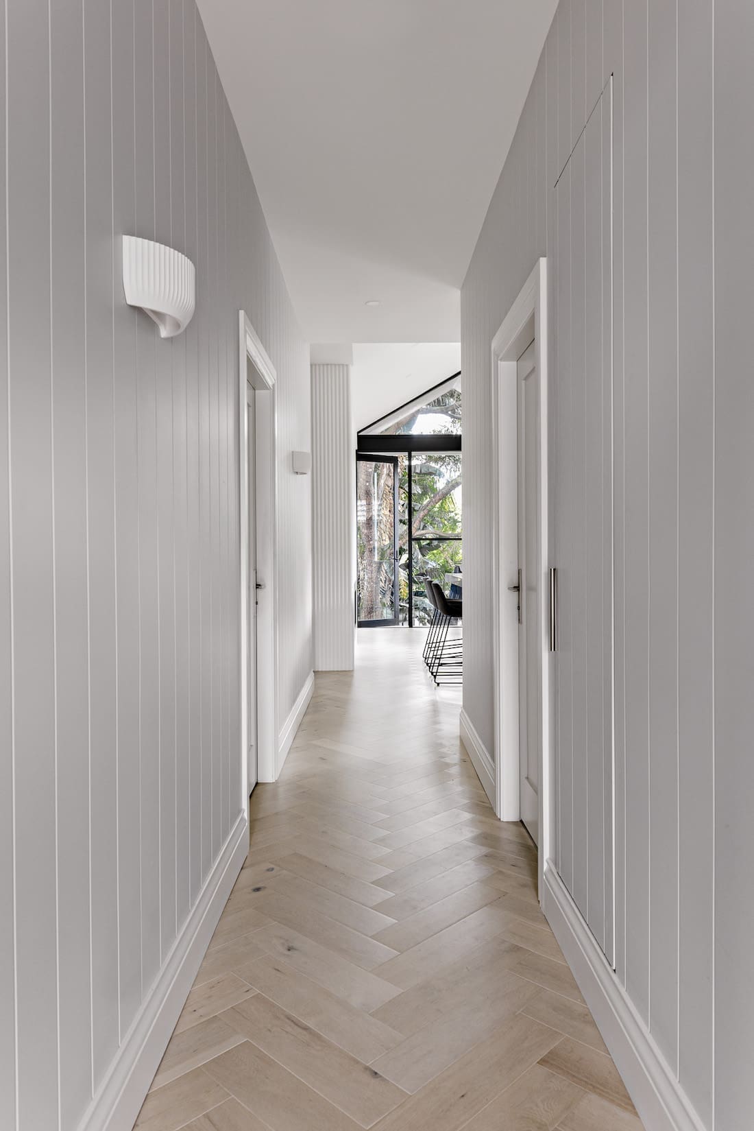
“But we also wanted to bring a feeling of connection to the new renovation. To achieve this, we used a neutral colour palette and similar textures throughout.
“We wanted to created a cohesive design which considerately blended the two styles. For example, the traditional style of herringbone patterned floors were the perfect way to connect past and present.
“We also had a vision of using the ribbed panelling on the base of the kitchen island as a feature, and decided to carry that profile throughout, changing only the colour in each space.”
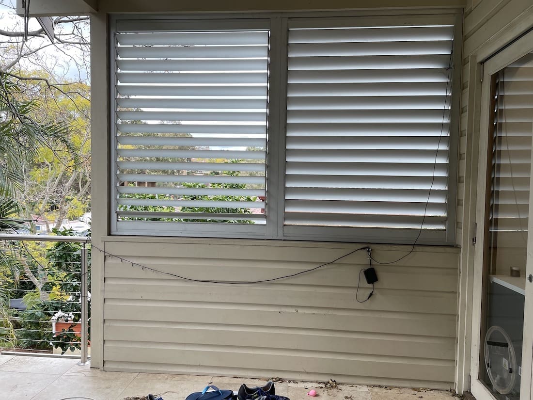
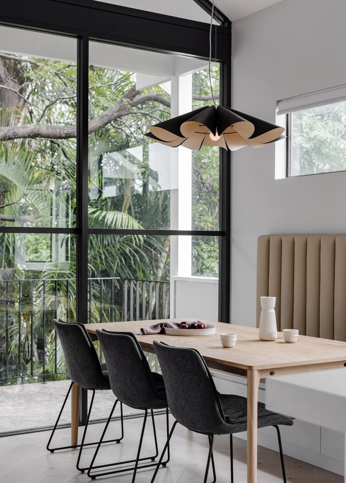
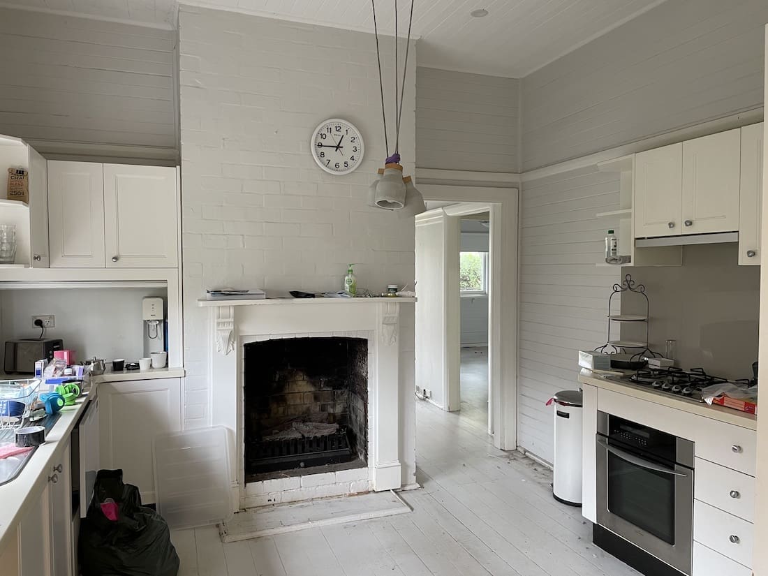
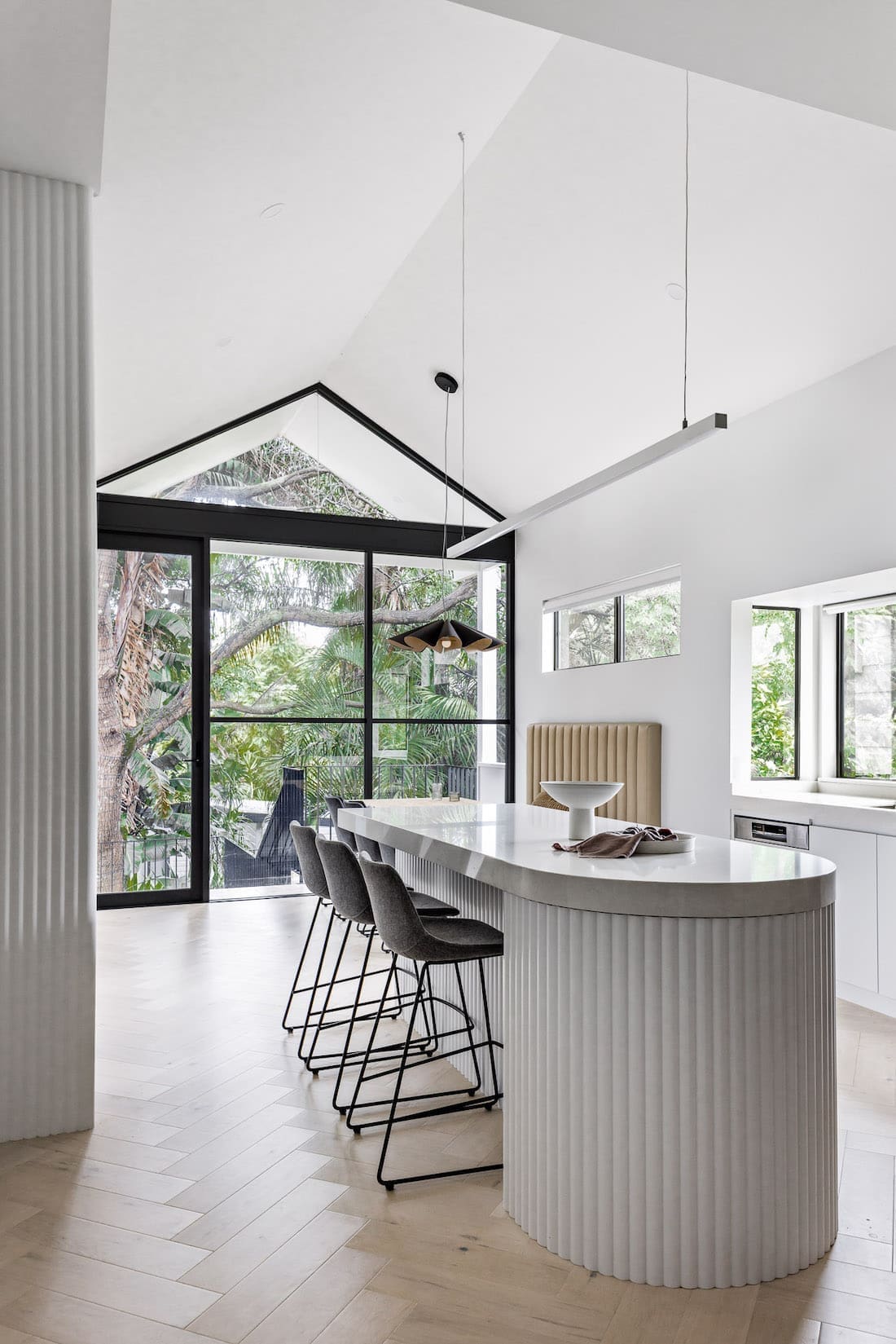
It was the kitchen before and after transformation that caught our eye on a recent Instagram scroll. And it seems the kitchen is Laura’s favourite space too.
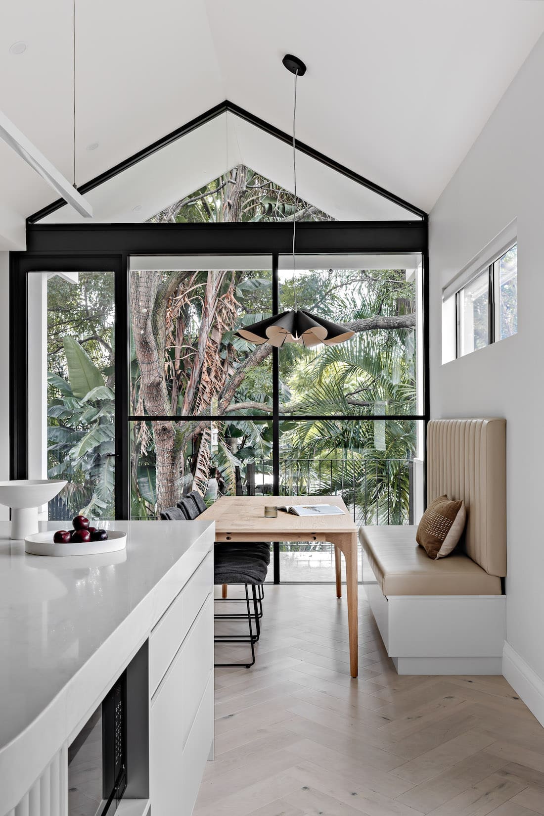
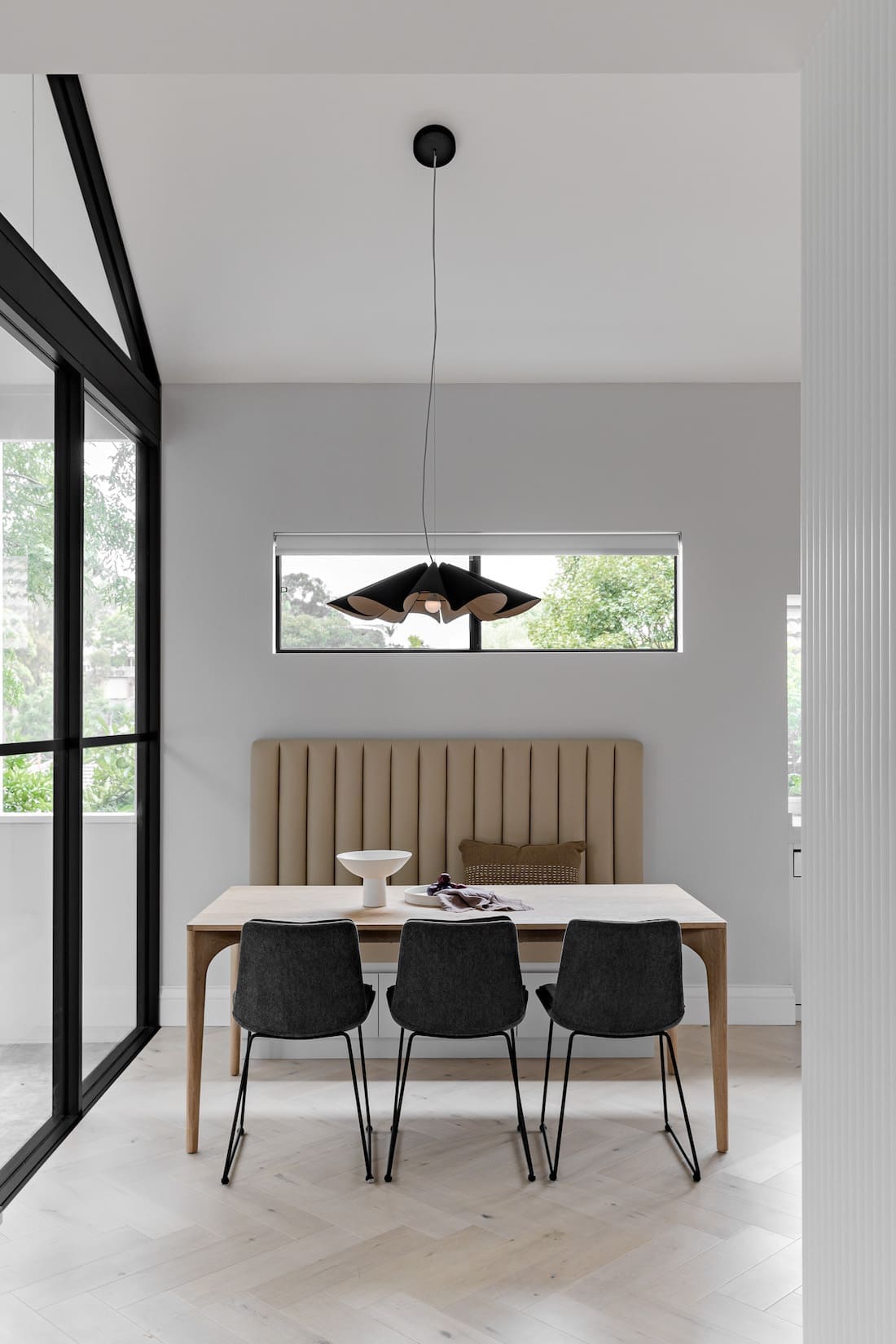
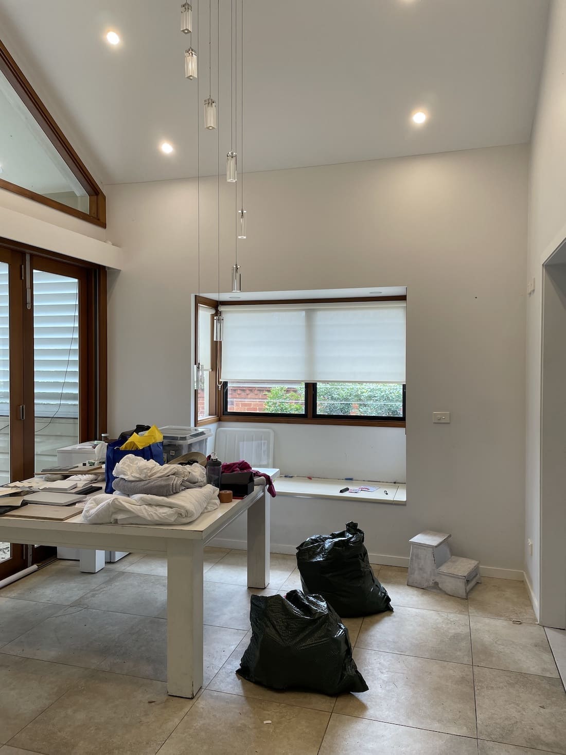
“My favourite space would be the kitchen and dining area,” smiles Laura. “This home has a stunning well-established garden in the backyard, which is a rare find in the lower North Shore.
“From the first visit to the property, I immediately had a vision to ‘frame’ this lush green outlook and make a feature of it from the dining room.
“To make a bold statement, we used black semi-commercial windows and created a pitched cathedral ceiling. I wanted the feature lights to seem like they were floating so not to distract from the view, while still bringing ambience to the interior. The end result is just stunning.”
Design — Branche Designs
Photography — The Palm Co
Construction — Rez Construction
Thank you so much to Laura for allowing us to take a peek around this wonderful before and after home project. Be sure to drop by Branche Designs website to view more of their gorgeous projects, or take a scroll through their Instagram account.
Were you as amazed at the home’s transformation as we were? Did you have a favourite feature? Chat with us in the comment section below!
More before and after home tours here

