Snooza dog beds

The Block Glasshouse: Apartment 6 week 1 room reveals

Last night revealed The Block Glasshouse: Apartment 6 week 1!

There’s a lot of money on the line during these challenges and the contestant weren’t afraid to get competitive.

With the winner of the Apartment 6 challenge getting $20,000 off their apartment’s reserve price, the runner up $15,000 off and third place $10,000 off, it’s not surprising things got a bit heated this week.

Related article: The Block 2021: Week 10 — Backyard and pool week
Related article: The Block 2021: Week 11 — Garage, study and wine cellar week

Darren & Dee’s ensuite

Darren and Dee were determined to win the challenge and that’s exactly what they did, scoring themselves a sweet $20,000 off their apartment’s reserve price at auction.

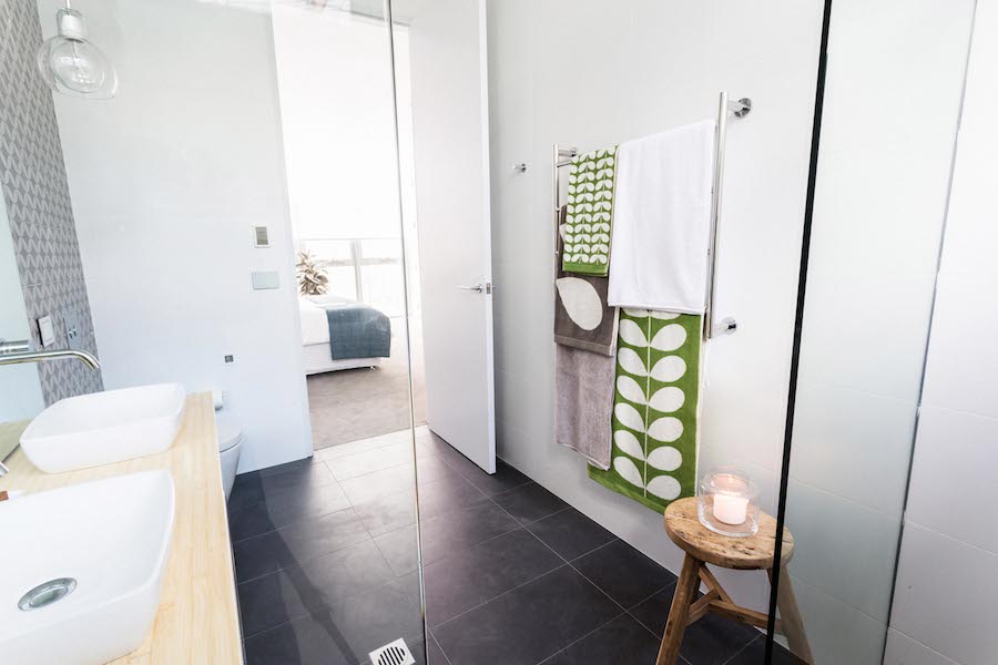
Their ensuite was a hit with all three judges. Shaynna said it was “sophistication without snobbery” and almost fell over when she discovered the heated towel rail.

Darren said lacquered bamboo is the stuff from his nightmares but that it actually works really well in their ensuite because of the finesse and design they’ve used.

Everyone had a laugh when Neale said he might stick his head out and say it’s one of the best bathrooms on the Block (a phrase we’ve heard a couple of times before 😉 ).
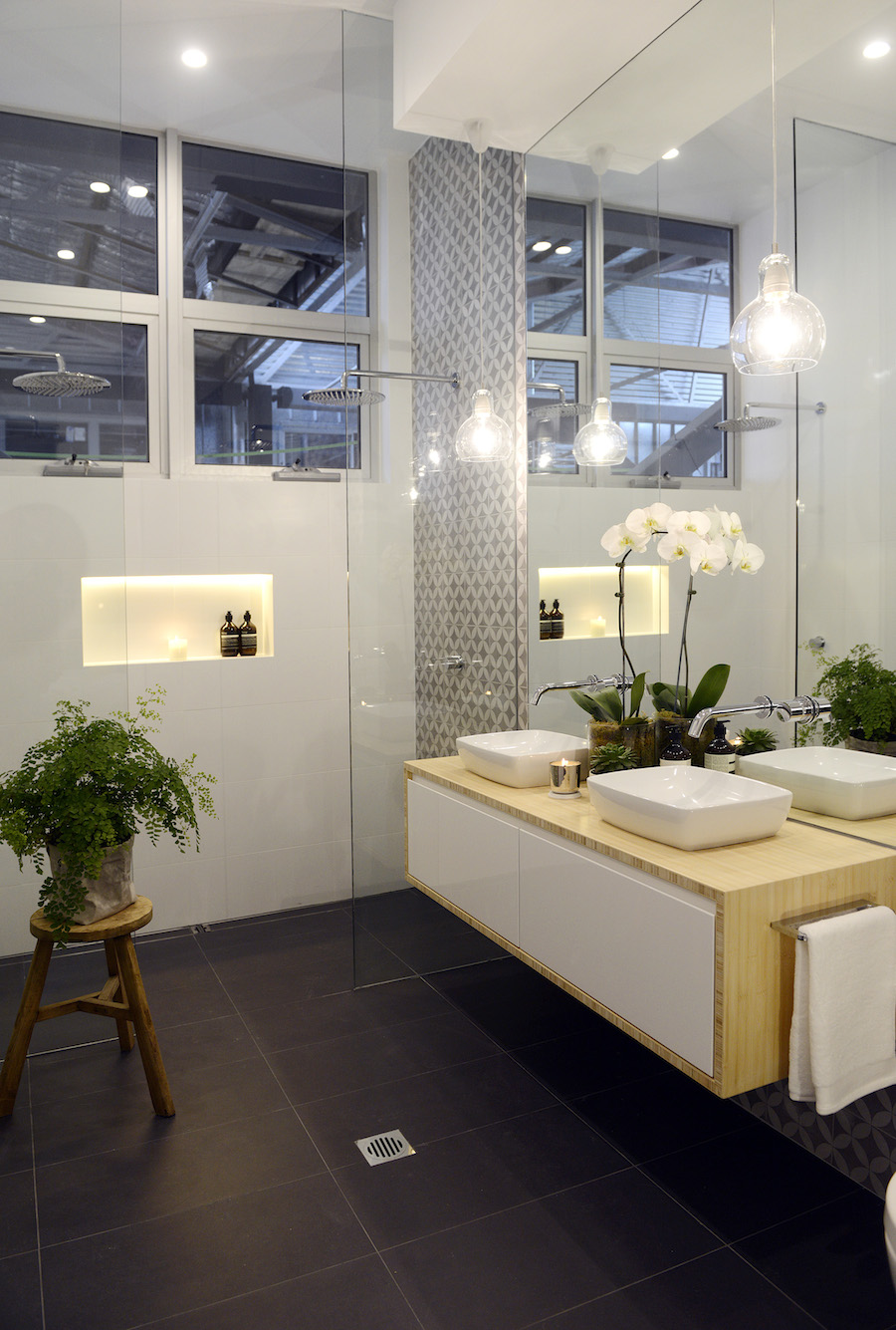
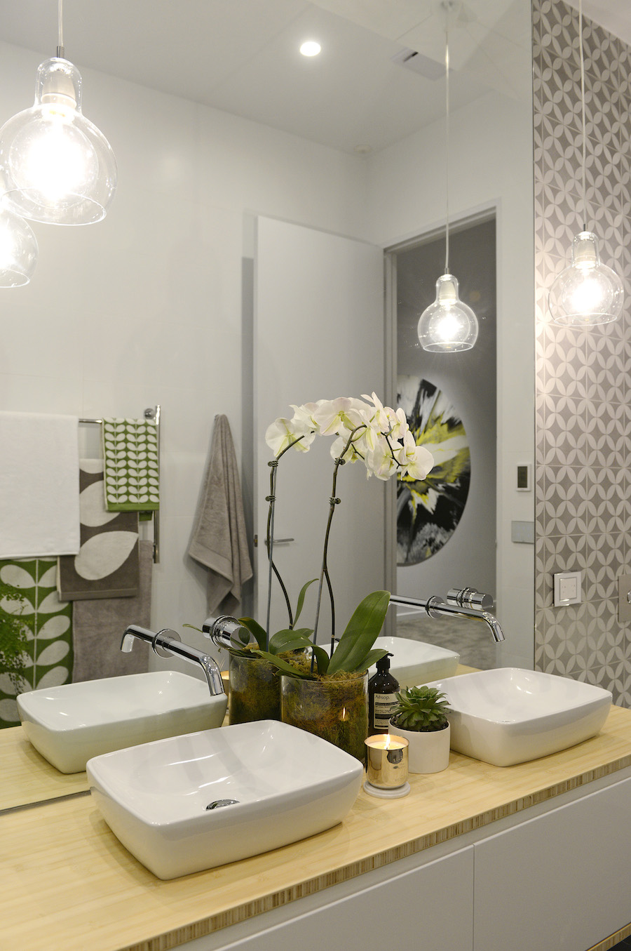
Darren and Dee's ensuite
Darren and Dee’s ensuite
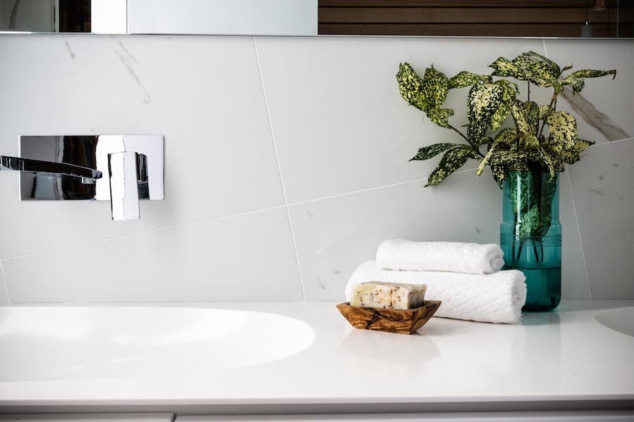
Vanity and geometric tiles
Darren and Dee heated towel rails
The heated towel rail and towels Shaynna loved

Max and Karstan’s master bedroom

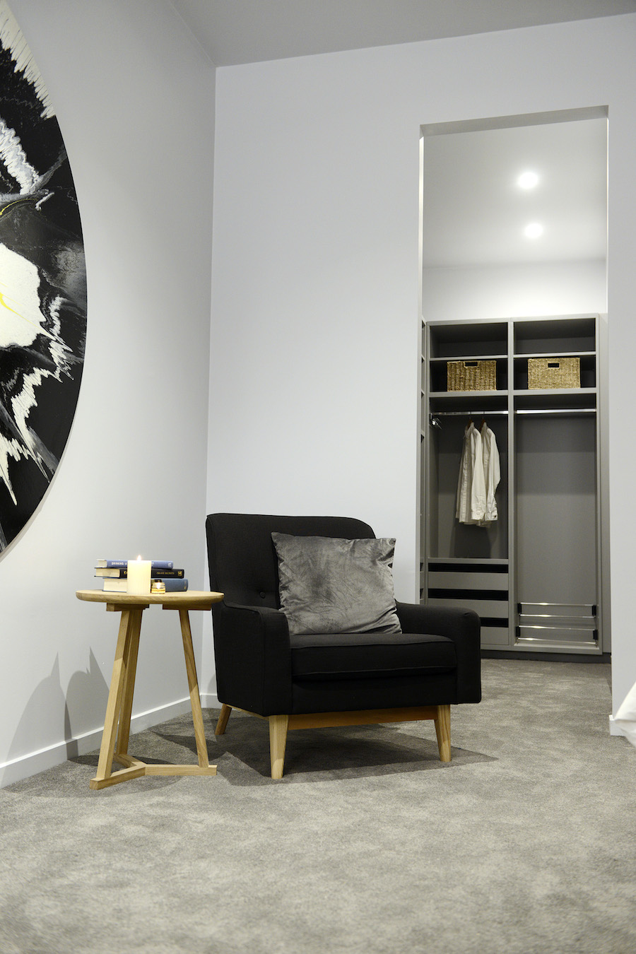
The judges didn’t have to guess for a minute who’s room this was — statement art, luxe cabinetry in the walk in and paired back styling all screamed Max and Karstan.

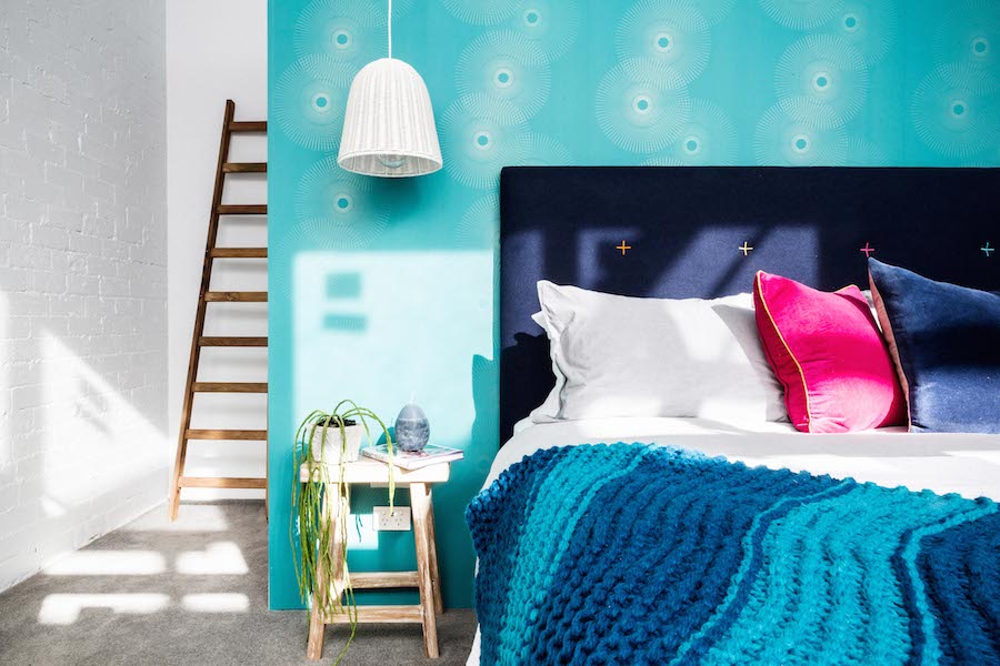
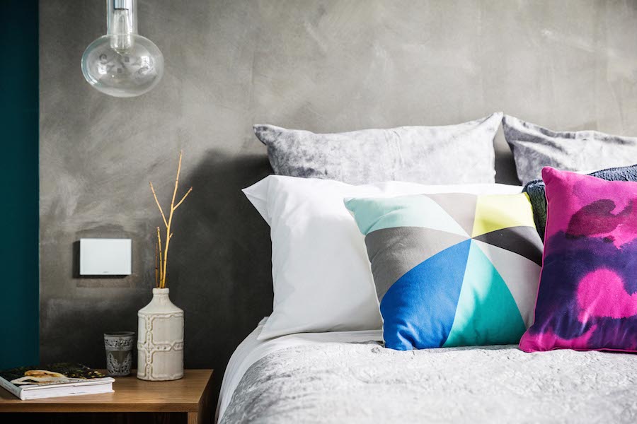
At first Shaynna felt she’s “not seeing anything cohesive here” but Neale pointed out the continuation of the ’70s theme with the choice of teal blue colour and the rubber plant, and he was impressed on the delivery of the look.

Max and Karstan walked away with $15,000 off their apartment’s reserve!
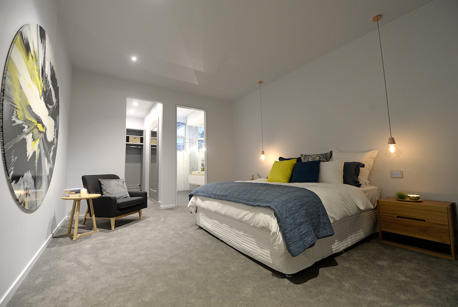
Max and Karstan's bedroom
Max and Karstan’s bedroom
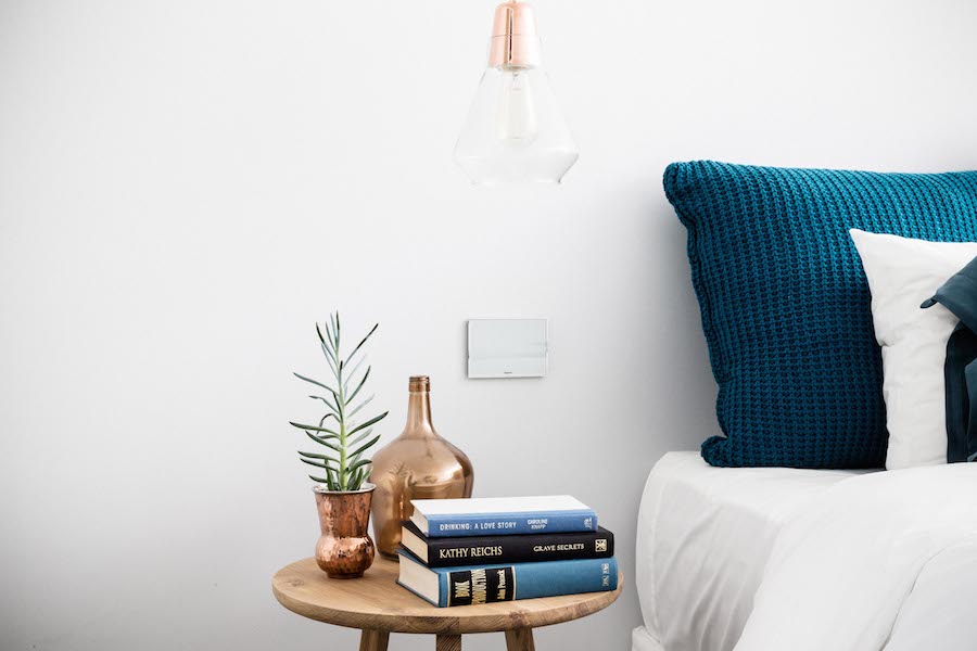
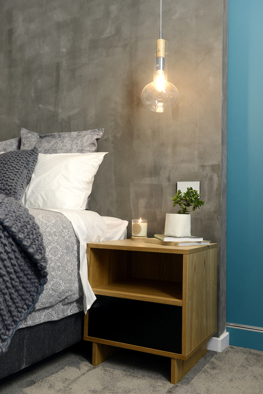
Bedside styling
Bedside styling
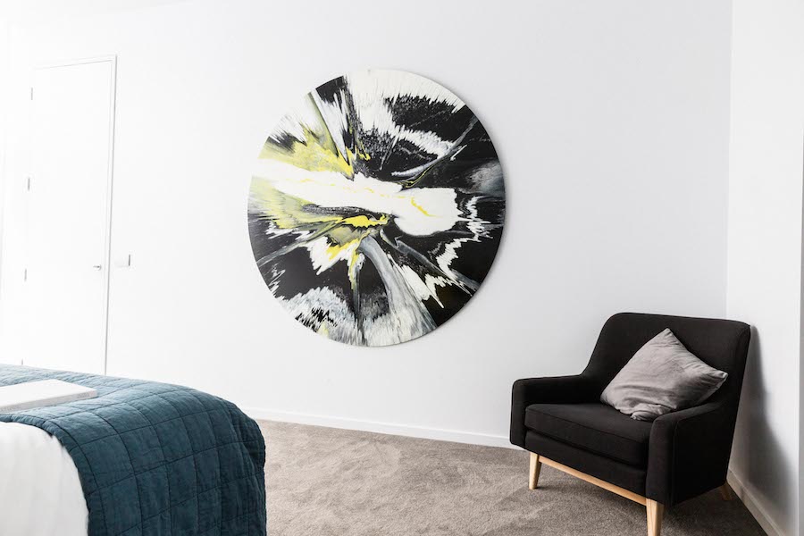
Max and Karstan statement artwork
Statement artwork by Tim J S Wise
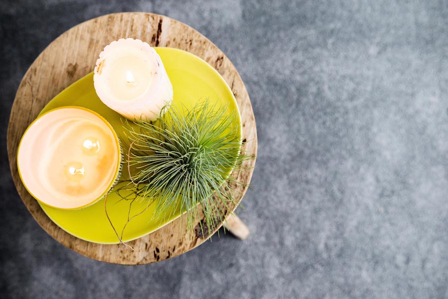
Max and Karstan styling
Max and Karstan styling up close
Peek into their walk in robe

Simon and Shannon’s bathroom

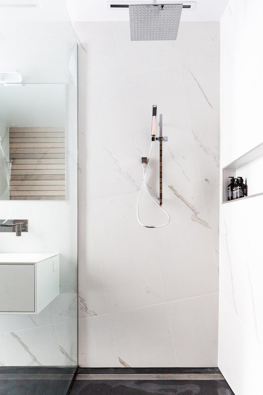
The geometric pattern the boys created by angling their large marble tiles immediately caught the judges’ eyes (although they did feel for the poor tiler!).

Shaynna loved the copper and concrete pendant lights from Josh and Jenna’s new lighting range.

Despite the judges being disappointed the toilet didn’t have an in-wall system, they still placed Simon and Shannon in third place, taking $10,000 of their apartment’s reserve price at auction.
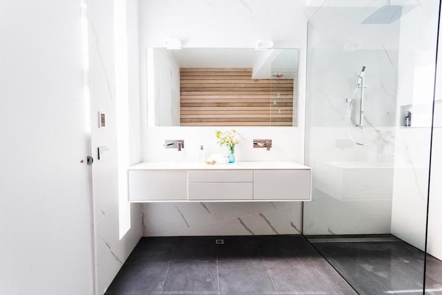
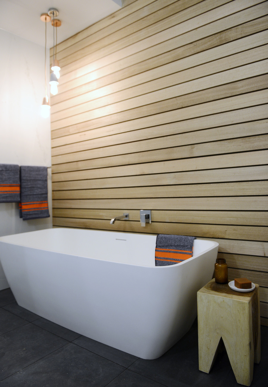
Shannon and Simon's bathroom
Shannon and Simon’s bathroom
Copper and concrete pendant lights
Shannon and Simon shower
Large shower impressed
Shannon and simon vanity
Close up of the vanity and angled tiles

Michael and Carlene’s bedroom

Carlene hoped the judges could appreciate the light heartedness of their room.

Neale got it right away, saying it felt like a den and had a sense of humour. Although he did feel the styling was slightly messy and let the room down.

The scale of the room and quality of finishes got Shaynna’s tick, and Darren thought it was a great unisex room that would be well suited to a teenager.

Unfortunately for Michael and Carlene, they didn’t place in the top 3 and won’t receive any money off their apartment’s reserve price.
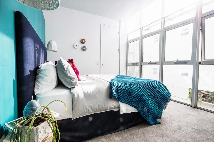
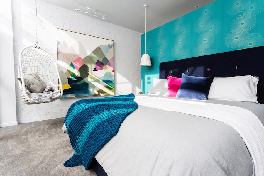
Michael and Carlene's bedroom
Michael and Carlene’s bedroom
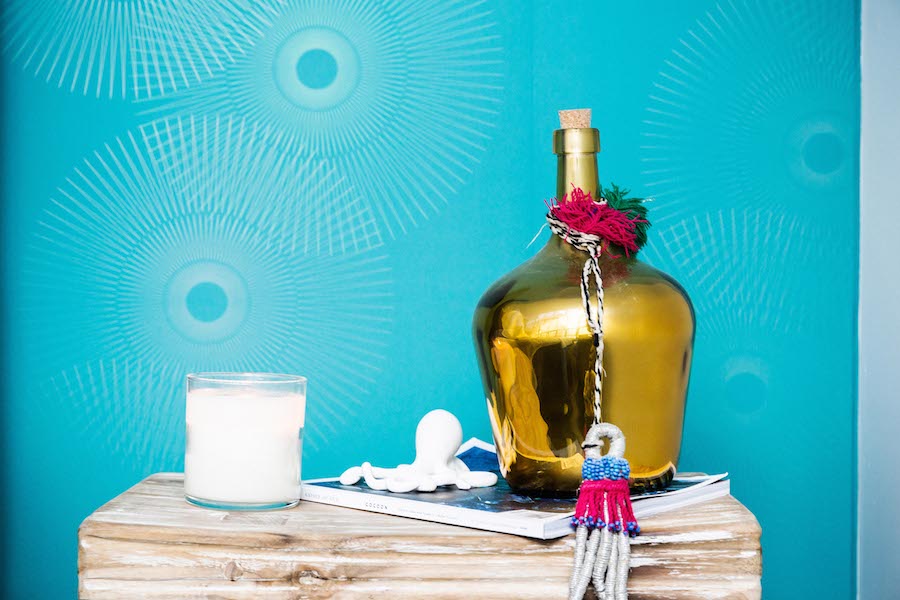
Michael and Carlene artwork
Stunning artwork by Belynda Henry
Fun teal blue wallpaper in Michael and Carlene's room
Fun teal blue wallpaper
Michael and Carlene bedroom styling
Bedside styling
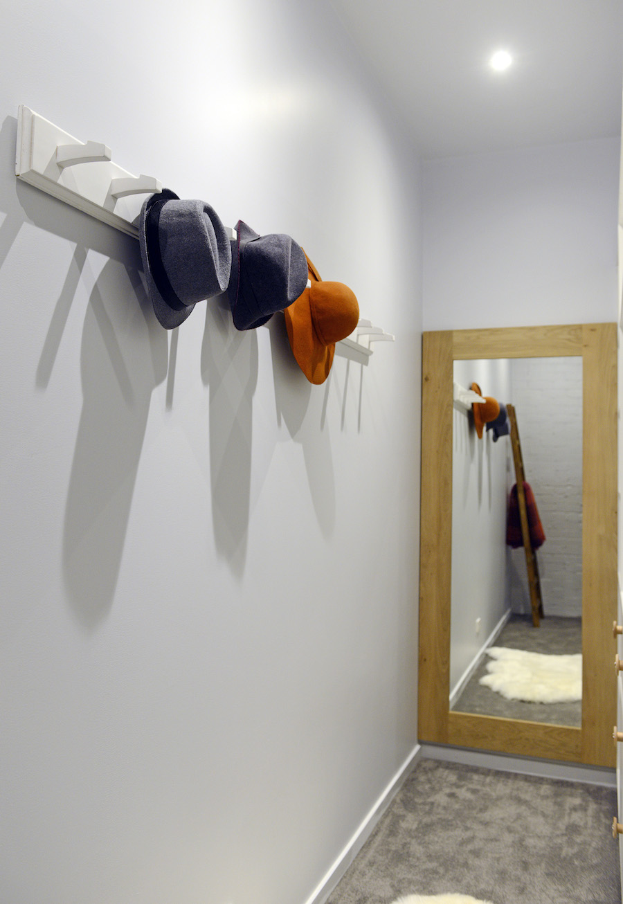
Michael and Carlene walk in robe
Walk in robe with peg hooks

After the judging, the contestants were able to walk through each other’s rooms and this left Carlene feeling a little confused. How is it an unfinished room (Shannon and Simon’s bathroom) could get such a high score? She thought an unfinished room was an absolute no no. Michael joked “they must have really hated our room”. In all seriousness though, Shannon and Simon’s toilet wasn’t installed (just placed), some surfaces were not painted, there was no door handle and there was still wood under the mirror holding it in place.

Hopefully our faves can walk away with some cash next week although it’s pretty hard to impress with a laundry.

Chris and Jenna’s bedroom

Ah these guys just keep getting caned. Even with the judges not knowing who completed each room, they got ripped to shreds.

Neale felt the grey on grey was cold (to which Jenna suggested he “get a beanie”) and that overall it was not a sleep inducing place. Although there were pockets of the room he pointed out worked really well like the styling by the chair.

Shaynna (aka Storage Queen) was mortified when she saw the centre of the cupboard could not be accessed — especially as Chris is a cabinet maker!
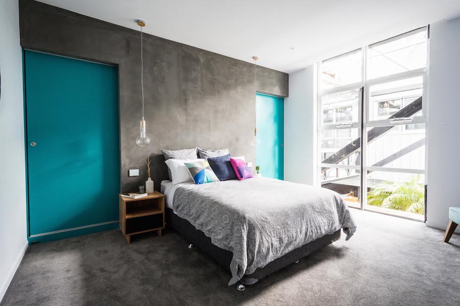
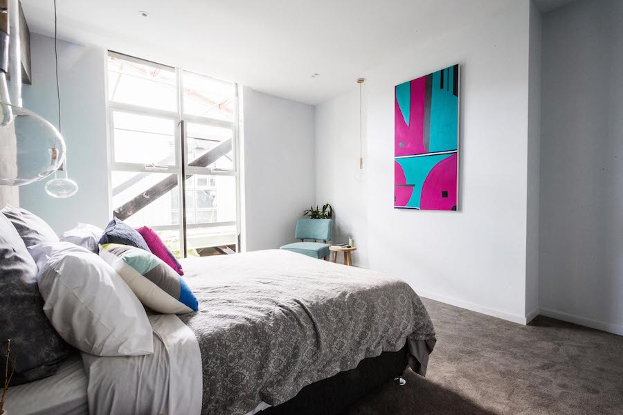
Chris and Jenna's bedroom
Chris and Jenna’s bedroom
Chris and Jenna self made artwork
Self-made artwork
Chris and Jenna beside styling
Bedside styling
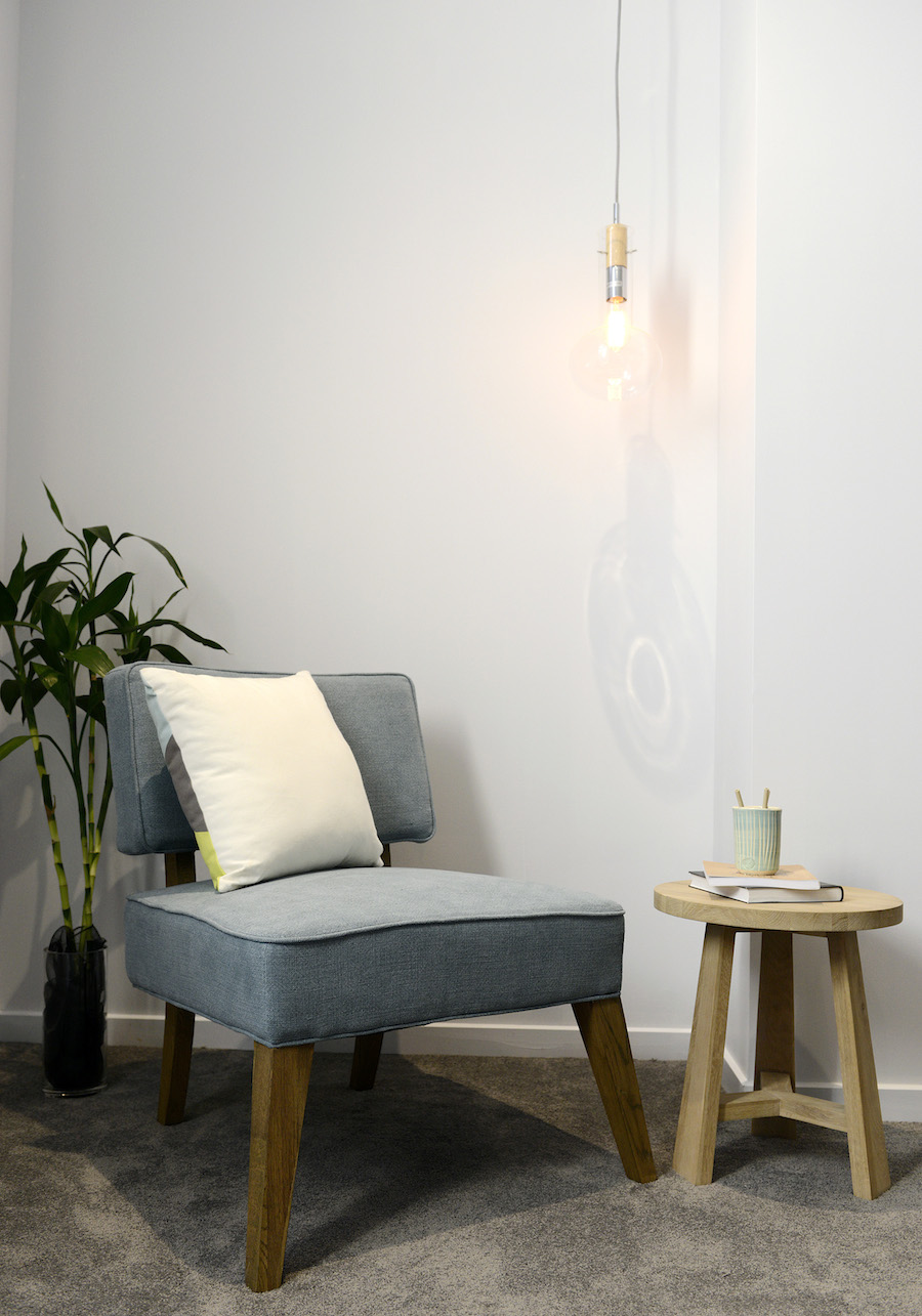
Chris and Jenna chair styling
Neal complimented the styling of this space
Bright mismatched cushions

Images via Jumpin The Block Glasshouse.

What were your thoughts on The Block Glasshouse: Apartment 6 week 1 rooms? Did you agree with the judges scoring and comments? We thought Michel and Carlene should have beaten Shannon and Simon. Tell us what you think in the comments below!

Find more Block reveals here

Gina Beschorner Style Curator

Welcome to Style Curator, your destination for daily interiors inspiration, styling tips, reno advice, home tours and DIY projects!

We're on a mission to help you create a home you love. And with plenty of tips and tricks, tutorials and other home inspo, we give you all the tools to achieve it!

I’m Gina, Founder and Interior Designer, and you can read more about Style Curator here.

Subscribe

Get the best of the blog to your inbox each week PLUS instant access to our free downloads!

    We respect your privacy. Unsubscribe at any time.
    Interior style quiz

    Shop our fave online stores

    Vorsen
    Betta
    Koala Eco

    As seen in

    Style Curator in the media

    Altina

    5 COMMENTS

    1. I don’t think it was ever a level playing-field. The couples doing bathrooms received the same budget as the other rooms PLUS Reece vouchers PLUS Beaumont Tiles vouchers, so they had almost unlimited budgets versus the bedrooms!
      Additionally, those who had “friends” who happen to be professional artists do artworks cheaply is surely against the rules of not paying less than 50% for the market/retail value of items for rooms?
      I did like Dee & Darren’s ensuite and styling however their door would also have been unfinished had Carson not helped (then they squealed like selfish brats about Keith helping Simon by teaching how to hang a door!). I agree with others that the boys’ unfinished bathroom should not have been eligible or at least marked down like other rooms in past have been so as not to gain a placing.
      I was not a fan of Chris and Jenna’s bedroom on the whole — parts of it were nice but they don’t seem to learn?
      I never liked Michael and Carlene’s colour schemes throughout their apartment (I just don’t have a love of the grey-and-hospital-green theme!) so their bedroom with it’s teen-styling didn’t appeal.
      While the styling overall on this series of The Block is the best yet (gone are the in-your-face bizarre ‘humourous’ – read childish – styling of some on previous series!) it’s hard to watch when so many things seem unfair and the contestants are held up by building events that should have occurred before the contestants were on site!

      • Hi Sal

        Sounds like you’re a longstanding Block fan like us but with behind the scenes intel – thanks for sharing all that juicy goss!

        Agree that the Block has come a long way, we recently re-watched the first season when Jamie Durie was on it! OMG some of the stuff they did back then was hilarious.

        Will be interesting to see how the next room reveals go and whether or not they’ll even out the playing field a bit.

        Would love you to tell us what you think of the next lot of rooms too!

    2. Dee and Darren’s ensuite was superb. I want that space for myself! I also really liked Carlene and Michael’s room and I thought they should have placed.
      I thought Max and Karstan’s room was cold, uninviting and sterile. No appeal for me at all. The boys bathroom had potential but they shouldn’t have been placed with an unfinished room. The less said about Chris and Jenna, the better!

      • Ha ha, ruthless Kirsten! Sadly Chris and Jenna seemed to have peaked early in the comp and it’s been hard to watch ever since.

        Loved loved loved D&D’s ensuite too and agree with all your other comments! The finale is just around the corner, woot!

    3. Michael and Carlene should have come second. The boys room was so unfinished and messy and their bedroom was way better than Max and Karstan’s room.

    LEAVE A REPLY

    Please enter your comment!
    Please enter your name here