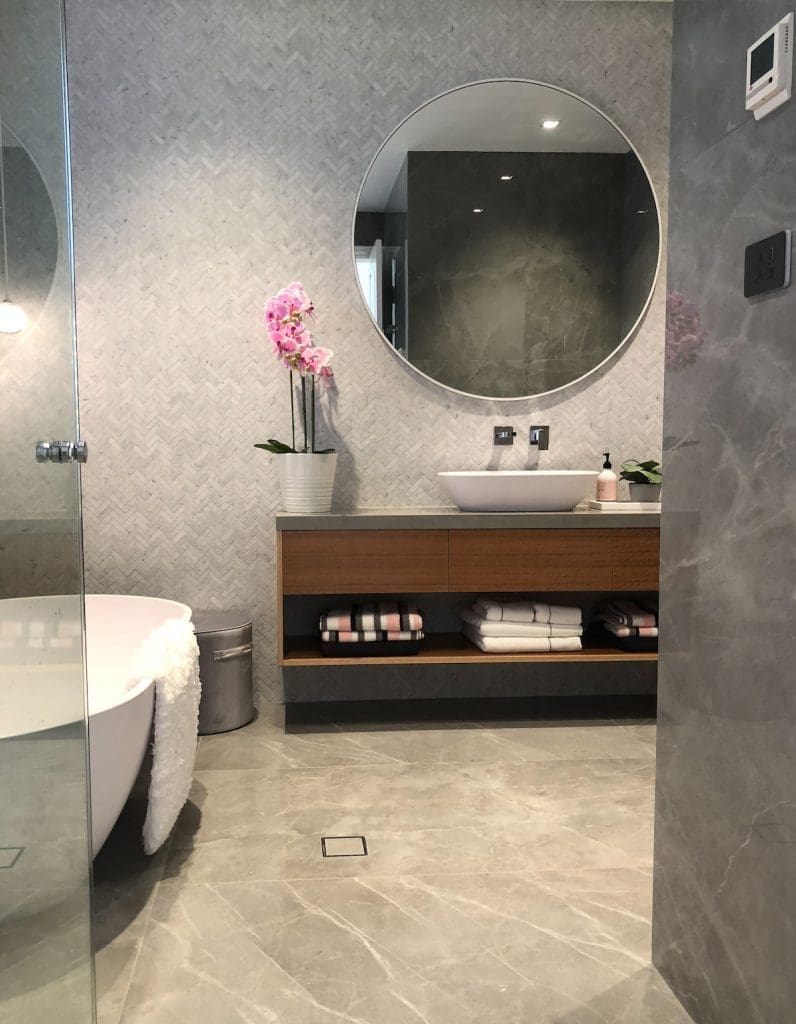
A big lesson we learnt in bathroom design is the value of free space to create the sense of luxury. By that we mean, downsizing your vanity or bath can often create a more luxe feel because there isn’t a sense of being cramped. It’s a strange thing to get your head around when so often we’re told ‘bigger is better’.
Design lead and founder of YOLK Interior Design, Nicola Smith, demonstrates the value of space in this recently completed classic bathroom project.
Related article: 15 stunning bathrooms that don’t use white tiles
Related article: Hamptons luxe bathroom reno that’s loaded with #bathroominspo
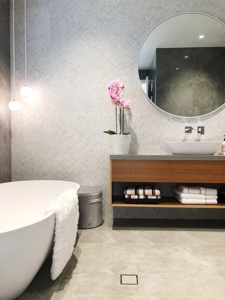
“This bathroom is mainly used by the grandchildren and guests and had a disproportionate amount of storage — a full wall vanity with cupboards below and oversized mirrored cabinets above,” she explains.
“We were keen to simplify the design and treat the vanity and mirror more like furniture items.”
While the original brief was for a light and bright bathroom, the space evolved as new materials and products were introduced.
“Our client had the luxury of time and took many visits to suppliers to explore products and finishes.
“They loved the large format tiles they discovered at a local tile store, which we had to use. I was concerned with finding a way to make a modern bathroom fit within their heritage home. It was important to create a bathroom that complemented the original features. For example, parquetry floors throughout the home. I also wanted to achieve a sense of space, light and calm.
“We went through about three tile iterations before deciding on the final selections — in the end, it was very much a collaborative process between the client and us.”
Working with the constraints of existing plumbing and room size, she and her team set out to create a demolition plan and proposed a new floor plan.
“We took the opportunity to remove all the hobs and level the floor. With a clean slate we worked on placement and scale.
“A common mistake I see people make is placing a bath between three walls, in a tight space. They lend themselves to having free space around them, at least on two sides.”
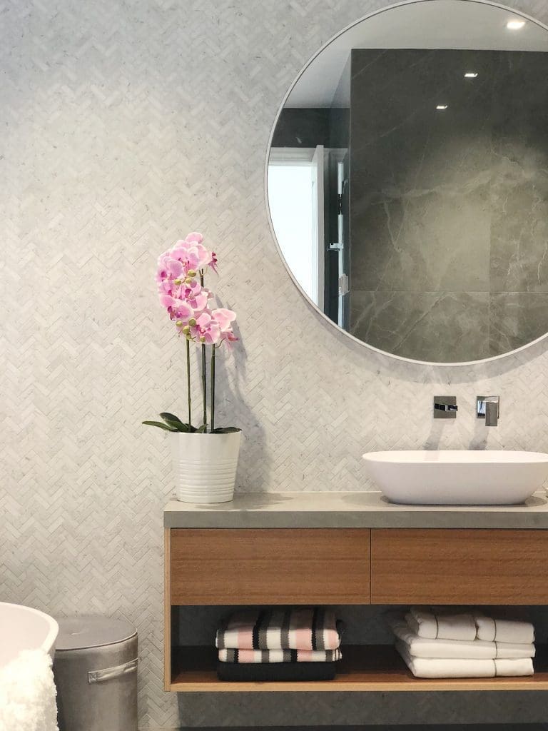
One of our favourite features in this bathroom is that stunning floating vanity.
“We had it custom built by Capital Veneering and it brings personality into the space. Although it’s a fraction of the size of the original vanity, it still offers plenty of storage. And I love the combination of materials.”
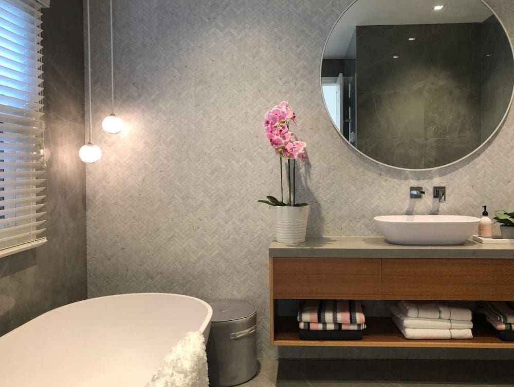
But Nicola says her favourite aspect of this bathroom is the use of tiles.
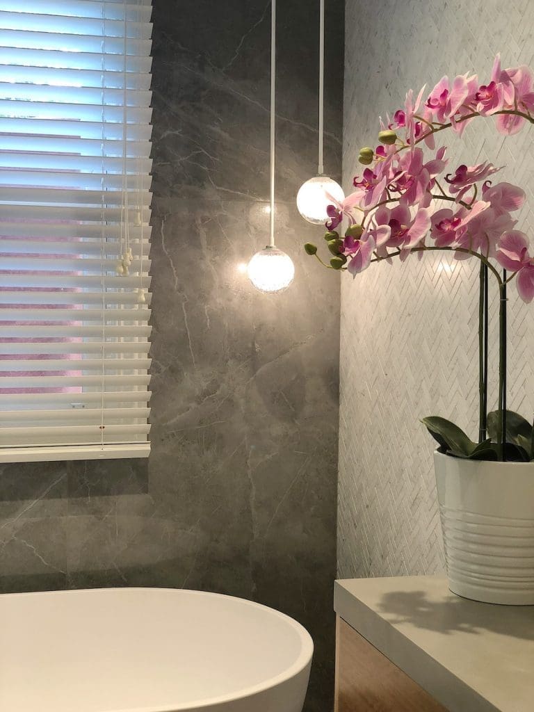
“It’s not often you get to work with a client with this kind of budget so using those honed Carrara marble herringbone mosaic tiles was a real treat for me. I also love how we combined three different tile formats in one bathroom — it was certainly a fun project.
“The pendant lights are another favourite. We specified those from Articolo in Melbourne and they are hand blown glass.”
The client brief was to create ‘wow factor’ with sympathy for the heritage features and original architecture of home and we think Nicola and the team nailed it with this classic bathroom! You can connect with the team on Instagram.
Check out more bathroom inspo here
