Hold on to your hats, friends! We’re calling today’s home tour to make it into our Top 10 most popular tours ever! Just keep scrolling to see this modern home makeover that incorporates black panel joinery with warm timber accents and stunning pops of terrazzo. It’s a show stopper by GIA Bathrooms & Kitchens!
Related article: Design inspo: Beautiful black kitchens
Related article: Real terrazzo vs terrazzo-look tiles, what you need to know
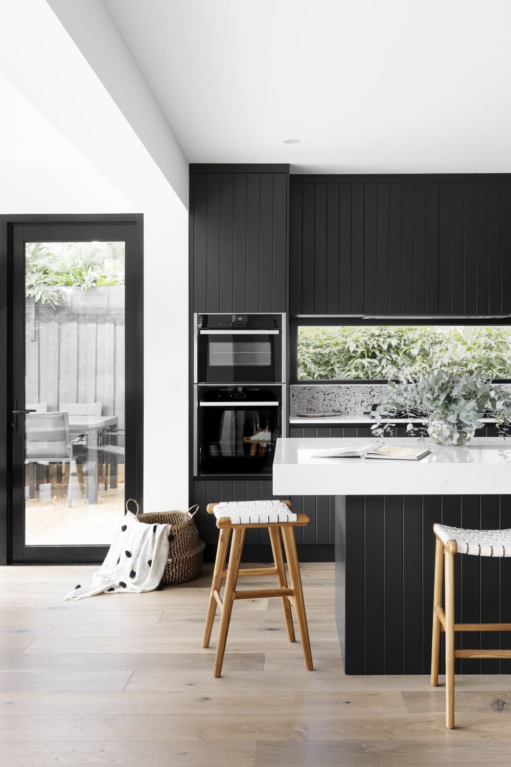
When GIA were brought on board to tackle this project, their brief was to create more storage and open the space up.
“Generally, the owners weren’t satisfied with the amount of storage space in the house. The pantry was also difficult to access and the dining area was small,” explains Kia Howat, Interior Designer at GIA Bathrooms & Kitchens.
“Visually, they wanted an interior with an abundance of natural light.
“It was an extensive renovation project to revamp this home for a family of five. We added an extension at the rear of the home and reworked the wall structure to improve the internal configuration to further suit the family’s needs.”
Keeping on brief to create a large, bright space meant considering some simple, but important details.
“Some of the things this family needed were a larger fridge space and greater dining room space.
“Plus an organised pantry with accessible drawers, designated appliance storage and space for 5 stools.
“The dining area also needed large scale windows or a glass atrium-like roof. This allowed for natural greenery and light to pour in,” Kia explains.
“This is offset by the black joinery and new timber floors that replaced the previous dark slate flooring.”
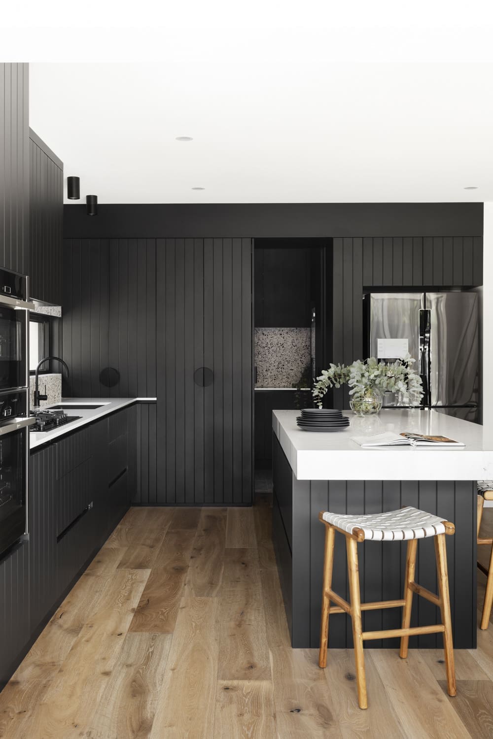
To create more space, a new layout was proposed resulting in a real hidden gem.
“By suggesting a few structural changes, we were able to open things up to improve the kitchen’s visual appearance,” Kia says.
“This helped create deeper joinery to allow for a larger fridge and better pantry storage, as well as a larger island bench.
“The laundry entry is now cleverly concealed behind joinery. Also hidden is a separate powder room with direct access to the outdoor pool area.”
The hidden, walk-in laundry was key to the success of this kitchen.
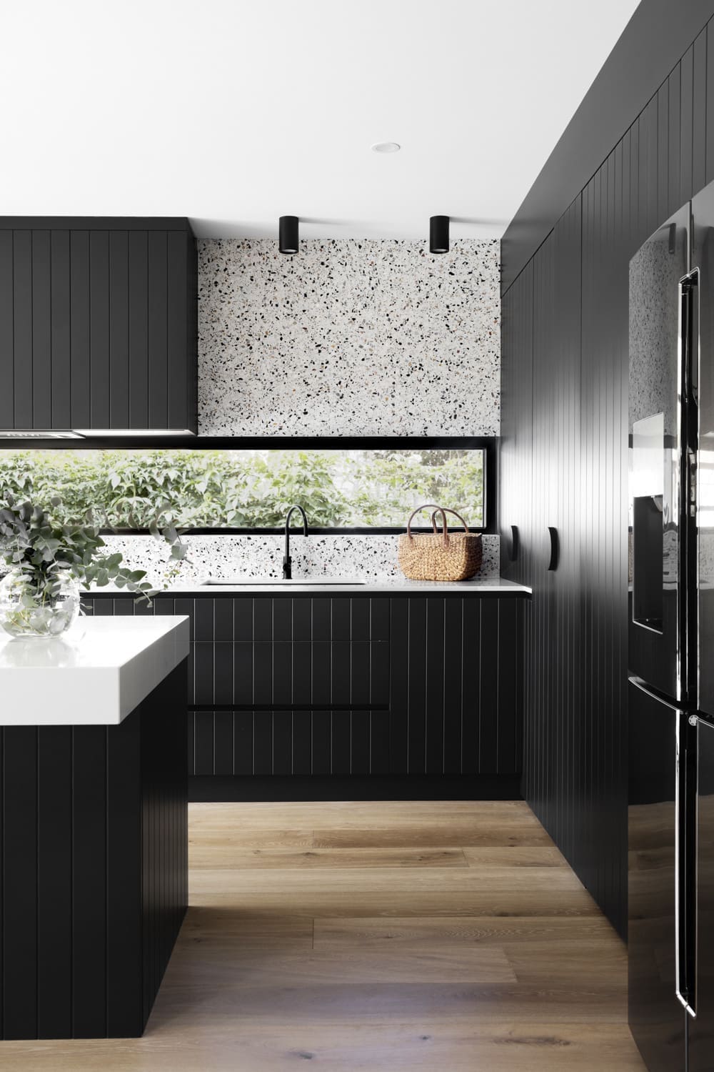
What makes this modern home makeover so unique is the clever mix of materials and textures used throughout.
“A key feature of this renovation was clearly the black joinery. It’s a dramatic feature that allowed us to use a palette of natural textures and materials, including terrazzo, marble and timbers.”
“The joinery is paired with veined white marble benchtops in a thick fascia to the island.
“The white speckled terrazzo splashback frames around the window bringing in an abundance of natural light. It adds a bold contrast to the light and bright aesthetics.”
We love to hear what the people behind the renovation love most about projects they pour their heart and soul into.
“The combination of the 3.5m window splashback and stunning terrazzo in the kitchen is my favourite element,” Kia says with a smile.
“The harmony of materials works well and creates such a fantastic impact upon entering the space.”
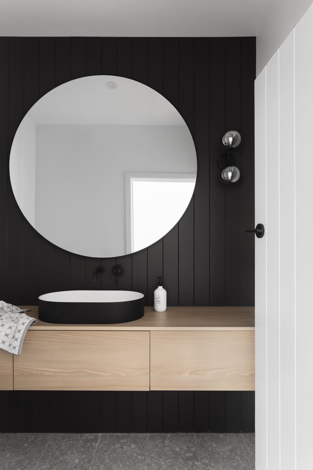
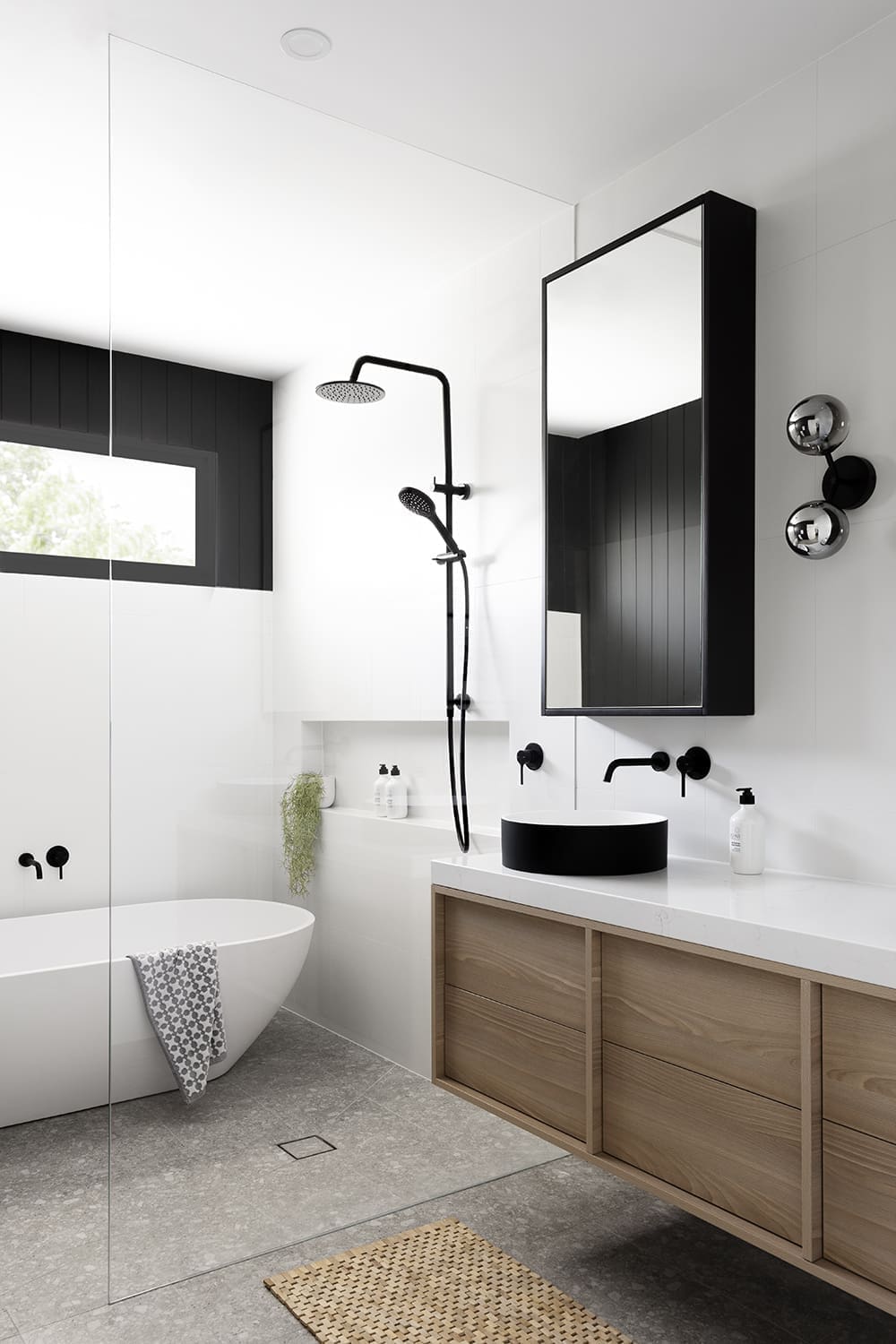
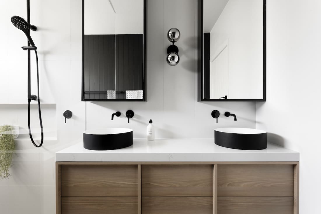
The sleek colour scheme continues into the bathroom, ensuite and powder rooms with the black joinery playing yet another starring role. To see more from GIA Bathrooms & Kitchens, visit their website or keep up to date on their Instagram feed. Now keep scrolling to see more of this stunning home makeover. What are you thoughts on this bathroom? Let us know in the comment section below!
See more real home tours here
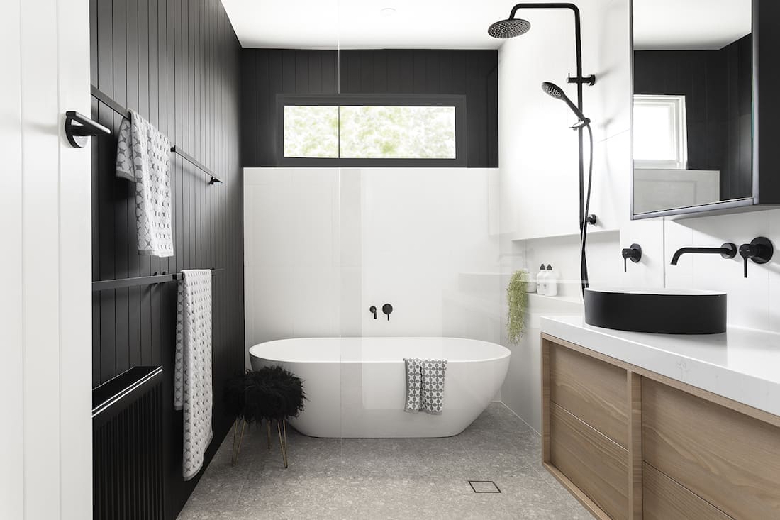
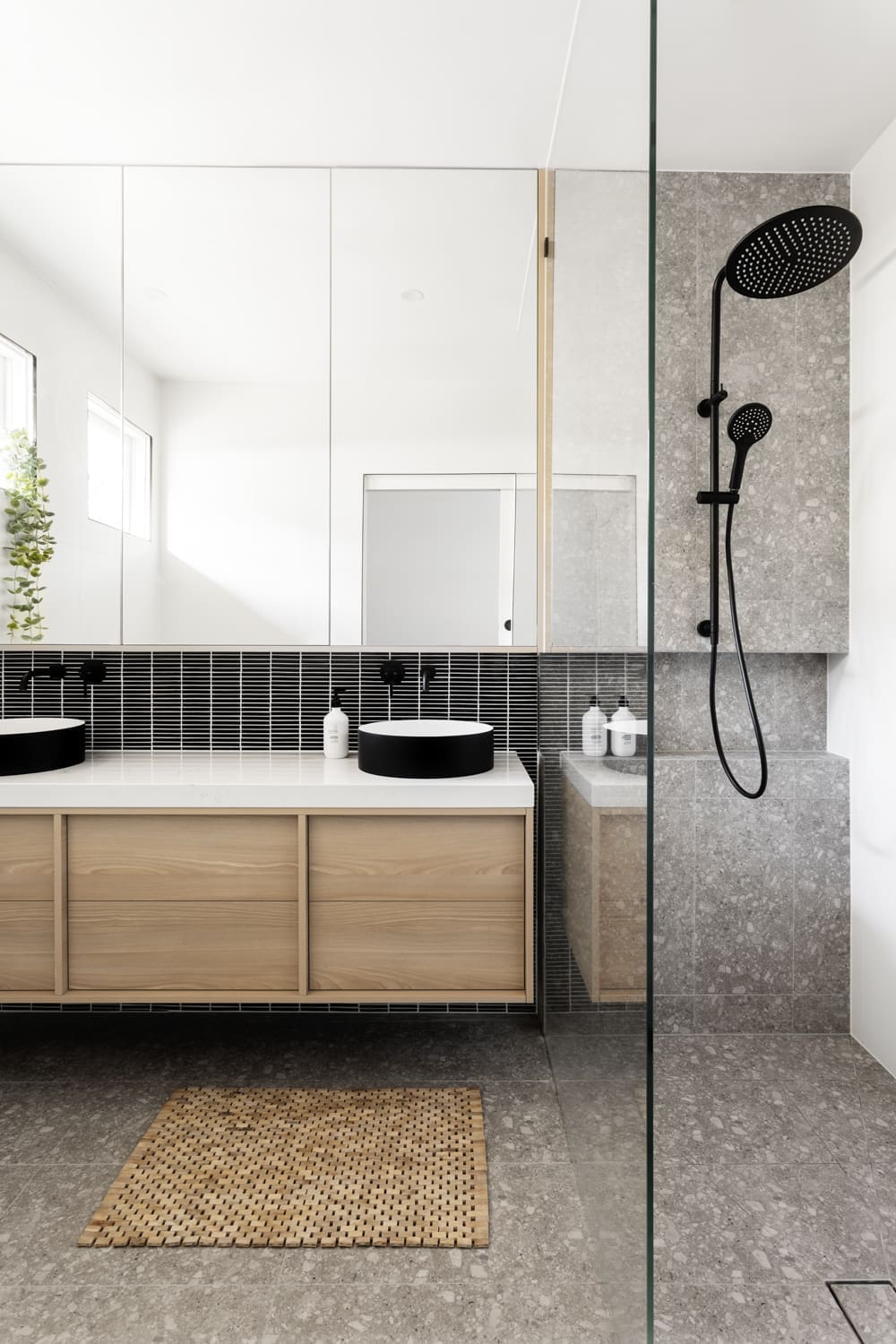


OMG I love this thread. I need to know where those black and white tiles are from on the backsplash above the vanity in the ensuite pictured above. Please can you help me? Thank you xx
Hi Kate,
That’s a black mosaic finger tile and they’ve used a white grout to give it more contrast and to define the shape of the tiles. You can find it at a range of tile shops in gloss or matte (they’ve used matte in this project). Hope that helps 🙂