I recently shared our black and white main bathroom and as much I love certain features in this space… there are a lot of mistakes too!
Bathrooms are a difficult space to get right and mistakes in here can be hard to rectify and costly!
I hope sharing my bathroom mistakes to avoid will help you get your next bathroom even more perfect. There’s a lot to be said for getting the small details right.
Check out this video where I explain our mistakes and what I would do differently next time.
Related article: Hamptons luxe bathroom reno that’s loaded with #bathroominspo
Related article: How to decorate your bathroom: Bathroom styling tips and tricks
Main mistakes I made
Forgetting shower wall niche
Even though it was there on the plan, it got overlooked during the build and was spotted too late. Not wanting to fix up sheeting, re-waterproof, wait the days for it to dry and get our tiler back out on site, we opted for a black shower shelf instead.
Before waterproofing starts, I suggest doing a walk through of your bathroom and checking details such as cutouts for niches and shaving cabinets. This is also a good time to check that all electrical provisions are there, such as for powerpoints, wall lights, LED strip lighting and heated towel rails.
Forgetting a towel rail next to the shower
We have towel hooks on the other side of the bathroom but forgot to allow space for a towel rail or wall hook next to the shower. Most guests use the small stool by the shower or throw their towel over the shower screen but it isn’t ideal.
Putting our toilet flush too low
I know people say you should close your toilet before flushing but I live in a house with boys. Enough said.
The low toilet flush is discreet but not all that functional. Next time I would position it higher.
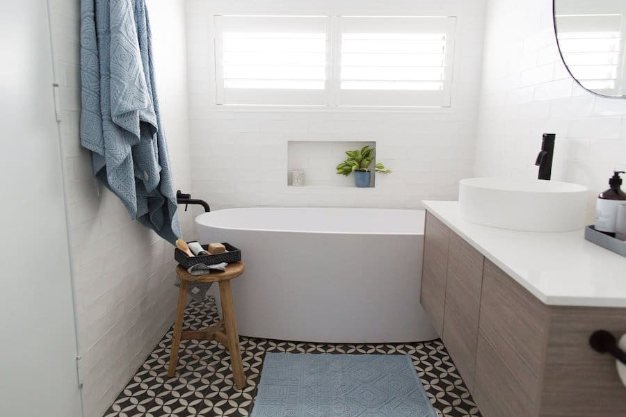
Placing powerpoints in a visible spot
My gut told me not to put the power point above the vanity but I didn’t listen and now it’s the first thing I see when I enter the bathroom. Good design is about function first but aesthetics is also important. Next time I would hide it in the vanity or at least place it in a less obvious spot.
Positioning the bath drain too far to one side
This mistake was so annoying as I’d picked out the exact bath I wanted and provided specs to all my trades, yet somehow the drain was placed to one side of the room and didn’t line up with the bath.
My only options were to jack up the floor or select another bath. Not wanting to delay our build any further or add to the budget blowouts, I picked a different bath which was a bit crushing as I LOVED the one I originally selected.
Tip: provide specs of all your products, including vanity, toilet and shaving cabinet, to your trades at the start of the project so they can allow for these during the build.
Not getting the overall scale right
We went a bit overboard with our shower while the rest of our bathroom is a regular size. It feels out of balance and more importantly, it means we sacrificed valuable space in areas where we need it most — around the bath and vanity. And when the door is open, it feels really tight.
Next time, I would go with a different layout to get the proportions of the space right.
I hope sharing my bathroom mistakes to avoid helps you with your bathroom renovation or new build! Do you have any bathroom questions or concerns? Post them in the comments below!





I definitely think your shelf looks better than a niche which can get a bit gross in showers but look awesome near baths.
Oh thanks so much Caroline! All these lovely comments about the shelf are making me feel like it was another ‘lucky mistake’ to make 🙂
I love how your bathroom looks and could definitely live with these mistakes in my home! Still got bathroom envy over here!
Awww thanks Sarah! Sometimes I wonder how I could have missed such obvious things but building a house is pretty crazy and around the time our bathrooms got done there were a million trades in our house all at once so I can see how things got overlooked 🙂
Hi Dear,
Thanks for sharing. It’s easy to make mistakes. Sometimes we overlook the simplest things since we make constant use of them.
So true Julie, I can’t believe I put the flush so low 🙁 Oh well, all learnings for next time!
True that. The mirror is a beauty! I went moody charcoal in the powder room, pretty pinky/mushroom in the ensuite shower and a braver turquoise behind the main bath. All the same tiles, just mixed up the colours. A bit nervous about the colour pairing of the ensuite tile With the tapware – I chose Flemish Copper (Astra Walker), so it’s either going to look hideous or soft and romantic. Hopefully the latter! I’ll post it on the blog soon ?
I was almost too terrified to read this! I made the same mistake with the proportions to the downstairs bathroom. There was never going to be enough room for a decent towel rail either but luckily it will mostly be used as a powder room. Other oversights will undoubtedly come to light over the coming weeks! Hehe.
I actually love your shower shelf and when you look at the bathroom as a whole, I’d buy into it being deliberate so the bath wall niche packs more punch (love the strip lighting in there btw). Also dig The bath tub but I know what you mean about wanting to get your first choice…
I like your thinking about the wall niche Jane 🙂 There are just so many things to think about in a bathroom that it’s hard to cover off every detail… and even if you plan perfectly unexpected things can pop up during the build (like the position of our drain!). Luckily there isn’t anything in here that bothers me overly – I’m just glad I found that killer mirror which makes the space feel complete and more balanced some how. Can’t wait to see pics of your bathroom soon! Did you end up selecting a coloured wall tile?