Here’s the latest before and after of our recent Erskineville project and it’s my favourite zone of the home — the main bathroom makeover!
Related article: Bathroom inspiration: Modern classic bathroom that’s generous on space
Related article: The Block 2020: Week 4 — Master ensuite reveal
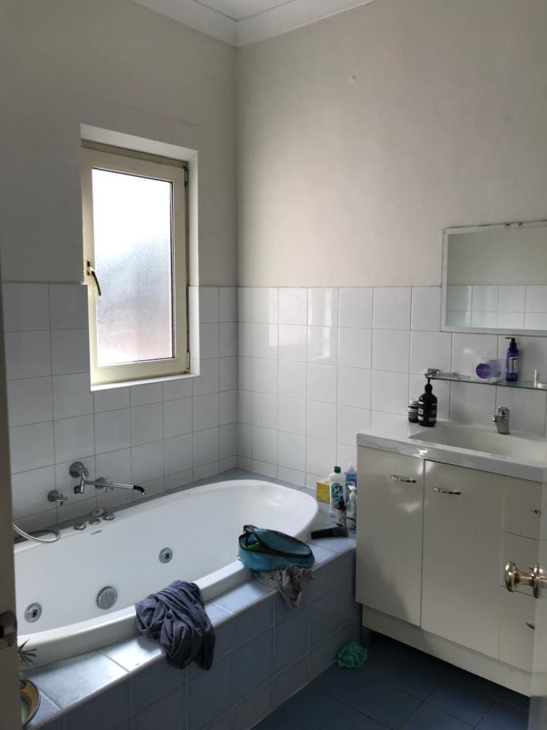
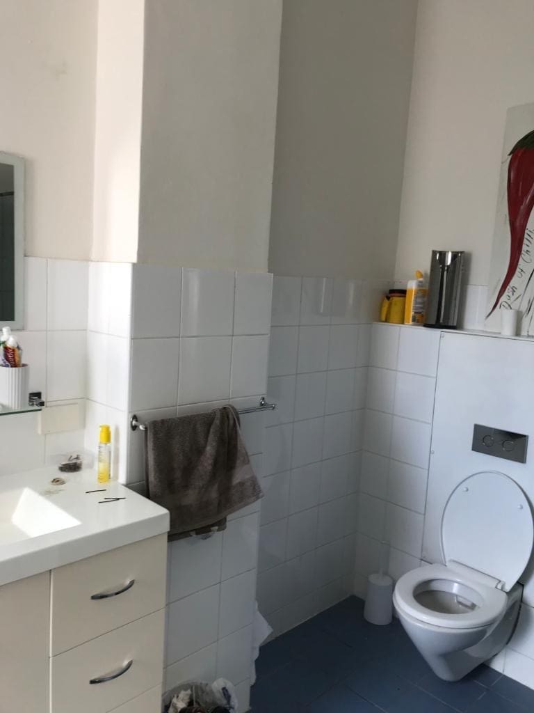
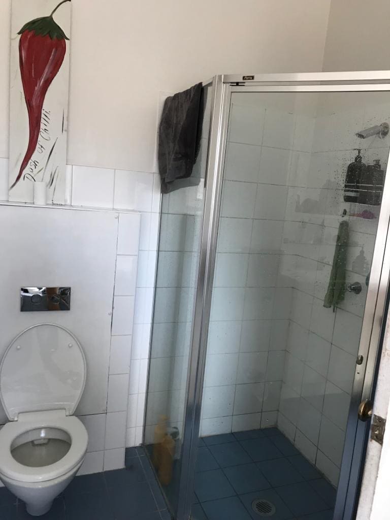
Bathroom before
The main bathroom was a fairly blah space with no features that inspired. It had been reno’d in the 90s so all of the original features had been taken out and replaced with basic bathware…
We wanted to reimagine the space and create a modern Victorian bathroom. We also needed to rework this floor plan to allow for a larger vanity and to make it possible to open the window without hopping into the bath!
Design inspiration
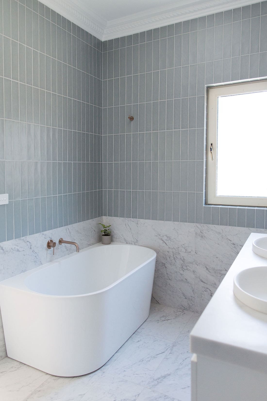
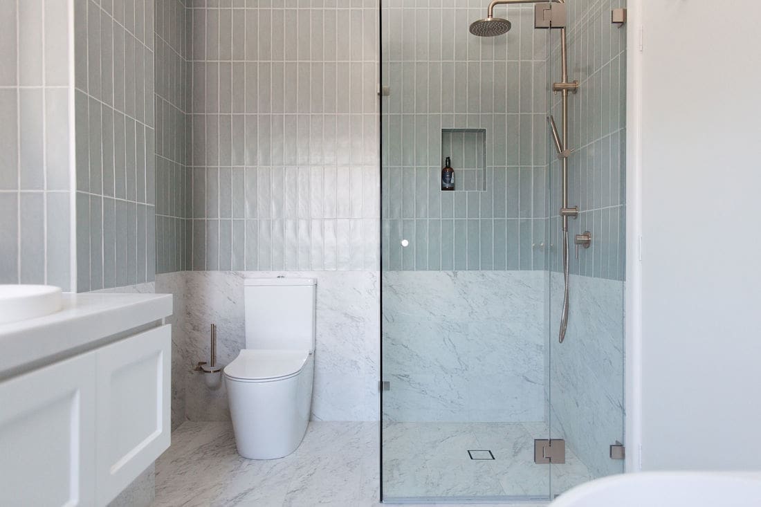
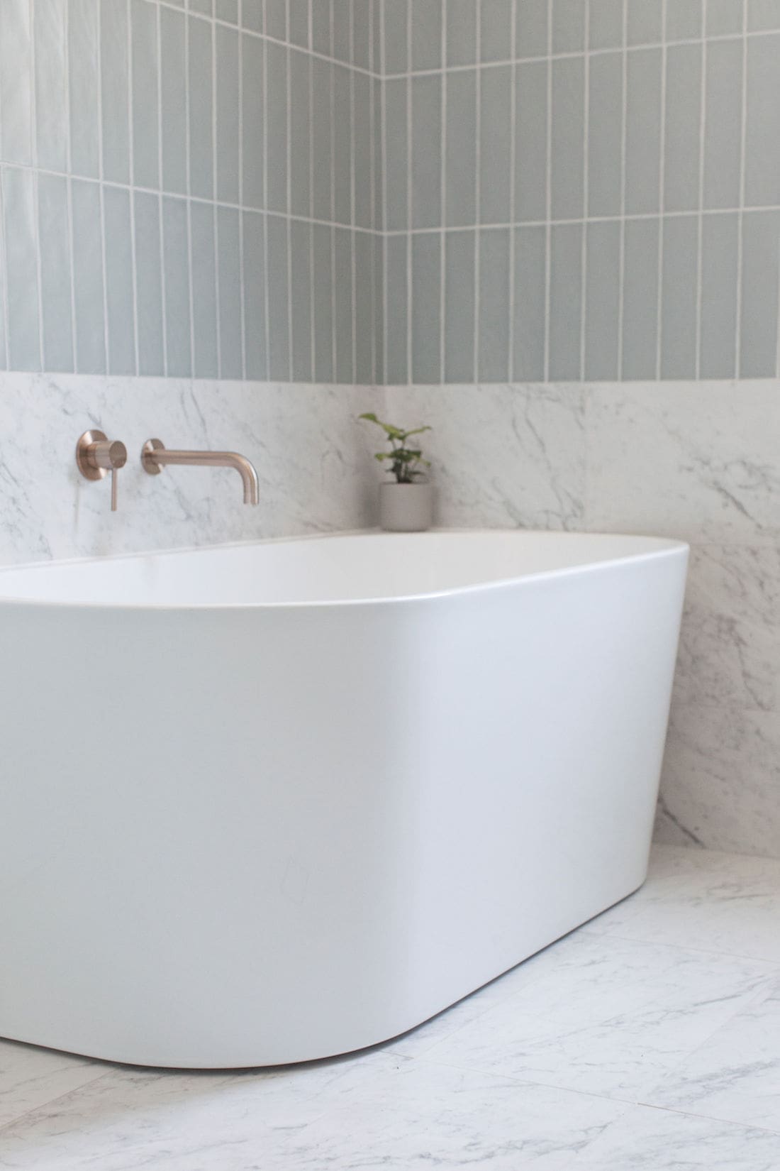
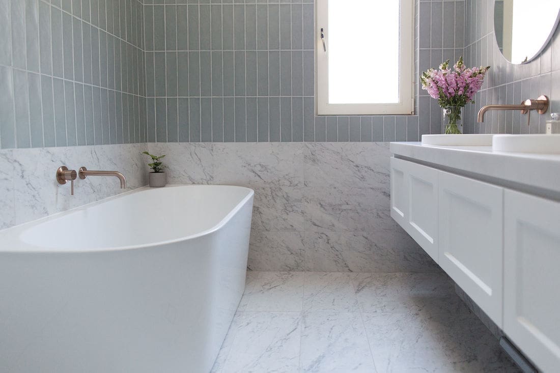
I loved the concept of running the floor tile up the wall to a half height and a feature tile above. It’s a look I’d seen done before and knew it would play to the Victorian design style. By using subways in a vertical straight stack, we’d give the bathroom that modern twist.
Because this is quite a bold look, we simplified all the other elements in the space. A simple back-to-wall bath is smart on space and allowed us to flip the bath to the back wall, making way for a much larger vanity and access to the window.
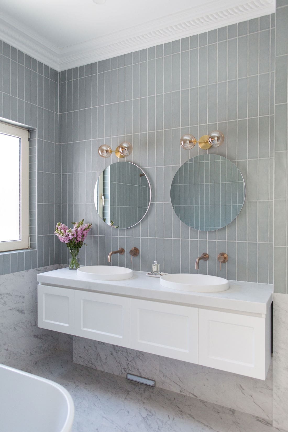
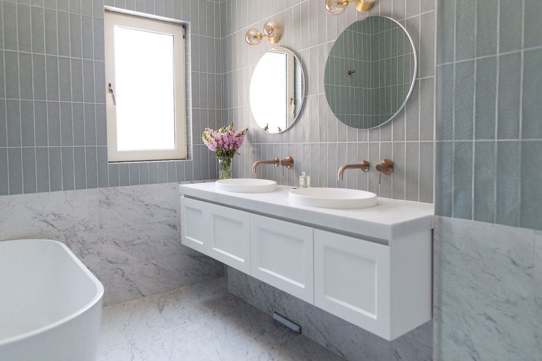
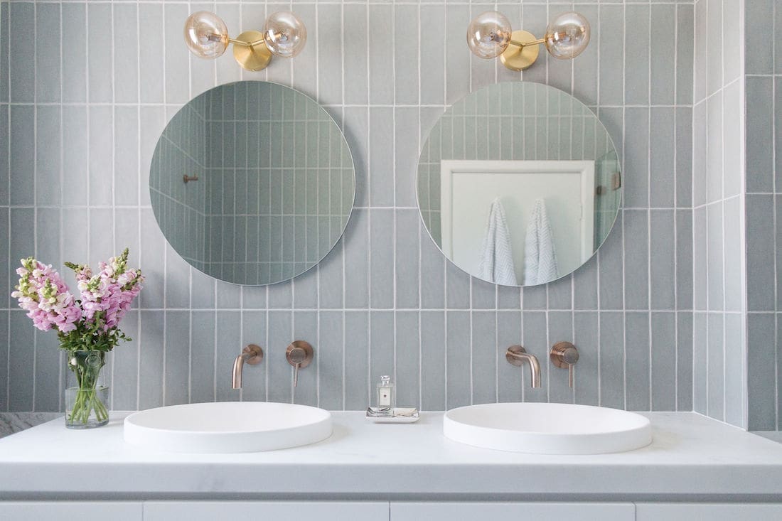
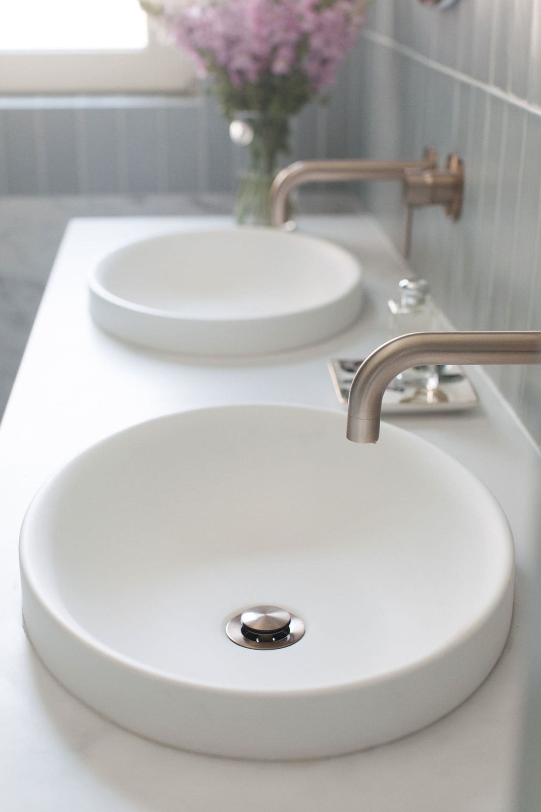
The large wall hung vanity offers plenty of storage space and the marble-look top ties into the rest of the space. Round mirrors introduce curves and soften all the angular lines.
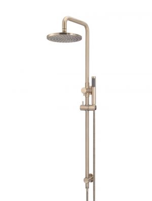
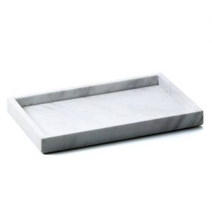
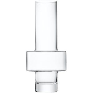
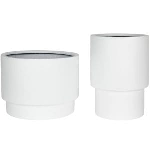
Shop the modern Victorian look
Bathroom after
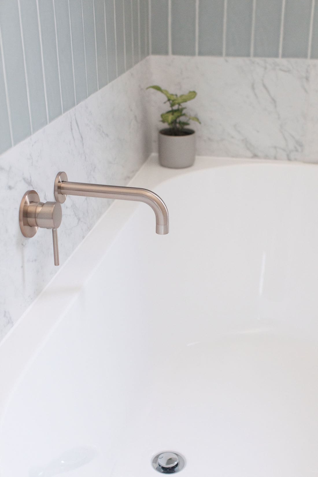
We couldn’t be happier with how this bathroom turned out! The tiling combo exceeded our expectations and all the other bathware ties in beautifully.
The client also had decorative cornices installed to bring back period features that were removed by the previous owner.
This space feels luxe but inviting and balanced. I hope our take on a modern Victorian bathroom has gives you some inspo for your next bathroom!
Bathroom renovation lessons
Bathrooms are one of the trickiest zones of the home to renovate and this project presented more than a few challenges — especially as it was interstate and I couldn’t be on site. This meant we missed some things or things didn’t quite go according to plan. In the interest of helping you achieve the best bathroom renovation possible, let me share some of the key learnings.
Check your niches
Early planning is essential for bathroom niches. You may need to move wall studs to position the niches exactly where you want. And they certainly have to be cut out before the bathroom is waterproofed!
I received bathroom update pictures after sheeting, and I noticed that the wall niches for the mirrored cabinets hadn’t been cut out. The client also took it upon themselves to add an extra wall niche above the toilet to hold toilet paper. You’ve never seen me text so fast, ha ha! Let’s just say, I’m not a fan of having toilet paper on display.
Having to change niches about will delay your project and cost more so triple check this at every step of the reno: at framing, at sheeting, and at waterproofing.
Consider your vanity plumbing
My client was changing from a floor-standing vanity to a floating wall-mounted vanity. To change these types of vanities, you must move the pipes behind the wall, or you will have a visible pipe running from below the vanity into the ground.
When I project manage a bathroom, I always opt to pay a little extra to move the pipe as it creates a cleaner, more luxurious look. Unfortunately the pipes weren’t moved so we came up with a workaround by building a box frame below the vanity.
If you want to avoid this issue, talk with your plumber early about what type of vanity you’ve selected so they can work to those specifications.
Similarly, if you want to change from a vanity mixer to wall taps, your plumber will also need to move pipes.
Stick to your guns
Finally, a positive lesson that was reinforced from this project is that a little risk pays off! Using a bold materials palette and unconventional tiling scheme was outside of my clients’ comfort zone. Thankfully they had faith in this modern Victorian bathroom design vision and saw it through.
Too often I see people backtrace and get talked out of making bold design choices… selecting the ‘safe’ option and that often becomes their biggest regret.
If you have any questions about this project, or just want to leave a comment, please pop it in the comments section below.
Check out more bathroom inspo
Shop the modern Victorian look
Photography — Thorson Photography
Disclaimer: This post contains some affiliate links. This means, if you purchase an item we may receive a commission on that sale of the products at no extra cost to you.





Sorry can I also ask – is the subway tile sage or grey?
Thank you.
Hi, I love this bathroom. Can you tell me where did you get the tiles please? I see you have named them but I can find them anywhere.
Thank you.
Catherine Kirkpatrick
Melbourne
Hi Catherine, thanks for your lovely comment. I found the marble tile online here https://www.onetile.com.au/en-au/marvel-shine-statuario-supremo-24-x-48-3-543-matte.aspx and the subway tile doesn’t seem to be available online any more, sorry! It was technically a grey colour called ‘Cement’ but it had a lot of green undertones. When you lay a tile, the colour becomes more vivid so when I wrapped it around all 4 walls it did appear quite green 🙂
Hi – it really looks amazing. Can you please tell me the name of the tiles?
Thanks
Danielle
Thanks so much Danielle! The subway is ‘Milano Fossil’ in a 75×300 size and the floor tile is ‘Marmi Carrara’ in a 300×600 size 🙂
Looks great! We have the same tapeware and I was hoping to find out out where the shower screen hardware is from.
Thanks
Hi Sarah, I’ll try find the name and get back to you 🙂
Hi Sarah, apologies for the delay. Just wanted to let you know the shower screen hardware was from an independent tradie in Sydney. If it’s helpful, I can email you his name and number?
This bathroom looks amazing! What is the basin type?
Thanks for your lovely comment, Jan 🙂 The basin is a semi inset one called ‘Dignity’. You can buy it online at link or your local bathware store may stock it. Hope this helps!