Interior Designer Lori Murray from March Twice Interiors blew us away with this stunning coastal federation home renovation. Now, we’re incredibly excited to share her latest project, Mosman Residence IV! The front rooms of this federation home were in need of a sophisticated glow up, and boy did Lori deliver!
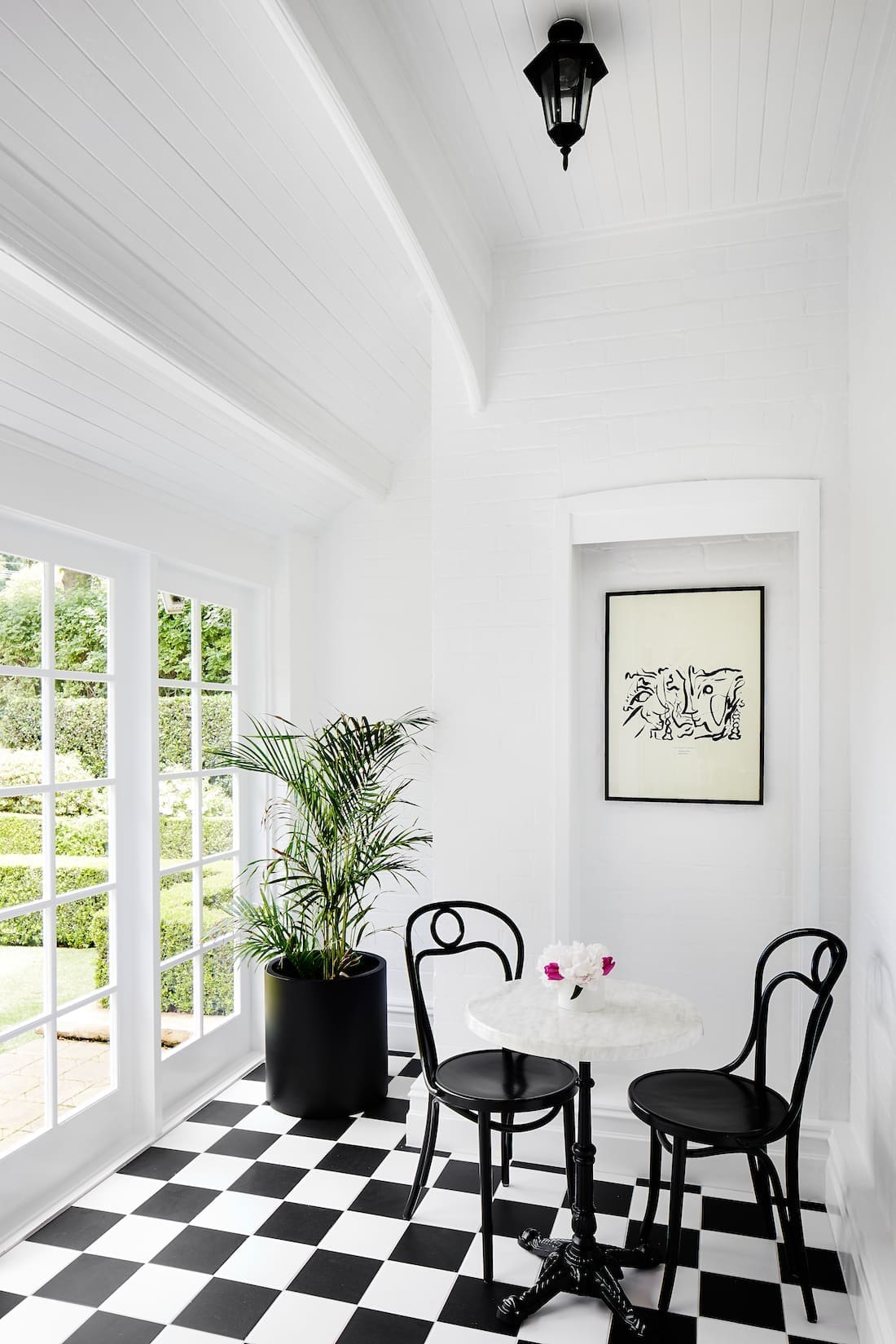
With high ornate ceilings, timber work detailing, and stunning checkerboard terrace flooring, this federation family home is sophisticated and elegant while maintaining the charming features of the original build.
Related article: Country meets luxe in this Byron Bay holiday haven: A visit to Fig Tree Villa
Related article: Rich timber textures and a timeless aesthetic — the sustainable heritage-listed home renovation of Laneway House
This renovation was all about refreshing the home while working within the original footprint.
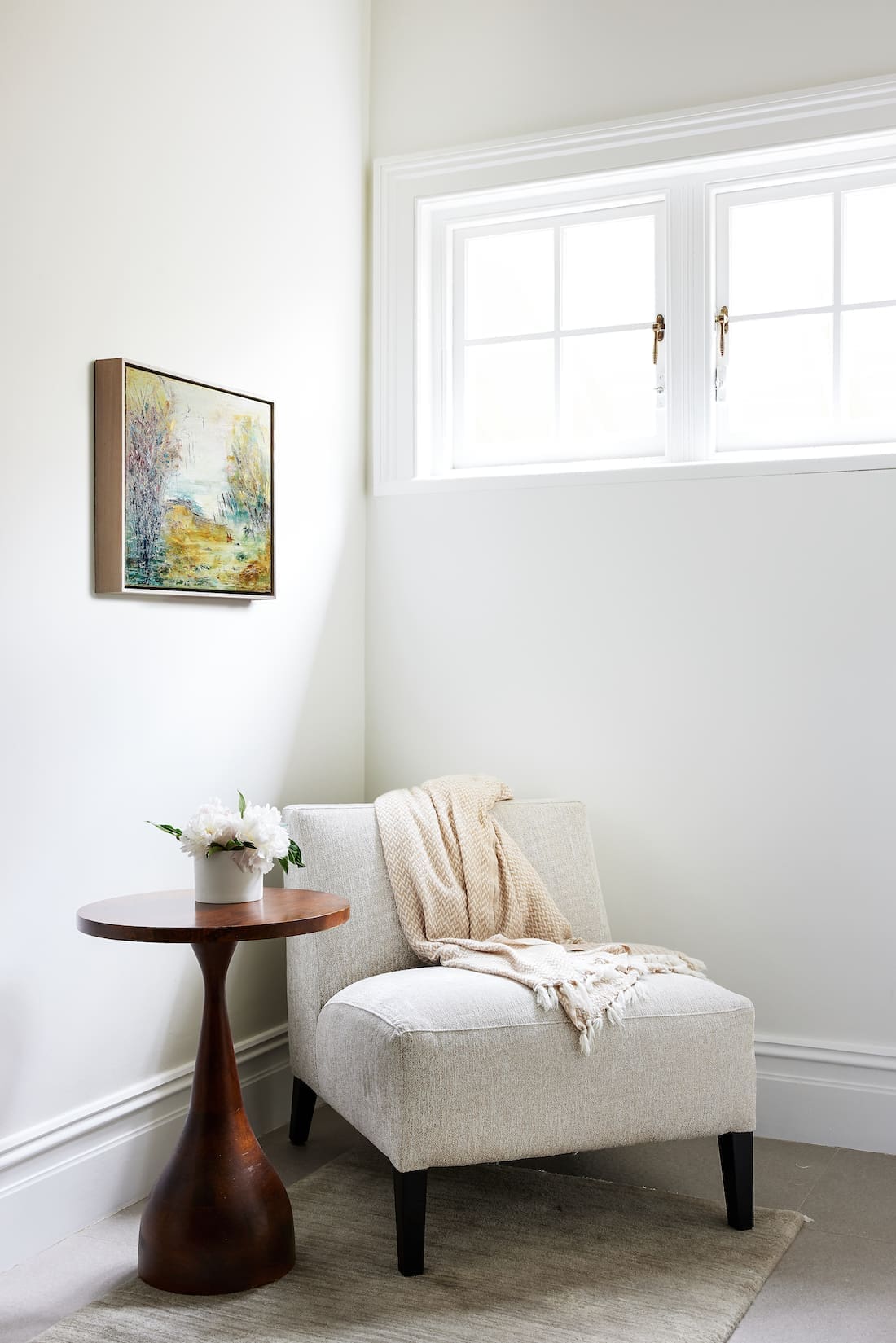
“The brief was to update the dark rooms at the front of the federation family home. We had to transform them into warm, sophisticated and useable spaces — for grown ups only!
“Our client wanted to embrace classic and timeless style, with reference to luxury British interior design.
“The clients were keen to keep structural changes to a minimum and work within the existing footprint. We were more than happy to as it allowed us to retain and restore many of the beautiful period details.
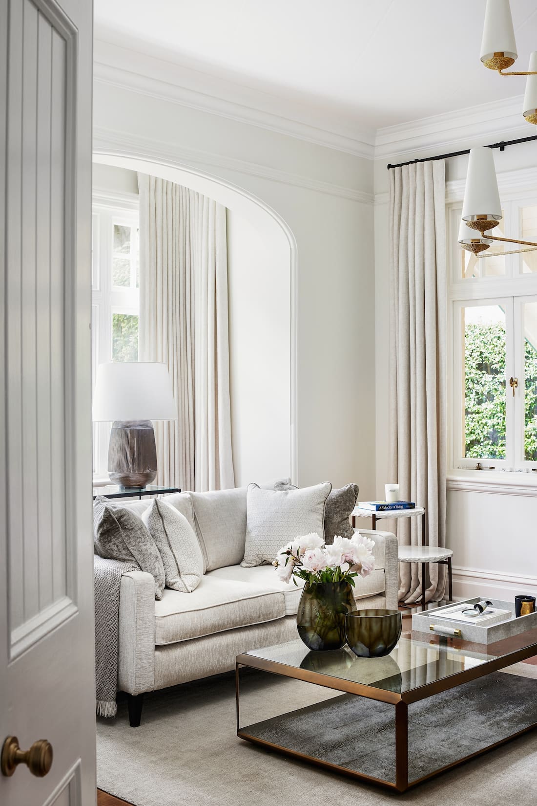
“This gave us a framework to start with. High ornate ceilings, beautiful timber work detailing, and stunning windows in these federation homes always provide a wonderful canvas to layer in the luxe fabrics and materials we selected.
I would describe the style of this home as classic, timeless, elegant and layered.

With usability in mind, Lori’s team completely transformed rooms of the home to suit the needs of the family.
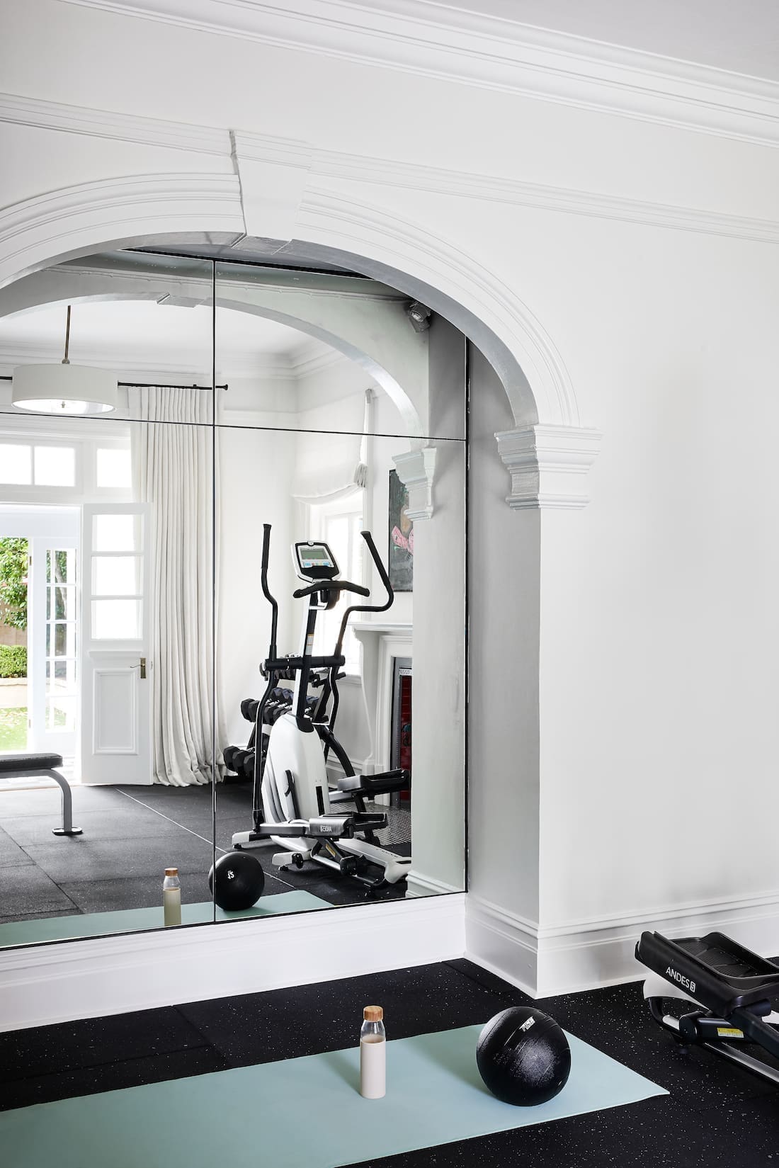
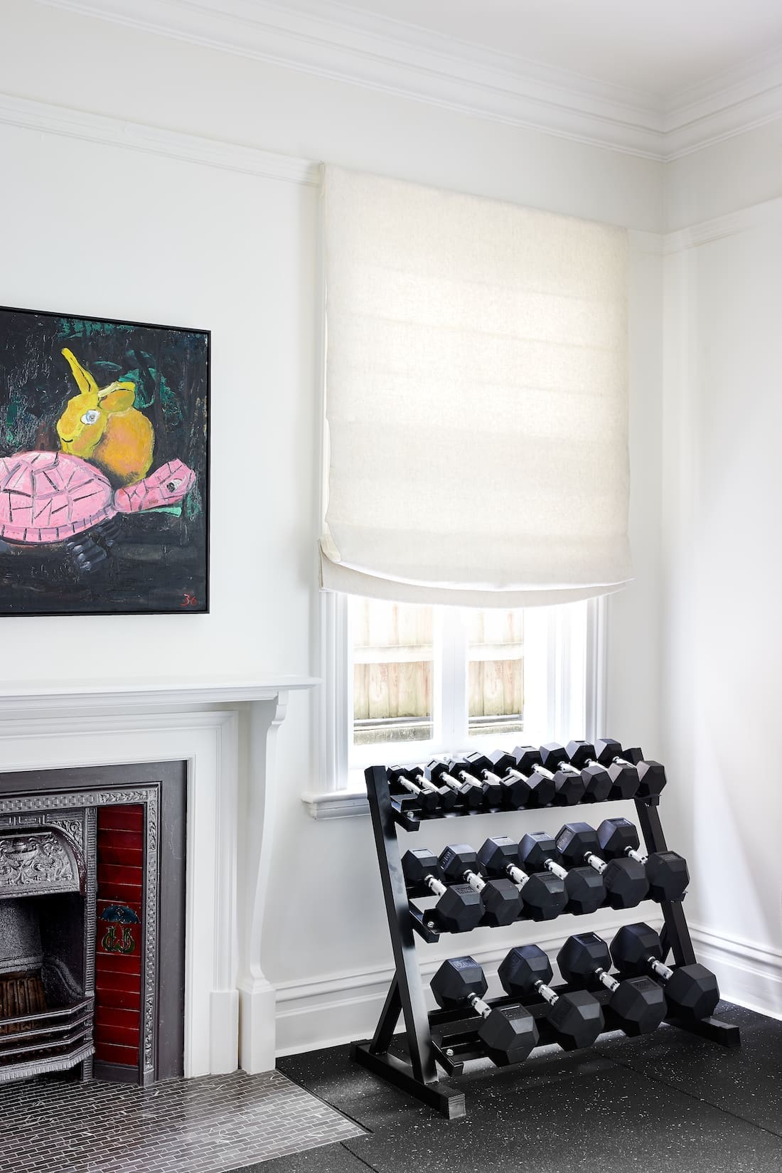
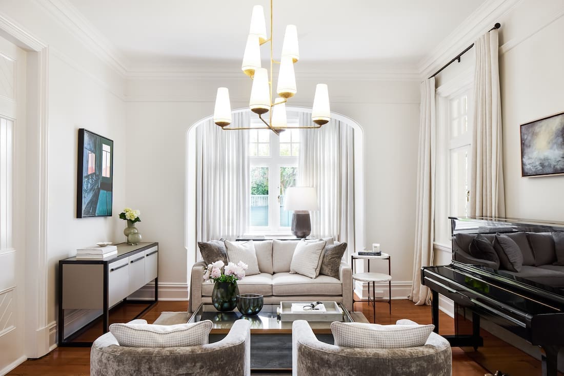
“The sitting room became a quietly luxurious space for the grown ups to retreat to. The client no longer needed the formal dining room so we transformed it into a home gym!
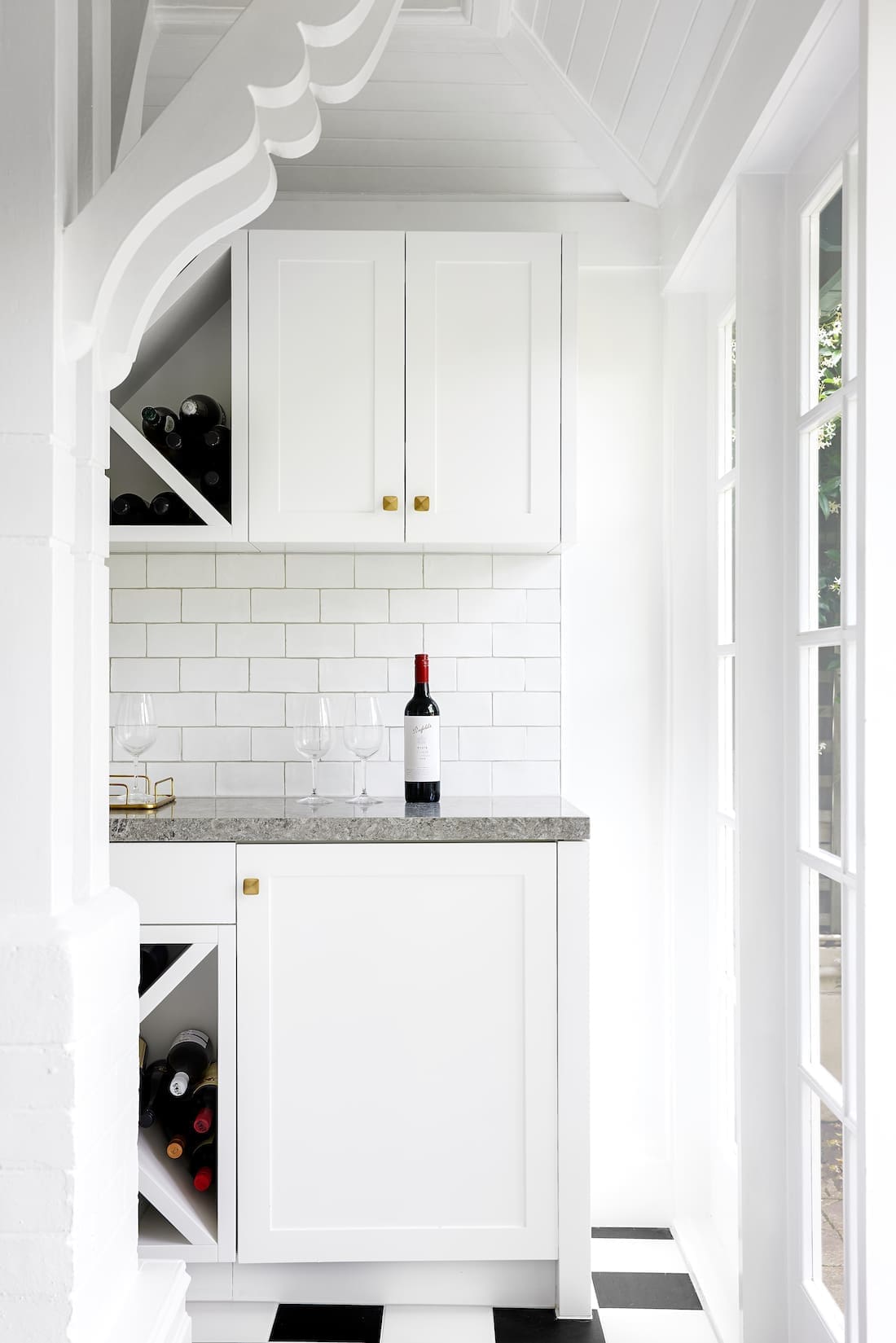
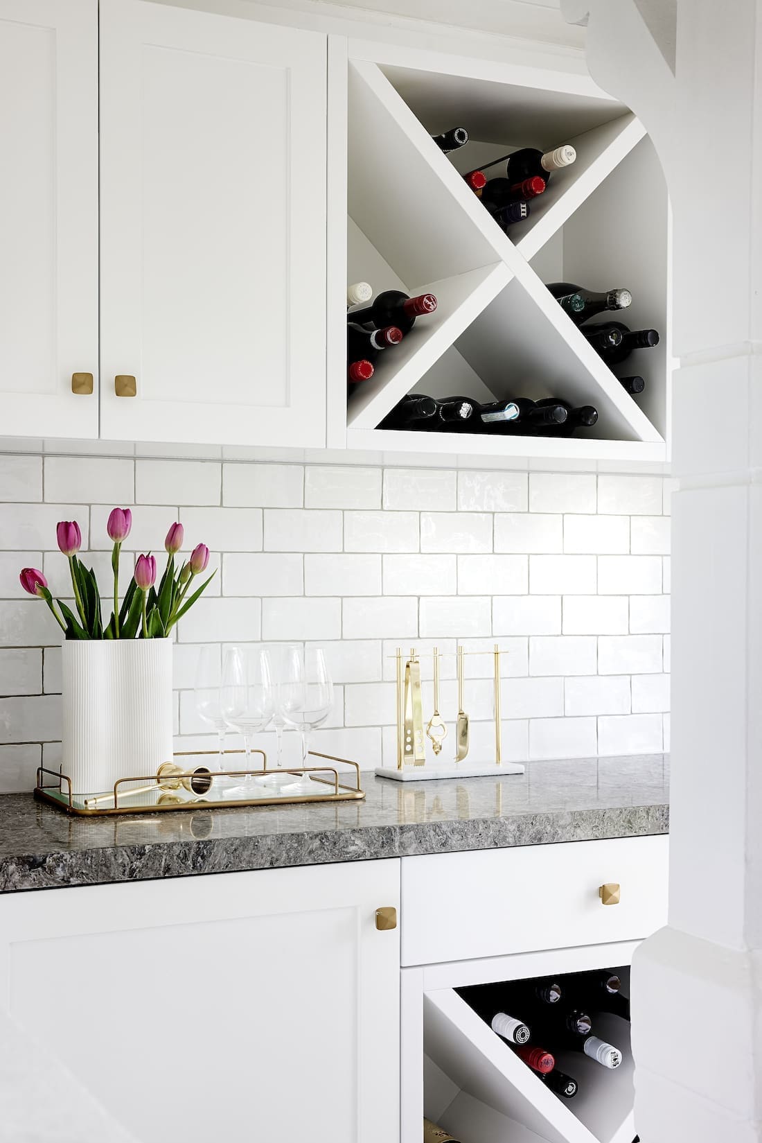
“The kitchen space shown is a small second kitchenette/bar area in the updated terrace. It gives the client a second fridge and freezer hidden in the joinery. They also have wine storage too! Our clever joiner worked around some tricky angles in this room. We topped the crisp white joinery with a striking benchtop in a textured dark Caesarstone Turbine Grey.
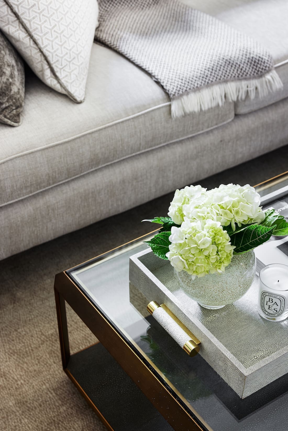
“The living room turned out to be a particularly special room, showing that changes to your home don’t have to be big to have impact! We had to carefully choose furniture that was sized in proportion to the odd room shape — long but not wide.
“We introduced side tables that could be moved around depending on needs. And we added appropriately sized furniture, textured fabrics and layers to beautifully highlight the tall ceilings. We also carefully layered lighting, using the stunning chandelier has the main light source but adding lamps to provide a second lighting layer.”
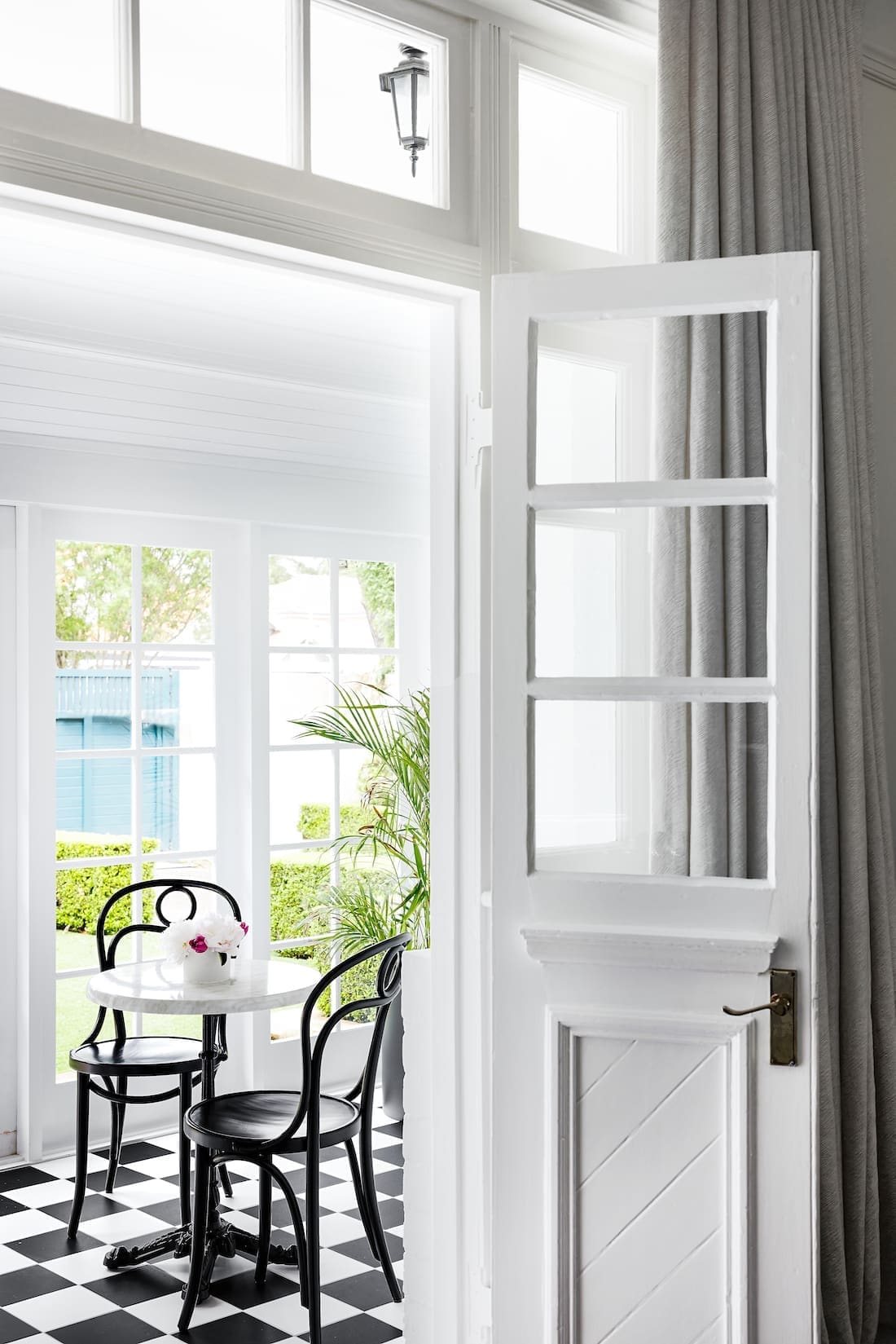
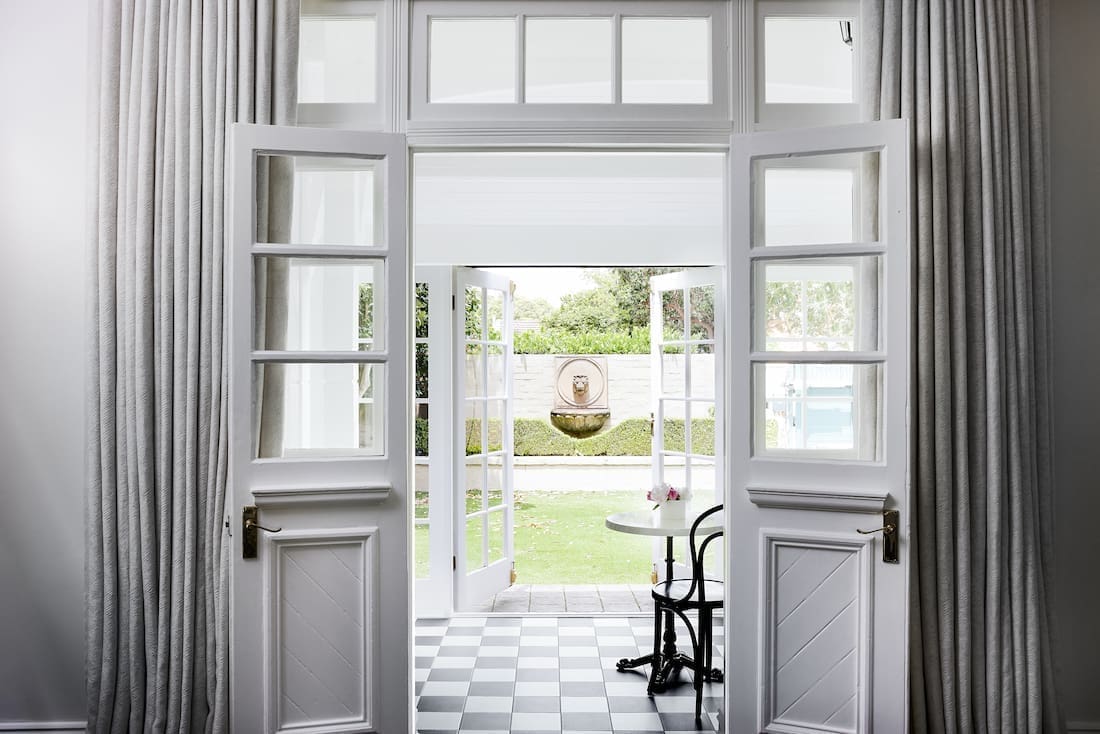
One of the standout features in this home has to be the updated terrace with checkerboard flooring.
“We brought the unused terrace back to life!” says Lori excitedly. “Coupled with the bistro style table and chairs, and the small bar within reach, our client can feel like she is sitting in a Parisian cafe while she watches the children play in the courtyard.
“When designing the space, we wanted something that would brighten up this terrace. It had to increase the appeal of the home from the front, where the terrace is located, yet not be at odds with the classic detailing in the rooms that adjoin it.
“The material here also had to be hardwearing. So we settled on these surprisingly inexpensive porcelain tiles, in a classic checkerboard pattern, which is so fitting for this style of home.”
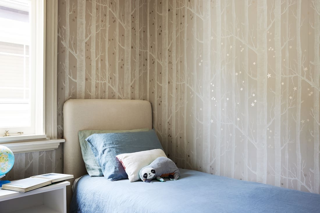
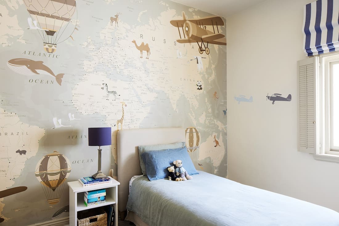
Often the hardest area in any home to keep cohesive to a specific style, these kid’s bedrooms hit the mark, all while remaining unique to each child.
“It is always so fun to have a hand in designing children’s rooms! We like to give the kids some choice — but always make sure the options we put in front of them are pre-approved by us and the parents!
“Despite these boys being quite young, we generally don’t like to go overboard with lot of bright colour and patterns. Kids really do grow so quickly.
“As such, the world map wall mural from Natty and Polly was a perfect choice for one of the boys rooms. And the enchanting Cole and Son ‘Wood and Stars’ wallpaper was selected for the other bedroom.
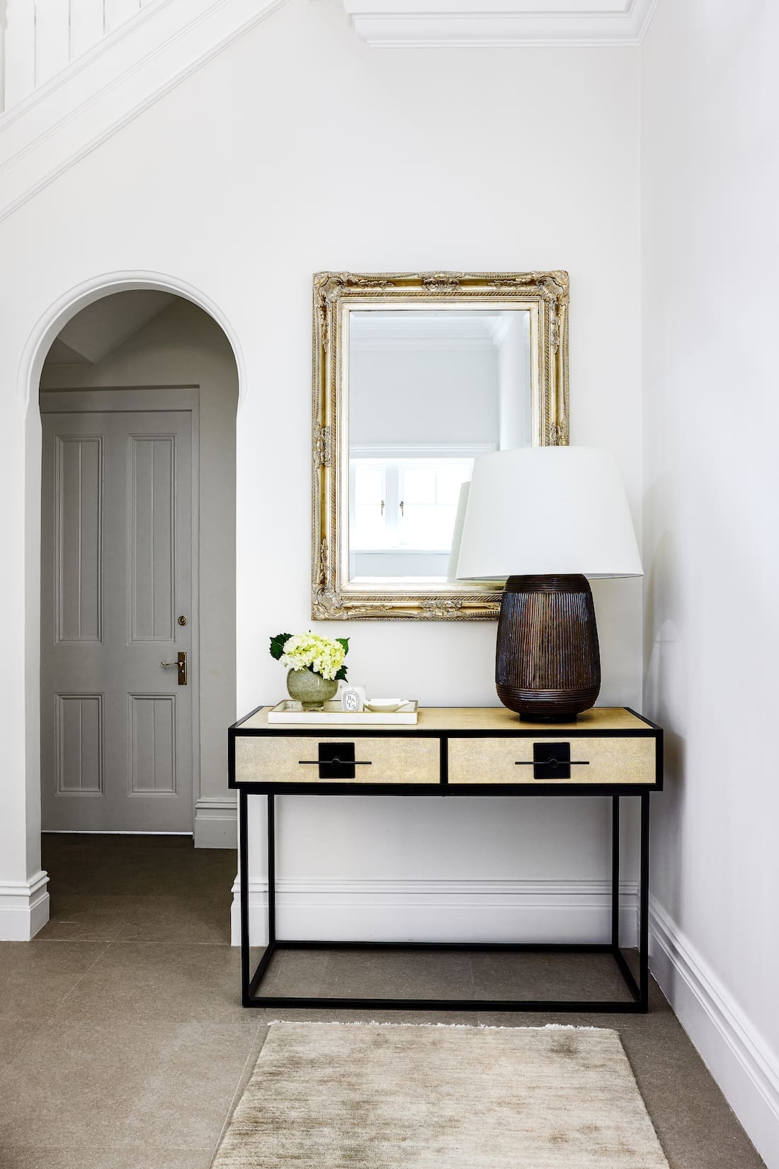
With so much experience in white walls, we couldn’t help but ask Lori for any advice she had to help you select the right white paint.
“Ah, white paint! Never as easy as it sounds. Cool whites tend to add a more contemporary edge, but are also generally better in larger and brightly lit spaces so they don’t fall too flat or cold.
“Warmer whites, which we tend to favour, are best in rooms that don’t get as much light. These whites help soften and warm up the space.
“My tip is always to paint a few sample sections of different whites around the room and leave for a day or two. Make sure you go in and look at them in the morning, afternoon and evening to see how the tone changes.”
Find more tips on selecting the right white paint here.
Interior Design — March Twice Interiors
Builder — BKP Projects
Photographer — Ryan Linnegar
Kitchenette/bar and gym mirror — Steve’s Joinery
Custom living room sofa, some chairs and cushions — March Twice Interiors
Living room rug — Armadillo and Co
Checkerboard tiles — Surface Gallery
Chandelier and lamps — Montauk Lighting Co.
We loved talking with Lori about Mosman Residence IV. For more projects from Lori, you can find her full portfolio on the March Twice Interiors website, or connect with her on Instagram. What are your thoughts on this federation family home? Do you like the checkerboard flooring as much as we do? Let us know your thoughts in the comment section below!
Find more home tours here







Thank you for the wonderful article! We loved creating these beautiful rooms for our client.
We just love this project, thanks so much for taking us on the tour!