The Reno Rumble week 2 bedrooms, TV’s newest renovation show, is blowing us away! Like last week, the Blue team and Red team will each need to renovate a house in one week.
Part 1 of the house renovations were revealed last night — brace yourself for some truly fabulous bedrooms!
Related articles: Reno Rumble week 3 bedrooms
Related articles: The Block 2021: Week 3 — Master bedroom reveal
Blue team
Despite a slip up from team captain Ben in organising (or lack of organising!) a floor polisher, this team really stepped up this week. They only fell two points behind the Red team.
Tasked with creating a ‘Modern Scandinavian’ home, let’s see how they went…
Carly and Leighton
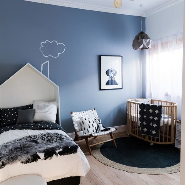
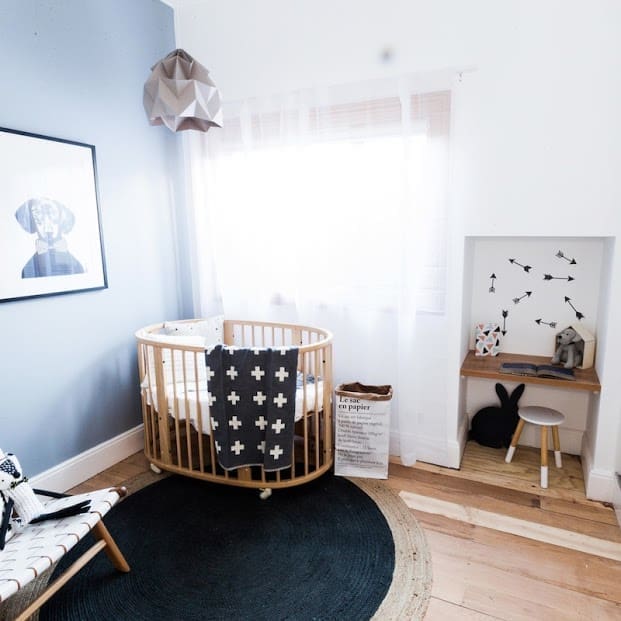
“Better than a magazine” said the judges and we’ve got to agree. This is one of the hottest kids bedrooms we’ve seen!
The monochrome colour palette really pops and the details in the wall decal, mix of textures and artwork give the room softness.
Michelle and Steve
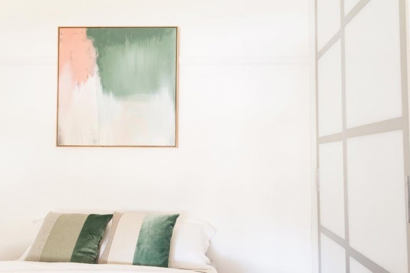
“So warm and raw at the same time,” said Romy of this gorgeous master bedroom.
The artwork over the bed and the way they picked up the colours in those drool-worthy cushions got big ticks from us.
It was also clever how they used the space and ran a desk along the side of the room.

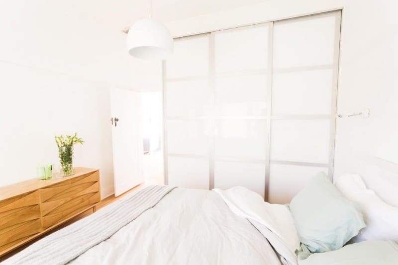
Ben and Jemma
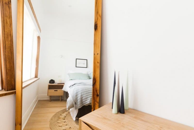
Last week Romy felt they missed the brief in the guest bedroom. Luckily, she loved what they did with their bedroom this week! The judges were impressed with the feeling of the room — the use of timber, soft colours, and that gorgeous Armadillo & Co rug.
Only criticisms were of the wardrobe and wall lights which didn’t really fit the brief.
Chris and Nick
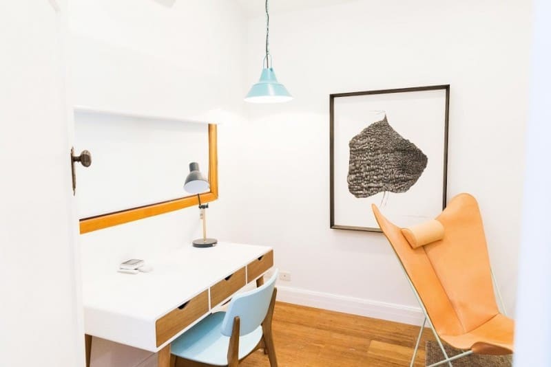
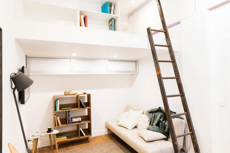
These guys transformed what was a dark and cramped cave into an airy and light study.
We felt they were more on the mark with their choice of furniture this week. However the room didn’t have that same wow feeling as the other couples. The top of the landing was messy and could have been a great opportunity to get some custom cabinetry made to really show what they can do.
Romy felt that statement chair was wasted in this space and should be brought out into the living room. Darren didn’t feel the bamboo floors were on brief.
Red team
Since Michael and Carlene left the show on Monday night, this team were at a disadvantage to finish the rooms with two fewer teammates. Of course they did amazingly to create a ‘Modern Vintage’ home…
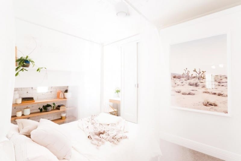
Josh and Jenna
Seriously?! Just stop it you two! These guys are on fire and it’s great to see how far they’ve come since being Block contestants (even though they were amazing to start with!).
This dreamy bedroom WOWED us and the judges! All the details from the timber finish in the study nook to the floating timber shelves in the fire place were just perfection!
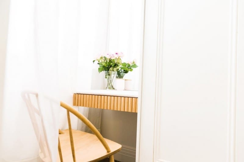
Kyal and Kara
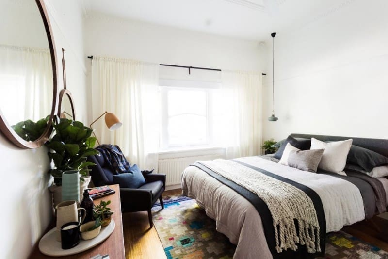
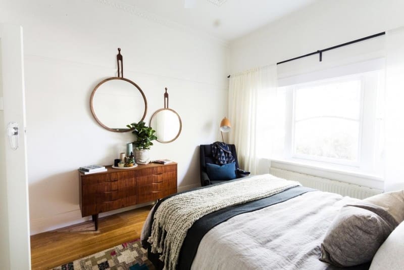
Something we’ve always loved about Kyal and Kara is how they can create spaces that feel lived in and warm! The two really have a knack for layering, selecting unusual pieces and combining colours in a fresh way.
They scored points from the judges for creating a room that felt original and a perfect fit for the home owner. Romy thought the room was perhaps a little dark and could be fresher but we loved the moodiness it created.
Jess and Ayden
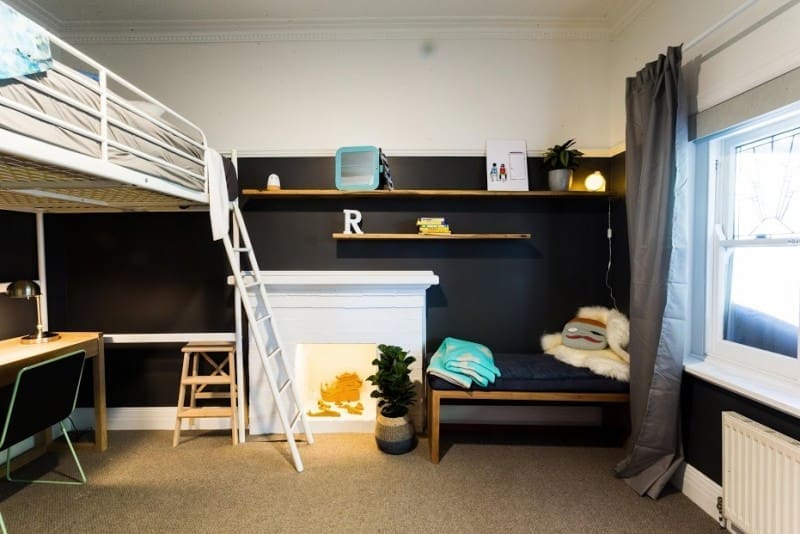
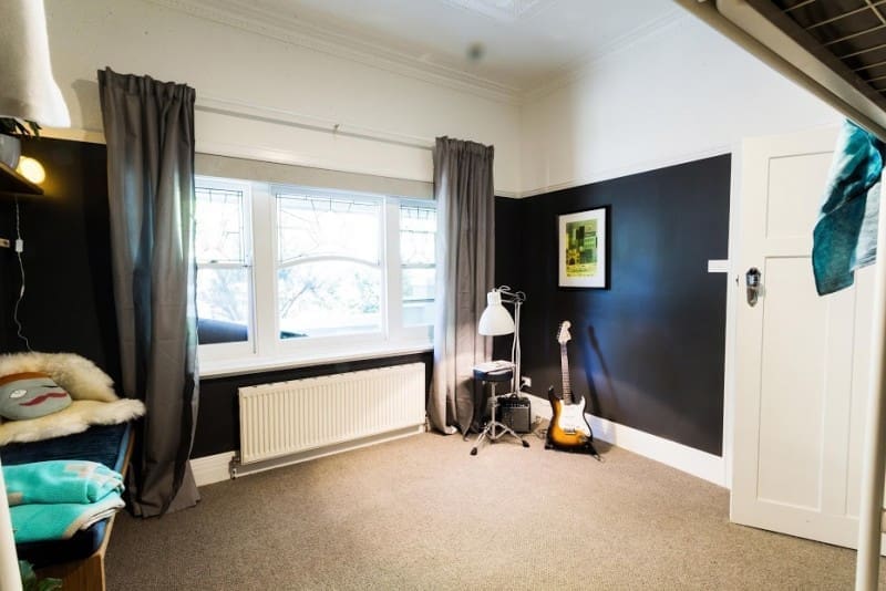
Jess and Ayden transformed this boy’s bedroom from a drab green cramped space into a spacious and cool bedroom.
Exposing the fireplace and adding detailing to the ceiling were great moves! The high bunk bed and low ceiling fan had the judges worried it could be hazardous though. We also would have loved to see the space ‘filled’ a little more (but we can see they opted to put a lot of that budget towards a new guitar).
Shared outdoor area
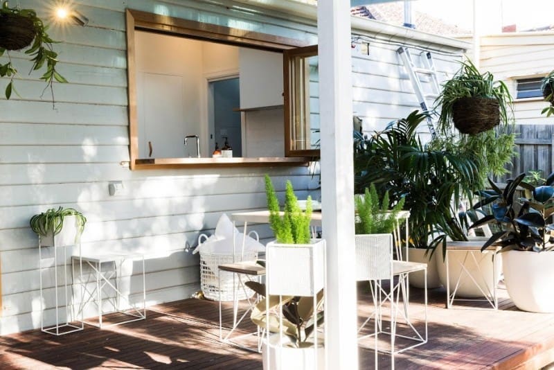
Great use of green screening to give this outdoor deck some privacy. The mix of pot plants, stands and hanging planters create interest in this space and the use of white throughout brings it all together and really make the greenery pop.

What did you think the Reno Rumble week 2 bedrooms? Tell us in the comments below!





Hi can anyone help me with the blue used in the children’s room? It’s the exact shade I’m looking for! Thank you
Hi Nadia, we’ve been searching for hours to try and track down the paint colour for you but no luck 🙁 Even going back on Carly and Leighton’s Facebook page they didn’t respond to questions about the name of the paint colour. We did manage to confirm that Dulux was the paint brand sponsoring that season of Reno Rumble though so hopefully if you contact them, they will let you know the colour name. Sorry we couldn’t be of more help! If you find out, please let us know so others can benefit. Thanks
Love Reno rumble can you tell me where to find the ceiling fan
Hi Alison
Do you mean the fan in Josh and Jenna’s bedroom? It’s called ‘Artemis 58 Inch Fan Light in White’ and you can find it at Beacon Lighting http://www.beaconlighting.com.au/ 🙂
Desperately trying to source any of the products from the shared outdoor area!
Insideout says the outdoor setting is from Loose Leaf in Collingwood, but I would love to know where the big round planters, planter stands and basket are from! Any ideas?
Hi Eliesha
We loved that outdoor area too! Most of the outdoor items were from Loose Leaf including:
– hanging plants
– large pots
– outdoor furniture, and
– white wire plant stand.
Although you can buy similar stands from Ivy Muse here: http://ivymuse.com.au
Or for a budget buy, you can check out Kmart’s new garden range which includes pot plant stands and hanging planters: http://www.kmart.com.au/category/home-&-garden/shop-by-category/garden-&-outdoor/251168
Hope this helps!
Josh and Jenna’s room warmed my soul. Stunning and so well thought out.
The styling on the shelves was a little mature for the client in my opinion but that as easy fix once her own items are unpacked in the room.
Do you know where the stunning artwork was from? It blew me away!
As much as Carly and Leighton’s room impressed me, it felt like it was straight out of a catalogue, she just shopped well.
I felt Josh and Jenna’s room was more creative and original. The red team are amazing at thinking outside the square, because on The Block, that’s how you win rooms.
Hi Sarah
Thanks for your comment, totally agree! Josh and Jenna’s room was so original and that stunning artwork was from The Artwork Stylist. We interviewed them recently and you can find out more about them here: http://stylecurator.com.au/introducing-the-artwork-stylist/ 🙂
We’re absolutely loving Reno Rumble and the pace of room reveals! Who do you think will win??
A lovely selection of bedrooms! My favourite was the “dreams” room by Josh and Jenna. I think it is slightly more adult than intended, but my 8 year old daughter said she’d love to have it and so would I. I might have to get my handyman onto a bed structure.
That room was perfection! Lucky you having a handyman who can recreate that stunning bed 🙂 You’ll have to send us pics if you do it!