If you asked us to pick our favourite element from today’s room tour… we honestly couldn’t tell you! We take a look around a truly dreamy bathroom with Interior Designer, Jeanette Del Zio from JDZ Designs.
Terrazzo, pink, gold, touches of timber… swoon! Talk about bathroom goals!
Related article: Gina’s bathroom renovation reveal: Take a peek around my new bathroom
Related article: How to decorate your bathroom: Bathroom styling tips and tricks
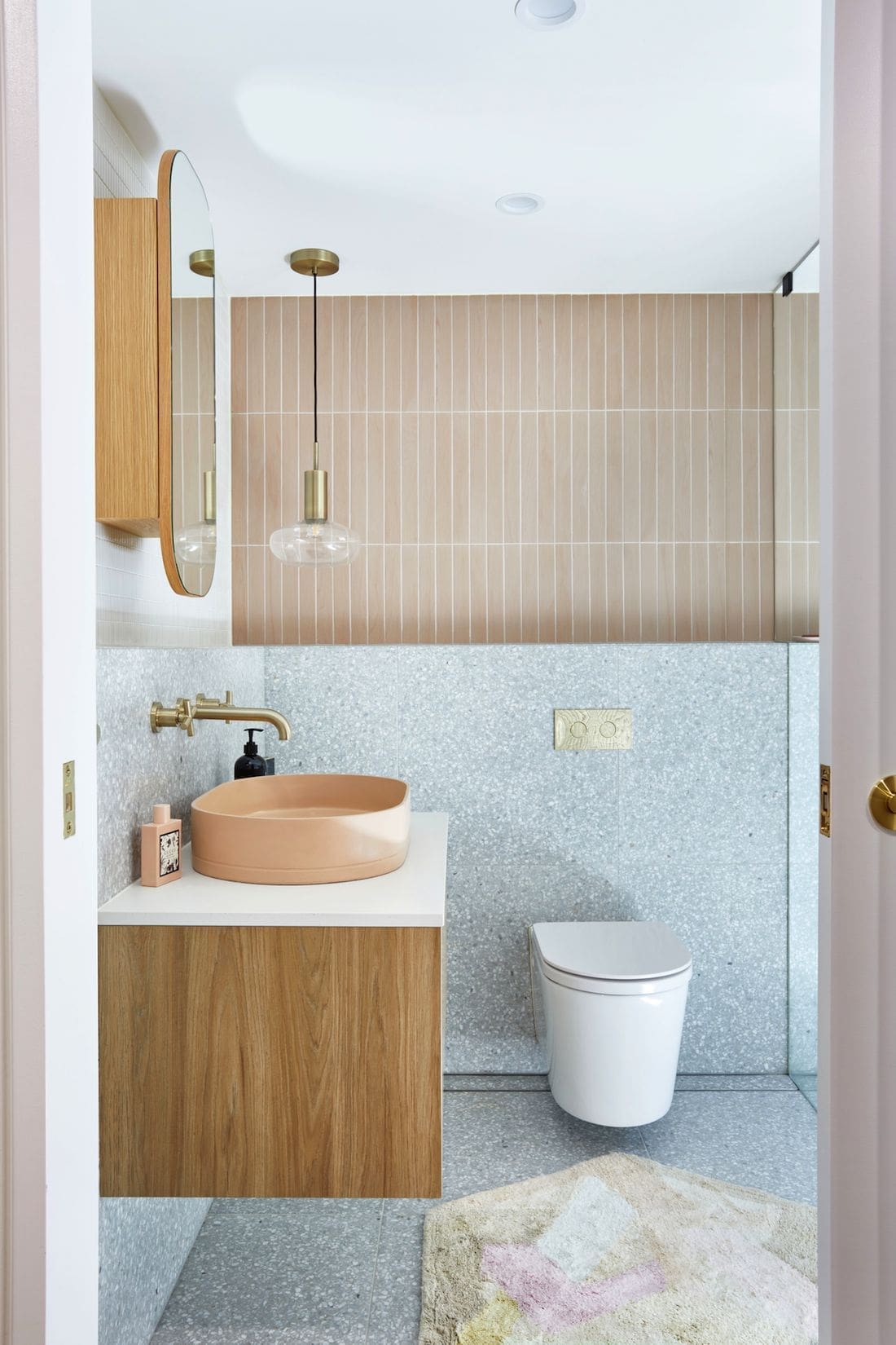
New build with a touch of retro… this was the design inspiration behind this bathroom of dreams.
“What I love about this bathroom is that it has lots of texture and a subtle mix of pattern. The entire palette and inspiration for this room was a mixture of elegant, understated retro with detail and colour to give the space a lot of personality,” explains Jeanette.
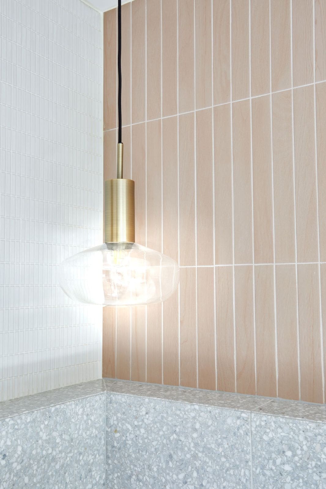
“It feels super feminine with the beautiful blush feature tile offset with a white mosaic to give the space depth, length and brightness.
“It was actually the blush tile (Technicolor — Powder TC04) that was the starting point for this whole room. The client was very specific about wanting to use terrazzo too (Fibonacci Flannel Flower).
“And then that beautiful Nood Co sink just fitted in perfectly with the blush colour of the feature tile. It was like it was meant to be!”
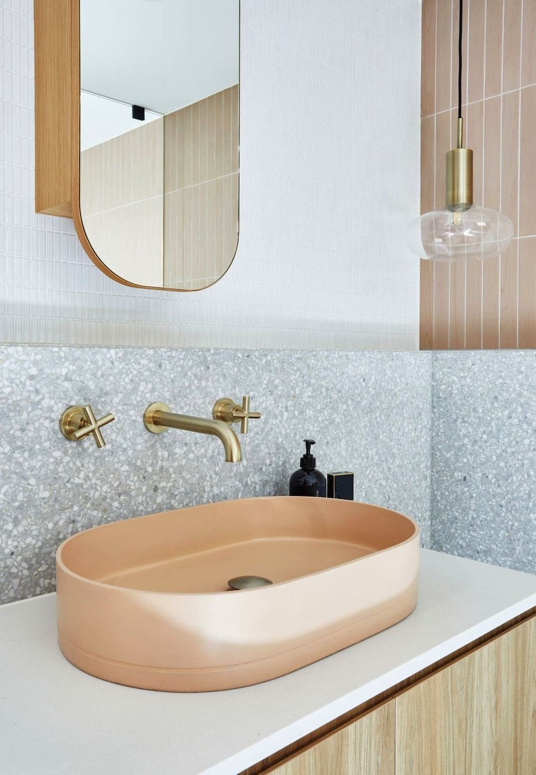
What this bathroom proves is that you can have a mix of colour and textures in a small space and make it work.
“It’s important not to have more than two contrasting elements in terms of tiles. In this case we have the pink Technicolour that is completely different in look and pattern to the Fibonacci Flannel Flower. The softness of the colour tones work together and they don’t compete, even though the patterns do.
“The key then is to have something completely offset them. It made sense to go with something white, to make the rest of the space feel seamless, open and bright,” says Jeanette.
“Next up, it was all about scale and shape. The pink tile is rectangle and knowing it was going to be laid in a vertical pattern on the wall, we decided to scale down with a similar shape to offset.
“That’s why we chose Kit Kat Luminosa to go on the opposing walls. The slightly gloss texture allows the light to subtly bounce off the walls and works perfectly with the speckles in the terrazzo.
Everything still references each other in terms of tones and shape, even though they’re all individual in look and feel.
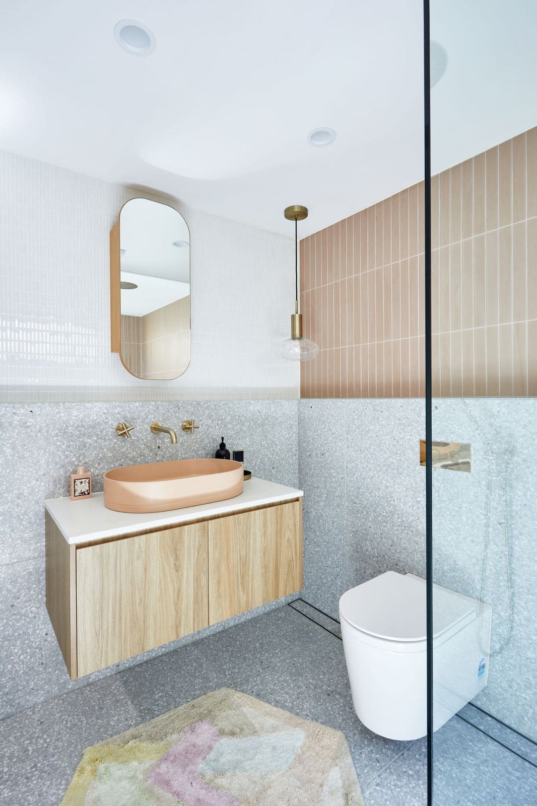
Working within a fairly tight space, Jeanette explains that layout is key when designing a beautiful yet functional bathroom.
“For this dreamy bathroom to work, it was all about layout. Sometimes you can’t have it all, and have to know what’s most important in working best in the space you have.
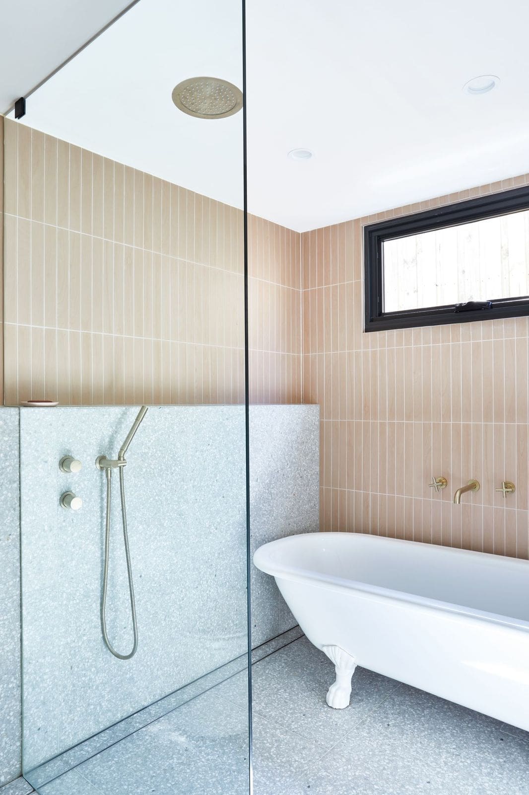
“Tile choice is also key — you’d be amazed at how much the orientation of the tile can change the look and feel of a space,” Jeanette explains.
“Don’t over complicate things! Make sure all the elements have some breathing room. Like allowing adequate space for the toilet! Plus, try to keep the vanity and toilet in close proximity to one another.
“One of my top tips to create a beautiful bathroom, is keep the shape of your tapware consistent. Don’t mix brands, unless they look the same. And don’t mix square with round profiles.”
Credits | Suppliers
Photographer — Danella Chalmers
Builder — Logico Homes
Interior Design — JDZ Designs
Tiles — Di Lorenzo Tiles
Sink — Nood Co
Tapware — Brodware
We loved taking a look around this dreamy bathroom with Jeanette. Did you have a favourite element? Tell us in the comment section below. For more projects from Jeanette at JDZ Designs, check out her website or Instagram page.
More bathroom inspiration here
