Last week we had the fun of travelling to Sydney to take over the Icon by Design showroom at Supa Centa Moore Park for a day! Our challenge was to style 3 items of furniture and thanks to all your suggestions on Facebook, Instagram and the blog, we couldn’t be happier with how it went!
We love the story behind Icon by Design — a shift away from mass-produced and disposable items towards quality craftsmanship, sustainability and timeless design. It was important to us that we styled the items fitting with their minimalist aesthetic (very much like our own!) and found subtle ways to enhance their stunning furniture.
Here’s how we did it and our guide to styling furniture in your home too!
Related article: Julia Green’s tips on adding greenery to your home
Related article: 5 ideas to steal from restaurant interiors
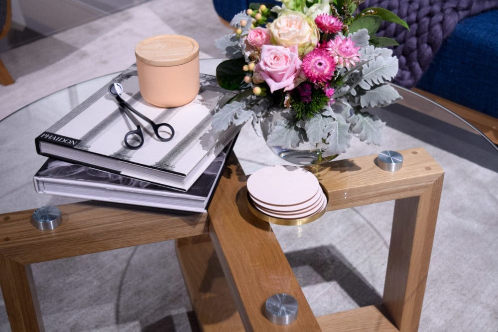
Coffee table
The Felix coffee table puts a contemporary spin on glass coffee tables, combining a solid oak base with tempered glass top (also available in rectangular shape).
The challenge was to style this piece in a way that was interesting while not being too busy that it would cover the beautiful details of the table, such as the mitered edges in the timber base.
We wanted the overall look of the table to be feminine and pretty, but still sophisticated.
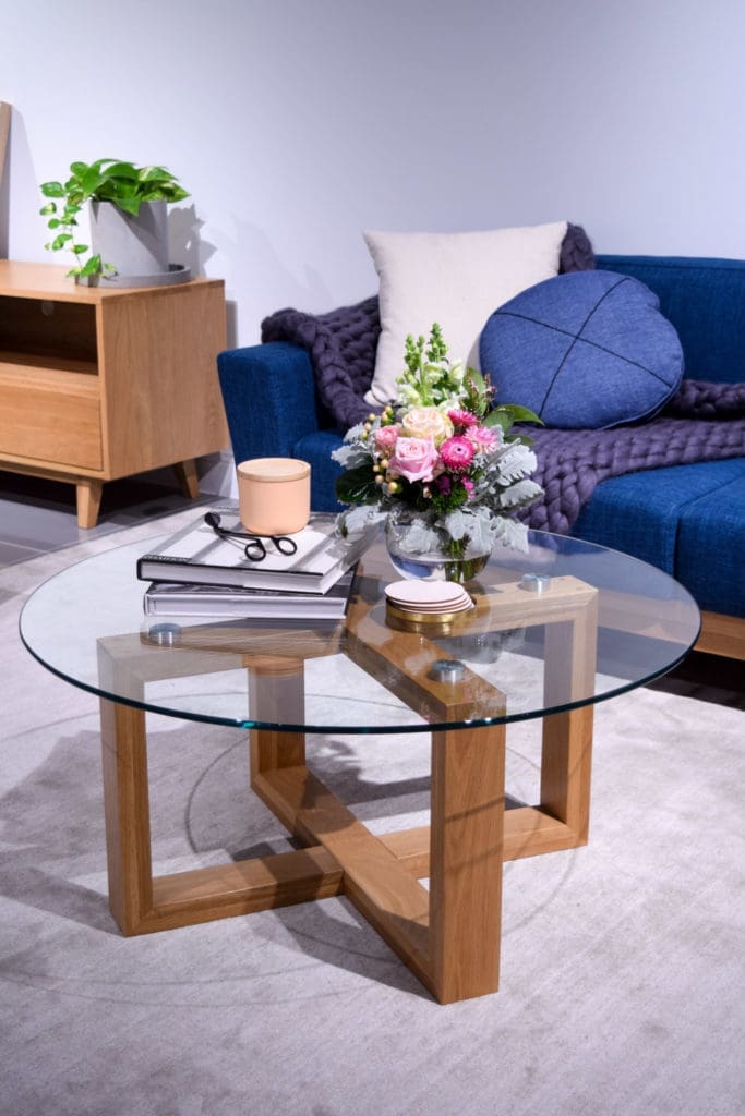
Add a pop of life
No styling is complete without a pop of life and for this coffee table look we used a small posy of flowers.
The flowers were our inspiration – we combined traditionally ‘pretty’ flowers such as roses with unexpected flowers like paper daisies – and we drew out colours to form the palette for this look.
Style in odd numbers
You’ve probably heard us say it a million times but styling in odd numbers (3, 5, 7 etc) is more appealing to the eye and somehow makes the overall look appear more balanced.
We used 5 main elements on this table – the books, candle, wick trimmer, flowers and coasters.
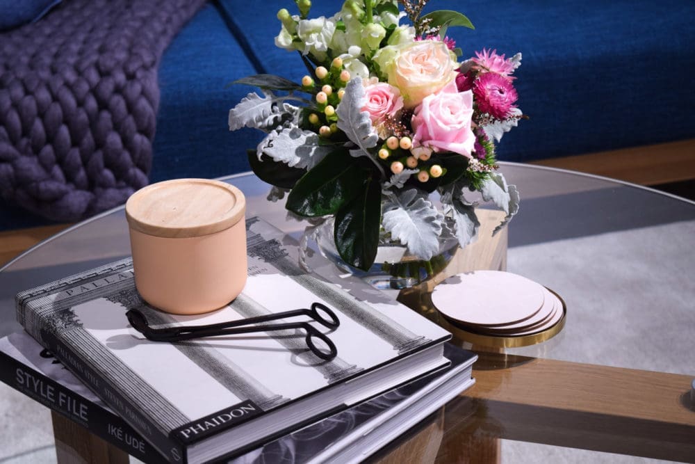
Use books as a base
Layering items creates instant interest and sophistication. Rather than always using a tray to place items on top, consider mixing it up and using a stack of books.
We used larger coffee table books with beautiful black and white covers.
Dining table
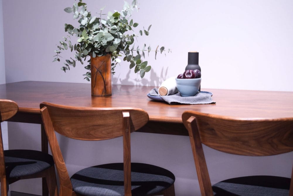
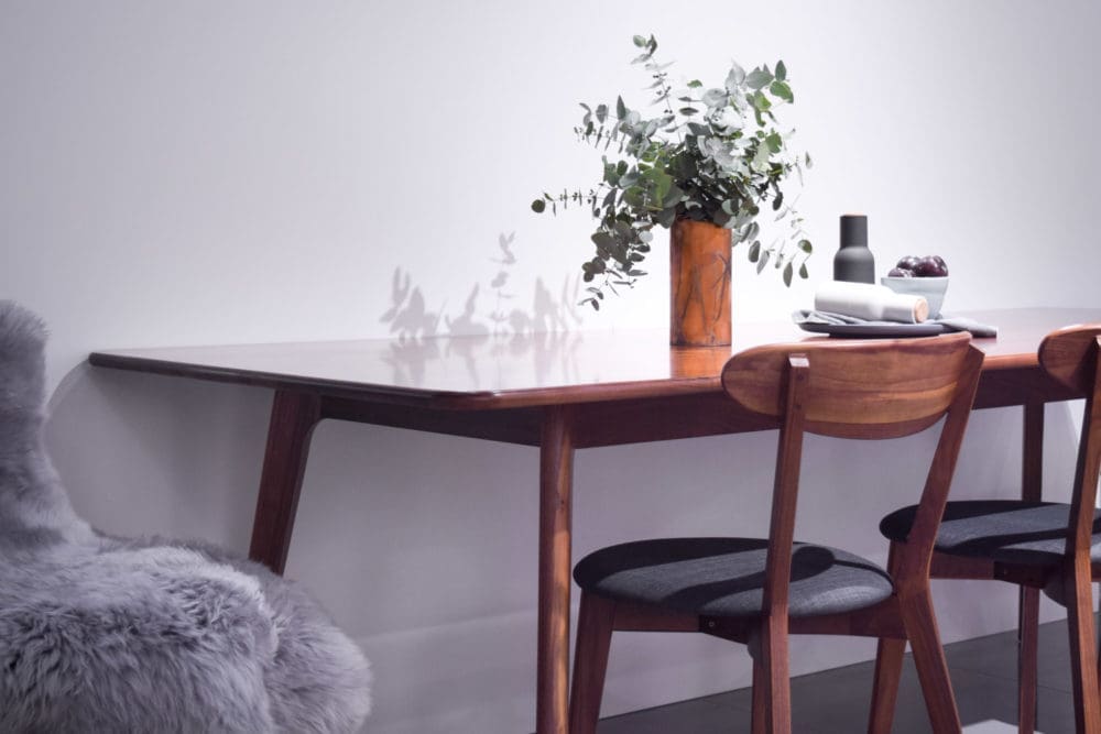
The Magnus dining table is an absolute showstopper! The walnut timber is so beautiful and as many of you suggested, we kept this styling super simple to allow the timber to be the hero.
You gave us so many ideas for colour palettes and styling direction for this piece but eventually decided to go with a moodier tone, which seemed to be the overwhelming favourite.
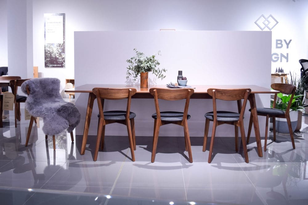
Add a hint of metallic
Thanks to Maria for the hot tip to use copper with dark timber, we just love how this Grey Box Design copper vase complements the table and eucalyptus branches are an absolute fave right now.
Play with textures
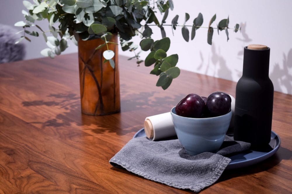
Mixing textures is always a good idea when styling. A napkin layered over the denim blue plate (used as a trivet) and a grey sheepskin fur draped over one chair brings in softer textures.
Items in a bowl
An often forgotten styling friend is ‘the bowl’ and items placed in a bowl look even better. This small ceramic bowl is by Canberra artist Bison and plums add both moody colour and hint of life as we mentioned above.
Sideboard
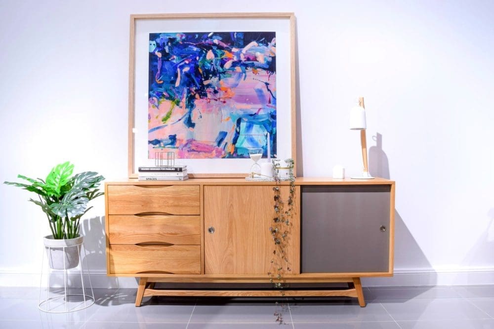
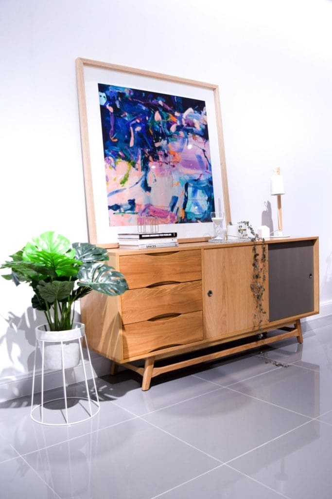
In our guide to styling furniture, the final piece we styled was the Svend sideboard. Again for this piece, we got a million suggestions ranging from coastal to monochromatic!
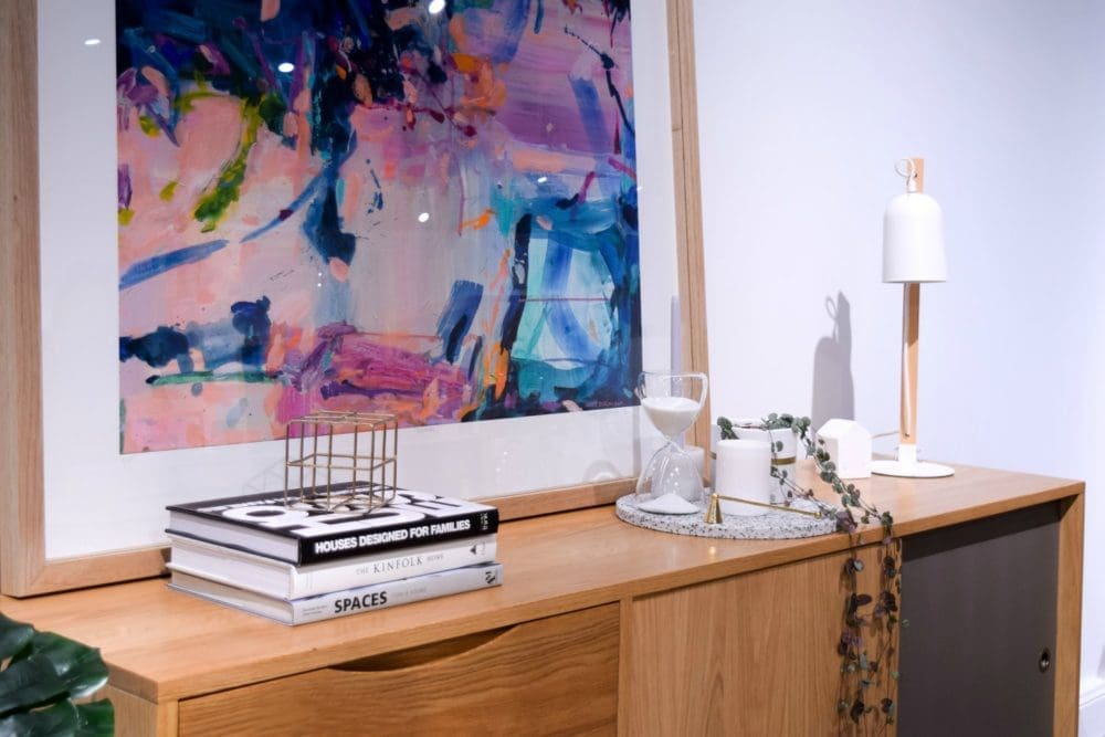
In the end, we chose an all-white colour palette offset by an oversized abstract art print by Annie Everingham.
Monochromatic colour scheme
Despite popular usage, a monochromatic colour scheme doesn’t just mean black and white, rather it’s when one colour is used so you could have a green, pink or yellow monochromatic colour scheme.
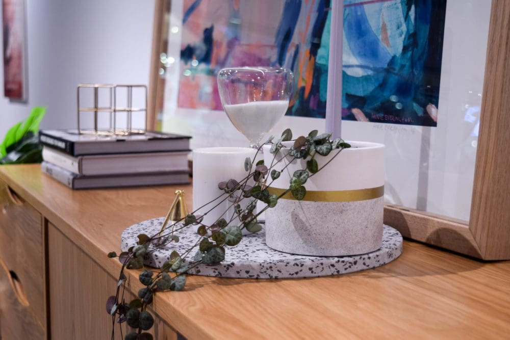
We used a grey-white scheme and a top tip when styling with one colour is to mix up materials so it doesn’t become flat – sand in the hour glass, a stone tray, books and a metal lamp are just some of the ways we did this.
Add height
When styling a sideboard, it’s easy to select pieces that are all relatively the same size but having at least one or more taller items will make the eye travel across the piece and add interest.
A tall candlestick in the centre and a taller table lamp on the end is how we added height to the sideboard.
Use trays or trivets
And finally, our best friend when styling is the tray or trivet! For this sideboard, we found a beautiful white and grey terrazzo trivet and used this to anchor all of the smaller décor pieces in the middle. For a more personal touch, you can also DIY your own, like this one we created here.
Trays and trivets help smaller items look like they belong and are another way of adding layers like we mentioned above.
Huge thanks to all of you who shared your tips on how we should style these furniture pieces! As you can see, we took soooo many of your ideas on board and love the three very different looks we created.
Hopefully you enjoyed these styling tips and are feeling inspired to style the furniture in your home now too!
And if you’re on the look out for new furniture, check out the range on the Icon by Design website here or pop into their Sydney showroom where their super friendly staff are happy to help.


Comments are closed.