You know we’re major fans of Michelle Hart from Bask Interiors who has featured several times on SC. Well this Melbourne interior designer just keeps upping her game — honing her signature style of contemporary yet homely — and her latest project is one of our favourites yet. Statement lighting, dreamy flooring, custom joinery and clean line bathrooms are just a few of the stand out features. Keep reading to find out about her design process and see all the pics of this bayside beauty.
Related article: House call: A classic cottage meets modern construction
Related article: House call: A modern home featuring the epitome of joinery perfection


This renovation project saw Hart Builders team up with Bask Interiors to bring a tired, rundown home back to its former glory (with a modern twist).
“We purchased this Californian bungalow in Bayside Melbourne with the intention to renovate and sell. Which it did, prior to auction,” says Michelle proudly.
“We knew we wanted to restore and turn this original house into a new and functional family home. There was a long wish list and we tried to incorporate as many items into the renovation design concept.”
We’re always intrigued to know how an interior designer tackles a renovation project where the outside is so vastly different to the inside.
“The house was in a heritage overlay area. This meant the facade and any part of the house seen from the street front had to remain as traditional to the home’s original era.
“For the interiors, I wanted it to be a mix of new and old. This meant maintaining as many of the original features of the house as possible.
“We went for a contemporary, somewhat conservative feel throughout the home, knowing we had to appeal to a lot of people as it was going to be sold.”

Proving that good things come to those who wait, this renovation project wasn’t without its challenges. The team endured time delays, extension issues and changing floorplans.
“There were SO many restrictions on what we could do in terms of an extension,” Michelle explains.
“The original upstairs area had to be reduced in overall size. It also had to be set back further from the front of the house so it couldn’t be seen from the footpath.
“We had a number of town planning challenges at the design and planning stage which set us back 6 months.
“The upstairs rooms had to be re-jigged so we could still maintain a separate living space as well as bedrooms that were still a decent size.
“This meant we had to sacrifice a second master bedroom and ensuite upstairs. Instead it became a standard sized bedroom with a shared bathroom. Still, it all worked out well in the end!”

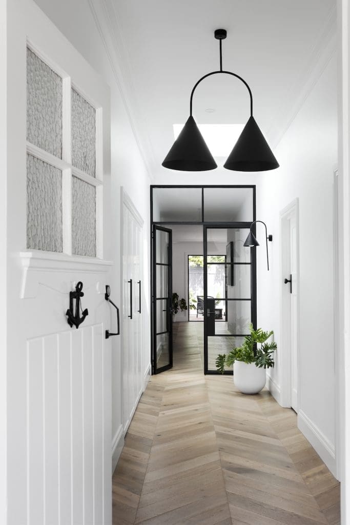
There’s no mistaking it. The statement lighting in this home is its crowning glory and helped bring the whole design concept together.
“The light fixtures were some of the first pieces that I selected for the house.”
I do love statement lighting. They are like decorative art pieces for your home and can not only be functional but enhance the entire look and feel of a room.
“I selected lights for the formal living room, entry and hallway, master bedroom, stairwell and dining area. I then worked around creating the rooms with the pendant lights in mind.”
Designing a home with statement features while also appealing to potential buyers is no easy task and we asked Michelle how she gets the balance right.
“I try to think about the bigger picture and how I would like the space to feel. Then I create visuals in my mind and find inspiration from a number of places — blogs, Instagram, Pinterest, magazines — and put together a mood board.
“I decide early on what colour palette I’d like to use throughout the house and set out looking for inspirational art that I feel a connection with. Artwork really helps to bring a room to life,” says Michelle.
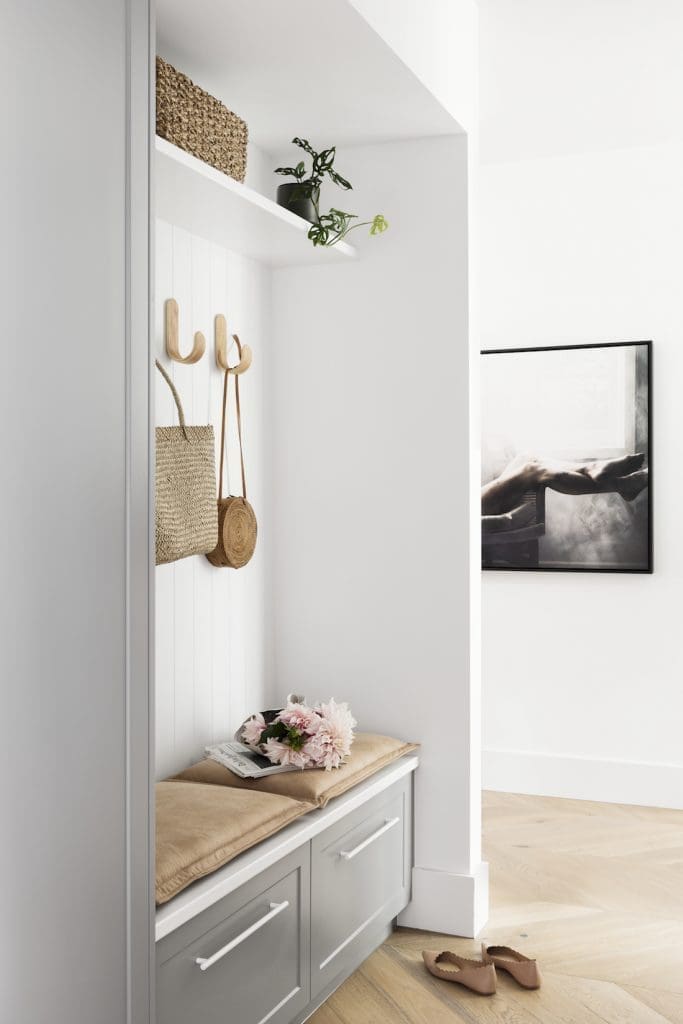
“Next I add things like soft furnishings and vessels, flowers, plants and objects of interest. All the little details add to the layering of each room, giving it that sense of home and completeness.”

With so many lust-worthy design features, we struggled to pick our favourite. So what were Michelle’s faves?
“The oak chevron flooring downstairs, the steel frame doors in the hallway and the wine storage room,” Michelle says.
“Also, the mud room and the large light-filled master bedroom with wall paneling and traditional fire place.”
Photography — Martina Gemmola
Shoot styling — Bea Lambos
Huge thanks to Michelle for showing us around this gorgeous home and sharing her design tips. For more of her stunning work, check out Bask Interiors website or Instagram page. What are your thoughts on the hometour? What do you like? Is there anything you would do differently? Let us know in the comment section below!
View more home tours here


Hi, love the renovation! Can you please let me know where the entrance pendant is from? Absolutely love it 😍 Thank you!
Hi Corrin, isn’t that pendant stunning?! It’s by a local company called LAAL (https://www.instagram.com/laal_official/) but they are currently taking a break and not accepting orders 🙂
Thank Gina! I’ll keep my eye on them and hopefully they start taking orders again soon 🤞
Thanks for getting back to me Gina. Much appreciated.
Hi Gina,
I am wondering if it is possible for you to find out what exterior paint colour scheme was used (including guttering)? Many thanks
Hi Sue
I’ll ask Michelle now and see if she’s happy to share the details 😉
Hi Sue, Michelle has shared the paint colours. The grey is ‘Graphite Grey’ and the white is ‘Magnolia Moonlight’ both by Haymes Paint 🙂
Who made the black steel framed glass doors in the hallway
Hi Gregg, they were custom designed and ordered by Michelle for this project. You can contact her at https://baskinteriors.com.au/contact/ 🙂
What material has been used for the kitchen bench, splash and island?
Hi Janell
Sorry for the delay. I’ve reached out to Michelle to ask and will update you as soon as I find out 😉
Thanks for your patience Janell, Michelle said it’s called ‘Grey Tundra’ from Signorino. Have a fab day!
Hello! I’m wondering what color your kitchen cabinets are? Thanks!
Hi Annie, Michelle used ‘Smoky Silhouette’ by Haymes Paint 😉