It’s been over a year since I first got the keys to my creative space. A blank room in need of a lot of love but I was so excited to have a child-free space to work. Having the busiest year for Style Curator yet — and the birth of my second child — it’s taken until now to share the space with you!
This room was pretty drab when I first got the keys so naturally I invested time and energy to make it my own. Here’s how I updated the space.
Related article: How to create a square panel feature wall: Step-by-step instructions and video
Related article: Inspiration gallery: VJ panel living room walls
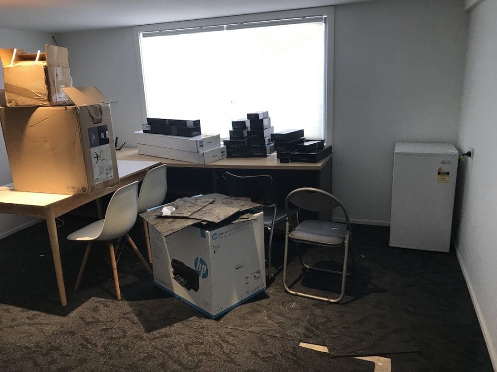
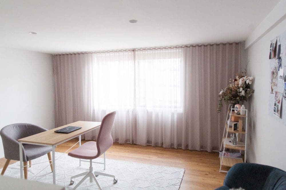
Space before and after
The previous tenant left the room in a bit of a state. Piled high with boxes and old furniture, the space needed a good clear out before I could decide on what cosmetic changes to make.
New flooring
The old carpet squares were one of the first things to go! We DIYed luxury vinyl planks that we installed straight over the concrete slab floor. I selected these because they’re hard-wearing, relatively affordable and provide the same visual warmth as timber.
Warmer colour palette
While I have nothing against white walls, I decided to paint the room a soft grey (‘Soothe’ by Haymes) to make it feel more inviting.
More practical window coverings
And for practicality, I switched the honeycomb light filtering blinds to a blockout roller blind (as Alexander often slept in here when he was younger). I also installed a beautiful, wall-to-wall pink sheer curtain from DIY Blinds over the top (called ‘Blush’ from their Como range).
Adding much-needed storage
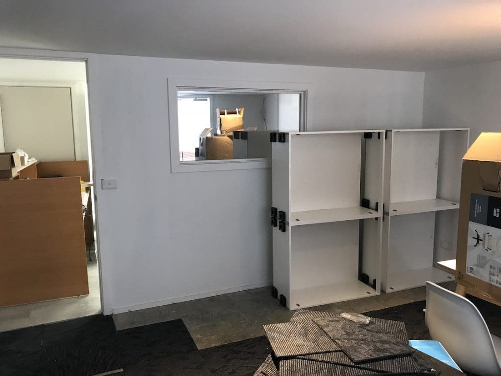
The other side of the room needed even more work. It had an awkward mirrored window that I wanted to cover over and as there was zero storage in the room, I also had joinery installed.
DIY panel wall
Rather than hiring a plasterer to cover over the window, I thought a DIY panel wall would be a cost-effective solution. You can buy ready-made VJ wall panels from Bunnings but I had my heart set on something with a slimmer and more pronounced profile. Unfortunately, the product I was looking into would have cost thousands! So we painstakingly created our own version using individual pieces of timber and spacers. While it’s not perfect, I’m pretty darn impressed with our efforts!
Furniture and decor
At the moment, the furniture in here is fairly basic — simple Kmart desk and IKEA work chair. I did splurge a little on that petrol blue armchair from Adairs. Over time, I’ll update the furniture but for now these pieces do the trick 😉
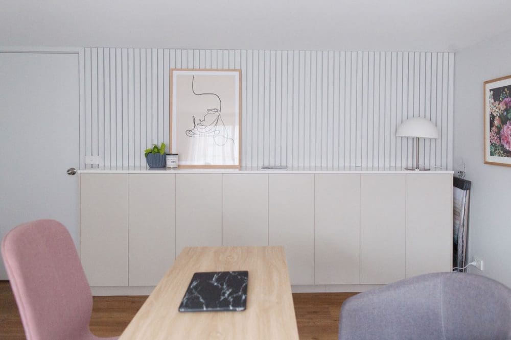
A dedicated space for blogging, styling, content creation and design work…
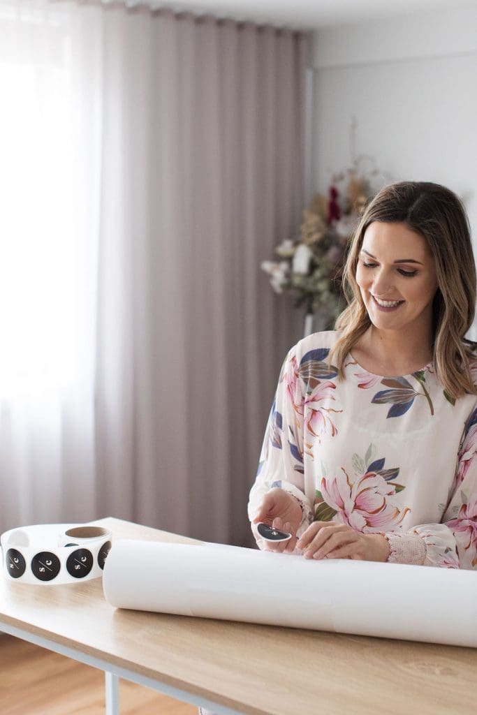
Style Curator has changed a lot over the years. What started as simply a blog where I would feature other people’s projects and design news, has morphed into a content creation studio.
Now, I spend my days shooting photos or videos for brands and writing content on behalf of brands for other media sites, in addition to what you see here on SC. I have also transitioned from being on the sidelines of design, merely writing about other people’s work, to actively engaging in many of my own projects.
It’s great to have this dedicated space where I can make all this happen… without having to worry about my little people drawing all over things or ‘re-styling’ my work (Patrick is notorious for this at home!).
I plan on creating more videos next year for Youtube and this space allows me to have the equipment set up and ready to go — giving me one less excuse to put off making them happen, ha ha.
I’m feeling very grown up — and that Style Curator is very grown up — to have a dedicated creative space. At the moment the rest of the SC team works virtually but perhaps soon I’ll be sharing this space with someone in the team, I hope!
Thank YOU so much for supporting SC by reading and commenting on our articles, or following along on our social channels and liking posts. Your support is what allows me to call this my job and I’m forever grateful xx
More styling ideas



Comments are closed.