It’s week 2 and guest ensuite time! The Blockheads got their first taste at renovating a bathroom on The Block and it went… semi-ok! Let’s just say if we were the judges on this series, things would have been scored a little differently!
Let the judging begin!
Related article: The Block 2020: Week 1 — Guest bedroom reveal
Related article: The hits and misses of ensuite reveals from The Block 2018
Harry and Tash
We thought things were looking up for this pair but unfortunately bathroom week wasn’t their best effort. They may have had the smallest bathroom on The Block, but the judges had a lot say. And not much of it was good — eek!
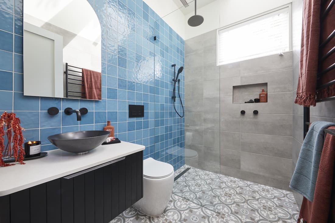
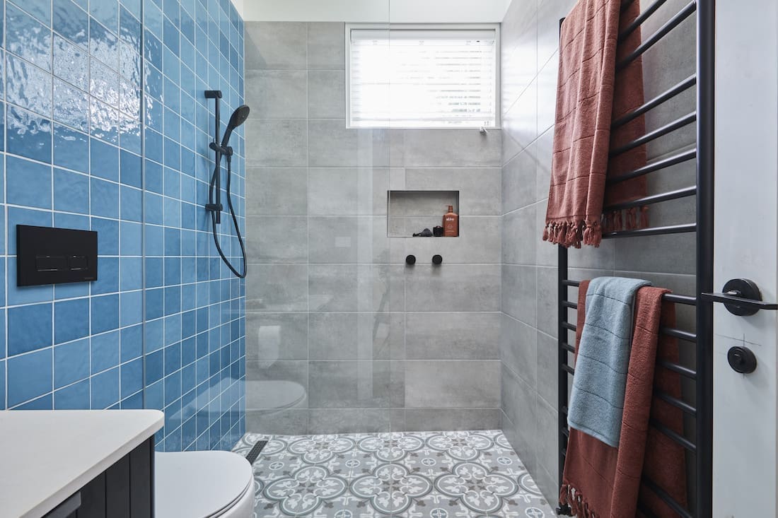
These guys had the perfect brief to create a stunning bathroom but what they delivered was a mish-mash of styles, colours and patterns that just didn’t work together.
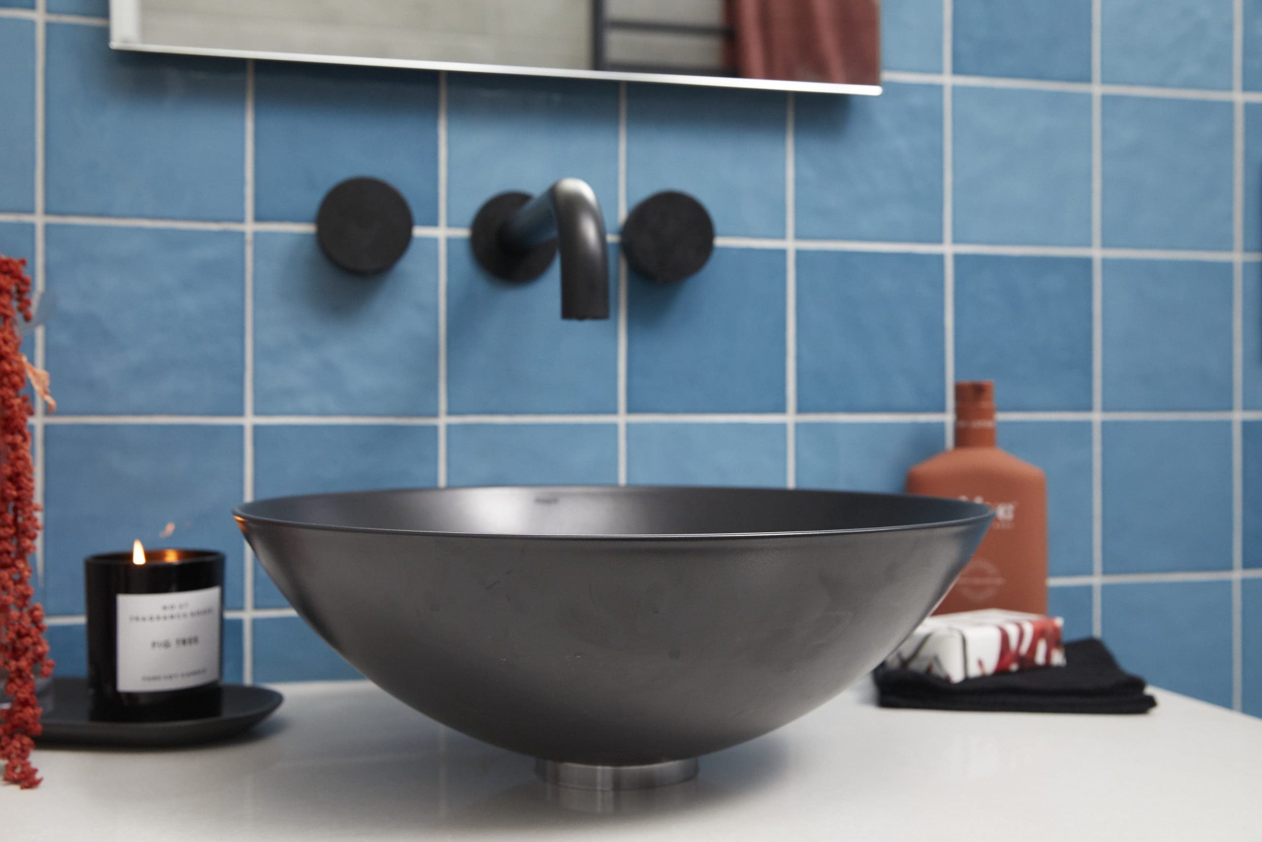
The biggest issue was the tiles. While nice on their own, all used together they didn’t work. The duo was criticised for their floor tiles not fitting their 1920s house brief and for a home in affluent Brighton, it was noted they should have included underfloor heating. On the plus side, Neale liked the basin and curved edges of the bathroom cabinet.
We would have liked to see them use a traditional floor tile as the hero and keep the walls simple. The bathware and tapware they selected were all ultra-modern too. Imagine how stunning some more decorative tapware in a brushed platinum finish would have looked?!
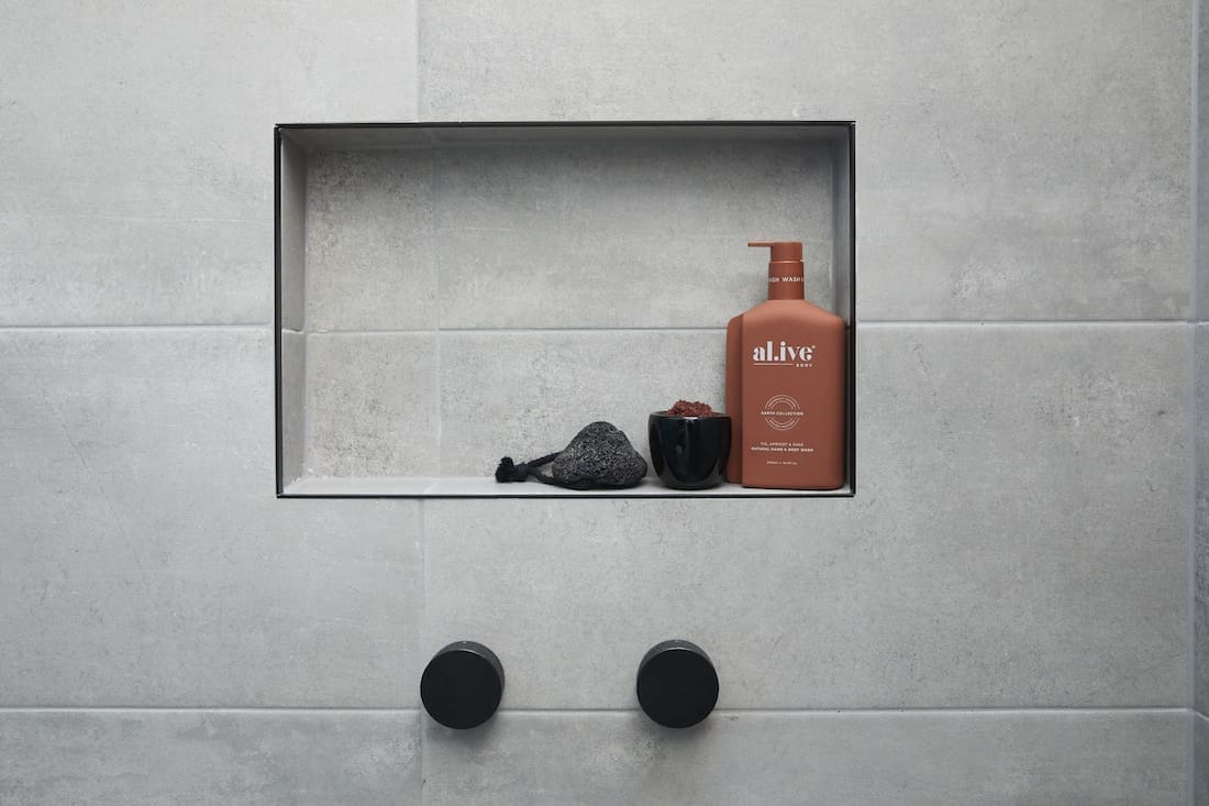
A small thing, but we loved that they used former Block contestants Alisa and Lysandra’s Al.ive products. You can read our interview with the girls about their newest business venture here.
Score: 21.5 / 30 (5th place)


George and Sarah
Yes! These guys are starting to find their groove and this was (almost) George and Sarah’s week!
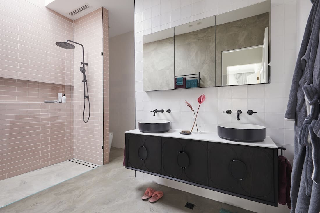
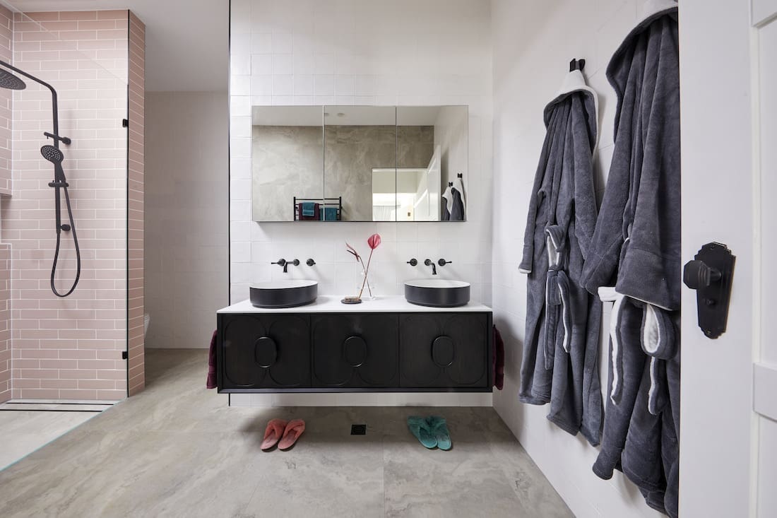
Last week they played it safe so it was great to see them take more design risks this week. Nailing the 1940s brief, they also managed to bring in a lovely contemporary feel to their guest ensuite bathroom.
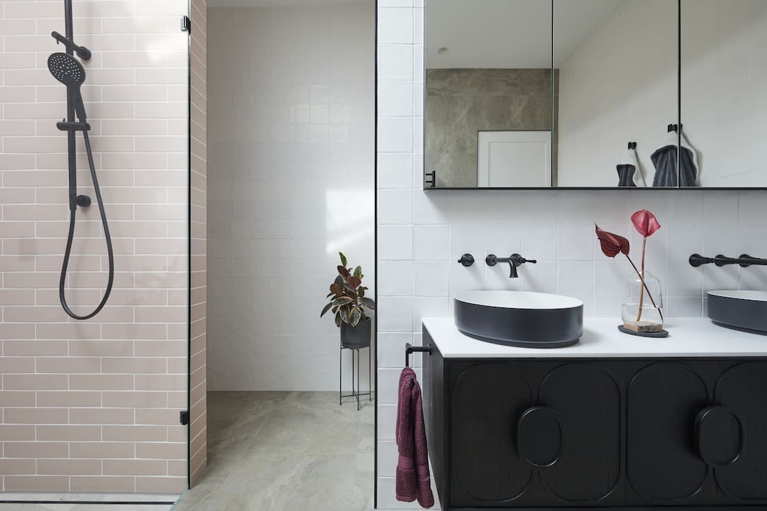
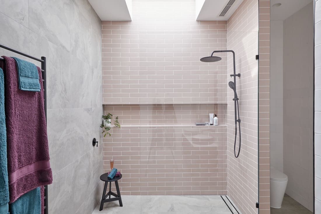
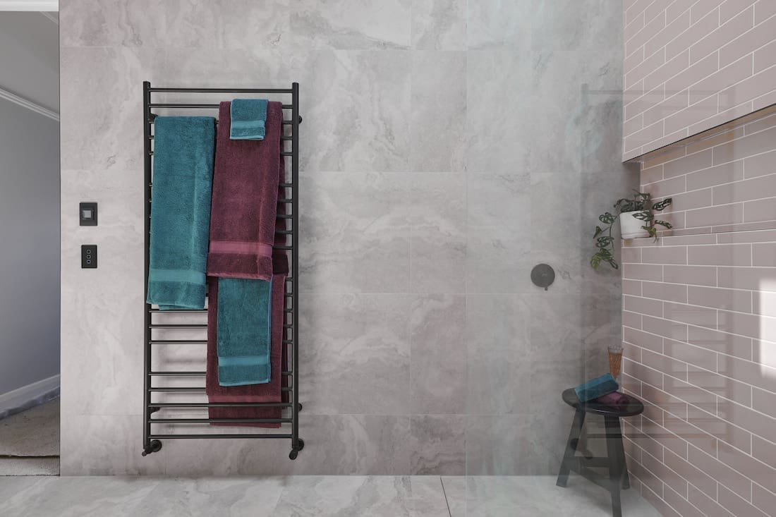
The whole colour palette was gorgeous and the judges simply loved the blush pink tiles from Beaumont Tiles. The pair were praised for their well thought out bathroom plan, in particular the wall they installed to keep the toilet separate from the shower.
We noted they were the only couple to use decorative tapware and thought their vanity was a work of art, suiting their brief to a T. We’re excited to see what they pull out of the hat next week!
Score: 27 / 30 (2nd place)


Daniel and Jade
We were expecting big things from this couple given their understated and perfectly styled bedroom last week but were left disappointed. And the judges agreed.
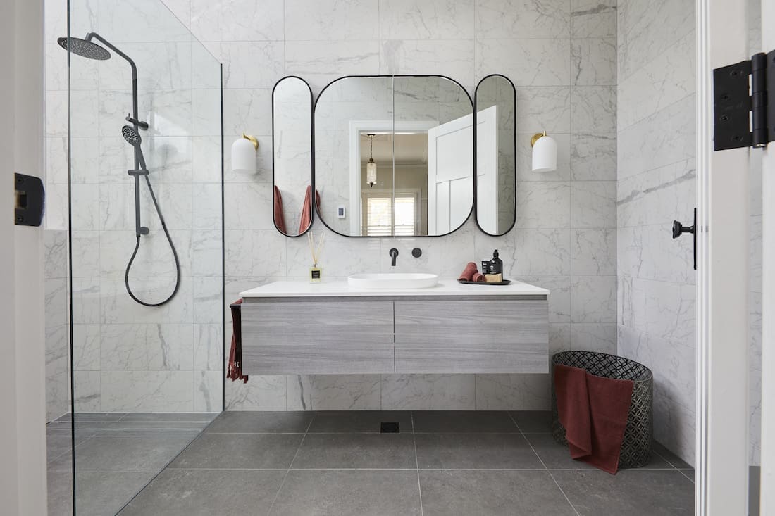
It was a tough week for team 3 as they had to leave The Block after the death of Daniel’s grandfather in South Australia. They were really happy with their bathroom, however the judges thought it was way too contemporary for their 1930s era home.
Where they gained points last week for their attention to detail for their 1930s touches, this week they didn’t have much at all. Functionally, it was a good bathroom and while the judges loved the art deco mirror, we weren’t so keen.
Yes, the mirror is cool but it dominates the space and sadly the only element we liked was the lighting. We know it was a tough week for the couple but most of their choices didn’t suit their 1930s brief… and more to the point, didn’t work together in the space.
Here’s hoping they embrace a bit more pattern, colour and decorative finishes with their next bathroom.
Score: 23 / 30 (4th place)


Luke and Jasmin
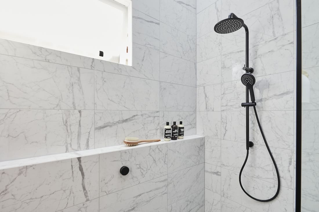
So… if we were judging The Block guest ensuite week, then we’d definitely have bumped Luke and Jasmin up the leaderboard. A big step up from their bedroom last week, the couple went with a less is more approach and we loved it!
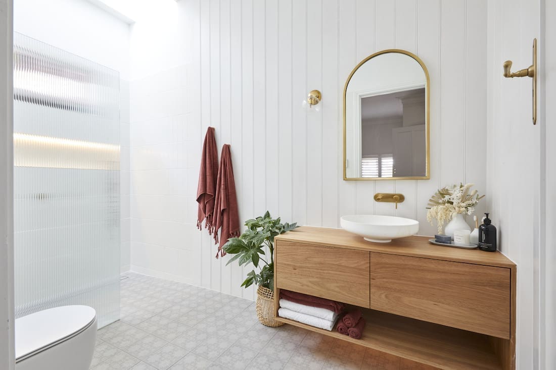
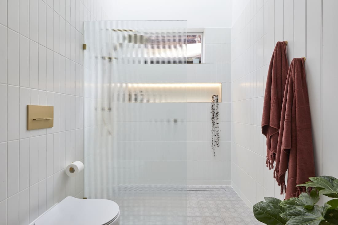
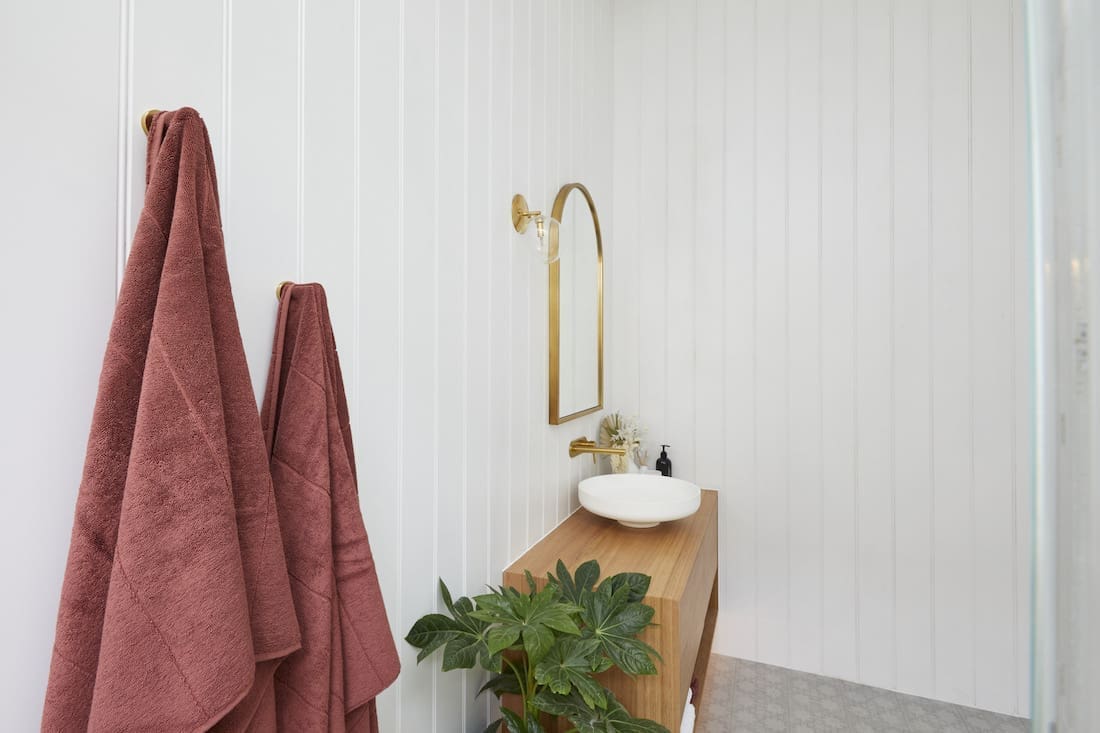
The pair received a visit from judge Darren Palmer earlier in the week to give them a few pointers on what the 1910s era was all about and it seriously paid off. Their bathroom had immediate impact, especially over the reeded shower screen which the judges (and we) loved. Actually, we thought it was to die for!
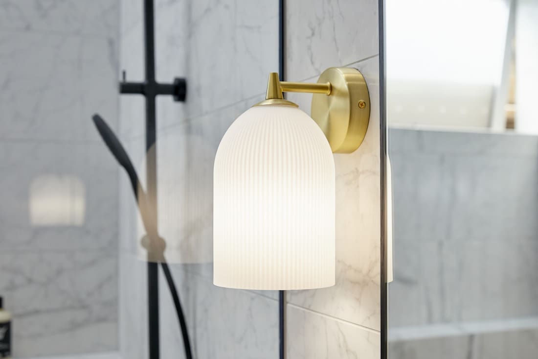
The VJ panelling worked perfectly with their floor tiles and the basin, wall sconces and tapware were also a hit. We thought they designed a 1910 style bathroom through a modern lens and created a space that was both functional and beautiful. All the other elements worked in harmony and got big ticks from us — we think these guys should have been the winners this week.
Score: 25.5 / 30 (3rd place)




Jimmy and Tam
And taking out top spot for the 3rd time was Jimmy and Tam in house 5. We liked it, but the judges loved it.
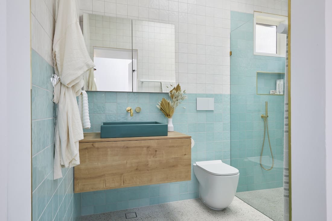
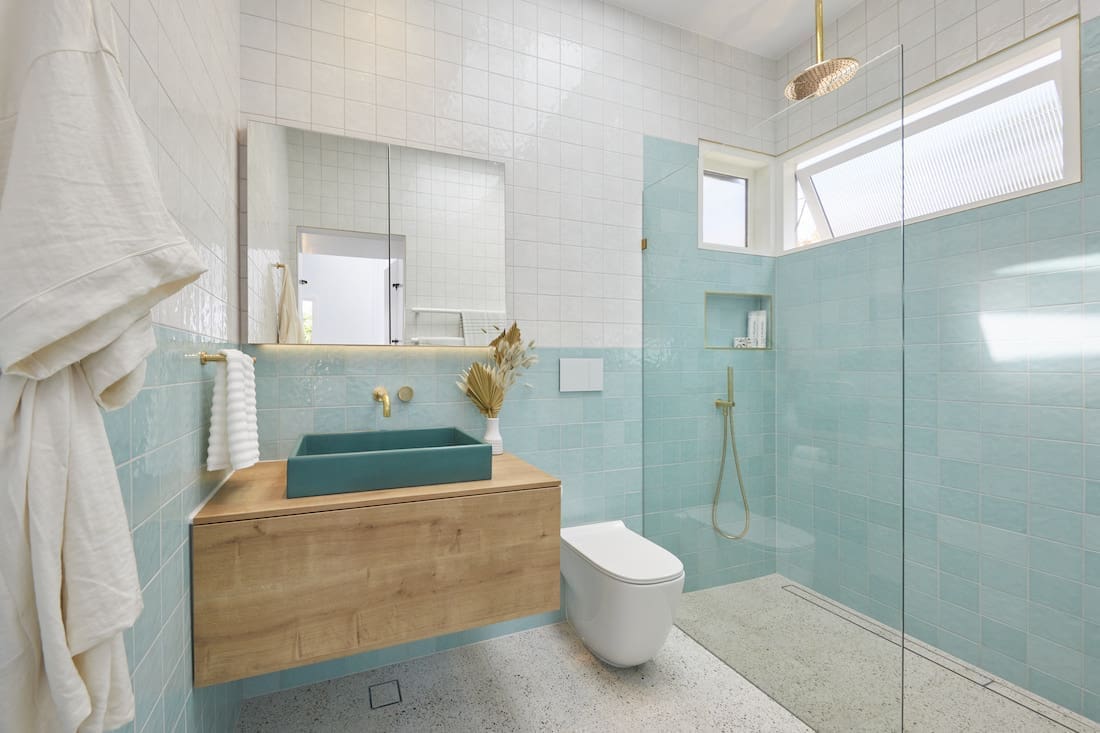
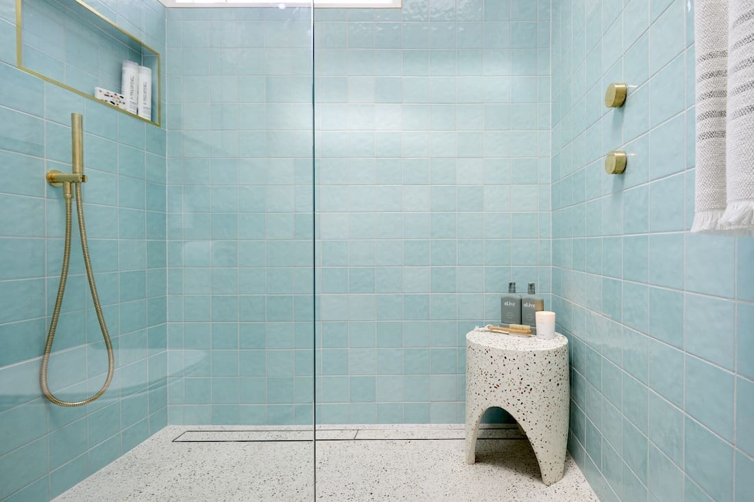
While Darren compared their guest ensuite bathroom to a public pool (haha!) it was actually a compliment. The judges thought the terrazzo tiles and stool were perfect, and their colour palette matched their winning bedroom from week one.
They were praised for nailing the brief and sticking to their 1950s house theme. We, on the other hand, thought a little differently.
We love that these guys are willing to take a risk and try something a bit different… only the execution didn’t quite do it for us. We know they’re working with a 1950s style and love the bold square aqua tile they selected, but the white square tile didn’t work as there wasn’t enough contrast between the wall tiles — being the same shape and finish.
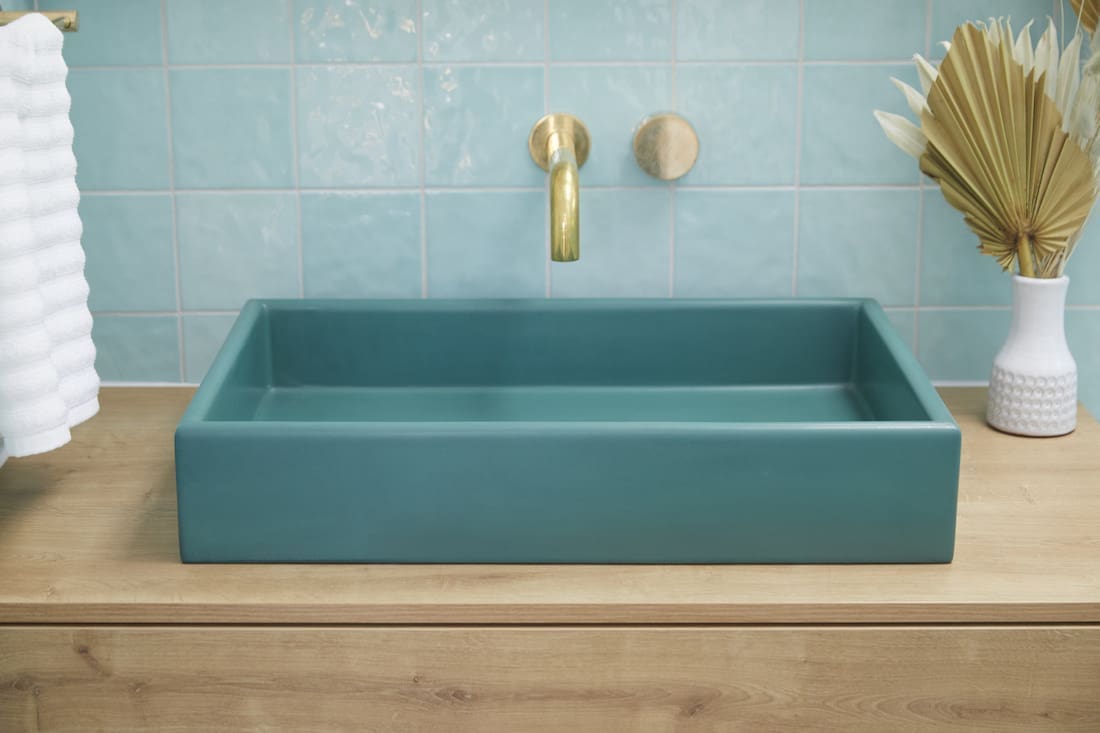
Imagine if they’d used a border tile to finish off the aqua, and used a cool wallpaper above or even plain painted white walls?! It would have been great to see a bit more functional lighting around the vanity as well. Big props from us for their green Nood Co basin and terrazzo floor tiles though.
Score: 28.5 / 30 (1st place)




Be sure to check out The Block Shop if you’ve spied something you love in this week’s room reveals. And you can catch all The Block 2020 goss on the official website. What did you think of the guest ensuite bathrooms for The Block 2020? Did you agree with the judges (or us?!). Tell us in the comment section below!
All imagery by David Cook Photography


